10,000 search results
(0.043 seconds)
- Praline MCL by My Creative Land,
$29.00 The family contains two fonts - charged with OpenType features vintage soft serif and a sans serif with corresponding forms and softness. Serif: Grandma’s sweet and soft recipe with more than 1300 ingredients (lots of alternates, swashes, ligatures and design elements). This font takes it’s inspiration from Goudy, Windsor and Bookman typefaces. Watch the video showing the font stylistic alternates and swashes in action https://youtu.be/_MHNizwq1bM Sans serif: Soft and friendly, it is a simple 1970s inspired geometric grotesque to use as a support font with Praliné Serif or any other serif or script font of your choice. Both fonts fully unicode mapped so can be used in any application. Get your designs look 1970s!
 - Cutney by Twinletter,
$15.00 Introducing Cutney, a display typeface that has been meticulously developed to give the idea of a display that is fun, easy, and versatile to use. Use this font for your outstanding project, and you and your audience will be ecstatic to witness a stunning, proportionate presentation. Many viewers were taken aback, leaving you with a fantastic opportunity. This font is perfect for games, sporting events, branding, banners, posters, movie titles, book titles, quotes, logotypes, and more. of course, your various design projects will be perfect and extraordinary if you use this font because this font is equipped with a complimentary font family, both for titles and subtitles and sentence text, start using our fonts for your amazing projects.
 - Holidream by Subectype,
$16.00 Introducing the new "Holidream" font, a monoline script font. For those of you who are needing a touch of clean monoline handwritten Font, chic and modernity for your designs, this font was created for you! Holidream was built with beautiful alternate ending. and It has an extensive lingual support, covering all European Latin scripts. What's Included: Web Fonts Ligature & Alternate Works on PC & Mac Simple installations Accessible in the Adobe Illustrator, Adobe Photoshop, Adobe InDesign, even work on Microsoft Word. PUA Encoded Characters - Fully accessible without additional design software. Fonts include multilingual support for; Afrikaans, Albanian, Czech, Danish, Dutch, English, Estonian, Finnish, French, German, Hungarian, Italian, Latvian, Lithuanian, Norwegian, Polish, Portugese, Slovak, Slovenian, Spanisch, Swedish.
 - R21 hSq by 103cia,
$10.00 R21-h sq is stand for "Ratio 2:1 in horizontal square"; a comparison in making a glyph typography, horizontally in the form of a square. R21-h sq font consists of bold-retro typeface with its own unique funky style. Suitable for app design, games, toys character face, storybook covers, logos, advertisements, branding, poster, or anything that needs a daring and fresh typography. Font include: R21-hSq-Latin (+extended) font R21-hSq-Cyrillic font R21-hSq-Greek font* * Additional Light font for Greek only. All styles include Latin standards (except for free/demo version). The glyph 6, 8, 9, x, O, Q and X on display are for commercial version (the free/demo version are different).
 - Jenifer Style by Sensatype Studio,
$15.00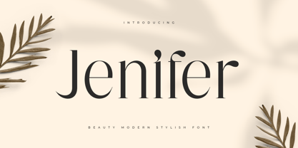 Jenifer is a Beauty Modern Stylish Font A new font that we created special for branding needs, with unique characters and awesome alternative characters are ready to add value of your brand. It so nice to leverage designer or product owner that need solutions to make their design look more beauty and modern. And specially for Salute font, We prepared any swash and any alternate characters to help you create unlimited variations for your creative needs. Jenifer is a Beauty Modern Stylish Font ready with: Any options to get creative variations (combination of Alternate) Preview as a inspirations that you can do with Jenifer font Ready with Lowercase and Uppercase characters Wish you enjoy our font. :)
 - Mirganel by Sensatype Studio,
$15.00 Mirganel - Modern Vintage Serif Font is a well-balanced contemporary font with a fancy, unique, and versatile vintage serif, font that you can combine to get any variations and unique shapes easily just in seconds with choose alternates of them. It is a serif display font with moderate contrast that perfect for branding projects, logo, wedding designs, social media posts, advertisements, product packaging, product designs, label, photography, watermark, invitation, stationery, and any projects, it makes with a high level of legibility. What's Included: Mirganel font Character set A-Z Normal & Italic Style Numerals & Punctuation Accented Characters (West Europe) Stylistic alternates Works on PC & Mac Recommended using Adobe Illustrator or Adobe Photoshop. Wish you enjoy our font. :)
 - Enigmatica by Artisticandunique,
$10.00 Enigmatica - Serif font family - 18 Styles - Multilingual supports Enigmatica is a stylistic and powerful serif font family with different alternative type designs. You will have the opportunity to enrich the content of your projects with alternative characters. This font comes with multilingual support and 18 styles. It has an elegant structure that can be effective in the development of your projects. Especially for editorials, magazines, books, branding, logo design, web design, headlines, movie titles etc. If you are looking for a font with stylistic alternatives, Enigmatica serif font might meet your needs. With this font you can create your unique designs. If you have a question, please contact me. Have a good time.
 - Salute SS by Sensatype Studio,
$15.00 Salute is a Modern Vintage Beauty Font A new font that we created special for branding needs, with unique characters and awesome alternative characters are ready to add value of your brand. It so nice to leverage designer or product owner that need solutions to make their design look more beauty and modern. And specially for Salute font, We prepared any swash and any alternate characters to help you create unlimited variations for your creative needs. Salute Modern Vintage Beauty font ready with: Any options to get creative variations (combination of Alternate and Swash) Preview as a inspirations that you can do with Salute font Ready with Lowercase and Uppercase characters Wish you enjoy our font. :)
 - Hug Shack by Yumna Type,
$12.00 A beautiful and easy-to-style font duo to elevate your design. Hug Shack expresses a feeling of joy and cute overall. Through the script font, Hug Shack brings your design to delve deep into the world of cuteness, while the display font creates modern look. You can mix and match this harmonious font duo to make gorgeous result in your design. This font become more special with awesome clipart as bonus. Features: Stylistic Sets Ligatures Multilingual Supports Numerals and Punctuation It can be used for branding, logos, social media quotes, stickers, posters, vintage designs, wall art, merchandise, social media, and many more. Get more inspiration by seeing the preview. Thank you for purchasing our premium fonts! Happy Designing!
 - Attack by Sensatype Studio,
$15.00 Attack is Corporate Logo Sans Serif Font is a well-balanced modern font with a minimalist, unique, and iconic sans serif, font that you can combine to get any variations and unique shapes easily just in seconds with choose ligatures of them. It is a sans serif font with minimalist style that perfect for branding projects, logo, poster designs, social media posts, advertisements, product packaging, product designs, label, photography, watermark, invitation, stationery, and any projects, it makes with a high level of legibility. What's Included: 9 Weights Attack font Ligature Characters Character set A-Z Numerals & Punctuation Accented Characters (West Europe) Works on PC & Mac Recommended using Adobe Illustrator or Adobe Photoshop. Wish you enjoy our font. :)
 - Modar by SAMUEL DESIGN,
$29.00 MODAR means Modern and Artistic. A good font must be enduring and of high quality. This typeface is beautiful and noble, like an elegant sculpture, both historical and modern. This font is great for fashion, magazines, premium services, publishing, and also great for premium brands. MODAR is paired with a sans-serif typeface for a simple yet elegant visual effect. The font is very straight and has high-quality details, combining Eastern and Western aesthetics in one typeface. Designers borrowed classic fonts such as Didot and Canela in this font, combined with the elegant style of personal advocacy, to create 350 characters. I hope this font will help your brand be more visible.
 - Wishful by Sensatype Studio,
$15.00 Wishful is a Fancy BEauty Display Font A new font that we created special for branding needs, with unique characters and awesome alternative characters are ready to add value of your brand. It so nice to leverage designer or product owner that need solutions to make their design look more beauty and modern. And specially for Salute font, We prepared any swash and any alternate characters to help you create unlimited variations for your creative needs. Wishful is a Fancy BEauty Display Font ready with: Any options to get creative variations (combination of Alternate and Ligature) Preview as a inspirations that you can do with Wishful font Ready with Lowercase and Uppercase characters Wish you enjoy our font. :)
 - Charpentier Sans Pro by Ingo,
$41.00 A humanistic sans serif The first version of this font was created in 1994 within the framework of the bid placed by the city of Graz to become the location for the Winter Olympics in 2006. Appropriately, its original name was ”Olympia.“ The font is intended to embody classic ideals as well as to meet modern demands. The proportions of Charpentier Sans are directly derived from Roman capitals and the humanistic book-face. The contrast between strokes and thin strokes is based on medieval uncial script. And thus, a modern serif sans was created emphasizing thick and thin strokes together. Thanks to its traditional form language, Charpentier Sans is very legible, adapts to various forms of content and expresses a kind of calmness and certainty. Details resulting from writing with the quill guarantee that the font doesn’t appear too rough and unemotional. Even the tiny, pointed mini serifs contribute to the unmistakable appearance of the font. They create an exciting contrast to the soft flowing forms of the letters and are, to a great extent, conducive to the legibility. Consequently Charpentier Sans always appears with an extremely sharp and clear outline. Charpentier Sans Italique has an even more distinct ductus derived from writing. Especially the rounded forms from a, e, f, g and y reflect the handwritten humanistic cursive. Charpentier Sans is comprised of many ligatures, including discretional ones, plus proportional medieval and capital figures for the normal type as well as disproportional tabular figures with a consistent width. Above and beyond the ”normal“ Latin typeface system, small caps are available as an especially elegant form of distinction.
 - Camy by Scholtz Fonts,
$9.50 I wanted to create a "handwriting" font which could be used professionally. I have often needed such a font with a variety of weights and styles for a particular project and have had to resort to mixing fonts, creating a rather messy, amateur job. Camy is named for a little village in South West France where I did much of the initial work on this font. Camy is ideal for contemporary display work, comes in ten styles, and has a contemporary appeal with its casual, easy to read letters. Camy was designed as a total professional package for designers looking for a handwritten font suitable for all kinds of contemporary display work: the idea being that once you have the Camy Professional Pack you don't have to waste time searching for other handwritten fonts. The Family: LIGHT -- NARROW - light weight, condensed width, delicate line -- MEDIUM - light weight, delicate line -- WIDE - light weight, expanded width, delicate line NORMAL WEIGHT -- NARROW - of medium weight and condensed width - perfect for limited space -- MEDIUM - of medium weight -- WIDE - of medium weight and expanded width BLACK - for best readability -- NARROW - condensed width for bolder statements in small areas without losing legibility -- MEDIUM - for bolder statements -- WIDE - expanded width for bolder statements FAT -- WIDE - for maximum impact Use a combination of styles for product branding, book covers, invitations, greeting cards. The Camy combination works well for both headings and body text. Camy contains over 250 characters - (upper and lower case characters, punctuation, numerals, symbols and accented characters are present). It has all the accented characters used in the major European languages.
 - Icing by Great Lakes Lettering,
$24.95 Icing is a font based on a naive, illustrated handwriting that can be used on a daily basis. It is a delicate, handwritten front with a somewhat masculine feel which mimics the natural stroke of pointed pen calligraphy. Icing embodies a folksy feel that brings true character to any design. Purchase it together with its extended family Frosted in our Winter Mix Package!
 - HT Cafe by Dharma Type,
$19.99 This connected and brush script is very impressive, but is also legible, so it is the best for package of sweets or breads, shop card, shop front and so on. Holiday Type Project offers retro hand drawing scripts. Inspired by retro script on shopfront lettering, wall paint advertisements in Italy around 1950s. Check out the script fonts from Holiday Type!
 - Mantika Sans Paneuropean by Linotype,
$67.99With its well-defined characters that are readily legible even in the small font sizes, Mantika Sans by Jürgen Weltin is ideal for typesetting. The elaborately designed and highly individual set of italics enhances the attractiveness of the font.Jürgen Weltin developed the Mantika™ Sans sans serif font using older designs for an serif font as his inspiration. Nothing more than the merest suggestion of the original serifs has survived. Bevelled line endings and the slight variation in thickness of verticals, in particular, provide Mantika Sans with a very dynamic character that evokes manuscript. Short ascenders and descenders give the font a compact appearance that is also underscored by its condensed proportions. Weltin has achieved his aim of producing a typeface with excellent legibility even in small sizes not just by means of the x-height, which is tall in comparison with the capital letters, but also by using clearly defined and well differentiated designs for critical letters, such as i", "I" and "l". Lower case "i", for example, has a serif while the "l" has a curved base.In addition to uppercase numerals, Mantika Sans also has lowercase or old style numerals that have been designed so that they can be used in both tabular and proportional settings. The uppercase numerals are slightly shorter than the uppercase letters, ensuring that the latter can be sympathetically incorporated within continuous text.The Mantika Sans italics are very unusual. They are inclined at only 4.5° (the usual angle for italics is 10 - 12°) and so appear to be almost upright. In addition, they also have quite distinctive forms. The overall effect calls attention to their curvilinear, manuscript character, enhances contrasts and further emphasizes the terminals. Weltin explains: "Within the variety of forms of the italics there are many contrasting terminal elements that create dynamism. The result is a diversity of interaction between the rounded and angular forms". Mantika Sans Italic thus has all the features of a display typeface, but can also be happily used on its own to set longer text passages. Mantika Sans is available in two weights; Regular and Bold, both of which have corresponding italics sets. Mantika Sans has been designed so that the widths of the four related cuts are identical, meaning that a change of font within a single layout will have no effect on justification. In addition, the members of the Mantika Informal font family, designed by Jürgen Weltin in 2010, also have the same thickness. Other font families having weights with equal thickness can be found in the "Linotype Office Alliance series".The Mantika Sans character sets are paneuropean. There are characters for setting texts in Eastern European languages, Greek and Cyrillic. There is also a range of special symbols, including right-angled brackets, subscript and superscript lower case letters, together with numerals, arrows and many different bullet points.As a vibrant and highly legible text font, Mantika Sans has a broad spectrum of potential applications. Its unusual italics are not just perfect for use in display text. The fact that it has only four cuts means that Mantika Sans is particularly suitable for office use or for the setting of business reports. Its excellent legibility even in the small font sizes also makes it ideal as a text for electronic reading devices; this also applies to Mantika Informal.At the 3rd International Eastern Type Design Competition Granshan 2010, Mantika Sans was awarded in the category Greek text typefaces." - Mantika Sans by Linotype,
$50.99 With its well-defined characters that are readily legible even in the small font sizes, Mantika Sans by Jürgen Weltin is ideal for typesetting. The elaborately designed and highly individual set of italics enhances the attractiveness of the font.Jürgen Weltin developed the Mantika™ Sans sans serif font using older designs for an serif font as his inspiration. Nothing more than the merest suggestion of the original serifs has survived. Bevelled line endings and the slight variation in thickness of verticals, in particular, provide Mantika Sans with a very dynamic character that evokes manuscript. Short ascenders and descenders give the font a compact appearance that is also underscored by its condensed proportions. Weltin has achieved his aim of producing a typeface with excellent legibility even in small sizes not just by means of the x-height, which is tall in comparison with the capital letters, but also by using clearly defined and well differentiated designs for critical letters, such as i", "I" and "l". Lower case "i", for example, has a serif while the "l" has a curved base.In addition to uppercase numerals, Mantika Sans also has lowercase or old style numerals that have been designed so that they can be used in both tabular and proportional settings. The uppercase numerals are slightly shorter than the uppercase letters, ensuring that the latter can be sympathetically incorporated within continuous text.The Mantika Sans italics are very unusual. They are inclined at only 4.5° (the usual angle for italics is 10 - 12°) and so appear to be almost upright. In addition, they also have quite distinctive forms. The overall effect calls attention to their curvilinear, manuscript character, enhances contrasts and further emphasizes the terminals. Weltin explains: "Within the variety of forms of the italics there are many contrasting terminal elements that create dynamism. The result is a diversity of interaction between the rounded and angular forms". Mantika Sans Italic thus has all the features of a display typeface, but can also be happily used on its own to set longer text passages. Mantika Sans is available in two weights; Regular and Bold, both of which have corresponding italics sets. Mantika Sans has been designed so that the widths of the four related cuts are identical, meaning that a change of font within a single layout will have no effect on justification. In addition, the members of the Mantika Informal font family, designed by Jürgen Weltin in 2010, also have the same thickness. Other font families having weights with equal thickness can be found in the "Linotype Office Alliance series".The Mantika Sans character sets are paneuropean. There are characters for setting texts in Eastern European languages, Greek and Cyrillic. There is also a range of special symbols, including right-angled brackets, subscript and superscript lower case letters, together with numerals, arrows and many different bullet points.As a vibrant and highly legible text font, Mantika Sans has a broad spectrum of potential applications. Its unusual italics are not just perfect for use in display text. The fact that it has only four cuts means that Mantika Sans is particularly suitable for office use or for the setting of business reports. Its excellent legibility even in the small font sizes also makes it ideal as a text for electronic reading devices; this also applies to Mantika Informal.At the 3rd International Eastern Type Design Competition Granshan 2010, Mantika Sans was awarded in the category Greek text typefaces."
 - Fantini by Canada Type,
$29.95 Fantini is the revival and elaborate update of a typeface called Fantan, made in-house and released in 1970 by a minor Chicago film type supplier called Custom Headings International. In the most excellent tradition of seriously-planned American film faces back then, CHI released a full complement of swashes and alternates to the curly art nouveau letters. Fantan didn't fare much among the type scene's big players back then, but it did spread like electricity among the smaller ones, the mom-and-pop type shops. But by the late 1980s, when film type was giving up the ghost, most smaller players in the industry were gone, in some cases along with little original libraries that existed nowhere else and became instant rarities on their way to be forgotten and almost impossible to resurrect for future technologies. Fantini is the fun and curly art nouveau font bridging the softness and psychedelia of the 1960s with the flirtatious flare of the 1970s like no other face does. Elements of psychedelia and funk flare out and intermix crazily to create cool, swirly letters packed with a lot of joy and energy. This is the kind of American art nouveau font that made its comeback in the late 20th century and is now a standard visual in the branding drive of almost every consumer product, from coffee labels to book and music covers to your favorite sugar or thirst-crunching fix. Alongside Fantini's enormous main font come small caps and three extra fonts loaded with swashy alternates and variations on plenty of letters. All available in all popular font formats. Fantini Pro, the OpenType version, packs the whole she-bang in a single font of high versatility for those who have applications that support advanced type technologies. In order to make Fantini a reality, Canada Type received original 2" film specimen from Robert Donona, a Clevelander whose enthusiasm about American film type has never faltered, even decades after the technology itself became obsolete. Keep an eye out for that name. Robert, who was computer-reluctant for the longest time, has now come a long way toward mastering digital type design.
 - Fried Chicken by FontMesa,
$25.00 The name of this font brings back memories of an old fried chicken restaurant in Willow Springs Illinois circa 1960’s and 1970’s, my family would all get in the car and take a long drive down to an old country road Illionis Rt 171 through a forest preserve where we’d come upon the old Willowbrook motel with a bar and restaurant next door. The restaurant was called Kegal’s, when you entered the building you had to walk through the smoky bar first to get to the restaurant, I can still see the hard wood floors with all the finish worn off from decades of foot traffic. Up until the mid 1960’s Kegal’s used to raise their own chickens behind the restaurant, back then fried chicken in the Midwest was either coated in flour or bread crumbs, Kegal’s was covered in a beautiful layer of golden bread crumbs. Before your meal arrived they’d bring a basket of dinner rolls along with crackers, bread sticks and country butter, on the side they’d serve coleslaw with a vinegar sauce, which is very common in the Midwest, the first time you try it your face puckers up like you just sucked on a lemon but you get used it over time. After waiting for what seemed like forever to a child the waitress comes out of the kitchen with a huge tray of that golden deliciousness and your mouth begins to water, in her other hand was another tray filled to overflowing with crinkle cut french fries all made by hand, I’d eat a hole handful of those french fries first then take a bite of that tender juicy farm raised chicken. Today a fine Italian restaurant occupies the old Kegal’s building and the motel is long gone, only my fond memories remain. Fast forward to 2020 and FontMesa has just made some Fried Chicken as an eight weight type font family with alternates. With the Fried Chicken slab serif font family we’ve broken some rules by removing a few of the slabs on certain letters for a unique homemade look. Fried Chicken is perfect for your next product label, t-shirt design, logo, headline or cookbook cover. Treat yourself to some good ol’ Fried Chicken today.
 - Bobby Jones by Tom Chalky,
$19.00 Introducing The Loud & Proud Bobby Jones Font Collection Inside you'll find 16 quirky handcrafted fonts, oozing with personality, ripe and ready to take center stage within a variety of creative and fun design projects. If you're looking to grab eyeballs with an ad campaign, a logo design, apparel, printed stationery, and all that other good stuff, then worry not. Bobby has you covered. We all come with imperfections and Bobby is no exception! His outlines are slightly off, his corners are irregular, his straights aren't straight, but he's cool with it. In fact, he's too busy strutting his stuff. - What's Inside? Each of the fonts listed below boast multilingual glyph ranges and their own individually handcrafted outline style! (16 fonts in total!) - Bobby Jones - The original Bobby.J - Bobby Jones Soft - A rounded version of the above - Bobby Jones Condensed - The thinner and leaner sibling to Bobby Jones - Bobby Jones Condensed Soft - A rounded version of the above - Bobby Rough - A high-res textured version of the original - Bobby Rough Soft - A textured version of Bobby Jones Soft - Bobby Rough Condensed - A textured version of Bobby Jones Condensed - Bobby Rough Condensed Soft - A textured version of Bobby Jones Condensed Soft Designed a little over five years ago, the original Bobby Jones Font was my first ever product. This new and improved version has been entirely redesigned from bottom to top. Holding dearly to the punch that the original had, while adding a whole lot of extra power. I hope you enjoy the Bobby Jones Family as much as I do and have, and as always if you have any questions or comments, please do not hesitate to get in touch. I'd love to hear from you. (tom[at]tomchalky.com)
 - Avionic by Grype,
$16.00 The aviation world contains loads of stylish logotypes, from handwritten scripts to geometric styles and so on. The Avionic Condensed family finds its origins of inspiration in the Air China company logotype, and from there has been expanded upon to create a large stylistic family of 40 fonts. Avionic celebrates the geometric sans serif styling of the original logotype, evolving beyond the condensed all capital set logo to include a lowercase designed in parity with the original design style, as well as many weights and widths to offer a fresh diversity. Each subfamily includes a full standard character set with expansive international support of latin based languages, and 5 weights jumping from book to black, along with 5 accompanying obliques. This family is ready to chart a course for your design destination, whatever it may be. Here's what's included with the Avionic Family bundle: 370 glyphs per style - including Capitals, Lowercase, Numerals, Punctuation and an extensive character set that covers multilingual support of latin based languages. 5 weights in each subfamily: Book, Regular, Bold, Heavy, & Black. • 4 widths in the collection: Condensed, Regular, Wide, and Extra Wide. Accompanying Obliques with each weight/width style. Fonts are provided in TTF & OTF formats. The TTF format is the standard go to for most users, although the OTF and TTF function exactly the same. Here's why the Avionic Collection is for you: You're in need of a dynamic geometric font with a variety of weights and widths for your designs You're an aviation junkie and have to have anything inspired by Air China You love the style of Bank Gothic, but really want something just a little different You are looking for a pseudo-techno style font family with versatility You just like to collect quality fonts to add to your design arsenal
 - ÉconoSans Pro by Ingo,
$41.00 The most space-saving sans serif This font saves more space than any of its kind! Slim proportions, but not “condensed” Characters which nearly touch Sparse ascenders and descenders Distinct forms How close to each other can the characters of a font get? Theoretically, as close as you want. But obviously, the words should still be legible. And as any designer knows, body clearance of characters also depends on other parameters such as point size and line spacing. In practice, there are always situations in which as much information as possible has to be positioned in as little space as possible. The ingoFont ÉconoSans is made for exactly this purpose. Even the name of the font implies its function: French for the infinitive “to save” is “économiser.” Now if that doesn’t sound good… The shapes of the upper and lower case letters are completely matter-of-fact, the way a modern font has got to be. The letters c e, and s are wide open to their neighbors. An especially distinguished trait of this font is the design of the “triangular” characters v w y x k z and A V W Y Z K X M N. And the open form of B R and P is also not typical in a sans serif. The distance between letters is kept tight and often the characters nearly touch, but only nearly. With ÉconoSans you gain approximately 20% more text in a line than with »Tahoma«, and even still more than 10% compared to »Helvetica«. ÉconoSans also includes tabular figures as well as ligatures. Among the ligatures, the double mm is especially unusual and is hardly familiar, but can contribute greatly to saving space without catching the reader’s eye.
 - Halberg by Krafted,
$10.00 Wish to infuse some tradition and nostalgia into your project? Whether you’re working on a logo, promo materials, packaging, or invitations, we’ve got just the thing to elevate your design. Introducing Halberg - a Vintage Serif Font. From luxury brands to artisan businesses, Halberg has a timeless appeal to customers. Give it a shot and see how a great font improves the way people see you. What you’ll get: Multilingual & Ligature Support Full sets of Punctuation and Numerals Compatible with: Adobe Suite Microsoft Office Keynote Pages Software Requirements: The fonts that you’ll receive in the pack are widely supported by most software. In order to get the full functionality of the selection of standard ligatures (custom-created letters) in the script font, any software that can read OpenType fonts will work. We hope you enjoy this font and that it makes your branding sparkle! Feel free to reach out to us if you’d like more information or if you have any concerns.
 - Megabeat by Invasi Studio,
$17.00 Megabeat Font is a new and exciting typeface that is inspired by the robotic and mecha poster movies of the past. The font references the science-fiction visual of the retro-futurism mindset, making it perfect for any project that requires a futuristic and technologically advanced design. This font is perfect for creating sci-fi movie posters, serials, technology-based branding, posters, logos, vintage illustrations, packaging, snacks, event and festival materials, album and cover artwork, books, toys, games, arcades, cards, automotive designs, and many more. The font features bold and chunky letterforms with sharp angles and mechanical elements, giving it a futuristic and robotic feel. The font is easy to read and legible, making it perfect for headlines, titles, and other design elements that need to be easily understood. The font is perfect for any project that requires a futuristic and technologically advanced design that is inspired by the iconic visual of retro-futurism.
 - Utrecht by Cititype,
$10.00 Utrecht is a handwritten font that is composed from natural and casual handwritten characters so that the shapes are less neat. The hand stroke node becomes the hallmark of this font. It was inspired by environmental posters that were directly handwritten in simple media. We named this font Utrecht, referring to this city in the Netherlands. We choose it because it is a friendly city, caring about the environment, its size is compact and therefore it is very easy to get a broad sense of the city in a short time. Likewise, this font is only handwritten with standard characters but on the other hand this handwriting gives the impression of being more familiar, reflecting natural design and spontaneity. This font is suitable for posters, crafts, writing quotes, unique logos, natural text writing. So this is Utrecht, a quirky handwritten font with a casual feel. It will effortlessly turn any design idea into a statement.
 - Our Infinity Love by Putracetol,
$28.00 Our Infinity Love - Monoline Wedding Font. Our Infinity Love wedding script fresh & modern script with handmade calligraphy style. This font is inspired by monoline the character's style which shows the romance of a relationship through hand strokes with the added "love" symbol at the end of the line. This font is perfect for a professional touch making this font more elegant and suitable for all types of projects you are working on, especially for romantic-themed work. But this font is also suitable for logos, branding, greeting cards, invitation cards, advertisements, titles, healines, book titles, stickers, packaging, quotes, posters, t-shirts/apparel, billboards and others. The alternative characters were divided into several Open Type features such as Swash, Stylistic Sets, Stylistic Alternates, Contextual Alternates, and Ligature. The Open Type features can be accessed by using Open Type savvy programs such as Adobe Illustrator, Adobe InDesign, Adobe Photoshop Corel Draw X version, And Microsoft Word. This font is also support multi language.
 - Richard Starkings by Comicraft,
$39.00 A NEW HOPE! You begged with us..! You pleaded with us..! But we decided to release the official Richard Starkings font anyway! Huh? WHAT? You heard that line before? Where? Hmm... on this very site...? Well, yes, the Hedge Backwards font is all fine and dandy and does resemble the lettering legerdemain of comic book lettering robot, Richard Starkings... but has it been tweaked over the years to better suit the writing stylings of ELEPHANTMEN creator and writer, Richard Starkings? Has it been refurbished and digitally remastered by ELEPHANTMEN designer and Comicraft Secret Weapon, John JG Roshell? Hmm? No? Well then... here it is, retooled, reimagined and reStarkingsed...ah, what the hell, we started from scratch! This ain't no Greedo Shoots First -- you won't have to keep your pasty '70s VHS recordings of previous Richard Starkings Fonts inside a concrete bunker. Because any other font that claimed to be the official Richard Starkings font would have been called The Official Richard Starkings Font, would it not?
 - Marquette by Letteralle,
$18.00 Marquette is a rustic font with sharp scratch characters. Marquette is very suitable for signature logos, branding, merch, ads, book title, packaging, etc. With this font each word produced will give its own uniqueness. Marquette includes 3 weights: - Marquette Regular: The main font with Uppercase, Lowercase, Number, Punctuation, and also multilingual support. - Marquette Alternate: Besides you can access alternative characters from the main font through the OpenType features, you can also install this alternative fonts. Marquette Alternate will give you other options for a character, which of course will add a natural impression. - Marquette Swashes: A set of 14 swashes, you just have to install it, then type the letters A - N to make swashes. Marquette also has a some of ligatures that will enhance the natural impression. That’s it! Please do let me know what you think, feel free to comment if there are issues or queries. Enjoy the Font, Thank You!
 - Morgan by Krafted,
$10.00 Looking for a powerful and distinct font for your brand? Introducing Morgan – an Industrial Font. A perfect blend between vintage and modern design, Morgan makes your business image strong and reliable. It’s excellent for both print and web, allowing you to create eye-catching web pages, apps, ads, printed cards, merchandise, and anything else you need. What you’ll get: Multilingual & Ligature Support Full sets of Punctuation and Numerals Compatible with: Adobe Suite Microsoft Office KeyNote Pages Software Requirements: The fonts that you’ll receive in the pack are widely supported by most software. In order to get the full functionality of the selection of standard ligatures (custom created letters) in the script font, any software that can read OpenType fonts will work. We hope you enjoy this font and that it makes your branding sparkle! Feel free to reach out to us if you’d like more information or if you have any concerns.
 - Lost Monday by Din Studio,
$29.00 Is your project missing something that makes people going madly in love? Looking for a gorgeous font to engage and captivate your audience? What if we told you that we have a solution to maximize your designs? Introducing Lost Monday-A Monoline Font This is a different level font. A modern and stylish handcrafted monoline font that’ll make your audience swoon and enhance your projects. Every stroke and curve was created to capture the essence of simple but style. With stylish and passion edged into every curve and twist of this brush font - you’ll be sure to boost your sales and make the best impressions. Use it for headings, logos, business cards, printed quotes, invitations of all sorts, cards, packaging, and your website or social media branding. Lost Monday includes Multilingual Options to make your branding globally acceptable. Features: Beautiful Ligatures Stylistic Sets Multilingual Support PUA Encoded Numerals and Punctuation Thank you for downloading premium fonts from Din Studio
 - Brodlizh by Krafted,
$10.00 Looking for a font that combines elegance with contemporary trends? Digital or print, we’ve got a fresh font that can stand up to the task. Introducing Brodlizh - a Stylish and Modern Serif. Sharp, sophisticated, and fashionable, Brodlizh aligns perfectly with modern brands. From logos and branding to invitations and packaging, this serif will give a soul to your design. What you’ll get: Multilingual & Ligature Support Full sets of Punctuation and Numerals Compatible with: Adobe Suite Microsoft Office Keynote Pages Software Requirements: The fonts that you’ll receive in the pack are widely supported by most software. In order to get the full functionality of the selection of standard ligatures (custom-created letters) in the script font, any software that can read OpenType fonts will work. We hope you enjoy this font and that it makes your branding sparkle! Feel free to reach out to us if you’d like more information or if you have any concerns.
 - Chokellate by Alfaraby Studio,
$15.00 INTRODUCING Chokellate font family a fonts of Chokellate font family duo stylish calligraphy that have a varied base line, fine lines, classic and elegant touches. Can be used for various purposes. Such as title, signature, logo, wedding invitation, t-shirt, letterhead, nameplate, label, news, poster, badge etc. Chokellate font family displays stylish calligraphy alternate characters. Includes initial letters and terminals, alternatives, ligatures and multiple language support. The Features of this fonts is: * Standart ligatures * Stylistic Alternates * PUA Unicode (Private Use Areas) * Swash Programs that support in this font is a Adobe Photo Shop, Adobe Illustrator, Adobe Indesign, Corel Draw and Microsoft Office. OpenType features can be accessed by using OpenType smart programs such as Adobe Photo Shop, Adobe Illustrator, Adobe Indesign, Corel Draw and Microsoft Office. can also be accessed through the character map. Special greetings for all, all of us all smoothly in running the routine. Thank you for your purchase!.
 - Egyptian Slate by Monotype,
$34.99 Just as the camera adds weight to human faces, serifs can add weight to typographic faces. Rod McDonald trimmed and adjusted his new Egyptian Slate design as it emerged from its sans serif predecessor, the Slate typeface family. Slate is a great sans serif design, and the addition of his Egyptian Slate to your typeface library will make it even more versatile. Egyptian Slate is a solid and stylish slab serif design that will look superb in the spotlight of your choosing. Available in six weights – from a svelte light to a commanding black – each upright member of the Egyptian Slate family has a complementary italic. Egyptian Slate fonts are available as either OpenType Std or OpenType Pro fonts; the later options offers an extended character set that supports most Central European and many Eastern European languages. Egyptian Slate™ font field guide including best practices, font pairings and alternatives. Featured in: Best Fonts for Logos, Best Fonts for Websites
 - Bandiko by Twinletter,
$18.00 Introducing Bandiko, the perfect font for all your design needs! This font features a retro condensed theme with high and unique shapes, making it suitable for a wide range of design themes. The font comes with a stylistic set of alternate and unique ligatures, giving you the freedom to add a touch of personality to your designs. With Bandiko, you can create eye-catching designs that will surely stand out. Whether you’re working on a movie title, book cover, or branding project, Bandiko is the ideal font for you. So why wait? Download Bandiko now and start designing today! What’s Included : - File font - All glyphs Iso Latin 1 - Alternate, Ligature - Simple installations - We highly recommend using a program that supports OpenType features and Glyphs panels like many Adobe apps and Corel Draw so that you can see and access all Glyph variations. - PUA Encoded Characters – Fully accessible without additional design software. - Fonts include Multilingual support
 - Marteks by Nathatype,
$20.00 Ready to make your branding spark? If you need to create a big, bold logo for your business, work on a poster for an event, or whatever your project may be-then this is the perfect font for you. Marteks-A Sans Serif Font Family If we can give you many options then why not? Marteks is a package that will makes you super excited. With this family you will get many options to maximize your designs with stylish fonts. This font is more than just another sans serif font. It encapsulates the essence of luxury and modernity. Lose yourself in the romance of a crisp Fall morning, or soaking up the last drops of the sun in a golden harvest field. Perfect for headings, logos, business cards, printed quotes, wedding invitations, cards, packaging, and your website or social media branding. Features: Multilingual Support PUA Encoded Numerals and Punctuation Thank you for downloading premium fonts from Nathatype
 - Bomber TV by Kustomtype,
$25.00 I was asked by a good friend of mine to design his tattoo lettering. This fellow prefered an easy stencil with no ornament, such as swirls or loops. After some preliminary design I finally accepted the challenge and while completing the whole alphabet, the idea of creating a cool font of it occured to me. Only a few months later this new font family already contained 4 weights, every weight has a companion Italic style, punctuation, numerals and mathematical operators, as well as all accented characters. Bomber TV is a brand-new font and all glyphs have been contemplated very carefully so that all characters match in a well-balanced and streaming way. In both shaped weights, the font suits extraordinary well for headings, slogans etc. The cleanly cut and powerful Bomber TV font can easily be used for logotype, games, prints, magazines, web, apps, packaging, posters, T-shirts, signage & design projects. The font is original and custom made by Kustomtype.
 - Happy Birthday by dotHK Studio,
$28.00 Happy Birthday Font is a modern calligraphy font with the current handwriting style, this font is perfect for branding, wedding invites, magazines, mugs, business cards, quotes, posters, and more, you can try first if you want to buy this font. Happy Birthday Font is equipped with 363 glyphs. and by having many of these glyphs there will be able to choose the letters according to your likes, lots of variations and options for each letter, so you can customize on your design choices. To use a variety of flying machines, you need a program that supports OpenType features such as Adobe Photoshop Cs / Adobe Photoshop CC, Adobe Illustrator CS / Adobe Illustrator CC, Adobe Indesign and Corel Draw and many more programs that support OpenType. If you do not have a program that supports OpenType, you can access all the alternate glyphs using Font Book (Mac) or Character Map (Windows) Thanks and happy designing :-) Thank You for purchase! Arief.hk
 - Luciferum by Artisticandunique,
$25.00 Luciferum - Serif font family - 6 Styles - Multilingual supports. Luciferum is a stylish serif font family with different alternative character designs. It has a structure that you may encounter especially in horror novels, movies, posters and similar content. This font provides flexibility in all your projects with the alternatives it offers you with its multiple language options, 6 styles and rich glyph options. You will have the opportunity to enrich the content of your projects with alternative characters. Depending on the purpose of use in typographic compositions that you will create with the aesthetic structure of alternative characters; You can enrich your titles in books or magazines, and your logos in branding. Especially for movie titles, posters, album covers, editorials, magazines, books, branding, packaging, logo design, web design, headlines, etc. If you're looking for a font with stylistic alternatives, Luciferum serif font might meet your needs. With this font you can create your unique designs. Have a good time.
 - Allioideae by URW Type Foundry,
$49.99 This fine lined display type face was named Allioideae because of the ascenders of the lower cases. They are rising upright with a single stroke and are ending - depending on the font style - into a spherical blossom. The name was chosen concerned to the plant allium, that forms an umbel at the top of a leafless stalk, when it is blooming. Allioideae is the name of a subfamily of monocot flowering plants in the family Amaryllidaceae. The name is derived from the generic name of the type genus, Allium. The wide and round capital letters are showing a nice contrast to the lower cases and giving the font a kind of female feeling. That provides a functional and lovely use in headlines for all beauty and cosmetics issues.The typeface appears in 4 different styles. a plain style – Allioideae, a stencil style - Allioideae Stencil, a (dotted) style for both - Allioideae Dot and Allioideae Stencil Dot. It supports multi language as it covers all the latin diacritics and a cyrillic character set. Lots of numbers as monospaced, lining figuers, old styles, sub- and superscript and many fractions in two different styles are giving a nice finish to that font. Also some matching ornaments are included.