10,000 search results
(0.032 seconds)
- Kristafly by Maulana Creative,
$11.00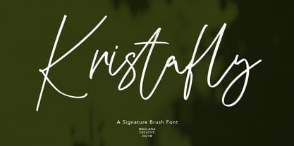 Kristafly is a brush script font With rough brush stroke and fun character. It has Opentype features of rich ligatures character, To give you an extra creative work. Kristafly brush script font support multilingual more than 100+ language. This font is good for logo design, Social media, Movie Titles, Books Titles, a short text even a long text letter and good for your secondary text font with sans or serif. Make a stunning work with Kristafly brush script font. Cheers, MaulanaCreative
 - Astavilla by Maulana Creative,
$11.00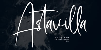 Astavilla handwritten script font, with contrast felt-tip stroke, uprights and fun character. It has Opentype features ligatures of character and alternate lowercases, To give you an extra creative work. Astavilla script font support multilingual more than 100+ language. This font is good for logo design, Social media, Movie Titles, Books Titles, a short text even a long text letter and good for your secondary text font with sans or serif. Make a stunning work with Astavilla font. Cheers, MaulanaCreative
 - Slinces Heart by Nathatype,
$29.00 Slinces Heart is a captivating script font that captures the essence of handwriting with a touch of romance. Each letter in this font is meticulously crafted with fairly high line contrast, adding a dynamic and eye-catching quality to the font. The swinging endings in Slinces Heart add a flourish of creativity and uniqueness. With its smooth and flowing letterforms, this font offers a natural and seamless writing style. For the best legibility you can use this font in the bigger text sizes.
 - Wairel by Supfonts,
$14.00 Wairel is a modern serif family with vintage charm, fashionable appearance with a touch of retro Quick access - using the built-in OPEN TYPE functions. Just add "-" or "_" to the letter and instantly get an alternative. This feature works in most applications Font is an open type with clean shapes and precise kerning. It includes ligatures encoded by the PUA. Language support: All European languages Don't forget to subscribe so you don't miss out on the new awesome fonts Dima
 - Rephone by Majestype,
$15.00 Rephone is a handwriting font that has a force and rush personality but still beautiful. Each letter was made with love so that it can work well with one another. Rephone are designed to work well on the design like invitation, clothing, photography, branding, album covers, signature and the style that can work well with this font. Rephone support Multiple Language & OpenType features, that can allow you to choose a character that you like and suitable for the project you're working on.
 - Colfige by Alcode,
$20.00 Collge is a serif typeface with ligatures also complete multilingual glyphs. Collge come with Regular style, it will make this typeface can be used in all design projects and works perfectly for pairing with script typeface or handmade fonts, Headlines, Posters, Packaging, T-shirts, Postcards, Invitation, Wedding Sign, Sign Painting, Signboard, and much more. Try Collge, enjoy the richness of OpenType features and let her fun and elegant excitement make you happy and enhance your creativity! You can use this font very easily.
 - NewNerdish by Ingrimayne Type,
$9.95 A sans-serif face in which the circular elements have become almost square, NewNerdish resembles a number of typefaces which have become associated with a modernistic, computer look. There is little or no variation in the weight of horizontals, diagonals, and verticals. It comes in two widths each with five weights and each weight has an oblique version, which has the same letter shapes as the upright version. The ShadowedInside style is designed to be used in a layer with the Shadowed style.
 - Cally by Gleb Guralnyk,
$15.00 Cally is a classic looking typeface with decorative vintage elements. It is perfectly suited for label design and for various lettering postcards and invitations. Cally includes the English alphabet, punctuation, numbers and Western European multilingual characters (check out the screenshots with all available characters). Also there are few ligatures and swashes. To access swash glyphs, just type underscore character and number 1-5, like this _1. Using "standard ligature" feature this symbols will be automatically replaced with one of the swash symbols.
 - Orange Leafy by Attype Studio,
$12.00 Orange Leafy is an Autumn font duo with maple leaf display, Fall in love with it and bring your projects to the highest levels! Orange Leafy is perfect for Autumn branding, logo, invitation, stationery, social media post, product packaging, merchandise, blog design, game titles, cute style design, Book/Cover Title and more. What's Included : - Ligatures - Multilingual Support (Afrikaans, Albanian, Catalan, Danish, Dutch, English, Estonian, Finnish, French, German, Icelandic, Italian, Norwegian, Portugese, Spanisch, Swedish, Zulu) Hope you enjoy with our font! Attype Studio
 - Morgalina Vintage by Agny Hasya Studio,
$12.00 Morgalina Vintage Is a Serif Display Font With a Retro Vintage Style Bold Typeface, Modern Classic Yet Decorative. It Comes in 2 (Two) Styles (Regular and Italic) Including Slants, and Is Created With Stylistic Alternatives and Ligatures. Featured With Uppercase and Lowercase, Numeral and Punctuation, Multilingual Support, and Opentype Features. Perfect for Your Design Projects Like Logos, Branding, Advertising, Product Designs, Stationery, Magazine Designs, Book/Cover Title Designs, Photography, Art Quotes, Wedding Designs, Fashion Designs, Special Events, Labels, Product Packaging, and More.
 - Mysterio by PandAE86,
$10.00 Hello, Mysterio fun font is sans serif font. It brings joyful and happiness to all of us. Inspired by handlettering with marker pen with bold and strong style. This font is ideal for display, text, print, branding, birthday, birthday invitation, with a set of optimal characters for your design in any layout. Happy Design What will you get ? OTF and TTF file formats Uppercase Lowercase Numeral Punctuation Ligatures Multilingual characters support Thank you and have a nice day ! Dedi T A
 - Beauty Balichot by Agny Hasya Studio,
$12.00 Beauty Balichot is a Modern Serif Display Font combined with decorative ornaments that make it unique, luxurious, elegant, and versatile. Come in 2 (two) styles (regular & italic) and is created with glyph variations like alternates and ligatures. Featured with Uppercase and Lowercase, Numeral and Punctuation, Multilingual Support, and Opentype Features. Perfect for your design projects like logos, branding, advertising, product designs, stationery, magazine designs, book/cover title designs, photography, art quotes, wedding designs, fashion designs, special events, labels, product packaging, and more.
 - Circe Rounded by ParaType,
$40.00 Circe Rounded is an extension for a popular Circe typeface, with rounded terminals. Bold and ExtraBold faces have two variants with different radius of the roundings. Circe Rounded is even more friendly than the original Circe. The typeface is designed by Alexandra Korolkova and Alexander Lubovenko and released by ParaType in 2015. It is known that the Circe typeface is distinguished by mild and humanist nature being formally a geometric sans-serif. However, as an experiment we decided to make it even softer: Circe now has a version with rounded terminals — Circe Rounded. Rounding is generally regarded as a mechanical operation, but in this case a lot of manual adjustment was needed because of the humanist nature and peculiarities of type design. Moreover, the two bold styles now have two options: a basic one is slightly rounded and an alternate one is fully rounded. In Circe Rounded we decided to dismiss characters with swashes that are rather inappropriate in such a rounded font, but the stylistic sets and alternate characters are remaining. Rounded terminals make an open and friendly typeface even more childish. For example, in quite large point sizes (because the x-height is still not big) it can be used as a body type in infant books. Circe Rounded, similar to Circe, has alternative forms of lowercase characters, which are called “infant” and are used in publications for children’s reading. However, a humanist basis is preserved alongside with its softness and it does not allow it to be as “plasticine” as many other rounded fonts. Two of the most obvious areas of possible application of Circe Rounded are everything for children and everything edible, especially all that is sweet and puff. However, we believe that there are other options.
 - Classica Pro by URW Type Foundry,
$35.99 Classica Pro by Bernd Möllenstädt A real alternative for letterpress printing A masterpiece It was only after many years, shortly before the end of his life, Bernd Möllenstädt brought out these early drafts of his Classica Light and Light Italic from his drawer, and asked me to produce for him on the computer a Bold and Bold Italic, from which we later wanted to interpolate further cuts like Regular and so on. The boldening of letters with an oblique axis and with hairlines which should not grow to the same extent as the general line widths, is hard to cope with perfectly, even for the smartest computer program, and even more so, when it concerns an as complicated set of data as those conceived by Bernd. The automatically generated result could therefore only be a first step that had to be improved manually later. This was about the stage that we had reached when Bernd died in March 2013, leaving me behind with comprehensive corrections on proofs of this automatically generated Bold. Although I was aware that it would mean a lot of work to complete the project, I did not want to leave it unfinished and decided to finalize and publish the Classica, also in Bernd‘s honor. In the course of the two years that I worked on this font family it somewhat naturally became also my own. New details were added and some of the existing changed. A book typeface requires the supreme and forgives rarely, it represents a true masterpiece. My intention and my ambition were to create a real alternative for letterpress printing, with a font family that contains all the typographic options for an excellent typesetting, and is better readable and has a better appearance than other existing typefaces. Whether this was achieved, the reader may decide. Volker Schnebel, Hamburg, december 2014
 - FormPattern Color Six by Tarallo Design,
$14.99 Use this font to make lines, borders, patterns, backgrounds, unique bullets, or use it inline within text. Let your imagination explore the possibilities to combine these geometric shapes. Use letter spacing to connect the shapes in a continuous pattern, or space them apart horizontally. Stack them vertically and control their distance with leading (line spacing). Make fields of pattern and explore layering and opacity for color mixing. FormPattern Color Six takes inspiration from mosaic patterns seen in the south of Italy. It is easier to use this font to make patterns than to use drawings because you can control the size, color, and spacing from the type menu. It is also an effective way to make web graphics that are responsive with text. Using it is simple. As you type, forms will appear instead of letters. Each font in this collection is a colored set. The sets are primary, secondary, tertiary, analogous, dark, old world, vintage, greyscale, cool grey, and warm grey. There is a solid font that can be colored in the same way as regular fonts. The color fonts are accessed in the type menu where you would normally find the different weights or italics Most design software, such as Illustrator, InDesign, and Photoshop provide a glyphs palette where you can choose the precise form you want. It can work with the simplest text editors too. However, these may not support the color options. FormPattern Color Six is a vector-based and fully scalable SVG OpenType format. Color fonts are supported by Photoshop 2017, Illustrator 2018, and QuarkXPress 2018 (and later versions). This version of FormPattern Color Six is compatible with all FormPattern fonts by Tarallo Design. The display artwork shows it paired with the typeface Scanno.
 - Sunset Imaginary by Din Studio,
$29.00 Sunset Imaginary is a captivating duo of fonts that brings together the charm of a handwritten style and the timeless elegance of a serif typeface. This combination creates a harmonious and versatile typographic pairing, perfect for a wide range of design projects. The first font in the Sunset Imaginary duo is a beautiful handwritten font. Its letterforms are intricately crafted, with each letter seamlessly connected to the next, creating a flowing and cohesive script. This handwritten style exudes a sense of warmth and authenticity, as if each word was lovingly penned by hand. The connected letters add a touch of fluidity and rhythm to the text, enhancing its visual appeal. Complementing the handwritten font is a refined serif typeface. With its classic and elegant characteristics, the serif font provides a sense of stability and sophistication to the overall design. The carefully designed serifs and balanced proportions give the text a timeless and polished look. The combination of the handwritten font and serif font in Sunset Imaginary offers a versatile typographic palette. It allows you to create striking contrasts and establish hierarchy within your designs. Enjoy the various features available in this font. Features: Stylistic Sets Ligatures Multilingual Supports PUA Encoded Numerals and Punctuations Sunset Imaginary fits in invitation posters, branding materials, packaging, editorial layouts, or any project that demands a balance of personal touch and timeless elegance Find out more ways to use this font by taking a look at the font preview. Thanks for purchasing our fonts. Hopefully, you have a great time using our font. Feel free to contact us anytime for further information or when you have trouble with the font. Thanks a lot and happy designing
 - PF Bodoni Script Pro by Parachute,
$79.00 Always intrigued by Bodoni's original work, I was set out—back in 2000—to examine his work and study Manuale Tipografico, one of the greatest specimen books ever printed. Issued in 1818 at Parma, Italy by Bodoni's widow, the two-volume work shows an impressive array of 142 roman alphabets and some foreign ones such as Greek and Cyrillic. After a careful examination of all characters, I decided to create a typeface based on the distinct script capitals presented in the book. Matching lowercase italics were later selected and designed to complete the series. Since my intention was not to create simply a digital version of Bodoni's work, this typeface was designed with connected characters and capitals with extra calligraphic elements. The result was released in 2002 and published in our award-winning catalog/book IDEA/Trendsetting Typography vol.1. Later in 2005 we revived a large number of ornaments and borders (credit goes to designer George Lygas). All this work was left behind till recently when it was revisited to create a complete 'Pro' family. Several new uppercase and lowercase glyphs were designed in order to create a distinct typeface, which is based on Bodoni but yet it stands out on its own. The new version also takes care of conflicts between neigbouring letters, something that was not included in the first version. Bodoni Script Pro is a 3-weight superfamily. It supports 10 special opentype features including 'contextual alternates' as well as support for both Latin and Greek. Each font comes with 725 glyphs including a large number of alternates as well as 144 ornaments. Furthermore, when you purchase the whole package you get a bonus font which contains 120 frame parts. These parts, when put together, create some truly amazing borders. -Panos Vassiliou
 - ITC Clearface by ITC,
$45.99 The Clearface types were originally designed by Morris Fuller Benton in 1907. Their forms expressed the Zeitgeist of the turn of the 20th century; typical and distinguishing characteristics are the forms of the a" and the "k." The ATF version did not include an accompanying Italic. In 1978, ITC's Victor Caruso was licensed by ATF to develop a new serif typeface and matching italic based on the forms of Clearface. The result was ITC Clearface, a serif typeface with marked stroke contrast and italic weights. The teardrop-formed endings of the lowercase a, c and f (also found in Caslon) define the character of the face. The type's design is also distinguished by its small -- almost slab -- serifs, a large x-height, and little stroke contrast. ITC Clearface, with its historical touch, is good for both texts and headlines, but its slightly condensed nature performs at its best when it is allowed its space.
 - Utrecht by Cititype,
$10.00 Utrecht is a handwritten font that is composed from natural and casual handwritten characters so that the shapes are less neat. The hand stroke node becomes the hallmark of this font. It was inspired by environmental posters that were directly handwritten in simple media. We named this font Utrecht, referring to this city in the Netherlands. We choose it because it is a friendly city, caring about the environment, its size is compact and therefore it is very easy to get a broad sense of the city in a short time. Likewise, this font is only handwritten with standard characters but on the other hand this handwriting gives the impression of being more familiar, reflecting natural design and spontaneity. This font is suitable for posters, crafts, writing quotes, unique logos, natural text writing. So this is Utrecht, a quirky handwritten font with a casual feel. It will effortlessly turn any design idea into a statement.
 - Carnova by Typotheticals,
$4.00This is a standard, plain face with no special distinguishing features. It was created over a period of four months for use in small text in a cartographer package. While the face was extremely suitable for the purpose it was designed for, the party who was to purchase the family outright decided upon another design, allowing me to offer it up for sale. The original design for this face is nothing new, and has been greatly influenced by many others already in existence. It was not intended to be flashy, nor eye-catching, and I believe I have managed to escape any individuality that could have affected the face. It displays well in the lower text sizes, and, in my own opinion, displays some characters more clearly than some other similar faces that are currently in use (not all, some). While individuality makes a typeface stand out from all the others, this style of design would have been compromised with it. - Rondey by Craft Supply Co,
$20.00 Introducing Rondey – Display Font A Bold Serif with a Twist Rondey is a captivating Display Font that combines bold serifs with a unique twist, making it ideal for display purposes. Display Elegance Rondey’s design exudes an elegant charm that’s perfect for grabbing attention in various display contexts. Versatility for Diverse Projects Moving beyond its captivating elegance, Rondey’s versatility shines through, allowing it to seamlessly complement a wide range of creative projects. Captivating and Memorable Rondey ensures that your content is not only captivating but also memorable. It leaves a lasting and distinctive impression that sets it apart. In Conclusion In summary, Rondey – Display Font is a font designed to captivate in the world of display typography. Its unique twist on bold serifs adds an elegant touch to your projects. Whether it’s for branding, posters, or a myriad of creative endeavors, Rondey’s versatile and captivating design caters to a broad readership, ensuring your content leaves a memorable and distinctive mark.
 - Showboat by Canada Type,
$25.00You are looking at the friendliest, happiest and most faithful of puppies. It comes to greet you as soon as your eyes see it, radiates its joy, wags its tail, jumps in circles, and begs to be played with. Showboat is a very unique bragger of a font. Its bouncy metrics and whimsical shapes are a sure formula for attention. People will soak it in and feel happy while they do. How can anyone greet such happy letters with anything other than a smile? No matter how many fonts your design box has, you can be sure that none of them is this radiant, lively or cute. This happy camper comes in four fonts: two weights and a large number of corresponding ligatures and alternates. Showboat can be used in a vast number of design applications; flyers and webs for parties, pre-teen and teen events, scrapbooking, candy branding, posters, children's publications and web sites, pet stores and products, toys, and many many other things. - Favio by Anastasia Kuznetsova,
$17.00 I present to you an elegant, playful and very harmonious duo of serif fonts "Favio", inspired by ancient printed texts. It looks great on its own as part of a minimalist design. Play with letters to get different effects. The font "Favio" is guaranteed to give your text an individual and very attractive look. Great for branding, wedding invitations, packaging, quotes and labels. And it is also a bold choice of typography for the design of logos, album covers, illustrations, children's books, posters and much more. Font Features: - A-Z; a-z character set; - 1 language (English); - numbers and punctuation marks, symbols. Fonts can be opened and used in any software that can read standard fonts, even in MS Word. No special software is required to get started. It is recommended to use it in Adobe Illustrator or Adobe Photoshop. Made with love and magic ♡ Thank you for reading it, and do not hesitate to send me a message if you have any questions! ~ Anastasia
 - Utroligt by Hanoded,
$15.00 I am (trying to) learn Danish using an app on my phone. The grammar and vocabulary are not that difficult, as the Danish language is very close to the Dutch language. The pronunciation, however, is quite tricky. Words look simple when written down, but when pronounced, they sound very different. Take ‘pige’ (‘girl’) - it reads ‘pee-guh’, right? Well, it is pronounced ‘pee-uh’. Or how about ‘brød’ (meaning bread)? If you keep in mind that the o-slash is pronounced as the ‘i’ in bird - almost like ‘uh’, it should be br-uh-d, right? Wrong again. It is pronounced br-uh-l. Aaargghh! I will succeed, hopefully! Utroligt is a Danish word meaning ‘incredible’. It is a nice, uncomplicated all caps font. I made it with a cheap rollerball pen and some nice French paper. Comes with double letter ligatures and all the diacritics you’d like - including the danish ones.
 - Brave Brothers by Strong,
$20.00 Brave Brothers is a stylish modern font that's perfect for use in fashion-related design projects. Its elegant thin font makes it ideal for branding and logo design, while low legibility height makes it perfect for use in websites, advertising, and other types of communications. Brave Brothers Modern Font is perfect for adding a touch of luxury and elegance to your designs. This stylish font was created with care to be perfect for use in modern fashion logos, websites, and marketing materials. Brave Brothers is a stylish modern font that's perfect for use in fashion-related design projects. Its elegant thin font makes it ideal for branding and logo design, while low legibility height makes it perfect for use in websites, advertising, and other types of communications. Brave Brothers Modern Font is perfect for adding a touch of luxury and elegance to your designs. This stylish font was created with care to be perfect for use in modern fashion logos, websites, and marketing materials.
 - VLNL Cleaver by VetteLetters,
$29.99 Chop chop! VLNL Cleaver is an important tool in the Vette Letters’ kitchen. It’s a butcher knife of a font. Razor sharp, ultra heavy and with pointy slanted serifs. At first glance it seems straight-lined, but a closer look revails that all straight lines are curved inward slightly, which enhances the sharp image even more. Cleaver was originally designed by DBXL for cutting meat - hell, it even hacks right through bone. It can easily splice a chicken in one slash or seperate ribs, just like that. You can also very well use it to chop up hard vegetables like pumpkin or squash on the chopping block. It gets better, the opposite blunt side can be deployed to crush ingredients like garlic, nuts or spices like black pepper. You could use a grinder, but with Cleaver it’s more fun, isn’t it? VLNL Cleaver is suitable to give a sharp edge to flyers, posters, logos (Heavy metal bands and other) or magazine headlines.
 - Pusia by ROHH,
$40.00 Pusia is a versatile font family with a lot of character and warmth. It is a professional, contemporary sans serif with original letter forms, friendly and dynamic feel. Its subtle curved shapes and attention to details give Pusia a very distinctive look. Its proportions and optimized kerning make it a very clean and legible in all sizes. Pusia is a great choice for all kinds of design work, both print and on-screen. It is perfect for display use in headlines, advertising, logo design and branding as well as long and short paragraphs of text. Pusia consists of 20 fonts - 10 weights and their corresponding italics. It has extended language support including cyrillic and true italics, as well as broad number of OpenType features, such as small caps, case sensitive forms, ligatures, stylistic alternates, contextual alternates, lining, oldstyle, tabular, small cap and circled figures, slashed zero, fractions, superscript and subscript, ordinals, currencies and symbols.
 - Bacute by Afkari Studio,
$13.00 BACUTE Display Sans Typeface offers a captivating blend of contemporary design and readability, ensuring your projects stand out with finesse and clarity. Features: Three Unique Styles: Enjoy the versatility of BACUTE's three styles - Light, Regular, and Bold. Each style adds its distinctive visual appeal to complement various design aesthetics. Special Alternates: Unleash your creativity with alternative characters and glyphs that infuse uniqueness into your designs, allowing for personalized expressions. Complete Character Set: BACUTE includes uppercase and lowercase letters, numerals, punctuation, and a range of essential glyphs for comprehensive design flexibility. Cross-Platform Compatibility: Seamlessly use BACUTE across both PC and Mac platforms, effortlessly integrating with leading design software like Adobe Illustrator, Adobe Photoshop, Adobe InDesign, and Microsoft Word. Effortless Installation: Experience hassle-free installation, granting instant access to the font's capabilities without the necessity of additional design software. Multilingual Support: BACUTE ensures inclusivity by supporting a variety of special characters, catering to multiple languages, including ä, ö, ü, Ä, Ö, Ü, ß, ¿, and ¡. BACUTE adapts flawlessly to an extensive range of design projects, including Logos, Posters, Product Labels, Cartoons, Comics, Editorial Designs, Website/Blog Elements, Social Media Posts, Packaging Designs, Social Media Subtitle And more! Dive into the boundless potential that BACUTE Display Sans Typeface offers. Its modern aesthetic, coupled with a multitude of features, positions it as an invaluable asset for designers seeking to make an impactful impression without compromising readability. Embrace BACUTE to elevate your projects and captivate your audience with its distinctive charm!
 - Magent by Craft Supply Co,
$20.00 Introducing Magent – Display Typeface A Fusion of Style Magent sets itself apart as a striking Display Typeface that seamlessly merges the timeless elegance of serifs with the contemporary allure of sans serifs. This extraordinary fusion not only shatters monotony but also injects a vibrant energy into your designs. Fun and Playful Typography Magent exudes an unmistakable aura of fun and playfulness. It’s the font to choose when you want to infuse your projects with a touch of whimsy and character. The result is content that not only stands out but also leaves a lasting and memorable impression. Endless Creative Versatility An outstanding attribute of Magent is its sheer versatility. This font effortlessly adapts to a multitude of design contexts, spanning from posters to branding and beyond. Its adaptability makes it a true chameleon in the world of creativity. Memorable and Engaging Magent’s dynamic blend of serif and sans serif elements guarantees that your content remains not only memorable but also engaging. It captivates your audience and leaves them with a vivid and enduring impression, ensuring they keep coming back for more. In Conclusion In summary, Magent – Display Typeface is a font that defies conventions. It’s a design masterpiece that harmoniously combines aesthetics with a playful spirit. Whether it’s branding, posters, or an array of creative projects, Magent is a one-of-a-kind font that captivates your audience and infuses your content with vibrancy and charm.
 - Moyenage by Storm Type Foundry,
$55.00Blackletter typefaces follow certain fixed rules, both in respect to their forms and to the orthography. Possibly, they were a reaction to the half-developed Carolingian minuscule which was soon to end in the Latin script. Narrow, ordered script was to replace the round, hesitant and shattered shapes of letters in order to simplify writing, to unify the meaning of individual letters, and to save some parchment, too. Opposed to the practice common in monasterial scriptoriums where Uncial, Irish and Carolingian inspiration flew freely and as a result, the styles of writing differed in each monastery, the blackletter type was to define one, common standard. It was to express spiritual verticality, in perfect tune with the architecture of the Gothic era. Typography became an integral part of the overall style of the period. The pointed arch and the blackletter type were the vanguard of the spectacular transformation from the Middle Ages towards the modern era, they were a celebration of a time when works of art were not signed by their makers yet. Some unfortunate souls keep linking blackletter solely with Germany and the Third Reich, while the truth is that its direct predecessor, the Gothic minuscule, evolved mostly in France. Even Hitler himself indicated blackletter type obsolete in the age of steel, iron and concrete – thus making a significant contribution to the spreading of the Latin script in Germany. Once we leave our prejudice aside, we find that the shapes of blackletter type have exceptional potential, unheard of in sans-serif letterforms. The lower case letters fit into an imaginary rectangle which is easily extended both upwards and sideways. In its scope and in the name itself, the Moyenage type family project is to celebrate the diversity of the Middle Ages. I begun realizing the urge to design my own blackletter when visiting the beer gardens of Munich and while walking through the villages of rural Austria. The letters from the notice boards of inns are scented with spring air, with the flowers of cudweed, with white sausage and weissbier. The crooked calligraphic hooks and beaks seem to imitate the hearty yodeling of local drinkers and the rustle of the giant skirts of girls who distribute the giant wreaths of beer jugs. Moyenage is, however, a modern replica of blackletter, so it contains some otherwise unacceptable Latin script elements in upper case. I chose these keeping the modern reader in mind, striving for better legibility. The font is drawn as if written with a flat pen or brush, and with the ambition to, perhaps, serve as a calligraphic model. In medium width, the face is surprisingly well legible; it is perfect for menus as well as posters and CD covers for some of the heavier kinds of music. It has five types of numerals and also a set of Cyrillic script, symbolising the lovelorn union of Germans and Russians in the 20th century. Thus, it is well suited for the setting of bilingual texts of the German classic literature, which, according to the ancient rules, must not be set in Latin script. - MVB Embarcadero by MVB,
$79.00 MVB Embarcadero lies in a space between grotesque sans serifs and the vernacular signage lettering drawn by engineers. It’s a style that happens to convey credibility and forthrightness without pretense—it’s anti-style, actually. All of this makes for the most versatile of typefaces, capable of delivering any kind of message while staying out of the way. As is often the case with a type design that develops over several years, Embarcadero isn’t the realization of a specific concept. In the ’90s Mark van Bronkhorst began digitizing a blocky slab serif from the Victorian era, which was then set aside for many years. He later revisited the design, paring it down to its bare essentials, and as more time passed, it evolved from a grid-based outline to curves that echoed the rigid skeleton of the original. Eventually it became a complete family with all the readability requirements of a text sans serif, yet maintaining the subtle eccentricities of its inspiration. Functionally, the Embarcadero family is as adaptable as its design. The OpenType Pro set of 20 fonts contains two widths and five weights, each with italics, small caps, a full set of figures, bullets and arrows, and support for most Latin-based languages. In all, Embarcadero is suitable for headlines or text. And—thanks to its simple, square form—it’s ideal for type on screen too.
 - Yasmine by Arabetics,
$39.00 The Yasmine type family follows the guidelines of the Mutamathil Taqlidi type style. It has one glyph for every basic Arabic Unicode character or letter and one additional, final-position, glyph for each Arabic letter that is normally connected with other letters from both sides in traditional cursive Arabic strings. Yasmine employs four fixed x-height values, two above and two below the x-axis. Values are high to give a slight vertical overall look. Its design uses full curves with equally distributed weight. Yasmine family includes all required Lam-Alif ligatures and uses ligature substitutions, and marks positioning but it does not use any other glyph substitutions or forming. Text strings composed using types of this family are non-cursive with stand-alone isolated glyphs. It employs our “natural Arabic input” method where first glyph is displayed in its non-isolated form. Tatweel (or Kashida) glyph is a zero width space. Keying it before any glyph will display that glyph isolated form. Keying it before Alif Lam Lam Ha will display the Allah ligature. Yasmine family includes both Arabic and Arabic-Indic numerals, all required diacritic marks, Allah ligature, in addition to all standard English keyboard punctuations and major currency symbols. The fonts in this family support the following scripts: Arabic, Persian, Urdu, Pashtu, Kurdish, Baluchi, Kashmiri, Kazakh, Sindhi, Uyghur, Turkic, and all extended Arabic scripts.
 - Futura Now Variable by Monotype,
$383.99 For nearly 90 years, Paul Renner’s Futura has been as popular as it is versatile—from children’s books to fashion magazines to the plaque on the Moon. Futura is a typographic icon. Futura Now offers designers a chance to see Futura with fresh eyes. It’s more truly Futura-like than any digital version you’ve ever worked with. “It brings some much-needed humanity back to the world of geometric sans serifs,” says Steve Matteson, Monotype’s Creative Type Director who led the design team. “Despite its reputation as the ultimate modern typeface, Futura Now is surprisingly warm,” he explains. “It’s just as at home set next to a leafy tree as it is next to a stainless-steel table, because it skillfully navigates the border between super-clean geometry and humanist warmth.” Futura Now—the definitive Futura—contains 102 styles, including: new Headline and Text weights; new Script and Display weights and styles; and new decorative variants (outlines, inlines, shadows, and fill). Its contemporary alignment of names and weights makes the family easier to understand and use, and its comfortable Text and judicious Headline subfamilies provide instantly refined spacing. With a large Latin, Greek, and Cyrillic character-set, Futura Now serves a wider international creative community. Futura Now is available both as individual OpenType fonts and as a set of Variable fonts, delivering limitless styles in a tidy digital footprint.
 - Lumina by Scholtz Fonts,
$21.00Lumina combines a fluid, informal look with an upright, fairly formal character structure. The font is reminiscent of leaded or stained glass, suggesting a trying to-be-solid outline with flowing inner spaces. Characters are softened by the use of staggered heights and slightly irregular widths, creating the impression of hand-crafted, ink-drawn shapes. Lumina is unusual in that it gives a medieval treatment to a modern character outline. The outline has been given an irregular, slightly hand-crafted look that is at variance with its modern character and hints at both the informality of a grunge font and the carefully hand-drawn quality of medieval illuminated scripts (hence its name). It is one of the few informal, compressed fonts that retains a high degree of legibility. Use it when you want your text to be both relaxed and readable, and yet take up very little space on the page. Lumina Regular is not an outline font in the usual sense, since it contains one or more rounded hollows or lacunae within its outline. Use Lumina for: —Ecclesiastical book headings and illustrations —Church posters —Book covers —Greeting card design —Advertisements —The "fine print" The font contains a full 256 character set (upper and lower case, punctuation, diacritical characters, special symbols and numerals), in which all characters have been fully kerned and letter-spaced. - Futura Now for Leica by Monotype,
$53.99For nearly 90 years, Paul Renner’s Futura has been as popular as it is versatile—from children’s books to fashion magazines to the plaque on the Moon. Futura is a typographic icon. Futura Now offers designers a chance to see Futura with fresh eyes. It’s more truly Futura-like than any digital version you’ve ever worked with. “It brings some much-needed humanity back to the world of geometric sans serifs,” says Steve Matteson, Monotype’s Creative Type Director who led the design team. “Despite its reputation as the ultimate modern typeface, Futura Now is surprisingly warm,” he explains. “It’s just as at home set next to a leafy tree as it is next to a stainless-steel table, because it skillfully navigates the border between super-clean geometry and humanist warmth.” Futura Now—the definitive Futura—contains 102 styles, including: new Headline and Text weights; new Script and Display weights and styles; and new decorative variants (outlines, inlines, shadows, and fill). Its contemporary alignment of names and weights makes the family easier to understand and use, and its comfortable Text and judicious Headline subfamilies provide instantly refined spacing. With a large Latin, Greek, and Cyrillic character-set, Futura Now serves a wider international creative community. Futura Now is available both as individual OpenType fonts and as a set of Variable fonts, delivering limitless styles in a tidy digital footprint. - Futura Now by Monotype,
$53.99 For nearly 90 years, Paul Renner’s Futura has been as popular as it is versatile—from children’s books to fashion magazines to the plaque on the Moon. Futura is a typographic icon. Futura Now offers designers a chance to see Futura with fresh eyes. It’s more truly Futura-like than any digital version you’ve ever worked with. “It brings some much-needed humanity back to the world of geometric sans serifs,” says Steve Matteson, Monotype’s Creative Type Director who led the design team. “Despite its reputation as the ultimate modern typeface, Futura Now is surprisingly warm,” he explains. “It’s just as at home set next to a leafy tree as it is next to a stainless-steel table, because it skillfully navigates the border between super-clean geometry and humanist warmth.” Futura Now—the definitive Futura—contains 102 styles, including: new Headline and Text weights; new Script and Display weights and styles; and new decorative variants (outlines, inlines, shadows, and fill). Its contemporary alignment of names and weights makes the family easier to understand and use, and its comfortable Text and judicious Headline subfamilies provide instantly refined spacing. With a large Latin, Greek, and Cyrillic character-set, Futura Now serves a wider international creative community. Futura Now is available both as individual OpenType fonts and as a set of Variable fonts, delivering limitless styles in a tidy digital footprint.
 - Lombardia Script by Mans Greback,
$69.00 Lombardia Script is a creative and decorative script font that exudes vividness and elegance. This font is perfect for designing logotypes, tattoos, and other projects that require a signature-like quality. Designed with the art of calligraphy in mind, Lombardia Script features a delicate and expressive stroke that gives it a natural and authentic look. Its ink and brush-like appearance adds to its creativity and uniqueness, making it a great choice for any project that requires a touch of sophistication. Lombardia Script comes in four styles: Regular, Italic, Bold, and Bold Italic. This range of styles provides versatility and allows for dynamic and creative designs. With its beautiful and flowing letterforms, Lombardia Script is the perfect choice for adding a touch of elegance and creativity to any project. Use underscores _ anywhere in a word to make a swash. Example: Wonder_woman Use multiple underscores to make different swashes. Example: Extra__vagant The font is built with advanced OpenType functionality and has a guaranteed top-notch quality, containing stylistic and contextual alternates, ligatures and more features; all to give you full control and customizability. It has extensive lingual support, covering all Latin-based languages, from Northern Europe to South Africa, from America to South-East Asia. It contains all characters and symbols you'll ever need, including all punctuation and numbers.
 - LTC Kennerley by Lanston Type Co.,
$24.95 Kennerley Old Style was designed by Goudy for publisher Mitchell Kennerley in 1911. Goudy described it as a "book letter with strong serifs, firm hairlines, and makes a solid, compact page." One of Goudy's best text faces, Kennerley is considered an original American classic as it is not based on historical type designs.
 - New Hotinok 2D by 2D Typo,
$36.00 The type family New Hotinok 2D continues Ukrainian tradition and in the same time connects it with Art Deco style. It is good for presentation, literary, arts and foods, especially sweets and coffee. Connection of geometry and ornamental effect can help in logo design. Includes four styles, Latin diacritics for many languages.
 - Dino Smile by Reyrey Blue Std,
$16.00 Dino Smile is a playful handwritten typeface. It is perfect for headings, logotypes, book covers, printed quotes, apparel designs, flyers, greeting cards, etc. It comes with multilingual support also. This unique font will make your project shine, super sweet, and lovely. Features : · All Uppercase and Lowercase · Number & Symbol · Supported Languages · Ligatures · PUA Encoded