10,000 search results
(0.087 seconds)
- Scarab Border - Unknown license

- Hello Fresh by Resistenza,
$29.00 Fresh is best! Say hello to this playful and bouncing font designed by Resistenza. This all-caps have been specially created to add a lively mood to your graphics. You’ll be able to create catchy quotes combining these all-caps fonts or you can use them individually. Including 2 sets of letters on each font (uppercase & lowercase), so you can choose an alternate for each glyph just using your keyboard or the opentype glyphs panel on Indesign, illustrator and other apps with opentype features. Have fun with this friendly font family and give a whimsical touch to your projects. Perfect to create headlines, posters, DIY hand-lettered artwork, books, holiday cards, wrapping paper, invitations, T-shirts, labels, packaging, fashion supplies, food products, artisanal goods, and an endless array of options.
 - Parnas by Larin Type Co,
$20.00 Parnas is an amazing font that can be used in a classic style or in a more expressive and elegant with alternative and ligatures, of which there are many. Set the style and mood of your design, because just a few touches can absolutely change it. With it, you can easily realize all your ideas. Parnas family includes a serif and sans serif font Classical forms, smooth lines, sharp serifs, weightless style, various weaves, long tails, all this and much more will give you many options for creating your project and will not leave indifferent even the most demanding. This font is easy to use, has OpenType features. This font has 900 glyphs and includes: - 190 Alternates for Uppercase - 168 Alternates for Lowercase - 74 Ligatures for Uppercase - 70 Ligatures for Lowercase - 10 illustrations - Multilingual support
 - Botanique by PintassilgoPrints,
$29.00 Botanique is a hand-drawn typeface based on Schmalfette Bernhard Antiqua by Lucien Bernhard. The original face was released in 1912 by Flinsch Type Foundry, which was later acquired by Bauer. Schmalfette means ‘bold condensed’ in German and Botanique adds a charming roughness to these attributes, evoking an organic and somewhat retro mood. Its uppercase glyphs shine with adorned stylistic alternates and cool blooming swash versions for both initial and final forms, all cleverly programmed into OpenType font features. Botanique is a great pick for display purposes, branding, packaging, editorial design, poster work and many more. The original face counts more than one hundred years, but yet communicates quite well, you bet. Specially if loaded with some contemporary flair and smart features such as this one. Let it bloom.
 - Edit Serif Pro by Atlas Font Foundry,
$49.00 The Edit Collection is a brand new super family designed to create multi-platform brand and editorial typography. The Renaissance construction allows the typeface to handle long texts in small, medium and large sizes, balancing its astonishing and recognisable details with high legibility. The Edit Collection with its rational, clean aesthetics and great versatility is best suited for complex typography programs. Edit Serif Pro is a modern multilingual multi purpose typeface and the first release of Atlas’ next super family. Its humanist contrast combined with modern details makes Edit Serif Pro suitable for headlines and texts that need to distinguish themselves — while still expressing rational and clean aesthetics. Each style comes with 1.540 glyphs, many features and alternative character sets. As the well known Heimat Collection and Novel Collection already are, Edit will soon become a huge superfamily like all typefaces published by Atlas Font Foundry. Designed by Christoph Dunst for Atlas Font Foundry between 2012 and 2017.
 - BeachBar by DearType,
$40.00 BeachBar is a modern bold script with a sunny mood. It is inspired by, well, Beach bars, the summer and the sea, the hot afternoons with a cocktail in your hand and the sound of splashing waves. Beachbar turns our love for summer into a dynamic and vivacious font that comes in three different styles to choose from: BeachBar (connecting small letters, disconnected basic caps, ideal for text), BeachBar Alt (all letters are disconnected) and last but not least BeachBar Script (connecting letters, script-like caps and a bold set of swash capitals for more eye-catching designs). All three styles come in six weights making the font versatile and useful both for web and print; think websites, posters, menus, logotypes, cards, signage, packaging and whatnot. BeachBar is friendly, sturdy and it makes a statement, but most of all, it is fun to play with.
 - Mingolia Display by Mega Type,
$15.00 Mingolia Display - A modern serif font family (Variable Font) with a unique and classy style. It looks amazing at display size and is easy to read in text size. Mingolia Display comes in 8 weights from Extra Light to Black with matching Oblique. Mingolia Display also offers many alternative fonts and beautiful ligatures, which allow you to replace standard fonts with alternative fonts/ligatures to make your designs more unique and attractive. Mingolia Display is a display font created primarily for headlines, titles and other short text and is perfect for advertising, vintage mood boards, branding, logo type, packaging, titles, editorial design, and modern and vintage designs. Feature · All Uppercase and Lowercase · Alternates and Ligatures · Numbers & Symbols · Supported Languages · Substitutes and Binders · PUA Encoded Have fun using Mingolia Display!!! I really hope you enjoy it! Feel free to follow, like and share. Thank you so much for checking out my shop!
 - Rito by Wilton Foundry,
$19.00 Rito Regular and Italic is a clean, crisp and modern monospaced font ready to make your work shine. Its distinctive ink-trap inspired chiseled glyphs create a unique flavor that is more pronounced in the italics. Rito is not your typical monospaced boring font - from the outset the goal was to develop an exuberant, dynamic and contemporary mono-spaced font. Ideal for coding, writing and has plenty of attitude to stretch into display formats!
 - Krok by ParaType,
$30.00 Krok is an experimental geometric sans serif designed by Zhanar Bereketova. It’s suitable for posters, packaging, brand elements and short memorable texts. Each character of this font adds a visual accent to the message. There are many alternative forms, designed in two stylistic sets and one contextual set that allow you to create a different mood of the text -- from electronic folk to science fiction. The font was released by ParaType in 2018.
 - Vulnerable by Gian Studio,
$12.00 Vulnerable is an elegant script typeface inspired by a vintage type specimen I found some time ago at an art fair. Thin to thick contrasting lines and elegant curves make Beginta the perfect font for this type of logo and display purposes. Hope you enjoy it Feel free to contact me if you have any questions or concerns you may have and I will get back to you as soon as I can.
 - Rocket Clouds by Wacaksara co,
$18.00 Introducing our new font called Rocket Clouds inspired by Sythwave Style, 80's Music, and Neon Light Sign. This font offer the aesthetic style and retro mood for your design needed. The Rocket Clouds style has a universal and timeless design. This font uses style of classic sign typography. Rocket Clouds immediately engages you no matter what you use it for. It’s beautiful for product labels, houseware and text overlay to any background picture.
 - Happy Sparkle by Letterhend,
$15.00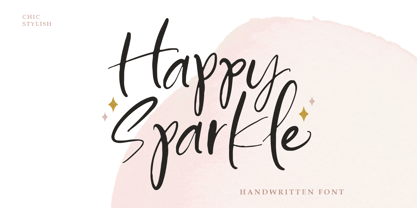 Introducing, Happy sparkle! a happy handwritten font that will bring your design into a happy and fun mood. this font is perfect for branding, packaging, logotype, headline, wedding invitation, etc. Features : - uppercase & lowercase - numbers and punctuation - multilingual - alternates and ligatures - swash - PUA encoded We highly recommend using a program that supports OpenType features and Glyphs panels like many of Adobe apps and Corel Draw, so you can see and access all Glyph variations.
 - Gwestl by Pesotsky Victor,
$9.90 Gwestl font is a modern version of the graceful antiqua. The serifs are kept to a minimum, and the sprawling loops make the font bright and memorable. In mood, it is a cheerful and grazie typeface. It is suitable for branding and web-sites. The font has both uppercase and lowercase letters, so it's suitable for both catchy headlines and texts. Specifications: Basic Latin, Cyrillic, Diacritics 90+ languages Alternates signs Upper & lowercase
 - Galactica by Melonaqua,
$10.00 The universe always made me curious as to what could be found beyond earth. For the past few weeks, I’ve been staring outside my bedroom window looking at the same star. Every day at one in the morning, it shone beautifully in the cloudless night sky as I face West. That same star paved way for some inspiration to create a futuristic typeface. Every day, I watch it before it disappears into the oblivion.
 - Coco Gothic Pro by Zetafonts,
$39.00 Inspired by a biography of Coco Chanel and trying to capture the quintessential mood of classical fashion elegance, Cosimo Lorenzo Pancini designed Coco Gothic looking for the effect that the first geometric sans typefaces (like Futura, Kabel or the italian eponyms like Semplicità) had when printed on paper. The crisp modernist shapes acquired in printing charme and warmth through a slight rounding of the corners that is translated digitally in the design of Coco Gothic. This signature touch is enhanced by the inclusion of light humanist touches to the proportions of the letters, resulting in the unique mix that makes Coco Gothic one of our best sellers, with a look that is both contemporary and vintage. After six years from the original project (that has spawned in the meanwhile successful families like Cocogoose and Coco Sharp), we went back to the design to completely redraw and expand the original family, creating with a Pro version that has better on-screen readability, a wider weight range, variable type versions and more language coverage (with Coco Gothic Arabic adding a new script to the latin, greek and Cyrillic of the original). Coco Gothic Pro comes in three subfamilies, each with seven weights with matching italics and featuring an extended character set with open type support for small caps, ligatures, alternates, European languages, Greek and Cyrillic alphabets. The original, body-text optimised Coco Gothic and Coco Gothic Alternate subfamilies have been kept for compatibility with the previous version, while a new Coco Gothic Display subfamily has been developed with a complete redesign aimed at display usage, featuring tighter spacing and optimised letterforms. A distinguishing feature of Coco Gothic Pro is the inclusion of ten alternate historical sets that allow you to use the typeface as a true “typographic time machine”, selecting period letterforms that range from art deco and nouveau, to modernism and to eighties’ minimalism. Equipped with such an array of historical variants, Coco Gothic Pro becomes an encyclopedia of styles from the last century, ready to transform itself and adapt to the mood of your text.
 - Cleargothic Pro by SoftMaker,
$15.99 Morris Fuller Benton designed the serifed Clearface typeface for ATF in 1907. He liked the design so much that he also created a flare-serif variation, Clearface Gothic, soon after. It is a great typeface for headlines. SoftMaker created an updated version, Cleargothic Pro, in 2012. SoftMaker’s Cleargothic Pro typeface family contains OpenType layout tables for sophisticated typography. It also comes with a huge character set that covers not only Western European languages, but also includes Central European, Baltic, Croatian, Slovene, Romanian, and Turkish characters. Case-sensitive punctuation signs for all-caps titles are included as well as many fractions, an extensive set of ligatures, and separate sets of tabular and proportional digits.
 - Nutcase by ArtyType,
$29.00 Nutcase is a perfect example of a font that principally designed itself. I created a hexagonal template (the most economical form in nature by the way) and took out the center to increase the decorative element. I played around with it, creating some pleasing characters at first but it soon became clear it would translate into a complete alphabet, so I set to work applying the idea to both upper and lower cases. It wasn't all straight forward though, avoiding awkward characters and retaining legibility took a little perseverance but it eventually paid off. I thought of this primarily as a decorative display face but having tested it out, found it reads surprisingly well as body copy too.
 - Discordia by Naipe Foundry,
$60.00 Discórdia is a type-family of contrasting contrasts. Each of the four members of the family has a different contrast type. Regular has broad-nib contrast, Bold has horizontal contrast, the Italic is monoline, which means it has no apparent contrast, and Bold Italic is... Well, it’s probably best if see for yourself. These different design structures were fine-tuned to work well together in the same line, creating emphasis and hierarchy through a mini-super-family that groups a wedge-serif Regular, a slab-serif Bold, a sans-serif-ish Italic and a twisted Bold Italic. Naipe teamed up with Ben Nathan of Hafontia to extend Discórdia and give full Hebrew Support. Coming soon!
 - Dislope Display by Slope Type Foundry,
$15.00 Are you looking for a sleek, clean, and futuristic font for your projects? Dislope Display is the font for you! Dislope Display is a geometric sans serif typeface with mono-weight strokes and distinctive, fluid diagonals. Futuristic and dystopian films, TV series, and games inspired its minimal yet striking characteristics. Its simplicity makes it easily adaptable to the needs of even the most specialized projects. Dislope Display's carefully adjusted spacing and kerning ensure amazing-looking titles, headings, logotypes, and all other medium to large-form text. Each weight has a complete, comprehensive glyph set of 183 glyphs, and the family has a total of 549 glyphs. Dislope Display can be used in any text-manipulating program once installed.
 - Write Now by Scholtz Fonts,
$15.00 Write Now: Write Now is an elegant, informal, handwritten script font, developed from the designer's handwriting, and carefully crafted to create a flowing, legible image. The large, opulent capitals, with their loose loops and curves create a perfect foil for the more subdued lower case characters, presenting a strong but gentle message . Write Now is perfect for: -- invitations -- advertising material where an informal and personal mood is required -- greeting cards -- menus -- book covers Write Now comes in two styles, Write Now Regular and the delicate Write Now Thin. The font has been carefully letterspaced and kerned. A full character set (all upper and lower case characters, punctuation, numerals and accented characters) is present.
 - Glaire by Krismagraph,
$17.00 Glaire is a beautiful and inspiring combination of script and sans with unique ligatures. Glaire is made mainly for headlines, titles, and other short texts and is well-suited for advertising, vintage mood board, branding, logotypes, packaging, titles, editorial design, modern logos, websites, social media quotes, wedding branding, and modern and vintage design. Accessible in Adobe Illustrator, Adobe Photoshop, Coreldraw, and even work on Microsoft Word. PUA Encoded Characters – Fully accessible without additional design software. Fonts include multilingual support. Image used: All photographs/pictures/vectors used in the preview are not included, they are intended for illustration purposes only. Feel free to follow, like, and share. Thanks so much for checking out my shop!
 - Big Clyde by Galapagos,
$39.00In designing an advertising poster to show off the unconventional Safefont typeface, Steve drew what appeared as relatively traditional letterforms for the expository text. When these characters were as well received as the typeface which was the subject of the poster, Steve decided to expand them into a full-fledged graffiti style typeface of their own. While exploring where this new design might lead, Steve worked to elaborate the poster segment which had inspired it. He soon found himself staring at a drawing of a weapons-wielding Bonnie and Clyde. The desperate duo resonated with the graphic elements of the drawn letters; thus leading to the effortless fleshing out of the design, and to its name, Big Clyde. - Pexico Micro by Setup,
$- Pexico Micro is a pixel typeface that uses 5 by 7 grid (capital letter) in 8 styles: 4 basic styles for text setting — Regular, Bold, Narrow, and Mono and 4 stylistic variations of the Regular style for display setting — Outline, Dots, Round, and Inverse. It fits the display's pixel grid when used at 10pt size or its multiples. Pexico Micro supports Latin, Cyrillic, and Greek Monotonic scripts, all with thoroughly designed diacritics. Moreover, Pexico Micro makes use of advanced OpenType features, just as any other modern text typeface. Each style also has 9 sets of numbers, small capitals and is properly kerned. For more information go to For more information go to Urtd.
 - Architype Renner by The Foundry,
$99.00 The geometry of Paul Renner’s sans letterforms was tempered by optical correction to follow earlier typeface proportions, with capitals close to old-style forms, yet still retaining the spirit of the New Typography. His early experimental characters were included as alternatives in the sans which was to become the Futura released by Bauer in 1927–30. Unusually, old style figures also appeared in his early versions but they too were soon discarded. Foundry Architype Renner as a new four weight family has been developed from the original Renner Regular and Bold, created by The Foundry for the first Architype Collections in the early 1990s. This new family features the old style figures and the experimental elements.
 - Horst More by MIX.Jpg,
$10.00 Horst More is a retro soft serif typeface comprising 18 fonts. It can handle most typographic applications from branding to body copy with its range of weights and inherent legibility. Whatever you type will have a friendly message, but it really comes into its own when you start applying some of the additional ligatures and alternates that are built into this type family. You’ll soon be creating distinctive typographic compositions that are pleasing to the eye. There are 18 fonts, 9 weights altogether. It has an extensive character set that covers all Latin European languages. Key features: 9 weights in Roman and Italic Alternates Ligatures Thanks for visiting and purchasing my font! Ekayasa Mix.Jpg
 - Cedi by Typogama,
$25.99 The Cedi Typeface is a single weight display font that is based on the fluid handwritten style of a work colleague. This design is a fast flowing script that is both lively and original yet equally legible due to it's defined letterforms and open forms. Despite working well in a regular format, during the design process I started to look at ligatures as a solution for solving some problematic combinations. However, this small implementation soon got vastly expanded as I started to focus on the rythm of the letterforms and how best to convey the hand drawn feature in the design. A common problem in most script fonts is the repeating letterforms that would be particularily un-natural for this manual typeface, therefore hinting at it's digital source. The ligature concept soon evolved into over 2400 ligatures, trying to cover all repeating glyphs as well as finding more harmious combiations. This design was created for use in short text settings and use at large point sizes suiting titles, screen use or logo designs.
 - Child's Play Trial Version - Unknown license

- Whiskey Tango by Missy Meyer,
$15.00 I've been in a vintage-meets-modern mood in my most recent font construction, and this is no exception. Whiskey Tango is a fun retro-style tall and narrow sans-serif font with a scoop of variety: it includes over 110 items in the Private Use Area, including small caps, alternates, ligatures, and ordinal indicators. There's just enough imbalance in stroke widths to make this font a little goofy and quirky, and really charming. All of the lines and curves are clean and sharp, making it great for text that's large, medium, or small. And it's great for crafting as well! As usual for me, this font contains over 300 extended Latin characters for language support, as well as full uppercase and lowercase sets of Greek and Cyrillic characters. And everything, as always, is fully PUA-encoded so all characters are easy to access, no matter what method you use.
 - Umkhonto by Scholtz Fonts,
$19.00 Umkhonto is the Zulu word for SPEAR, the traditional weapon of war that the Zulus used. The sharp points of the letters face upwards and represent the sharp points of the dangerous spears. The font includes a full 256 character set: all upper and lower case letters, as well as all numerals and punctuation. It also includes the most commonly used characters used in non-English European languages such as Spanish, French, German and Portuguese. The numerals are mono-spaced so that they will line up correctly in columns of figures. The letters of the alphabet are spaced according to their width and are carefully kerned.
 - Nomenclatur by Aronetiv,
$9.99 The font was created under the influence of German tabular inscriptions. Especially, DIN font influenced on Nomenclatur graphic. It adds clarity and conciseness in the font. Nomenclatur is intended for use in architectural and design topics. It is also intended for a set of instructions and manuals. The font has the aesthetics of the Bauhaus and other constructivist movements. Characters of font are designed with high intelligibility, which makes it well readable in a small size. The lowercase letter "l" has a tail, so as not to confuse it with the capital letter "I", which has serifs. It avoids confusion in words like "Illinois". The font is well suited for the design of signs and navigation texts. A wide selection of styles allows you to design complex typography. The font family includes 15 styles. The font family has a variable font with two axes of weight and width. The font contains a set of alternative characters that will allow you to create different moods. The font contains Western European Latin and standard Cyrillic. The font has more than 3,600 kerning pairs configured. The font contains beautiful ampersand.
 - Linotype Typo American by Linotype,
$29.99Mark Stanczyk designed Linotype Typo American in 1999. The font is an excellent revival of American style typewriter type. As most of us can remember from our childhood years, or through old stories and movies, everyone used to type with typewriters before the invention of computers. Unlike computers, most individual typewriters only had one typestyle, or font, to chose from. To make matters worse, the letters in a typewriter font would wear down with use. Over time, text typed out on a typewriter would look more and more corroded, old, and uneven. Stanczyk has captured exactly these features in this “revival” font! Also like most older typewriter styles, Linotype Typo American’s letters are all mono-spaced, i.e., the letter i is the same width as the letter w. Typewriter letters also all tended to be cast in the same size, around 12 points or so. When using typewriter-style fonts, it is best to keep setting your text in similar sizes. (Of course, you can set really large and fun headlines with Linotype Typo American, too; if anything the unevenness of the design will come even more across in these applications.) - FP København by Fontpartners,
$35.00 Copenhagen has been in need of a typeface that unites the city’s many visual expressions. The three designers Morten Rostgaard Olsen, Henrik Birkvig and Ole Søndergaard have designed and developed the typeface FP København. Now available from MyFonts in 20 styles: Uprights & Italics, small caps, pictos-characters, stencils, sprayed style, OT-features, ligatures, contextual alternates etc. The shapes of the letters are inspired by the city’s culture and the visual environment and design in Denmark in the 20th century. It is relatively low and wide as the city itself and with rounded corners that give it a warm visual mood. “You can find examples of the use of a typeface with the same purpose in other parts of the world, for example, to identify local areas or urban tourism materials. FP København is our take on that kind of typeface” the designers add.
 - Goudy by Ascender,
$40.99 Goudy Forum is a revival and dramatic expansion by Tom Rickner, type designer at Ascender Corporation, of Frederic W. Goudy’s 20th typeface design, "Forum Title". The Pro font began twenty years ago while Tom Rickner was a student at the Rochester Institute of Technology (RIT). Tom printed a type specimen using the Forum Title foundry hot metal types. Then in 1993 Tom began to digitize the font from that specimen while working as an independent type designer. Fifteen years passed before Tom dusted off the digital data and began working in earnest on font with a full Latin 1 character set. Steve Matteson, type director at Ascender, encouraged Tom to take this font further still, and soon the glyph repertoire and feature set blossomed to a robust Pro font with a myriad of advanced typographic OpenType features.
 - Thystle by Scholtz Fonts,
$25.00 Thystle is a "font for all seasons". It has six styles ranging from fine to in-your-face, from delicate mono-weight pen strokes to fully calligraphic lines, from delicate, narrow characters to bold, powerful statements. Characteristically, all the styles abound with Anton Scholtz's energetic "creative common" style - extravagant capitals, clear characters, and bursting-with-life swashes. Three Thystle styles are calligraphic. You can use: - Regular for invitations, poems, greeting cards and body text - Black for swing tags, music media, menus and sub-headings - Fat for posters, book covers and headings Three Thystle styles are monolinear. You can use: - Mono1, which is both delicate and condensed in width, for invitations, poems, greeting cards and body text - Mono2, which is of medium weight and condensed in width, for swing tags, music media, menus and sub-headings - Mono3, which is heavier and of standard width, for posters, book covers and headings. Opentype features include alternative upper case characters, as well as a number of ligatures. (These can be used in applications that access OpenType features.) Thystle contains over 283 characters - (upper and lower case characters, punctuation, numerals, symbols and accented characters for both Text and Display caps). It has all the accented characters used in the major European languages.
 - Futura Now Variable by Monotype,
$383.99 For nearly 90 years, Paul Renner’s Futura has been as popular as it is versatile—from children’s books to fashion magazines to the plaque on the Moon. Futura is a typographic icon. Futura Now offers designers a chance to see Futura with fresh eyes. It’s more truly Futura-like than any digital version you’ve ever worked with. “It brings some much-needed humanity back to the world of geometric sans serifs,” says Steve Matteson, Monotype’s Creative Type Director who led the design team. “Despite its reputation as the ultimate modern typeface, Futura Now is surprisingly warm,” he explains. “It’s just as at home set next to a leafy tree as it is next to a stainless-steel table, because it skillfully navigates the border between super-clean geometry and humanist warmth.” Futura Now—the definitive Futura—contains 102 styles, including: new Headline and Text weights; new Script and Display weights and styles; and new decorative variants (outlines, inlines, shadows, and fill). Its contemporary alignment of names and weights makes the family easier to understand and use, and its comfortable Text and judicious Headline subfamilies provide instantly refined spacing. With a large Latin, Greek, and Cyrillic character-set, Futura Now serves a wider international creative community. Futura Now is available both as individual OpenType fonts and as a set of Variable fonts, delivering limitless styles in a tidy digital footprint.
 - Futura Now for Leica by Monotype,
$53.99For nearly 90 years, Paul Renner’s Futura has been as popular as it is versatile—from children’s books to fashion magazines to the plaque on the Moon. Futura is a typographic icon. Futura Now offers designers a chance to see Futura with fresh eyes. It’s more truly Futura-like than any digital version you’ve ever worked with. “It brings some much-needed humanity back to the world of geometric sans serifs,” says Steve Matteson, Monotype’s Creative Type Director who led the design team. “Despite its reputation as the ultimate modern typeface, Futura Now is surprisingly warm,” he explains. “It’s just as at home set next to a leafy tree as it is next to a stainless-steel table, because it skillfully navigates the border between super-clean geometry and humanist warmth.” Futura Now—the definitive Futura—contains 102 styles, including: new Headline and Text weights; new Script and Display weights and styles; and new decorative variants (outlines, inlines, shadows, and fill). Its contemporary alignment of names and weights makes the family easier to understand and use, and its comfortable Text and judicious Headline subfamilies provide instantly refined spacing. With a large Latin, Greek, and Cyrillic character-set, Futura Now serves a wider international creative community. Futura Now is available both as individual OpenType fonts and as a set of Variable fonts, delivering limitless styles in a tidy digital footprint. - Futura Now by Monotype,
$53.99 For nearly 90 years, Paul Renner’s Futura has been as popular as it is versatile—from children’s books to fashion magazines to the plaque on the Moon. Futura is a typographic icon. Futura Now offers designers a chance to see Futura with fresh eyes. It’s more truly Futura-like than any digital version you’ve ever worked with. “It brings some much-needed humanity back to the world of geometric sans serifs,” says Steve Matteson, Monotype’s Creative Type Director who led the design team. “Despite its reputation as the ultimate modern typeface, Futura Now is surprisingly warm,” he explains. “It’s just as at home set next to a leafy tree as it is next to a stainless-steel table, because it skillfully navigates the border between super-clean geometry and humanist warmth.” Futura Now—the definitive Futura—contains 102 styles, including: new Headline and Text weights; new Script and Display weights and styles; and new decorative variants (outlines, inlines, shadows, and fill). Its contemporary alignment of names and weights makes the family easier to understand and use, and its comfortable Text and judicious Headline subfamilies provide instantly refined spacing. With a large Latin, Greek, and Cyrillic character-set, Futura Now serves a wider international creative community. Futura Now is available both as individual OpenType fonts and as a set of Variable fonts, delivering limitless styles in a tidy digital footprint.
 - Isento by DSType,
$40.00 We always wanted to design a gothic typeface. Our most similar typefaces are Rude and Firme, but Rude has some very delicate curves especially visible in the vertical strokes and Firme introduces a type family with reasonably big ascenders and descenders. On the other hand, Isento has a much more straightforward approach to the particular genre. Loosely inspired by Times Gothic, introduced in the American Type Founders Specimen Book and Catalogue from 1923, soon followed its very own path. Is our first typeface that clearly shows a distinct weight difference between the uppercase and the lowercase and the spacing is very open to provide a much more mechanical feeling. Isento and Isento Slab ranges from Thin to ExtraBold with perfectly matching italics. Immediately seemed very clear that a slab serif companion would follow the sans, therefore Isento Slab is the perfect companion to Isento, with very strong rectangular serifs, ideal to set short passages of text or to become the key actor in a big headline.
 - Nexus Typewriter Pro by Martin Majoor,
$49.00 Nexus (2004) consists of three matching variants – a serif, a sans and a slab – which makes it a highly versatile typeface. Nexus started as an alternative to Seria, a typeface Majoor had designed some 5 years earlier. But soon the design developed into a new typeface, with numerous changes in proportions and in details and with a redrawn italic. Besides the three connected versions (Nexus Serif, Nexus Sans, Nexus Mix) Majoor designed a monospaced version called Nexus Typewriter. The Nexus family is a workhorse typeface system like Scala, with features such as small caps in all weights, four different sorts of numbers and an extensive set of ligatures. All fonts in the Nexus family come in regular, italic, bold and bold italic. Free bonus: there are more than 100 elegant Swash italics and dozens of arrows and other icons. The Nexus family was awarded the First Prize at the Creative Review Type Design Awards 2006.
 - Seizieme by URW Type Foundry,
$49.99 In 1905 the Parisian typefounders Peignot & Cie. issued their Série 16. This clear roman with a large x-height and an italics soon enjoyed a great popularity. Coen Hofmann’s drawings made for the Seizième follow the original Peignot Série 16 as close as possible. The regular font has the original small caps, while all members of the family are enhanced, next to the ranging ones, with old style figures. Also superior and inferior figures are available. The original series did not have a bold version. This was, however, carefully drawn for this digital rendition. The Série 16 and its versions for the composing machines were much used for the type setting of scientific publications. That is why a comprehensive set of mathematical and sundry characters are added to the Seizième fonts. Next to the accented characters for the several West and East European languages the Seizième was also enhanced with a Cyrillic, also available in regular, italic and bold versions.

