10,000 search results
(0.033 seconds)
- Marquee by DP Fonts,
$25.00 Marquee is a hand drawn lowercase font with a vintage marquee sign feel.
 - Taste by Suomi,
$25.00 Taste, with seven weights, is versatile enough for use in headlines and text.
 - Super Bodo Bodo by Daylight Fonts,
$50.00 This is a modern, ultra-thick Bodoni font with a lot of swashes.
 - Trsc by Konrad Trzeszczkowski,
$5.00 This font was based on calligraphic letters I made with pen size 2B.
 - Philo Logic by TrueBlue,
$16.00 A new font with a large impact for words that shall be remember.
 - Direkteur by Bogstav,
$16.00 A legible and very functional comic book font, with a slightly crunchy edge.
 - Juline by URW Type Foundry,
$35.99 Juline has the character like a straight-based robot, mixed with curved letters.
 - Passage by Tour De Force,
$25.00 Passage is freshly looking decorative Art Deco font family, inspired with modern influences.
 - Guld Script by Mans Greback,
$59.00 A brush typeface with vibrant strokes; sloppy and wet, yet simple and pure.
 - Ringa by Melvastype,
$25.00 Ringa is extra bold slab serif typeface with a fun and sympathetic feel.
 - LD Castle by Illustration Ink,
$3.00LD Castle is an antique-themed storybook font with stylized letters and numbers. - Ikewund by Intellecta Design,
$22.90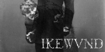 Ikewund is a font with a peculiar creepy feeling. Great for header designs.
 - Mandragora by Scriptorium,
$12.00Mandragora is a set of 16th century decorative initials with a floral theme. - DB Girly Girl by Illustration Ink,
$3.00DoodleBat Girly Girl is everything girl. Join in the fun with this DoodleBat. - Maze by Oporto Design,
$79.90 Maze is a modern font created from a single line with no interruption.
 - Komfortabel by Bogstav,
$13.00 Say hello to my fancy handmade font - made with in a scribllelicious mood.
 - Delamere by AVP,
$29.00Delamere uses conventional sans-serif letterforms but delivered with a strong calligraphic feel. - FG Nadja by YOFF,
$13.95FG Nadja is bold and beautiful - with a real artistic flair around her. - Eingraviert by Intellecta Design,
$29.90 Eingraviert is based on old books capitals, with a wood type engraving style
 - H74 Black Mass by Hydro74,
$25.00 Black Mass is a black-letter / tattoo structure with a slight progressive edge.
 - Zerega by Haiku Monkey,
$10.00Zerega is a confident, handwritten font, constructed informally but with some calligraphic flair. - Flix by BA Graphics,
$45.00A powerful yet happy look. A great headline face with a distinct look. - LD Charlie Chunk by Illustration Ink,
$3.00LD Charlie Chunk is a scruffy and thick font with an outline style. - Fraggle by BA Graphics,
$45.00Designed with a happy loose feeling. Great for childrens books and fun occasions. - Yakety Yak by BA Graphics,
$45.00A great fun font a happy-go-lucky font with a loose look. - 20 Kopeek by Letterhead Studio-YG,
$35.00 20 kopeek is sans serif font with a slight touch of a steampunk.
 - Jeunes by Etewut,
$30.00 Here is a new typeface JEUNES. Script font with alternates and some ligatures.
 - LD Erin by Illustration Ink,
$3.00LD Erin is a simple styled font with tall thin letters and numbers. - KG All Of Me by Kimberly Geswein,
$5.00 A stamped, eroded font with the texture of a real rubber stamped image.
 - Sparrowhawk Script by Max.co Studio,
$14.00 Sparrowhawk Script is retro signage font, bold and clean. There are so many variations on each character. Include Opentype stylistic alternates. You are able to create so many different typographical layouts easily and quickly. Make sure you use OpenType savvy program and simply open Glyph Palette to access all of the glyphs. This font is suitable for t-shirts, signage, logos, headlines, branding, packaging, etc. Sparrowhawk Script features 460+ glyphs and alternate characters. including initial and terminal letters, alternates, ornament, swash, ligatures and multiple language support. To enable the OpenType Stylistic alternates, you need a program that supports OpenType features such as Adobe Illustrator CS, Adobe Indesign & CorelDraw X6-X7, Microsoft Word 2010 or later versions. How to access all alternative characters using Adobe Illustrator: http://youtu.be/iptSFA7feQ0 Sparrowhawk Script is coded with PUA Unicode, which allows full access to all the extra characters without having special designing software. Mac users can use Font Book , and Windows users can use Character Map to view and copy any of the extra characters to paste into your favourite text editor/app. How to access all alternative characters, using Windows Character Map with Photoshop: https://www.youtube.com/watch?v=Go9vacoYmBw If you need help or advice, please contact me by e-mail "maximal.fonts@gmail.com"
 - Metal Cry by Fabulous Rice,
$25.00 Metal Cry is a font family that was inspired by countless hours spent playing video games, watching old movies or reading comic books. And even more hours closely analysing the design of all these things. The art of creating beautiful letters has slowly declined with the rise of the digital age and its solid-colour, 2D fonts. And most of the time, the care given to typography in cultural products just isn't what it used to be anymore. This was the inspiration for Metal Cry, a family of 4 layerable fonts that can bring a feeling of depth to its letters, and offers endless possible combinations. Metal Cry Outlands is the basic shape of all the characters, it can be used as the bright side of the bevel. Metal Cry Front is the inline border font that can be used as the front side of the bevel. Metal Cry Shadow can be used as the dark side of the bevel. Metal Cry Depth can be used to flash out the inside shape of the letter. But of course, any font can be combined with any other font(s) to obtain various results. The planets in the above visuals are courtesy of 3D artist Thomas Veyrat / veyratom.com
 - BF Konkret Grotesk Pro by BrassFonts,
$39.99 BF Konkret Grotesk Pro, designed by Guido Schneider, is a contemporary grotesque with a straightforward style – but a very individual touch. Inspired by classic grotesque typefaces, Konkret Grotesk Pro impresses with its unique character and rhythm: It’s elegant and edgy, flexible and forceful. The Pro family supports up to 220 Latin-based languages. Each of the 16 fonts contains more than 1500 glyphs, including small caps, 7 figure sets, fractions, many ligatures, currency symbols, alternates, special characters and other useful symbols. 11 style sets give you the option to individualize and adjust the typeface to the requirement of your design, without changing the general visual feeling. In this way you can also switch the simply slanted styled Italic into a “real Italic”. BF Konkret Grotesk Pro is a typeface family that can adapt to many requirements without losing its character and expression. The range of 8 weights provides all possibilities. Due to the lovingly designed details, Konkret Grotesk Pro works both in small sizes as well as in display applications. Thus, Konkret Grotesk Pro is ideally suited for contemporary and demanding typographic tasks, both in the fields of editorial design, branding, posters and advertising. (The new Pro edition is the extended and optimized version of the previous BF Konkret Grotesk.)
 - Funky Sign by Putracetol,
$26.00 Funky Sign - Groovy Hipster Font is an eye-catching display font that exudes retro charm and groovy vibes. With its pop, fancy, and colorful styles, this font offers a fun and playful typographic solution. It comes in two versions: clean and textured/rough, providing versatility and creative options for various design projects. Funky Sign is the perfect choice for creating captivating posters, logos, landing pages, titles, headlines, stickers, branding materials, cards, and any project with a music or funky theme. The Funky Sign font stands out with its funky and hipster-inspired style, bringing a sense of nostalgia and vibrancy to your designs. The clean version offers a polished and sleek look, while the textured/rough version adds a touch of authenticity and edginess. Whether you're designing a poster for a music event, creating a logo for a trendy brand, or crafting a funky landing page, this font will infuse your designs with a unique and dynamic flair. With Funky Sign - Groovy Hipster Font, you have a versatile and lively typographic tool at your disposal. Its retro and groovy styles, along with the clean and textured versions, offer endless possibilities for designing captivating visuals. Whether you're working on a music-themed project, creating funky branding materials, or designing eye-catching posters, this font will bring a unique and vibrant touch to your designs, setting them apart with its distinctive and playful appeal.
 - FS Lola by Fontsmith,
$80.00 L-O-L-A Like the subject of the Kinks’ song, FS Lola is a little bit of both – a font with a rare combination of masculine and feminine. The font was inspired by the song, which itself was inspired by the night the Kinks’ manager spent dancing drunkenly in a Soho club with a beautiful woman... Or so he’d thought, until her stubble started to show halfway through the evening. Masculine/feminin Phil Garnham’s experience in designing FS Lola was similar to the one related by Ray Davies. Setting out to create a sans serif font, he realised along the way that he was actually dealing with a semi-serif. He went with it, though, and produced a font with the best masculine and feminine qualities: hard edges and corners tempered by shapes of softness and generosity, the outcome of what Phil calls an “organic” design process. “Initially, my designs were very graphic and hard but not very distinctive. By printing and redrawing the letters in pencil I achieved a softer and friendlier alphabet with a strong personality.” Broad Lola, as you’d expect, is very broad-minded. Available in five weights with italics – and fluent in central European languages – FS Lola offers a confident combination of feminine softness and male steeliness to any kind of design. As the song says, “It’s a mixed-up, muddled-up, shook-up world... except for Lola.
 - ITC Werkstatt by ITC,
$29.99ITC Werkstatt is a result of the combined talents of Alphabet Soup's Paul Crome and Satwinder Sehmi, along with Ilene Strizver and Colin Brignall. It is inspired by the work of Rudolph Koch, the renowned German calligrapher, punchcutter, and type designer of the first third of this century, without being based directly on any of Koch's typefaces. Werkstatt has obvious affinities with the heavy, woodcut look of Koch's popular Neuland, but also with display faces like Wallau and even the light, delicate Koch Antiqua. Brignall began by drawing formal letters with a 55mm cap height, which Sehmi reinterpreted using a pen with a broad-edge nib. “Not an easy process,” says Brignall, “since one of the features of Koch's style is that while it was calligraphic in spirit, most of the time his counter shapes did not bear any resemblance to the external shapes, as they would in normal calligraphy. This meant that Sehmi could not complete a whole character in one go, but had to create the outside and inside shapes separately and then ink in the center of the letters.” The process was repeated, only without entirely filling in the outlines, for the Engraved version. Crome handled the scanning and digitization, maintaining the hand-made feel while creating usable digital outlines. “The collaboration of artisans with particular skills,” says Brignall, “in a modern-day, computer-aided studio environment, seems very much in step with the 'workshop' ethos that Rudolph Koch encouraged and promoted so much.” - Floro by Andinistas,
$29.95 Floro is a typographic family with 3 members designed by Carlos Fabian Camargo. Its idea combines medieval ideas, grotesque, stencil and grunge for T-shirts, stickers, advertising material design. More specifically the concept of Floro join several DNAís coordinating X height, ascendant, descendant and wide, in which proportions and adaptive optics were determined to inject great visual impact when composing titles. Its forms and counter forms have imperfections controlled with vitality and consistency. Floro is useful for ranking words and phrases with corroded edges and creases between the lines of his letters. In that vein, Floro refers to improvised design, deletion and copying. For that reason, its determinants seem stencil patterns that attract the attention of the reader. Its inaccurate decisions were planned that way, in which the type of contrast seems made with a flat tip and the amount of contrast between thick and thin is medium. Its sizes, regular and italic shine by their systematic wear and terminations sometimes in pointed forms resembling medieval darkness. In short, we can say that Floro comes from the miscegenation of Gothic calligraphy texture, foundational calligraphy and some refinements of gothic writings with italic sans-serif ideas of late 19th century. Even with the blur appearance, floro has ideal proportions to pile for horizontal and vertical areas when composing titles with striking looks and robust. And finally, floro dingbats are related shields and stamps, to accompany the written resulting useful at the level of visual support and hierarchical.
 - Morgan Sans by Feliciano,
$50.00The Morgan Project can be considered a big type family with ‘many styles’ or a set of different types that match with each other. For me it’s one typeface with different versions with deliberate and visible differences according to the propose to which each version was created. The design started in 2000 as a display type with the design of the Morgan Tower, to which more two display versions were added; Morgan Poster and Morgan Big — all together the make our: FTF Morgan Display Kit 1. All three versions consist only in uppercase with alternate letters in the lowercase and a set of special ligatures. Morgan Tower has four variants that differ in width/weight, Morgan Poster has six variants (often called styles), three weights in upright and oblique and Morgan Big has twelve, six weights in upright and oblique. Lately, the FTF Morgan Tex Kit 1 was added. Apropriate versions to use in text setting. Both versions, FTF Morgan Sans and FTF Morgan Sans Condensed share the same structure and character mapping. Four variants each; regular, bold, oblique and bold oblique with a large character set including: small caps, lining and old style figures (here called Office figures) — both tabular —, small caps lining figures, mathematical symbols and fraction figures, and, a set of foreign characters expanding the possibilities of use for a wider range of languages. Characters are distributed in six different font layouts: Lining, Office, Expert, Caps, Figures & Pi. - Caltic by Ingrimayne Type,
$12.95 Caltic-Holiday, Caltic-Festival, and Caltic-Straight are three eye-catching, very bold typefaces that are suitable for posters and signage. Caltic-Holiday and Caltic-Festival base letter shapes on trapezoids with curved sides but with curves that are reversed going from one to the other. Caltic-Straight has letters based on trapezoids with straight sides. None are suited for text and with their built-in spacing will not work as all upper-case or all lower-case. All three come in two widths, regular and wide, giving the Caltic family six members. Caltic has nothing to do with Celts. The Calt refers to the calt or contextual alternative OpenType feature that makes this typeface work. When the letters on the upper-case keys alternate with the letters on the lower-case keys, they fit snuggly together. As long as the user has a word processor that supports the contextual alternatives feature, there is no need for the user to alternate letters; the calt feature does it automatically. Although the fonts seem similar to hand-drawn lettering that was done on posters and signs during the hippie era of the 1960s and 1970s, I can find nothing quite like them. My inspiration for them is older, in a newspaper from 1932 that led to the typeface family PoultySign. Caltic (and Lentzers) are the result of seeing what else I could do with the inspiration that sprang from that 1932 newspaper.
 - Kobern by The Northern Block,
$19.30 A strong, horizontal sans serif typeface. The letterforms distinct lateral emphasis combined with condensed proportions helps improve readability and use of space across layouts. Ideally suited for a wide range of modern applications, details include 9 weights with italics, 540 characters, 5 variations of numerals, manually edited kerning and Opentype features.
 - Ordillon Handwriting by Letterara,
$14.00 Ordillon Handwriting is a beautiful original handwritten font with a unique feel and a stunning impact. It will add a unique spark to any design project that you wish to create! This font is PUA encoded which means you can access all of the amazing glyphs and ligatures with ease!