10,000 search results
(0.013 seconds)
- Talk To Me by PizzaDude.dk,
$20.00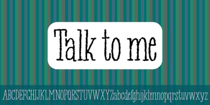
- Bank Sans EF by Elsner+Flake,
$35.00 With its extended complement, this comprehensive redesign of Bank Gothic by Elsner+Flake offers a wide spectrum for usage. After 80 years, the typeface Bank Gothic, designed by Morris Fuller Benton in 1930, is still as desirable for all areas of graphic design as it has ever been. Its usage spans the design of headlines to exterior design. Game manufacturers adopt this spry typeface, so reminiscent of the Bauhaus and its geometric forms, as often as do architects and web designers. The creative path of the Bank Gothic from hot metal type via phototypesetting to digital variations created by desktop designers has by now taken on great breadth. The number of cuts has increased. The original Roman weight has been augmented by Oblique and Italic variants. The original versions came with just a complement of Small Caps. Now, they are, however, enlarged by often quite individualized lower case letters. In order to do justice to the form changes and in order to differentiate between the various versions, the Bank Gothic, since 2007 a US trademark of the Grosse Pointe Group (Trademark FontHaus, USA), is nowadays available under a variety of different names. Some of these variations remain close to the original concept, others strive for greater individualism in their designs. The typeface family which was cut by the American typefoundry ATF (American Type Founders) in the early 1930’s consisted of a normal and a narrow type family, each one in the weights Light, Medium and Bold. In addition to its basic ornamental structure which has its origin in square or rectangular geometric forms, there is another unique feature of the Bank Gothic: the normally round upper case letters such as B, C, G, O, P, Q, R and U are also rectangular. The one exception is the upper case letter D, which remains round, most likely for legibility reasons (there is the danger of mistaking it for the letter O.) Because of the huge success of this type design, which follows the design principles of the more square and the more contemporary adaption of the already existing Copperplate, it was soon adopted by all of the major type and typesetting manufacturers. Thus, the Bank Gothic appeared at Linotype; as Commerce Gothic it was brought out by Ludlow; and as Deluxe Gothic on Intertype typesetters. Among others, it was also available from Monotype and sold under the name Stationer’s Gothic. In 1936, Linotype introduced 6pt and 12pt weights of the condensed version as Card Gothic. Lateron, Linotype came out with Bank Gothic Medium Condensed in larger sizes and a more narrow set width and named it Poster Gothic. With the advent of photoypesetters and CRT technologies, the Bank Gothic experienced an even wider acceptance. The first digital versions, designed according to present computing technologies, was created by Bitstream whose PostScript fonts in Regular and Medium weights have been available through FontShop since 1991. These were followed by digital redesigns by FontHaus, USA, and, in 1996, by Elsner+Flake who were also the first company to add cursive cuts. In 2009, they extended the family to 16 weights in both Roman and Oblique designs. In addition, they created the long-awaited Cyrillic complement. In 2010, Elsner+Flake completed the set with lowercase letters and small caps. Since its redesign the type family has been available from Elsner+Flake under the name Bank Sans®. The character set of the Bank Sans® Caps and the Bank Sans® covers almost all latin-based languages (Europe Plus) as well as the Cyrillic character set MAC OS Cyrillic and MS Windows 1251. Both families are available in Normal, Condensed and Compressed weights in 4 stroke widths each (Light, Regular, Medium and Bold). The basic stroke widths of the different weights have been kept even which allows the mixing of, for instance, normal upper case letters and the more narrow small caps. This gives the family an even wider and more interactive range of use. There are, furthermore, extensive sets of numerals which can be accessed via OpenType-Features. The Bank Sans® type family, as opposed to the Bank Sans® Caps family, contains, instead of the optically reduced upper case letters, newly designed lower case letters and the matching small caps. Bank Sans® fonts are available in the formats OpenType and TrueType.
 - FM Thank You by The Fontmaker,
$20.00 FM Thank You consists of 26 ‘thank you’ hand letterings - all custom made and handwritten. Now you have 26 unique ways to say ‘thank you’, adding a personal touch to your message.
 - ITC Talking Drum by ITC,
$29.99 - Banks and Miles by K-Type,
$20.00 K-Type’s ‘Banks & Miles’ fonts are inspired by the geometric monoline lettering created for the British Post Office in 1970 by London design company Banks & Miles, a project initiated and supervised by partner John Miles, and which included ‘Double Line’ and ‘Single Line’ alphabets. The new digital typeface is a reworking and extension of both alphabets. Banks & Miles Double Line is provided in three weights – Light, Regular and Dark – variations achieved by adjusting the width of the inline. Banks & Miles Single Line develops the less used companion sans into a three weight family – Regular, Medium and Bold – each with an optically corrected oblique. Although the ‘Banks & Miles Double Line’ and ‘Banks & Miles Single Line’ fonts are based on the original Post Office letterforms, glyphs have been drawn from scratch and include numerous adjustments and impertinent alterations, such as narrowing the overly wide Z and shortening the leg of the K. Several disparities exist between the Post Office Double and Single Line styles, and K-Type has attempted to secure greater consistency between the two. For instance, a wide apex on the Double Line’s lowercase w is made pointed to match the uppercase W and the Single Line’s W/w. Also, the gently sloping hook of Single Line’s lowercase j is adopted for both families. The original Single Line’s R and k, which were incongruously simplified, are drawn in their more remarkable Double Line forms, and whilst the new Single Line fonts are modestly condensed where appropriate, rounded letters retain the essentially circular form of the Double Line. Many characters that were not part of the original project, such as @, ß, #, and currency symbols, have been designed afresh, and a full set of Latin Extended-A characters is included. The new fonts are a celebration of distinctive features like the delightful teardrop-shaped bowl of a,b,d,g,p and q, and a general level of elegance not always achieved by inline typefaces. The Post Office Double Line alphabet was used from the early 1970s, in different colours to denote the various parts of the Post Office business which included telecommunications, counter services and the Royal Mail. Even after the Post Office was split into separate businesses in the 1980s, Post Office Counters and Royal Mail continued use of the lettering, and a version can still be seen within the Royal Mail cruciform logo.
 - EF Tante Emma by Elsner+Flake,
$35.00 - People Talk JNL by Jeff Levine,
$29.00 A title card with cast credits for the 1935 movie “The Whole Town’s Talking” (starring Edward G. Robinson and Jean Arthur) formed the basis for People Talk JNL. The hand lettered names were done in a slightly condensed slab serif – mostly rectangular in shape with rounded corners. A few characters take on their own unique appearance. People Talk JNL is available in both regular and oblique versions.
 - Painting With Chocolate - 100% free

- Made With B - Personal use only

- stoned wash 6 - Unknown license

- Big Fish Ensemble - Unknown license

- Willo the Wisp - Unknown license

- Atlantic Sea Washed by URW Type Foundry,
$39.99 The original plan for Atlantic was to design a typeface in the Venetian syle of the Renaissance, with handwriting character and large ascenders. There is a wave-rolling unevenness in both the x- and cap-height caused by the strong ductus pointing to the upper right, together with heavily curved serifs, resulting in a very lively image of text on a page. Atlantic – its name reflects the ocean, ships, carriers and loads, tourism and so on. These are the themes Atlantic is best suited for. The extended family includes a serif, a sans, and a special variant – a SeaWashed. Atlantic was designed for the URW++ SelecType collection.
 - Running With Scissors by Comicraft,
$19.00 Your Mama told you not to do it, so you just KNOW this font will be good for you! In fact, you might say it’s a Cut Above the Rest. OUCH! Blade Runners: Be careful, you don’t want to retire a human by mistake... Remastered Running With Scissors contains: Two weights with hook-topped uppercase and hookless lowercase Activate "Discretionary Ligatures" to create perfectly futuristic sci-fi logos! support for 221 languages including Western & Central Europe and Vietnamese
 - Gans Vessels Fishes by Intellecta Design,
$19.90 See also other font families inspired by Gans' original typefaces: Gans Tipo Adorno, Gans Lath Modern, Gans Titular Adornada, Gans Ibarra, Gans Antigua, Gans Antigua Manuscrito, Gans Fulgor, Gans Radio Lumina, Gans Carmem Adornada, Gans Italiana, and Gans Titania.
 - Fyne Fish NF by Nick's Fonts,
$10.00The pattern for this face was designed by Will Bradley in 1894 for the cover of Inland Printer magazine, and was licensed the following year to American Type Founders. Its classic lines and condensed footprint make this typeface a natural for elegant and inviting headlines. All versions of this font include the Unicode 1250 Central European character set in addition to the standard Unicode 1252 Latin set. - Made With B by Mans Greback,
$59.00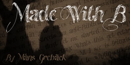
- Math with Greek by Bitstream,
$29.99 - Stay With Me by PizzaDude.dk,
$20.00Slightly grungy and blurred-edged combined with a thick stroke and a fat drop shadow. This font is eye catching in many ways! - Murisa Baby Fish by Murisa Studio,
$10.00 Murisa BabyFish is our next font in early 2022. This font is inspired by the joy of children playing. Their joy is reflected in the creation of this font. Cheerful, joyful and colorful, are the strengths of this font. This font is perfect for use in your products that are targeting children and teenagers. Babyfish will lead your product to success. Get it right now.
 - Big Fish DD by Doffdog,
$14.00 Big Fish DD is a decorative, metal and punk rock music inspired font. It is perfect for: Logos Posters Headlines Apparel Music covers & more Stay true! Stay metal!
 - Penny Wise JNL by Jeff Levine,
$29.00 The unusually-shaped hand lettering of Penny Wise JNL was modeled from the cover of the 1936 sheet music for "You Dropped Me Like a Red Hot Penny", and is available in both regular and oblique versions. Although it was drawn during the Art Deco period, this type of lettering design style was revived during the Hippie movement of the 1960s and 1970s.
 - Brush With Death by Cyberian Khatru,
$20.00 This font was made possible by creating a custom brush in Illustrator. I started with a flat brush dipped in India ink to create the stroke. From a scan of that stroke I made a vector tracing which I then I altered as necessary to get the desired dimensions. The lower case letters have a thinner stroke than the capitals.
 - With A Twist by Letters by Wordsworth,
$23.00 With A Twist is not shy, not ordinary, not predictable which makes it the perfect choice for attention-getting titles. With A Twist Monoline is slightly more retiring and fun to fill in. Pull up a stool, order a martini & have some font fun - With A Twist.
 - Appointment With Danger by Device,
$29.00
- Merry With Dream by Seemly Fonts,
$12.00 Merry with Dream is a cute and simple lettered handwritten font that can be used for all chalkboard quotes or teaching material! Its authentic look will add a personal and realistic feel to your designs.
 - Numbers With Rings by Typodermic,
$11.95 Numbers with Rings uses an OpenType system that allows you to generate numbers in rings up to 999999. You can even have ringed letters or letter/digit combinations. If your application supports OpenType ligatures, you can type letters or digits on your keyboard, and they’ll automatically squeeze into rings. First, select a ring which can hold the number of digits you want, then type the digits; the rest happens automatically. There’s also a filled ring which can be used to give your ring a colored background. For more details on how Numbers with Rings works, check the PDF guide .
 - Anke Calligraphic FG - Unknown license

- BN M@TAN - Unknown license

- TAN Waltzing Mathilde by TANTypeCo.,
$19.00 Our fonts are supported by most design software, please make sure it can read the OpenType fonts to be able to access all ligatures. Please be informed that while our font works well in Canva, but Canva itself doesn’t support advance opentype features such as special characters.
 - You Wish You Were a Shirley - Unknown license

- Talking to the Moon - Personal use only

- Talk to the hand - Unknown license

- Bank Sans Caps EF by Elsner+Flake,
$35.00 Based on Bank Gothic designed by Morris Fuller Benton in the 30th, Bank Sans Caps from Elsner+Flake offers a wide variety of weights from Light to Bold with Compressed, Semi Condensed and Condensed widths. All weights are also available with Cyrillic character sets.
 - Fish in the bathroom - Unknown license

- KR Filled With Flowers - Unknown license

- In Love With Rome by SilverStag,
$19.00 I am so happy to introduce my brand new handwritten font that exudes chic elegance like no other - meet In Love With Rome Script. Every single letter has been lovingly crafted by hand, resulting in a stunningly unique typeface that's perfect for anyone looking to add a touch of sophistication to their designs. With 274 alternate letters and ligatures, you'll have all the tools you need to create truly one-of-a-kind pieces. But what sets this font apart isn't just its beauty - it's also incredibly versatile. Whether you're working on a wedding invitation, a branding project, or simply adding some flair to your social media posts, this font is the perfect choice. It's feminine, cool, and it strikes the perfect balance between modern and classic. So if you're looking for a font that's as beautiful as it is functional, look no further! In Love With Rome Script Font Includes: Over 274 Ligatures and Alternates Full Language Support Lowercase and Uppercase letters Numerals & Punctuation Web Font Kit is Included as Well NOTE: Ligatures are supported in most desktop programs including Photoshop, Illustrator, InDesign, Word, Pages & Keynote. Most of them will have this option automatically switched on. If you're using Canva, ligatures are not supported out of the box, however, I have included detailed instructions on how you can use them for your designs as well! Happy creating everyone!
 - Down With The King by A New Machine,
$19.00 Down With the King is a very bold all caps font best used for large titles, headers and logo work. The lower case letters have rounded edges for a softer feel.
 - Rise Up With Fists by Ana's Fonts,
$15.00 Rise Up With Fists is a fun, sans serif font with lots of variations and extra drawings, inspired by protest posters. Use Rise Up With Fists in any design that needs a bold font, such as logotypes, quotes and social media posts, website and magazine layouts, and poster designs. Rise Up With Fists includes: Rise Up With Fists Regular, with 100 ligatures that makes this font look truly handmade and realistic (and fun to use!) A Filled alternative for a more bold look An Extras font with floral drawings and doodles
 - Poultry And Fish JNL by Jeff Levine,
$29.00 The image of an old enamel sign advertising poultry inspired Poultry and Fish JNL, which is available in both regular and oblique versions. Horizontal cut-through lines within the Art Deco-era hand lettering adds to the uniqueness of this type design.


