10,000 search results
(0.038 seconds)
- Over Under by Ingrimayne Type,
$5.00 OverUnder is a two font family that plays with the capabilities of the Opentype feature of Contextual Alternatives to alternate two sets of characters. One set is on tall vertical slabs and the other set is on wide horizontal slabs, and when the sets are alternated, the result is a pattern that has a woven appearance.
 - Master by Jure Kožuh,
$29.00 Master of the World was included on the front page of a novel in several parts, The Count of Monte Christo (mid 20th century). Typeface characters show design guidelines of the pre-war era (2nd world war). The idea of development origins from a wish to evolve traditional forms of typefaces which were used in Slovenia.
 - Bagor by Trustha,
$17.00 Bagor is a sans-serif typeface with a heavy touch. The concept is a big x-height and small ascender. Comes with 3 widths, namely: normal, wide, and expanded. And also a round version, making it 6 styles. Complete with ligature, alternative glyphs become an attractive choice. Bagor is perfect for branding, titling, headline, and more.
 - Ancora by FAEL,
$20.00 I’m happy to announce the complete version of Ancora, a typeface I designed back in 2013. Ancora is a sans serif typeface with a distinctive style, inspired by the imagery in the production of the famous Port wine, such as boats, barrels, grapes, and bottle labels. Use Ancora for magazines, packaging, posters, stamps, brands and logos a new taste.
 - Nada Qonita by Ghuroba Studio,
$15.00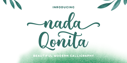 Nada Qonita is a modern calligraphy font that feels beautiful classy, elegant, and modern. It is perfectly suited for a wide variety of projects! This font is PUA encoded which means you can access all of the wonderful glyphs and swashes with ease! It also features a wealth of special features including alternate glyphs and ligatures.
 - Fatigue by Typesthetic Studio,
$13.00 Heroic is a bold and playfull handwritten brush font. This font is very unique because sometimes it can look fierce like in modern street art graffiti if with capital letters, but sometimes it can look cute if it is included with the lowercase letters. As a result, this font can matches a wide pool of designs.
 - Plastic Template JNL by Jeff Levine,
$29.00 Prior to the advent of digital type, many architectural layouts, amateur print projects and a myriad of other lettering jobs were created by the use of routed plastic templates and ink pens. Plastic Template JNL was designed from just one strip of a multi-part template set and replicates the clean lines of the original design.
 - Laurel by Fenotype,
$25.00 Often in typography, a standout appeal is required – but preferably without compromising on clarity and legibility. Laurel font family by Fenotype is where the best of both worlds meet – an edgy display letter yet easily legible and appropriate for a wide range of use cases. Brand identities, packaging, posters or editorial – choose Laurel for a touch of unique flair.
 - On The Ground by Fascination Workshop,
$10.00 On the Ground is a picture font made from drawings of found objects. These object were found on the ground while walking around different cities in the United States. The font uses varying drawing styles (from detailed to pictographic) but they all have a similar irregularity, unifying the characters. Perfect for animations, signs, greeting cards, posters, etc.
 - Alphard by ErlosDesign,
$19.00 Alphard - Handwritten Font by erlosDESIGN Alphard is a delicate, elegant and flowing handwritten font. It has beautiful and well balanced characters and as a result, it matches a wide pool of designs. Alphard features a varying baseline, smooth lines, gorgeous glyphs and stunning alternates. Add it to your most creative ideas and notice how it makes them come alive!
 - ATC Timberline by Avondale Type Co.,
$20.00 ATC Timberline, is an ultra wide-set sans-serif typeface. With its sharp points and extended curves, ATC Timberline feels just at home in mid-century modern as it does in forward-looking modern settings. Contains 370+ glyphs, full alphabet, ligatures, numberals, accents and punctuation. File type included in download is .otf. ATC Timberline was released in 2016.
 - FF Milo Slab by FontFont,
$68.99 FF Milo Slab is not just the sans with slabs attached. It has undergone a wide range of careful adjustments from increased contrast, longer ascenders and descenders and modified glyphs in the heavier weights. All these changes amount a typeface that feels enough like Milo but also can stand on its own as a new and fresh typeface.
 - Thierry by Olivetype,
$18.00 Thierry is an elegant signature script font. This versatile script font has a wide spectrum of applications ranging from logotype, product branding to headlines. Add a romantic feel to your next project with this modern calligraphy-styled font. So what's included : Basic Latin A-Z & a-z Numbers, symbols, and punctuations Ligatures Accented Characters : ÀÁÂÃÄÅÆÇÈÉÊËÌÍÎÏÑÒÓÔÕÖØŒŠÙÚÛÜŸÝŽàáâãäåæçèéêëìíîïñòóôõöøœšùúûüýÿžß Thank you
 - Tarquin AT by Akufadhl,
$15.00 Tarquin is a All-Caps sanserif typeface, inspired by the beautiful hand-painted sign. It has a strong personality, high contrast stem, and widely opened counter to improve the readibility as it designed for display purposes. It's available in 3 different style, REGULAR, STENCIL, and SHADOW designed for display purpose design Crafted beautifully and carefully with hand.
 - Ignorance by Typogama,
$29.00 Ignorance is a script typeface that mimics traditional handwriting found in America in the 19th century. Full of vitality and personality, this typeface includes a wide range of Opentype ligatures, alternates and swash characters that allow multiple choices for each setting. This design is principally aimed for use in display and titling setting that will reveal it's finer details.
 - Sign Shop JNL by Jeff Levine,
$29.00Sign Shop JNL was inspired by a set of ceramic titling and display letters similar to those used to model Entitled JNL and made by the Mitten's Display Letter Company of Redlands, California. The distinctive retro feel adds a great touch to any project. Bold, Deco and Oblique versions were created by Jeff Levine for extra visual impact. - Asbury Park JNL by Jeff Levine,
$29.00 In the 1930s the WPA (Works Progress Administration) sponsored a Federal art project. Many posters were produced that featured government-sponsored cultural events, health and safety tips and various other topics. One such poster from Pennsylvania has the words “Work with Care” in a hand-lettered inline sans design. This became the basis for Asbury Park JNL.
 - Censorship JNL by Jeff Levine,
$29.00 Censorship JNL joins the wide array of stencil-themed fonts from Jeff Levine. An advantage to this particular design is the larger amount of stencil sections per letter or number. When used with a plotter/cutter, stencils in excess of 12 inches high can be cut into masking material without the cut-out characters becoming floppy or unstable.
 - Chocolate by Sparklefonts,
$22.00A digital foundry situated in England's rural South-West and established in 2005, Sparklefonts is Geoff Andersen, a man on a quest, from philosophy to aesthetics, from wild inspiration to wild gesticulation, from post-modernism right through to post-rationalisation. Boldly seeking unique and viable letterform architectures, he is equally determined to maintain legibility without compromising style. His journey has taken him through stencils and uncials, calligraphy and typography, through graphic design and guitar design. The story has been moving, the view spectacular, the punctuation superb. Geoff's sources are apparently limitless, his passion overwhelming, his fonts a labor of love, his therapist a Trojan! - Gradl Max by Fresh Air Fonts,
$14.00 Max J. Gradl was a German jewelry designer. A Web search today turns up several examples of his work from the turn of the 20th century. He seemed to favor green stones in silver metalwork. Gradl also did advertising work and co-authored a book on architectural design. Most important for our purposes, though, are the incredible hand lettered alphabets and monograms the man left behind. I’ve digitized one of those delightful alphabets and tried to keep it true to the original. Beyond the base character set of letters, numerals and basic punctuation, I had to extrapolate forms that, I hope, hold true to Gradl’s design. Enjoy!
 - Tungsten by Sparklefonts,
$22.00A digital foundry situated in England's rural South-West and established in 2005, Sparklefonts is Geoff Andersen, a man on a quest, from philosophy to aesthetics, from wild inspiration to wild gesticulation, from post-modernism right through to post-rationalisation. Boldly seeking unique and viable letterform architectures, he is equally determined to maintain legibility without compromising style. His journey has taken him through stencils and uncials, calligraphy and typography, through graphic design and guitar design. The story has been moving, the view spectacular, the punctuation superb. Geoff's sources are apparently limitless, his passion overwhelming, his fonts a labor of love, his therapist a Trojan! - ITC Ludwig by ITC,
$29.99ITC Ludwig has an edge. It's nervous, tense - maybe even a little scary. Drawn by Italian designer Giuseppe Errico, ITC Ludwig refuses to be confined to a traditional baseline. Its twisted lowercase g" and an "e" that could double as an upside-down "a" both add to the design's spooky personality. As a young man, Errico studied to be a fine artist. He became a graphic designer only after a “long reflection period,” he says. His early training is evident in many of ITC Ludwig's suggestive qualities. There is far more to this face than cranking up the “distort” knob in Fontographer. Reflection and personal expression are at its core." - Dialog by Sparklefonts,
$22.00A digital foundry situated in England's rural South-West and established in 2005, Sparklefonts is Geoff Andersen, a man on a quest, from philosophy to aesthetics, from wild inspiration to wild gesticulation, from post-modernism right through to post-rationalisation. Boldly seeking unique and viable letterform architectures, he is equally determined to maintain legibility without compromising style. His journey has taken him through stencils and uncials, calligraphy and typography, through graphic design and guitar design. The story has been moving, the view spectacular, the punctuation superb. Geoff's sources are apparently limitless, his passion overwhelming, his fonts a labor of love, his therapist a Trojan! - Festival by Sparklefonts,
$22.00A digital foundry situated in England's rural South-West and established in 2005, Sparklefonts is Geoff Andersen, a man on a quest, from philosophy to aesthetics, from wild inspiration to wild gesticulation, from post-modernism right through to post-rationalisation. Boldly seeking unique and viable letterform architectures, he is equally determined to maintain legibility without compromising style. His journey has taken him through stencils and uncials, calligraphy and typography, through graphic design and guitar design. The story has been moving, the view spectacular, the punctuation superb. Geoff's sources are apparently limitless, his passion overwhelming, his fonts a labor of love, his therapist a Trojan! - Validity Script by Mans Greback,
$29.00 Validity Script is a cute, outlined handwriting font family. The typeface was drawn and developed by Måns Grebäck and Misti Hammers during 2019. With swirly letters and charming wilderness it is perfect for a crafty project or an invitation with a personal touch. It comes in three weights and each weight as Italic, totaling in six styles: Thin, Thin Italic, Regular, Regular Italic, Bold, Bold Italic. Each font of this family is of high-quality and contains OpenType features. The fonts have extensive ranges of glyphs; they support all Latin-based European languages, contain numbers as well as all symbols and characters you'll ever need.
 - Nophine by Mantype Studio,
$18.00 Nophine is a typeface conceived by Sulai Man specifically for intensive editorial use, mainly in newspapers, magazines, and online, its personality and flexibility make it a true multipurpose typeface. The intermediate weights deliver a neutral look when used in text sizes, providing the usual robustness expected in a newspaper font. The unobtrusive appearance, excellent texture, and slightly colour allow it to behave flawlessly in continuous text, even in the most unforgiving editorial applications. As it becomes larger in print,Nophine shows its personality through a series of measured particularities which make it easy to remember and identify. Its energetic character, becomes evident when used for subheadings and headlines.
 - Tunesmith JNL by Jeff Levine,
$29.00 A "tunesmith" is one so nicknamed because the person or persons craft (compose) a song from scratch. When the area of Broadway known as Tin Pan Alley was in its heyday, every music publisher's office would have sounds emanating from the various cubicles of men and women trying for the next big hit. Sheet music was the main source of songwriter's royalties during those days, and to please the general public with a song destined to be a popular piece was a lofty goal. It's then only fitting that the lettering inspired by a 1920s-era piece of sheet music for a song called "Jerry" would be named Tunesmith JNL.
 - Quache Variable by Mans Greback,
$59.00 Quache is a flexible sans-serif, created by Måns Grebäck between 2018 and 2020. It has unique, stylish curvatures and is clear, legible and sharp with open letter forms. This is a variable font. It is only one font file, but this file contains multiple styles. Use the sliders in Illustrator, Photoshop or InDesign to manually set any weight and width. This gives you not only the 28 predefined styles, but instead 1000 times 1000 options to customize the type to the exact look your project requires. It supports Latin-based languages, and contains numbers and all symbols you'll ever need. More info about Variable Fonts: https://mansgreback.com/s/About_Variable_Fonts.pdf
 - Maintenance Stencil JNL by Jeff Levine,
$29.00 In the opening scenes of the 1938 Three Stooges comedy “Tassels in the Air” the Stooges are working as maintenance men inside an office building. Their immediate job requirement is to paint the tenants’ business names on the corresponding office doors with pre-cut stencils. Of course, they get it all wrong. Nonetheless, the stencils appear to be a hand cut sans serif design in a squared or ‘block’ style with rounded corners, and some of the applied lettering made for an interesting challenge to recreate as a typeface. The end result is Maintenance Stencil JNL, which is available in both regular and oblique versions.
 - Southwark by Hanoded,
$15.00 London is one of my favourite cities, so it was about time I named a font after it. Well, technically, I named a font after one of London’s districts. Southwark comes from the Anglo-Saxon word Suthriganaweorc, which means ‘Fort of the men of Surrey’. The font Southwork is a handmade Clarendon. I used a Japanese brush pen to create the outlines. I gave the glyphs texture by filling them in with a brush and Chinese ink. Southwark, therefore, has an uneven look and a brushy texture. It looks good on just about anything, but posters, greeting cards and product packaging come to mind.
 - Groundhog by Sparklefonts,
$22.00A digital foundry situated in England's rural South-West and established in 2005, Sparklefonts is Geoff Andersen, a man on a quest, from philosophy to aesthetics, from wild inspiration to wild gesticulation, from post-modernism right through to post-rationalisation. Boldly seeking unique and viable letterform architectures, he is equally determined to maintain legibility without compromising style. His journey has taken him through stencils and uncials, calligraphy and typography, through graphic design and guitar design. The story has been moving, the view spectacular, the punctuation superb. Geoff's sources are apparently limitless, his passion overwhelming, his fonts a labor of love, his therapist a Trojan! - Gerdika by Mantype Studio,
$22.00 Gerdika is a typeface conceived by Sulai Man specifically for intensive editorial use, mainly in newspapers, magazines, and online, its personality and flexibility make it a true multipurpose typeface. The intermediate weights deliver a neutral look when used in text sizes, providing the usual robustness expected in a newspaper font. The unobtrusive appearance, excellent texture, and slightly colour allow it to behave flawlessly in continuous text, even in the most unforgiving editorial applications. As it becomes larger in print,Gerdika shows its personality through a series of measured particularities which make it easy to remember and identify. Its energetic character, becomes evident when used for subheadings and headlines.
 - Sequal by Mans Greback,
$29.00 Sequal is a handwritten graffiti tag script. It was drawn and created by Måns Grebäck between 2018 and 2020. Its round and soft letters are youthful and active, and cool while being cute. Sequal is a typeface family of five weights: Thin, Light, Regular, Bold and Black. The different weights ensures usability in any context, while also giving the ability to emphasize phrases or words. The font supports hundreds of languages, including European and Asian Latin scripts. Composed of over 1250 glyphs, it is guaranteed to contain all characters you'll ever need, including all punctuation and numbers. It also contains OpenType features such as alternates and ligatures.
 - Cal Roman Black by Posterizer KG,
$19.00 Cal Roman Black is one more font from the PKG “Cal” (Calligraphic) group. This time for calligraphic sketches we used a wide brush instead of the iron pen. Instead of minuscule letters, there are Small Caps (which are almost the same weight as capitals). There was an intention to keep the spacing as small as possible, because of that, there is no obvious difference in the stroke thickness of the capitals and the lowercase capital letters. The difference in height is only one-third of the brush-width. Cal Roman Black font is rhythmic, informal, dark and hefty... romantic and strong at the same time (just like Ferdinand). As such, this font is widely used in the typographic creation of shorter and closely packed text forms such as magazine headlines, brochures and book covers, t-shirt designs, logos, posters, movie spots, banners...
 - Largo EF by Elsner+Flake,
$35.00The typefaces Largo Mager (Light) and Largo Halbfett (Medium) were cast for the first time in 1937 by Ludwig & Mayer based on the designs by Hans Wagner. One weight Largo Licht (Outline) was added in 1956. All fonts were only configured with capitals. The digital version of Largo has pointed serifs and not the slightly rounded ones seen in the hot metal versions which gives the typeface a more elegant note. Largo is often used for fine printing jobs as business cards or formal invitations, or in the fashion and cosmetics fields. Hans Wagner was born in Munich in 1894 and died in 1977 in Altenburg where he had worked as a painter, graphic designer and book designer. In addition to the Largo typeface, he developed, among others, the Altenburger Gotisch (1928), the Welt-Antiqua (1931-1934) and the Wolfram (1930). - Antipol by phospho,
$30.00 Antipol is a Sans Serif design that reverses the conventions of a regular Latin Sans Serif. With a weight emphasis on the horizontals and its vertical terminals Antipol radiates a 1970s charisma known from the like of Antique Olive. Its modern and avantgardistic attributes are most pronounced in the Hairline weight, where ultra thin lines meet distinctive arrowhead-corners. This particular weight is meant for display settings, think full-page magazine titles or posters. Antipol Wide and Antipol Extended are a generous statement for graphic design with enough space to let the type breathe: art catalogs, lead texts, invitations, letterheads or brand identity. Any style comes with a wide range of OpenType features that goes beyond a standard display font: Small Caps, Proportional and Tabular Oldstyle Figures and Lining Figures, Fractions, and much more. Type Specimen: http://bit.ly/2mxRCcA
 - Primitivus by PizzaDude.dk,
$18.00 It all started with making of a simple all-caps font. I drew the whole alphabet, numbers all else needed - but something wasn't quite right...the lettershapes were fine, but quite boring. Then I took a drastic decision: I started all over again ... meaning, I printed the whole thing, messed it up using a wet cloth and wrinkled the paper - then scanned it all again, and imported all the graphics yet again. A lot of work, yes - but personally I think it was worth it! But anyway, that's the story of how Primitivus was made ... well, almost, but not quite ... but that's another story! Use Primitivus for anything that needs that special kind of look were handdrawn letters meets grunge! Play around with the 4 different versions of each letter to make your text look even more random and natural!
 - Magenos Soft by Graphite,
$18.00 Magenos Soft is the rounded version of Magenos typeface family. It is a modern geometric sans serif family characterized by its simplicity and extensive functionality. With its open apertures, geometric architecture and low contrast strokes, it expresses a sincere tone with a modernistic, neutral, yet friendly personality. It has been designed to work well for a wide range of applications and is a reliable workhorse. Equally suitable for print and screen usage, it works well for both text and display at a wide range of point sizes. The addition of true italics gives the whole family a dynamic edge and flexibility. Magenos Soft comes with many OpenType features including stylistic alternates, standard ligatures, oldstyle and lining (proportional and tabular) numerals, slashed zero and a variety of symbols, making it a perfect choice for contemporary and professional typography.
 - Rondolux Cyrillic by Ira Dvilyuk,
$18.00 Rondolux Cyrillic Serif Font is a narrow classy all-caps serif typeface with narrow lowercase, wide uppercase letters, and tons of ligatures. Perfect for gorgeous logos and titles, Rondolux Cyrillic Serif Font will pair beautifully with many fonts and work well with whatever project you're working on. You can choose to use narrow or wide glyphs to make your typography more varied. Rondolux Latin part contains 38 ligatures which you can get by typing the number 1 after letters such as OC1 KO1 Lu1... Rondolux Cyrillic part also contains 27 ligatures Multilingual Support for 32 languages: Latin glyphs for Afrikaans, Albanian, Basque, Bosnian, Catalan, Danish, Dutch, English, Estonian, Faroese, Filipino, Finnish, French, Galician, Indonesian, Irish, Italian, Malay, Norwegian Bokmål, Portuguese, Slovenian, Spanish, Swahili, Swedish, Turkish, Welsh, Zulu. And Cyrillic glyphs support Russian, Belorussian, Bulgarian, Ukrainian, and Kazakh languages.
 - Aromo by TipoType,
$19.00 Aromo was initially conceived for editorial purposes. This typeface mixes the versatility of a simple and modern sans-serif, with the sensibility of the humanist feeling: thus making it useful in a wide range of purposes when a balanced and friendly font, with elegant proportions and high readability is required. The functional nature of its design is complemented by a family of 14 variants (7 weights, plus their matching true italics) interpolated optically for application as a hierarchical resource, where the middle weights (Light, Regular) have been optimized for use in small bodies, while the extremes (Ultra Light, Black) where designed for display environments._ Aromo also offers a wide range of historical and discretionary ligatures, small caps, eleven different types of numerals and a set of more than 700 characters covering about two hundred languages of Latin script._