9,578 search results
(0.014 seconds)
- Linotype Tetria by Linotype,
$29.99Tetria was designed by Martin Jagodzinski, who says that the font came from the need for a compact, constructivist typeface. Tetria combines the expression of simplicity of the 'norm' typefaces like DIN Mittelschrift with elements of Old Face typefaces which optimize legibility. It therefore contains old style figures and a larger stroke contrast, which makes the font legible even in smaller point sizes." Sources of inspiration for Tetria were the designs of Joost Schmidt and Herbert Bayer as well as the norm typefaces. The name comes from the Greek word for 'four', tetra. "Four is the number of many simple and useful objects, four wheels on a car, four corners of a book. Also, the basic forms of Tetria come from the simple geometric form of the square." The space-saving Tetria is well-suited to a variety of uses, from corporate typeface to text to display on posters, flyers or onscreen." - Povetarac Didone by Tour De Force,
$25.00 Povetarac Didone font family is part of Povetarac Superfamily together with Povetarac Sans and Povetarac Display. Available in 6 weights with matching italics, Povetarac Didone relays on lively uppercase proportions that took inspiration from vintage typefaces. It is well balanced family, elegant and fully recognizable. One of its characteristics are straight and wide terminals without usual serifs for this kind of typefaces. Playful and harmonic italics are one more uniqueness of Povetarac Didone. They were gently crafted to fulfil they role not just for editorial use, but as display typeface as well. Comes with Fractions and extended Latin character map.
 - Dezen Pro by DizajnDesign,
$- Dezen is a contemporary, mechanical grotesque typeface. Its letters were first constructed from individual modules and then optically refined to enhance its rhythm. Its tight letter spacing and narrow proportions make the typeface particularly well suited for display sizes and headlines. When you add spacing, font can be used for shorter amount of text, bigger than 12 points. The Dezen type family consists of a wide variety of styles – solid and stencil. The Dezen Pro subfamily combines all 4 styles (Solid, Stencil 01, Stencil 02, Stencil 03) in a specific sequence, which originates a “pattern” for the alphabet (or dezen, in Slovak).
 - Dezen Solid by DizajnDesign,
$39.00 Dezen is a contemporary, mechanical grotesque typeface. Its letters were first constructed from individual modules and then optically refined to enhance its rhythm. Its tight letter spacing and narrow proportions make the typeface particularly well suited for display sizes and headlines. When you add spacing, font can be used for shorter amount of text, bigger than 12 points. Dezen type family consists of a wide variety of styles – solid and stencils. Dezen Pro subfamily combines all 4 styles (Solid, Stencil 01, Stencil 02, Stencil 03) in a specific sequence, which originates a “pattern” for the alphabet (or dezen, in Slovak).
 - Obvia Expanded by Typefolio,
$29.00 'Obvia' appeared as a result of direct observation on typefaces classified as geometric and the plan to explore for the first time width axes Condensed, Narrow (soon), Normal and new Wide and Expanded. The idea behind 'Obvia's design was to create a distancing from geometrically pure shapes, in this case, square shapes. Then some details were added, such as subtle inktraps, concave endings of the stems and carefully drawn alternate characters, giving a 'geohumanist' tone to the font. This first family of 'Obvia' has 9 weights ranging from Thin to Black, delivering a strong typographic identity, from the paper to the pixel.
 - Dezen Stencil 02 by DizajnDesign,
$39.00 Dezen is a contemporary, mechanical grotesque typeface. Its letters were first constructed from individual modules and then optically refined to enhance its rhythm. Its tight letter spacing and narrow proportions make the typeface particularly well suited for display sizes and headlines. When you add spacing, font can be used for shorter amount of text, bigger than 12 points. Dezen type family consists of a wide variety of styles – solid and stencils. Dezen Pro subfamily combines all 4 styles (Solid, Stencil 01, Stencil 02, Stencil 03) in a specific sequence, which originates a “pattern” for the alphabet (or dezen, in Slovak).
 - Mickle by VP Creative Shop,
$20.00 Introducing Mickle - Creative Display Font Mickle is creative and wide font with multilingual support. It's a very versatile font that works great in large and small sizes. This font is perfect for branding projects, home-ware designs, product packaging, magazine headers - or simply as a stylish text overlay to any background image. FEATURES Uppercase, numeral, punctuation & Symbol Multilingual support No special software is required to type out the standard characters of the Typeface. Canva friendly Feel free to contact me if you have any questions! Mock ups and backgrounds used are not included. Thank you! Enjoy!
 - Dezen Stencil 03 by DizajnDesign,
$39.00 Dezen is a contemporary, mechanical grotesque typeface. Its letters were first constructed from individual modules and then optically refined to enhance its rhythm. Its tight letter spacing and narrow proportions make the typeface particularly well suited for display sizes and headlines. When you add spacing, font can be used for shorter amount of text, bigger than 12 points. Dezen type family consists of a wide variety of styles – solid and stencils. Dezen Pro subfamily combines all 4 styles (Solid, Stencil 01, Stencil 02, Stencil 03) in a specific sequence, which originates a “pattern” for the alphabet (or dezen, in Slovak).
 - Obvia Condensed by Typefolio,
$29.00 'Obvia' appeared as a result of direct observation on typefaces classified as geometric and the plan to explore for the first time width axes Expanded, Wide, Normal, Narrow and Condensed The idea behind 'Obvia's design was to create a distancing from geometrically pure shapes, in this case, square shapes. Then some details were added, such as subtle inktraps, concave endings of the stems and carefully drawn alternate characters, giving a 'geohumanist' tone to the font. This first family of 'Obvia' has 9 weights ranging from Thin to Black, delivering a strong typographic identity, from the paper to the pixel.
 - Dezen Stencil 01 by DizajnDesign,
$39.00 Dezen is a contemporary, mechanical grotesque typeface. Its letters were first constructed from individual modules and then optically refined to enhance its rhythm. Its tight letter spacing and narrow proportions make the typeface particularly well suited for display sizes and headlines. When you add spacing, font can be used for shorter amount of text, bigger than 12 points. Dezen type family consists of a wide variety of styles – solid and stencils. Dezen Pro subfamily combines all 4 styles (Solid, Stencil 01, Stencil 02, Stencil 03) in a specific sequence, which originates a “pattern” for the alphabet (or dezen, in Slovak).
 - Obvia Narrow by Typefolio,
$29.00 'Obvia' appeared as a result of direct observation on typefaces classified as geometric and the plan to explore for the first time width axes Condensed, Narrow, Normal, Wide and Expanded. The idea behind 'Obvia's design was to create a distancing from geometrically pure shapes, in this case, square shapes. Then some details were added, such as subtle inktraps, concave endings of the stems and carefully drawn alternate characters, giving a 'geohumanist' tone to the font. This first family of 'Obvia' has 9 weights ranging from Thin to Black, delivering a strong typographic identity, from the paper to the pixel.
 - Ozzi Modo NF by Nick's Fonts,
$10.00This double-wide wonder is based on Oswald Cooper’s original drawings for the typeface Cooper Fullface. ATF rejected this offering because they felt that several of the letterforms, and particularly the numbers, were a little too wacky for the mainstream. By now, you know that such an accusation is a "Please don't throw me in the briar patch" plea to yours truly. So, here, proudly and true to their designer’s original intent, are two versions of a really fun font. Both versions of this font include the complete Unicode 1252 Latin and Unicode 1250 Central European character sets. - Tioga by Monotype,
$29.99Tioga is a highly legible typeface designed specifically to display clearly on low-resolution displays. With superior readability even at small sizes, Tioga is an ideal typeface for developers of set-top boxes and digital televisions. Tioga is metrically compatible with Tiresias, a widely-used typeface designed for digital TV applications and adopted by the DVB and MHP standards. Tioga was fine-tuned to be more readable and aesthetically pleasing. Individual characters were adjusted for improved legibility and the letter spacing was revised to improve appearance and readability. Tioga bold was created to make the design more versatile. - Stingwire BT by Bitstream,
$50.99Bonislawsky pulls off a beauty in these letterforms rendered with barbed wire. In our view, it couldn't have been done better. Now you can contain the animal in you with style. - Bright Rainbow by Din Studio,
$29.00 Bright Rainbow is a classy brush font. The brush combined with handwritten font will make your design project more beautiful. Made for any professional project branding. It is the best for logos, branding and quotes. Every letter has a unique and beautiful touch. Features: Multilingual Support PUA Encoded Numerals and Punctuation Thank you for downloading from Din Studio.
 - Rankfine by Din Studio,
$29.00 Rankfine is a elegant calligraphy with natural and handwritten style. It brings a modern and attractive typeface. Made for any professional project branding. It is the best for logos, branding, wedding and quotes. Includes: Rankfine (OTF) Features: Stylistic Set Beautiful Ligatures Multilingual Support PUA Encoded Numerals and Punctuation Thank you for downloading premium fonts from Din Studio
 - Yeah Baby by Comicraft,
$29.00Mmm-hmmm! Dig that crazy beat! Following the success of Lilou's GIRLS!GIRLS!GIRLS! font, we couldn't wait to give you More!More!More! Yeah, Baby! It's a font and it's clip art and it's bound to make heads turn and temperatures rise. Get up on the dance floor, girl, and dance the way you've never danced before! - Hawken by Din Studio,
$29.00 Hawken is a powerful sans serif display typeface come with sporty themes. Perfect for quotes, posters, logo, logotype, branding, business card, crafting needs, print, t-shirt, mug, merchandise, packaging, and many more. Includes: Hawken (OTF) Features: Alternates Stylistic Set Swashes Multilingual Support PUA Encoded Numerals and Punctuation Thank you for downloading premium fonts from Din Studio
 - Steppin Out by Bitstream,
$50.99Nick Curtis has created this stylish, Deco inspired design, packed full of quirky features and characters. Some of the letterforms, like the uppercase K, appear to be walking. And dig that lowercase ‘g’! There is a lot of lively design happening here, so much so that its a battle not to be stylish when you are Steppin Out. - Fiosthic by Din Studio,
$29.00 Fiosthic is a modern signature font with natural and handwritten style. It brings a elegant and attractive typeface. Made for any professional project branding. It is the best for logos, branding, wedding and quotes. Includes: Fiosthic (OTF) Features: Stylistic Set Beautiful Ligatures Multilingual Support PUA Encoded Numerals and Punctuation Thank you for downloading premium fonts from Din Studio
 - Roaster Brush by Din Studio,
$29.00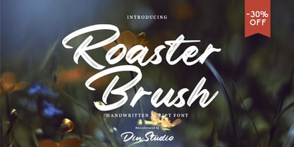 Roaster Brush is a elegant handwritten font. The handwritten combined with brush font will make your design project more attractive. Made for any professional project branding. It is the best for logos, branding and quotes. Every letter has a unique and beautiful touch. Features: Multilingual Support PUA Encoded Numerals and Punctuation Thank you for downloading from Din Studio.
 - Rithem by Din Studio,
$29.00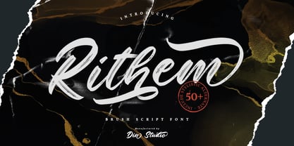 Rithem is a classy brush font. The brush combined with calligraphy font will make your design project more powerful. Made for any professional project branding. It is the best for logos, branding and quotes. Every letter has a unique and beautiful touch. Features: Multilingual Support PUA Encoded Numerals and Punctuation Thank you for downloading from Din Studio.
 - Dellons Signature by Din Studio,
$29.00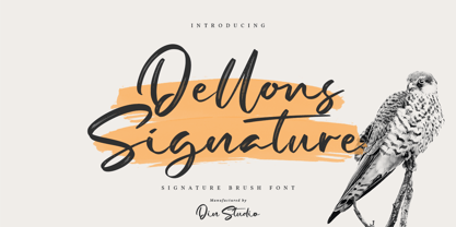 Dellons Signature is a elegant brush font. Combined with brush textured handwritten will make your design project more special. Made for any professional project branding. It is the best for logos, branding and quotes. Every letter has a unique and beautiful touch. Features: Beautiful Ligatures Multilingual Support PUA Encoded Numerals and Punctuation Thank you for downloading from Din Studio.
 - DINosaur by Type-Ø-Tones,
$60.00 DINosaur is the typographical mise en scène of a calligraphic standard for technical writing, found in a 1967 manual. Although its base is a regular grid and its main reference is the DIN norm, it is full of a multitude of small original features. The microtypographic details refer to the tools originally used for its reproduction.
 - Feel Better by Din Studio,
$29.00 Feel Better is a elegant handwritten font. The handwritten combined with brush font will make your design project more beautiful. Made for any professional project branding. It is the best for logos, branding and quotes. Includes: Feel Better (OTF) Features: Beautiful Ligatures Multilingual Support PUA Encoded Numerals and Punctuation Thank you for downloading from Din Studio.
 - Kickoff by Din Studio,
$29.00 Introducing Backyard - A Display Font This awesome typeface with amusing style looks very interesting for loads of different projects and promotions. It is perfect to be used on your website, for your social media branding, Pinterest banners, printed products, and more! Features: Multilingual Support PUA Encoded Numerals and Punctuation Thank you for downloading premium fonts from Din Studio
 - Starlight Ballroom NF by Nick's Fonts,
$10.00Cross the irrepressible Samuel Welo with a bit of found matchbook art and voilà! You have this retro charmer, proudly found on the kind of neon signs that offered an invitation to dine and dance. To continue the baseline treatment between words—or to extend it on either side—use the _Underscore character. Both versions of the font include complete Latin 1252, Central European 1250 and Turkish 1524 character sets, with localization for Moldovan, Romanian and Turkish. - Pistoletto by Etewut,
$22.00 Introducing Pistoletto script. I was inspired by works of Roy Lichtenstein and Michelangelo Pistoletto. There are 4 fonts that in different combinations make interesting results: Background, Black, Highlight, Regular. Each style supports European languages. Basic latin has uppercase alternates, two lowercase alternates, many ligatures and swashes. I used for display pictures following works of Roy Lichtenstein: Pistol (1964), Engagement Ring (1961), Oh, Jeff...I Love You, Too...But... (1964), Seductive Girl, Yellow Brushstroke I (1965), Brushstroke (1965).
 - Mothman by Hanoded,
$15.00 In 1966 and 1967 a series of weird events spooked Point Pleasant, a small town in West Virginia. Townspeople described a creature that looked like a man, with red eyes and moth-like wings, which appeared at several locations around town. The Mothman myth was born. Mothman font is spooky as well. It is a very scratched and distorted typeface, completely hand drawn, using ink and various sharp utensils. Mothman font will surely leave a lasting impression!
 - LifeAfterCollege by Ingrimayne Type,
$13.95 The LifeAfterCollege family began as a set of four fonts based on two styles of Ranger, which are slab-serif, geometric fonts with no curves. Two of the four are outlines with hollow insides, and two have-filled insides. The two fonts that are outlined have been taken apart and made into three typeface that can be layered. This allows one color for the inside, another for the middle ring, and a third for the outside outline.
 - Chapeau by EVCco,
$20.00 The cold, conservative strokes of a typical sans-serif/grotesque descend into a distinctive "bat-wing drip" in this subtly spooky font named after the band for which it was originally designed. Perfect for any wordings which project darkness or menace, yet still require an air of respectability. Business in the front, evil in the back. Comes packaged in both TrueType and OpenType formats with standard complement of alpha-numeric glyphs, punctuation marks, mathematical symbols, and European diacritics.
 - Dual Line Deco JNL by Jeff Levine,
$29.00 Sheet music for the title song from the 1933 Jean Harlow-Clark Gable film "Hold Your Man" has the movie title hand lettered in a dual line sans serif with Art Deco influences. This is now available as Dual Line Deco, and is available in both regular and oblique versions. The song itself was written by Arthur Freed and Nacio Herb Brown, whose vast catalog of musical compositions was tapped for the 1952 musical classic "Singing in the Rain".
 - LeKing by Misprinted Type,
$39.00 LeKing is a Frankenstein of vintage ornamental typefaces of the past centuries. Each character is a collage of different bits of different letters. The font has the classic elegant feel of the old ornamental typefaces, combined with a modern and edgy feel. It has 2 uppercase variations, so you can mix letters without repeating them or find the exact type that suits your needs. Le King also comes with an EPS file with 24 vector ornaments! Enjoy!
 - 1533 GLC Augereau Pro by GLC,
$42.00 This font was inspired by one of Antoine Augereau's three roman typefaces: the Gros Romain (±16 Pts) size, used in 1533 to print Le miroir de l'âme..., a religious poetic compilation by Marguerite de Navarre, sister of the French king François the first. It seems possible that Augereau may have also engraved italic styles. This alphabet, with its complete small caps collection, is covering all West, East and Central European languages (including Baltic and Celtic) and Turkish.
 - Vagebond by Characters Font Foundry,
$17.50 Vagebond is a monoline family in three widths, Condensed (C), Normal (N), and Extended (XT). With Vagebond I was inspired by a very old television I once saw on a junkyard. I wanted to create a typeface with round edges that would fit within the 4 x 3 proportion of the screen. It had to be monoline, because that gives it a very simplistic and minimalistic look. Having created the XT width I felt it needed the both complementing widths to make it complete. The Condensed version, for me, is the funky rounded version of the DIN. I love DIN, but it sometimes feels just a bit to ‘normed’ for me. Vagebond C brings in a bit more personality. Although Vagebond looks kinda ‘oldstyle’, it works very well in futuristic designs. It feels best in combination with a super futuristic 3d object.
 - DINfun Pro Removed by CheapProFonts,
$10.00 A collection of DIN Mittelschrift variants where parts of the letters have been removed to create different effects. The Plain font is included if you buy the family pack, and can be mixed in. The DINfun Pro fonts are special versions of the classic DIN 1451 Mittelschrift, far removed from the original typeface's serious and no-nonsense roots. I have made them as companions to the classic, with some some very different expressions, complete with a large multilingual character set. Time to spice up that DIN profile! :) ALL fonts from CheapProFonts have very extensive language support: They contain some unusual diacritic letters (some of which are contained in the Latin Extended-B Unicode block) supporting: Cornish, Filipino (Tagalog), Guarani, Luxembourgian, Malagasy, Romanian, Ulithian and Welsh. They also contain all glyphs in the Latin Extended-A Unicode block (which among others cover the Central European and Baltic areas) supporting: Afrikaans, Belarusian (Lacinka), Bosnian, Catalan, Chichewa, Croatian, Czech, Dutch, Esperanto, Greenlandic, Hungarian, Kashubian, Kurdish (Kurmanji), Latvian, Lithuanian, Maltese, Maori, Polish, Saami (Inari), Saami (North), Serbian (latin), Slovak(ian), Slovene, Sorbian (Lower), Sorbian (Upper), Turkish and Turkmen. And they of course contain all the usual "western" glyphs supporting: Albanian, Basque, Breton, Chamorro, Danish, Estonian, Faroese, Finnish, French, Frisian, Galican, German, Icelandic, Indonesian, Irish (Gaelic), Italian, Northern Sotho, Norwegian, Occitan, Portuguese, Rhaeto-Romance, Sami (Lule), Sami (South), Scots (Gaelic), Spanish, Swedish, Tswana, Walloon and Yapese.
 - DINfun Pro Grunge by CheapProFonts,
$10.00 A collection of DIN Mittelschrift variants with some typical grunge style treatments. The Plain font is included if you buy the family pack, and can be mixed in. The DINfun Pro fonts are special versions of the classic DIN 1451 Mittelschrift, far removed from the original typeface's serious and no-nonsense roots. I have made them as companions to the classic, with some some very different expressions, complete with a large multilingual character set. Time to spice up that DIN profile! :) ALL fonts from CheapProFonts have very extensive language support: They contain some unusual diacritic letters (some of which are contained in the Latin Extended-B Unicode block) supporting: Cornish, Filipino (Tagalog), Guarani, Luxembourgian, Malagasy, Romanian, Ulithian and Welsh. They also contain all glyphs in the Latin Extended-A Unicode block (which among others cover the Central European and Baltic areas) supporting: Afrikaans, Belarusian (Lacinka), Bosnian, Catalan, Chichewa, Croatian, Czech, Dutch, Esperanto, Greenlandic, Hungarian, Kashubian, Kurdish (Kurmanji), Latvian, Lithuanian, Maltese, Maori, Polish, Saami (Inari), Saami (North), Serbian (latin), Slovak(ian), Slovene, Sorbian (Lower), Sorbian (Upper), Turkish and Turkmen. And they of course contain all the usual "western" glyphs supporting: Albanian, Basque, Breton, Chamorro, Danish, Estonian, Faroese, Finnish, French, Frisian, Galican, German, Icelandic, Indonesian, Irish (Gaelic), Italian, Northern Sotho, Norwegian, Occitan, Portuguese, Rhaeto-Romance, Sami (Lule), Sami (South), Scots (Gaelic), Spanish, Swedish, Tswana, Walloon and Yapese.
 - Blossomy by kapitza,
$99.00 Blossomy is a pictographic font consisting of 72 plant and flower illustrations, designed by kapitza. The font explores the beauty of shapes and structures in nature. The illustrations are based on photographs which have been traced by hand and are the result of a long term interest in the organic and erratic lines of naturally growing plants. The idea for Blossomy originated several years ago via a series of paintings exploring forms and structures in nature. The outlines for those paintings were traced in Illustrator and then transferred onto canvas. The outcome was so simple and beautiful that the designers decided to keep working on new illustrations and combine them in a font. Blossomy can be used as individual illustrations or to create patterns. The font covers a wide variety of flora and fauna, including pot flowers, a bonsai trees, leaves, blooms and grasses, and gives creatives a wide variety of shapes to get inspired by and use in their work.
 - Komu by DizajnDesign,
$39.00 Komu is the revival of a style of letters frequently used on billboards during the socialist period in the former Czechoslovakia. These were usually uppercase letters made of paper and covered with a layer of aluminum foil. People just had to pick the letters (that included a variety of widths and sizes) out from a box and pin them up on a styrofoam billboard, thus making it easy to announce any event. Komu consists of two styles. Version A is rather squarish and includes some weird characters (K, 5, narrow E, strange diacritics) while version B is more rounded with most letters equally wide (with the exception of E, F and L, which look really wide next to the rest). The optical disparity of the original letters was kept, so that some of them look slightly darker than the others. Komu is intended to be used on posters, books and other products about Socialism in our region and includes full support for languages based on latin script.
 - Brophy Script by Monotype,
$29.99Brophy Script is a bold connecting brush alphabet. This brush script typeface was designed in 1953 by the American type designer Harold Broderson. Broderson worked for ATF (the American Type Founders), who were the original publishers of this design. Brophy Script is a version with more handwritten letters than to its other version called Body. This a brush script face that mimics the show card style of lettering, which was very popular throughout the United States during the first half of the 20th Century. The letters appear as if they were drawn quickly and spontaneously with a wide, flat lettering brush. The lowercase letters connect to each other, cursive script style. Brophy Script is the perfect display face to provoke a nostalgic feeling for the 1950s. Anything having to do with apple pie, home cooking, or last minute sales would look great in this face. You could outfit a whole supermarket signage system in a snap with Brophy Script.