10,000 search results
(0.06 seconds)
- ITC Dinitials by ITC,
$29.99ITC Dinitials is the work of German designer Helga Joergensen. When I started drawing the first of them, I was very much inspired by dinosaurs, but during the work my fantasy guided me more and more and then became rather fabulous creatures." ITC Dinitials is a capital letter alphabet available in both black on white and white on black weights." - Imperia by Wiescher Design,
$49.50 Imperia is derived from my Classic font Imperium – the Roman Original from the Trajan column. I pushed Imperia a lot further, adding two versions of swings. To make the family more usable I threw in my own version of lowercase letters for free; Roman did not have lowercase letters of that kind! The other three cuts – A, B, and C –have classic smallcaps.
 - Kari Pro by Positype,
$45.00 I have always enjoyed this typeface and have had fond memories from the time I originally drew its predecessor, Kari. Now with almost 100 new ligatures, alternate and swash characters, Kari Pro has a great deal more personality and versatility. Subsets from the original Kari have been integrated into each unified weight adding both lining and hanging (oldstyle) numerals as options as well.
 - Chili by FontMesa,
$29.00 Chili is a version of our Texas Chili font with the spurs removed. The Chili font family also includes a Unicase i that's balanced to the weight of the uppercase. You'll need an application such as Adobe Creative Suite or any other Opentype aware program to access the alternate Unicase i in the Chili font family. Chili is a trademark of Fontmesa LLC
 - Brush Crush by Hanoded,
$20.00 I bought a few new pencils and I tried them out using Chinese ink and quality French watercolor paper. The result is Brush Crush - a very nice brush font. Brush Crush would look perfect on packaging, book covers, posters and headlines and comes with alternates for all lower case letters. Needless to say, Brush Crush speaks most Latin-based languages.
 - Tambor by CastleType,
$39.00 Over the years I have bought many books and music CDs in persuit of my passion for African and Latin (and especially Afro-Latin) cultures. I've noticed that a great number of these books and CDs feature either of two popular display fonts that are, in my opinion, very much overused. As an alternative, I designed Tambor. The Tambor family includes seven styles.
 - Recipe for a lovely day by PizzaDude.dk,
$16.00 Originally I planned to call this font “pegefinger” which is index finger in danish. Due to the obvious reason that I drew the letters using my “pegefinger” :) Most letters mimic a loose (perhaps even childish) handwriting, but the legibility is never out of hand. I’ve added 5 different versions of each lowercase letter, and they automatically changes as you type!
 - Cuteness Persimmon by Abo Daniel,
$17.00 introducing CUTENESS PERSIMMON -unique bouncy script- it is great for branding, packaging, quotes, wedding card, logo, signature, tote bag design, card, banner, and anything craft project. I created some doodles to make this font perfect. you can add underscore twice after a to k. Features: - Uppercase - Lowercase - Numeral - Multilingual - doodles - PUA encoded I hope you love it. regards, Abo Daniel Studio
 - Invulnerable BB by Blambot,
$12.00 Clean and clear are the buzzwords for Invulnerable BB. A comic book font with no fuss. The opentype version includes contextual alternates to create multiple versions of letters, numbers and punctuation, as you type. Errant serif-I correction (in comics, only personal pronouns have the serf-I), also, type up to six consecutive, identical letters, and get a bouncy baseline.
 - Neverland by Mirror Types,
$30.00 Neverland is my attemp of a lettering font. I was inspired by the letters in displays of retaurants. It will work great in posters, shirts, magazines and displays because it has a charming feel. I received a lot of help from my good friend Maximiliano Sproviero (Lián Types). The name is based on the tale of Peter Pan from James Matthew Barrie.
 - Scavenged by AT Foundry,
$30.00 My font takes inspiration from repeating firearms of the mid- to late 18th Century; their sleek and elegant appearance contrasts with their rigidity and simplicity are what I attempted to implement within the font itself. I imagined the font being used for logos, titles and other forms of large text as the font looks best when its finer details can be made out.
 - Kong Gulerod by PizzaDude.dk,
$16.00 Kong Gulerod is handmade, yet digitally remastered. I did my best to keep the whimsical and childlike looks, and keep the legibility. Use Kong Gulerod for massive amounts of text or for product labelling, maybe even educational materials for kids or creative minds. I have added 4 different versions of each lowercase letter, and they automatically change as you type!
 - Monem by Wiescher Design,
$39.50 Monem is the word for the smallest significance-carrying part of a language. I thought that was a good name for a clean, straightforward Sans typeface. Monem is very sturdy and usable for lots of occasions. I am using this font myself for those of my clients that want to convey a clean unobtrusive image. Your very restrained Gert Wiescher
 - Areplos by Storm Type Foundry,
$53.00To design a text typeface "at the top with, at the bottom without" serifs was an idea which crossed my mind at the end of the sixties. I started from the fact that what one reads in the Latin alphabet is mainly the upper half of the letters, where good distinguishableness of the individual signs, and therefore, also good legibility, is aided by serifs. The first tests of the design, by which I checked up whether the basic principle could be used also for the then current technology of setting - for double-sign matrices -, were carried out in 1970. During the first half of the seventies I created first the basic design, then also the slanted Roman and the medium types. These drawings were not very successful. My greatest concern during this initial phase was the upper case A. I had to design it in such a way that the basic principle should be adhered to and the new alphabet, at the same time, should not look too complicated. The necessary prerequisite for a design of a new alphabet for double-sign matrices, i.e. to draw each letter of all the three fonts to the same width, did not agree with this typeface. What came to the greatest harm were the two styles used for emphasis: the italics even more than the medium type. That is why I fundamentally remodelled the basic design in 1980. In the course of this work I tried to forget about the previous technological limitations and to respect only the requirements then placed on typefaces intended for photosetting. As a matter of fact, this was not very difficult; this typeface was from the very beginning conceived in such a way as to have a large x-height of lower-case letters and upper serifs that could be joined without any problems in condensed setting. I gave much more thought to the proportional relations of the individual letters, the continuity of their outer and inner silhouettes, than to the requirements of their production. The greatest number of problems arose in the colour balancing of the individual signs, as it was necessary to achieve that the upper half of each letter should have a visual counterbalance in its lower, simpler half. Specifically, this meant to find the correct shape and degree of thickening of the lower parts of the letters. These had to counterbalance the upper parts of the letters emphasized by serifs, yet they should not look too romantic or decorative, for otherwise the typeface might lose its sober character. Also the shape, length and thickness of the upper serifs had to be resolved differently than in the previous design. In the seventies and at the beginning of the eighties a typeface conceived in this way, let alone one intended for setting of common texts in magazines and books, was to all intents and purposes an experiment with an uncertain end. At this time, before typographic postmodernism, it was not the custom to abandon in such typefaces the clear-cut formal categories, let alone to attempt to combine the serif and sans serif principles in a single design. I had already designed the basic, starting, alphabets of lower case and upper case letters with the intention to derive further styles from them, differing in colour and proportions. These fonts were not to serve merely for emphasis in the context of the basic design, but were to function, especially the bold versions, also as independent display alphabets. At this stage of my work it was, for a change, the upper case L that presented the greatest problem. Its lower left part had to counterbalance the symmetrical two-sided serif in the upper half of the letter. The ITC Company submitted this design to text tests, which, in their view, were successful. The director of this company Aaron Burns then invited me to add further styles, in order to create an entire, extensive typeface family. At that time, without the possibility to use a computer and given my other considerable workload, this was a task I could not manage. I tried to come back to this, by then already very large project, several times, but every time some other, at the moment very urgent, work diverted me from it. At the beginning of the nineties several alphabets appeared which were based on the same principle. It seemed to me that to continue working on my semi-finished designs was pointless. They were, therefore, abandoned until the spring of 2005, when František Štorm digitalized the basic design. František gave the typeface the working title Areplos and this name stuck. Then he made me add small capitals and the entire bold type, inducing me at the same time to consider what to do with the italics in order that they might be at least a little italic in character, and not merely slanted Roman alphabets, as was my original intention. In the course of the subsequent summer holidays, when the weather was bad, we met in his little cottage in South Bohemia, between two ponds, and resuscitated this more than twenty-five-years-old typeface. It was like this: We were drinking good tea, František worked on the computer, added accents and some remaining signs, inclined and interpolated, while I was looking over his shoulder. There is hardly any typeface that originated in a more harmonious setting. Solpera, summer 2005 I first encountered this typeface at the exhibition of Contemporary Czech Type Design in 1982. It was there, in the Portheim Summer Palace in Prague, that I, at the age of sixteen, decided to become a typographer. Having no knowledge about the technologies, the rules of construction of an alphabet or about cultural connections, I perceived Jan Solpera's typeface as the acme of excellence. Now, many years after, replete with experience of revitalization of typefaces of both living and deceased Czech type designers, I am able to compare their differing approaches. Jan Solpera put up a fight against the digital technology and exerted creative pressure to counteract my rather loose approach. Jan prepared dozens of fresh pencil drawings on thin sketching paper in which he elaborated in detail all the style-creating elements of the alphabet. I can say with full responsibility that I have never worked on anything as meticulous as the design of the Areplos typeface. I did not invent this name; it is the name of Jan Solpera's miniature publishing house, in which he issued for example an enchanting series of memoirs of a certain shopkeeper of Jindrichuv Hradec. The idea that the publishing house and the typeface might have the same name crossed my mind instinctively as a symbol of the original designation of Areplos - to serve for text setting. What you can see here originated in Trebon and in a cottage outside the village of Domanín - I even wanted to rename my firm to The Trebon Type Foundry. When mists enfold the pond and gloom pervades one's soul, the so-called typographic weather sets in - the time to sit, peer at the monitor and click the mouse, as also our students who were present would attest. Areplos is reminiscent of the essential inspirational period of a whole generation of Czech type designers - of the seventies and eighties, which were, however, at the same time the incubation period of my generation. I believe that this typeface will be received favourably, for it represents the better aspect of the eighties. Today, at the time when the infection by ITC typefaces has not been quite cured yet, it does absolutely no harm to remind ourselves of the high quality and timeless typefaces designed then in this country.In technical terms, this family consists of two times four OpenType designs, with five types of figures, ligatures and small capitals as well as an extensive assortment of both eastern and western diacritics. I can see as a basic text typeface of smaller periodicals and informative job-prints, a typeface usable for posters and programmes of various events, but also for corporate identity. Štorm, summer 2005 - Frankfurter by ITC,
$40.99 Frankfurter font is the work of designer Alan Meeks. The most distinctive feature of this informal, sans serif typeface is its curved or rounded terminals. The letters look best when set closely together. Frankfurter Medium is well-suited to a variety of display applications and comes in four weights, regular, medium, highlight and inline.
 - Armature Neue Sans by fontBoy,
$15.00 Armature Neue Sans is an extension of the original Armature Neue family released in 2010. Like Armature Neue, Armature Neue Sans consists of six weights with accompanying italics. Armature is one result of my interest in typefaces that are constructed, rather than drawn. Although it is basically a monoline design, there are subtle details throughout that compensate for a monoline’s evenness. As with all fontBoy fonts, there are dingbats hidden away in the dark recesses of the keyboard. When I first started designing this face in 1992, I called it Dino - I thought I would name all my fonts after famous pets, so the dingbats for Armature are dinosaurs. To access the alternate characters (closed counter B and R, and others) use Stylistic Set 1 or the glyphs palette in your OpenType-enabled application. Designed by Bob Aufuldish with editing and production by Psy/Ops.
 - Fresh Onion by Haksen,
$12.00 Hello Guys! I would like to present my new collection font with handmade style. Fresh Onion comes with natural taste of handwritten. with the real hand done I created them, also additional Extrude for a layered font to make good sensation feel. When you type with this font, I believe you will enjoy the sensation of the natural feel of this font, equipped with ligatures and extrude features make the display even stronger for your projects such as posters, logos, advertisements, book covers and all brands for your requirement. I recommend for you to use photoshop or illustrator to make design with this font and let see when you will say WOW :) So what include when You want to use them ? OTF Ligatures Numbers + Punctuation Non-English support Ligatures Extrude for a second layer font Please contact me if anything question,I'm glad to help :) Happy Designing, Haksen
 - HGB Unik by HGB fonts,
$23.00 For many years I had repeatedly written names on certificates or designed texts for certificates of honor with a pen. I later digitized a font written with a broad pen from 1988 to make it easier to use. After the technical possibilities for this had developed, I made a PostScript font out of this document font. The "HGB-Unik" is a humanistic antiqua that arose from this written type. In 2009 Unik was chosen as the text font for a book. However, the book designers wanted to have an italic and a bold style as well. The cursive was developed from written texts that I also wrote for various occasions in the 1980s. The resulting font family was thoroughly revised several times until a usable text font with four weights was created. Although the Unik looks very idiosyncratic in display size, it shows a surprisingly balanced, pleasant typeface in read size.
 - Cowgirl by By Meg Burk,
$25.00 An uppercase font that has versatile character. Got a story to tell? Cowgirl can help you tell it. Includes western-themed vector illustrations handmade by Meg Burk. I grew up spending almost every family vacation as a road trip across the southwestern US. In these adventures, I fell in love with learning about the nature around us; deserts, mountains, plains, piñon trees, rainbow trout, black bears, eagles, and more. I fell into freezing cold white water rapids, explored long-abandoned cliff dwellings, camped under the Milky Way, saw old cave markings, stone markings, preserved art, and read many a many old map legends. These memories are visceral and the inspiration that I get from them permeates my every day. Take a piece of these stories with you and use them in your designs, too. Handmade, meant to last a lifetime and inspire others for decades to come.
 - Verse Serif by Hubert Jocham Type,
$39.00 In 2006 the art director of Emotion, a women’s psychology magazine, asked me to design a copy typeface for them. Before I actually got the job I started to work on a serif. I wanted it to be feminine but still clear and modern. On one hand there are the floral round elements and on the other hand the angular serifs. In the composition I wanted the two extremes to work together. All the other elements had to be harmonized. The proportions needed to match the magazine’s requirements. The ascenders and descenders are short enough to work in narrow columns but long enough to work in small sizes. As you can imagine, the emotion-job never happened. Verse is now a serif and a san-serif with 7 weights with italics and smallcaps. In copy you should not get heavier than Heavy. Extrabold and Ultrabold work best in display.
 - Pickled Limes by Missy Meyer,
$15.00 It all started with the letter S. I drew it, I liked it, I based a font around it! This is Pickled Limes, a tall and narrow single-case font. It's built clean from the ground up, for ultra-sharp lines and corners, as well as super-smooth curves. The slightly flared ends and quirky character mix make this font a ton of fun to use on its own, but it will also pair well with tons of hand-written styles! I've branched out on this one; in addition to over 300 Extended Latin characters, I've also included Unicode's 256 Cyrillic and 121 Greek characters for even more language support. Add in the 90+ alternates, ligatures, and catchwords, and Pickled Limes clocks in at just over 1000 characters. I hope you enjoy using my tasty Pickled Limes for your branding project, logo, crafting work, or design project. Happy fonting, MyFonts fans! :)
 - Servus Slab by Dada Studio,
$29.00 This family is very special to me. I started working on it right after my first son was born. I decided to name the typeface "Servus" which means "Hello" in my country. The whole idea of the family symbolizes a child’s growth. It starts with Thin and Narrow weights - just like a newborn baby - then it slowly grows to Black and Wide. As You can guess, my son is quite chubby now! And I can assure You that I put all my love into details. Servus consists of 9 weights which gives us 18 fonts with matching italics. Lights and Bolds, due to their strong personality, are perfect for display uses. At the same time, Regulars create a harmonious structure that provides good legibility in long texts. Servus covers all latin languages. It contains a wide set of numerals, small capitals, fractions, ligatures and other OpenType goodies.
 - Leaf by Journey's End,
$12.00This "Leaf" font has been swirling in my head for years - I remember my sister and I making letter formations like these when I was young. It was exciting to see the lettering look even better on paper than it did in my mind! "Leaf" surprised me by having two distinct looks: in size 24 or smaller, the look is delicate, because your eye doesn't see any space in the letters. In size 28 or larger, the eye can discern spaces, which gives a different facet to its personality. As much as I like this font when viewed on a monitor screen, it really shines when printed. The "Leaf" font is a perfect blend of quaint hand-written style mixed with crisp letter formations. This font has a very "happy" quality to it. May using it bring a little more happiness to your day! - Ata by Bülent Yüksel,
$19.00 My son’s name is Ata Caner Yüksel. After building this typeface, I decided to honor it with my son’s name. I think I fully reflects the character I created in my mind. Ata typefamily, only one of the four other deep end with rounded corners consist of sharpened flat plate. Matched to one another and are optimized for screen. The family has eight weights plus matching italics was designed by Bülent Yüksel in 2016. Ideally suited for advertising and packaging, editorial and publishing, logo, branding and creative industries, poster and billboards, small text, way-finding and signage as well as web and screen design. ATA provides advanced typographical support for Latin-based languages. Case-Sensitive Forms, Classes and Features, Small Caps from Letter Cases, Fractions, Superior, Inferior, Denominator, Numerator, Old Style Figures, Stylistic Alternates in just one touch easy In all graphic programs. You will enjoy using it.
 - Halogen Flare by Positype,
$29.00 When I released Halogen, I asked ‘Who doesn't want or need an expansive contemporary extended sans that has a sense of style and swagger… what if it had a lowercase, small caps and various numeral options… how could you say no?’ Go, click on the Halogen link and read on, if you're interested. Halogen was well-received, so I decided to take it further with Halogen Flare (the name kinda tips you off as to what kind of typeface it is, don't ya think?). As always, I prefer not to take short cuts and provide an anemic offering of glyphs — a modern typeface offered today must provide more than just the basics and this one does — lowercase, smallcaps, old style numerals, tabular forms, stylistic and titling alternates, fractions, case-sensitive features, and even an alternate uppercase ordinal set is included. Now, go make cool print and digital things with it.
 - Hooking by Canden Meutuah,
$20.00 is a beautiful handwritten font. this font is so simple that i write very carefully. Even though it looks simple, this font still looks cool and stylish. Handwritten script font. This Fonts are perfect for: logos, branding, wedding invitations, business cards, greeting cards, posters, magazines, social media, proliferate fonts, planner prints and websites. Get creative with their unique fun, and use them to brighten up any craft project! Get this font now and boost your creativity with it! If you have any questions, before or after your purchase, don't hesitate to contact us. Thank You
 - Shifters by Arendxstudio,
$17.00 Shifters Handwritten Script is a font with distinctive handwritten characters and is perfect for branding projects, logos, wedding designs, media posts, advertisements, product packaging, product designs, labels, photography, watermarks, invitations, stationery, and any project that needs a handwritten touch. Features Character Set A-Z , Numerals & Punctuations (OpenType Standard), Accents (Multi-lingual characters), Ligatures. There it is! I really hope you enjoy it. Comments and likes are always welcome and accepted. More importantly, don't hesitate to send a message if you have a problem or question. Now just read this, go there and make it happen.
 - Thunder Shutter by Aminmario Studio,
$20.00 Thunder Shutter font is modern and elegant signature with a great flow effect. This font is great for your creative projects such as watermark on photography, and perfect for logos & branding, photography, invitation, watermark, advertisements, product designs, stationery, wedding designs,label, product packaging, social media, movie titles, books titles, a short text even a long text letter and good for your secondary text font with sans or serif. And also for special events or anything that need handwritting taste. Thanks for checking out this font. I hope you enjoy it!
 - Darlia Nephan by Bungletter,
$16.00 arlia Nephan is a beautiful script perfect for branding, wedding invitations, and other romantic projects. This love centered look makes it perfect for use in all your design projects be it logos, labels, packaging designs, blog titles, posters, wedding designs, social media posts, Instagram designs, etc. Font Features: Lowercase letters start and end swash up and down style 2 Styles Connect hearts Contains full set: -Uppercase -Lowercase -Alternative -Ligatures -Punctuation -Number -Multilingual support. I hope you enjoy this font. If you have any questions, feel free to message me :) Thank you for your purchase!
 - Redig by Great Scott,
$16.00 Redig is a bold condensed display typeface with an assertive and athletic aesthetic. Inspired by newspaper headline typefaces from early 1900s it has chamfered corners with rounded edges that smooths out some harshness and generous x-height to its lower case characters. Redig will shine when used big. And I mean BIG. This is certainly a case when “bigger is better” really is the truth. Redig comes with an oblique style and ligatures and works best in headlines, logos, branding, social media or any display type use. Use it big.
 - Jocker Block by Figuree Studio,
$21.00 Introducing Jocker Block! Jocker Block is natural and strong hand-drawn brush font that combines attractive curves with a fresh urban edge; delivering a stylish brush font that is guaranteed to add an eye-catching appeal to your logo designs, brand imagery, handwritten quotes, product packaging, merchandise, social media post, or website font. Features: All Caps Font Support for MAC or PC PUA Encoded Versatile for branding, headline, or printing product Detailed dry brush markers I hope you enjoy this font. If you have questions, don't hesitate to give me a message :) Thank You!
 - Handrail Signature by Create Big Supply,
$15.00 Handrail Signature is a signature font with multiple ligatures which gives it a natural feel and looks like real handwriting. Be mesmerized by its beautiful style and use it to create beautiful wedding invitations, beautiful stationary art, eye-catching social media posts and more! This font is PUA encoded which means you can access all the amazing glyphs and ligatures easily Features: Uppercase & lowercase Numbers and punctuation Multilingual Ligatures PUA Encoding Full Character Set !"#$%&'()*+,-./0123456789:;?@ABCDEFGHIJKLMNOPQRSTUVWXYZ[\]^_`abcdefghijklmnopqrstuvwxyz{|}~¡¢£€¥Š§š©ª«®¯°±²³ž¹º»ŒœŸ¿ÀÂÃÄÅÆÇÈÉÊËÌÍÎÏÑÒÓÔÕÖ×ØÙÛÜÝÞßàáâãäåæçèéêëìíîïñòóôõö÷øùúûüýþÿ¤¨´•†‹›‒–ˆˇ˜“‘˚”’ı
 - Astogria Bejha by Figuree Studio,
$18.00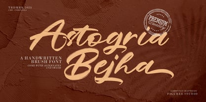 Introducing Astogria Bejha! Astogria Bejha is modern hand-drawn brush font that combines attractive curves with a fresh urban edge; delivering a stylish brush font that is guaranteed to add an eye-catching appeal to your logo designs, brand imagery, handwritten quotes, product packaging, merchandise, social media post, or website font. Features: Uppercase and Lowercase Number and Punctuation Ligature Stylistic Alternate Swash Versatile for branding, headline, or printing product Detailed dry brush markers I hope you enjoy this font. If you have questions, don't hesitate to give me a message Thank You!
 - Ontario Script by Factory738,
$15.00 Call me Ontario - A fashionable handwritten font with a personal touch. Ontario script is ideal for a variety of projects such as branding, logo design, wedding designs, social media posts, advertisements, product packaging, product designs, label, photography, watermark, invitation, stationery, and any other project that requires a handwritten touch. Ontario Script (Regular, Caps, and Tails) Basic Latin A-Z and a-z Numerals & Punctuation Stylistic Alternates Multilingual Support for ä ö ü Ä Ö Ü … Free updates and feature additions Thanks for looking, and I hope you enjoy it.
 - My Hero Father by Putracetol,
$18.00 My Hero Father is a quirky playful font with father's day theme. This font has 7 variations of fonts, each variation has a different decoration. The decorations are items that a father often wears, such as: cigarettes, glasses, hats, mustaches, ribbons and crowns. I made this font specifically for the Father's Day theme, but other than that this font can also be used for other projects. This font is suitable for logos, crafting, greeting cards, invitation cards, social media, products, stickers, headings, quotes and more. This font is also support multi language.
 - Phoen by Canden Meutuah,
$15.00 Phoen is a beautiful handwritten font. this font is so simple that i write very carefully. Even though it looks simple, this font still looks cool and stylish. This Fonts are perfect for: logos, branding, wedding invitations, business cards, greeting cards, posters, magazines, social media, proliferate fonts, planner prints and websites. Get creative with their unique fun, and use them to brighten up any craft project! Get this font now and boost your creativity with it! If you have any questions, before or after your purchase, don't hesitate to contact us. Thank You
 - Waxaw by Canden Meutuah,
$20.00 Waxaw is a beautiful handwritten font. this font is so simple that i write very carefully. Even though it looks simple, this font still looks cool and stylish. This Fonts are perfect for: logos, branding, wedding invitations, business cards, greeting cards, posters, magazines, social media, proliferate fonts, planner prints and websites. Get creative with their unique fun, and use them to brighten up any craft project! Get this font now and boost your creativity with it! If you have any questions, before or after your purchase, don't hesitate to contact us. Thank You
 - Satnight Script by Picatype,
$17.00 Introducing Satnight, a classy and contemporary modern script font. This versatile script typeface includes many different alternatives for each lowercase letter. It's fun to use because every word can be changed according to your wishes. Satnight offers beautiful typographic harmony for a variety of design projects, including logos & branding, wedding designs, social media posts, advertising & product design. That's it! I hope you enjoy this type!! Let me know what do you think!!! Feel free if you have a question, please contact me : picatypestudio@gmail.com Thank you and keep creative!
 - Aprilla Grotesk by Zamjump,
$17.00 Aprilla Grotesk is a modern serif font packed with alternatives and binders, helping you create logos, quotes, posts, social media posts, branding projects, magazine covers, book writing, and more. · Works on PC & Mac · Multilingual support · Ligature · Alternate Fully accessible without additional design software Accessible in Adobe Illustrator, Adobe Photoshop, and Microsoft Word. I really hope that you will have fun using the Aprilla Grotesk font and that it will make a perfect addition to your font collection! Contact me with an inbox message if you have any questions. Thank You!
 - Open Heart by Aminmario Studio,
$20.00 Open Heart is a modern and beautiful script font. Comes with regular and italic, also support multilingual. This font is great for your creative projects such as watermark on photography, and perfect for logos & branding, photography, invitation, watermark, advertisements, product designs, stationery, wedding designs,label, product packaging, social media, movie titles, books titles, a short text even a long text letter and good for your secondary text font with sans or serif. And also for special events or anything that need handwritting taste. Thanks for checking out this font. I hope you enjoy it!