10,000 search results
(0.042 seconds)
- Lumina by Scholtz Fonts,
$21.00Lumina combines a fluid, informal look with an upright, fairly formal character structure. The font is reminiscent of leaded or stained glass, suggesting a trying to-be-solid outline with flowing inner spaces. Characters are softened by the use of staggered heights and slightly irregular widths, creating the impression of hand-crafted, ink-drawn shapes. Lumina is unusual in that it gives a medieval treatment to a modern character outline. The outline has been given an irregular, slightly hand-crafted look that is at variance with its modern character and hints at both the informality of a grunge font and the carefully hand-drawn quality of medieval illuminated scripts (hence its name). It is one of the few informal, compressed fonts that retains a high degree of legibility. Use it when you want your text to be both relaxed and readable, and yet take up very little space on the page. Lumina Regular is not an outline font in the usual sense, since it contains one or more rounded hollows or lacunae within its outline. Use Lumina for: —Ecclesiastical book headings and illustrations —Church posters —Book covers —Greeting card design —Advertisements —The "fine print" The font contains a full 256 character set (upper and lower case, punctuation, diacritical characters, special symbols and numerals), in which all characters have been fully kerned and letter-spaced. - Double Porter by Fenotype,
$30.00 Double Porter - an elegant font collection. Double Porter includes following: • 6 fonts - a clean and textured version of each. • Ornaments • Catchwords • Ending swash ornaments for the script Double Porter is a clean cut script font with five strong sans fonts. All the fonts are designed to work nice together. Here’s a short introduction to the fonts: • Double Porter 1 -Clean connected script with Swash Alternates for caps and lowercase letters with ascender or descender. The Script also has Contextual Alternates that add variation & make the flow smooth. Contextual Alternates are automatically on. • Double Porter 2 -Wide Sans Serif font. • Double Porter 3 -Bold version of Double Porter 2 • Double Porter 4 -Semi condensed Sans Serif • Double Porter 5 -Condensed Bold Sans Serif • Double Porter 6 -Serif version of Double Porter 5 • Double Porter 7 -Set of 60 icons and ornaments • Double Porter 8 -Set of 68 Catchwords • Double Porter 9 -Set of 62 Ending Swashes and Strokes designed to go with Double Porter 1 - the script. In addition there is a “Printed” version of every Double Porter font. Printed versions are named Double Porter P x. Printed versions are exactly the same but the shapes have rugged outlines and a worn-out texture. Double Porter has wide language support including West European, Central European, Baltic, Turkish and Romanian character sets.
 - Qualion by ROHH,
$39.00 Qualion™ is a modern geometric grotesk typeface with humanist and calligraphic inspirations. The base of design is a minimal geometric sans serif with subtle humanist touches. Letter shapes are crafted with the highest care for beautiful proportions and excellent legibility. Qualion™ is a sibling of Qualion Round™ & Qualion Text™ - type family adjusted to fit paragraph text and small sizes best (narrower width, greater contrast, larger ink traps and tapering, adjusted spacing and kerning & even more calligraphic, elegant true italics). This versatile sans serif is not only well suited to clean, minimal projects and text paragraphs, but it has lots of features making it perfect for branding, logo design and all kinds of display use. All fonts are packed with alternates, swashes, terminal forms and ligatures, which make Qualion™ a very original ornamental type great for posters and packaging design. Qualion™ family consists of 10 weights with corresponding oblique and true italic styles, that give total of 30 styles. Both Oblique and Italic styles were hand drawn to get sharp and fine letter shapes. It has extended language support, as well as broad number of OpenType features, such as small caps, case sensitive forms, standard and discretionary ligatures, swashes, terminal forms, stylistic sets, contextual alternates, lining, oldstyle, tabular and small cap figures, slashed zero, fractions, superscript and subscript, ordinals, currencies and symbols.
 - Schism One by Alias,
$55.00 Schism is a modulated sans-serif, originally developed from our Alias Didot typeface, as a serif-less version of the same design. It was expanded to three sub-families, with the thin stroke getting progressively heavier from Schism One to Schism Three. The different versions explore how this change in contrast between thick and thin strokes changes the character of the letterforms. The shape is maintained, but the emphasis shifts from rounded to angular, elegant to incised. Schism One has high contrast, and the same weight of thin stroke from Light to Black. Letter endings are at horizontal or vertical, giving a pinched, constricted shape for characters such as a, c, e and s. The h, m, n and u have a sharp connection between curve and vertical, and are high shouldered, giving a slightly square shape. The r and y have a thick stress at their horizontal endings, which makes them impactful and striking at bolder weights. Though derived from an elegant, classic form, Schism feels austere rather than flowery. It doesn’t have the flourishes of other modulated sans typefaces, its aesthetic more a kind of graphic-tinged utility. While in Schism Two and Three the thin stroke gets progressively heavier, the connections between vertical and curves — in a, b, n etc — remain cut to an incised point throughout. The effect is that Schism looks chiselled and textural across all weights. Forms maintain a clear, defined shape even in Bold and Black, and don’t have the bloated, wide and heavy appearance heavy weights can have. The change in the thickness of the thin stroke in different versions of the same weight of a typeface is called grading. This is often used when the types are to used in problematic print surfaces such as newsprint, or at small sizes — where thin strokes might bleed, and counters fill in and lose clarity, or detail might be lost or be too thin to register. The different gradings are incremental and can be quite subtle. In Schism it is extreme, and used as a design device, giving three connected but separate styles, from Sans-Didot to almost-Grotesk. The name Schism suggests the differences in shape and style in Schism One, Two and Three. Three styles with distinct differences, from the same start point.
 - Schism Three by Alias,
$55.00 Schism is a modulated sans-serif, originally developed from our Alias Didot typeface, as a serif-less version of the same design. It was expanded to three sub-families, with the thin stroke getting progressively heavier from Schism One to Schism Three. The different versions explore how this change in contrast between thick and thin strokes changes the character of the letterforms. The shape is maintained, but the emphasis shifts from rounded to angular, elegant to incised. Schism One has high contrast, and the same weight of thin stroke from Light to Black. Letter endings are at horizontal or vertical, giving a pinched, constricted shape for characters such as a, c, e and s. The h, m, n and u have a sharp connection between curve and vertical, and are high shouldered, giving a slightly square shape. The r and y have a thick stress at their horizontal endings, which makes them impactful and striking at bolder weights. Though derived from an elegant, classic form, Schism feels austere rather than flowery. It doesn’t have the flourishes of other modulated sans typefaces, its aesthetic more a kind of graphic-tinged utility. While in Schism Two and Three the thin stroke gets progressively heavier, the connections between vertical and curves — in a, b, n etc — remain cut to an incised point throughout. The effect is that Schism looks chiselled and textural across all weights. Forms maintain a clear, defined shape even in Bold and Black, and don’t have the bloated, wide and heavy appearance heavy weights can have. The change in the thickness of the thin stroke in different versions of the same weight of a typeface is called grading. This is often used when the types are to used in problematic print surfaces such as newsprint, or at small sizes — where thin strokes might bleed, and counters fill in and lose clarity, or detail might be lost or be too thin to register. The different gradings are incremental and can be quite subtle. In Schism it is extreme, and used as a design device, giving three connected but separate styles, from Sans-Didot to almost-Grotesk. The name Schism suggests the differences in shape and style in Schism One, Two and Three. Three styles with distinct differences, from the same start point.
 - Schism Two by Alias,
$55.00 Schism is a modulated sans-serif, originally developed from our Alias Didot typeface, as a serif-less version of the same design. It was expanded to three sub-families, with the thin stroke getting progressively heavier from Schism One to Schism Three. The different versions explore how this change in contrast between thick and thin strokes changes the character of the letterforms. The shape is maintained, but the emphasis shifts from rounded to angular, elegant to incised. Schism One has high contrast, and the same weight of thin stroke from Light to Black. Letter endings are at horizontal or vertical, giving a pinched, constricted shape for characters such as a, c, e and s. The h, m, n and u have a sharp connection between curve and vertical, and are high shouldered, giving a slightly square shape. The r and y have a thick stress at their horizontal endings, which makes them impactful and striking at bolder weights. Though derived from an elegant, classic form, Schism feels austere rather than flowery. It doesn’t have the flourishes of other modulated sans typefaces, its aesthetic more a kind of graphic-tinged utility. While in Schism Two and Three the thin stroke gets progressively heavier, the connections between vertical and curves — in a, b, n etc — remain cut to an incised point throughout. The effect is that Schism looks chiselled and textural across all weights. Forms maintain a clear, defined shape even in Bold and Black, and don’t have the bloated, wide and heavy appearance heavy weights can have. The change in the thickness of the thin stroke in different versions of the same weight of a typeface is called grading. This is often used when the types are to used in problematic print surfaces such as newsprint, or at small sizes — where thin strokes might bleed, and counters fill in and lose clarity, or detail might be lost or be too thin to register. The different gradings are incremental and can be quite subtle. In Schism it is extreme, and used as a design device, giving three connected but separate styles, from Sans-Didot to almost-Grotesk. The name Schism suggests the differences in shape and style in Schism One, Two and Three. Three styles with distinct differences, from the same start point.
 - Rezak by TypeTogether,
$36.00 Nothing is hidden in the simplistic forms and overt aesthetic of Anya Danilova’s Rezak font family. Rezak is not a type family directly from the digital world, but was inspired by the stout presence of cutting letters out of tangible material: paper, stone, and wood. With only a few cuts, the shapes remain dark and simple. With more cuts, the shapes become lighter and more defined, resulting in a dynamic type family not stuck within one specific category. The Black and medium weights began as one approach before separating into display and text categories. The four text weights were created through pendulum swings in design direction that experimented with contrast, angles, tangent redirections, and the amount of anomalies allowed. The text weights are vocal when set larger than ten points and subtle at smaller sizes. The tech-heavy Incised display style came last, employing a surprising range of trigonometric functions to make it behave exactly as desired. Its look can result in something distinctive and emotional or completely over-the-top. Most normal typefaces change only in thickness; Rezak changes in intention, highlighting the relationship between dark and light, presence and absence, what’s removed and what remains. Rezak’s Black and Incised display styles are like a shaft of light in reverse and are perfect in situations of impact: websites, headlines and large text, gaming, call-outs, posters, and packaging. The tone works for something from youthful or craft-oriented to organic and natural products. Try these two in logotypes, complex print layering, branding, and words-as-pattern for greater experimentation. The text styles are bold, energetic, well informed, and round out the family with four weights (Regular, Semibold, Bold, Extrabold) and matching italics for a family grand total of ten. These jaunty styles work well in children’s books, call-outs, movie titles, and subheads for myriad subjects such as architecture, coffee, nature, cooking, and other rough-and-tumble purposes. Rezak’s crunchy letters are meant to expose rough, daring, or dramatic text. A further benefit is that this family is not sequestered within one specific genre or script, so it can be easily interpreted for other scripts, such as its current Latin and extended Cyrillic which supports such neglected languages as Abkhaz, Itelmen, and Koryak. Rezak’s push toward creativity and innovation, with an eye on typography’s rich history, reinforces our foundry’s mission to publish invigorating forms at the highest function and widest applicability.
 - Winslow Title by Kimmy Design,
$25.00 Winslow Title is a high contrast modern type family comes in two styles and a monolinear script family. The traditional proportions of Winslow Title are historical in nature and follow the design and style of Winslow Book as a high contrast variant. The Winslow Title Mod family is a contemporary take on the style, with tapering terminals and less pronounced finials. Each family includes both styles, to be accessed through the opentype panel as a stylistic alternate. If preferable, you can purchase the entire family collection to have easier access to both styles, but it's not necessary. The typeface family comprises of roman and italic styles in six weights from Thin to Black and two widths in the roman style: Regular and Narrow. The accompanying script family has a single weight but offers five tracking widths, from Narrow to Wide. The bundle is an elegant combination of styles perfect for titling and display design. The serif typeface is packed with features that make ideal titling styles. Not only do they include the Stylistic Alternates, but also Titling Alternates, Discretionary Ligatures, Small Capitals, Swashes and Contextual Ligatures. As noted previously, the typeface comes in two styles, Traditional and Modern. Each can be accessed either by the Stylistic Alternates or Stylistic Sets. Titling Alternates are alternates that expand the ball terminals to K, R, V, W, and Y (see Titling Alternates slide). Contextual Ligatures are for capital combinations with A that tighten the gap created by the extended serifs. It connects characters with a pairing serif (the lower right serif of the M with the lower right serif of the A) and bridges them together. This combination works for single and multiple A combinations. It is turned on automatically in the Opentype panel and shouldn’t need to be accessed individually. Alternatively, the Discretionary Ligatures feature combines diagonal or baseline stems with lifted small capitals, creating a unique combination of characters. Swashes is an extensive feature that offers up to five swash options per many of each character. These can be selected via the Glyphs panel or as character alternates in Adobe programs. The Script family has a feature set of it’s own, with initial and final swashes on lowercase letters, middle swashes for select characters, and a titling feature that joins words together by replacing the space with a line. Stylistic alternates create a bouncing baseline on connecting strokes. *Note: there is no great need to purchase both families as all styles can be accessed via Opentype features, but if customers prefer to purchase both styles, it can be done by selecting the Complete Typeface Family collection.
 - KR Passover Dings, created by Kat Rakos, is a unique and thematic font that transcends the traditional boundaries of typography, providing users with an assortment of symbols and imagery deeply roote...
- Ammer Handwriting by Schriftlabor,
$18.99 Austrian Cartoonist Wolfgang Ammer lent his handwriting to this font, which was produced by Miriam Surányi. Wolfgang already uses the font in his daily routine: It facilitates corrections and translations of his cartoons for international newspapers. Rich in contextual alternates, Ammer contains about 1800 glyphs. Each character has multiple alternates. And a complex OpenType substitution feature makes sure that the same variant does not appear twice in a line. As a special gimmick, the font contains a Tic Tac Toe game: To activate it, type a # and turn on stylistic set 20. Then use digits 1–9 for setting the naughts and crosses on their places. The enclosed TT variant has a reduced glyph set and therefore a smaller file size, hence it is better suited for use on the web.
 - Huge by Omotu,
$16.00 Huge is a handwritten font with a personal charm. Huge is perfect for branding projects, homeware designs, flyers, posters, product packaging - or simply as a stylish text overlay to any background image. Whats Include? 1. Uppercase and lowercase characters 2. Supports international languages 3. Numerals & punctuations, stylistic alternates, and ligatures 4. Accessible in the Adobe Illustrator Glyphs panel, or under Stylistic Alternates in the Adobe Photoshop OpenType menu, Adobe InDesign, Corel Draw, even work on Microsoft Word. 5. TTF and OTF files 6. Bonus 59 vectors (swashes, catchphrases, and doodles) Fonts include multilingual support. Please message me if you're unsure of any language support. Thanks for looking, and I hope you enjoy it! Please don't hesitate to drop me a message if you have any issues or queries. Omotu Studio ibnu.blawong2@gmail.com
 - One Night Stand by T4 Foundry,
$21.00Torbjörn Olsson's experimental type One Night Stand deserves a longer relation. Use it for drop caps or quotes, to add drama in dull surroundings and to spice up bland editorial content. One Night stand is also the perfect way to seduce readers of advertisments, as well as delivering contrast in headlines. Do you want to show the world in stark black and white? The One Night Stand is for you! One Night Stand is an OpenType typeface for both PC and Mac. Swedish type foundry T4 releases new fonts every month. One Night Stand is our twelfth introduction. Note: The underlying sans-serif font for One Night Stand is Esans Bold, also designed by Torbjörn Olsson. Esans is a fine sans, excellent for headline use, inspired by Granby, Tempo, Gill and others. - Pinfong Typeface by Alcode,
$23.00 Pinfong Typeface is a Decorative display font with ligatures also complete multilingual glyphs. Pinfong come with Regular style, it will make this typeface can be used in all design projects and works perfectly for pairing with script typeface or handmade fonts, Headlines, Posters, Packaging, T-shirts, Postcards, Invitation, Wedding Sign, Sign Painting, Signboard, and much more. Try Pinfong, enjoy the richness of OpenType features and let her fun and elegant excitement make you happy and enhance your creativity! You can use this font very easily. •Multilingual Support And Special Ligatures Your download will include OTF format files. If you do not have programs that support OpenType features like Adobe Illustrator and CorelDraw X Versions, you can access all alternative flying machines using Font Book (Mac) or Character Map (Windows)
 - Plinc Italiano by House Industries,
$33.00 Dave West’s Italiano is a smooth and sensuous typographic dish with a few extra savory dashes. The silky semi-serif combines ingredients from eighteenth-century engraved italics and nineteenth-century Italian Modern, softened by fine stroke endings and plump dolloped terminals. Preserve Italiano’s subtle flavors by maximizing its size in headlines, advertising captions, and identity campaigns, or capitalize on its swash characters to sweeten package and poster designs. However you use it, Plinc Italiano is a tasty typographic treat—non ci piove! Drawn in the late 1960s for Photo-Lettering, Inc., Italiano was digitized by Steve Ross with Ken Barber in 2015. Like all good subversives, House Industries hides in plain sight while amplifying the look, feel and style of the world’s most interesting brands, products and people. Based in Delaware, visually influencing the world.
 - WBP Emperio by Studio Jasper Nijssen,
$20.00 A classic serif font with a twist. WBP Emperio has an interesting shape. She has rounded corners and a slightly 'curvy' look. The little indent makes her stand out above the rest. A sensation in the making. Emperio has two styles. The Regular: Great for designing friendly corporate identities. And there's the Hand Drawn style: Great for design posters of prints with a handmade feel. Combine the two and you can go infinite. WBP Emperio was a sketch I designed when I started my company. So you can say it's been five years in the making XD. When I was invited to add two pages to the Typodarium 2022, I speeded up the process and added the hand-drawn style. The end result is awesome. A classic serif font, with a crazy extra style.
 - Bushcraft by Cultivated Mind,
$35.00 Bushcraft is a fun geometric monoline script and sans serif font. This family includes five weights, a sans serif font and art. Bushcraft Basic and Pro scripts are simplistic with a geometric look. Bushcraft Basic scripts comes with one set of 63 alternates and ligatures. Bushcraft Pro scripts includes 278 alternates and ligatures. Both versions supports extended Latin Pro and OpenType. Bushcraft Sans is an all caps, vintage inspired font that pairs nicely with the scripts and artwork. Bushcraft is well-suited for type art, murals, product design, books, film, television, branding, magazines, signage and other creative projects. To use the OpenType ligatures/alternates you will need to use any program that supports OpenType features such as Adobe Illustrator CS and Adobe InDesign. Fonts designed by Cindy Kinash.
 - Meloso by Rachel Kick,
$14.00 Meloso is an easygoing typeface. It has a playful and organic feel that has its own hand-drawn charm while still being incredibly legible due to its simple shapes and high x-height. It has the unique ability to stand alone as a title text or work in small paragraph form. It's the perfect way to bring the friendly feel of an "imperfect" and slightly rounded font into your next project. Meloso is a variable font with 6 set weights. If you're using a program that supports variable fonts, you'll be able to choose any point between the "Extra Thin" and "Extra Bold" weights to get the perfect thickness and adjust the italic to the angle you need. You can also use the standard OTF files to have the 6 set weights.
 - Aisyah by Malindo Creative,
$10.00 Aisyah is a modern hand-based typography, This font is made up of irregularly flowing letters, both between top-down and with subsequent letters,which makes it suitable for Logotype, posters, businness cards, merchandise, wedding invitations, greeting cards, banners blogs, clothing, water-based paint designs / prints, correspondence, quotes and more!. Aisyah has given PUA encoded (fonts with special code). This Font Equipped: -Uppercase -Lowercase -Figures & Punctuation -Stylistic Alternatives -Ligatures -Language Support To enable the OpenType Stylistic alternates, you need a program that supports OpenType features such as, Adobe Indesign,Adobe Illustrator CS & CorelDraw X6-X7, Microsoft Word 2010 or later versions. Files include: Aisyah otf. -If you have any questions, please contact me at. malindocreative@gmail.com. -Thanks for support -Feel free to contact me if you have any questions, I am happy to help you
 - Dofta by Alcode,
$23.00 Dofta is a serif Decorative typeface with ligatures also complete multilingual glyphs. Dofta come with Regular style, it will make this typeface can be used in all design projects and works perfectly for pairing with script typeface or handmade fonts, Headlines, Posters, Packaging, T-shirts, Postcards, Invitation, Wedding Sign, Sign Painting, Signboard, and much more. Try Dofta, enjoy the richness of OpenType features and let her fun and elegant excitement make you happy and enhance your creativity! You can use this font very easily. •Multilingual Support And Special Ligatures Your download will include OTF format files. If you do not have programs that support OpenType features like Adobe Illustrator and CorelDraw X Versions, you can access all alternative flying machines using Font Book (Mac) or Character Map (Windows)
 - Majorelle by S&C Type,
$14.00 Majorelle is a textured script font designed by Fanny Coulez and Julien Saurin in Paris. This finely balanced font was designed to be easy to read, and because it’s just as important, easy to use. Majorelle includes alternates and OpenType ligatures that you can use to improve your designs and make them look natural and friendly. With a lot of extras like swashes, keywords, or splatters, this organic script could be used for any project that needs a warm and informal touch. We hope you will enjoy our work :) You could follow us on our Instagram: instagram.com/sc.type Merci beaucoup! Note: You could perfectly combine Majorelle with other S&C Type’s fonts, such as Naïve or The Hand for example. Just click on our foundry name to check them out!
 - La Rosaleda by Mevstory Studio,
$15.00 La Rosaleda Font Duo is a ligature font pair with 30 amazing chic logo templates. With this open type font duo you can explore your creativity in unlimited way. To recreate your brand all you need is mix and match from the La Rosa font duo. This font duo is full of stylish ligatures, so that your writing with La Rosaleda can stand out. - Font Features: All fonts are OpenType fonts All fonts are fully vector designed Accurate kerning for all serif family Amazing ligatures to look natural in script font Alternative characters for script lowercase alphabets Multilingual Support for Both Scrip and Serif All OpenType fonts, Serif and Script. 30 Fully editable logos for Adobe Photoshop or Adobe Illustrator Font installing help file for PC and Mac Web-fonts for Script and Serif
 - Alchemist by Carmel Type Co.,
$39.00 Inspirited as much by nature and the elements as it was by the decorative and ornate alphabets of early sign-painting and lettering books, Alchemist aspires to become the next surefire, go-to staple in the display type community. This semi-condensed, high contrast, and stylish take on classic Roman forms is certain to stand out in your arsenal.Alchemist lends itself adeptly to signage, headlines, cinematic and gaming titles, packaging design and much more. This protean display face can shift and adapt to your every need with over 100 alternate characters and more than 40 ligatures. Explore this massive 500+ character font today and see what you can create with it. 100+ Stylistic Alternates Standard & Discretionary Ligatures Uppercase & Lowercase Numerals & Punctuation 500+ glyphs Supports 75+ Latin based languages OTF file Design by Jason Carne
 - Maphylla by Groen Studio,
$15.00 Maplylla is a script font, beautiful and unique. It is a model of modern calligraphy typefaces, in combination with a calligraphy writing style. In total, there are 378 glyphs. Features include: Contextual Alternates Standart ligatures Discretionary ligatures Stylistic Alternates Stylistic sets initial form File included: Maplylla OTF Languages supported: Breton, Catalan, Czech, Danish, Estonian,French, German, Hungarian, Icelandic, Italian, Romanian, Scottish Gaelic, Slovak, Latvian, Lithuanian, Norwegian, English, Finnish, Polish, Portuguese, Slovenian, Spanish, Swedish, Turkish, Welsh. Basically, all european languages that are based on latin alphabet Can be used for various purposes.such as headings, logos, wedding invitations, t-shirts, letterhead, signage, labels, news, posters, badges etc. To enable the OpenType Stylistic alternates, you need a program that supports OpenType features such as Adobe Illustrator CS, Adobe Indesign & CorelDraw X6-X7.
 - Angila by Scoothtype,
$10.00 Angila is a fresh, handmade typeface, made with brush and ink. a contemporary approach to natural hand-painted design as well as subtle script combinations. Works perfectly for logos, magazines, menus, books, invitations, wedding / greeting cards, packaging, labels, t-shirts, Like Novel Titles, Apparel, Invitations, Quotes, Book Titles, Stationery Designs, Branding, Logos, Greeting Cards, T-shirts, Packaging Design, Posters and more. Angila includes a complete set of upper and lower case letters, as well as support for multiple languages, numbers, punctuation, ligatures, and alternative characters. Files include: * Angila .TTF How to access all alternate characters, using Windows Character Map with Photoshop: https://www.youtube.com/watch?v=Go9vacoYmBw How to access all the alternate characters using Adobe Illustrator: https://www.youtube.com/watch?v=XzwjMkbB-wQ If you need help or advice, please contact me via email.
 - Magthina Blessing by Bungletter,
$16.00 Introducing our new beautiful calligraphy font, Magthina Blessing! A beautiful script for those who want to perfect their designs with elegance and style. Magthina Blessing includes a full set of upper and lower case letters, common letters, numbers, punctuation, ligatures and multilingual. There are two different strokes for each lowercase letter so you can easily give your designs a natural, yet sophisticated, hand calligraphy look. Magthina Blessing is interesting because the typeface is pleasing to the eye, clean, feminine, sensual, glamorous, simple and very easy to read, due to the many luxurious letter relationships. You will get: (according to what is shown in my presentation or product cover) File Magthina Blessing If you need help or have any questions, let me know. I'm happy to help. Thanks & Happy Designing!
 - Nokrios by Twinletter,
$17.00 Nokrios is a font specifically inspired by the sport of racing. adopts the speed and power it tries to fully reflect to make a bold statement that stands out. We designed it to be a heavy-duty, functional add-on option for big, bold titles or small add-on types. This font features two different font options and two italic options. This font is perfect for adding punch to your projects without losing readability or impact at small sizes. What’s Included : - File font - All glyphs Iso Latin 1 - Alternate, Ligature - Simple installations - We highly recommend using a program that supports OpenType features and Glyphs panels like many Adobe apps and Corel Draw, so you can see and access all Glyph variations. - PUA Encoded Characters – Fully accessible without additional design software. - Fonts include Multilingual support
 - KillJoy by Comicraft,
$19.00 S P O I L E R A L E R T ! We don't want to be a drag, a wet blanket or a spoilsport, but we're here to tell you that everything before “but” is bulls*it! Yep, if you're a merrymaker, a carouser, a jester, a reveler or a live wire, we're here to poop your party with our latest knicker-twister, KILLJOY! Call us cynics, call us crabs, grouches, grumpy old men, sourpusses or bores, but we're the kind of Killjoys who just have to make some noise... sound effects (sic) everybody, so listen up even if you can't handle the truth... and here’s OUR truth; Keep Calm and be a Fabulous Killjoy! Yes, it’s easy to be mean -- but why should anybody else have all the fun? Or all the fonts?
 - Daisy Rider by Blythe Green,
$13.00 Daisy Rider is a handcrafted, mixed-case, semi-script font with an authentic feel and lots of extras! It's perfect for: logos, branding, wedding invitations, business cards, greeting cards, posters, magazines, social media, planners, prints, and more. NOTE: Since this is a semi-script font, I programed Daisy Rider with many alternate characters and ligatures that ensure the characters work seamlessly together (unlike what you're seeing with the sample text on My Fonts). See the sample images for reference. Once you download the file, you can access these features through any Open Type program such as Adobe Creative Suite, Microsoft Word, etc. FEATURES: 60 ligatures to help make your type look as handwritten as possible Alternate characters to give a unique touch to each word Multilingual accents + characters
 - TessieStandingBirds by Ingrimayne Type,
$13.95 A tessellation is a shape that can be used to completely fill the plane—simple examples are isosceles triangles, squares, and hexagons. Tessellation patterns are eye-catching and visually appealing, which is the reason that they have long been popular in a variety of decorative situations. These Tessie fonts have two family members, a solid style that must have different colors when used and an outline style. They can be used separately or they can be used in layers with the outline style on top of the solid style. For rows to align properly, leading must be the same as point size. Shapes that tessellate and also resemble real-world objects are often called Escher-like tessellations. This typeface contains Escher-like tessellations of birds. A number of years ago I decided to see how many of the 28 Heesch types of tessellations I could use to make birds standing on the backs of other birds. I found standing bird patterns for all 17 of the types that had either translated or glided edges. The TessieStandingBirds typefaces contain the standing-bird shapes that I discovered. At first glance they seem to be quite similar, but small differences matter in how they fit together. Most of the patterns require more than one character. The sample file here shows how pieces fit together to give tessellating patterns. (Earlier tessellation fonts from IngrimayneType, the TessieDingies fonts, lack a black or filled version so cannot do colored patterns.)
 - Capsbats by Typephases,
$25.00 Everything your head should not be or would rather not do is here. A complete collection of 225 illustrations (plus bonus shadows) in three fonts. The illustrations collected in the Capsbats keep the free-flowing lines of the ink-on-paper sketches. As a dingbat, or pictorial typeface, the Capsbats are very versatile: you can use them immediately in any application. The vectorial format of the font file means they are scalable with no loss of quality. And you can customize them in no time in your favourite graphics program. They can be used out of the box, as accents or spot illustration, or enlarged, combined, coloured, textured... to achieve an infinite variety of results easily. With Capsbats you have an incredible resource for your concept illustration needs: enlarge them and you can create a high impact page layout, posters, magazine covers and book jackets, advertising... The Capsbats Shadows are bonus silhouettes that you can use in very different situations. Use these shadows to fill them with your own patterns, or use them as a mask or clipping path, to paste the images you want inside them. The possibilities are endless. We didn't limit our imagination in drawing them, so why would you when using them? The book 1000 Heads is a compendium of the drawings featured in the Capsbats and Entestats and it gives a glimpse of the limitless applications of this collection.
 - Schnorr by HiH,
$10.00 Schnorr is a family of three fonts drawn by a German designer, Peter Schnorr. Schnorr Dekorativ is one of the less frequently seen of the alphabets he designed and one of the few for which he designed as lower case. Like many of the alphabets of the period, Schnorr Dekorativ is a delicate design. To provide a little more presence, we have added a DEMIBOLD version. Included in both Schnorr Dekorativ and Schnorr Demibold are an ornament of Schnorr’s design, seven T-ligatures and an alternate lower case t. 123=Ta, 125=Te, 135=Th, 137=Ornament, 167=Ti, 172=To, 188=Tr, 190=Tu and 177=alternate t. Schnorr’s design for the lower case t is unusual and not readily recognized. The alternate may be used to improve readability. Schnorr Initialen was designed as an upper case only design and as such is quite popular. It is often seen under the name of Odessa. Our font is a fresh scan and is paired with our Schnorr Demibold to provide a compatible lower case, along with all the rest of the auxiliary characters. Schnorr Initialen includes all the extras supplied with Schnorr Dekorativ and Schnorr Demibold: 123=Ta, 125=Te, 135=Th, 137=Ornament, 167=Ti, 172=To, 188=Tr, 190=Tu and 177=alternate t. In addition, Schnorr Initialen also includes an alternate uppercase I (172) and five lotus ornaments (123, 125, 167, 188 and 190).
 - Routerline Rough by Viaction Type.Co,
$16.00 Routerline Rough is a script monoline with 4 styles, nice applied in various products. Complete with multilingual characters, ligature and alternate. It is suitable for quote, clothing design, vintage logo, label, poster, packaging design and other designs. File Include (All Styles) : Routerline Rough.otf Routerline Rough.ttf Routerline Rough Slant.otf Routerline Rough Slant.ttf Routerline Rough Bold.otf Routerline Rough Bold.ttf Routerline Rough Bold Slant.otf Routerline Rough Bold Slant.ttf Features (PUA Encoded) : UPPERCASE. LOWERCASE. MULTILINGUAL. PUNCTUATION & SYMBOL. STYLISTIC SET. LIGATURE. I hope you enjoy and thank you.
 - Realtime Text by Juri Zaech,
$30.00 Realtime Text is the proportional alternative to the monospaced Realtime type family. Nevertheless Realtime Text includes a monospaced design already built into the font. It is employable through OpenType by activating alternate characters. Realtime Text is a technical yet friendly design with details that serve function and visual impact alike and lends itself to tabular designs, sturdy columns and tidy layouts. It comes in five weights, from light to black, and with a character set that covers over 200 latin languages.
 - Meranie by Garisman Studio,
$20.00 Meranie is made a naturally modern script with the ending swashes and more than ligatures. With the unique Opentype in it and the ligature will add aesthetic value to your design product. Available in this file are Meranie Swash which you can unite into an amazing design. - Simple installation - Ligatures & OpenType included - Swashes - Work for Windows or MAC - PUA Encoded Open - Versatile for poster, logotype, labels, book cover - Supported for: Adobe Illustrator, Photoshop, Shillouette, Corel Draw, Indesign, and Procreate (updated)Signature
 - The Archies Typeface by IKIIKOWRK,
$17.00 Proudly present The Archies Typeface, created by ikiiko. A summer mood typeface that has a vintage style & holiday vibes. This typeface is perfect for an holiday greeting, summer camp poster, vacation title, beach & tropical design, and so much more. What's Included? Uppercase & Lowercase Number & Punctuation Ligature Multilingual support Format File : TTF & OTF Works on PC & Mac Get also a good offer & FREEBIE at our site : www.ikiiko.com Enjoy our font and if you have any questions, you can contact us by email : ikiikowrk@gmail.com
 - Fatz by Good Java Studio,
$20.00 Fatz is the perfect font for all your fun designs. The main font file is equipped with ordinary characters. Everything is made with the bold and smooth brush, and everything is the same size as Hello Balls, so you can be sure they will work well together! It is suitable for you to use in making t-shirt design, quote, label, packaging, logo type, or long writing. Because we have compiled kerning and matrices that are tailored to your needs.
 - Casler by Letrasupply Typefoundry,
$20.00 Casler Font is a display font designed for any creative project that needs to be stand out. While get inspired by some vintage aphotecary labels, Casler Font wrapped as firm yet unique font display that consists over 1000 glyphs and 26 icon as extras. A terrific combo that gives experimentally mood in classic and modern style. Casler Font is a best thought for any advertisements usage, logos, headlines or headings, book covers and many more. A must have display font collection!
 - Hello Hiltown by Good Java Studio,
$20.00 Introducing Hello Hiltown - Playfull Condensed Hello Hiltown is the perfect font for all your fun and minimalism designs. The main font file is equipped with ordinary characters. Everything is made with the funny brush. So you can be sure they will work well together! It is suitable for you to use in making t-shirt design, quote, label, packaging, logo type, or long writing. Because we have compiled kerning and matrices that are tailored to your needs. Caps Only Fonts.
 - Breathine by MJB Letters,
$19.00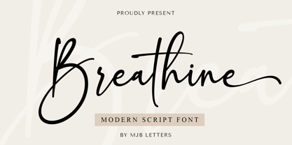 Breathine is a modern script font, with stylish looks that will add a chic elegance to design, perfect for websites, wedding stationery, modern logos, personal branding, social media quotes, and more. Files Included: Works on PC & Mac Simple installations Accessible in Adobe Illustrator, Adobe Photoshop, Adobe InDesign, and even work on Microsoft Word. PUA Encoded Characters – Fully accessible without additional design software. Thank you so much for checking out my shop, and please get in touch if you have any questions!
 - Ongunkan Byzantine Empires by Runic World Tamgacı,
$100.00 For this Byzantine Empire calligraphy font, I had to work for 2 weeks and 3-4 hours a day and search the internet. It made me very tired, but I finally finished it, and it was good. This font can use both latin keyboard and greek keyboard. I also added Greek unicode characters. I will adapt this font to the latin alphabet, I will make the full character set font, this will take less time. I wish you good work.