10,000 search results
(0.074 seconds)
- Camy by Scholtz Fonts,
$9.50 I wanted to create a "handwriting" font which could be used professionally. I have often needed such a font with a variety of weights and styles for a particular project and have had to resort to mixing fonts, creating a rather messy, amateur job. Camy is named for a little village in South West France where I did much of the initial work on this font. Camy is ideal for contemporary display work, comes in ten styles, and has a contemporary appeal with its casual, easy to read letters. Camy was designed as a total professional package for designers looking for a handwritten font suitable for all kinds of contemporary display work: the idea being that once you have the Camy Professional Pack you don't have to waste time searching for other handwritten fonts. The Family: LIGHT -- NARROW - light weight, condensed width, delicate line -- MEDIUM - light weight, delicate line -- WIDE - light weight, expanded width, delicate line NORMAL WEIGHT -- NARROW - of medium weight and condensed width - perfect for limited space -- MEDIUM - of medium weight -- WIDE - of medium weight and expanded width BLACK - for best readability -- NARROW - condensed width for bolder statements in small areas without losing legibility -- MEDIUM - for bolder statements -- WIDE - expanded width for bolder statements FAT -- WIDE - for maximum impact Use a combination of styles for product branding, book covers, invitations, greeting cards. The Camy combination works well for both headings and body text. Camy contains over 250 characters - (upper and lower case characters, punctuation, numerals, symbols and accented characters are present). It has all the accented characters used in the major European languages.
 - Spring Season JNL by Jeff Levine,
$29.00 Spring Season JNL is a decorated and stylized Art Deco slab serif design from1935 which is based on the hand lettered title on the sheet music for “Paris in the Spring”. The characters are cut through with both a straight line and a wavy, spoked line which looks something like a thorny vine. Spring Season JNL is available in both regular and oblique versions.
 - Commuters Sans by Dharma Type,
$19.99 Commuters Sans is a daily type. Classic but Modern. Very simple geometry and wide type with warm clearness. Useful for both body-text and titling by their minimal glyph shapes and slightly wide and eye-catching proportion. Consists of eight weights and their matching italics. Supporting almost all latin languages. All-caps text for one line or a few is as wonderful as normal mixed-case typesetting.
 - Hello Father by Sealoung,
$10.00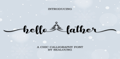 Hello Father feels equally charming and elegant. This stunning handwritten font is a stylish homage to classic calligraphy. It features a varying baseline, smooth lines, gorgeous glyphs and stunning alternates. It will elevate a wide range of design projects to the highest level, be it branding, headings, wedding designs, invitations, signatures, logos, labels, and much more!
 - Santomyse Eridupes by Sealoung,
$12.00 Santomyse Eridupes is a delicate, elegant and flowing handwritten font. It has beautiful and well balanced characters and as a result, it matches a wide pool of designs. The Glisten features a varying baseline, smooth lines, gorgeous glyphs and stunning alternates. Add it to your most creative ideas and notice how it makes them come alive!
 - Skorid by Totem,
$20.00 Skorid is a geometric condensed sans serif font family, constructed only out of straight lines. Coming in 7 weights, regular and italic, from thin to black, you have a wide array of possibilities of using Skorid for any purpose you need. Skorid speaks around 70 languages, including Cyrillic. Contains a lot of alternative letters to boost your creativity.
 - Baby Sandria by Straight.Co,
$10.00 Baby Sandria is a delicate, elegant and flowing handwritten font. It has beautiful and well balanced characters and as a result, it matches a wide pool of designs. Baby Sandria features a varying baseline, smooth lines, gorgeous glyphs and stunning alternates. Add it to your most creative ideas and notice how it makes them come alive!
 - HU Specialmovie by Heummdesign,
$15.00 HU Specialmovie is a retro, wide square typeface, characterized by streamlined, narrow stroke ends. The first consonants are designed to be large with full modules to improve readability. The grapheme 'O', which is the face of the font, is in the form of a square in harmony with straight lines and curves, expressing a solid and simple feeling overall.
 - LHF State Fair by Letterhead Fonts,
$39.00 Reminiscent of lettering used on old stock certificates from the late 1800’s. With its extra wide letters and ornate features, LHF State Fair commands attention. Get over 60 bonus panels and ornaments when you purchase the set (Regular, Lined & Light).
 - Naive Sans by S&C Type,
$8.00 Naïve Sans is a sans serif handwritten font designed by Fanny Coulez and Julien Saurin in Paris. Our goal was to draw a font with finely irregular lines that give a human and whimsical feeling. We drew five finely balanced weights to assure a good readability whatever the size, with contrasting upstrokes and downstrokes to add an unusual, fancy touch. We also designed five shaked versions with different lowercases and uppercases, to improve your designs and bring a more organic and playful feeling. Mixed or not, both styles can be used for various purposes, such as headings, logos, posters, wedding invitations... This font is part of our Naïve superfamily that contains lot of variations: Line, Inline, Serif, Sans Serif, and a special Art Deco one. Just click on our foundry name to see them all! We hope you will enjoy our work. Merci beaucoup!
 - Etelka by Storm Type Foundry,
$49.00 Etelka was designed for purposes of corporate identities, branding, product package design and outside lettering. It works anywhere an extremely legible typeface is needed. Package and label design often requires a wide choice of weights and widths: light and narrowed fonts to fit huge amount of mandatory informations onto a small box, or to squeeze text lines around a bottle, fat and wide styles to emphasize information on a poster or vehicle. The regular styles will serve well for business card, small texts and for your website. Etelka’s design idea is wide, open rounded square. Some details are extremely minimized: lower-case “a, n” or “u” lack their typical spur. The typeface has a distinctive industrial expression with all diagonals slightly softened, and her overall strict mono-linear principle is exceptionally broken only for fine optical adjustments in joints. Cyrillic and Greek scripts are present for international business, as well as rich latin diacritics. Etelka is actually very well suited for all kinds of visual communication, especially orientation systems in modern architecture. The first drawing of the font, which was later named “Etelka”, was submitted in 2004 for the Czech Television identity competition and was rejected by the jury. We later concluded that the design was worth extending to the current superfamily of 42 fonts. It is a reliable typeface for corporate identities and websites.
 - Newport Classic SG by Spiece Graphics,
$39.00 Willard T. Sniffin designed this extra condensed art deco typeface for American Type Founders in 1932. Low-waisted capital letters curve in stunning geometric fashion next to large, oversized lowercase letters. The heart of this classic design is undeniably 1930s but it also looks just fine in contemporary situations. Many of the original alternate characters plus a few new ones have been included in this complete digital version. Newport Classic with Alternates is also available as an OpenType font. This version now contains small caps, lining and oldstyle figures, prebuilt fractions, stylistic alternates, word ornaments and a wide assortment of f-ligatures. These advanced features currently work in Adobe Creative Suite InDesign and Illustrator. Check for OpenType advanced feature support in other applications as it gradually becomes available with upgrades.
 - Peppy Pegasus by Putracetol,
$22.00 Peppy Pegasus - Quirky Unicorn Theme Font is a charming typeface designed to transport you to the whimsical world of unicorns, pegasus, and rainbows. This font showcases playful, rounded, and soft letterforms that add an element of delight to your designs. It's versatile and can be used on its own or paired with any of its nine enchanting variations. With nine distinct variations inspired by pegasus, horses, horns, wings, rainbows, and magic, Peppy Pegasus is the perfect choice for children's themes, crafting projects, and imaginative designs. It brings a sense of fun, playfulness, and a vibrant, colorful aesthetic to your creations.
 - Bookbag by Letradora,
$15.00 Bookbag is a font for teaching kids to read and write. It comes in 4 weights, from light to extrabold, and has dotted and lined versions for students to practice. Many glyphs have alternate versions, that can be accessed either through OpenType stylistic alternates, or using the Alt versions of the font. Bookbag has a very wide language support, with most latin languages supported.
 - HU Noodle KR by Heummdesign,
$25.00 HU NoodleKR is a stencil-type font designed for drawing with one brush and writing in stroke order. It is composed of large grapheme for good visibility, and fine curves are added to the shape based on straight lines to create a soft feel. In particular, it is a full-bodied square font where personality is felt in double consonants. HU NoodleKR includes Korean.
 - Heritage Set by Katatrad,
$29.00 Heritage Set is a display font. It was designed specifically for display, headline, logotype, branding, and similar applications. Heritage Set has been designed to equipped with three different widths; Narrow, Normal and Wide, addition to expanding weights to support various usabilities ranging from ExtraLight, Light, Regular, Bold and ExtraBold. Which makes with a Tabular Lining features support the creativities of the designer from the Font Menu.
 - Sticky Annie by Sander's Conspiracy,
$20.00Sticky Annie is the latest in the series of fonts I've designed that are named after my wife. Little bundles of overlapping sticks or lines make up each character. It's made to look good at small font sizes, but the bigger, the better. At small sizes it's fun and a little childish. At bigger sizes, especially in all-caps, it looks intricate, distinctive and stately. - Falstaff MT by Monotype,
$29.99 Falstaff first appeared with Monotype in 1931, an alphabet in the style of a wide, bold antiqua that was especially popular in the first third of the 19th century. Such typefaces distinguished themselves through their consistent basis in the transitional antiqua style. They are characterized by their extremely fine unflexed serifs with no curve connecting them to the thick strokes. The numerals with their generous curves and ball-like stroke endings and beginnings are particularly decorative. The vertical strokes are dominant and give lines of this typeface a column-like and therefore static look. Falstaff is today often used for book titling, especially for mystery novels. It is best used sparingly in middle and larger point sizes.
 - Culinary by Latinotype,
$39.00 Culinary is a typographic system inspired by the art of cooking. This family comes with 2 subfamilies: one Regular Family of 4 weights plus a Sans Line font and a set of Borders, and one 4-weight Script Family that also includes Sans Line and Borders. Culinary is well-suited for packaging, restaurant and cafe branding, bakeries, logos, magazines, menus, recipe books, invitations and much more. The OpenType features allow access to a wide set of characters, including ligatures, swashes, endings, initial and terminal forms, and lots of alternates.
 - Cygnet CF by Connary Fagen,
$35.00 Cygnet CF charms with classic warmth and curious verve. An absurdly generous x-height makes this surprisingly readable and versatile display typeface perfect for headlines, captions, logos, and more. Nine weights plus italics grant a wide range of applications and moods, from sweet and elegant thins to intense and playful bolds. Nine weights with italics Extensive Latin script support for multiple languages OpenType features including alternates Free updates and feature additions
 - Dad Collections by Ake,
$12.00 Introducing Dad Collections, a versatile duo font consisting of a modern script and display font that's perfect for a wide range of design projects. Whether you're designing wedding invitations, postcards, magazines, or any other project, Dad Collections adds a touch of elegance and sophistication to your work. With its clean lines, stylish curves, and legible characters, this font is sure to become a favorite in your design arsenal.
 - Contane Text by Hoftype,
$49.00 Contane Text is the text optimized version of the Contane family. More solid, more robust, it repesents the down-home addition to the more subtle Contane family. Stronger hairlines, solid serifs, and slightly more comfortable proportions make it appropriate for bold headlines, as well as for small text sizes. 20 styles offer fine graduation of the weights. All weights contain small caps, ligatures, superior characters, proportional lining figures, tabular lining figures, proportional old style figures, lining old style figures, matching currency symbols, fraction- and scientific numerals, matching arrows, and alternate characters.
 - ITC Florinda by ITC,
$29.99 ITC Florinda was designed by Luis Siquot in 1997 and consists exclusively of capital letters. The basic forms were influenced by old favorites like Franklin Gothic, but Siquot ornamented the classic forms with symmetrical knobs which look like pieces of lead left over after pouring the forms. This gives the figures a playful, constructed look. When used in a text, the horizontal lines seem to come together to draw a fine line through the middle of the lines of text, giving it an ornamented character. ITC Florinda should be used exclusively for headlines or display.
 - Mokka by Ludwig Type,
$45.00 Mokka is a robust and crisp typeface with strong serifs and individual forms. Even in text and striking in display, it is suitable for a wide variety of uses. The style-linked family includes oldstyle and lining figures both tabular and proportional.
 - Harlem Text by Solotype,
$19.95This bold blackletter is rather wide, which enhances its readability. In Victorian job printing it was not unusual to find one line of blackletter in a card or handbill, just for contrast. This one came on the scene sometime in the 1880s. - Sinah by Linotype,
$29.99Linotype Sinah is part of the Take Type Library, selected from the contestants of Linotype’s International Type Design Contests of 1994 and 1997. Designed by the German artist Peter Huschka, Linotype Sinah is a rounded, ornamental font with many strokes ending in teardrop forms. The letters of this wide-running font do not share a common base line. The capital S and the lower case l both drop under it although neither have descenders. Overall, Linotype Sinah has an almost Asian or Indian feel. The font must be used with generous line spacing and is intended exclusively for headlines or shorter texts in point sizes of 12 or larger. - Sinah Sans by Linotype,
$29.99Linotype Sinah is part of the Take Type Library, selected from the contestants of Linotype’s International Type Design Contests of 1994 and 1997. Designed by the German artist Peter Huschka, Linotype Sinah is a rounded, ornamental font with many strokes ending in teardrop forms. The letters of this wide-running font do not share a common base line. The capital S and the lower case l both drop under it although neither have descenders. Overall, Linotype Sinah has an almost Asian or Indian feel. The font must be used with generous line spacing and is intended exclusively for headlines or shorter texts in point sizes of 12 or larger. - Uniman by The Northern Block,
$19.30 A clear and simple sans serif typeface. Straight lines are combined with precision curves to form a functional and versatile font best suited for a wide range of applications. Developed to meet the needs of the professional user, details include 9 weights with italics, 540 characters, 5 variations of numerals, small caps, stylistic alternatives, manually edited kerning and Opentype features.
 - Holand Century by Fargun Studio,
$19.00 Holand Century is classified as a contemporary display grotesque font. It features sharp and dynamic strokes, a strong contrast between thick and thin lines, and delicate pointed grotesque elements. Its extensive set of styles, versatile usage, and support for various languages make it a valuable tool for designers looking to create clean, elegant, and visually striking typography for a wide range of applications.
 - Maroon Vibes by ErlosDesign,
$19.00 Rafflesia - Modern Calligraphy by erlosDESIGN Rafflesia is a delicate, elegant and flowing modern calligraphy font. It has beautiful and well balanced characters and as a result, it matches a wide pool of designs. Rafflesia features a varying baseline, smooth lines, gorgeous glyphs and connecting heart swashes. Add it to your most creative ideas and notice how it makes them come alive!
 - Scratch by ITC,
$29.99Scratch was designed by Andrew Smith in 1995. It looks as thought many fine lines were drawn next to and over each other with a felt-tipped pen. Small bits of white peek out among the strokes and give the font its dynamic character. Flexible and sketchy, the forms are based on those of a classic sans serif cursive typeface. Scratch is meant exclusively as a headline or display font. - PAG Ministero by Prop-a-ganda,
$19.99Prop-a-ganda offers retro-flavored fonts inspired by lettering on retro propaganda posters, retro advertising posters, retro packages all the world over. This is perfect font for your retrospective project. PAG Minister reminds us of old cinema posters or old magazine advertisements. Its vertical line is extremely bold, some of the stroke are curled and winding. With PAG Minister, usual typed text is changed into impressive design. - Seashell Paradise by Letterhanna Studio,
$19.00 Introducing "Seashell Paradise," a delightful new handwritten font. This font captures the essence of tranquility and elegance with its flowing lines and graceful curves. "Seashell Paradise" is a versatile typeface that can be used for a wide range of design applications, from invitations and greeting cards to branding and product packaging. Its clean, modern look makes it a perfect choice for projects that require a contemporary and sophisticated feel.
 - Belle Story by Creativemedialab,
$19.00 Belle Story is a beauty serif family. This hi-contrast display font Consists of 2 styles Display & Regular and each style has 10 weights from thin to black with fine lines and smooth curves to make this font perfect for luxury, classy, high-end branding, logo, and many more. Belle Story also includes a Variable style as well as multilingual support, numbers, and currency symbols, and dozens of alternates.
 - Cantiqe by XdCreative,
$25.00 Cantiqe the rational serif with a circular/ball terminal and strong vertical contrast and fine horizontal hairlines, This makes Cantique a blend of elegant and beautiful. Cantiqe Incredibly versatile is perfect for fashion branding or editorial designs. this font fits a wide pool of designs, elevating them to the highest levels. Add this font to your favourite creative ideas and notice how it makes them come alive! Thank You _xdCreative
 - Punkto by Ahmet Altun,
$19.00 The Punkto font family comes in nine weights of Normal and Italic. With the Punkto font family, you can create beautiful works for the web, including logos, banners, body copy, and presentations. Punkto typeface also works nicely in print formats such as posters, T-shirts, magazines, and affiches. Because of its eye-pleasing style, this font is both effective and versatile. It supports a wide range of languages, including Extended Latin and Cyrillic.
 - Mina by Resistenza,
$39.00 Go back to a time when the Mediterranean coastline was truly glamorous, when stylish women and men in wire-framed glasses listened to Domenico Modugno songs on the radio while sipping wine in sidewalk cafes. A relaxing summer’s day, a gentle sea breeze, taking the time to write a postcard to your loved ones in your best handwriting. The 1950’s may have come and gone, but the elegance and simplicity of that classic style has not, Mina keeps the feel of calligraphy, the long connections between letters is elastic, the clean, thin lines, it is a relaxed cursive ideal for logotypes, titles, and lettering. There are eleven Mina font styles and many loops to choose from to customize any letter. Bring the seaside glamour of a bygone era to your projects of today with Mina. Ranging from light to heavy, Mina Calligraphic, and Mina Shadow, this family of fonts work perfectly separately but you can also achieve beautiful results when combining them. Check out also Mina Chic We recommend to combine Mina with: PestoFresco Turquoise
 - Banks and Miles by K-Type,
$20.00 K-Type’s ‘Banks & Miles’ fonts are inspired by the geometric monoline lettering created for the British Post Office in 1970 by London design company Banks & Miles, a project initiated and supervised by partner John Miles, and which included ‘Double Line’ and ‘Single Line’ alphabets. The new digital typeface is a reworking and extension of both alphabets. Banks & Miles Double Line is provided in three weights – Light, Regular and Dark – variations achieved by adjusting the width of the inline. Banks & Miles Single Line develops the less used companion sans into a three weight family – Regular, Medium and Bold – each with an optically corrected oblique. Although the ‘Banks & Miles Double Line’ and ‘Banks & Miles Single Line’ fonts are based on the original Post Office letterforms, glyphs have been drawn from scratch and include numerous adjustments and impertinent alterations, such as narrowing the overly wide Z and shortening the leg of the K. Several disparities exist between the Post Office Double and Single Line styles, and K-Type has attempted to secure greater consistency between the two. For instance, a wide apex on the Double Line’s lowercase w is made pointed to match the uppercase W and the Single Line’s W/w. Also, the gently sloping hook of Single Line’s lowercase j is adopted for both families. The original Single Line’s R and k, which were incongruously simplified, are drawn in their more remarkable Double Line forms, and whilst the new Single Line fonts are modestly condensed where appropriate, rounded letters retain the essentially circular form of the Double Line. Many characters that were not part of the original project, such as @, ß, #, and currency symbols, have been designed afresh, and a full set of Latin Extended-A characters is included. The new fonts are a celebration of distinctive features like the delightful teardrop-shaped bowl of a,b,d,g,p and q, and a general level of elegance not always achieved by inline typefaces. The Post Office Double Line alphabet was used from the early 1970s, in different colours to denote the various parts of the Post Office business which included telecommunications, counter services and the Royal Mail. Even after the Post Office was split into separate businesses in the 1980s, Post Office Counters and Royal Mail continued use of the lettering, and a version can still be seen within the Royal Mail cruciform logo.
 - Vingo by Poole,
$32.00Vingo is an understated, elegant, sans serif face. This font is among the first in a series of alphabets I am creating that are dignified and sophisticated. I wish these fonts had been available when I was designing wine labels. These fonts are rooted in "old world" tradition, but are more utilitarian. Some of the funky aspects are downplayed, some are enhanced and updated. Any job that requires understated sophistication is perfect for this face. The name comes from the French for wine, "Vin", and "Go" from gothic-wine gothic or Vingo. - Antipol by phospho,
$30.00 Antipol is a Sans Serif design that reverses the conventions of a regular Latin Sans Serif. With a weight emphasis on the horizontals and its vertical terminals Antipol radiates a 1970s charisma known from the like of Antique Olive. Its modern and avantgardistic attributes are most pronounced in the Hairline weight, where ultra thin lines meet distinctive arrowhead-corners. This particular weight is meant for display settings, think full-page magazine titles or posters. Antipol Wide and Antipol Extended are a generous statement for graphic design with enough space to let the type breathe: art catalogs, lead texts, invitations, letterheads or brand identity. Any style comes with a wide range of OpenType features that goes beyond a standard display font: Small Caps, Proportional and Tabular Oldstyle Figures and Lining Figures, Fractions, and much more. Type Specimen: http://bit.ly/2mxRCcA