9,510 search results
(0.011 seconds)
- Positive Attitude by Seemly Fonts,
$12.00 Positive Attitude is a simple and thin lettered font. Dainty and joyful, this font will be ideal for writing wedding invitations, cards, or any other design that may need a romantic, personalized touch!
 - Argufy by Ali Hamidi,
$10.00 Argufy is a cool, vintage styled and organic display font. It will look stunning on any food menu, poster flyer or print. Use this font for your designs and explore its endless possibilities.
 - Wake Up Now by Seemly Fonts,
$12.00 Wake Up Now is a cute and simple lettered handwritten font that can be used for all chalkboard quotes or teaching material! Its authentic look will add a realistic feel to your designs.
 - Dastin toxic Graffiti by Sipanji21,
$15.00 Dastin Toxic Graffiti is a spectacular display font, It will elevate a wide range of design projects to the highest level, be it branding, headings, wall art illustration, apparel, labels, and much more!
 - Street Of Zeus by Sipanji21,
$15.00 Street Of Zeus is an urban styled display font. It will elevate a wide range of design projects to the highest level, be it branding, headings, invitations, signatures, logos, labels, and much more.
 - Enthalpy 298 by Grigorij Gushchin,
$15.00 Enthalpy 298 - the thermal effect of a chemical reaction measured at a standard temperature (298 K). This retro display font will give your projects a unique atmosphere of american posters from the 60s.
 - Christmas Happiness by Seemly Fonts,
$14.00 Christmas Happiness is a simple and friendly handwritten font, featuring the perfect amount of trendiness. This original look will appeal to a wide range of crafty ideas, from letterheads and titles to stationery.
 - Shilliaek by Canden Meutuah,
$20.00 A new elegant Sans serif font that will add a touch of luxury and style to your projects. This is a very versatile font that works well in both large and small sizes.
 - Comic Candy by Beast Designer,
$15.99 Comic Candy is a fun script font. It will elevate a wide range of design projects to the highest level, be it wedding designs, branding, headings, invitations, signatures, logos, labels, and much more!
 - Voklea by Sakha Design,
$12.00 Voklea is a cool, bold and trendy looking display font. Whatever the topic, this font will be a wonderful asset to your font library, as it has the potential to enhance any creation.
 - Micholas by Rockboys Studio,
$19.00 Micholas is a simple and casual serif font with an undeniably clean feel. With its neat and beautiful arrangement of letters, this typeface will look outstanding in both formal and non-formal designs.
 - Lamiar by Antipixel,
$15.00 Lamiar is a decorative, fun, san serif handwritten font. This rounded monoline font will add an fancy, weird and unique look to your work. It's recommended for display usage for its glyph quality.
 - Kayane by Differentialtype,
$10.00 Kayane is a splendid script font that can be used for branding, greeting cards, wedding invitations, and many other projects. It will add luxury to any design project that you wish to create.
 - Tropical Love by Tigade Std,
$30.00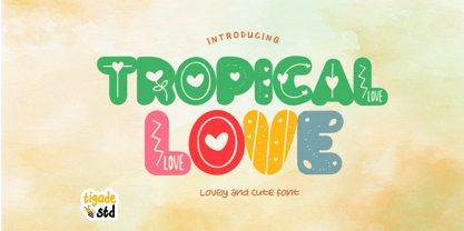 Tropical Love is a cute, quirky, friendly decorative font. It is suitable for cartoon designs, book cover or just any creation that requires a lovely touch, this font will be an fabulous choice.
 - Honeywelly Modern Calligraphy by IbeyDesign,
$17.00 Honeywelly Modern Calligraphy Font is a beautiful light handwritten font with a unique feel and a stunning impact. It will add a luxury spark to any design project that you wish to create.
 - Maria-Ballé-Initials by ARTypes,
$35.00Maria-Ballé-Initials are derived from the Ballé series I made by the Bauer foundry. When set at 60 pt this font will match the size of the original 48-pt Didot design. - Mafieso by Rometheme,
$6.00 Mafieso is a fun, playful display font created for a large range of different designs. It features a sweet, cute style with bold letters, that will help you with getting your message across.
 - Faqro Pro by ffeeaarr,
$9.00 Faqro is a cool and casual looking display font. No matter the topic, this font will be an incredible asset to your fonts’ library, as it has the potential to elevate any creation.
 - Allista by Typefactory,
$14.00 Allista is a fancy handwritten font, carefully handcrafted to become a true favorite. This font will look outstanding in any context, whether it’s being used on busy backgrounds or as a standalone headline!
 - Home Decor by Goodigital13,
$20.00 great for any projects including : branding, logo, stationery, business card, signage, flyer, brochure etc. Almost all industries will be match for this typeface: comic, events, florist, gardening, makeup artist, travel, cartoon, musician etc
 - SK One Block by Salih Kizilkaya,
$3.50 SK One Block was designed by Salih Kızılkaya in 2020. Inspired by Kufic typeface, this font includes many typographic material you will need. SK One consists of 8 different fonts and 2696 glyphs.
 - Vessagio by Rockboys Studio,
$23.00 Vessagio is an elegant and modern sans serif font. No matter the topic, this font will be an incredible asset to your fonts’ library, as it has the potential to elevate any creation.
 - Diamond Lake by Rillatype,
$15.00 Introducing, Diamond lake! This font have strong and bold charasteristics that will make your design more standout from the others. this font is perfect for magazine, headline, packaging, branding, logotype, badge,book, etc.
 - Fino by TypeTogether,
$35.00 Tall, stately, and refined, with a showy contrast between thick and thin, a certain kind of titling Didone has become synonymous with fashion. Ermin Međedović’s latest type system amplifies the most theatrical aspects of this genre while bringing an uncommon flexibility of style and variation to any type palette — particularly those required for editorial design. Fino is a Rational (or Modern) display serif with sharp details. Its fairly Title proportions produce a regular beat of bold stems at frequent intervals. One can add an unexpected twist to this plot line by introducing the alternate ‘C, D, G, O, and Q’ (found in the uppercase); these replace the standard, Title oval shapes with big, full, show-stopping round ones. Other alternate forms, along with a grand ensemble cast of ligatures, lets the director continually flip the script. This stage is set in three acts: Fino, Fino, and Fino Stencil. Each of these offer six weights and italics, and each actor is comfortable speaking any Latin-based language, from standard Hollywood English to the many accents of Eastern Europe. Finally, every style comes in two optical sizes, with Title having the finest hairlines for the biggest parts. This lets you put Fino to work in a variety of productions, from short texts (24pt–48pt settings) to epic titles. The complete Fino family, along with our entire catalogue, has been optimised for today’s varied screen uses. All these talents let Fino perform a range of roles far broader than your typical Bodoni or Didot.
 - Vernacular Sans by jpFonts,
$19.95 The Vernacular trilogy was designed by Swiss designer Hans-Jürg Hunziker, who had worked for Adrian Frutiger in Paris for many years. Based on the concept of a transitional Linear Antiqua, he has developed a colorful bouquet of typefaces that contain the entire spectrum of typefaces for book design and corporate identity. Thanks to his "Swiss school" and his outstanding skills, he has succeeded in giving the typefaces a particularly noble and sympathetic expression. In addition to the Sans family, there is a Serif family and a Clarendon family, each of which, including the separately drawn italics, is equipped with 12 font weights that are finely tuned to one another. Each of the 3 font styles develops its own character, but thanks to a concept that brings the different font styles closer together, they also work well together and complement each other perfectly. Sans and Clarendon have a vertical axis and similar endings in contrast to the Serif, which has a traditional diagonal axis and horizontal endings. The straight stems and the proportions are used as an element to stress the closeness of the typeface-trilogy. They thus share a comon feature. All fonts contain tabular and proportional figures as well as old style figures. Small caps and small cap figures are also available in all fonts. In addition, some fonts have alternative characters available via style set, such as «g», which can be used to further vary the typeface. Vernacular offers all the options for well-kept typesetting for print and web - for small and large orders.
 - Libel Suit by Typodermic,
$11.95 Libel Suit is a slim, efficient sans-serif typeface. This compact headliner has a unique industrial look with distinct post-modern curves. Using your application’s “stylistic alternates” functionality," you can access a more conventional “g” and “y.” OpenType numerical ordinals and fractions are included. Libel Suit is available in six weights and italics. Most Latin-based European, Vietnamese, Greek, and most Cyrillic-based writing systems are supported, including the following languages. Afaan Oromo, Afar, Afrikaans, Albanian, Alsatian, Aromanian, Aymara, Azerbaijani, Bashkir, Bashkir (Latin), Basque, Belarusian, Belarusian (Latin), Bemba, Bikol, Bosnian, Breton, Bulgarian, Buryat, Cape Verdean, Creole, Catalan, Cebuano, Chamorro, Chavacano, Chichewa, Crimean Tatar (Latin), Croatian, Czech, Danish, Dawan, Dholuo, Dungan, Dutch, English, Estonian, Faroese, Fijian, Filipino, Finnish, French, Frisian, Friulian, Gagauz (Latin), Galician, Ganda, Genoese, German, Gikuyu, Greenlandic, Guadeloupean Creole, Haitian Creole, Hawaiian, Hiligaynon, Hungarian, Icelandic, Igbo, Ilocano, Indonesian, Irish, Italian, Jamaican, Kaingang, Khalkha, Kalmyk, Kanuri, Kaqchikel, Karakalpak (Latin), Kashubian, Kazakh, Kikongo, Kinyarwanda, Kirundi, Komi-Permyak, Kurdish, Kurdish (Latin), Kyrgyz, Latvian, Lithuanian, Lombard, Low Saxon, Luxembourgish, Maasai, Macedonian, Makhuwa, Malay, Maltese, Māori, Moldovan, Montenegrin, Nahuatl, Ndebele, Neapolitan, Norwegian, Novial, Occitan, Ossetian, Ossetian (Latin), Papiamento, Piedmontese, Polish, Portuguese, Quechua, Rarotongan, Romanian, Romansh, Russian, Rusyn, Sami, Sango, Saramaccan, Sardinian, Scottish Gaelic, Serbian, Serbian (Latin), Shona, Sicilian, Silesian, Slovak, Slovenian, Somali, Sorbian, Sotho, Spanish, Swahili, Swazi, Swedish, Tagalog, Tahitian, Tajik, Tatar, Tetum, Tongan, Tshiluba, Tsonga, Tswana, Tumbuka, Turkish, Turkmen (Latin), Tuvaluan, Ukrainian, Uzbek, Uzbek (Latin), Venda, Venetian, Vepsian, Vietnamese, Võro, Walloon, Waray-Waray, Wayuu, Welsh, Wolof, Xavante, Xhosa, Yapese, Zapotec, Zarma, Zazaki, Zulu and Zuni.
 - Smart Sans by Monotype,
$29.99 Smart Sans is a personal tribute to Leslie (Sam) Smart, the first type director to be hired by a major typesetting house in Canada. Smart was a twentieth century design pioneer who raised the standards of Canadian typography. Together with three of his peers, he established the first Type Directors Club in Toronto. After Smart's death in 1998, type designer Rod McDonald decided that something should be done to commemorate Smart's life and achievements. I had first thought of establishing a scholarship in Sam's name, but a typeface design soon replaced this idea," says McDonald. "Once I decided to design a typeface, however, it became a foregone conclusion that it would be a sans serif - for no other reason than that I loved the name Smart Sans." Two typefaces served as inspiration for McDonald's work. "Like thousands of designers, I'm keen on Matthew Carter's Helvetica Compressed series. And, when I was younger, I also loved Fred Lambert's Compacta," says McDonald. "I thought there might be a place for a small range that could take over from these 'old workhorses' and, in the process, bring a fresher look to the genre." McDonald drew three weights for the Smart Sans family, all ideally suited for setting attention-getting headlines and powerful display copy. The two-storied 'g' contributes to the design's lively personality, and the short 'r' helps maintain tight, even spacing. Smart Sans is the perfect homage to a great typographer, because it raises the bar on what to expect from condensed sans serif typefaces. Sam Smart would be pleased."
 - Longhorn by Belldorado,
$20.00 I saw a cool UT-Ligature on an old (maybe 70's or 80's) Texas Longhorns fan-shirt - it was in 3D and I wanted something like that with my own initials A and B to print it on a baseball hat. I started drawing it and when I was finished, I thought it might be nice to do the same for my officemates. I needed another G, T and K. After finishing that I thought it might be cool to do this for other people as well. Since the source of all the 3D glyphs is found in the regular ones which get moved by a 45 degree angle and then connected with lines , I first draw all the uppercase regular glyphs. The thing that followed was kind of an addiction: after finishing the uppercase letters, I wanted to add lowercase letters, after finishing the 3D letters, I thought it would be nice to have a fill version to layer with the 3D letters. Having a rough, woodcut version of the regular style would be cool, too. And the font is also pretty much suited to make a stencil version. When all this was done, I was interested on how the font would look like without the serifs and curves instead of the 45 degree angles, so I did the Longhorn Sans. Good to use for all sports-related designs, especially retro-style soccer/football shirts. Uppercase characters can be combined to form ligatures or logotypes.
 - Juxta Sans Mono by NaumType,
$19.00 Juxta Sans Mono is an experimental monospace sans, an extension of the Juxta superfamily. During the creation of the Juxta script, I felt that the aesthetics and the main idea of the font had promising potential and I started thinking about a pair for it. So the idea of Juxta Sans Mono was formulated. Juxta has several style-forming elements: 45° beveled or cross out bowls, squared m and w arcs and other unobvious letter structures. Despite its unusual and sometimes odd (f, g, m) letterforms, Juxta Sans is fairly easy to read due to its monospace font nature and wide spacing. Juxta Sans Mono offers great customization potential. It has two sets of stylistic alternates — [salt] makes a letter underscored, but keep it in line, [ss01] replaces some of the glyphs with different letterforms. The [case] function automatically adjusts the height of the punctuation marks to the neighbor letter and [onum] is a set of old style numbers. Juxta Sans Mono also has subscript and superscript features, but they are utilized a bit unconventionally — if you want to customize your logo or headline, you can make a glyph superscript and the one next to it subscript and they automatically kern into one letter width. You can see examples of using these features in the presentation. Juxta Sans Mono is available in 8 weights, including Thin, Light, Regular, Medium, SemiBold, Bold, ExtraBold and Black. It extends multilingual support to Basic Latin, Western European, Euro, Catalan, Baltic, Turkish, Central European, Pan African Latin, Afrikaans, and Basic Cyrillic.
 - Gallos by W Type Foundry,
$25.00 What comes to your mind if I say Architype, Geometric, Gaelic, and Uncial? An impossible combination of features? An unrealistic setup of tastes as weird as your music list? Or some part of a joke told by your favourite comedian? Just chill and stick to the idea that is possible. Gallos combines the conceptual historical elegance of the Uncials with the practical rationalism of the Geometric style. Moreover, this typeface is composed by two sub families: Gallos Uncial and Gallos Architype. The letters “M”, “N”, “W”, “a”, “m”, “n”, “r”, and “w” differ between these two models. The first one is related to both: The Uncial script aspect displaying the leaned “a” with a closed bowl, and the classical geometric style depicting more conventional uppercase and lowercase letters “m” and “n”. The Architype one is inspired by Paul Renner’s Architype model, thus the leaned “a” has an open counter, the “r” is composed by a stem and a dot, and the rest of the mentioned letters were built using square rational features. Both models are connected by classical Uncial features such as the curved stroke “e” and curved shaft “t”, and with Gaelic vibes which can be seen in uppercase and lowercase letters “K” and “X”. Also, the curved descender “g” and “y”, alongside the curved stem “z” connect really well with the rest of the system and provide more uniqueness to the Gallos type family. Without further ado, we say to you: let’s make Uncials popular again!
 - Fino Sans by TypeTogether,
$35.00 Tall, stately, and refined, with a showy contrast between thick and thin, a certain kind of titling Didone has become synonymous with fashion. Ermin Međedović’s latest type system amplifies the most theatrical aspects of this genre while bringing an uncommon flexibility of style and variation to any type palette — particularly those required for editorial design. Fino Sans is a Rational (or Modern) display serif with sharp details. Its fairly Title proportions produce a regular beat of bold stems at frequent intervals. One can add an unexpected twist to this plot line by introducing the alternate ‘C, D, G, O, and Q’ (found in the uppercase); these replace the standard, Title oval shapes with big, full, show-stopping round ones. Other alternate forms, along with a grand ensemble cast of ligatures, lets the director continually flip the script. This stage is set in three acts: Fino Sans, Fino Sans, and Fino Sans Stencil. Each of these offer six weights and italics, and each actor is comfortable speaking any Latin-based language, from standard Hollywood English to the many accents of Eastern Europe. Finally, every style comes in two optical sizes, with Title having the finest hairlines for the biggest parts. This lets you put Fino Sans to work in a variety of productions, from short texts (24pt–48pt settings) to epic titles. The complete Fino Sans family, along with our entire catalogue, has been optimised for today’s varied screen uses. All these talents let Fino Sans perform a range of roles far broader than your typical Bodoni or Didot.
 - Fino Stencil by TypeTogether,
$35.00 Tall, stately, and refined, with a showy contrast between thick and thin, a certain kind of titling Didone has become synonymous with fashion. Ermin Međedović’s latest type system amplifies the most theatrical aspects of this genre while bringing an uncommon flexibility of style and variation to any type palette — particularly those required for editorial design. Fino Stencil is a Rational (or Modern) display serif with sharp details. Its fairly Title proportions produce a regular beat of bold stems at frequent intervals. One can add an unexpected twist to this plot line by introducing the alternate ‘C, D, G, O, and Q’ (found in the uppercase); these replace the standard, Title oval shapes with big, full, show-stopping round ones. Other alternate forms, along with a grand ensemble cast of ligatures, lets the director continually flip the script. This stage is set in three acts: Fino Stencil, Fino Stencil, and Fino Stencil Stencil. Each of these offer six weights and italics, and each actor is comfortable speaking any Latin-based language, from standard Hollywood English to the many accents of Eastern Europe. Finally, every style comes in two optical sizes, with Title having the finest hairlines for the biggest parts. This lets you put Fino Stencil to work in a variety of productions, from short texts (24pt–48pt settings) to epic titles. The complete Fino Stencil family, along with our entire catalogue, has been optimized for today’s varied screen uses. All these talents let Fino Stencil perform a range of roles far broader than your typical Bodoni or Didot.
 - Tchig Mono by Eclectotype,
$30.00 This is Tchig Mono, a monospaced type family that doesn't take itself too seriously. Why make a monospaced font? For coding, sure, but display? It’s my humble opinion that it’s the aesthetic choices driven by the constraints of the monospaced environment that makes them attractive. It’s a challenge for the type designer to squash and expand glyphs into a rigid bounding box, and the more unorthodox shapes that spring from this have a feel about them which lends them to postmodernist layouts and hipsterish anti-design. And the payoff for the type designer - no kerning! Yay. So what’s different about Tchig? Like I said before, it doesn't take itself too seriously. Even the name Tchig is just a stupid, fun sound (although it does show off that nice g!). There are a selection of playful alternates that give text a slightly alien feel. Stylistic set 1 chops off ascenders and descenders of lowercase letters, giving it a kind of small caps meets unicase feel (it is also accessible using the small caps feature). The other sets (or stylistic alternates if you don't have access to stylistic sets) make certain letters more twirly, more square, more “experimental”. Automatic fractions use a half-width numerator and denominator so fractions like one half and five eighths have the same width as figures (and every other glyph). There you go then - a monospaced type family not initially intended for use in the usual ways monospaced families are intended to be used. Give it a try. You could even do some coding with it if you like.
 - Bunday Clean by Buntype,
$22.50 Bunday Clean is a minimalist and friendly font family with different moods. It drops everything unnecessary like spurs and ears and appears crisp and contemporary with a slightly squarish touch. Like the other members of the superfamily (Bunday™ Sans and Bunday™ Slab), Bunday Clean provides uprights, a second set of styles with characters that reference handwritten cursive. These curvy styles give words a distinct look and are especially attractive for use in display applications and logotype design. Bunday™ Clean is space-saving and creates a homogenous text color with good legibility. The font was manually hinted and contains extensive handcrafted kerning tables to ensure perfect appearance in all media. It ships with 9 standard, 9 upright, and the corresponding italic styles from a considerably thin hairline to a quite thick heavy. It supports at least 99 languages and provides OpenType® features for ligatures, alternative glyphs, localized forms, and much more. Feature Summary*: -4 Moods: Normal, Upright, Italic and Upright Italic -9 weights: Hair, Light, Thin, SemiLight, Regular, SemiBold, Bold, ExtraBold and Heavy -Supports at least 99 Languages incl. eastern european -Overall width: Narrow or Space-Saving -Advanced f- ligature set including fb -Discretionary s- and c- ligatures -Alternative Characters: a, e, f, g, l, t, y, A, E, F, L, and more -Capital German Eszett -Extra characters with Polish Kreska -Catalan Punt Volat -More than 570 characters per font * Some features may only be available in OpenType®-savvy applications Please, take a look at the other Bunday superfamily members: Bunday™ Sans Bunday™ Slab
 - Elido by Kontour Type,
$50.00 Elido (Odile in reverse) is the sans counterpart to the Odile type. Together they form a sans/serif superfamily with a wide range of variations for editorial use. Elido follows Odile’s proportions and matches the weight and typographic color of its serif twin. Elido is a sans with classical proportions. A slight geometric hint and open counters convey an airy feel. Elido’s family structure and relations within echo the conceptual approach of Odile. The arched stroke low off the stem reveals a script characteristic most pronounced in the Elido Upright Italic. This particular interpretation is gradually diminished in the Italic and becomes even less emphasized in the Regular. Six balanced weights, from an elegant Light to a pronounced Black, are in tune with three display solutions and a set of beautiful Ornaments. These variants allow for a diverse and multifaceted typography for the discerning type user. Sans serif initials amount to a rare finding. The charming monolinear Elido Initials come in two flavors, elaborate and rational, designed to hold their own in editorial and headline sizes. This type design boasts an extensive character set, many OpenType features including roman and italic Small Caps, five sets of numerals, beautiful ligatures, and many more. OT stylistic variants (with accents) offer a one-story “a” for the roman weights, alternate “g” and “s” designs for the italics, and a variant glyph “s” for the Upright Italic. These distinct qualities with its versatile and sincere traits make Elido an excellent choice for text and display use.
 - Vernacular Serif by jpFonts,
$19.95 The Vernacular trilogy was designed by Swiss designer Hans-Jürg Hunziker, who had worked for Adrian Frutiger in Paris for many years. Based on the concept of a transitional Linear Antiqua, he has developed a colorful bouquet of typefaces that contain the entire spectrum of typefaces for book design and corporate identity. Thanks to his "Swiss school" and his outstanding skills, he has succeeded in giving the typefaces a particularly noble and sympathetic expression. In addition to the Sans family, there is a Serif family and a Clarendon family, each of which, including the separately drawn italics, is equipped with 12 font weights that are finely tuned to one another. Each of the 3 font styles develops its own character, but thanks to a concept that brings the different font styles closer together, they also work well together and complement each other perfectly. Sans and Clarendon have a vertical axis and similar endings in contrast to the Serif, which has a traditional diagonal axis and horizontal endings. The straight stems and the proportions are used as an element to stress the closeness of the typeface-trilogy. They thus share a comon feature. All fonts contain tabular and proportional figures as well as old style figures. Small caps and small cap figures are also available in all fonts. In addition, some fonts have alternative characters available via style set, such as «g», which can be used to further vary the typeface. Vernacular offers all the options for well-kept typesetting for print and web - for small and large orders.
 - Vernacular Clarendon by jpFonts,
$19.95 The Vernacular trilogy was designed by Swiss designer Hans-Jürg Hunziker, who had worked for Adrian Frutiger in Paris for many years. Based on the concept of a transitional Linear Antiqua, he has developed a colorful bouquet of typefaces that contain the entire spectrum of typefaces for book design and corporate identity. Thanks to his "Swiss school" and his outstanding skills, he has succeeded in giving the typefaces a particularly noble and sympathetic expression. In addition to the Sans family, there is a Serif family and a Clarendon family, each of which, including the separately drawn italics, is equipped with 12 font weights that are finely tuned to one another. Each of the 3 font styles develops its own character, but thanks to a concept that brings the different font styles closer together, they also work well together and complement each other perfectly. Sans and Clarendon have a vertical axis and similar endings in contrast to the Serif, which has a traditional diagonal axis and horizontal endings. The straight stems and the proportions are used as an element to stress the closeness of the typeface-trilogy. They thus share a comon feature. All fonts contain tabular and proportional figures as well as old style figures. Small caps and small cap figures are also available in all fonts. In addition, some fonts have alternative characters available via style set, such as «g», which can be used to further vary the typeface. Vernacular offers all the options for well-kept typesetting for print and web - for small and large orders.
 - Burford by Kimmy Design,
$10.00 Burford is a font family that I sketched while traveling through Europe. I was mesmerized by all the unique typography that was showcased throughout the five countries I visited. Inspired by all that I had seen, I found myself spending 4-5 hours per day in Amsterdam’s Vondel Park drawing characters. Once back in the states I digitalized Burford, deciding it would make for a beautiful layer-based font. Burford Pro package comes with all 18 layering fonts including 5 base layers, 3 top layers, 5 bottom layers and 2 sets of graphic elements. They are strategically made to build on top of each other, creating a cohesive and easy to use layer-based family. Each font also comes with a set of Stylistic Alternatives for letters A C E F G H P Q R. Burford Basic package is created for users who don’t have access to premiere design programs (such as Illustrator, InDesign, Photoshop, etc) and are unable to use the layering effect. Burford can still be a powerful tool as each font can also be used on its own. It includes every font file not needed for the layering effect. (Include 13 fonts - Burford Basic, Dots, DropShadow, Extras Set A, Extras Set B, Extrude B, Extrude C, Inline, Line, Marquee, Outline, Stripes A and Stripes B). The Burford Extras set uses all basic keyboard characters - around 100 total elements per set. They are designed to go specifically with Burford and complement its varying styles perfectly. The set includes: banners, borders, corners, arrows, line breaks, catchwords, anchors and many more!
 - Transport New by K-Type,
$20.00 Transport New is a redrawing of the typeface designed for British road signs. In addition to the familiar Heavy and Medium weights, Transport New extrapolates and adds a previously unreleased Light weight font originally planned for back-lit signage but never actually applied. Version 3.0 of Transport New features significant improvements including numerous outline and spacing refinements, and a full complement of Latin Extended-A characters. Also, to align Transport New with the 2015 release of Motorway, the other typeface used for UK road signage, Italic fonts for all three weights have been added. Originally designed by Jock Kinneir and Margaret Calvert beginning in 1957 and first published on the Preston bypass in 1958, the original Transport font has subtle eccentricities which add to its distinctiveness, and drawing the New version involved walking a tightrope between impertinently eliminating awkwardness and maintaining idiosyncrasy. The Grotesk roots of the glyphs were investigated and cheekily fine-tuned – uncomfortably close terminals of characters such as 5, 6, C, G, and e were shortened, the S and s were given a more upright aspect and their protruding lower terminals tucked in, overly wide glyphs like the number 4 were narrowed, and some claustrophobic counters were slightly opened up. The question mark was redesigned and parentheses given some stroke contrast. The x height was edged fractionally even taller. The Heavy font is actually more of a Bold, and the Light is pretty much a regular weight, but the original nomenclature has been retained for old times’ sake.
 - Geneo Std by Typofonderie,
$59.00 A robust oldstyle, an elegant slab, 8 styles Geneo, created by Stéphane Elbaz, is a synthesis of historic and present-day visions of typography, a slab serif constructed on an oblique axis. Its subtle contrast evokes both Renaissance elegance and the robustness of the Egyptian typefaces that were in vogue during the 19th century. Geneo falls halfway between the classic styles of Garamond and Transitionnals, with aspects of contemporary slab serifs like Rockwell, Boton, as well a bit informal. From this blend of styles and genres, it emerges with a singular identity perfectly suited for modern illustrations of quality, savoir-faire, and culture. Geneo’s limited contrast has been carefully crafted to make the font adaptable for use as both text and headlines, as well as for small-print elements like footnotes, appendices, and captions. The variety and precision of certain weights, like Regular, allow minute adjustments of the font color in text compositions. This flexibility is especially useful for displaying on devices with high pixel densities such as the latest iPhone or iPad, on which text may appear too thin. Flexibility and sturdiness The sturdiness of Geneo makes it a perfect choice for posters, logos, print and any project that requires finesse and sophistication. It provides alternate versions of some letters such as g and a to give you the flexibility you need for your typographic projects. Geneo pairs perfectly with contemporary typeface genre. Geneo, a new typeface designed by Stéphane Elbaz Tokyo TDC 2014 Type Directors Club 2009