10,000 search results
(0.056 seconds)
- Auretta by Timurtype,
$14.00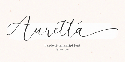 Introducing by Timur type Proudly Present, Auretta Auretta A Modern Script Font Auretta is perfect for product packaging, branding project, megazine, social media, wedding, or just used to express words above the background. Auretta also multilingual support. Enjoy the font.Thank you!
 - Makota by Yukita Creative,
$14.00 The modern font Makota is perfect for use in luxury-related design projects. Its tall elegant typeface makes it ideal for branding and advertising, while its high legibility makes it perfect for use on websites, advertisements and other types of communication.
 - Casemark Stencil JNL by Jeff Levine,
$29.00 Casemark Stencil JNL is a bold sans serif design modeled after an image of a hand made antique shipping stencil used by the Bridgeport Brass Company of Bridgeport, Connecticut. The type design is available in both regular and oblique versions.
 - Bushwhacked NF by Nick's Fonts,
$10.00Central Type Foundry of St. Louis issued this quirky little gem under the name of Quaint Roman around the turn of the twentieth century. This version is a little less gnarly than the original, but retains all of its eccentric charm. - Stencil Piece JNL by Jeff Levine,
$29.00 Based on an antique metal stencil plate used for identifying crates, bales or barrels, Stencil Piece JNL is one of the numerous stencil designs available through Jeff Levine Fonts. The type design is available in both regular and oblique versions.
 - Flowertype by Okaycat,
$29.95 Want your type in flowers? With Flowertype all letters, numbers & symbols are made of flowers. Combine flower font styles for many cool possibilities. Flowertype is an extended font, containing West European diacritics & ligatures, making it suitable for multilingual environments & publications.
 - Kinderline Script by Letterhend,
$15.00 Kinderline Script is a joyful and playful monoline script typeface. Very suitable to be used as a headline, instagram post and stories, logos, magazines, books, greeting/wedding cards, packaging, fashion, make up, stationery, novels, labels or any type of advertising purpose.
 - Roniq by Negara Studio,
$19.00 RONiQ is a display font. A type which should not be taken too seriously, a mixture in styles as per usual. this one is also quite juicy. Ready to be used in fun projects. Supports some languages, a lil bit multingual.
 - Equalis Stencil by Eurotypo,
$28.00 Equalis Stencil is a slab-serif typeface. This OpenType font comes in three weights, alternates and symbols, with support for CE languages. Equalis Stencil can be used as display type, headlines, packaging, signs routing and a wide range of projects.
 - AZ Grampa by Artist of Design,
$25.00 AZ Grampa font was inspired from old content type on vintage tins. This font utilizes an "old look" to the line work which is designed to have a "worn feel" to it. Ideal for use as content text in you design.
 - Mamut by Totem,
$29.00 Mamut is a display type family of three weights. It has elegant and distinctive letterforms with lots of character. Mamut is your chunky friend, perfect for designing headlines, logos, labels, lettering works, posters and lots of eye-pleasing typographic works.
 - Blue Point by Solotype,
$19.95We began with the Victorian font Dotted, so-called because the counters of many of the letters contained a dot. We knocked out the dots, added a lowercase, and voila! a more useful type than the original without losing its charm. - Huntsman by Solotype,
$19.95Issued from the Haddon Foundry in England. Most of their original faces had names beginning with H, like their own name. Some of their types were designed by Phil May, but we cannot guarantee that this is one of them. - Union by Alias Collection,
$60.00 A softer, streamlined and more elegant development of the ideas originally explored in Jude. Incised letterforms are now rounder and more intuitive, less geometric. Union is a modern classic‚ typeface, avoiding quirky idiosyncrasies to produce a useable and highly contemporary type.
 - NowGrotesk by Hot Russian Pancakes,
$- Retro-futuristic unicase with alternates and ligatures, specially designed for magazine headlines and cheerful logos. Inspired by the art deco geometry and late 2000s trends in graphic design. Works well as text pattern. It is better suited for large type sizes.
 - Thinkerbery by Mightyfire,
$15.00 Need a semi-formal yet unique font? Thinkerbery is the answer! The look of Thinkerbery is like a digital typing style but still has its uniqueness. We bring a strong looks for your text. Enjoy in creating unique arts using Thinkerbery! :)
 - Western Bevel JNL by Jeff Levine,
$29.00Western Bevel JNL smooths out the ornate design of Stablehand JNL to offer a cleaner slab serif font that retains its Western wood type feel. Aside from Western themes, it can be applied to sports team promotions and other nostalgic projects. - Remachine Script Arabic by Mans Greback,
$59.00 Remachine Script Arabic is a retro typeface with support for Arabian and Persian Languages, in addition to support for all Latin European languages. The font contains all characters you'll ever need, including all punctuation and all types of Arabic numbers.
 - FF GeäbOil by FontFont,
$30.99Italian type designer Fabrizio Schiavi created this display FontFont in 1995. The font is ideally suited for music and nightlife and poster and billboards. FF GeäbOil provides advanced typographical support with features such as ligatures. It comes with proportional oldstyle figures. - Quick Rest by wearecolt,
$19.00 Quickrest is a tall & quirky type with slight irregularities, Quickrest does not do conformity - each character is entirely individual. A fun looking family with its heart set in the handmade / crafty scene. The Quickrest family features five weights and slanted versions.
 - Augustin by Ludwig Type,
$45.00 Augustin is an elegant and legible typeface inspired by the classic letter forms of the renaissance, namely the type of Nicolas Jenson made in Venice in 1470. The style-linked family includes oldstyle and lining figures both tabular and proportional.
 - Turman Grotesk by Chank,
$99.00 Turman Grotesk is inspired by the hand-drawn painterly letterforms poster artist Adam Turman uses in his poster designs. Each character uppercase and lowercase has contextual alternates that can be used to give your type a more natural, handmade feel.
 - Argentina Cursive NF by Nick's Fonts,
$10.00 Here's an elegant addition to Argentina NF, carefully crafted after the pattern provided by master type designer Morris Fuller Benton in 1919. Both versions of this font support the Latin 1252, Central European 1250, Turkish 1254 and Baltic 1257 codepages.
 - Doodles by Outside the Line,
$19.00Doodles received honorable mention in U&lc's First Annual Type Design Competition in the Picture Category. Inspiration came from many long hours logged in corporate strategic planning meetings. Check out Doodles the Alphabet designed to compliment the Doodles picture font. - Zinc by K-Type,
$20.00 Zinc is a clean, distinctive family which is essentially a monoline sans serif but with horizontal and diagonal nubs that add a subtle script quality to display type and an easy-to-read rhythm to the flow of ordinary text.
 - Rustic Stencil JNL by Jeff Levine,
$29.00 A hand-lettered title on a children's stencil book for sale in an online auction served as the basis for Rustic Stencil JNL. Reminiscent of classic wood type, this stencil design adds a Western-influenced flair to any typographic project.
 - TAN Angleton by TANTypeCo.,
$17.00 TAN ANGLETON is an elegant combination of serif and serif-italic. They are classy and the perfect match if you needs something modestly stylish. Its high legibility makes it versatile to be used as a display type or body copy.
 - Daikon by Pepper Type,
$30.00 Daikon is a semi-closed geometric grotesque featuring rich language support including Cyrillic, various OpenType features and multiple sets of figures. This family’s clean and legible feel makes it useable as both display and body type in any font size.
 - Bitelephant by Kah Khiong Design,
$13.00 Bitelephant is a type of pixel font with Slab Serif. It's unique pipeline characteristic, result a bold & simple font. It's bitmap give a retro game looks, but with a futuristic feel. Suitable for any fun, sci-friction, techno, game & digital theme.
 - County Clerk JNL by Jeff Levine,
$29.00 County Clerk JNL was modeled after the vintage Hamilton wood type design Gothic Special, and is available in both regular and oblique versions. An early grotesk font, this condensed sans serif lends itself well to short headlines and brief body copy.
 - FF Elementary by FontFont,
$41.99 German type designer Nicole Kapitza created this pi and symbols FontFont in 1995. FF Elementa is a series of three picture fonts: FF Elementary Earth, FF Elementary Life, and FF Elementary Space. It comes with tabular oldstyle and proportional oldstyle figures.
 - Urban Case by Inumocca,
$15.00 URBAN CASE inspiration from the Urban People, Simple, Elegant, Classy, have a great different Style. great for your Logos, signature, promotion media, etc. unique glyph and deep touch. - Multilingual Characters Support - UPPERCASE - Lowercase - Numeric - Symbol - Punctuation Character inumocca type Studio
 - Magicalnotes by Timurtype,
$14.00 Introducing by Timur type Proudly Present, Magicalnotes Magicalnotes A Handwritten Font Magicalnotes is perfect for product packaging, branding project, megazine, social media, wedding, or just used to express words above the background. Magicalnotes also multilingual support. Enjoy the font.Thank you!
 - Alive by Tasty Type,
$11.00 A fun trendy font with a monoline calligraphy style. This is a display sans-serif font that we recommend using in the following types of work; magazines (titles and layouts), logos and branding, invitations, quotes, blog headers, posters and advertising.
 - Mrs Eaves XL Serif by Emigre,
$59.00 Originally designed in 1996, Mrs Eaves was Zuzana Licko’s first attempt at the design of a traditional typeface. It was styled after Baskerville, the famous transitional serif typeface designed in 1757 by John Baskerville in Birmingham, England. Mrs Eaves was named after Baskerville’s live in housekeeper, Sarah Eaves, whom he later married. One of Baskerville’s intents was to develop typefaces that pushed the contrast between thick and thin strokes, partially to show off the new printing and paper making techniques of his time. As a result his types were often criticized for being too perfect, stark, and difficult to read. Licko noticed that subsequent interpretations and revivals of Baskerville had continued along the same path of perfection, using as a model the qualities of the lead type itself, not the printed specimens. Upon studying books printed by Baskerville at the Bancroft Library in Berkeley, Licko decided to base her design on the printed samples which were heavier and had more character due to the imprint of lead type into paper and the resulting ink spread. She reduced the contrast while retaining the overall openness and lightness of Baskerville by giving the lower case characters a wider proportion. She then reduced the x-height relative to the cap height to avoid increasing the set width. There is something unique about Mrs Eaves and it’s difficult to define. Its individual characters are at times awkward looking—the W being narrow, the L uncommonly wide, the flare of the strokes leading into the serifs unusually pronounced. Taken individually, at first sight some of the characters don’t seem to fit together. The spacing is generally too loose for large bodies of text, it sort of rambles along. Yet when used in the right circumstance it imparts a very particular feel that sets it clearly apart from many likeminded types. It has an undefined quality that resonates with people. This paradox (imperfect yet pleasing) is perhaps best illustrated by design critic and historian Robin Kinross who has pointed out the limitation of the “loose” spacing that Licko employed, among other things, yet simultaneously designated the Mrs Eaves type specimen with an honorable mention in the 1999 American Center for Design competition. Proof, perhaps, that type is best judged in the context of its usage. Even with all its shortcomings, Mrs Eaves has outsold all Emigre fonts by twofold. On MyFonts, one of the largest on-line type sellers, Mrs Eaves has been among the 20 best selling types for years, listed among such classics as Helvetica, Univers, Bodoni and Franklin Gothic. Due to its commercial and popular success it has come to define the Emigre type foundry. While Licko initially set out to design a traditional text face, we never specified how Mrs Eaves could be best used. Typefaces will find their own way. But if there’s one particular common usage that stands out, it must be literary—Mrs Eaves loves to adorn book covers and relishes short blurbs on the flaps and backs of dust covers. Trips to bookstores are always a treat for us as we find our Mrs Eaves staring out at us from dozens of book covers in the most elegant compositions, each time surprising us with her many talents. And Mrs Eaves feels just as comfortable in a wide variety of other locales such as CD covers (Radiohead’s Hail to the Thief being our favorite), restaurant menus, logos, and poetry books, where it gives elegant presence to short texts. One area where Mrs Eaves seems less comfortable is in the setting of long texts, particularly in environments such as the interiors of books, magazines, and newspapers. It seems to handle long texts well only if there is ample space. A good example is the book /CD/DVD release The Band: A Musical History published by Capitol Records. Here, Mrs Eaves was given appropriate set width and generous line spacing. In such cases its wide proportions provide a luxurious feel which invites reading. Economy of space was not one of the goals behind the original Mrs Eaves design. With the introduction of Mrs Eaves XL, Licko addresses this issue. Since Mrs Eaves is one of our most popular typefaces, it’s not surprising that over the years we've received many suggestions for additions to the family. The predominant top three wishes are: greater space economy; the addition of a bold italic style; and the desire to pair it with a sans design. The XL series answers these requests with a comprehensive set of new fonts including a narrow, and a companion series of Mrs Eaves Sans styles to be released soon. The main distinguishing features of Mrs Eaves XL are its larger x-height with shorter ascenders and descenders and overall tighter spacing. These additional fonts expand the Mrs Eaves family for a larger variety of uses, specifically those requiring space economy. The larger x-height also allows a smaller point size to be used while maintaining readability. Mrs Eaves XL also has a narrow counterpart to the regular, with a set width of about 92 percent which fulfills even more compact uses. At first, this may not seem particularly narrow, but the goal was to provide an alternative to the regular that would work well as a compact text face while maintaining the full characteristics of the regular, rather than an extreme narrow which would be more suitable for headline use. Four years in the making, we're excited to finally let Mrs Eaves XL find its way into the world and see where and how it will pop up next.
 - Comenia Sans by Suitcase Type Foundry,
$75.00Comenia Sans was designed in the framework of a unique typographic project for all types of schools. It is a complementary face for Comenia Serif, released by our friends at Storm Type Foundry. Comenia Sans has a lot in common with its serif sister: the height of both upper and lower case, the length of ascenders and descenders, and the general weight. This makes the two perfect partners which work well even when set side by side in a single line of text. Comenia Sans does, however, lack all serifs, ornamental elements and stroke stress variation. All these elements freshen up the feel of long texts, but for shorter texts use, they are not necessary. Despite that, Comenia Sans retains the soft, friendly character of its big sister, as well as a few tiny details which lend it its unique character without compromising legibility or utility. Open counters give all letters an airy feel and permit enough variation in construction. This is why the face works well even in multiple-page texts. All its letters are easily distinguished from each other, so the reader's eyes are not strained. Diacritics and punctuation harmonize with both upper and lower case. As usually, all diacritical marks fully respect conventional shapes of accents and they are perfectly suitable for Czech, Slovak, Polish and other Central European languages, where a lot of diacritics abounds. Similarly to the renaissance italics which refers to the cursive forms, Comenia Sans introduces novel shapes of some characters drawing from the hand-written heritage. This is most apparent in the single-bellied a, the simplified g, and the stem of f which crosses the baseline and ends with a distinct terminal. In the text, emphasized words are thus distinguished not only by the slant of letters, but also by the shapes of the letters themselves. All twelve styles contain set of small caps, suitable for the names, in the indexes or the headlines in longer texts. Legibility in small sizes under 10 points was at the center of designers' attention, too. This is why the counters of a, e and g are large enough to prevent ink spread in small sizes, both on-screen and in print. After all, the font was specifically optimized for screen use: its sober, simple forms are perfectly fit to be displayed on the computer screen and in other low-resolution devices. When used in the context of architecture, the smoothness of all contours stands out, permitting to enlarge the letters almost without limit. A standard at the Suitcase Type Foundry, each style of Comenia Sans boasts a number of ligatures, an automatic replacement of small caps and caps punctuation, a collection of mathematical symbols, and several types of numerals which make it easy to set academic and other texts in an organised, well-arranged way. For the same purpose, fractions may come in handy, too. Apart from the standard emphasis styles, the family also contains six condensed cuts (each set has the same number of characters), designated for situations where space is limited or the need for striking, poster-like effect arises. Comenia Sans is the ideal choice for the setting of magazines, picture books, and navigation systems alike. Its excellent legibility and soft, fine details will be appreciated both in micro-typography and in poster sizes. Although it was designed as a member of a compact system, it will work equally well on its own or in combination with other high-quality typefaces. - Shameless by Positype,
$79.00 I will spare you the long-winded description this time and all of the motivations and witty innuendoes. Quite frankly, I forgot about creating this typeface and it sat on my hard drive for almost a year. Luckily, my daughter Isobel saw the initial drawings one day and ask me about those pretty letters and I remembered… yep, that happened. That said, time made this a better typeface… with fresh eyes and time, much was redrawn, retooled and expanded to something I truly enjoy playing with. Shameless makes extensive use of Contextual alternates to create a proper ebb and flow from letter to letter. Interestingly, there are only a handful of ligatures… instead many special combinations are accounted for solely by relying on Contextual Alts. Mix in Stylistic Alts, Swashes, responsive Titling Alts, numerous Style Sets, etc and you can have a lot of fun. I created 2 versions. A ‘Standard’ version that has 2200+ characters and a ‘Deluxe’ version that has 2400+ characters and an interesting caveat… I plan on expanding the Deluxe version any time I have an idea to add to the typeface… and as such, buyers will receive all of those updates at no charge (with updates going directly to the distributors). You get what you pay for… no insane discounts. Oh, and if you are wondering… Shameless is based on my handwriting using Kuretake Zig CocoIro pens. I love these pens.
 - Gunplay by Ray Larabie is a font that grabs your attention as soon as you lay eyes on it. Designed with a robust and unapologetic style, it embodies a gritty, almost rebellious attitude that seems to...
- Amstello by Letterafandi Studio,
$16.00 Amstello is a cute and fun handwritten display font. This original look will appeal to a wide range of crafty ideas, from letterheads and titles to stationery.
 - Belinar by TM Type,
$12.00 Belinar is a sleek, signature script that will give your work instant class and style. Use this font for branding, logos, signatures, invitations and any other designs.