10,000 search results
(0.05 seconds)
- Korolev by Device,
$39.00 DF Korolev is a 72 weight geometric sans serif family based on lettering by an anonymous Soviet graphic designer from the propaganda displays at the Communist Red Square parade in 1937. It has been named in honor of Sergey Pavlovich Korolyov, or Korolev, considered by many to be the father of practical astronomics. Rational and robust, it is also elegant and refined. Tracings done in Illustrator over a photograph featuring this type pinned down some of the basic character shapes. These were then imported into FontLab, where the full glyph complement was developed. The lower-case has been designed from scratch, and adheres to the structural logic of the uppercase as closely as possible. The complete Korolev super-family includes standard, italic, condensed, and compressed versions, each in five weights. Try the ‘rounded’ and ‘rough’ companion families. The Alternate families come with a double-story “a”.
 - Keiss Condensed Big by DSType,
$50.00 The Keiss type family is our interpretation of the popular nineteen century Scotch Roman typefaces. We intended to keep a very classic approach while introducing a couple of new elements that differentiate this type family from it’s ancestors. This design, with short descenders and ascenders, along with three very distinct optical sizes makes this type family well suited for contemporary newspapers. The Title and Big versions range from Thin to Heavy, with matching italics, in order to be used in big sizes and stand out in the design. The Text ranges from Thin to ExtraBold and is a standalone type family for text usage, with narrow proportions and wider and open italics for improved text setting. The Condensed versions, ranging from Thin to Bold, don’t have italics, although they can be matched with the italics of the Title and Big versions, due to the fact they are very condensed.
 - Keiss Text by DSType,
$50.00 The Keiss type family is our interpretation of the popular nineteen century Scotch Roman typefaces. We intended to keep a very classic approach while introducing a couple of new elements that differentiate this type family from it’s ancestors. This design, with short descenders and ascenders, along with three very distinct optical sizes makes this type family well suited for contemporary newspapers. The Title and Big versions range from Thin to Heavy, with matching italics, in order to be used in big sizes and stand out in the design. The Text ranges from Thin to ExtraBold and is a standalone type family for text usage, with narrow proportions and wider and open italics for improved text setting. The Condensed versions, ranging from Thin to Bold, don’t have italics, although they can be matched with the italics of the Title and Big versions, due to the fact they are very condensed.
 - Maithe by Letterara,
$12.00 Maithe is an incredibly sweet and delicious handwritten script with a lovely feel. Whether it’s Valentine’s Day or Christmas, this the ultimate font for turning any romantic crafts idea into a stunning piece of art! Maithe works both on Mac & PC and it simple to install. This family contains Swashes , Titling, and Ligatures. Multilingual Support (ä ö ü Ä Ö Ü ß ¿ ¡). Accessible in the Adobe Illustrator, Adobe Photoshop, Adobe InDesign, CorelDraw, even work on Microsoft Word. To access the alternate glyphs, you need a program that supports OpenType features such as Adobe Illustrator CS, Adobe Photoshop CC, Adobe Indesign, and CorelDraw. More information about how to access alternate glyphs, check out this link (http://goo.gl/ZT7PqK) To stay up to date for my latest releases, follow me and let’s be friends because there will be many promos.
 - Austral Sans by Antipixel,
$15.00 Austral Sans is a hand-drawn layered font designed by Antipixel. Based in the Slab version, it is part of the Austral type family. This sans makes your work unique & noteworthy, because the possibilities of combinations of textures & styles create distictive results. Austral Sans comes in three weights, Regular, Light & Thin, which all share the same crooked look with irregular strokes and outlines. For these reasons this font can be used in a vast variety of projects, such as logos & branding, stationery, book covers, magazine design, clothing prints & tags, packaging, animated videos, and many more! Austral Sans has three sets of alphabets in uppercase and lowercase to avoid repeating the same character pattern, and giving the font a more natural handwritten feel. This is included in the Open-Type Contextual Alternates, which applies an automatic substitution of glyphs as long as the Open-Type features are activated. Also, Austral Sans offers other Open-Type features such as Stylistic Alternates, Ligatures, Discretionary Ligatures, Fractions, Superscript, Subscript, Denominator, Numerator, Scientific Inferiors & Kerning. This font has a very large glyph coverage and can be used in a wide range of languages, including English, Spanish, Italian, French, German, Polish, Czech, Vietnamese, Finnish, Icelandic, among many others. The style Maplines Thin is offered Free for commercial & personal use! Check Austral Slab!
 - Hibernica by SIAS,
$39.90 Hibernica is a new genuine Irish sans in the classical modern style. With Hibernica it is possible to express Irishness in an up-to-date fashion rather than the traditionalist way. The design of Hibernica is based on my Lapidaria family. With Lapidaria it shares the classic appearance and coolness, stroke pattern, proportions and dimensions. Therefore Hibernica and Lapidaria are a perfect couple for bilingual text editing, e.g. Irish–English (not to forget the Greek parts of Lapidaria!). All fonts contain the full set of dotted ḃ ċ ḋ ḟ ġ ṁ ṗ ṡ ṫ in upper- and lowercase and an additional set of a dozen celtic ornaments. Hibernica also ows its “Minor-Medior” concept to Lapidaria, that is a special uncial-style variant set for lowercase letters. Choose from the six Hibernica fonts which suits your needs best! The Minor fonts are performing elegantly even in longer text bodies, whereas the Medior sorts offer a brillant and entirely new typographic look for headings and captions. Use Hibernica for outstanding designs – for a contemporary Irish understatement in typography. Wether you’re designing menus or shop signs, banners or ads, wether you do textwork upon historic topics or create T-shirts for St Patrick’s day – Hibernica is your new friend! For more new wonderful Irish fonts look at Ardagh and Andron Gaeilge!
 - Richtive Script by Mans Greback,
$69.00 Richtive Script is a sharp brush typeface. This calligraphy font's vivid style and strong movements instantly gets the attention of its spectator, and the lettering has a powerful motion while maintaining clarity. Drawn and created by Mans Greback and Toni Studio in 2022, this handwritten lettering has a wild appearance and a vigorous personality, perfect for a cool handwritten logotype. Write ¤ # < after any word to make a tail. Example: Signed¤ Use underscore _ to make a swash. Example: Super_man Use multiple underscores for different swashes. Example: Love______letter (Download required.) The font is built with advanced OpenType functionality and has a guaranteed top-notch quality, containing stylistic and contextual alternates, ligatures and more features; all to give you full control and customizability. It has extensive lingual support, covering all Latin-based languages, from Northern Europe to South Africa, from America to South-East Asia. It contains all characters and symbols you'll ever need, including all punctuation and numbers.
 - Bothering Script by Mans Greback,
$69.00 Bothering Script is a high-quality calligraphy typeface. This brush font's energetic style and vivid movements instantly gets the attention of its spectator, and the flow has an harmonic rhythm while maintaining activity, sharpness and clarity. Drawn and created by Mans Greback and Toni Studio in 2022, this handwritten lettering has a wild appearance and a strong personality. Use it for a youthful product layout or a fresh logotype. Use underscore _ to make a swash. Example: Wonder_woman Use multiple underscores for different swashes. Example: Cool___ness (Download required.) The font is built with advanced OpenType functionality and has a guaranteed top-notch quality, containing stylistic and contextual alternates, ligatures and more features; all to give you full control and customizability. It has extensive lingual support, covering all Latin-based languages, from Northern Europe to South Africa, from America to South-East Asia. It contains all characters and symbols you'll ever need, including all punctuation and numbers.
 - Noman by Arendxstudio,
$15.00 Noman - Bold Display Fontl, retro looking display font. Whether you use it for cartoon related designs, children games or just any creation that requires a lovely touch, this font will be an amazing choice. Features : • Character Set A-Z • Numerals & Punctuations (OpenType Standard) • Accents (Multilingual characters) Ligature
 - Busky by Craft Supply Co,
$20.00 Urban Graffiti Font Busky Introduction Meet Urban Graffiti Font Busky, a vibrant display font inspired by street art. This font captures the essence of graffiti culture. It’s perfect for adding a playful touch to your designs. Busky’s bold and lively appearance is sure to grab attention. Design and Style Busky features bubble letter forms, giving it a fun and bouncy feel. Each character is crafted to resemble graffiti bubbles. The font’s rounded edges convey a sense of movement and fluidity. This style is ideal for projects needing a touch of urban flair.
 - Colaneira by Forberas Club,
$16.00 Colaneira is handwritten font. Will be nice if you application this font for cute, special moment, beauty, tees, simple word quotes, wedding party, invitation.
 - Degaule by Forberas Club,
$16.00 Degaule is handwritten font. Will be nice if you application this font for cute, special moment, beauty, tees, simple word quotes, wedding party, invitation.
 - Purify Signature by Aestherica Studio,
$9.00 Purify Signature is a modern and simple handwritten script font. Contemporary and fashionable, this font will look great for a wide variety of projects.
 - The Show by Sakha Design,
$14.00 The Show is a fun and friendly display font. Whimsical and a little bit quirky, this font will brighten up each of your designs!
 - Classist by Sohel Studio,
$10.00 Classist sans serif is a bold font style with a classic and modern touch . There are 4 different styles that you can apply in your design projects. This font is designed with a curved and bold style so it is very perfect for branding projects, logos, business cards, t-shirts, clothing, magazines, product branding, advertisements, posters, quotes etc. Classist Features: · 4 Weights font (Regular,Italic,Bold,Outline) · Uppercase · Numerals & Punctuation · Accented characters · Multilingual Support Thanks and have a wonderful day
 - Guess Who by Gassstype,
$23.00 Hello Everyone, introduce our new product Font Guess Who is a Fun Display Typeface .This is a Textured Natural Style and classy style with a clear style and dramatic movement. This font Guess Who is great for your next creative project such as logos, printed quotes, invitations, cards, product packaging, headers, Logotype, Letterhead, Poster, Design this font is great for your creative projects such as watermark on photography. You can activate 8 Ligatures glyphs and 8 Alternates glyphs OpenType panel.
 - 1812 by Apostrof,
$40.00 '1812' type family is a revival and further development of the typeface '1812' by Lehmann Type Foundry (St. Petersburg). It was created for the centenary of the French invasion of Russia, known in Russia as the Patriotic War of 1812 along the lines of decorative engraved inscriptions and ornamented typefaces of that time, presumably by the artist Alexandre Benois. It was used mainly for the decoration of luxurious elegant publications. Later, in 1917, this typeface was used on the Russian Provisional Government banknotes. In the Soviet period of time '1812' appeared to be one of the few typefaces included in the first Soviet type standard OST 1337. It was produced for manual typesetting until the early 1990s. This typeface could be seen on Soviet letterheads, forms, posters and even air tickets. The digital version development was launched in 2010. The original version was supplemented with lowercase letters and alternative symbols, the extended Latin and Cyrillic alphabets were fully supported. The font was evolved into a family of 14 decorative styles which can refine any design giving it a festive and elegant but at the same time strict and nostalgic look. Despite its decorative nature, '1812' is perfectly readable in small emphasized text blocks due to its classic shape and careful spacing.
 - STCO Prescissa by Shaltype Co,
$15.00 Prescissa is inspired by Textualis, also known as textura or Gothic bookhand, which was the most calligraphic form of blackletter, and today is the form most associated with “Gothic”. Written manually by hands, and reform into clean Typeface. Natural stroke from original handwriting. It can be used for just Title or even writing. In this font, you will get : Over 449 Glyphs 12 OpenType features Multilingual languages. Get Prescissa now! It will best use for any design requirement, many fonts will coming with a unique concept. Thank you! Best Regards, FM-STCO.
 - Heartwave by Shaltype Co,
$12.00 Heartwave is a handcraft display typeface that's inspired by old signs, 70's posters, and mixed with modern trend design. Build manually by hands, and reform into clean Typeface. Natural stroke from original hand-lettering. It can be used for just Title or even writing. In this font, you will get : Over 276 glyphs, 49 ligatures in 3 OpenType features, Support for 67 languages. Get HEARTWAVE now! It will best use for any design requirement, many fonts will come with a unique concept. Thank you! Best Regards, PUDJI PANGESTOE STUDIOS
 - Swift by Linotype,
$30.99 Gerard Unger developed this newspaper font between 1984 and 1987 for Dr.-Ing. Rudolf Hell GmbH, Kiel. He was mainly influenced by William A. Dwiggins (1880-1956), the typographic consultant of Mergenthaler Linotype, who started to develop more legible, alternative fonts for newspaper printing as early as 1930. Swift was named after the fast flying bird. Austere and concise, firm and original, Swift is suited for almost any purpose. Swift has been specially developed to sustain a maximum of quality and readability when used in unfavorable print and display processes, e.g. newspapers, laser printing and low resolution screens. Its robust, yet elegant serifs and its large x-height provide an undeniable distinction to the typeface, making it suitable for corporate ID and advertising purposes as well. Swift 2.0 family was designed in 1995. It's an improved version with technical and aesthetic enhancements and new family members. The Cyrillic version was developed for ParaType in 2003 by Tagir Safayev. Please note that this family includes only basic latin characters; it does not include accented characters required for western and central Europe.
 - Akko Paneuropean by Linotype,
$79.00The Akko typeface family is the first new design from Akira Kobayashi in a very long time - and it is well worth the wait. Picture an industrial strength typeface like the Isonorm™ design. Now blend this with an organic design like the Cooper Black™ typeface. It was the idea of the fusion of these two design concepts that inspired Kobayashi to draw Akko. „My initial idea was to create a sanserif type with a ‚soft-focus‘ effect,“ says Kobayashi. „From here, the design evolved into two families, the robust and structured sanserif Akko and soft and friendly Akko Rounded.“ Akko has a wide range of weights, with options including complementary italics and a new Condensed range. The Akko typeface family is available as a suite of OpenType™ Pro fonts, allowing for the automatic insertion of small caps, ligatures and alternate characters. Pro fonts also offer an extended character set supporting most Central European and many Eastern European languages. And new Paneuropean versions introduce support for Cyrillic and Greek. - Kasia by ROHH,
$40.00 Kasia™ is a unique contemporary sans serif family, full of character and originality. It's soft and rounded shapes give it warm, friendly, playful and dynamic feel. Special ink traps serve as ornamental details in bigger sizes, making Kasia™ a wonderful display font family. In small sizes, Kasia™ is very clean and legible. Its proportions and optimized kerning make it a versatile, friendly and organic text family, that features broad variety of OpenType features. Thanks to its various advantages Kasia™ is a great choice for all kinds of design work, both print and on-screen. It is a great choice for branding, logo design and advertising, as well as all sorts of paragraph text. Kasia™ consists of 20 fonts - 10 weights and their corresponding italics. It has extended language support including cyrillic and true italics, as well as OpenType features, such as small caps, case sensitive forms, ligatures, stylistic alternates, contextual alternates, lining, oldstyle, tabular, small cap and circled figures, slashed zero, fractions, superscript and subscript, ordinals, currencies and symbols.
 - Akko by Linotype,
$40.99 The Akko typeface family is the first new design from Akira Kobayashi in a very long time - and it is well worth the wait. Picture an industrial strength typeface like the Isonorm™ design. Now blend this with an organic design like the Cooper Black™ typeface. It was the idea of the fusion of these two design concepts that inspired Kobayashi to draw Akko. „My initial idea was to create a sanserif type with a ‚soft-focus‘ effect,“ says Kobayashi. „From here, the design evolved into two families, the robust and structured sanserif Akko and soft and friendly Akko Rounded.“ Akko has a wide range of weights, with options including complementary italics and a new Condensed range. The Akko typeface family is available as a suite of OpenType™ Pro fonts, allowing for the automatic insertion of small caps, ligatures and alternate characters. Pro fonts also offer an extended character set supporting most Central European and many Eastern European languages. And new Paneuropean versions introduce support for Cyrillic and Greek.
 - Core Sans CR by S-Core,
$20.00 Core Sans CR family is a rounded version of Core Sans C; a part of the Core Sans Series, such as Core Sans N, Core Sans M, Core Sans E, Core Sans A, Core Sans D, Core Sans G, Core Sans R and Core Sans B. Core Sans CR is inspired by classic geometric sans (Futura, Avenir, Avant Garde etc.). It is based on geometric shapes, like near-perfect circle and square. It has a much higher x-height (height of lowercase letters), an effect which promotes readability especially at small print sizes. The Core Sans C Family consists of 9 weights (Thin, Extra Light, Light, Regular, Medium, Bold, Extra Bold, Heavy, Black) and Italics for each format. Core Sans C supports complete Basic Latin, Cyrillic, Central European, Turkish, Baltic character sets. Each font includes proportional figures, tabular figures, oldstyle figures, numerators, denominators, superscript, scientific inferiors, subscript, fractions and case features. Core Sans C is an ideal font family for use in magazines, web pages, screens, displays, and so on.
 - Swift 2.0 Cyrillic by ParaType,
$100.00 Gerard Unger developed this newspaper font between 1984 and 1987 for Dr.-Ing. Rudolf Hell GmbH, Kiel. He was mainly influenced by William A. Dwiggins (1880-1956), the typographic consultant of Mergenthaler Linotype, who started to develop more legible, alternative fonts for newspaper printing as early as 1930. Swift was named after the fast flying bird. Austere and concise, firm and original, Swift is suited for almost any purpose. Swift has been specially developed to sustain a maximum of quality and readability when used in unfavorable print and display processes, e.g. newspapers, laser printing and low resolution screens. Its robust, yet elegant serifs and its large x-height provide an undeniable distinction to the typeface, making it suitable for corporate ID and advertising purposes as well. Swift 2.0 family was designed in 1995. It's an improved version with technical and aesthetic enhancements and new family members. The Cyrillic version was developed for ParaType in 2003 by Tagir Safayev. Please note that this family includes only basic latin characters; it does not include accented characters required for western and central Europe.
 - Lion by Atlantic Fonts,
$26.00 Lion is playful, wild, and full of expression. Lion Solid is sans pattern, but just as brave. Mix upper and lower case with pride, and turn on double-letter ligatures for added hand-made presence. Shown in posters with other Atlantic fonts including Atlantic Doodles and Eeeek images.
 - Maiandra by Galapagos,
$39.00The Maiandra family of typefaces were inspired by an early example of Oswald Cooper's hand-lettering, as seen in an advertisement for a book on home furnishing, circa 1909. Although many of Oz Cooper's letterform designs were cast in metal type, this particular one was not. Cooper's design itself was inspired by examples of letterforms he had admired in his study of Greek epigraphy (inscriptions). Cooper combined those ancient forms with the flair characteristic of design styles of his time. The result was an attractive design possessing subtle, purposeful irregularities, or "meanders" in his skilled brushwork. The Cooper design exhibits a unique warmth and harmony in text, while presenting a compelling rhythm, color and texture on the page. "Realizing the presence of this uniform warmth and readability," notes Dennis, "I decided to expand the design into a family of three weights with companion italics." The weights for the Maiandra family were selected for their versatility in usage over a broad range of output device resolutions. Indeed, "the consideration of eventual display resolutions, be they for screen or printer, provided the greatest challenge in the design of this typeface family," explains Dennis. Creating shapes that conform to the rigors of digital letterforms and modern rendering environments, without losing the unique characteristics of Oz Cooper's original design, is what Dennis has accomplished with his tribute to this great designer of the past. Maiandra, whose name derives from the Greek 'maiandros', meaning 'meander,' is intended for extended text use, as well as for informal subject matter, such as business correspondence, brochures and broadsides. "An example of a good use for Maiandra," notes Dennis, "is in printed matter relating to the turn-of-the-century art period known as the Arts and Crafts Movement. It can stand alone or be used with designs that complement its shape and color." - Werksatz by Identity Letters,
$39.00 Inspired by early grotesque typefaces such as Akzidenz Grotesk and Venus, Werksatz is our contemporary interpretation of this beloved genre. Some things are timeless. These are the things that only get better with use. The aforementioned typefaces certainly belong into this category. Rediscovered by designers from every generation again and again, they are here to stay. However, as tools evolve and technology moves on, even a well-tried design has to adapt to this evolution continuously in order to stand the test of time. Werksatz is such an adaptation, taking the best from the invincible classics and infusing them with the warm blood of today’s tech. With 10 weights from Thin to Black, each with painstakingly fine-tuned obliques, and more than 940 characters per style, this font family is ready for the future. Its Extended Latin support ensures you won’t miss a letter in any of hundreds of languages. Special glyphs like three variations of arrows and additional shapes will make your design work so much easier—for well-structured forms as well as radical editorial layouts. Among a treasure trove of OpenType features, you’ll find essentials such as Capital Spacing, Case-Sensitive Forms, and Ligatures, but also advanced functions like Small Caps, Subscript and Inferior figures and letters, plenty figure sets (Lining Figures, Tabular Figures, Old-Style Figures, circled and squared figures, figures for small caps … you get the idea), Slashed Zero, and more. You’ll discover that Werksatz is less formalistic and rigid than your average neogrotesk typeface. Sure, you can use it for serious business—whether in corporate design, branding, editorial design, publication design, or web design for industries and topics ranging from politics, government, management, or law to technology, entrepreneurship, commerce, or finance. However, Werksatz is much more versatile than that. Its more human appearance also allows for effective use in culture, fashion, art, entertainment, sports, exhibitions, leisure, and luxury. It’s an excellent choice for wayfinding applications, apps, packaging, and all kinds of nonfiction books. Other Grotesks with big names are left behind outdated by their proprietors, but Werksatz is here to stay. The classic industrial warmth of these letterforms will age like fine wine.
 - Moonstore by Raditya Type,
$12.00 Moonstone is the definition of fun, uniqueness, and authenticity. This eye-catching font will turn your creative ideas into a standout. It will take your various design projects to the highest level, be it branding, headings, book cover, t-shirt, mug design, logos, labels, and much more!
 - Crunchy Orange by Raditya Type,
$12.00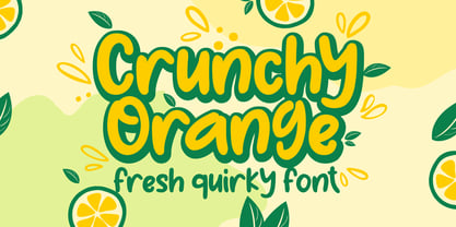 Crunchy Orange is a picture of fun, uniqueness, and authenticity. This eye-catching handwritten font will turn your creative ideas into a standout. It will take your various design projects to the highest level, be it branding, headings, wedding designs, invitations, signatures, logos, labels, and more!
 - Fragilly by Sarid Ezra,
$15.00 Fragilly is a modern calligraphic font that will make your project more stunning. It comes with cute and quirky vibes. There's also essential ligatures that will you often use! Also comes with multilingual support and PUA encoded! Sent me an email to saridezra@gmail.com for more information!
 - Gingersans by Sryga,
$22.00 Introducing Gingersans, the typeface that's basically a font party in 12 different weights! Imagine a font that's not just a font but a personality chameleon, smoothly transitioning from easygoing and polite in the regular weights to downright wild and fun in the bolds. It's like having multiple distinct characters living in one seamless universe. The design? Oh, it's calligraphy meets sans serif – the rebel child of fonts. The curves are having a party of their own; they go wild on the Black, get too cute on the Hairline, and throw in some artsy politeness on the Regulars. It's a typographic adventure that keeps the vibe consistent, whether you're going Hairline, Regular or Black. And here's the best part – Gingersans is not just a font; it's a variable font too, with a weight axis to cater to your every design mood swing. Get ready to fall in love with the font that's as versatile as your ever-changing design whims! 🎉✨ #Gingersans #TypefaceMagic
 - Town by J Foundry,
$20.00 Town is a display collection inspired by art deco and contemporary lettering. The fonts have a classic feel, with contemporary proportions, styling and details. There are eight base weights and nine decorative styles in multiple weights. The variety of styles are designed to create bespoke brand marks, stylish liquor labels, unique restaurant menus, engaging websites and fresh magazine layouts. The fonts are built on the same foundations, so the display and decorative styles can be mixed and matched while maintaining a harmonious look. Several of the styles can also be layered together; add a subtle shadow to your headline or create a full dimensional look with an inline face. The collection is rounded out with two sets of accent fonts, and a set of text weights, with matching italics.
 - Sticky Rough by Forberas Club,
$16.00 This cute font with thin style. You must have this font for sure. Do your cute moment. :)
 - København CS by Fontpartners,
$35.00 New versions of FP København Sans family now available: FP København CS. CS for Condensed Sans, or Condensed City.
 - Landsick by Tour De Force,
$25.00 Landsick is single weight script family. It's charming, it's characteristic, it's lively and playful. Ready to be used everywhere.
 - FaRer by Letterhead Studio-YG,
$19.00 The FaRer family was originally made in 1997. The OpenType revision, with extended Latin characters, was made in 2009.
 - Vektori by Suomi,
$19.00 Vektori family comes from those Atari games that had those distinct vector graphics with thin and precise straight lines.
 - Banque Gothique by Red Rooster Collection,
$45.00Based on the earliest ATF/M.F. Benton versions of the Bank Gothic typefaces. ‘Fleshed-out’ into a full family. - Volta by Linotype,
$29.99Volta is a robust typeface from the 1950s. A revisit to styles that were en vogue at the turn of the century, Bauer type foundry designers Walter Baum and Konrad Bauer designed this type family in1955. The form of Volta's letters are similar to those in New Transitional Serif typefaces, like Cheltenham and Century. Developed after the Didone (i.e., Bodoni) style types, New Transitional Serifs speak more to the zeitgeist of the late 19th Cntury, and were typographic adaptations to it's newer technologies. Already in the period of mass production, typographers and printers at the dawn of the 20th Century had to cope with larger print runs on cheaper materials. The robust letterforms of New Transitional Serifs were designed to compensate for this, but they were also ingenious little inventions in their own right. Form the beginning, the new, peculiar forms of New Transitional Serif letters were adopted for use by advertisers. Their robustness also allowed them to be used in virtually all sizes. Volta was designed especially with advertising display usage in mind. The x-height of Volta's letters is higher than average for serif faces. It is recommended that Volta be used exclusively for shorter tracks of text, above 12 point. Headlines look dashing set in Volta. Four different font styles are available for the Volta typeface: Regular, Medium, Medium Italic, and Bold."