10,000 search results
(0.373 seconds)
- M Yuppy PRC by Monotype HK,
$523.99 M Yuppy PRC is a handwritten style Simplified Chinese typeface. Handwritten font designs are derived directly from hand-drawn lettering or handwriting using analogue tools. Handwritten style Simplified Chinese fonts can include typefaces that reference or reinterpret traditional calligraphy, using classical exemplars by calligraphic masters.
 - The Blanger by Gold Type,
$16.00 he Blanger Script is one of the Elegant script fonts that comes with a very beautiful character change, a kind of classic copper decorative script with a modern twist, designed with great detail to bring out an elegant style. You will get: The Blanger files The Blanger Script is interesting because the typeface is pleasing to the eye, clean, feminine, sensual, glamorous, simple and very easy to read, thanks to the many luxurious letter connections. I also offer a decent number of stylistic alternatives for some of the letters. Classic style is very suitable to be applied in various formal forms such as invitations, labels, restaurant menus, logos, fashion, make up, stationery, novels, magazines, books, greeting/wedding cards, packaging, labels or all kinds of advertisements. destination. . . If you need help or have any questions, let me know. I'm happy to help. Thanks & Happy Design.
 - Malmont by Larin Type Co,
$15.00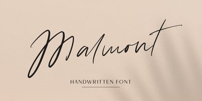 Malmont is an amazing handwritten font is light and elegant, and will emphasize your individuality in any project and will charm you with his signature. This font includes alternates and ligatures for lowercase. You can also use them to create a logo, branding, t-shirts, book covers, stationery, marketing, blogs, magazines, cosmetic, signboard and more. This font is easy to use has OpenType features.
 - Skinny Marker by Mvmet,
$12.00 Skinny Marker is a cool handwritten font, inspired by quick graffiti tags seen on streets. It will elevate a wide range of design projects to the highest level. You can use this font for many design ideas such as stickers, t-shirt designs, amazing logo designs, magazine or book covers, comics, cartoon drawings, and many more. This font will add a cool touch to your designs!
 - Sportive by Stringlabs Creative Studio,
$29.00 Sportive is a unique and modern display font. This playfully conceptual typeface font will look truly outstanding in a wide range of contexts.
 - StudioSans by BrightHead Studio,
$20.00 StudioSans — is a modern representative of the class of sans-serif fonts inspired by the traditional Swiss design and typography of the mid 20th century. This is a minimal, clean and open font family with friendly forms. Focuses on functionality, has a high x-height and short ascender and descender elements. This is combined with soft circles and high legibility of characters contributing to comfortable reading. The family contains six weights from ExtraLight to ExtraBold. Each of them has in its arsenal more than 450 glyphs and knows more than 50 languages. Support for OpenType Features focused on the Oldstyle Figures (including signs of currencies and interest), Case-Sensitive Forms, Standarts and Discretionary Ligatures, Slashed Zero and Etc.
 - Sica Condensed by dooType,
$30.00 The Sica Family was designed in order to address issues related to technology, while maintaining humanistic forms. Thus, a font with square shapes emerged, but with smooth curves and slightly rounded terminals making it friendly. The family has three widths – condensed, normal and expanded – each of them with six weights and their respective italics, resulting in 36 fonts. With particular details and open shapes that increase legibility, it can be used for both text compositions as well for display sizes. It has 774 glyphs, covering more than 50 languages, as well as ligatures, lining, oldstyle, tabular and proportional figures, fractions, superiors, inferiors, and small caps, all of them accessible through OpenType features.
 - Avid Pro by Naghi Naghachian,
$49.00 Avid Pro font family is designed by Naghi Naghashian. A modern interpretation of classic Sans Serif characters in 6 weights: Thin, Light, Regular, Demi Bold, Bold and Heavy. The character set of this Font family supports most western languages including: Afrikaans, Basque, Breton, Catalan, Danish, Dutch, English, Finnish, French, Gaelic, German, Icelandic, Indonesian, Irish, Italian, Norwegian, Portuguese, Sami, Spanish, Swahili and Swedish. There are 17 additional symbol characters: euro, litre, estimated, omega, pi, partialdiff, delta, product, summation, radical, infinity, integral, approxequal, notequal, lessequal, greaterequal, and lozenge. It also includes the characters necessary to support the following central European languages: Croatian, Czech, Estonian, Hungarian, Latvian, Lithuanian, Polish, Romanian, Serbian (Latin), Slovak, Slovenian and Turkish.
 - Sica Expanded by dooType,
$30.00The Sica Family was designed in order to address issues related to technology, while maintaining humanistic forms. Thus, a font with square shapes emerged, but with smooth curves and slightly rounded terminals making it friendly. The family has three widths – condensed, normal and expanded – each of them with six weights and their respective italics, resulting in 36 fonts. With particular details and open shapes that increase legibility, it can be used for both text compositions as well for display sizes. It has 774 glyphs, covering more than 50 languages, as well as ligatures, lining, oldstyle, tabular and proportional figures, fractions, superiors, inferiors, and small caps, all of them accessible through OpenType features. - PF Square Sans Pro by Parachute,
$79.00 Designer Panos Vassiliou created Square Sans Pro in his quest for a true square-like text typeface which could balance simplicity with vitality and enhance with its subtle power the identity of any product or service, without compromising its characteristics as a text typeface. The family consists of 12 fonts—from extrablack to thin—including true italics. It supports 19 special OpenType features like small caps, fractions, ordinals, etc. and offers multilingual support for all European languages including Greek and Cyrillic. Finally, every font in this family has been completed with 270 copyright-free symbols, some of which have been proposed by several international organizations for packaging, public areas, environment, transportation, computers, fabric care and urban life.
 - Sica by dooType,
$30.00The Sica Family was designed in order to address issues related to technology, while maintaining humanistic forms. Thus, a font with square shapes emerged, but with smooth curves and slightly rounded terminals making it friendly. The family has three widths – condensed, normal and expanded – each of them with six weights and their respective italics, resulting in 36 fonts. With particular details and open shapes that increase legibility, it can be used for both text compositions as well for display sizes. It has 774 glyphs, covering more than 50 languages, as well as ligatures, lining, oldstyle, tabular and proportional figures, fractions, superiors, inferiors, and small caps, all of them accessible through OpenType features. - Crown Jewels by TofinoType,
$120.00 Crown Jewels is a massive Super Pro font like no other. This must be one of the most complex font ideas ever imagined. Based on an original font by George Williams, Crown Jewels takes that original idea to a whole new level. Containing thousands of glyphs, it has the size and complexity for any fancy job. This font is like hundreds of fonts in one. Many OpenType features and sub-styles to give you hundreds of different looks. Every single capital letter has been hand-sculpted into a unique complex shape like no other. Multi-language support for numerous countries including Greece and Russia. It also has advanced Open Type features like converting numbers to Roman Numerals automatically for your art projects. Numbers from 1 to 3,999,999,999 can be converted automatically to two different Roman Numeral styles. This font also comes with a nice large pdf manual explaining every function so please read it in its entirety so you can use this font successfully. There is a optional add-on font of Flourishes containing over 800 complex glyphs that can be used with this font or any font you already own. It will bring your fonts and art projects to life. It also has numerous OpenType features programmed so that each feature simply outputs 94 flourishes at a time to your keyboard. There is also a complete color-coded pdf directory of each and every one so you can find the shape you want fast. Every single one is available in recent versions of Photoshop and InDesign by simply turning on a OpenType feature and hitting a key on the keyboard. There is also a separately programmed ligature feature in case that is the only OpenType feature you have and just with that feature every single glyph can be placed into your documents easily. Crown Jewels is priced so you don't have to lay siege to the tower to afford it. It has a very low cost per glyph and is actually one of the best values here. This font took over nine years to make and it’s still just pennies a glyph. Usage: Photoshop styles, InDesign, Promotion Logos, Monograms & Signatures....That’s where it shines and it’s made for art, cards, fancy documents, really super fancy labels & even notes to Mom. If you have a fancy art project that needs doing this is the font to use.
 - RRollie by Eurotypo,
$38.00 RRollie is a typeface family inspired on the proportions of the Roman capital in the Augusto's age, some of them can be seen in inscriptions of Pompeii; in this particular case, it has taken an inscription from a tomb of the year 15 AD. The subtlety of the serif is hardly insinuates, helping to strut the terminals of the stems. Ascenders and descenders are very short. The thickness variation is presented quite delicate, highlighting the light-dark passage and even the agile counterblocks of the typeface. These fonts can be used in many kind of graphic works by its strong personality, visual impact and readability. This font family include OpenType features: Standard and discretionary ligatures, small caps, case sensitive from, old style figures, tabular, diacritics for western languages and many others. Roberto Rollie (1935-2003) was an outstanding professional of Graphic Design, Photography and Visual Artist. He was involved in the creation of the career of Visual Communication Design at the Faculty of Fine Arts (National University of La Plata, Argentina), in the late '60s; he was a pioneer and great teacher too, who loved the Roman Capitals for its subtle and balanced design, especially for high readability and clever design. Those who, like me, knew him as a person and teacher, we are deeply grateful for having received their warmth and enthusiasm for graphic design.
 - Fishmonger by Suitcase Type Foundry,
$39.00Fishmonger originated from a commission of two fonts for the corporate identity of a fishmonger shop. When sketching the elementary principles for the lettering, the idea for a modern, extensive font family with a large number of styles was born. The first step consisted of defining the range of widths and weights. Then the master design Medium Regular was completed. The next step was adjusting the Extra Condensed Thin, the Extra Condensed Bold, The Extra Extended Thin and the Extra Extended Bold weights, as they are the vertices of an imaginary square map of the face. This meant that, in order to achieve a harmonious result, the x and y axis needed to be defined. From top to bottom, from the widest to the most condensed cut, the proportions are linear. However, from light to black, the line curves gently, allowing lesser difference between the light cuts, and a dramatic one between the heavier cuts. To ensure the original parameters were respected each position on the vertex was checked against the Medium Regular. After sorting out the ideal set-up, the remaining characters of each of the weights were drawn, and the remaining cuts were interpolated according to the principles above. Fishmonger is a functional, clean design, free of any buoyant, ornamental shapes, almost minimalist. Maybe this is what lends the type family its unique appearance. - Garino by Julien Fincker,
$34.99 About Garino: Garino is a modern sans-serif typeface family. It gains its expressive character from a dynamic sweep in the curves and high-contrast transitions. The thinner and thicker weights are particularly suitable for strong headlines, while the middle weights can be used for typographic challenges and body text. As a result, it can be used in a reserved as well as an expressive way. Thanks to an extensive character collection, it becomes a real workhorse. A versatile allrounder that is up to all challenges – for Corporate Identity, Editorial, Branding, Orientation and Guidance systems and much more. Features: The Garino family has a total of 20 styles, from thin to heavy with matching italics. With over 1165 characters, it covers over 200 Latin-based languages. It has an extended set of currency symbols and a whole range of Open Type Features. There are alternative characters as stylistic sets, small caps, automatic fractions – just to name a few. Arrows and numbers: In particular, the extensive range of arrows and numbers should be highlighted, which are perfectly suited for use in orientation and guidance systems. Thanks to Open Type Features and an easy system, the various designs of arrows and numbers can also be simply "written" without first having to select them in a glyph palette. Get the Variable Font here: https://www.myfonts.com/fonts/julien-fincker/garino-variable/
 - Testament by Canada Type,
$24.95 From the standpoint of calligraphy, a font family of capitals and uncials makes perfect sense. The Roman square capitals, the quadrata, are matched by round capitals of older Greek origin; the word "uncus" means hook-shaped like a beak or talon. Interrelated and often interchangeable, these capital letters served as book hands for both the Latin West and the Greek-speaking East before they evolved into minuscule alphabets. The Testament family is based on the few formal capital manuscripts of the Bible, Virgil and Homer that have survived from the ancient world. Throughout the Middle Ages both uncials and square capitals were used, often together, for headings and initial characters. By their nature the Roman capitals are the voice of Caesar and hold the place of authority, while the uncials speak for the Church in a balanced relationship. In ancient times church and state were not as separate as they are now, and the alphabets were not as different as typographic tradition has made them. In this calligraphic rendering it is clear that they are of the same substance and can be written in the same style, conveying even to the modern eye the eternal and classical quality of epic and scripture. Testament comes in all popular font formats, and includes support for a vaster-than-usual range of Latin-based languages.
 - Povetarac Didone by Tour De Force,
$25.00 Povetarac Didone font family is part of Povetarac Superfamily together with Povetarac Sans and Povetarac Display. Available in 6 weights with matching italics, Povetarac Didone relays on lively uppercase proportions that took inspiration from vintage typefaces. It is well balanced family, elegant and fully recognizable. One of its characteristics are straight and wide terminals without usual serifs for this kind of typefaces. Playful and harmonic italics are one more uniqueness of Povetarac Didone. They were gently crafted to fulfil they role not just for editorial use, but as display typeface as well. Comes with Fractions and extended Latin character map.
 - Anlinear by Linotype,
$29.99Anlinear is part of a series of constructed typographic experiments from the young Swiss designer Michael Parson. In the Anlinear family, which contains three separate weights, Parson has successfully created a fabulous display of alphabets out of the sole arrangement of lines at right angles to each other. The letters in this face virtually groove with the beat as you set them in text. Like a musical score, they provide a fantastic look just right for your next flyer. This family of fonts looks best when set in larger point sizes, in headlines or other display settings. - Matterdi by Creativemedialab,
$20.00 Introducing Matterdi, an elegant High-Fashion serif family with tons of unique and fashionable ligatures. This versatile serif family contains 100+ unique, elegant ligatures and alternates. 9 weights available from Thin to Black which gives you many possibilities to layout your next projects. Perfect for word-marks, monograms, logos, branding projects, or to use as web font. Try Matterdi Bold for display titles or Matterdi Thin for a fashionable and elegant look. It is also perfect to pair with a hand-drawn script! How to access alternate? Adobe Photoshop go to Window - glyphs Adobe Illustrator go to Type - glyphs
 - Switzal by Four Lines Std,
$15.00 "Switzal Font" speaks a universal language of happiness and optimism. It transcends age, culture, and borders, making it perfect for projects that aim to connect with a wide audience. Let your imagination run wild as you create eye-catching headlines, captivating slogans, or playful branding. "Switzal" font is your ticket to infuse a dose of happiness into your designs.
 - Landsknecht by Kaer,
$21.00 Hey! I'm happy to introduce to you my new font. Landsknecht is a blackletter style calligraphy font. Do you need to design perfect alcohol labels, retro style logos, music album covers, circus posters, luxury packaging identity, etc.? If you want dark and strong medieval style concepts, please try it. You’ll get: * Uppercase and lowercase * Multilingual support * Numbers * Symbols * Punctuation * Ligatures Please feel free to request any help you need. Best, Roman.
 - Jodith Gladyse by FadeLine Studio,
$12.00 Introduce Jodith gladyse! Jodith gladyse a new handwritten font with a style natural, sweet and simple. Made with great care to provide the natural and modern elements. The great thing about this font is you can find some style when you use it, examples such as natural handwriting style, unique, simple, elegant, and luxury. Very suitable to meet your various design needs that are trending now. Please try it!
 - Viyona by Attype Studio,
$13.00 Viyona is a Script Vintage font with stylistic set and alternates. Combine with Viyona - Extrude to get 3D character style! Fall in love with its incredibly versatile style and use it to create spectacular designs! Viyona is perfect for branding, logo, invitation, quotes, apparel design, product packaging, merchandise, game titles, cute style design, Book/Cover Title and more. What's Included : - Ending Swash - Multilingual Support Hope you enjoy with our font!
 - Swash by Paul O'Connell,
$9.95 This innovative styled swash font was created to suit various design applications within the typeface market and is aimed at people looking for a sharp styled brush script typeface that doesn't fit in with the regular trends of hand written fonts. Designed and produced by Paul O'Connell of POCT, it is a strong pointed styled typeface with sharp edges and curves, but still manages to retain a subtle hand drawn feel.
 - Mixottally by Zamjump,
$17.00 Introducing Mixottally Serif Display Font – a perfect fusion of vintage and classic themes, available in both regular and stamp styles. The regular style exudes timeless elegance, ideal for branding and logo design. Meanwhile, the stamp style adds a touch of vintage authenticity, perfect for a weathered, classic look. Elevate your creative projects with this versatile font, designed for a range of applications from modern branding to nostalgic designs.
 - Brenda Valentine by Letterara,
$12.00 Brenda Valentine is a cute handwritten font. It will add a romantic touch to any crafting project.
 - Minnak by Esintype,
$18.00 Minnak, as a whole geometric display type is our take on Square Kufic (Makili) style Latin script fonts, comes in eleven weights with linear progression. It is an Uniwidth typeface at the core. From Hairline to Black, all multiplexed weights take up the same space in width and can be used interchangeably. Supports wide range of Open Type features, with many stylistic alternates in 12 context. Minnak is also have a close relation with pixel fonts, because in spite of its based on Makili forms, it all started as a pixel font in the drawing stage before further steps came into play. The key difference between Minnak and Makili style is that the latter must have the exact square counters with no diagonal strokes, and any other components of a letterform must conform to be proportional. Such style-specific requirements determine the overall dimensions of the glyphs and therefore, there can be only minor differences between the typefaces. In Minnak, counters are rectangular because of its narrow and condensed proportions, but the Makili form influence is still manifest. This impression is best confirmed with Medium weight where negative spaces and stem thickness are equal. Contrast and virtually no optical correction were presented, as characteristic of its genre had to have equal horizontal and vertical line thicknesses. As per the minimal and authentic look of the type, all glyphs are drawn as straight or only as 45-degree diagonal strokes. The representation of the ‘diagonalless’ approach is preserved by stylistic alternatives, making its similarity in visual aesthetics clearly visible. Marks and punctuation is another feature that doesn’t follow the strict rules of the origin style. Although not a pixel font, all building parts of the glyphs in Minnak share the same unit precision as they are designed with pixel equivalents in mind. Even space characters are designed to match glyph widths, meeting the demands of certain typesetting or multi-line lettering compositions. With its Pseudo Ancient and Runic alternates, extention parts and ornaments included in all weights, Minnak is suitable for branding, logo and monogram designs, the screen titles and headlines, packaging, posters, book covers and more, where it shines at big sizes. Its pixel font-like appearance makes it a significant choice for the modern compositions. Thanks to mostly uniform width design, it is possible to use Minnak also as a system for lettering. This feature can be used as vertical fitting of the letters between the lines. As a casual expression in Turkish, “Minnak” is one of the seven typeface designs in Esintype's ancient scripts of Anatolia project, Tituli Anatolian series — representing Seljuk period in the medieval Anatolia and their tradition of architectural stone ornamentation.
 - Franzi by Wannatype,
$26.00 The new sans-serif Franzi typeface family – as neutral as can be, but at the same time individual and striking. Its unmistakable character lies in the detail, with no effect pushing itself to the fore. As a wide-running typeface with a relatively large x-height, the typeface family is perfectly suited to small text sizes but, with its elegant details, it leaves nothing to be desired in display applications either. Originally designed with constructed, often rectangular elements, Franzi has gradually been rounded during the development process and is now less hard in order to guarantee optimal legibility. A total of 20 well-developed fonts are available: 10 line thicknesses from hairline to black, each of which can be upright and italic. The italics are softly and elegantly drawn, while the upright characters appear much more severe. The design appeal reveals itself in the two-storey ‘a’ – a tribute to legibility in body copy; however, for those who prefer the geometric in applications, an alternative single-storey ‘a’ is also available. All styles have small caps, superscript and subscript lowercase letters, lining, non-lining and small caps figures, fractions as well as several ligatures, alternative fonts, symbols and arrows. The Latin uppercase letters are also available as discreet swash variants. In addition to the extended Latin alphabet, the typeface family also includes the complete Greek, Cyrillic and International Phonetic Alphabet IPA. Franzi was created as a further development of an order to produce a sign for a therapy practice in Vienna’s Franz-Hochedlinger-Gasse – hence the name, which is more common as an abbreviation for Franziska than as a diminutive for the male name Franz: Franzi is therefore a hybrid typeface name which has female tendencies.
 - Freaky Story by Sarid Ezra,
$15.00 Freaky Story is a condensed serif with horror & creepy vibes! This serif is so unique that will make your design pop up. This font is suitable for poster movies especially thriller & horror movies. With unique lowercase, this font will make your poster more stand out and stylish! You also can use this font for any design because of the versatility in this font. Also, this font support multi language. Let's make your next halloween poster with this font!
 - Scary Things by Sarid Ezra,
$15.00 Scary Things is a sharp serif with horror & creepy vibes! This serif is so clean that will make your design pop up. This font is suitable for poster movies especially thriller & horror movies. With unique & sharp shape, this font will make your poster more stand out! You also can use this font for any design because of the versatility in this font. Also, this font support multi language. Let's make your next halloween poster with this font!
 - Haboro by insigne,
$- Haboro is a powerful workhorse. It’s a neoclassical font developed for numerous uses, ranging from editorial and corporate to web pages and apps. This new face from insigne Design takes a modern twist on the high-contrast typeface genre known as the Didone. Recognized for their ability to convey clarity, the geometric simplification of the Didone genre adds a level-headed rationality to whichever work it’s applied. Didones are used to lend style and sophistication to a wide number of applications—everything from style or cosmetic labels to annual reports. With its unique take on this classic genre, Haboro—with its slight wedge-shaped serifs and unique terminals—is still defined by elegance, tradition and timelessness. Even more to its versatility, this multi-purpose text face features whimsical terminals, which liven up even the most serious texts. If you desire, you can also opt for the more usual ball terminals by activating OpenType alternates. The Haboro family consists of seven weights from a Thin to a Black along with matching italics. The contrast from the letters’ thick strokes and thin strokes draws the eye to your design, making Haboro a powerful visual tool for communicating your message. The typeface also contains numerous ligatures and alternates. Choose between serif variants such as ball terminals or standard serifs by utilizing OpenType alternates. We recommend using the default contextual alternates and discretionary ligatures in order to benefit from all members of this fantastic font family. In addition, Haboro has a sizable set of option glyphs and numerous other OpenType variables to give your text the unique touches it needs. Haboro has all of the attributes you need to undertake your next project. Use its modified elegance to shape and mold your next design, whether a web site, app, branding package, or magazine. You’ll find there’s no job Haboro can’t take on.
 - Marquette by Letteralle,
$18.00 Marquette is a rustic font with sharp scratch characters. Marquette is very suitable for signature logos, branding, merch, ads, book title, packaging, etc. With this font each word produced will give its own uniqueness. Marquette includes 3 weights: - Marquette Regular: The main font with Uppercase, Lowercase, Number, Punctuation, and also multilingual support. - Marquette Alternate: Besides you can access alternative characters from the main font through the OpenType features, you can also install this alternative fonts. Marquette Alternate will give you other options for a character, which of course will add a natural impression. - Marquette Swashes: A set of 14 swashes, you just have to install it, then type the letters A - N to make swashes. Marquette also has a some of ligatures that will enhance the natural impression. That’s it! Please do let me know what you think, feel free to comment if there are issues or queries. Enjoy the Font, Thank You!
 - Untold History by Arterfak Project,
$15.00 Lights up your past memory with Untold History font, a classic typewriting font designed in modern style. Comes in four available styles: regular, bold, underlined, and inky. Each style has its own unique touch, allowing you to create a variety of designs. The inky style adds a subtle ink bleed effect to the letters, giving it a more authentic vintage look. Inspired by classic typing machines, this font gives the taste of the past while still being versatile enough for modern designs. Untold History is suitable for a range of projects, such as editorial designs, vintage posters, books, branding, and quotes. Fonts featured : Uppercase Lowercase Numbers & symbols Punctuation Stylistic alternates Multilingual support Thank you for always supporting our work!
 - Orbi by ParaType,
$30.00 The Orbi type system is a low contrast antiqua of elegant design with a well developed set of members. It consists of 10 roman and italic faces of different proportions and weights and 3 decorative calligraphic fonts. It also contains 3 additional fonts with various decorated initials. The roman includes small capitals. Thanks to its variety of styles the font is suitable for a wide range of applications - the basic styles are good for books and periodicals; the narrow styles work well in the columns and tables of business papers; the decorative styles are ideal for ceremonial typography where swashes, calligraphy and initials are usual. The fonts were designed by Natalia Vasilyeva. Released by ParaType in 2010.
 - Bobba Tea by Gassstype,
$23.00 Here comes a New font, Introducing Bobba Tea It's Fun Display Font is a Cute Craft style and Textured Natural Style , this font is great for your creative projects such as watermark on photography, and perfect for logos & branding, invitation,advertisements,product designs, stationery, wedding designs,label ,product packaging, special events or anything that need handwritting taste. Bobba Tea a natural funny Hand Drawn feel. It is perfect for any design project as Invitation,logo, book cover, craft or any design purposes,photos, photography overlays, signs, window art, scrapbooking, tags and so much more! Inspired by Food Logo style and combination with Cute Craft style. This font is PUA encoded which means you can access all of Alternates glyphs.
 - 2011 Slimtype by GLC,
$42.00 This light manual font, with two styles, is a looking like slab serif or typewriter pattern. It is containing Western and Northern European, Icelandic, Baltic, Eastern, Central European and Turquish specific characters, plus old style numerals, ct, st and f standard ligatures. The two styles are both legible from 10-11 pts.
 - Grasstrack by Gassstype,
$33.00 Hello Everyone, introduce our new product Font Grasstrack This Is Rough Brush Font.This is a Textured Natural Style and classy style with a clear style and dramatic movement. That is has charming, authentic and relaxed characteristic more natural look to your text. You can activate 29 Ligatures and 5 Alternate glyphs OpenType panel.
 - Thinkthin by Gassstype,
$27.00 Hello Everyone, introduce our new product Font Thinkthin This Is Display Thin Font.This is a Textured Natural Style and classy style with a clear style and dramatic movement. That is has charming, authentic and relaxed characteristic more natural look to your text. You can activate 2 Ligatures and 42 Alternate glyphs OpenType panel.
 - Reepika by Khoir,
$15.00 Reepika is a thick serif font inspired by 70-90s design styles, A mix of groovy styles combined with streetwear styles but still looks not stiff. Perfect fit for logo design. posters, branding, album covers, fashion, apparel, merchandise, and more. What's included? Uppercase Characters Lowercase Characters Alternates & Ligature Support 75+ Language FEATURES Reepika
 - Cheeky Moghster by Salamahtype,
$19.00 Cheeky Moghster is a fun slab serif font mixed with vintage style. Cheeky Moghster are ready to be used to make your design projects more interesting. Its special stamp style gives your design a unique and classic touch. Features : – Uppercase and lowercase – Punctuation and symbols – Multilingual support – Style: Regular, Stamp, Expanded, Slant