10,000 search results
(0.022 seconds)
- Geogrotesque Sharp by Emtype Foundry,
$69.00 Geogrotesque Sharp is a superfamily of seven widths and 99 styles, that puts together the work of a decade. Some design aspects has been simplified but without losing its soul, we have removed ink traps and rounded corners. This update lead Geogrotesque to another dimension, becoming more usable and less idiosyncratic. A Variable Font version is included with the family, or as a separate style. Despite being more web oriented, this new format has gained popularity in recent years, so we thought it was the right moment to launch a variable Geogrotesque. For more info visit emtype website or see the Geogrotesque Sharp PDF.
 - Biblia Serif Display by Hackberry Font Foundry,
$12.95 What I needed in my projects was a solid oldstyle serif typeface with impact for heads. I had an old engraving font, which I’d never really finished. It happened to be built on the Minister/Diaconia base drawings I used to create Biblia Serif, so I took a shot at it. It’s wide enough to minimize the large solid ink shapes of many of the bolder display headline faces. It’s not readable, but it’s very legible. This is exactly what I needed for headlines, callouts, and special subheads. It uses the same vertical metrics of the Biblia Serif book Production Group It helps keep fiction designs comfortable
 - Abadi by Monotype,
$29.99 Designed by Malaysian designer, Ong ChongWah, Abadi is a versatile sans serif typeface whose style lies between the humanist Gill Sans and the more rigid lineales such as Monotype Grotesque and Helvetica. These humanist characteristics give the Abadi fonts a friendliness in use and contribute as much to its legibility as the generous 'x' height. The italic font relates to the roman, yet has sufficient character to be effectively used independently. The range of weights and widths available give Abadi a wide spectrum of graphic applications, from small quantities of text in magazines and newspapers, to display use in packaging, advertising and even television.
 - Gavora by Twinletter,
$12.00 Introducing the Gavora sans serif font. Modern strokes are the result of the harmonization of width and height, especially in lowercase letters, to support the best possible readability. Gavora Sans’ goal is to become a universal weapon not only because it works well in headlines, sorts, and long copy, but also because of its subtle neutrality. So that it creates a proportional text. of course, your various design projects will be perfect and extraordinary if you use this font because this font is equipped with a font family, both for titles and subtitles and sentence text, start using our fonts for your extraordinary projects.
 - Marmaris by Larin Type Co,
$15.00 Marmaris this is a soft and elegant serif font. It carries a bold weight, round shapes it is well readable and works well in headlines and with text. This font is suitable for a wide variety of projects such as: logos, labels, branding projects, magazines, homeware designs, product packaging, mugs, quotes, posters and much more. It can also be more expressive and playful, thanks to the many alternatives and ligatures that are harmoniously combined in this font and make it more attractive and versatile. Try to change the alternatives, ligatures and you will get a lot of options for your project that will make it unique.
 - Signque by dayflash,
$31.99 Signque is a contemporary sans serif typeface based on geometric shapes. The persistent tension between precise lines and accurate curves as well as the ongoing contrast between open and closed contours constitute the main characteristics of this fresh and modern font family. While unconventional letterforms make up signque’s distinctive appearance, extended widths, tall x-heights and clear shapes provide good legibility and nice readability. With its unique look and feel, signque will perform outstanding for headlines as well as for almost any other type of analogue and digital application. The signque font family comes in nine weights and includes unique letterforms as well as extensive ligatures, fractions, and figures.
 - P22 Victorian Gothic by P22 Type Foundry,
$24.95 P22 Victorian is a font set created in conjunction with the Albright-Knox Art Gallery's exhibition of Victorian-era French artist James Tissot. The fonts developed for the P22 Victorian set are based on historic typefaces dating from the late 19th century. Victorian Gothic was based on a type style called ‘Atlanta’, a simple, expanded width, quirky, yet elegant face similar to ‘Copperplate’. Victorian Swash was inspired by the willowy, delicate face ‘Columbian’, which has also been known in recent years as ‘Glorietta’. The P22 version includes ‘snap-on’ flourishes based on the original 'Columbian' ornamental embellishment designs. Victorian Ornaments features over 150 decorative embellishments.
 - Planc by Taner Ardali,
$39.00 Planc has emerged as an approach to reconsider the grotesque font anatomy in a contemporary way. It is a new grotesque family with its subtle touches of details. Its relaxed proportional structure differentiates Planc from the usual grotesque anatomy, meeting the grotesque font requirement that can keep up with today. In addition to the solid grid structure on the horizontal axis, with its smoothed curves, Planc provides a comfortable reading flow and avoids being dull with its details. Its minimalist approach comes from Planc's reduced dysfunctional details. As a clean design principle, it contains innovative letterforms. Planc font family consists of 10 weights including matching italics with extended Latin character set. It is a designer-friendly typeface with extra symbols, standard-old style,tabular-proportional numbers, arrow sets, and stylistic alternates.
 - Eris Pro by DBSV,
$120.00 Rolling gemstones… The name "Eris" is again borrowed from Greek mythology, is related to the myth "the apples of Hesperides" which were gold and one of them got the Erida!!! More about this myth can be found on the web... And in this font (as in one section in the "Cyceon" font) I have mixed in the lower case with the capitals in many letters.I tried here to give a different illustration in lowercase letters, simply because of whims or because the monotony is tiring me!!! One can also mix here with two levels to get a third color depiction using the “ErisPro-Black” with “ErisPro-Strap” or “ErisPro-BlackIt” with “ErisPro-StrapIt” This series is composed and includes twenty-four fonts with 658 glyphs each, with true italics and supports Latin, Greek and Cyrillic.
 - Lost and Foundry by Fontsmith,
$15.00 Breaking the cycle of homelessness We are partnered with The House of St. Barnabas, a private members club in Soho Square, whose work as a not for profit charity aims to break the cycle of homelessness in London. Each purchase (of the family pack) comes with a one month membership to The House and 100% of the proceeds from sales of fonts go directly to the charity to help their essential work. This unique collection of 7 typefaces is based on the disappearing signs of Soho, at risk of being lost forever due to the ever changing landscape of the area. By re-imaging the signage as complete fonts, we have rescued this rich visual history from the streets and present the typefaces into a contemporary context for a bright optimistic future. FS Berwick Thanks to its humble tiled origins, this Egyptian serif type maintains a uniform character width, creating the irregular letter proportions found in the final alphabet. Broad-shouldered, the bracketed serifs firmly ground the font, whilst its extreme hairlines become a necessity due to the uniform width. Of note is the upside down ‘S’, to be found on the original sign on Berwick Street. Perhaps due to its ceramic origins, there is a surprising ‘slippiness’ to its final appearance. FS Cattle Cattle & Son is best described as a wide, but not overly extended, grotesque-style sans serif, showing a uniform width and carrying a robust strength to its form. Whilst lightly functional overall, the purposeful diagonal legs of the ‘K’, ‘R’ and the tail of the ‘Q’ add an urgency to its appearance. The reduced size of the ampersand gives away Cattle & Son’s hand-painted origins, and the oblique compacted ‘LTD’ found on the original sign is also included in the final set. This beautiful sign is tucked away under an arch in Portland Mews, sheltering from the weather. Perhaps this is why it has lasted so long. FS Century This somewhat elongated set of Roman capitals was originally rendered in paint circa 1940, but its roots trace back to the Trajan Column in Rome. Witness the slightly unbalanced ‘W’ and the painter’s hand is revealed. Century’s flared serif style is extremely short, sharp and bracketed. The ‘M’ is splayed and has no top serifs. Century has a uniform appearance of width, probably due to its sign-written origins. Yet is elegant, classic and exudes sophistication. FS Charity A true Tuscan letterform, the original is located on The House of St. Barnabas in ceramic tiles and was revealed in all its broken glory in 2014. FS Charity retains the option of using these incorrect characters (try typing lowercase in the test drive above and compare with the more uniform uppercase characters). FS Charity features fishtailed terminals on its strokes, a curious branched ‘T’ and the ‘S’ displays tear-drop ends to its serifs. Almost uniform in width, the ‘A’, ‘M’ and ‘W’ are the widest characters in this set. FS Marlborough The elongated Marlborough features diagonal terminals to some characters and numerals. Also retained is the space-saving contracted ‘T’ glyph from the original sign, while the ‘R’ features a distinctive wedge-shaped leg. Highly individual in this form, similar signage appears around Soho, but featuring a variety of widths in their design. FS Portland The sister type to Cattle & Son, Portland is oblique rather than italic. The serifs are not overly long, yet still enhance its rather rigid cap height and baseline appearance. Its ‘A’ has a top serif, the ‘M’ is square and the ‘G’ foregoes any spur. Particularly delightful is the open ampersand. Numerals align to encourage the horizontal flavour of the oblique style. Overall, Portland is both confident and graceful. FS St James A lineal Continental style, St James also displays a true sense of ‘Londoness’ in its titling form, perhaps influenced by early Underground signage. Irregular letterforms display a continental flavour, particularly evident in its Deco style ‘W’, ampersand and numerals. The rather high cross bar in the ‘A’ is also reflected in the raised middle strokes of the ‘M’. Noteworthy are the distinctive unions found on all of the characters and the additional small caps. The original lettering is still located on Greek St.
 - Sancoale Slab Soft by insigne,
$24.75 Ready for the designs of today, the Sancoale superfamily takes a softer turn with a rounded slab serif. Crafted from Sancoale’s simple geometry, new softened slab serifs provide a lively typeface that conveniently enhances its cousins: Sancoale Softened--a sans with blunted terminals; Sancoale Slab; and, certainly, the first Sancoale. The weights of each and every member are balanced diligently to be compatible with one another. When used alongside one another, the combination makes for robust and tight design. With weights starting with the slender thin ranging to the juicy black, Slab Soft opens the doorway to the vary of uses. Its design is legible and neutral enough for bodies of copy--both in print and on your website. The web font also stands out perfectly as a headline or a display face. Slab Soft carefully places a foot ahead, and doesn't overpower like many slabs. This font’s the choice to seize the day and get the job done. All insigne™ fonts are absolutely loaded with OpenType options. Sancoale Slab is geared up for pro typography, together with alternates with stems, compact caps and lots of alts, together with “normalized” capitals and lowercase letters. The font features many numeral sets, with fractions, old-style and lining figures with superiors and inferiors. OpenType-capable programs like Quark or the Adobe suite allow you to quickly change ligatures and alternates. You can see these options shown in the .pdf brochure. Bundled are compact caps, fractions, old-style and lining quantities, scientific superior/inferior figures, entire ordinal and inferior alphabet. The Sancoale superfamily also features the glyphs to aid a variety of languages, together with Central, Eastern and Western European languages. In all, Sancoale Slab supports around forty languages that utilize the Latin script, earning Sancoale the pick for for multi-lingual publications and packaging.
 - Civane by insigne,
$- High atop the mountain of fonts, a new structure has been raised--one solid and strong against the challenges of time. Civane is a victorious conqueror among fonts, standing above the clutter and the mundane. Its firm structure joins effortlessly with graceful calligraphy in a new flowing, inscriptional typeface. Civane is inspired by monuments of great civilizations, whose lofty inscriptions remain chiseled into the very stones and columns of their structures. The font’s medium contrast with its flared stroke ends lead the reader to feel the solemn presence found in these great obelisks and shrines. Even Civane’s thinnest weight holds a quiet power over its audience. Still, its classic lines provide a beautiful flow between the strong letters, allowing the reader’s eye to move easily across the page. Civane supports OpenType features and comes with upright italics, alternates, ligatures, old-fashioned figures, titling and small caps. Preview all these features in the interactive PDF manual. The font family has 48 fonts, with three widths and eight weights. The font family also includes glyphs for 72 languages; over 550 glyphs per font stand ready for you to command throughout your design. Civane is built for advertising and display typesetting as well as title and small text, making it an excellent choice for websites as well as flyers and packaging. Use it for defining your brand or for creating designs that evoke academia, militaria, monuments, automobiles, signs, and so on. Its 48 well-designed fonts are well-equipped to help you leave your mark on history. Production assistance from Lucas Azevedo and ikern.
 - Lens Grotesk by Typedepot,
$39.99 Lens Grotesk is a Neo-grotesque type family of 16 fonts born as a result of a very conscious research in the field of the neutral Swiss aesthetic. There's a reason for all the prominent examples of this design like Helvetica and Univers to be used on a daily basis for more than 70 years and it's a simple one - they just work. The closed terminals, the low contrast, uniform widths and proportions makes the Neo-grotesques feel just right. Although very often branded as stiff, the neutral Neo grotesques are here to stay and Lens Grotesk is our own reading of the popular style. Lens Grotesk takes the Neo-grotesk model one step further adding a pinch of Geometric sans-serif to the mix thus creating a way more modern and contemporary looking design. Characterized with more generous oval proportions and slightly more open terminals, Lens Grotesk keeps the modulation and rhythm needed for a slightly longer texts while visibly keeping everything in order. Zooming in you'll find traces of the Geometric aesthetic - the robust almost right angled approach of the arches and tails (look t, f, j, y) and the way more circular rounded shapes. Like all our fonts, Lens Grotesk is equipped with a range of OpenType features, stylistic alternatives and of course Cyrillic support. It comes in a pack of 16 fonts with 8 styles and their matching italics or one variable font file available with all full family purchases. Live Tester | Download Demo Fonts | Subscribe
 - Rotis Semi Sans by Monotype,
$40.99 Rotis¿ is a comprehensive family group with Sans Serif, Semi Sans, Serif, and Semi Serif styles, for a total of 17 weights including italics. The four families have similar weights, heights and proportions; though the Sans is primarily monotone, the Semi Sans has swelling strokes, the Semi Serif has just a few serifs, and the Serif has serifs and strokes with mostly vertical axes. Designed by Otl Aicher for Agfa in 1989, Rotis has become something of a European zeitgeist. This highly rationalized yet intriguing type is seen everywhere, from book text to billboards. The blending of sans with serif was almost revolutionary when Aicher first started working on the idea. Traditionalists felt that discarding serifs from some forms and giving unusual curves and edges to others might be something new, but not something better. But Rotis was based on those principles, and has proven itself not only highly legible, but also remarkably successful on a wide scale. Rotis is easily identifiable in all its styles by the cap C and lowercase c and e: note the hooked tops, serifless bottoms, and underslung body curves. Aicher is a long-time teacher of design and has many years of practical experience as a graphic designer. He named Rotis after the small village in southern German where he lives. Rotis¿ is suitable for just about any use: book text, documentation, business reports, business correspondence, magazines, newspapers, posters, advertisements, multimedia, and corporate design.Today Rotis ia also available with pan european caracter set.
 - Gopixel by Ditatype,
$29.00 Go Pixel is an exciting game-themed display font designed in uppercase, capturing the essence of retro pixel art. The consistent proportions of this font create a harmonious and balanced visual experience. Each uppercase letter is crafted with precision, ensuring uniformity and maintaining the overall aesthetic appeal. This design choice guarantees that every character fits seamlessly together, resulting in a cohesive and visually pleasing typographic composition. The uneven borders of Go Pixel add a touch of vintage charm and quirkiness to the font. Each letter is outlined with varying thickness, mimicking the imperfections found in retro pixel art. This unique feature gives the font a distinct personality and captures the nostalgia of classic video games. With low contrast, it embraces a softer and more subtle approach to readability. The slight variation in stroke width allows for a smooth and comfortable reading experience. While the low contrast may be unconventional, it enhances the overall retro feel of the font, immersing your audience in the world of classic gaming. Enjoy the available features here. Features: Multilingual Supports PUA Encoded Numerals and Punctuations Go Pixel fits in headlines, logos, posters, titles, branding materials, print media, editorial layouts, website headers, and any projects that aim to evoke a sense of fun and nostalgia. Find out more ways to use this font by taking a look at the font preview. Thanks for purchasing our fonts. Hopefully, you have a great time using our font. Feel free to contact us anytime for further information or when you have trouble with the font. Thanks a lot and happy designing.
 - Banished GRP by Grype,
$16.00 Banished was inspired by posters for the 1968 Cult Cinema Classic, “Astro Zombies”, but it exudes the rough and tumble, chewed up and spit out Old West era. Banished dives head first into all of the nostalgic clichés of the old west, as well as the cult classic that inspired it. Here's what's included with Banished: 388 glyphs - including Capitals, Lowercase (Alt. Capitals), Numerals, Alt. Numerals, Punctuation and an extensive character set that covers multilingual support of latin based languages. (see the 6th graphic for a preview of the characters included) Contextual Alternates that auto-switches between Capitals & Lowercase (Alt Capitals) glyphs, as well as Numerals and Alt Numerals for visual randomness. To access the Contextual Alternates feature, you will need to be using software with Opentype compatibility otherwise you can access the alternate glyphs via a Glyphs panel. Stylistic Alternates feature that swaps all default Numerals with their Alternates Numerals Font is provided in TTF & OTF formats. The TTF format is the standard go to for most users, although the OTF and TTF function exactly the same. Here's why Banished is for you: You're in need of a good rustic slab serif typestyle with a narrow width and gritty feel You're planning a Western themed party and need a unique western typeface You're a fan of the 1968 Cult Classic "Astro Zombies" as just have to have the font to match You've got one of those Old West photography studios and need a great Wanted poster font You just like to collect quality fonts to add to your design arsenal
 - FF DIN Stencil Variable by FontFont,
$524.99 FF DIN: the famous, faithful and first revival of DIN 1451. FF DIN originates in the lettering models from the German standard DIN 1451, and is considered the perfect standard typeface due to the methodical and engineered nature of its design. The FF DIN family breathes an atmosphere of versatility and authority, FF DIN Stencil follows the same design principles with extra flair. The bridges are arranged vertically, which usually replaces the thinnest parts of the strokes — offering depth in your headlines. Go loud and scale up, as the weights get heavier, the width of the bridges skillfully expand and contract, enabling FF DIN Stencil to provide confidence in volume, and in any chosen style. Also made available as a Variable font, creatives can design hyper specific variations to thrive in any design space, and even to animate movement from one state to the next. Get innovative with the entire FF DIN family, FF DIN Stencil’s spacing and kerning is identical to FF DIN, this enables swapping between any FF DIN font without changes in word length or line breaks. For true FF DIN fans, FF DIN Slab and FF DIN Stencil designed by Albert-Jan Pool, Antonia Cornelius and Achaz Reuss, can be seen as harmonious companions to the FF DIN family, rather than alternatives. Bestowed with its parents distinctive DNA, all the FF DIN extensions open up new possibility with their own unique qualities, but stay true to the FF DIN design philosophy of engineered precision.
 - Safari Squad by Mix Fonts,
$13.00 Introducing SAFARI SQUAD, the bold and stylish font perfect for making a statement. With its solid and italicized design, this font is perfect for creating impactful and attention-grabbing headlines and logos. The unique selling point of SAFARI SQUAD is the quirky stylized animal print alternates for the uppercase and lowercase letters, which add a touch of personality and originality to your designs. These alternates give you the flexibility to switch up your design and make it stand out even more. For those who can’t access the alternates, SAFARI SQUAD SUB is the same font but using the alternates as the default, making it accessible for everyone. SAFARI SQUAD SUB also offers the same solid and italicized design, perfect for creating impactful and memorable designs that will leave a lasting impression. SAFARI SQUAD and SAFARI SQUAD SUB are perfect for a wide range of uses, from social media posts and website design to marketing materials and publishing projects. These versatile fonts are sure to make your content stand out, whether you’re creating a bold and striking headline or a unique and eye-catching logo. Make your designs stand out with SAFARI SQUAD and SAFARI SQUAD SUB, the bold and unique fonts that’s sure to elevate your design game. SAFARI SQUAD comes with the following glyphs: ABCDEFGHIJKLMNOPQRSTUVWXYZ abcdefghijklmnopqrstuvwxyz 0123456789 !@#$%^&*()`~♥✿•· ÷×+−±≈=≠≥≤[]<>:;'”,.\|/?{}“”‘’-–—_ …‚„©®™‹›«»°¹²³¡¿₱¢€£¥¶§† ÁÀÂÄȦÃÅĂĀĄÆĆĈČĊÇÐĐÉÈÊËĖĒĘḞǴĜǦḠĠĤȞḦḢ ÍÌÎÏĪĮĴḰǨŁḾṀŃÑŇÓÒÔÖÕŌŐØŒṔṖŔŘṘŚŜŠŞȘŤṪȚ ÚÙÛÜŨŮŬŪŰŲẂẀŴẄẆÝŶŸŹẐŽŻƵ áàâäȧãåăāąæćĉčċçðđéèêëėēęḟǵĝǧḡġĥȟḧḣ ıíìîïīįĵḱǩłḿṁńñňóòôöõōőøœṕṗŕřṙśŝšşșťṫț úùûüũůŭūűųẃẁŵẅẇýŷÿźẑžżƶ SAFARI SQUAD SUB comes with the following glyphs: ABCDEFGHIJKLMNOPQRSTUVWXYZ abcdefghijklmnopqrstuvwxyz 0123456789 !@#$%^&*()`~♥✿•· ÷×+−±≈=≠≥≤[]<>:;'”,.\|/?{}“”‘’-–—_ …‚„©®™‹›«»°¹²³¡¿₱¢€£¥¶§† ÁÀÂÄȦÃÅĂĀĄÆĆĈČĊÇÐĐÉÈÊËĖĒĘḞǴĜǦḠĠĤȞḦḢ ÍÌÎÏĪĮĴḰǨŁḾṀŃÑŇÓÒÔÖÕŌŐØŒṔṖŔŘṘŚŜŠŞȘŤṪȚ ÚÙÛÜŨŮŬŪŰŲẂẀŴẄẆÝŶŸŹẐŽŻƵ áàâäȧãåăāąæćĉčċçðđéèêëėēęḟǵĝǧḡġĥȟḧḣ ıíìîïīįĵḱǩłḿṁńñňóòôöõōőøœṕṗŕřṙśŝšşșťṫț úùûüũůŭūűųẃẁŵẅẇýŷÿźẑžżƶ
 - Rotis Semi Sans Paneuropean by Monotype,
$92.99Rotis¿ is a comprehensive family group with Sans Serif, Semi Sans, Serif, and Semi Serif styles, for a total of 17 weights including italics. The four families have similar weights, heights and proportions; though the Sans is primarily monotone, the Semi Sans has swelling strokes, the Semi Serif has just a few serifs, and the Serif has serifs and strokes with mostly vertical axes. Designed by Otl Aicher for Agfa in 1989, Rotis has become something of a European zeitgeist. This highly rationalized yet intriguing type is seen everywhere, from book text to billboards. The blending of sans with serif was almost revolutionary when Aicher first started working on the idea. Traditionalists felt that discarding serifs from some forms and giving unusual curves and edges to others might be something new, but not something better. But Rotis was based on those principles, and has proven itself not only highly legible, but also remarkably successful on a wide scale. Rotis is easily identifiable in all its styles by the cap C and lowercase c and e: note the hooked tops, serifless bottoms, and underslung body curves. Aicher is a long-time teacher of design and has many years of practical experience as a graphic designer. He named Rotis after the small village in southern German where he lives. Rotis¿ is suitable for just about any use: book text, documentation, business reports, business correspondence, magazines, newspapers, posters, advertisements, multimedia, and corporate design.Today Rotis ia also available with pan european caracter set. - Rotis Semi Serif Paneuropean by Monotype,
$92.99Rotis¿ is a comprehensive family group with Sans Serif, Semi Sans, Serif, and Semi Serif styles, for a total of 17 weights including italics. The four families have similar weights, heights and proportions; though the Sans is primarily monotone, the Semi Sans has swelling strokes, the Semi Serif has just a few serifs, and the Serif has serifs and strokes with mostly vertical axes. Designed by Otl Aicher for Agfa in 1989, Rotis has become something of a European zeitgeist. This highly rationalized yet intriguing type is seen everywhere, from book text to billboards. The blending of sans with serif was almost revolutionary when Aicher first started working on the idea. Traditionalists felt that discarding serifs from some forms and giving unusual curves and edges to others might be something new, but not something better. But Rotis was based on those principles, and has proven itself not only highly legible, but also remarkably successful on a wide scale. Rotis is easily identifiable in all its styles by the cap C and lowercase c and e: note the hooked tops, serifless bottoms, and underslung body curves. Aicher is a long-time teacher of design and has many years of practical experience as a graphic designer. He named Rotis after the small village in southern German where he lives. Rotis¿ is suitable for just about any use: book text, documentation, business reports, business correspondence, magazines, newspapers, posters, advertisements, multimedia, and corporate design. Today Rotis ia also available with paneuropean caracter set. - Blacker Sans Pro by Zetafonts,
$39.00 Blacker Sans Pro is a complete redesign and development of the original family designed by Francesco Canovaro in 2019 as a sans-serif variant of the successful Blacker created by Cosimo Lorenzo Pancini and Andrea Tartarelli. The original idea of Blacker Sans was to create a versatile pairing for Blacker, parting with its spiky wedge serifs but keeping its dark, elegant character and extending its weight range to 20 weights including italics. This Blacker Sans Pro family did also differ in contrast from the original Blacker family, choosing a more even and monolinear, almost grotesque approach. This choice that favored versatility over elegance left some of the original uses of Blacker not covered by its sans counterpart, and so two subfamilies were added, applying to the same skeleton varying degrees of contrast, from the readability-optimized medium contrast of Blacker Sans Text to the extreme variations of Blacker Sans Display, with its elegant juxtapositions of thin curves and thick black slabs. The original signature details of Blacker, like the hook shape of lowercase "f", have been complemented by new alternate forms, ligatures and swashes, with stylistic sets providing options to easily make logos and headings stand out. The wide range of OpenType features (that includes also small caps, positional numbers, and alternate punctuation) is applied to all the 60 weights of the family, each with over 1600 characters offering language support for 220+ languages using Latin, Cyrillic and Greek alphabets. Ready to make your text look gorgeous? Ditch your usual sans-serifs and try Blacker Sans Pro!
 - Symply by TripleHely,
$16.00 Hi there! Let me introduce Symply – a handwritten signature-style font. Symply is perfect for logos, branding, quotes, blog headlines, magazine and book design, product packaging, web design – or for any text on postcards and your favorite photos. Symply contains: a standard set of characters with wide multilingual support: Western-, Central- and Eastern-European, Baltic, Turkish, Latin-type Africans, and Asian (94 languages in total) 2 additional sets of alternative characters for lowercase letters 8 alternative characters for some initial letters 28 ligatures for double letters and frequent combinations a bonus font with 62 swashes and doodles Symply has two types of embedded auto-replacements: lowercase letters without connecting strokes (for a case of the last character of the word), and ligatures (for a case of two letters that do not pair well together). These features work well in many apps (even simple ones like Notepad/TextEdit), and if you need to customize their application – you could use programs that support OpenType features (for example, Adobe apps or CorelDraw). All these additional glyphs are PUA-encoded, so if your software does not support OpenType — you could access them through Character Map (Windows) or Font Book (Mac) Swashes and doodles come in a bonus font, Symply Swashes. To type them, please press keys with letters A – X, a – x, and numbers 0 – 9 I hope you will like Symply and create great designs with it! And if you have any questions, feel free to contact me via e-mail: triple.hely@gmail.com
 - Rotis Semi Serif by Monotype,
$40.99 Rotis¿ is a comprehensive family group with Sans Serif, Semi Sans, Serif, and Semi Serif styles, for a total of 17 weights including italics. The four families have similar weights, heights and proportions; though the Sans is primarily monotone, the Semi Sans has swelling strokes, the Semi Serif has just a few serifs, and the Serif has serifs and strokes with mostly vertical axes. Designed by Otl Aicher for Agfa in 1989, Rotis has become something of a European zeitgeist. This highly rationalized yet intriguing type is seen everywhere, from book text to billboards. The blending of sans with serif was almost revolutionary when Aicher first started working on the idea. Traditionalists felt that discarding serifs from some forms and giving unusual curves and edges to others might be something new, but not something better. But Rotis was based on those principles, and has proven itself not only highly legible, but also remarkably successful on a wide scale. Rotis is easily identifiable in all its styles by the cap C and lowercase c and e: note the hooked tops, serifless bottoms, and underslung body curves. Aicher is a long-time teacher of design and has many years of practical experience as a graphic designer. He named Rotis after the small village in southern German where he lives. Rotis¿ is suitable for just about any use: book text, documentation, business reports, business correspondence, magazines, newspapers, posters, advertisements, multimedia, and corporate design. Today Rotis ia also available with paneuropean caracter set.
 - FF DIN Stencil by FontFont,
$50.99 FF DIN: the famous, faithful and first revival of DIN 1451. FF DIN originates in the lettering models from the German standard DIN 1451, and is considered the perfect standard typeface due to the methodical and engineered nature of its design. The FF DIN family breathes an atmosphere of versatility and authority, FF DIN Stencil follows the same design principles with extra flair. The bridges are arranged vertically, which usually replaces the thinnest parts of the strokes — offering depth in your headlines. Go loud and scale up, as the weights get heavier, the width of the bridges skillfully expand and contract, enabling FF DIN Stencil to provide confidence in volume, and in any chosen style. Also made available as a Variable font, creatives can design hyper specific variations to thrive in any design space, and even to animate movement from one state to the next. Get innovative with the entire FF DIN family, FF DIN Stencil’s spacing and kerning is identical to FF DIN, this enables swapping between any FF DIN font without changes in word length or line breaks. For true FF DIN fans, FF DIN Slab and FF DIN Stencil designed by Albert-Jan Pool, Antonia Cornelius and Achaz Reuss, can be seen as harmonious companions to the FF DIN family, rather than alternatives. Bestowed with its parents distinctive DNA, all the FF DIN extensions open up new possibility with their own unique qualities, but stay true to the FF DIN design philosophy of engineered precision.
 - Corpid by LucasFonts,
$49.00 The name Corpid derives from “Corporate Identity” — which is what this family of low-contrast sans-serifs was made for. Corpid was originally commissioned by Studio Dumbar in the Netherlands as a corporate typeface for the Dutch Ministry of Agriculture, Nature Management and Fishing. The font was designed to replace the existing standard typeface (a well-known business-like sans-serif) to provide the organization with a unique and strong identity. Although it was designed to fit strict technical requirements, Corpid has a personality all of its own. This was in part a result of what Luc(as) calls “creating tension” between the inner and outer curves of each character. “I tend to put a little more diagonal contrast into fonts than is the case in most neutral sans serif fonts. This brings a certain humanistic touch to the typeface. Much more subtle here than in Thesis – but although it is almost invisible, it is still palpable.” Corpid was gradually expanded into a five-weight, three-width family. The new Corpid SemiCondensed has double functionality. It is a no-frills, compact headline font that offers optimum legibility in sizes from small to huge. It is also a great space-saving text typeface for magazines, newsletters or annual reports: economic, versatile, and provided with several different numeral sets. In this OpenType type version, all weights come with Small Caps. With its wealth of numeral styles and complete character sets (including Central European) the Corpid family is now well equipped to tackle the most complex of typographic tasks.
 - Trakya Slab by Bülent Yüksel,
$19.00 Thrace (/θreɪs/; Greek: Θράκη, Thráki; Bulgarian: Тракия, Trakiya; Turkish: Trakya) is a geographical and historical region in Southeast Europe, now split among Bulgaria, Greece, and Turkey, which is bounded by the Balkan Mountains to the north, the Aegean Sea to the south, and the Black Sea to the east. It comprises southeastern Bulgaria (Northern Thrace), northeastern Greece (Western Thrace), and the European part of Turkey (East Thrace). Trakya Slab is a modern slab serif with a geometric touch. It has a modern streak which is the result of a harmonization of width and height especially in the lowercase letters to support legibility. Ideally suited for advertising and packaging, editorial and publishing, logos, branding and creative industries, posters and billboards, small text, way-finding and signage as well as web and screen design. Trakya Slab provides advanced typographical support for Latin-based languages. An extended character set, supporting Central, Western and Eastern European languages, rounds up the family. The designation “Trakya Slab 500 Regular” forms the central point. The first figure of the number describes the stroke thickness: 100 Thin to 900 Bold. "Trakya Slab" comes with 5 weights and italics; "Trakya Slab Alt" also comes with 5 weights and matching italics, giving a total of 20 styles. The family contains a set of 630+ characters. Case-Sensitive Forms, Classes and Features, Small Caps from Letter Cases, Fractions, Superior, Inferior, Denominator, Numerator, Old Style Figures just with one touch, easy to access in all graphic programs. Trakya Slab is the perfect font for web use. Enjoy using it.
 - Sintesi Semi by FSdesign-Salmina,
$39.00 Are you looking for a robust, contemporary font with strong personality? Sintesi Semi might be exactly what you are looking for. Sintesi Semi is a hybrid font which manages the “synthesis” between Sans and Serif in its own way. Due to its constant stroke the favorite font of the author is closer to a sans serif and scores with its robustness and contemporary style. Its strong serifs though evoke rather a slab serif font. Sintesi Semi builds together with Sintesi (Serif) and Sintesi Sans an extended family. Prove character too, with Sintesi Semi. Download a free trial version of Sintesi Semi with a reduced character set. Check it out!
 - Allysha Script by Sulthan Studio,
$12.00 Allysha Script is a handmade font created with passion and love. I love my work and the people who support me inspire me to always make it with my heart. Allysha Script is very elegant with smooth and soft lines, equipped with upper and lower case letters and alternative lowercase letters, swashes, multi-lingual symbols, numbers and punctuation. It is perfect for many design projects such as logo design, branding, blog graphics, stylish quotes, wedding stationery, art prints, collateral design, packaging, social media, and so on. I really enjoyed the process of making this font and I hope that you will make amazing designs with this font.
 - Yesterday Time by Putracetol,
$15.00 Yesterday Time - Vintage Script Display Font. In this font I try to combine vintage with luxury/aesthetics. So that this font can be used in various projects with retro/vintage and luxury themes. Such as logos, branding, posters, packaging, book covers, clothes/apparel, quotes, titles and others. This font come with clean and rough font version. Come with Opentype feature with a lot of alternates, its help you to make great lettering. This font is also support multi language. To access the alternate glyphs, you need a program that supports OpenType features such as Adobe Illustrator CS, Adobe Photoshop CC, Adobe Indesign, Corel Draw, Microsoft Office.
 - Industria Sans by Resistenza,
$39.00 This a big family called Industria Sans made of 36 cuts. Industria is modular, geometric, with ink traps and a lot of opentype features. We wanted to create a modular sans serif family with a good legibility. If you are working on branding and designing project for large scale identity then this font family is perfect for you. You can a give a bold and strong look to your design projects with Industria Sans. With its strong vertical appearance and soft rounded corners, ink traps Industria Sans is very versatile. Perfect for posters, logos, headlines, branding, blogs and more. With 446 Glyphs More About Opentype Features: https://bit.ly/opentype-rsz
 - Neatly Said by Mili + Wise,
$12.00 Introducing Neatly Said - sweet & versatile font family. Packed with hand-drawn letters, stylistic alternatives, and ligatures. Perfect for writing out uplifting quotes for instagram posts, wall art or greeting cards. It will also be there for you if you need to design some charming packaging or branding. Suitable for short and sweet quotes, as well as longer meaningful paragraphs. Designed and kerned with care and love to make using it a breeze. Neatly Said is packed with lovely features: many stylistic alternates for uppercase and lowercase ligatures multilingual support with accented characters for international designers Contact me with your order number to receive the illustrations: monika.torun@gmail.com
 - The Bad Vintage by Putracetol,
$14.00 The Bad Vintage - Vintage Script Font. In this font I try to combine vintage with luxury/aesthetics. So that this font can be used in various projects with retro/vintage and luxury themes. Such as logos, branding, posters, packaging, book covers, clothes/apparel, quotes, titles and others. This font come with clean and rough font version. Come with Opentype feature with a lot of alternates, its help you to make great lettering. This font is also support multi language. To access the alternate glyphs, you need a program that supports OpenType features such as Adobe Illustrator CS, Adobe Photoshop CC, Adobe Indesign, Corel Draw, Microsoft Office.
 - ITC Malstock by ITC,
$29.99ITC Malstock is the work of Czech designer Frantisek Storm. The idea is based on a sign painting technique that uses a flat brush and a Maalstok, a long bar with soft padding which is used as a rest for the painter's hand and a guide for vertical lines. The strokes of this font end with a split stem which recalls the traces of the writer's brush. ITC Malstock is a narrow typeface which is ideal for headlines, invitations and advertisements. The designer recommends combining his typeface with others, to create harmony with sans serif typefaces in text sizes or contrast with serif typefaces. - Modum by The Northern Block,
$- A contemporary serif font family. The design takes influence from traditional serif forms to develop a precise, highly functional text face with a low contrast. Smooth radius details are blended with carefully drawn angles that give a crisp, distinctive aesthetic when used across body copy. Modum is a stylish modern day serif with great charm, harmony and practicality that is best suited for complex hierarchical projects, such as editorials, newspapers and text based books. Details include 8 weights and true italics, over 800 characters with alternative lowercase a, e, g and y. 7 variations of numerals, true small caps with accents, ligatures, manually edited kerning and Opentype features.
 - Abrade by J Foundry,
$25.00 Abrade is a geometric sans serif with rational design choices for contemporary functionality. The family is designed with a medium x-height to provided great legibility in both display and text sizes. The forms are refined to work well in print and on screen. The italics maintain the rational forms, with only the essential structural changes. With 12 weights, the family is ideal for publications, digital media, corporate systems, branding, as well as your band’s gig poster. Abrade is equipped with extended language support, including Extended Latin, Greek, and Cyrillic. Features include: stylistic alternates, small caps, figure sets, and lots of OpenType features to keep designers happy.
 - Book Worm by me55enjah,
$14.00 Introducing Book Worm! A simple, fun and easy-to-read typeface. Base on hand lettering with paintbrush, this typeface inspired by kids storybook. This typeface add more fun in reading a book with this easy-to-read & playful characters. Including simple ligatures, number & punctuation, this typeface can be use for quotes, title, and also body text. This font just fills you with joy when you design with it. It's so fun and cutesy it is ideal for all child like designs and especially for birthday invites! We love this happy-go-lucky typeface and can't wait to see what you do with Book Worm!
 - Silver Miranda by Asenbayu,
$15.00 Silver Miranda is a sans serif font with an elegant and classy. Each typeface is crafted to produce a vintage modern font. This font features can direct you to access unique typeface collections. You can make works with clean elegant and professional writing, or make attractive decorative with alternative and ligature styles. This font is great for creating any desired projects such as logos, posters, headlines, albums, quotes, clothes and many more. This font is perfect for you if you want to come up with something interesting! Please see the pictures provided. I would like to know how you can get creative with this font. Thank you!
 - Harmony Vintage by Putracetol,
$15.00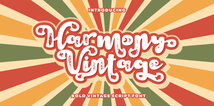 Harmony Vintage is a bold vintage script font. In this font I try to combine vintage with luxury/aesthetics. So that this font can be used in various projects with retro/vintage and luxury themes. Such as logos, branding, posters, packaging, book covers, clothes/apparel, quotes, titles and others. This font come with clean and rough font version. Come with Opentype feature with a lot of alternates, its help you to make great lettering. This font is also support multi language. To access the alternate glyphs, you need a program that supports OpenType features such as Adobe Illustrator CS, Adobe Photoshop CC, Adobe Indesign and Corel Draw.
 - Robesta by Jehansyah,
$15.00 Robesta is an incredibly beautiful font, with a luxurious and elegant appearance, making this the font of your best choice, with several alternates that you can combine, as well as League which is your newest style, this font has been coded with PUA which means you can easily use automatic glyphs, Robesta is a font that emphasizes dashing and daring, making this font look very striking and classy branding style, and with the combination of italics that we include in it for your design choices to be more creative with this font include : Numerica Punctuation Standard Latin Alternate Ligatures And Thank You Very Much Happy Design
 - Space Time by Lauren Ashpole,
$15.00 What can I say? I like fonts with stars. Space Time is a hand drawn font with a lot of variety. I started designing the regular version with the characters slightly touching but it wasn't quite what I had in my head. I’d imagined tightly spaced letters with overlapping shadows and the only way to get that effect was to create a second version with stackable layers. That means this download includes regular, base, outline, shadow, and stars files. Plus, the base and outline can be used for stacking or work fine as standalone fonts. This font is all caps but the lowercase letters feature alternative styles.