10,000 search results
(0.04 seconds)
- Tati by Wiescher Design,
$33.33I only had this bouncy curve and a photograph of a daily menu (Truite Meunière) I took outside an obscure Paris restaurant when starting the design of this font. But while working on it I suddenly started thinking about Jacques Tati the famous but almost forgotten french director of Les Vacances de Monsieur Hulot, Jour des Fêtes, Mon Oncle, Playtime, Trafic etc. I thought about his bouncy walk and his hilarious ideas. The memories never left me while working on the font, so I decided to name the font after this great French moviemaker who gave me so many happy hours. Since Tati was a very funny character, I gave my characters a funny price. Thank you Jacques Tati, yours Gert Wiescher - Doctrine by Barnbrook Fonts,
$75.00 A contemporary sans-serif typeface with an agreeable character, Doctrine Sans is the moderate comrade of the display typeface Doctrine Stencil. From the obscure starting point of the North Korean national airline livery, Doctrine was developed to encompass a series of more mature typographic influences. Doctrine draws influence from the classic mid-century neo-grotesques and, while it retains a sense of crisp modernity, it exudes a more contemporary and human character. The rounded, lighter weights speak with graceful composure while the large x-height, low contrast and squarer, heavier, weights give Doctrine an affable charm and a persuasive voice. The alternate characters borrow elements from humanist and geometric styles and provide an idiosyncratic, experimental counterpart to the primary character set.
 - Road Stencil by Wundes,
$15.00Road Stencil is a font based on painted street markings. The letters are stretched roughly six times their normal height so that when viewed from an angle, the text is seen as proportional. If you're looking to Photoshop a street scene, this is your font. This is an all caps font, but the letters were copied to lower-case for convenience. In these forms, I've preferred to use horizontal and diagonal dividers instead of verticals which can weaken the fonts readability. This font embodies a pleasant aesthetic while maintaining a coherent and believable feel. Check out the 'Rough' version of this font, which has more of a 'drawn on asphalt' look. The rough version's lower case letters have eroded alternates. - Darkmire by ryan creative,
$12.00 Darkmire Blackletter is a writing style created with the pentool. Attractive hand strokes give this font a strong look. It can be used for various purposes. such as, business design, product design, quotation etc. FEATURES; -Uppercase, Lowercase, Foreign Support, Numbers and Punctuation. -Regular & italic -Works on PC. -Simple installation. -Accessible in Adobe Illustrator, Adobe Photoshop. Adobe InDesign, it even works in Microsoft Word. -Fully accessible without additional design software. Darkmire is coded with Unicode PUA, which allows full access to all additional characters without having to design any special software. Mac users can use the Font book, and Windows users can use the Character map to view and copy any extra characters to paste into your favorite text editor/app.
 - Tabac Slab by Suitcase Type Foundry,
$75.00 Tabac Slab was created by combining several contradictory influences, the result of which is a universal linear font. The combination of brisk serifs and refined calligraphic details in the structure of the characters serves to create an original concept that mixes influences from both book and advertising graphics. Serifs aid legibility in long texts, while small drawn details realise their full potential in sizes of twenty-four points and larger. The basis for our Egyptienne was Tabac Sans, with which Slab logically forms a harmonic duo. The addition of bracket-less serifs caused the typeface to thicken and become solidly anchored on the lines, giving a firm answer to all typographers who like to complain about the slight exuberance of grotesque fonts.
 - Apocalypso by Barnbrook Fonts,
$30.00 Apocalypso is a pictogram font for the end of the world. The name Apocalypso is a portmanteau of the words apocalypse (end of the world) and calypso (joyful improvised music), with a meaning analogous to the idiom ‘fiddling while Rome burns’. The Apocalypso family is more of an art project than a practical font and contains a series of crosses and pictograms. The crosses add decorative detailing to typographic layouts, whilst the pictograms can be deployed to express the forthcoming apocalypse. Apocalypso was originally published in 1997, a few years before the turn of the millennium. It is both a document of the ideas of the time and a scarily prophetic vision of a possible world that has now largely come to pass.
 - FF Signa Stencil by FontFont,
$68.99 Danish type designer Ole Søndergaard created this display FontFont in 2011. The family contains 3 weights: Book, Bold, and Black and is ideally suited for advertising and packaging, film and tv as well as music and nightlife. FF Signa Stencil provides advanced typographical support with features such as ligatures, alternate characters, case-sensitive forms, fractions, super- and subscript characters, and stylistic alternates. It comes with a complete range of figure set options – oldstyle and lining figures, each in tabular and proportional widths. As well as Latin-based languages, the typeface family also supports the Cyrillic writing system. This FontFont is a member of the FF Signa super family, which also includes FF Signa, FF Signa Correspondence, FF Signa Serif, and FF Signa Serif Stencil.
 - FF Signa Correspondence by FontFont,
$68.99 Danish type designer Ole Søndergaard created this sans FontFont in 2002. The family contains 4 weights: Regular, Italic, Bold, and Bold Italic and is ideally suited for logo, branding and creative industries and small text. FF Signa Correspondence provides advanced typographical support with features such as ligatures, alternate characters, case-sensitive forms, fractions, super- and subscript characters, and stylistic alternates. It comes with a complete range of figure set options – oldstyle and lining figures, each in tabular and proportional widths. As well as Latin-based languages, the typeface family also supports the Cyrillic writing system. This FontFont is a member of the FF Signa super family, which also includes FF Signa, FF Signa Serif, FF Signa Serif Stencil, and FF Signa Stencil.
 - FF Celeste by FontFont,
$79.99 British type designer Chris Burke created this serif FontFont in 1994. The family has 10 weights, ranging from Regular to Black (including italics) and is ideally suited for book text, editorial and publishing as well as logo, branding and creative industries. FF Celeste provides advanced typographical support with features such as ligatures, small capitals, alternate characters, case-sensitive forms, fractions, and super- and subscript characters. It comes with a complete range of figure set options – oldstyle and lining figures, each in tabular and proportional widths. As well as Latin-based languages, the typeface family also supports the Cyrillic and Greek writing systems. This FontFont is a member of the FF Celeste super family, which also includes FF Celeste Sans and FF Celeste Small Text.
 - Ezekiel by MYSTERIAN,
$9.00 Ezekiel Script is the font become flesh—mythic gesture imposed upon forms of mechanical medium. Typography has changed the internet; our phasing mimetic desires tend toward posture rather than rationale, and the face is a concept that explores that concept. Obviously some reading of McLuhan has infliunced this concept of analysis. The script has ample diacritic extensions, as well as an alternative for the ampersand (characteristic of MYSTERIAN type) and the eszette: an upper and lower case. The upper and lower case alphabets are diverse in that the majuscules do not have linking strokes while the miniscules do. This was the first script that I've made, and great attentiveness was taken to ensure that links were set accurately, and spacing harmonious throughout.
 - HandMade by Misprinted Type,
$39.00 Handmade is based on my own handmade lettering, which is inspired by vernacular and ornamental type. It has the naive personality from street hand-painted signs from Brazil and that charm and elegance of vintage ornamental fonts. Each letter has its own style and the font comes with 2 uppercase variations, meaning you can mix them in order to write words without repeating the same character. The font has a handmade warmth feel to it, which is ideal for projects that demand the craftsmanship look or just that modern, grunge, fun type that goes well with tons of different styles. If that was not all, Handmade also comes with an EPS vector set with 16 vector and hand-drawn ornaments! Enjoy!
 - Royale Italic by Resistenza,
$39.00 With Royale, Resistenza reinvented the bifurcated Tuscan genre in a contemporary, warm and playful form. Now our aim was to complete this decorative family with an italic version of the font. Rounded terminals, fabulous fancy fun spurs with elegant and extravagant flourishing - Royale italic comes in 8 weights which can also be layered to create polychromatic effects in another nod to the Victorian era these styles were popularised. While inspired by days gone past this Royale is far from a revival as unlike the classic Tuscans which inspired its structure Royale is monoline and sophisticated in its simplicity. Perfect for display and emphasis, Royale will command attention and leave a memorable impression wherever it is used. Check out also Royale
 - FF Kievit by FontFont,
$99.99American type designer Michael Abbink created this sans FontFont in 2001. The family has 9 weights, ranging from Thin to Black (including italics) and is ideally suited for advertising and packaging, book text, logo, branding and creative industries, small text, wayfinding and signage as well as web and screen design. FF Kievit provides advanced typographical support with features such as ligatures, small capitals, alternate characters, case-sensitive forms, fractions, and super—and subscript characters. It comes with a complete range of figure set options—oldstyle and lining figures, each in tabular and proportional widths. As well as Latin-based languages, the typeface family also supports the Cyrillic and Greek writing systems. FF Kievit received several awards: the Bukva:raz award in 2001 and the ISTD award in 2001. - Jugo Script by Sudtipos,
$39.00 Jugo Script is a Koziupa/Paul near-parody of the soft and speedy late-1980s, early-1990s display scripts. Though it essentially is one of the usual exhibits of Koziupa's calligraphic skill, its individual shapes and overall construct show a mischievous wink at Oz Cooper and the hundreds of lens-blurred film types he inspired in the 1970s and 80s. Koziupa's unique sense of letterform and proportion is on full display in the uppercase and the figures, while the lowercase is an eccentric exercise in single stroke lettering, complete with quick and subtle wrist bends, minimal pausing, and hurried exits. Jugo Script's softness and internal call-and-answer structure make it a natural for comfort food packaging, especially the sweet stuff.
 - Esperanza by Anastasia Kuznetsova,
$21.00 Say hello to Esperanza :) 3 quivering, playful handwritten fonts, each carefully designed to complement each other in a natural way!! Enjoy it!! This product includes 3 font files containing uppercase and lowercase characters, numbers and a large set of punctuation marks. Font Features - A-Z; a-z character set; - 1 language (English); - numbers and punctuation marks, symbols Fonts can be opened and used in any software that can read standard fonts, even in MS Word. No special software is required, and to get started. It is recommended to use it in Adobe Illustrator or Adobe Photoshop Made with love and magic ♡ Thank you for checking this out, and feel free to write me a message if you have any questions! ~ Anastasia
 - Newspeak by Barnbrook Fonts,
$30.00 Newspeak is a display typeface based upon Soviet architectural forms from the Stalinist period (spanning the 1930s—'50s). Stalinist architecture is now considered unsightly and without aesthetic merit, yet it has a strange beauty, hinting at an unrealised utopia (while its function was to buttress a brutal dictatorship). Inspiration was also drawn from the Cyrillic alphabet which, to kids growing up in Western Europe in the '70s and '80s, was a cipher for an alternative way of living – Cyrillic letterforms represented the exotic, familiarity-twice-removed universe of Eastern Bloc states. When you visited a communist country you were confronted with unfamiliar typography that reinforced your sense of alienation and unease that there existed a real, if imperfect, working alternative to consumerism.
 - Valenteena by Ingrimayne Type,
$9.95 Valenteena is in the spirit of the 19th century, but there are no other typefaces quite like it. It is geometric, using distorted hearts to form the letters. The lower-case letters are smaller versions of the upper-case letters. The overlay variant is derived by breaking ValentinaContour into its parts: the inner letter, the white inner border, and the black outer border. To use them one must have a program that allows layers of letters. Type in and format the inside variant to get the message you want. Also select the color you want this layer to have. Copy this layer twice, formatting one to the medium and and the other to outside. Color each of them in the colors you want and them combine the three layers, placing them so the letters exactly align. You will get letters with three colors.
 - Ana by LetterPalette,
$35.00 Ana is a chromatic typeface consisting of 26 uppercase Latin characters, inspired by arabesque patterns from the nineteenth century. Programmed to enable users to easily create multicolored drop caps and initials, this decorative display typeface features a different ornament for every letterform, which fits perfectly with its glyph shape. This ornament is usually more luxurious on the left side of the letter, while on the right it is scarce, so that the body text can be placed close to the initial. These initials are valuable for use in large sizes, like posters, magazines, packaging design, fairy tales, and so on. The final forms of the initials consist of 5 parts which can be individually colored. There are 5 font files named Ana Layer A, Ana Layer B, and so on. A font user can manually create a multicolored initial with these font files, if there is no possibility to use the Contextual Alternates option. To do that, it is necessary to make 5 layers in the page layout software. Then, the corresponding character should be placed on each layer, so that Ana Layer A is on the lowest layer and Ana Layer E is on the highest one. Note that the glyph shapes are contained in the lower case positions. In contrast, the font file named Ana is programmed, so it is possible to create a multicolored initial with the Contextual Alternates command. There is no need for additional layers, everything happens on a single layer. First, the Contextual Alternates command (usually under OpenType menu) should be disabled. Then, using lower case key, type the desired character 5 times and apply color to them. Select them all and turn on the Contextual Alternates. Also, the font file Ana comes with a set of ‘black’ initials that can be used just like any other non-color typeface. The ornamental versions are contained in the uppercase positions, while the letters without the ornaments are in the lower case. With the font file Ana Monochrome one can only get the monochrome initials. Ornamental letters are contained in the upper case positions, while the letterforms without the ornaments are in the lower case.
 - Sorren Ex by Reserves,
$49.00 Sorren Ex is a slightly less condensed, more robust version of Sorren. Its overall width has been increased to the point just before its rounded forms begin to flatten, retaining the aesthetic essence of the original without compromise. Sorren is a definitive bold condensed sans influenced by neo-grotesque designs. A relatively low stroke contrast complimented with sharp, horizontal stroke ends lend an unyielding appearance, while its rounded forms and refined curves juxtapose its inherent strength with grace. Stylistically, Sorren has a classic, timeless feel with a contemporary finish and attention to detail. It is characteristically more elegant and considerably sturdier than the typical condensed sans, lending to its singular disposition.
 - Dequindre by Alex Jacque,
$30.00 Dequindre is a monolinear blackletter typeface, and was drawn as if grade school handwriting practice sheets came in a blackletter variety. Dropping the thin/thick calligraphic contrast of traditional blackletter glyph construction and instead sticking to the bare skeleton of the typeface, Dequindre manages to bring forth a delicate, contemporary aesthetic that plays off of a core blackletter form. Overall portrayed with a softer, more friendly take on the angular, severe forms of 16th century blackletter style, and through pulling some of the curvier, smoother stroke qualities of Antiqua while still maintaining the overall construction and flourish of Fraktur, Dequindre sits in a unique space in the pantheon of blackletter typefaces.
 - ChefScript by Andinistas,
$79.95 Chef Script is an experimental font designed by Carlos Fabian Camargo G. Its fantasy design contains 1463 glyphs to compose words, phrases and short messages on small and large sizes. The idea was born in a sketchbook that was perfected again by hand and achieving "non-neutral drawings" on tracing paper. With bezier digitization the empty and full parts of letters appeared with soft and eloquent curves as calligraphic result produces optimal readability. Chef Script combines warmth and good humor running in countless design applications such as labels and base plates, covers, posters, movie titles, seals and any printed design that needs an unusual typographic tool. In that sense, Chef Script is influenced by Speedball lettering manual (1957), Ross F. George. The illustrative nature of "ChefScript-complete" does not look anything like the traditional type design hierarchies. Therefore offers 7 hierarchical resource groups to design comfortable contexts flavored with illustration and typography: • ChefScript-Basic: Letters with horizontal and vertical thrifty proportions mimic an uninterrupted calligraphy brush made with flat tip. Thus its letters have ascenders and descenders strokes perpendicular to its base line and equal to the height of the lowercase. • ChefScript-Swashes: Letters expressive and unique flourishes to design highlighted words or phrases. • ChefScript-Caps: Uppercase with lowercase height give the impression of interrupted uppercase italics writing within what is written with uninterrupted lowercase letters producing strong contrast within a paragraph fragment. • ChefScript-Containers: Container drawings designed to exchange with infinite possibilities each order so that its inferior serve to store information written or drawn. • ChefScript-Dingbats: Pictograms that communicate: kitchen, chef, restaurant, food, etc. • ChefScript-Numbers: Bulky and useful numbers to highlight prices or figures containing points or dollar signs. • Chef Script-Words: Predesigned words with uninterrupted letters diagonally leveled highlighting various thoughts in writing.
 - VLNL Bonen by VetteLetters,
$30.00 While sketching for a music project logo, Donald DBXL Beekman looked at several wood type alphabets as a starting poing. One of these was No.120, patented in 1880 by William Hamilton Page. With its distinct diagonally cut serifs and round shapes cut off at top and bottom, it bore just the right feel for the project. DBXL digitized the alphabet, adding all characters needed for a full set. During this process all shapes were widened, tweaked and streamlined to enhance consistency and rhythm along the whole font. VLNL Bonen is an all-caps display font with a very specific western cowboy or circus look. For instance burger or barbecue grill restaurants would do well with this one. We can easily see it shine on a festival flyer or poster as well, and not just country & western festivals. VLNL Bonen is suitable for any ‘big’ use that needs to stand out of the crowd. Bonen is the Dutch word for beans, a world wide source of nutrition and proteins it comes in a multitude of shapes, colours and sizes. Beans are also the most eaten foods in a cowboy’s diet along the trail. Available in abundance and easily preserved and transported, many recipes on the cattle drives in the American Wild West used beans. Think of chili, mashed beans with biscuits and bean soups. “Keep them doggies movin’, cowboy!”
 - ThreeDee by URW Type Foundry,
$99.99The idea for this completely new font design with overlapping characters came when Axel Stoltenberg, longtime IKARUS program developer at URW + +, visited a restaurant. As it can be seen quite often , the daily specials were offered handwritten with chalk on a blackboard applying a writing technique never been available before for digital fonts: each character is partly covered by its predecessor creating a three-dimensional effect. The implementation of this unusual notation for digital setting required a lot of programming and testing until all necessary character variants were produced and set properly always using the correct form. In order to achieve this, the OpenType Pro font ThreeDee contains about 12,400 characters and all the necessary OpenType features (GSUB ) for the automatic setting in OTF savvy application programs. The slightly playful basic design for ThreeDee was created by Anna Stoltenberg , the daughter of Axel, specially devised for the innovative representation and support of its special nature. The shadow generated with IKARUS even intensifies the 3D effect. As is well-known, making use of the embedded OTF features, i.e. the automatic access to all the 12,400 character variants , a corresponding text / layout program ( InDesign, Quark Xpress, current Open / LibreOffice or MS Word etc. ) is required. ThreeDee is a headline font that will unveil all its charisma and exceptional quality at appropriate, larger sizes. - Welland by Factory738,
$15.00 Welland is a modern and elegant serif font family. The combination of modern and vintage elements renders an elegant design. The variety of weights provide a range of choices that will help you find the best typographic colour for your project. Lighter weights are well-suited for body text while heavier ones are ideal for high impact headlines. The available stylistic Ligature and Alternate offer a number of different characters that give your project design or logo a unique look. 5 Weights (Light, Regular, Semibold, Bold, Black) Basic Latin A-Z and a-z Numerals & Punctuation Stylistic Alternates & Ligatures Multilingual Support for ä ö ü Ä Ö Ü ... OTF file format Free updates and feature additions Thanks for looking, and I hope you enjoy it.
 - King Sans by Factory738,
$15.00 King Sans is a stylish sans serif font family. The mix of modern and vintage elements results in an elegant design. The different weights offer a variety of options to help you find the best typographic color for your project. Lighter weights are ideal for body text, while heavier weights are best for high-impact headlines. The available stylistic Ligature provide a variety of different characters that give your project design or logo an unique shape. 5 Weights (Light, Regular, Semibold, Bold, Black) 2 Styles (Regular and Italic) Basic Latin A-Z and a-z Numerals & Punctuation Stylistic Ligatures Multilingual Support for ä ö ü Ä Ö Ü ... Free updates and feature additions Thanks for looking, and I hope you enjoy it.
 - Ivory Coast by Aminmario Studio,
$20.00 Introducing Ivory Coast font is modern and elegant handwritten with a quick stroke pen effect. Comes with regular and italic. With built in Opentype features, this script comes to life as if you were writing it yourself. This font is great for your creative projects such as watermark on photography, and perfect for logos & branding, photography, invitation, watermark, advertisements, product designs, stationery, wedding designs,label, product packaging, social media, movie titles, books titles, a short text even a long text letter and good for your secondary text font with sans or serif. And also for special events or anything that need handwritting taste. Don't hesitate if you have any questions. Thanks for checking out this font. I hope you enjoy it! AminMario
 - Amienne by Typodermic,
$11.95 Looking for a typeface that’s full of life and energy? Look no further than Amienne! This charmingly informal brush script typeface is perfect for all your creative projects. With a nimble rhythm that moves gracefully across the page, Amienne is sure to capture attention and add a touch of whimsy to any design. But that’s not all—Amienne also features ligatures, which means that certain letter combinations will be replaced with custom glyphs to create a more natural-looking brush flow. This gives your text a unique and organic feel that’s perfect for everything from invitations to packaging design. And with both Regular and Bold styles available, you can choose the perfect weight to suit your project. Whether you’re creating a bold headline or a delicate script, Amienne has you covered. So why settle for a boring font when you can add a touch of charm and personality with Amienne? Try it out today and see the difference for yourself! Most Latin-based European, Greek, and some Cyrillic-based writing systems are supported, including the following languages. Afaan Oromo, Afar, Afrikaans, Albanian, Alsatian, Aromanian, Aymara, Bashkir (Latin), Basque, Belarusian (Latin), Bemba, Bikol, Bosnian, Breton, Bulgarian, Cape Verdean, Creole, Catalan, Cebuano, Chamorro, Chavacano, Chichewa, Crimean Tatar (Latin), Croatian, Czech, Danish, Dawan, Dholuo, Dutch, English, Estonian, Faroese, Fijian, Filipino, Finnish, French, Frisian, Friulian, Gagauz (Latin), Galician, Ganda, Genoese, German, Greek, Greenlandic, Guadeloupean Creole, Haitian Creole, Hawaiian, Hiligaynon, Hungarian, Icelandic, Ilocano, Indonesian, Irish, Italian, Jamaican, Kaqchikel, Karakalpak (Latin), Kashubian, Kikongo, Kinyarwanda, Kirundi, Komi-Permyak, Kurdish (Latin), Latvian, Lithuanian, Lombard, Low Saxon, Luxembourgish, Maasai, Macedonian, Makhuwa, Malay, Maltese, Māori, Moldovan, Montenegrin, Ndebele, Neapolitan, Norwegian, Novial, Occitan, Ossetian, Ossetian (Latin), Papiamento, Piedmontese, Polish, Portuguese, Quechua, Rarotongan, Romanian, Romansh, Russian, Sami, Sango, Saramaccan, Sardinian, Scottish Gaelic, Serbian, Serbian (Latin), Shona, Sicilian, Silesian, Slovak, Slovenian, Somali, Sorbian, Sotho, Spanish, Swahili, Swazi, Swedish, Tagalog, Tahitian, Tetum, Tongan, Tshiluba, Tsonga, Tswana, Tumbuka, Turkish, Turkmen (Latin), Tuvaluan, Uzbek (Latin), Ukrainian, Venetian, Vepsian, Võro, Walloon, Waray-Waray, Wayuu, Welsh, Wolof, Xhosa, Yapese, Zapotec Zulu and Zuni.
 - Harri Text by Blancoletters,
$39.00 Harri Text is more than an extension of Harri. It shares its origin, a certain flavour and a great deal of its idiosyncrasies, but while Harri is an uppercase-only typeface intended for display uses, Harri Text is conceived as a text type family, including a new extra-light weight, italics, small caps and other additions that make it suitable for editorial purposes. As its predecessor Harri Text addresses several concerns regarding the dualism neutrality vs. idiosyncrasy, or in other words, how local features meet global design in the context of a modern society (as is the case in the Basque Country in recent times). The origin of Harri Text —vernacular Basque lettering for the most part— is full of idiosyncrasies and peculiarities that, while giving them its special character, may hinder readability in some cases. The default set in Harri Text tones its essence down a little bit. It is still present, although less obstrusive. Stylistic sets 1, 2 and 3 are a chance to recover gradually this essence modifying some characters —specially the characteristic design of letter A– for those who seek a more local flavour. Stylistic set 4, on the other hand, does the opposite job, this is, removes asymmetrical serifs and other small details in order to create a more neutral atmosphere. Any traces to its origin are this way diluted resulting in a crisp and clean incise variant. Stylistic set 6 is available in the italic styles. It provides a more fluid and cursive flavour to some letters in case a calligraphic mood is desired. Harri Text comes with 1054 glyphs in its character set (1078 in the italics) with support for more than 220 languages.
 - Beefcakes by Monotype,
$50.99 Inspired by butcher shop and supermarket window advertising, Beefcakes™ emulates "big brush” style lettering – with a contemporary twist. Not for the typographically timid, this is a design that makes a powerful and friendly statement in print and on screen. Advertising headlines, posters, cover art, menus and packaging are all in Beefcakes’ wheelhouse. While it would be a little crowded on small screens, big type in web sites and games are also part of Beefcakes kit-bag. Drawn by Jim Ford, Beefcakes’ big, sassy and playful shapes are sure to grab attention. Its letterforms are dense and sturdy – yet soft and welcoming as your mom’s old couch. The suite of Beefcakes fonts is available as all-caps designs with small caps, in roman, italic and shadow flavors. As a nod to the typeface’s inspiration, Beefcakes fonts also include a set of decorative abbreviations (lb, oz, kg, in, etc.) for bold signage and showcard-style displays.
 - Essonnes by James Todd,
$40.00 Made up of sixteen individual weights and spread over three different optical sizes, Essonnes is designed to bring utility back to the Didot genre. It’s a common belief among designers that Didones don’t work for text. This wasn’t true in 1819 and it isn’t true today. Like its forbearers, Essonnes is a truly optical family—not just a study in adjusting contrast. The text and display weights have been designed from the ground up for their intended roles. This means that everything from the height of the uppercase & lowercase letters have been specifically tuned for their intended purpose. Like many typefaces, Essonnes started after falling in love with a piece of history. In this case, it was the eccentric forms of Pierre Didot’s Type and the evolution of the High contrast Didone throughout the 19th century. It was out of curiosity and love for these forms that led to the first draft of what would become Essonnes back in 2011. These unique situations—screens, modern printing methods, the previous 200 years of typographic innovation since the original design, my own life experiences—have led to a typeface that, while based on history, is not stuck in it.
 - TXT Monkeyshine by Illustration Ink,
$3.00This font is all monkey business. Add character and whit to scrapbook journaling, invitations, signs, flyers, and announcements. This lettering has a juvenile, handwritten style. - Bulbatail by Letterhend,
$14.00 Introducing, Bulbatail - a cute hand writing with casual looks. This type of font perfectly made to be applied especially in logo, and the other various formal forms such as invitations, labels, logos, magazines, books, greeting / wedding cards, packaging, fashion, make up, stationery, novels, labels or any type of advertising purpose. Features : uppercase & lowercase numbers and punctuation multilingual PUA encoded We highly recommend using a program that supports OpenType features and Glyphs panels like many of Adobe apps and Corel Draw, so you can see and access all Glyph variations.
 - Benacio by Keristyper Studio,
$14.00 Introducing Benacio Display Font is a handmade font style dance and then traces of life to have a Grungy brush and unique calligraphic shape, the writing style is very natural and simple. Benacio Handwriting Font multilingual support: Afrikaans, Albanian, Catalan, Danish, Dutch, English, Estonian, French, Finnish, German, Icelandic, Indonesian, Italian, Malay, Norwegian, Portuguese, Spanish, Swedish, Zulu, and many more. What’s Included : Web Fonts Standard & Multilingual glyphs Ligature Works on PC & Mac Simple installations Accessible in Adobe Illustrator, Adobe Photoshop, Adobe InDesign, even work on Microsoft Word. Hope you enjoy with our font!
 - Aprilla Grotesk by Zamjump,
$17.00 Aprilla Grotesk is a modern serif font packed with alternatives and binders, helping you create logos, quotes, posts, social media posts, branding projects, magazine covers, book writing, and more. · Works on PC & Mac · Multilingual support · Ligature · Alternate Fully accessible without additional design software Accessible in Adobe Illustrator, Adobe Photoshop, and Microsoft Word. I really hope that you will have fun using the Aprilla Grotesk font and that it will make a perfect addition to your font collection! Contact me with an inbox message if you have any questions. Thank You!
 - Terminax by Monotype,
$29.99Terminax™ is a highly legible monospaced sans serif font with an extensive character set. Unlike other monospaced fonts, Terminax has a personality all its own. Terminax is a futuristic and assertive font which is popular with titles, and headings. Why a Small Caps font you may ask? While most word processing and page layout software offer a small cap feature - this merely distorts the letterforms and creates squashed, uneven results. Terminax features small caps that were designed so their weight matches the upper case letters, providing a clean, attractive appearance. - Alessia Harvey by Letterhend,
$19.00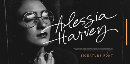 Introducing, Alessia Harvey - an authentic hand writing with natural signature style. This type of font perfectly made to be applied especially in logo, and the other various formal forms such as invitations, labels, logos, magazines, books, greeting / wedding cards, packaging, fashion, make up, stationery, novels, labels or any type of advertising purpose. Features : uppercase & lowercase numbers and punctuation multilingual alternates and ligatures PUA encoded We highly recommend using a program that supports OpenType features and Glyphs panels like many of Adobe apps and Corel Draw, so you can see and access all Glyph variations.
 - Futura Black by Bitstream,
$39.99Josef Albers drew a stencil sanserif form at the Bauhaus in 1923 (published in 1926); Paul Renner and the Bauer design office made a similar design into a typeface in 1929, and rather confusingly included it in the Futura series. Many websites erroneously attribute the stencil design to Josef Albers, but there is no evidence that the two met or collaborated on Futura Black. In 1929 Josef Albers and Jan Tschichold corresponded on the “Transito” typeface (another very similar stencil typeface, while Paul Renner was working with Jan Tschichold. - GHEA Granshan by Edik Ghabuzyan,
$40.00 GHEA Granshan is a super font family. It has 9 upright weights and their Italics. It supports Latin Pro, Armenian, Greek, Cyrillic, Bulgarian & Ukrainian alternatives alphabet systems. The weights from Regular to Bold and their Italics can be used as text fonts. The weights thinner than Regular and thicker than Bold can be used as Display fonts. It is an easily readable fond and the eyes don't get tired while reading. GHEA Granshan has a slight contrast style and at the same time is quite bright and clear.
 - Donna Lena by Eurotypo,
$39.00 Donna Lena is a chancery cursive, feminine in character. Elegant and timeless, this font marks the return of the classical canons of the Renaissance thanks to its open forms and the clear-cut ends, while recalls the graceful ways and the intense gaze of the ladies that populate the Florentine paintings in the sixteenth century. Donna Lena is soft and slightly inclined, with a fast ductus and marked contrasts in thickness to highlight the gesture. Different stylistic variations and ligatures are considered to make the most of the many OpenType features.
 - Mellodate by Letterhend,
$19.00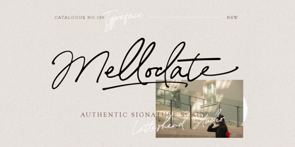 Introducing, Mellodate Script - an authentic hand writing with natural signature style. This type of font perfectly made to be applied especially in logo, and the other various formal forms such as invitations, labels, logos, magazines, books, greeting / wedding cards, packaging, fashion, make up, stationery, novels, labels or any type of advertising purpose. Features : uppercase & lowercase numbers and punctuation multilingual alternates and ligatures swashes PUA encoded We highly recommend using a program that supports OpenType features and Glyphs panels like many of Adobe apps and Corel Draw, so you can see and access all Glyph variations.