10,000 search results
(0.146 seconds)
- Super Giants by Letterhend,
$19.00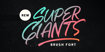 Introducing, Super Giants - a brush font with natural hand writing with modern and dynamic feel. This type of font perfectly made to be applied especially in logo, and the other various formal forms such as invitations, labels, logos, magazines, books, greeting / wedding cards, packaging, fashion, make up, stationery, novels, labels or any type of advertising purpose. Features : uppercase & lowercase numbers and punctuation multilingual alternates and ligatures swashes PUA encoded We highly recommend using a program that supports OpenType features and Glyphs panels like many of Adobe apps and Corel Draw, so you can see and access all Glyph variations.
 - Dinner by Ingrimayne Type,
$7.00 Dinner is a family of novelty fonts in which the characters are formed from spoons, forks, and knives. Dinner-Regular was designed in 1990, one of the earliest fonts in the IngrimayneType collection. It contains a mixture of knives, forks, and spoons and the lower-case letters are smaller versions of the upper-case letters. In 2021 the family was expanded with Dinner-Knives in which all characters are formed by arranging knife shapes, Dinner-Spoons in which the characters are formed from spoon shapes, and Dinner-Forks in which the characters are formed from fork shapes. All three are caps-only but the characters on the lower-case keys are alternate versions of upper-case letters . Dinner is a decorative display family that needs to be used at a large size. The logical place to use it is for food-related items.
 - Goudy by Ascender,
$40.99 Goudy Forum is a revival and dramatic expansion by Tom Rickner, type designer at Ascender Corporation, of Frederic W. Goudy’s 20th typeface design, "Forum Title". The Pro font began twenty years ago while Tom Rickner was a student at the Rochester Institute of Technology (RIT). Tom printed a type specimen using the Forum Title foundry hot metal types. Then in 1993 Tom began to digitize the font from that specimen while working as an independent type designer. Fifteen years passed before Tom dusted off the digital data and began working in earnest on font with a full Latin 1 character set. Steve Matteson, type director at Ascender, encouraged Tom to take this font further still, and soon the glyph repertoire and feature set blossomed to a robust Pro font with a myriad of advanced typographic OpenType features.
 - Ongunkan Hatran Hatrean by Runic World Tamgacı,
$70.00 I present Hatran as the last font of 2023. The Hatran script was used in what is now northern Iraq to write Hatran Aramaic, a Middle Aramaic dialect that was spoken in the region of Hatra and Assur in northeastern Mesopotamia from about the 3rd Century BC to the 3rd Century AD. Hatran Aramaic is also known as Aramaic of Hatra or Ashurian (Leššānā Assūrāyā \ ܠܫܢܐ ܐܣܘܪܝܐ), and first appeared in writing in 98 BC. The script is also known as the Hatran Aramaic script or Ashurian script. It appears mainly in texts found in the ruins of Hatra. There are also some texts in Hatran Aramaic from Assur and other places. It was discovered in 1912 by archaeologtists working in Hatra, which is near to the villages of Al-Hadar (الحضر) in the Nineveh Governorate (محافظة نينوى) of Iraq.
 - Cachet by Monotype,
$50.99According to designer David Farey, Cachet is a monospaced, monostroke typeface -- that isn't."" Why the sleight of hand? Typefaces that are limited to a single character and stroke width suffer in terms of legibility. Farey's goal in drawing Cachet was to create a typeface that gives the illusion of monospacing, while delivering a subliminal dose of reader-friendliness. At first glance, Cachet appears to be constructed of straight and nearly-straight strokes. A closer look, however, reveals several subtleties. Curved strokes have an almost calligraphic spontaneity. Places where character strokes meet are tapered slightly, while stroke ends have been flared. These quiet deviations from geometric uniformity give the design a human, organic, and decidedly non-digital look. An added benefit is that the subtle design modulation benefits readability. Farey's subtle design modulation results in a legible and highly usable new typeface. - Larks Tongues by Hanoded,
$15.00 Larks' Tongues in Aspic is the fifth studio album (released in 1973) by the English progressive rock group King Crimson. I have always liked this name, as it reminded me of old stories in which witches threw all kinds of weird ingredients (larks’ tongues, bat wings and petrified dragon dung) into a big cauldron. When I created this font, it looked like the writing in an old book of spells, so I just had to call it Larks’ Tongues. Larks’ Tongues is a very lively headline font which would look good on (children’s) book covers, posters and product packaging. So, if you are about to write a book about witches, want to throw a halloween party or want to market your Larks’ Tongues in Aspic, then by all means, use this font! Comes with a magical amount of diacritics.
 - Gentlemens Script by Piñata,
$15.00 Gentlemen’s Script is a dynamic hand-written script in which the sharpness and speed of writing harmoniously coexist with elegance and a serious attitude. The script allows you to simulate fast inscriptions made by hand while keeping them elegant and classy. Working on the project, we wanted to develop a script that would harmoniously complement serifs or traditional sans-serifs and perfectly match them. Gentlemen’s Script is like an accessory in a gentleman’s wardrobe. It dilutes font traditions and adds brightness and dynamics to them. Despite the fact that the script was designed to be used as a complementary font, it has all the prerequisites to become the main character of your design story. It does not matter how you use it—Gentlemen’s Script easily adapts to reality and always works at the maximum level of efficiency. To make the script more harmonious and natural, we have drawn more than 60 ligatures. In order for the ligatures to be substituted automatically, we recommend always keeping the standard ligatures OpenType feature turned on! In addition, there are several alternative characters in the font that are programmed on the OpenType feature contextual alternates and which are used when the letter meets the service characters. To use the script to its maximum power, we recommend that you always keep the standard ligatures and contextual alternates OpenType features turned on. If you do not have access to applications that support OpenType features, it does not matter—even without these features you can use and enjoy our font!
 - Bechamel by Andinistas,
$29.00 Hello! Do you need letters that look like they are drawn with a brush so that your creative work shines and stands out? We present Bechamel, a family of script fonts designed to be combinable with Bechamel Roman. BECHAMEL SCRIPT was hand drawn to design words and phrases in logos, packaging, posters, envelopes and greeting cards. BECHAMEL SCRIPT has high expressiveness because its energetic set of letters are meticulously drawn with calligraphy and lettering. In addition each of its incredible cursive letters give you the possibility to add a central vein to change the color, enhancing its impressive artisan splendor. These are the possibilities you receive by acquiring BECHAMEL: A) BECHAMEL-SCRIPT & VEIN: Cursive letters with carousel effect and OPENTYPE contained in: 26 Uppercase letters, 26 Small letters, 10 Numbers, 3 Fractions, 31 Punctuation marks, 77 Signs for languages belonging to Western Europe, 113 Signs for Central European languages. 20 Lowercase wipes, 13 uppercase alternatives for WORD START, 44 lowercase alternatives for HALF of word, 20 lowercase alternatives for WORD FINAL. NOTICE: Alternatives appear by clicking on glyph panel in Adobe Illustrator, Inkscape or Photoshop CC. B) BECHAMEL-WORDS: 57 words with capital letters underlined and combinable with BECHAMEL-SCRIPT 1, 2 and 3 ideal to connect and decorate your designs increasing expressiveness and authentic handwritten look of your ideas C) BECHAMEL-ORNAMENTS: 30 wonderful drawings made up of stars, borders, waves, hearts, dots, arrows, bow ties, etc., all specially coordinated to accompany your composite designs in BECHAMEL-SCRIPT and BECHAMEL-WORDS. Well, I hope that my work will be useful and above all that you have fun with it. If you have questions write to me that I will be happy to help you: • INTAGRAM: instagram.com/andinistas • BEHANCE: be.net/andinistas • FACEBOOK: fb.com/carlosfabiancamargoguerrero • TWITTER: twitter.com/andinistas
 - Cowgirl by By Meg Burk,
$25.00 An uppercase font that has versatile character. Got a story to tell? Cowgirl can help you tell it. Includes western-themed vector illustrations handmade by Meg Burk. I grew up spending almost every family vacation as a road trip across the southwestern US. In these adventures, I fell in love with learning about the nature around us; deserts, mountains, plains, piñon trees, rainbow trout, black bears, eagles, and more. I fell into freezing cold white water rapids, explored long-abandoned cliff dwellings, camped under the Milky Way, saw old cave markings, stone markings, preserved art, and read many a many old map legends. These memories are visceral and the inspiration that I get from them permeates my every day. Take a piece of these stories with you and use them in your designs, too. Handmade, meant to last a lifetime and inspire others for decades to come.
 - Urge Text by Eclectotype,
$30.00 It started with an italic, or to be more precise, half an italic. The slanted styles of Urge Text exhibit a certain bipolarity, the tops of glyphs having a standard italic form, the bottoms of glyphs being more Roman in their construction. This sturdy footing really locks the italics to the baseline, making them very legible while still being distinct from the uprights. The same bipolar approach didn't work very well in upright styles, so the Romans are more toned down. Ranging from the almost monoline, Egyptian style light weights to higher contrast ‘Modern’ bolds, there is much potential for use in typographically demanding scenarios. The family consists of six weights, normal and condensed widths, all with italics, making a total of 24 fonts; it’s a highly usable text typeface with an array of OpenType features. All styles include small caps, multiple figure styles (proportional- and tabular-, oldstyle and lining, small cap proportional figures, numerators, denominators, superscript and subscript), standard ligatures, alternate forms (stylistic sets), automatic fractions, case sensitive forms, and a handy (perhaps!) ‘percent off’ ligature in the discretionary ligatures feature.
 - Urban Tags by Tomatstudio,
$15.00 Inspired from tagging graffiti marker in the streets and my real experiences in graffiti scenes, Urban Tags comes with iconic rounded tip marker, this style often used by several graffiti artist around the world because the style is very unique, very fun to write in markers. Perfect if you want realistic Street art style or hip hop for your designs, poster, props etc. Because this is real graffiti fonts, "urban Tags" is different like other fonts, the space letter is shorter, for perfect result the Kerning you can adjust manually, because it's impossible to setting kerning like other regular fonts. I put extra glyphs for make the fonts looks more street art, use "åß∂ƒ©˙∆˚¬Ω≈ç" you can see in the preview.
 - Garvo by BeJota,
$25.00 Garvo is based on old Hollywood movie posters, vintage film credit designs and pays homage to Herb Lubalin's Serif Gothic font & lettering. This is why Garvo is named after the acclaimed international actress Greta Garbo. The Garvo family comes in 6 weights (from Thin to Black) and includes 2 different subfamilies: Garvo and Garvo Poster. Garvo is perfect for short readable texts, such as advertising and packaging designs, while Garvo Poster brings a wide range of contextual alternatives which makes it perfect for high impact pieces. Both styles increase the overall family flavor with discretionary ligatures, small caps figures. The 12 styles of Garvo are perfectly well suited for branding projects, album covers, audiovisual related designs, magazines and layouts, among other uses.
 - Angeletta by Monotype,
$50.99 Despite being drawn digitally, Angeletta is a typeface in the hand-lettering tradition. It draws on designer Rob Leuschke's three decades of experience with pen and ink, including his time creating scripts for Hallmark Cards. Spontaneous and energetic, Angeletta is satisfyingly inky – with strokes almost spilling into one another. Its quirky personality and titling version makes it a good choice for packaging and social expression, while its distinctive character could work well in branding, perhaps paired with a more sedate sans serif. The Angeletta typeface is a calligraphic script designed by Robert E. Leuschke exclusively for Monotype. It is available in OpenType OTF and TTF fonts formats. Angeletta has 900 glyphs with OpenType typographic features like contextual and stylistic alternatives, swashes, ligatures and fractions.
 - California Starlight by Cititype,
$17.00 California Starlight is a monoline signature font. Look like natural strokes using a roller pen. This is an upright font with a gently stroke follows the flow of the text. The uppercase size is higher, it's intended for a unique and prominent impression when used for 'branding', Tall and prominent yet integrated in the gentle flow of the lowercase. We propose this font for branding, logotype, photography caption, wedding invitation cards and merchandices, quote writing, craft projects, and various other unique prints. Stylistic Set Alternate (SS01 and SS02) is a swash at the beginning and end of the lowcase, also equipped with ligatures to add a unique impression and natural strokes. modern, sophistics and natural make this font a must have.
 - Mondo News by Untype,
$30.00 Mondo News is a typeface designed to fulfill digital and paper publication editorial needs, its cared equilibrium between slightly condensed proportions and generous «x» height, offers optimum performance without compromising legibility. The modulation of thick and thin strokes in the middle weights is balanced for extensive text reading, while on the heavy weights becomes more dramatic making them ideal for strong headlines. Equipped with 760+ glyphs, support for more than 200 languages, smallcaps, alternates, ligatures, dingbats and plenty of OpenType features, Mondo News modern interpretation of tradition performs excellent both on screen and on paper, satisfy the most demanding editorial needs and will nourish your pages with a convincing and reliable atmosphere. Mondo News is part of the Untype Mondo family typographic system.
 - Recoleta by Latinotype,
$29.00 Just like Grandma’s recipe, Recoleta combines a variety of ingredients—from various popular 1970s typefaces—such as the soft and gentle shapes found in Cooper or the fluid, angled strokes in Windsor— mixed into one single design that features familiar, yet fresh, modern flavors. Its variety of weights provide a range of choices that will help you find the best typographic color for your project. Lighter weights are well-suited for body text while heavier ones are ideal for high impact headlines. The available stylistic alternates offer a number of different characters that give your logo or business card a unique look. Recoleta, our best selling typeface; now support russian cyrillic. Made by Jorge Cisterna, the Latinotype Team with the consulting of Vika Usmanova.
 - Black Foroth by Twinletter,
$15.00 Black Foroth is a san serif font with an elegant yet fun relaxed appearance. It differs from other san-serif fonts in its application because it was created by combining serious and relaxed themes, resulting in a font that can give the impression of seriousness while remaining convenient. Use it in your creative projects to get a unique look and feel. This font is perfect for games, sporting events, branding, banners, posters, movie titles, book titles, quotes, logotypes, and more. of course, your various design projects will be perfect and extraordinary if you use this font because this font is equipped with a complimentary font family, both for titles and subtitles and sentence text, start using our fonts for your amazing projects.
 - Caskey by Twinletter,
$15.00 Caskey is a unique font with a graffiti motif, outdoor activities, and an abstract display with gorgeous graphics. We put all of it into this typeface, which we dubbed Caskey. We also include alternates, ranging from thin to thick, to make it easier for you to use; you are free to choose whichever suits you best. Now is the time to use this typeface to bring your specific project to life. This graffiti font is great for product logos, poster titles, headlines, packaging, film titles, logotypes, gorgeous writing, and trendy graffiti designs, among other things. Of course, if you utilize this font in your numerous creative projects, they will be perfect and outstanding. Use this typeface right away for your one-of-a-kind and remarkable projects.
 - Rabbits by Piñata,
$9.00 Rabbits is a super emotional hand-written font family that unites 10 different fonts. We’ve united these fonts with one common theme - childhood. Use these fonts to create any products for kids — children’s books layouts, mobile applications for children, as well as nursery interior design. We’ve given each rabbit a unique name. The names are arranged as the first 10 letters of the Latin alphabet: A — April, B — Bro, C — Chili, D — Dummy, E — Elf, F — Fatso, G— Goody, H — Hyper, I — Idol, J — Junior. Each rabbit has its own character, and you’ll definitely like Rabbits because of that. We’ve used an individual writing tool for every font. All the fonts were created on paper first and then digitized. Now, what’s your favorite rabbit?
 - House Sans by TypeUnion,
$30.00 House Sans is a 100 style super-family made up of 5 widths, 10 weights plus matching italics in two design approaches through stylistic alternates to the E, F, L and e characters. The weights range from compressed to expanded, from thin to heavy creating a plethora of styles to create with. House Sans has a unique visual structure to key glyphs such as the A, M & Y that give the font a stand out feel while the contrasting horizontal bars provide a nice balance. The compressed weights are great for fitting in tight spaces whilst the Heavy styles are perfect for standing out from the crowd. The font features extensive support for European and Cyrillic languages, stylistic and discretionary ligatures, plus superiors, inferiors and fractions.
 - ZT Mota by Khaiuns,
$14.00 ZT Mota is a bold and elegant typeface. It has a temperamental character but is more flexible towards various stylistic designs, reflecting more in its graphics the transitional stage between classical serifs of varying proportions, leaning towards the stylized types of Roman culture. All the ZT Mota styles are based on the same core but with a completely different expression which is to have an extra large x-height and bold so that the font looks bold as if the writing on the font was actually carved out of stone, perfect for an efficient choice for use of distinguishable displays such as headlines, packaging, magazines, posters, and advertisements, among others. I hope you have fun using ZT Mota Thanks for using this font ~ Khaiuns X zelowtype
 - Jacky Black by DLetters Studio,
$30.00 Jacky Black, Handwritten ink style letters font that have a simple and natural shape, but still look elegant and exclusive. Jacky Black, It is suitable for use in your creative ideas, who want unique and natural-looking writing to support your beautiful design. This is a listing of all 229 glyphs contained in the font, including OpenType variants that may only be accessible via OpenType-aware applications. Each basic character (“A”) is followed by Unicode variants of the same character (Á, Ä…), then OpenType variants (small caps, alternates, ligatures…). This way you can see all the variations on a single character in one place. Thanks for your support, please kindly send us a message for any question about our product. Hope you like it.
 - Melrin by Craft Supply Co,
$20.00 Melrin – Display Typeface: A Floral Serif Wonder Introduction to Melrin Introducing Melrin Floral Serif Typeface, a display typeface that blends artistic flair with functionality. Its unique design features serifs that bloom like flowers. Ideal for retro designs, Melrin captures the essence of nostalgia in each character. Design and Aesthetics Melrin stands out with its floral serif accents, reminiscent of blooming flowers. This aesthetic makes it perfect for projects needing a touch of vintage elegance. Its bold structure embodies strength, while the delicate serifs add a soft, artistic touch. Versatility and Usage Beyond retro designs, Melrin excels in various applications. It’s a top choice for circus-themed graphics, posters, and branding materials. Its versatility extends to digital platforms, enriching websites and online ads with its unique charm.
 - Western Brother by Nathatype,
$29.00 Ready to enhance your branding? Looking for that “something” that’ll make your audience go WOW and clients get on board immediately? We’ve got JUST the thing for you! Western Brother-A Vintage Font Western Brother is a display typeface. Designed primarily as a captivating font with retro style. This font features thick that easy on the eyes and nice to look while it’s also easy to read at captivating headlines, or large branding text, the font oozes that cute aesthetic that just makes you go “aww!” Our font always includes Multilingual Support to make your branding reach a global audience. Features: Alternates Ligatures Stylistic Sets Swashes Bonus Ornament PUA Encoded Numerals and Punctuation Thank you for downloading premium fonts from Nathatype
 - Castlery by Fikryal,
$25.00 Castlery Modern Serif Font is a modern and elegant font designed with great care to provide a professional look for documents and graphic designs. This font has smooth and clean lines, while maintaining clear and easy-to-read letter heights. With an elegant serif style, this font is perfect for use in logos, books, magazines, posters, and other marketing materials that require a classy look. Castlery Modern Serif Font is available with uppercase letters, making it easy to customize to meet your design needs. With the advantages of a very modern and elegant design, as well as the ability to give a professional impression to your designs, Castlery Modern Serif Font is the perfect choice for graphic designers looking for cool and high-quality fonts. Features: Multilingual Support Thank you
 - Chaotic Neutral by Missy Meyer,
$12.00 I'm letting my inner nerd show through on this one: "Chaotic Neutral" is a Dungeons & Dragons thing. But the name applies to this font, too! Chaotic: This font has all sorts of built-in irregularities. Some variation in letter heights and letter widths, and the stroke widths are all over the place. It's all about the hand-written messiness. Neutral: And yet! I've smoothed the strokes a bit, and gone for as few nodes on each letter as I can (while still keeping a bit of roughness), so this font can be used for any kind of purpose -- not just print, but cutting out as well! Chaotic Neutral also comes with over 300 extended Latin characters for language support, and is fully PUA-encoded for easy access no matter what program you're using.
 - MFC Nadall Medieval by Monogram Fonts Co.,
$19.00 MFC Nadall Medieval was originally designed by Bernard William "Berne" Nadall for Barnhardt Brothers & Spindler back in 1885 under the name "Faust Text" and later under the "Missal Text Series". While you could use its capitals to construct an initial monogram, this is not a monogram font, but instead a fully functional typeface for invitations and period lettering. This lettering style has been precisely recreated and expanded on to create a full typeface with a small collection of ligatures. Here's what's included with the MFC Nadall Medieval: - 397 glyphs in MFC Nadall Medieval - including Capitals, Lowercase, Numerals, Punctuation and an extensive character set that covers multilingual support of latin based languages. (see the last graphics for a preview of the characters included) - Ornaments - two ornament glyphs. - Ligatures - for ff, fi, fl, ffi, and ffl combinations.
 - Tusker Grotesk by Lewis McGuffie Type,
$35.00 Tusker Grotesk is a headline typeface designed for robust and high-impact use. The initial inspiration for Tusker came from postwar typefaces like Haettenschweiler, Impact and Helvetica Inserat which use very high x-heights. Other influences in the condensed end of the Tusker family are old grotesques like Folio Extra Condensed and Stephenson Blake Elongated Sans No.1 with their flat terminals and closed-up apertures. Then as the widths in Tusker grow, the lettering takes some more inspiration from gothic style sans such as Inland Type's Title Gothic No.8, while maintaining the optical weight established in the narrow end of the family. Each width set is duplexed, stackable and is ideal for headlines, logos and bold attention-grabbing editorial design. Tusker has extended latin coverage ideal for western, central and eastern European languages.
 - EquipExtended by Hoftype,
$49.00 EquipExtended is the next complement for the Equip family and with its 16 fonts together with EquipCondensed, it extends the family to 48 styles. While developed from the same basic shape as the rest of the Equip family, it has its own particular friendly and warm appearance. With its wide and open proportions, EquipExtended makes a grand entrance for your headlines, subheads and even for the body of text. Try it out, the light style is free. EquipExtended is very well suited for ambitious typography. The EquipExtended family comes in OpenType format with extended language support. All weights contain semi-ligatures (design optimized single characters), proportional lining figures, tabular lining figures, proportional old style figures, lining old style figures, matching currency symbols, fraction- and scientific numerals and arrows.
 - Amadi by Craft Supply Co,
$20.00 Amadi - Quirky Serif Font is a delightful typeface that dances to its own beat, infusing a dash of whimsy and charm into your designs. With its quirky serifs and playful letterforms, Amadi takes the traditional serif style and gives it a whimsical twist. This font is the perfect choice for projects that aim to stand out and make a statement with a touch of quirkiness. Whether you're working on invitations, posters, or any creative endeavor, Amadi adds a distinctive and charismatic touch. Its irregular flows and unique character shapes inject a sense of fun and individuality into your designs. Amadi is like a joyful dance in the world of typography, making it an excellent choice for projects that want to break free from convention and embrace a playful, quirky spirit.
 - Ricardo by Bureau Roffa,
$19.00 Rather than confining itself to a single style, Ricardo combines the best of two worlds: the conceptual clarity of a geometric design with the legibility and warmth of a humanist design. Its open counters, crisp joints, and even texture allow for effective use in long-form text settings, while its simple geometric shapes combined with some unexpected details make it highly suitable for display settings such as branding and marketing. Ricardo contains seven carefully chosen weights, ranging from ExtraLight to ExtraBold. The Medium weight functions as a slightly darker alternative to the Regular. Ricardo’s 812 glyphs per style support over a hundred languages, and also include arrows and case-sensitive punctuation. The Ricardo family consists of three subfamilies: Ricardo, Ricardo ALT, and Ricardo ITA. Ricardo contains the most conventional forms, and is the most suitable option for long-form text. Ricardo ALT contains simplified shapes for the a, j, u, and t, which are also accessible through Stylistic Set 2 within Ricardo (in opentype-savvy applications). The cursive-like italics of Ricardo ITA provide a slightly more eccentric alternative to the standard italics. Furthermore, all styles contain stylistic alternates that swap the blunt apexes in A, M, N, V, W, v, w, y, and 1 for pointier ones. These are also accessible through Stylistic Set 1. Other opentype goodness includes: (discretionary) ligatures, smallcaps, case-sensitive forms, fractions, nine sets of numerals, and more. David Ricardo (1772-1823) is considered the first of the classical economists, and combined ground-breaking mathematical abstractions with an understandable down-to-earth way of explaining his ideas.
 - Become Display by Brenners Template,
$19.00 BECOME Display Font Family It tries to display playful ideas in well-balanced styles. Hello, designers. We always seek new innovations, but run into the world of forms and frames, presently. This font family presupposes pleasant imagination and provocation, but controls the change of various styles so as not to lose a sense of balance. B, E, M and W glyphs started from the same skeleton, but the detailed correction work for interpolation transformation was all applied differently. It is designed to be well suited to any layout while providing a unique stimulus. It can be a great display for all ages, from kids to seniors, and covers publishing, web, app and graphic design areas. OpenType Features Stylistic Sets(ss01) : C,E,G,H,L,N,O,Q,U,Z(Uppercases), a,b,c,d,e,g,i,j,l,,n,o,p,q,u,z(lowercases) Stylistic Sets(ss02) : ↑↗→↘↓↙←↖↔↕ ligatures : fi,fl oldstyle figures tabular figures fractions
 - Aragon by Canada Type,
$24.95 Re-introducing the classic mid-1500s Garamond forms for the twenty-first century is never an easy task. But Hans van Maanen makes a fine attempt at just that by remodeling the traditional shapes through a modern lens with stunning results. Aragon is a workhorse family that performs very well in a variety of text sizes, from footnotes and legal copy to lengthy body sets. Its combination of wedge serifs with uniquely tapered stems offers a sturdy Dutch touch that improves legibility altogether, while at the same time the slight stress shift to the top half of the characters makes the immersive reading experience very open and comfortable. The Aragon family comes in a standard two-weight set with corresponding italics, a roman small caps font with its own italics, and very attractive initials for display uses. All fonts come in the usual popular formats, and include a glyph repertoire that covers Western, Central and Eastern European languages, as well as Turkish and Welsh/Celtic.
 - Melisenda Script by Stripes Studio,
$13.00 Melisenda Script with the kind of modern hand writing, I hope you are interested in this font. This font can be used easily and simply because there are a lot of features in it and therefore contain a complete set of letters lower and uppercase letters, assorted punctuation, numbers, and multilingual support. It also contains several ligatures and alternate style stylistic characters. To enable the OpenType Stylistic alternates, you need a program that supports OpenType features such as Adobe Illustrator CS, Adobe Indesign & CorelDraw X6-X7, Microsoft Word 2010 or later versions. And there are additional ways to access alternates/swashes, using Character Map (Windows), Nexus Font (Windows), Font Book (Mac) or a software program such as PopChar (for Windows and Mac). How to access all alternative characters using Adobe Illustrator: https://www.youtube.com/watch?v=XzwjMkbB-wQ How to access all alternative characters, using Windows Character Map with Photoshop: https://www.youtube.com/watch?v=Go9vacoYmBw This Font has given PUA unicode Thank you for your purchase!
 - Voluta Script by Adobe,
$35.00Voluta Script is the work of Austrian designer Viktor Solt, created for use in a guide to the Austrian Gallery at Castle Belvedere. A volute (Latin voluta") is a spiral or scroll-shaped ornament used in the Baroque architecture of Castle Belvedere, similar to the swashes in this typeface. The castle was the historic residence of Prince Eugene of Savoy, one of the great military commanders of the 18th century and a prominent figure in Austrian history. When asked to create a typeface based on the calligraphy of the period to illustrate Eugene's epic, Solt turned for inspiration to Kurrent writing, a cursive blackletter style. Solt created a hybrid style that embodies the rhythm and basic forms of its ancestors, with large capitals, dark vertical strokes, and flourished beginning and ending characters. The typeface was designed to be used in sizes of 24 points and greater. Voluta Script allows designers to evoke the Baroque era or to lend a hint of majestic grace to contemporary typesetting." - Karme by PeachCreme,
$18.00 Say hello to our new classy font duo "Karme"- a combination of all-caps serif and stylish handwritten script! Karme Serif - Due to its extraordinary and eccentric characters, the serif can be more suitable for displays, headers, and short logos rather than body or long texts. Not all but some of the letters have alternatives in stunning lowercase forms. You can play with 92 different fascinating ligatures with the Karma Serif. While using the serif, we would recommend turning off the automatic ligatures and accessing them manually through the Glyphs panel (or copy/paste) so that from several options you can choose the one that fits your text best. Karme Script - a modern and realistic handwritten font with a natural flow. Featuring 112 playful and groovy ligatures, the font can be well paired with serif, sans serif, and display fonts. Works great for stationery, websites, packaging, and many other handwritten style designs.
 - Dolce by Anatoletype,
$33.00Dolce is the next step in Elena Albertoni’s ongoing exploration of handwritten letterforms that started with her typefaces Dyna and Scritta. It is an attempt to arrive at a more naturally flowing type of handwriting, striking a balance between the orderly and the informal, while taking a critical look at the possibilities and limits of OpenType. Dolce uses OpenType functionality to achieve a strong sense of spontaneity. . Because the uppercase letters of Dolce are lively calligraphic initials, they should be used only in combination with lowercase, and not in all-caps setting; to make it easier for the user, Dolce includes a special OpenType feature that automatically substitutes initials with small caps when words are completely set in capitals. The small caps set is calmer, fitting nicely with the rest of the typeface. Dolce offers full support for Central European languages. In 2005 Dolce received the “Certificate of Excellence in Type Design” award from the Type Directors Club (TDC) of New York. - BlackHand by JOEBOB graphics,
$39.00 Finally the time has come to publish our new ‘BlackHand’ font. It is a bold and upright handwritten font featuring 150 ligatures, which make for a credible handwritten look and feel. The ligatures will appear quasi random without the user having to search for the right alternate character in a list of glyphs. As you will notice, the font does well in both headers (it even has an ‘instant logo’ quality) and in plain text. The font finds it’s origin in handwritten notes which were done without paying attention to aesthetics. The regular characters and the ligatures were handpicked to form an organic and natural, very readable result. The original writing was done with an Edding 1340 brushpen, giving the font frivolous thick/ thin strokes. We hope you enjoy using the font as much as we did creating it. As an introduction offer, you can get it now at 50% off in the first month after publishing.
 - Hello Monday by Fenotype,
$25.00 Hello Monday is a bold and wide vintage style serif font with a friendly charm and a reminiscence of a warm nostalgic feeling. Hello Monday is a great typeface for contemporary graphic design with that certain feeling of familiarity. It works well on logos, packaging, restaurant graphics, or any display use, as well as in headlines or shorter texts. Try Hello Monday with reduced tracking for tighter word images, or if you want to use it in really small sizes add some tracking. Hello Monday is equipped with Contextual, Swash, Stylistic and Titling alternates as well as Discretionary Ligatures and even more extra alternates. All these features can be accessed by OpenType controls or straight from Character or Glyphs window. Swash Alternates are the most exaggerating ones while Stylistic Alternates do smaller changes. In addition Hello Monday has 15 ornaments that can be accessed from 0-9 and punctuation by clicking on Titling Alternates.
 - Deco Sans by Alan Ronn,
$30.00This font was created while looking at the various shapes my handwriting consistently took, especially in the ways that letters would have breaks in them. Over the course of a few months I continually tweaked the letter forms and shapes, and lo and behold, I developed Deco Sans. This family currently only includes a thin weight, as I'm only one person, and very busy with college. I'm continuing work on a regular, bold, and possibly a future italic weight, but these may not be released for many months to come. As this is a very thin font, it should be used at sizes no smaller than around 16 or 18pt as it tends to get lost in whitespace, and looks best at large sizes. As such, this weight should be considered more of a display font than a text font, however, I predict a regular weight to be very readable and much more useable for the everyday.