10,000 search results
(0.038 seconds)
- Amanda's Script Smooth - Unknown license
- Engebrechtre Expanded - Unknown license
- SF DecoTechno Condensed - Unknown license
- vtks 38 - 100% free
- Fat Legs Outline - Unknown license
- SF Hallucination Extreme - Unknown license
- Blavicke Capitals - Unknown license
- Monument - Unknown license
- Do I like Stripes? - Unknown license
- Super Chunk - Unknown license
- SF Hallucination Shadow - Unknown license
- SF Retroesque Outline - Unknown license
- SF Planetary Orbiter - Unknown license
- SF Espresso Shack - Unknown license
- SF Cosmic Age - Unknown license
- SF Willamette Extended - Unknown license
- SF Port McKenzie - Unknown license
- Independant - Small Caps - Unknown license
- SF Groove Machine - Unknown license
- Punk Kid - Personal use only
- SF Synthonic Pop - Unknown license
- SF Baroquesque Extended - Unknown license
- Textan - Square - Unknown license
- SF Laundromatic Extended - Unknown license
- SF Zero Gravity - Unknown license
- Scrawny Kids - Unknown license
- Blast Beat - Personal use only
- Eldar Runes - Unknown license
- Gothic Flames - Personal use only
- SF Baroquesque Condensed - Unknown license
- Stays In The Cave! - Unknown license
- SF Speedwaystar Condensed - Unknown license
- Spinach - Unknown license
- futurama dingbats - Unknown license
- Vienna Extended by ITC,
$29.00 - Bandoliers by PintassilgoPrints,
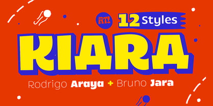
$19.90 - Kiara by RodrigoTypo,
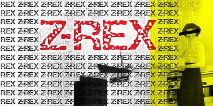
$25.00 - Z-Rex by Cool Fonts,
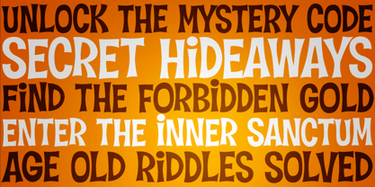
$24.00 - Hideaway by Pink Broccoli,
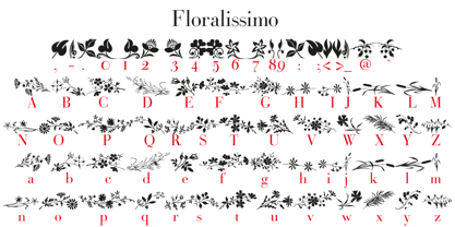
$14.00 - Floralissimo by Wiescher Design,
$39.50


