10,000 search results
(0.034 seconds)
- Gwendolyn by TypeSETit,
$24.95 This elegant extended script can be used for both formal and casual situations.
 - Rolit MF by Masterfont,
$59.00 Those elegant nib strokes create this unique rhythm to this cursive hand lettering.
 - Hebrew Pirkei Avot Std by Samtype,
$49.00 This is beautiful script font based in typeface of the Pirkei Avot book.
 - Banyan by Haiku Monkey,
$10.00 Banyan utilizes dramatic brush strokes to create a paradoxically strong yet delicate face.
 - Jeunes by Etewut,
$30.00 Here is a new typeface JEUNES. Script font with alternates and some ligatures.
 - Versatile EP by Borges Lettering,
$9.00 Versatile EP is a powerhouse of 9 fonts that make design and logo creation effortless. While other sans-serif fonts tend to be rigid and cold, Versatile stands out with it's warm and natural feel. It's generous x-height aids in its legibility and function, and the forms are classic yet modern allowing this font to live up to its name as a truly versatile workhorse for your next design or layout. Use it by itself, or in combination with Versatile 7 layer font package (Sold Separately.) https://www.myfonts.com/fonts/charlesborges/versatile-bold/ Versatile EP contains 3 body styles, and 6 shadow fonts including striped and solid in different weights. Versatile EP is not just for the Graphic Designer. It's well suited for the Sign Maker, Cricut and Silhouette users, and anyone else who uses a vinyl plotter. It weeds beautifully in cut vinyl. Its different layers allow the user to stack multi-colored vinyl to create one a kind signs and displays. Versatile EP is ideally suited for advertising and packaging, logo, branding and creative industries, poster and billboards, signage as well as web and screen design. What's included: 9 Fonts included in for one low price: 3 body fonts and 6 different shadows. 1,462 Glyphs (Characters) in each font for a total of 13,158 Glyphs per style pack. Over 200 Languages supported including Cyrillic, Bulgarian Cyrillic and Greek. A massive library of Alternate Characters: Latin, Extended Latin and Cyrillic Alternates including their Diacritic and Small Cap counterparts. Superscripts, Subscripts, Numerators, Denominators, and Scientific Inferiors. Small Caps in Latin, Extended Latin and Cyrillic include Numbers, Punctuation, Diacritics and Alternates. Extended currency symbols including Bitcoin. Fun assortment of speech bubbles. Unlimited fractions. PUA Encoded Versatile EP makes designing fun!
 - Garava - 100% free

- Apolline Std by Typofonderie,
$59.00 A Venetian serif in 6 styles The Apolline typeface family was created by Jean François Porchez as a means to study the transition from Renaissance writing into the first printing types. Rather than sticking to the method commonly used these days for the creation of revivals of Jenson or Bembo types, it seemed more interesting to try and get in the same mindset as those exceptional designers during this pivotal period in the history of typography. Thus Apolline is an exploration of the design methods used by people like Nicolas Jenson and his contemporaries for adapting handwriting with its multiple occurrences (a, a, a, b, b, b…) into single, unique signs (a, b…). Initially Jean François made drawings modelled after his own calligraphy. They were done at a very small size on tracing paper (2 cm high for the capitals) to preserve the irregularity of human handwriting. Besides emphasising the horizontal parts of the letter forms, the serifs were designed asymmetrically to reinforce the rhythm of the writing. The final drawings were produced at a large size (10 cm high for the capitals) to allow for subtle optimisation of specific details. The very narrow and fluid Apolline italic Influenced by various concepts for an ideal italic by Van Krimpen, Gill, etc. Apolline italic was designed at 8° degrees. Although the structure of the letterforms were informed by chancery scripts, the italic has full serifs like the roman. Very narrow and fluid, its unique design creates a good contrast when used in combination with its upright counterparts. Thanks to the presence of the serifs similar to roman typefaces it sets very neatly in large sizes. The next step was digitising the drawings with Ikarus (the pre-Bézier-curves era) to create the final roman and italic fonts. Two years later, when the family was expanded to six series the same method was used, this time with Fontographer. This was necessary for correcting a few problems caused by the conversion to Bézier outlines, and to add intermediate weights. Before the advent of feature-rich OpenType, quality type families consisted of several separate fonts for each weight to provide users with various sets of numerals, an extended ligature set and alternates, ornaments, and so on. Introducing Apolline Morisawa Awards 1993
 - ITC Bodoni Seventytwo by ITC,
$29.99Giambattista Bodoni (1740-1813) was called the King of Printers; he was a prolific type designer, a masterful engraver of punches and the most widely admired printer of his time. His books and typefaces were created during the 45 years he was the director of the fine press and publishing house of the Duke of Parma in Italy. He produced the best of what are known as modern" style types, basing them on the finest writing of his time. Modern types represented the ultimate typographic development of the late eighteenth and early nineteenth centuries. They have characteristics quite different from the types that preceded them; such as extreme vertical stress, fine hairlines contrasted by bold main strokes, and very subtle, almost non-existent bracketing of sharply defined hairline serifs. Bodoni saw this style as beautiful and harmonious-the natural result of writing done with a well-cut pen, and the look was fashionable and admired. Other punchcutters, such as the Didot family (1689-1853) in France, and J. E. Walbaum (1768-1839) in Germany made their own versions of the modern faces. Even though some nineteenth century critics turned up their noses and called such types shattering and chilly, today the Bodoni moderns are seen in much the same light as they were in his own time. When used with care, the Bodoni types are both romantic and elegant, with a presence that adds tasteful sparkle to headlines and advertising. ITC Bodoni™ was designed by a team of four Americans, after studying Bodoni's steel punches at the Museo Bodoniana in Parma, Italy. They also referred to specimens from the "Manuale Tipografico," a monumental collection of Bodoni's work published by his widow in 1818. The designers sought to do a revival that reflected the subtleties of Bodoni's actual work. They produced three size-specific versions; ITC Bodoni Six for captions and footnotes, ITC Bodoni Twelve for text settings, and ITC Bodoni Seventytwo - a display design modeled on Bodoni's 72-point Papale design. ITC Bodoni includes regular, bold, italics, Old style Figures, small caps, and italic swash fonts. Sumner Stone created the ornaments based on those found in the "Manuale Tipografico." These lovely dingbats can be used as Bodoni did, to separate sections of text or simply accent a page layout or graphic design." - ITC Bodoni Twelve by ITC,
$29.99Giambattista Bodoni (1740-1813) was called the King of Printers; he was a prolific type designer, a masterful engraver of punches and the most widely admired printer of his time. His books and typefaces were created during the 45 years he was the director of the fine press and publishing house of the Duke of Parma in Italy. He produced the best of what are known as modern" style types, basing them on the finest writing of his time. Modern types represented the ultimate typographic development of the late eighteenth and early nineteenth centuries. They have characteristics quite different from the types that preceded them; such as extreme vertical stress, fine hairlines contrasted by bold main strokes, and very subtle, almost non-existent bracketing of sharply defined hairline serifs. Bodoni saw this style as beautiful and harmonious-the natural result of writing done with a well-cut pen, and the look was fashionable and admired. Other punchcutters, such as the Didot family (1689-1853) in France, and J. E. Walbaum (1768-1839) in Germany made their own versions of the modern faces. Even though some nineteenth century critics turned up their noses and called such types shattering and chilly, today the Bodoni moderns are seen in much the same light as they were in his own time. When used with care, the Bodoni types are both romantic and elegant, with a presence that adds tasteful sparkle to headlines and advertising. ITC Bodoni™ was designed by a team of four Americans, after studying Bodoni's steel punches at the Museo Bodoniana in Parma, Italy. They also referred to specimens from the "Manuale Tipografico," a monumental collection of Bodoni's work published by his widow in 1818. The designers sought to do a revival that reflected the subtleties of Bodoni's actual work. They produced three size-specific versions; ITC Bodoni Six for captions and footnotes, ITC Bodoni Twelve for text settings, and ITC Bodoni Seventytwo - a display design modeled on Bodoni's 72-point Papale design. ITC Bodoni includes regular, bold, italics, Old style Figures, small caps, and italic swash fonts. Sumner Stone created the ornaments based on those found in the "Manuale Tipografico." These lovely dingbats can be used as Bodoni did, to separate sections of text or simply accent a page layout or graphic design." - ITC Bodoni Ornaments by ITC,
$29.99Giambattista Bodoni (1740-1813) was called the King of Printers; he was a prolific type designer, a masterful engraver of punches and the most widely admired printer of his time. His books and typefaces were created during the 45 years he was the director of the fine press and publishing house of the Duke of Parma in Italy. He produced the best of what are known as modern" style types, basing them on the finest writing of his time. Modern types represented the ultimate typographic development of the late eighteenth and early nineteenth centuries. They have characteristics quite different from the types that preceded them; such as extreme vertical stress, fine hairlines contrasted by bold main strokes, and very subtle, almost non-existent bracketing of sharply defined hairline serifs. Bodoni saw this style as beautiful and harmonious-the natural result of writing done with a well-cut pen, and the look was fashionable and admired. Other punchcutters, such as the Didot family (1689-1853) in France, and J. E. Walbaum (1768-1839) in Germany made their own versions of the modern faces. Even though some nineteenth century critics turned up their noses and called such types shattering and chilly, today the Bodoni moderns are seen in much the same light as they were in his own time. When used with care, the Bodoni types are both romantic and elegant, with a presence that adds tasteful sparkle to headlines and advertising. ITC Bodoni™ was designed by a team of four Americans, after studying Bodoni's steel punches at the Museo Bodoniana in Parma, Italy. They also referred to specimens from the "Manuale Tipografico," a monumental collection of Bodoni's work published by his widow in 1818. The designers sought to do a revival that reflected the subtleties of Bodoni's actual work. They produced three size-specific versions; ITC Bodoni Six for captions and footnotes, ITC Bodoni Twelve for text settings, and ITC Bodoni Seventytwo - a display design modeled on Bodoni's 72-point Papale design. ITC Bodoni includes regular, bold, italics, Old style Figures, small caps, and italic swash fonts. Sumner Stone created the ornaments based on those found in the "Manuale Tipografico." These lovely dingbats can be used as Bodoni did, to separate sections of text or simply accent a page layout or graphic design." - ITC Bodoni Brush by ITC,
$29.99Giambattista Bodoni (1740-1813) was called the King of Printers; he was a prolific type designer, a masterful engraver of punches and the most widely admired printer of his time. His books and typefaces were created during the 45 years he was the director of the fine press and publishing house of the Duke of Parma in Italy. He produced the best of what are known as modern" style types, basing them on the finest writing of his time. Modern types represented the ultimate typographic development of the late eighteenth and early nineteenth centuries. They have characteristics quite different from the types that preceded them; such as extreme vertical stress, fine hairlines contrasted by bold main strokes, and very subtle, almost non-existent bracketing of sharply defined hairline serifs. Bodoni saw this style as beautiful and harmonious-the natural result of writing done with a well-cut pen, and the look was fashionable and admired. Other punchcutters, such as the Didot family (1689-1853) in France, and J. E. Walbaum (1768-1839) in Germany made their own versions of the modern faces. Even though some nineteenth century critics turned up their noses and called such types shattering and chilly, today the Bodoni moderns are seen in much the same light as they were in his own time. When used with care, the Bodoni types are both romantic and elegant, with a presence that adds tasteful sparkle to headlines and advertising. ITC Bodoni™ was designed by a team of four Americans, after studying Bodoni's steel punches at the Museo Bodoniana in Parma, Italy. They also referred to specimens from the "Manuale Tipografico," a monumental collection of Bodoni's work published by his widow in 1818. The designers sought to do a revival that reflected the subtleties of Bodoni's actual work. They produced three size-specific versions; ITC Bodoni Six for captions and footnotes, ITC Bodoni Twelve for text settings, and ITC Bodoni Seventytwo - a display design modeled on Bodoni's 72-point Papale design. ITC Bodoni includes regular, bold, italics, Old style Figures, small caps, and italic swash fonts. Sumner Stone created the ornaments based on those found in the "Manuale Tipografico." These lovely dingbats can be used as Bodoni did, to separate sections of text or simply accent a page layout or graphic design." - Malaga by Emigre,
$59.00 Why do we need another typeface? This is a prickly question often asked of typeface designers. Depending on who you ask, the answer in simplified form is usually one of two: 1. As the basis of written communication, type design carries social responsibility, so we must continue to improve legibility. 2. Type design is a form of artistic expression. Without art, life is not worth living. The best work, of course, accomplishes both. Xavier Dupré, the designer of the Malaga typeface family, has at least one leg securely planted in the latter notion. He believes, like others, that within typeface design most legibility needs have been worked out and that today we are satisfying aesthetic desires. We design typefaces to differentiate our communications. Type design is primarily a formal exercise reflecting our personal quirks, technological obsessions, and cultural heritage. In case of Dupré’s work, issues of cultural heritage and personal quirks are of particular consequence. An incessant traveler, he visited the following countries during the development of the Malaga type family: Thailand, Malaysia, Indonesia, Myanmar, Cambodia, Vietnam, France, Belgium, and finally, Spain, where his choice for the name Malaga originates (Malaga is a port city in southern Spain). Dupré’s home is where his laptop is. He travels with a 12- or 15 inch PowerBook, without a printer, and with sporadic access to his reference books and other historical documents. All he needs is a table and chair. He even learned to design without a mouse since hotel and cafe tables are often too small to also fit a mousepad. Dupré is the new global designer who can take disparate influences and fluidly process the information into a coherent whole. Malaga is a case in point. It is inspired by ideas ranging from blackletter to Latin fonts, and from the Quattrocento’s first Venetian antiquas to brush stroke types. This makes Malaga a richly animated font saturated with unorthodox detail. Its black and bold weights are particularly suited for headlines and short texts, while the subtle modulation and moderate contrast in the regular and medium weights makes it perfectly readable in extended text settings. While Malaga doesn’t claim to resolve any particular legibility issues, it is nonetheless perfectly readable and will impart any design with a healthy dose of visual character.
 - ITC Bodoni Six by ITC,
$40.99Giambattista Bodoni (1740-1813) was called the King of Printers; he was a prolific type designer, a masterful engraver of punches and the most widely admired printer of his time. His books and typefaces were created during the 45 years he was the director of the fine press and publishing house of the Duke of Parma in Italy. He produced the best of what are known as modern" style types, basing them on the finest writing of his time. Modern types represented the ultimate typographic development of the late eighteenth and early nineteenth centuries. They have characteristics quite different from the types that preceded them; such as extreme vertical stress, fine hairlines contrasted by bold main strokes, and very subtle, almost non-existent bracketing of sharply defined hairline serifs. Bodoni saw this style as beautiful and harmonious-the natural result of writing done with a well-cut pen, and the look was fashionable and admired. Other punchcutters, such as the Didot family (1689-1853) in France, and J. E. Walbaum (1768-1839) in Germany made their own versions of the modern faces. Even though some nineteenth century critics turned up their noses and called such types shattering and chilly, today the Bodoni moderns are seen in much the same light as they were in his own time. When used with care, the Bodoni types are both romantic and elegant, with a presence that adds tasteful sparkle to headlines and advertising. ITC Bodoni™ was designed by a team of four Americans, after studying Bodoni's steel punches at the Museo Bodoniana in Parma, Italy. They also referred to specimens from the "Manuale Tipografico," a monumental collection of Bodoni's work published by his widow in 1818. The designers sought to do a revival that reflected the subtleties of Bodoni's actual work. They produced three size-specific versions; ITC Bodoni Six for captions and footnotes, ITC Bodoni Twelve for text settings, and ITC Bodoni Seventytwo - a display design modeled on Bodoni's 72-point Papale design. ITC Bodoni includes regular, bold, italics, Old style Figures, small caps, and italic swash fonts. Sumner Stone created the ornaments based on those found in the "Manuale Tipografico." These lovely dingbats can be used as Bodoni did, to separate sections of text or simply accent a page layout or graphic design." - Crossell by Emboss,
$35.00 Crossell is a display typeface inspired by linoleum cuts and old comic strips. It comes in three weights and can be purchased solo or as a family. Take it home and give it a spin today.
 - Potamion by Beewest Studio,
$10.00 The Ugaritic alphabet is a script with ancient letters that was used around 1400 BC. Ugarit is an Old Southwest Semitic language and was found in Ugarit, a place in Syria. It has 30 letters. Other languages (especially Hurrian) are sometimes written in the Ugaritic script in the area around Ugarit
 - Signalist by Melvastype,
$35.00 Signalist is a dynamic and energetic brush script. Tight spacing, narrow letters and sharp edges gives Signalist it distinctive looks and character. It is suitable for designs that needs a script with a contemporary feel. You can use it on logos, t-shirts, packages, as a title font... you name it!
 - Autelan by Aqeela Studio,
$20.00 Autelan Script is a contemporary calligraphy typeface. It's a mix of retro and modern sans serif script. With Autelan, your designs will get a classic and elegant touch. Autelan can be used for various purposes such as logos, wedding invitations, T-shirts, letterheads, signage, labels, news, posters, badges etc. Thank You
 - Quick Letter by Almarkha Type,
$35.00 Introducing Quick Letter - Authentic Handwritten Ligature Script is a Quality script that is written casually and quickly has many alternative letters, with a front and back tail that adds to a more attractive appearance. Quick Letter is perfect for homeware designs,branding projects, Logo, design, Quotes, Product packaging, Photography, Watermark.
 - Wakel by NamelaType,
$29.00 Wakel is a Bold display font that consisting on bilingual scripts, Latin and Arabic. The Arabic script was built based on the Naskh style. Wakel has approachable, fashionable and humanist look with low contrast and attractive curvature terminal. Wakel is great for large display projects, branding, package designs & much more!
 - Pink by ITC,
$29.00Pink is the work of British designer Timothy Donaldson, a sans serif in a style typical of the 1990s. Capitals are slightly condensed and feature unusual variations in stroke widths and the lowercase has an even more irregular stroke pattern, yet an even texture is produced when used in word settings. - MV Boli by Microsoft Corporation,
$49.00MV Boli™ was first introduced with Windows XP to support Thaana script, which is used for the Dhivehi language of the Maldives. Thaana font is similar to the Arabic script and is written right to left. Thaana font uses vowel signs and spaces between words. Character Set: Latin-1, Thaana - Stepira by Gatype,
$12.00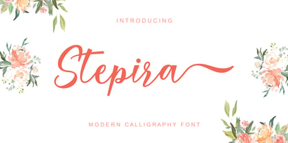 Stepira Script is a modern calligraphy font, with characters dancing along the baseline and an elegant touch. OpenType features such stylistic alternates, ligatures and multilingual support. Stepira Script can be used for various purposes such as logos, wedding invitations, headings, t-shirts, letterhead, signage, labels, news, posters, badges and more.
 - Mountain Signature by Almarkha Type,
$35.00 Introducing Mountain Signature - Stylish Signature Script is a quality script that is written casually and quickly with 28 ligature. Letters are made with Sign on paper. Then scanned and carefully drawn into vector format. Mountain Signature is perfect for homeware designs, branding projects, logos, designs, quotes, product packaging, photography, and watermarks.
 - Pepito by Fenotype,
$20.00 Pepito is a nonconnected version of Pepita Script. Pepito has a nice set of special features, including a set of ornaments and Swash, Stylistic and Contextual Alternates that you can easily access in any OpenType-savvy program. For the best price, purchase Pepito with Pepita Script or other Fenotype fonts.
 - Nicholia by Balpirick,
$15.00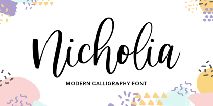 Nicholia is a cute and modern handwritten font with an incredibly friendly feel. It features gorgeous swashes and ligatures that make this script incredibly versatile. Whether you’re looking for fonts for Instagram or calligraphy scripts for DIY projects, Nicholia will turn any creative idea into a true piece of art!
 - Amilionia Calligraphy by Shape Studio,
$14.00 Amilionia is a new modern script calligraphy font with an irregular baseline. Trendy and feminine style.Amilionia Script looks lovely on wedding invitations, thank you cards, quotes, greeting cards, logos, business cards and more. Perfect for using in ink or watercolour. Including initial and terminal letters, alternates, ligatures and multiple language support
 - Emalia by JprintStudio,
$10.00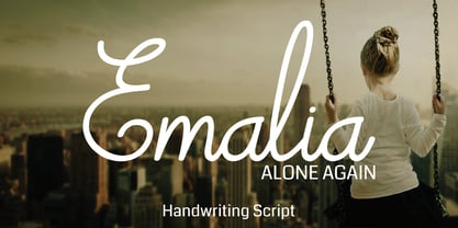 Emalia is a cute and casual handwritten font with an incredibly friendly feel. It features gorgeous swashes and ligatures that make this script incredibly versatile. Whether you’re looking for fonts for Instagram or calligraphy scripts for DIY projects, Emalia will turn any creative idea into a true piece of art!
 - Double Tracker by Hanzel Space,
$25.00 Double Tracker is an inspiration for a font with paint strokes so that it has a texture that seems natural, done with an original ink stroke process.. The strong and sturdy design makes it ideal for eye-catching headlines, branding, packaging, magazines, sports, logos, and more. Happy Creating! Hanzel Studio
 - Coffee Matcha by Awan Senja,
$14.00 Coffee Matcha is a Lovely script font. It features a modern and elegant style that will take your designs to the next level. Whether you�re looking for fonts for Instagram or calligraphy scripts for DIY projects, Coffee Matcha will turn any creative idea into a true piece of art!
 - Lavineta by Balpirick,
$15.00 Lavineta is a beautiful and elegant handwritten font with an incredibly friendly feel. It features gorgeous swashes and ligatures that make this script incredibly versatile. Whether you’re looking for fonts for Instagram or calligraphy scripts for DIY projects, Lavineta will turn any creative idea into a true piece of art!
 - Roselyn by Calamar,
$20.00 Roselyn Script is an elegant calligraphic font that will look awesome on wedding and event stationery, logos and branding materials, cards and so on. Roselyn Script includes Uppercase and Lowercase Latin Basic Characters, Numbers and Punctuation. Also the font contains ligatures and stylistic alternates to perfectly re-create natural calligraphy.
 - Bashirah by Cititype,
$14.00 Bashirah is a cute and casual handwritten font with an incredibly friendly feel. It features gorgeous swashes and ligatures that make this script incredibly versatile. Whether you’re looking for fonts for Instagram or calligraphy scripts for DIY projects, Bashirah will turn any creative idea into a true piece of art!
 - Revenge by Juncreative,
$19.00 Revenge is a cute and casual handwritten font with an incredibly friendly feel. It features gorgeous swashes and ligatures that make this script incredibly versatile. Whether you’re looking for fonts for Instagram or calligraphy scripts for DIY projects, Revenge will turn any creative idea into a true piece of art!
 - The Bentley by Bosstypestudio,
$14.00 The Bentley Script in a beautiful handwritten style. Equipped with 350 glyphs. The Bentley Script is perfect for branding projects, home appliance design, product packaging, use in business cards, invitation cards, etc. Simply as a stylish text overlay onto a background image or anything that requires a touch of elegance.
 - Charlie Brocklin by Almarkha Type,
$35.00 Introducing Charlie Brocklin - Stylish Ligature Script is a Quality script that is written casually and quickly with 15 ligature. Letters are made with Sign on paper. Then scanned and carefully drawn into vector format. Charlie Brocklin is perfect for homeware designs,branding projects, Logo, design, Quotes, Product packaging, Photography, Watermark.
 - Freaky Prickle by ParaType,
$25.00Freaky Prickle script was written using ink and various wooden sticks and digitized/ Autor’s target was to create the spontaneous, light, flying script with dynamics and energy at the same time. Upright and cursive styles are available. The type was planned for use as headline in fiction and display matter. - Raindec by Haniefart,
$17.00 Raindec is a handcrafted script typeface, a font inspired by sign paintings, branding, t-shirts, flyers, and more, with a variety of interesting characters. You can really make Raindec feel personalized for your client's projects. Raindec script fonts can be used for magazines, clothing designs, logos, titles, flyers and more.
 - Insula - Unknown license

- Kristen Curly - Personal use only


