10,000 search results
(0.032 seconds)
- Montu by Supfonts,
$12.00 Montu is an elegant, modern sans serif font family. It includes upright and Italic style, each of them has five weights from thin to bold. This is a multi-functional font that is perfect for any project Montu Font Features: - Full Set of standard alphabet and punctuation - PUA Encoded - no special software needed to access extra characters - Language support: All European languages - Multilingual Characters AÁĂÂÄÀĀĄÅÃÆBCĆČÇĊDÐĎĐEÉĚÊËĖÈĒĘẼFGĞĢĠḠHĦIIJÍÎÏİÌĪĮĨJKĶLĹĽĻŁMNŃŇŅÑ OÓÔÖÒŐŌØÕŒPÞQRŔŘŖSŚŠŞȘẞTŤŢȚUÚÛÜÙŰŪŲŮŨVWẂŴẄẀXYÝŶŸỲỸZŹŽŻ aáăâäàāąåãæbcćčçċdðďđeéěêëėèēęẽfgğģġḡhħiıíîïìijīįĩjȷkķlĺľļłmnńňņñoóôöòőōøõœpþ qrŕřŗsśšşșßtťţțuúûüùűūųůũvwẃŵẅẁxyýŷÿỳỹzźžż Thanks so much for checking out my shop, and please get in touch if you have any questions! Don't forget to subscribe so you don't miss out on the new awesome fonts Dima
 - Taronge by Sensatype Studio,
$15.00 Taronge - Urban Display Sans Serif that created special for Logo, Title and more stand out typography for sport and action. It's so perfect to add your style and headline overview for sport, technology, actions, and fighting theme. And specially for this font, we crafted for bold action style and modern feels so enjoy to create any project that will show your main idea out. Taronge - Urban Display Sans Seri ready with: Creative characters prepared to get best results Preview as a inspirations that you can do with Taronge font Ready with All Uppercase characters Wish you enjoy our font. :)
 - Sondela by Scholtz Fonts,
$19.00Sondela is a gently rounded, informal font, whose name means "welcome" or "come closer". It echoes the openhearted tradition of the Zulu people, where all who come are welcome. The font is available in regular and display (Pizazz) versions. Sondela Pizazz incorporates the zig-zag pattern that has been used in traditional Zulu beadwork for generations. It is highly effective when used in conjunction with the unadorned Sondela regular. The numerals are mono-spaced so that they will line up correctly in columns of figures. The letters of the alphabet are correctly kerned so that they appear correctly in text. - Jantan by Sulthan Studio,
$13.00 Jantan is a new fresh & modern script with a handmade calligraphy style, decorative characters and a dancing baseline! So beautiful on invitation like greeting cards, branding materials, business cards, quotes, posters, and more. The alternative characters were divided into several OpenType features such as Stylistic Alternates, and Ligatures. The OpenType features can be accessed by using OpenType savvy programs such as Adobe Illustrator, Adobe InDesign, Adobe Photoshop Corel Draw X version, And Microsoft Word. And this Font has given PUA unicode (specially coded fonts). so that all the alternate characters can easily be accessed in full by a craftsman or designer.
 - Core Gothic N by S-Core,
$72.00 Core Gothic N is a simple and modern sans-serif Korean font consists of 9 weights (Thin, ExtraLight, Light, Regular, Medium, Bold, ExtraBold, Heavy & Black). Character set is consist of Korean 11,172 characters, Hirakana & Katakana, Latin and Korean symbols. It is well balenced between Korean and Latin characters. Latin typeface (Core Sans N) was adjusted to be matched with korean typeface. Spaces between individual letter forms are adjusted in detail so that it makes perfect typesetting. Supported codepages are MS Windows 1252 Latin1 and MS Windows 949 Korean. We recommend to use for books, web, screen displays and so on.
 - Futuramano by Wiescher Design,
$39.50 Futuramano was the kind of typeface we scribbled in those old days, when I was an art-director in advertising agencies. We used it to simulate the headlines and the subheads, so the client could read what the copywriters had in mind. As Futura was the font of choice in those days (as it still is), our scribbled typeface looked much like Futura. The second half of the name “mano” means hand, so that is what it is, kind of a handwritten Futura. Futuramano is very practical if you want to have that unfinished touch! Yours very nostalgic Gert Wiescher
 - Boiller by Alit Design,
$9.00 Introducing Boiller Typeface 💖💖Boiller💖💖is a sans serif font that has an elegant romantic concept, supported by 736 glyphs. The Boiller font has a lot of alternative characters, from swash, ligature and of course it is also supported by multilingualism. In addition, Boiller also has 14 families from Thin to Heavy. So it can be used for body text and header text. Boiller is very suitable for design concepts that are elegant, simple, minimalist and romantic. Can be used for wedding card designs, shop signs, logotypes, promotions on Instagram and so on.
 - FS Brabo Paneuropean by Fontsmith,
$90.00Worldly Even though it’s a new arrival, FS Brabo has seen the world. Designed by a Brazilian working in London and studying in Belgium under a Dutchman, it’s certainly well-travelled. And it was inspired by the extraordinary archive of early book typefaces at the world-renowned Plantin-Moretus Museum in Antwerp, while Fernando Mello was attending Frank Blokland’s Expert class Type Design course at the Plantin Institute of Typography. It was there that Fernando became engrossed in the collection of early metal type, matrices, punches and type samples by figures such as Garamond and Granjon. So much so that he took on the mighty task of developing ‘a beautiful, functional, serifed text font’ of his own. Heroic FS Brabo’s journey from sketch to font family took an epic three years, starting in Antwerp, continuing at Fontsmith in London, and reaching its conclusion back in Fernando’s home city of São Paulo. No wonder Fernando was reminded of another titanic face-off: that of Antwerp’s Roman hero of legend, Silvius Brabo, and the evil ogre, Antigoon. Brabo came to the town’s rescue after the tyrannical giant had been charging ships’ captains extortionate taxes and chopping off the hands of those who refused to pay up. Having finally downed Antigoon after a long and terrible duel, Brabo cut off the giant’s own hand and threw it into the river Scheldt, unwittingly giving the town its name: the Dutch for ‘hand-throw’ is hand werpen. What better way for Fernando to name his literary typeface than after the hero of Antwerp’s oldest tale? The garalde factor FS Brabo is not a revival, but a very much a contemporary, personal interpretation of a garalde – a class of typeface originating in the 16th century that includes Bembo, Garamond and Plantin, with characteristically rounded serifs and moderate contrast between strokes. Brabo’s ‘ct’ and ‘st’ ligatures, upper-case italic swashes and contextual ending ligatures – ‘as’, ‘is’, ‘us’ – all preserve the beauty and character of traditional typefaces, but its serifs are chunkier than a garalde. Their sharp cuts and squared edges give them a crispness at text sizes, helping to bring a beautifully bookish personality to hardworking modern applications. A workhorse with pedigree It may give the appearance of a simple, four-weight typeface, but FS Brabo has hidden depths beneath its simplicity and beauty. OpenType features such as cap italic swashes, contextual ending swashes – programmed only to appear at the end of words – and stylistic alternatives make this a complete and well-equipped typeface. Comprehensive testing was carried out at text and display sizes, too, to prevent counters from filling in. All of which makes FS Brabo a very modern take on a traditional workhorse serif typeface: colourful and versatile enough to adorn not just editorial projects but also signage, advertising and logotypes. - Remora Sans by G-Type,
$39.00 Remora is an extensive new humanist sans serif which comes in 2 style variations, the effervescent Remora Sans and its corporate business partner Remora Corp . Both styles include 5 individual width sets ranging from the condensed W1 to the extra-wide W5. Furthermore, with an impressive 7 weights (Thin to Ultra) and true matching italics in each pack Remora is an ultra versatile super family comprising 140 individual fonts, perfect for any typographic assignment or design brief. Remora was designed by G-Type founder Nick Cooke. Both the Sans and Corp families share the same proportions, with the exception of certain key characters that change the overall appearance. Remora Sans is an exuberant and characterful typeface while Remora Corp, as its name suggests, is a businesslike typeface more suited to corporate typography. Quite early on in the design process Nick decided to give Remora Corp equal billing instead of incorporating these glyphs as alternates or a stylistic set that may get overlooked. “I created two separate families after learning a valuable lesson with one of my earlier typefaces, Houschka”, says Nick. “Houschka contained distinctive rounded A’s W’s and w’s, with ‘straight’ styles as character alternates. Even though style sets and alternates are easy to activate they are rarely used, so after many requests for customised versions of the fonts with the straight characters as defaults it was decided to create the separate ‘Alt’ family. So I cut straight to the chase with the two Remora variants and created two complementary families.” Both sets contain many shared letterforms, but it is the alternate characters that significantly alter the appearance of each font. Remora has been carefully designed for optimum legibility at large and very small sizes. Although fairly monolinear in appearance, especially in the lighter weights, particular attention has been paid to optical correction like the overshoots of the curved characters. Open counters and painstaking attention to detail (e.g. weight contrast between horizontal and vertical strokes, junctions of shoulders and stems etc) all boost readability and make Remora a great choice across all media. Remora Sans and Corp are ‘humanist’ rather than ‘geometric’ in style, meaning they’re not strictly based on rectangles and circles, resulting in a warm and friendlier feel. The slightly ’super-elliptical’ rounded forms create generously attractive curves. Remora has very distinctive italics in that they are only inclined by 8 degrees, but are not just based on slanted uprights. The italic styles are very alluring when used for display at large sizes and the good news is they come bundled free with their respective uprights. Each family also contains many OpenType features including proportional and tabular numbers, small caps, discretionary ligatures, plus five stylistic sets for ultra versatile typography.
 - FS Brabo by Fontsmith,
$80.00 Worldly Even though it’s a new arrival, FS Brabo has seen the world. Designed by a Brazilian working in London and studying in Belgium under a Dutchman, it’s certainly well-travelled. And it was inspired by the extraordinary archive of early book typefaces at the world-renowned Plantin-Moretus Museum in Antwerp, while Fernando Mello was attending Frank Blokland’s Expert class Type Design course at the Plantin Institute of Typography. It was there that Fernando became engrossed in the collection of early metal type, matrices, punches and type samples by figures such as Garamond and Granjon. So much so that he took on the mighty task of developing ‘a beautiful, functional, serifed text font’ of his own. Heroic FS Brabo’s journey from sketch to font family took an epic three years, starting in Antwerp, continuing at Fontsmith in London, and reaching its conclusion back in Fernando’s home city of São Paulo. No wonder Fernando was reminded of another titanic face-off: that of Antwerp’s Roman hero of legend, Silvius Brabo, and the evil ogre, Antigoon. Brabo came to the town’s rescue after the tyrannical giant had been charging ships’ captains extortionate taxes and chopping off the hands of those who refused to pay up. Having finally downed Antigoon after a long and terrible duel, Brabo cut off the giant’s own hand and threw it into the river Scheldt, unwittingly giving the town its name: the Dutch for ‘hand-throw’ is hand werpen. What better way for Fernando to name his literary typeface than after the hero of Antwerp’s oldest tale? The garalde factor FS Brabo is not a revival, but a very much a contemporary, personal interpretation of a garalde – a class of typeface originating in the 16th century that includes Bembo, Garamond and Plantin, with characteristically rounded serifs and moderate contrast between strokes. Brabo’s ‘ct’ and ‘st’ ligatures, upper-case italic swashes and contextual ending ligatures – ‘as’, ‘is’, ‘us’ – all preserve the beauty and character of traditional typefaces, but its serifs are chunkier than a garalde. Their sharp cuts and squared edges give them a crispness at text sizes, helping to bring a beautifully bookish personality to hardworking modern applications. A workhorse with pedigree It may give the appearance of a simple, four-weight typeface, but FS Brabo has hidden depths beneath its simplicity and beauty. OpenType features such as cap italic swashes, contextual ending swashes – programmed only to appear at the end of words – and stylistic alternatives make this a complete and well-equipped typeface. Comprehensive testing was carried out at text and display sizes, too, to prevent counters from filling in. All of which makes FS Brabo a very modern take on a traditional workhorse serif typeface: colourful and versatile enough to adorn not just editorial projects but also signage, advertising and logotypes.
 - Remora Corp by G-Type,
$39.00 Remora is an extensive new humanist sans serif which comes in 2 style variations, the effervescent Remora Sans and its corporate business partner Remora Corp. Both styles include 5 individual width sets ranging from the condensed W1 to the extra-wide W5. Furthermore, with an impressive 7 weights (Thin to Ultra) and true matching italics in each pack Remora is an ultra versatile super family comprising 140 individual fonts, perfect for any typographic assignment or design brief. Remora was designed by G-Type founder Nick Cooke. Both the Sans and Corp families share the same proportions, with the exception of certain key characters that change the overall appearance. Remora Sans is an exuberant and characterful typeface while Remora Corp, as its name suggests, is a businesslike typeface more suited to corporate typography. Quite early on in the design process Nick decided to give Remora Corp equal billing instead of incorporating these glyphs as alternates or a stylistic set that may get overlooked. “I created two separate families after learning a valuable lesson with one of my earlier typefaces, Houschka”, says Nick. “Houschka contained distinctive rounded A’s W’s and w’s, with ‘straight’ styles as character alternates. Even though style sets and alternates are easy to activate they are rarely used, so after many requests for customised versions of the fonts with the straight characters as defaults it was decided to create the separate ‘Alt’ family. So I cut straight to the chase with the two Remora variants and created two complementary families.” Both sets contain many shared letterforms, but it is the alternate characters that significantly alter the appearance of each font. Remora has been carefully designed for optimum legibility at large and very small sizes. Although fairly monolinear in appearance, especially in the lighter weights, particular attention has been paid to optical correction like the overshoots of the curved characters. Open counters and painstaking attention to detail (e.g. weight contrast between horizontal and vertical strokes, junctions of shoulders and stems etc) all boost readability and make Remora a great choice across all media. Remora Sans and Corp are ‘humanist’ rather than ‘geometric’ in style, meaning they’re not strictly based on rectangles and circles, resulting in a warm and friendlier feel. The slightly ’super-elliptical’ rounded forms create generously attractive curves. Remora has very distinctive italics in that they are only inclined by 8 degrees, but are not just based on slanted uprights. The italic styles are very alluring when used for display at large sizes and the good news is they come bundled free with their respective uprights. Each family also contains many OpenType features including proportional and tabular numbers, small caps, discretionary ligatures, plus five stylistic sets for ultra versatile typography.
 - Bruschetta by Canada Type,
$24.95The problem with scripts in general, and brush scripts in particular, is that the majority of them cannot be set in all-caps words or sentences. So as a rule of thumb most designers try to avoid brush scripts when they know they will be entering an all-cap zone. But here comes Bruschetta, so you won’t need to reduce your design options. Bruschetta is a great flowing brush script that can be attractively used in upper-lower, lower-lower, or upper-upper settings. Bruschetta also has so much variety in its design features – original, funny, natural, friendly, legible, and even somewhat psychedelic – it just may be the most versatile brush script ever made. Bruschetta also has an historical value as the revival of the Helmut Matheis’ Contact design from 1963. Why it hasn’t been digitized until this point is beyond us! So we digitized it from original specimen, expanded the character set to completion, and even added a few built-in alternates. Bruschetta’s versatility allows it to be used in a variety of applications. It is great for signage, posters, product labels, menus, book covers, and pretty much anywhere where a friendly bold brush type is needed. Get yourself a copy and show your friends and clients why the overused Choc and Cooper aren’t the last word in cool! - Emotional Expression by Seemly Fonts,
$14.00 Emotional Expression is a cute and simple lettered handwritten font. It can easily be matched to an incredibly large set of projects, so add it to your creative ideas and notice how it makes them stand out!
 - Dizzy Boy by Mchcrafter,
$14.00 Dizzy Boy is a cool and thin lettered display font. It can easily be matched to an incredibly large set of projects, so add it to your creative ideas and notice how it makes them stand out!
 - Christmas Glow by Pedro Teixeira,
$14.00 When I started designing this font, I had the purpose of giving a retro warming christmas feeling. So I added ornaments to add more value to your designs. Ornament glyphs can be arranged in numerous different designs.
 - Cypheral by Volcano Type,
$19.00 A type between letter and number. Cypherals' fresh typeface is a mix-up of number parts and lines that reveal to be letters. So who is to say that numbers and letters don't have much in common?
 - Marithin by DYSA Studio,
$19.00 Marithin is a New Modern Display Typeface. This another collection of Serif is perfect for your next branding project, excellent for your business. Marithin have a smooth edges, so this font gives an authentic handcrafted feel style.
 - Salute Riches by FHFont,
$17.00 Salute Riches is a handwritten script font with a hand lettering pen style, so many opentype features are included in the font. Suitable for element design, wedding, events, t-shirt, logo, badges, sticker, and other awesome work.
 - Wotham by Aqeela Studio,
$20.00 Wotham is a beautiful signature font featuring a modern and attractive typeface created for branding any professional project. This is best applied to logos, branding, cards, packaging, book covers, wedding invitations, printed quotes, merchandise, and so on.
 - Rhamela by DYSA Studio,
$19.00 Rhamela is a new handwritten scrip font. This another collection of handwritten is perfect for your next branding project, excellent for your business. Rhamela have a natural edges, so this font gives an authentic handcrafted feel style.
 - Auntekhno Script by FHFont,
$17.00 Auntekhno Script is Vintage Script Brush Font with Hand-lettering Brush Style, and so many OpenType feature include in the font. Suitable for design, element design, weddings, events, t-shirts, logos, badges, stickers, and awesome work, etc...
 - Font Thography by Alcode,
$23.00 Thography font is a new decorative typeface. This font has a very beautiful and elegant opentype feature, so that it can make users happy and can increase creativity or productivity, you can use this font very easily.
 - Payback by Subectype,
$16.00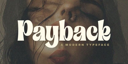 Introducing "Payback" Modern Serif font, that has own unique style & casual look. This font is perfect for an elegant & luxury logo, branding, title project, fashion brand, magazine, clothes, lettering, quotes, and so much more. Thank You. Subectype
 - Digital-LED by B1 Industries,
$6.00 I wanted to create a custom LED font, so I did, making sure to check for errors... It is useful for many things. (Electronically and in Real Life) (e.g. Documents, coding, signage, games, LED signs, calculators, etc.)
 - Richard Samuels by Letterena Studios,
$17.00 A serif modern and classic typeface that his own unique style & modern look. This typeface is perfect for an elegant & luxury logo, book or movie title design, fashion brand, magazine, clothes, lettering, quotes, and so much more.
 - Quirky by PizzaDude.dk,
$20.00 Quirky is so unpredictable and full of weirdness that you don't know what’s coming at you! The font has more than 250 different ligatures, that should be enough to boost your text into something funky and wild!
 - Floralissimo by Wiescher Design,
$39.50 Floralissimo are flowery embellishments that I found in several old publishing books dating back over a hundred years. I thought they might be useful for some of you, so I digitized them. Your digitizing typedesigner, Gert Wiescher
 - Big Limbo BT by Bitstream,
$50.99This freeform exercise in typographic design echoes the looseness of early 1960's advertising. Brian breaks almost every typographic rule we can think of — but so what? The bold letterforms of Big Limbo are anything but stuck! - Atomed by Jadatype,
$12.00 Atomed is a display font with Futuristic Feel. suitable for events, logotypes, Sci-fi stuff, modern & futuristic vibe, social media, products, and so on. Contains standard English letters, numbers, punctuation, ligature, and several accents that support multilingualism.
 - Precious Way by Seemly Fonts,
$12.00 Precious Way is a thin and simple lettered handwritten font. It can easily be matched to an incredibly large set of projects, so add it to your creative ideas and notice how it makes them stand out!
 - Big Wish by Seemly Fonts,
$12.00 Big Wish is a cool, casual, and fun display font. It can easily be matched to an incredibly large set of projects, so add it to your creative ideas and notice how it makes them stand out!
 - Nirwana by Arendxstudio,
$14.00 Introducing Nirwana, a Brush font script that is very suitable and captivating, with a very detailed hand touch so that the characters are the same and that Nirwana will be very suitable for your project design needs.
 - Movest Outline by Jadatype,
$12.00 Movest is a display font that has a bubble style with fun graffiti's vibe. suitable for poster, branding, social media, products, advertisements, and so on. contains standard English letters, numbers, punctuation, and several accents that support multilingualism.
 - Scenders by Juliane Bone,
$9.99 Scenders was inked first then digitized for the masses to use. Strong ascenders and descenders embellish the font, so the lowercase characters are quite compelling. Scenders is versatile, but it works very well in all caps headlines.
 - Laser Dots by Etewut,
$17.00 Laser dots display font is based on sans serif. Use it in your design be it cards, outside commercial, web or product adds and laser cuts. It has foreign characters so you may use your mother language.
 - Ludwig by Supfonts,
$15.00 Meet my new signature script Ludwig! Ludwig includes 158 ligatures, full set of uppercase and lowercase letters, multilingual symbols, numerals and punctuation. This is so perfect for invitations, monograms etc. It includes Multilingual support and 158 Ligatures.
 - Amstoven by DYSA Studio,
$19.00 Amstoven is a New Modern Serif Typeface. This another collection of Serif is perfect for your next branding project, excellent for your business. Amstoven have a smooth edges, so this font gives an authentic handcrafted feel style.
 - Break Stones by FHFont,
$17.00 Break Stones is Script Brush Font with Vintage Style, include 1218 Glyphs and so much opentype feature include of the font. Suitable for design, element design, wedding, event, t-shirt, logo, badges, sticker, and awesome work, etc...
 - Aaarp by Drawwwn,
$15.00 Aaarp's an arty farty cut paper display font - inspired by Jean Arp & Henri Matisse’s amazing work. Get creative with extra glyphs and shapes... Aaarp also has alternative letters so you can make all your designs look unique.
 - Superior Mind by Seemly Fonts,
$14.00 Superior Mind is an incomparable and simple lettered handwritten font. It can easily be matched to an incredibly large set of projects, so add it to your creative ideas and notice how it makes them stand out!