10,000 search results
(0.022 seconds)
- Naraba by Flawlessandco,
$9.00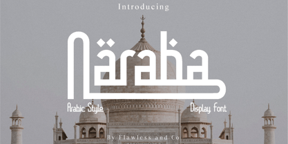 Introducing "Naraba," a stunning Arabic font inspired by the elegant Kufi style. This meticulously crafted typeface seamlessly merges tradition and modernity, making it perfect for a wide range of design applications. There's some connected letters and some alternates that suitable for any graphic designs such as branding materials, t-shirt, print, business cards, logo, poster, t-shirt, photography, quotes .etc This font support for some multilingual. Also contains uppercase A-Z and lowercase a-z, alternate character, numbers 0-9, and some punctuation. If you need help, just write me! Thanks so much for checking out my shop!
 - Argos by Hoftype,
$49.00 Argos, a type face with a strong personality. A rounded serif type family which uses exclusively modern design elements. While it possesses decorative qualities, thanks to its hearty serif weights it can be successfully used as a text type. Argos comes in 6 weights and with its extended character set it permits a wide range of applications. Each font is equipped with ligatures, small caps, proportional lining figures, tabular lining figures, proportional old style figures, lining old style figures, matching currency symbols, fraction- and scientific numerals. Argos supports Western European as well as Central and Eastern European languages.
 - Sliced Delight by Rajesh Rajput,
$9.00 Sliced Delight - a modern serif typeface combining classical elegance and contemporary flair. The Sliced Delight typeface is available in 9 weights ranging from Thin to Black, each featuring three optical variations - Display, Title, and Heading - for 27 styles. The Sliced Delight typeface's unique design features give it a bold and dynamic look while maintaining legibility and readability. In addition, the optical variations allow for versatility in usage. Whether you're designing a print publication, a website, or a brand identity, the Sliced Delight typeface is a versatile and eye-catching choice that will make your content stand out.
 - Noir by Mindburger Studio,
$39.00 Noir is a sans serif font family of 12 fonts with contemporary aesthetics heavily influenced by early 20th century geometric typefaces. While having its geometric structure it carries organic personality with touch of warmth injected to each form. Noir font family ranges from light and elegant weights perfect for small text, to extremely heavy and masculine weights suited for large display sizes. Noir has a rich arsenal of Open Type features for highly professional use and extended Latin, Cyrillic and Greek language support. Noir is delivered as Std and Pro version. Cyrillic and Greek are available in Pro package only.
 - Blaue Brush by Beige Type,
$29.00 Blaue Brush is a handmade typeface painted with a Japanese brush marker on smooth paper. While the font was digitalised, special care was taken to retain its handmade character; as a result it is rough and authentic. Blaue Brush offers a complete font set in one weight that can be used in many languages, with uppercase, lowercase and a full range of decorative characters – a set of five decorative borders, arrow segments and many image characters. Blaue Brush is suited for use in packaging design for labels, tags, posters, unique occasions, music band styles and whatever else. Embrace the brush!
 - The Amsterday by Jinan Studio,
$15.00 Introducing The Amsterday, a captivating and versatile Bold Retro Script Font that effortlessly transports your designs back in time while adding a touch of modern flair. This typeface exudes nostalgia and is perfectly suited for a wide range of creative projects, especially those with a vintage theme in mind. The Amsterday timeless elegance and a multitude of alternate characters make it a go-to choice for designers looking to infuse their work with a sense of yesteryear charm. Features A set of uppercase and lowercase glyphs Number, symbol, and punctuation Multilingual Support Alternates & Ligatures Extrude Version
 - Hercules by Storm Type Foundry,
$26.00Where Modern is too fragile and Century too boring, Hercules comes with its elegant forms and, at the same time, with sufficient firmness to be usable for longer texts. In its heavy, bold designs it approaches Falstaff, while in the light ones it has some features which are taken over from Didot or from Modern. The text designs have been corrected for small sizes. The range of its use is, therefore, quite extensive - from dictionaries and technical literature through magazines to art posters and advertising materials. Suitable combination: Splendid Quartett (especially recommended), Excelsor Script, Plagwitz, but also Zeppelin and Compur. - Nostalgia Peach Creme by PeachCreme,
$23.00 The "Nostalgia" font is a dark, vintage style that includes all the basic characters (letters, numbers, and punctuation) and is very simple to read. "Nostalgia" was inspired by inky handwriting with a natural flow and has fantastic starting and ending lowercase swashes. It works well for a wide range of projects, from wedding stationery to Instagram quotes to contemporary logos to packaging to websites. Consequently, these top-notch, traditionally-styled hand-drawn characters would be an excellent and priceless resource for those who want to write by hand. The headlines and titles you create will look fantastic with this font.
 - Ristella by Mans Greback,
$59.00 Ristella - a logotype script font. This high-quality typeface is created by Måns Grebäck. Its style is bold and has large, attention-grabbing uppercase letters. Ristella contains alternate and stylistic alternates, as well as multiple ligatures. With its hundreds of glyphs it also has support for a wide range of languages. How do you make a swash? Combine an ending and a tail to make a swash. Endings are found in the following symbols: [ ] { } Tails are found in the following symbols: < > § _ ¤ Example: Ristella}> With ligatures activated, write multiple tail symbols to make a longer swash. Example: Tailextender]¤¤¤
 - Fact by ParaType,
$29.00 Fact is a workhorse open sans serif type system. It is inspired by the great Frutiger typeface. While the Regular style is slightly modernized but still quite close to Frutiger, changing the weight or width makes differences of the design more pronounced. The style range of Fact is wider than of any cognate type family, including weights from Thin to Black and widths from Compressed to Expanded. Fact type system contains 48 upright styles and 48 italics with variations in width and weight. The font was designed by Alexandra Korolkova and Manvel Shmavonyan and released by Paratype in 2018-2019.
 - Empira by Hoftype,
$49.00 Empira is a new high-contrasted face. While its principal structure shows some reference to transitional faces, the pronounced graphic shape of its elements are definitely of contemporary origin. It appears crisp, sharp and even somewhat fancy. Empira supports up to 80 languages and its OpenType format allows a wide range of typographic applications. 20 styles offer a fine gradation of the weights. All weights contain small caps, ligatures, superior characters, proportional lining figures, tabular lining figures, proportional old style figures, lining old style figures, matching currency symbols, fraction- and scientific numerals, matching arrows and alternate characters.
 - Timber by Pelavin Fonts,
$25.00 Hand-hewn from sturdy planks with nary a splinter, Timber is a font with origins in the forests of our imagination whose genesis is displayed in its undulating grain. Using just the fill attribute it can present a diverse range of species from mellowest Maple to deepest Ebony. Additional layers of fill and stroke attributes provide the option for an endless variety of outlines and shadows, all the while preserving its luscious texture. If you’ve ever pined for a typographic solution which combines legibility with an organic character, you just might like to get on board.
 - Proza by Bureau Roffa,
$- Proza is a humanist sans serif typefamily, consisting of 12 styles (6 weights + italics), with roots in serif designs from the Renaissance, such as Garamond and Jenson. Proza was made to function well at a large range of sizes, from the smallest of text sizes, to gigantic posters, making it a highly versatile type family. Its large character set (support for 100+ languages) and opentype features do all the heavy lifting for you, while its elegance and refined details ensure to deliver a punch of class to your designs. A detailed article about the development and design of Proza on ilovetypography.com.
 - Megabold by Justin Penner,
$25.00 Megabold is the overweight champion of type. Designed to consume as much space as possible while retaining a modicum of legibility, Megabold is ideal for posters, logos and bold headlines. Simple yet immense letterforms make it friendly but at the same time, unstoppable. Express your own slant with left and right oblique styles ranging from 2–16 degrees, or fine-tune precisely with the included variable font ¹. ¹ Variable fonts are widely supported by web browsers, but not all desktop applications support them fully yet. Adobe Illustrator, Photoshop and InDesign support variable fonts if you’re using the latest versions.
 - FF OCR-F by FontFont,
$68.99 German type designer Albert-Jan Pool created this sans FontFont in 1995. The family contains 3 weights: Light, Regular, and Bold and is ideally suited for film and tv, small text as well as software and gaming. FF OCR-F provides advanced typographical support with features such as ligatures, alternate characters, case-sensitive forms, fractions, super- and subscript characters, and stylistic alternates. It comes with a complete range of figure set options – oldstyle and lining figures, each in tabular and proportional widths. As well as Latin-based languages, the typeface family also supports the Cyrillic writing system.
 - Weiss Modern Gothic by Jvne77 Studio,
$25.00 Weiss Modern Gothic is the first digital re-creation with a lot of improvements of a late seventies well-known edited typeface by Bauer. At the time known as Weiss Initials Extra Bold or Weiß Modern Gothik, the design was inspired by the famous Weiß Initialen N°2 drawn by Emil Rudolf Weiß (1875-1942); also father of the non-less famous "Neuland" typeface. Strangely, this beauty seemed abandoned while sister-flared faces like Friz Quadrata, Flange, Serif Gothic or Romic are in a new wave of revival. Hoping this one will not again disappear... Happy new life.
 - FF Tartine Script by FontFont,
$51.99 French type designer Xavier Dupré created this script FontFont between 2002 and 2007. The family contains 3 weights: Regular, Bold, and Black and is ideally suited for advertising and packaging, logo, branding and creative industries as well as sports. FF Tartine Script provides advanced typographical support with features such as ligatures, alternate characters, case-sensitive forms, fractions, super- and subscript characters, and stylistic alternates. It comes with a complete range of figure set options – oldstyle and lining figures, each in tabular and proportional widths. As well as Latin-based languages, the typeface family also supports the Greek writing system.
 - Virtue Serif by Jehoo Creative,
$19.00 Virtue Serif is a variation of the Virtue Script which is more friendly to use as the body of your design without losing its unique and authentic features while still being a workhorse in display use. The rugged and spacious look is armed with a stylish set that is easy to control due to the simple design of the nodes. with a full range of weights from thin to black, it also includes multilingual support this typeface is truly complete. Used for logo design needs, posters, magazines, mockups, web ui, branding, Cover art and more Virtue Serif font family is ready for that.
 - Strom by Lasse Strøm,
$35.00 STROM is а modern sans serif font with minimalistic and geometric characters. The rounded corners give the typeface a friendly look, yet it retains a professional quality. The attention to detail paid during its development means that this typeface offers a vast range of design possibilities – and helps users create eye-catching designs. The different font styles are built on the same foundation, so they can be mixed and matched while maintaining a harmonious look. The simple, clean lines make it noticeable and ideally suited in display settings, advertising, packaging, logo, branding, poster, billboards, film, television, web, screen and print design.
 - SG Larchett by Studio Gulden,
$20.00 SG Larchett is a stunning new sans serif font perfect for display. It features clean, elegant lines and a modern, minimalist design that is stylish and versatile. The font is characterized by its balanced proportions, uniform stroke width, and subtle variations in letterform, giving it a distinctive and sophisticated appearance. The unique features of SG Larchett make it ideal for use in a wide range of design applications, including branding, advertising, packaging, and web design. The font's clean, uncluttered lines and legibility make it easy to read even at small sizes, while its bold, striking appearance ensures that it stands out in any design. SG Larchett is a font that commands attention, yet remains understated and refined. It is the perfect choice for designers looking to make a bold statement with their typography while maintaining a sense of elegance and sophistication. Whether used in headlines, logos, or body copy, SG Larchett is a font that will impress.
 - ArTarumianBehrensInitialen by Tarumian,
$100.00 Behrens Initialen is based on the type graphics of the German architect and type designer Peter Behrens (1868-1940). The drawing of the original typeface is in tune with the Art Nouveau (Jugendstil) style in which Behrens worked. This is a light, delicate, somewhat theatrical typeface, the forms of which bear at the same time a certain shade of Gothic and modernity, and can be used, in particular, when there is a need to make a reference to medieval graphics while maintaining the modern style of composition. In the proposed version, the original initial graphics are used not only for uppercase letters, but also for Arabic figures, while for lowercase letters and for the base of other characters are used the letters themselves - without decorative framing. This feature can be useful for obtaining various effects when using both lower and upper cases in parallel, including when they are overlaid. The font includes the Latin, Cyrillic and Armenian ranges. Created by Ruben Tarumian in 2020.
 - Monas Grotesk by Arodora Type,
$30.00 With Monas Grotesk, you can write bold banner writings and bring your slogans to life. Monas supports many language options and will not let you down. Also includes many alternative glyphs, ligatures and more.
 - Swiss 721 by Bitstream,
$29.99 Swiss 721™ is a sans serif family that ranges in style from thin to black while mixing in a few unexpected, but beautifully made and ironically flattering, outline weights that spice up the grotesque design. Couple these upstanding letterforms with matching italic styles and you have yourself a beautiful tool that is as legible on screen as it is off, has the technical prowess to conquer even the trickiest of design riddles and will work in a myriad of projects. Swiss 721 is a staple sans serif that you’ll never be sorry you have in your library. It’s been said that a simple sans serif is one of the most difficult typefaces to design. This is because when letters are reduced to their most basic details, irregularities and inconsistencies in design become immediately visible. The Swiss 721 typeface family is a quintessential example of letterforms distilled to their essence while still possessing warmth and verve. Based on mid-century sans serif typefaces, Swiss 721 is a versatile family of weights and proportions ideally suited to a wide variety of print and interactive design projects and is equally at home as headlines on billboards as it is navigation content on small screens. Swiss 721 takes the essence of mid 20th century sans serif typefaces and melds it with modern design consistency and a systematic weight range.
 - ITC Tyke by ITC,
$29.99Tomi Haaparanta got the idea for the Tyke typeface family after using Cooper Black for a design project. He liked Cooper's chubby design, but longed for a wider range of weights. “I wanted a typeface that was cuddly and friendly,” recalls Haaparanta, “but also one that was readable at text sizes.” He started tinkering with the idea, and Tyke began to emerge. Even though Haaparanta knew his boldest weight would equal the heft of Cooper Black, he began drawing the Tyke family with the medium. His goal was to refine the characteristics of the design at this moderate weight, and then build on it to create the light and bold extremes. Haaparanta got the spark to design type in 1990, when he attended a workshop held by Phil Baines at the National College of Art and Design in Dublin. “I've been working and playing with type ever since,” Haaparanta recalls. He released his first commercial font in 1996, while working as an Art Director in Helsinki. After about two dozen more releases, he founded his own type studio, Suomi Type Foundry, early in 2004. At five weights plus corresponding italics, Tyke easily fulfills Haaparanta's goal of creating a wide range of distinctive, completely usable designs. The light through bold weights perform well at both large and small sizes, while the Black is an outstanding alternative to Cooper for display copy. - FF Signa by FontFont,
$72.99 Danish type designer Ole Søndergaard created this sans FontFont between 2000 and 2004. The family has 30 weights, ranging from Extra Light to Ultra in Condensed, Normal and Extended (including italics) and is ideally suited for advertising and packaging, editorial and publishing, logo, branding and creative industries as well as wayfinding and signage. FF Signa provides advanced typographical support with features such as ligatures, small capitals, alternate characters, case-sensitive forms, fractions, and super- and subscript characters. It comes with a complete range of figure set options – oldstyle and lining figures, each in tabular and proportional widths. As well as Latin-based languages, the typeface family also supports the Cyrillic writing system. This FontFont is a member of the FF Signa super family, which also includes FF Signa Correspondence, FF Signa Serif, FF Signa Serif Stencil, and FF Signa Stencil. In 2002, FF Signa received the Danish Design award.
 - Rijk by Wilton Foundry,
$39.00 The font name comes from the Dutch word "Rijk" meaning "rich". I'd like you to consider Rijk as a good Pinot Noir: medium bodied, offering succulent juicy berry flavors, accentuated by delicate aromas of coffee and vanilla oak. Ruby red in color, it boasts of velvety tannins and a long fulfilling fruity aftertaste. Rijk has a structure that is delicate and fresh. The aromatics are very fruity like cherry, strawberry, and plum, often with notes of tea-leaf, damp earth, or worn leather… My intent was to create a script that is rich, while not overbearing. It will serve many noble and useful purposes because of its fresh and lively texture. It is also very legible because it has a slightly more upright angle. Use Rijk for headlines, packaging, identities, advertising and online. Available in OpenType, it includes a range of ligatures as well as a full range of class kerning.
 - FF Unit by FontFont,
$104.99 German type designer Erik Spiekermann and American type designer Christian Schwartz created this sans FontFont between 2003 and 2011. The family has 14 weights, ranging from Thin to Ultra (including italics) and is ideally suited for advertising and packaging, book text, editorial and publishing, logo, branding and creative industries, small text, wayfinding and signage as well as web and screen design. FF Unit provides advanced typographical support with features such as ligatures, small capitals, alternate characters, case-sensitive forms, fractions, and super- and subscript characters. It comes with a complete range of figure set options – oldstyle and lining figures, each in tabular and proportional widths. As well as Latin-based languages, the typeface family also supports the Cyrillic and Greek writing systems. In 2004, FF Unit received the TDC2 award. This FontFont is a member of the FF Unit super family, which also includes FF Unit Rounded and FF Unit Slab.
 - TE Aldwawin by Tharwat Emara,
$50.00 Features of TE ALDWAWIN font with his high ability according to the letter's requirements. Diwani calligraphy is characterized by the convergence of letters, and their contiguity through one path, with the exception of some letters that must deviate from their path in order to move away from the monotony, leading to a horizon characterized by magnificence and beauty, flexibility and elegance in flow. Diwani calligraphy is characterized by being soft and malleable, and fits most writings. Suitable for most writings and is flexible in writing, The calligraphy was concerned with official books sent between kings and sultans, books of appointments to prominent positions, imitation of high positions, and special statements and orders issued by kings and princes. Write major names for books, and write ads.
 - Etrusco Now by Italiantype,
$39.00 Etrusco Now is the revival of a lead typeface originally cast in lead by Italian foundry Nebiolo in the early 1920s. Heavily inspired by the design of the Medium weight of Schelter & Giesecke's Grotesk, Etrusco was, like Cairoli, an early precursor of the modernist grotesque superfamilies: a solid, multi-purpose "work-horse" typeface family that could solve a wide range of design problems with its range of widths and weights. When designing the new incarnation of Nebiolo's Etrusco, the Italiantype team directed by Cosimo Lorenzo Pancini and Mario de Libero decided to extend the original weight and width range to keep this "superfamily" approach. Etrusco Now has twenty-one styles widths in three widths of seven weights each, with matching italics; the original weights for the typeface have been collected in the Etrusco Classic subfamily. Etrusco Now new widths allowed the team to include in the design many nods and homages to other vintage classics of Nebiolo. The lighter weights of the normal width have been heavily influenced by the modernist look of Recta, while the heavy condensed and compressed widths refer to the black vertical texture of Aldo Novarese's Metropol. This infuses the typeface with a slightly vintage mood, making Etrusco at the same time warmly familiar and unexpected to eyes accustomed to the formal and cold look of late modernist grotesques like Helvetica. Contemporary but rich in slight historical quirks, Etrusco Now is perfect for any editorial and branding project that aims to be different in a subtle way. Etrusco Now's deviations from the norm are small enough to give it personality without affecting readability, while its wide range of open type features (alternates, stylistic sets, positional numbers) and language coverage make it a problem solver for any situation. Like its cousin Cairoli, Etrusco is born out of love for lost letterforms and stands like its lead ancestor from a century ago, at the crossroads between artsy craftsmanship and industrial needs.
 - Giom Mod by Ardyanatypes,
$15.00 Giom Mod is a unique and elegant display font with a distinctive serif style. This font offers nine different thickness options, ranging from Thin to Black, providing a wide range of choices for various applications. Each thickness of Giom Mod has its own unique characteristics, allowing you to select the one that best suits your design aesthetics. For example, Thin may be suitable for light and elegant designs, while Black can be used for more dramatic and bold appearances. Furthermore, Giom Mod comes equipped with various OpenType features. These include features such as ligatures, which allow specific characters to combine beautifully, and alternative letterforms that provide more design options. With these features, you can create more engaging and unique text elements in your designs. Additionally, Giom Mod is designed to support multiple languages, making it suitable for use in many countries. This makes it highly versatile and appropriate for a wide range of multilingual design projects. So, if you are looking for a font that combines the beauty of serif with various thickness options, useful OpenType features, and multilingual support, Giom Mod is the perfect choice to meet your design needs.
 - URW Dock by URW Type Foundry,
$35.99URW Dock is a contemporary geometric type family inspired by the square sans typefaces of the 60s, notably the Eurostile, which is still used in countless applications to the present day. Designed to meet today's requirements for a multifunctional font, this reinterpretation includes numerous enhancements and optimizations to ensure a professional use in today's digital age. Including a wide range of styles, an extended character set and a careful composition, it has the potential to give brands, artworks, and interfaces a modern, professional and unique touch. Its high legibility and clear informative and technological appearance are perfectly suitable for infographics, signage and way-finding systems. And especially when embedded in app, gaming and infotainment software it will display its strength. While the upright styles communicate a clear, professional and informative message, the italics express a technological, dynamic and forward-thinking spirit. An extensive language support, several figure sets and a wide range of OpenType Features will make the URW Dock font family a perfectly suitable partner for a wide range of print, web and app projects. For more information please have look at the URW Dock PDF Type Specimen. - URW Dock Condensed by URW Type Foundry,
$35.99URW Dock Condensed is the matching complement for the URW Dock. Including 20 additional condensed styles the URW Dock Condensed is the space-saving alternative in the URW Dock family. URW Dock is a contemporary geometric type family rooted in the square sans genre. Inspired by the square sans typefaces of the 60s, it is a reinterpretation and enhancement particularly designed for today’s requirements of a multipurpose font: to work excellent in print and screen environments. Including a wide range of styles, an extended character set and a careful composition, it has the ability to give brands, artworks, and interfaces a modern, professional and unique touch. Its high legibility and clear informative and technological appearance are perfectly suitable for infographics, signage and way-finding systems. And especially when embedded in app, gaming and infotainment software it will display its strength. While the upright styles communicate a clear, instructional and informative message, the italics express an industrial, dynamic and forward-thinking spirit. An extensive language support, several figure sets and a wide range of OpenType Features will make the URW Dock font family a perfectly suitable partner for a wide range of print, web and app projects. - Paris Metro by Studio K,
$45.00 Nothing is more iconic of Paris than its antique Metro signs, which are the inspiration for this typeface. The signs vary from station to station, some featuring plain block capitals, others the most exquisite Art Nouveau. This example falls somewhere in between. and should inject a strong gallic flavour into any design or publishing project. To recreate the Metro effect in Photoshop, set your text white on red, then go to Layer Style> Inner Shadow. Or with Paris Metro Reverse set your text red on white, then go to Layer Style> Drop Shadow.
 - Checker by Shinntype,
$29.00 Checker is an all-cap ‘three-D’ font which automatically alternates white letters on black tiles with black letters on white tiles, by means of the Contextual Alternates feature. Checker is an attention grabber suitable for logos, titles and short headings. With its tiled construction, it's a natural for colorful interpretation. The letters are properly italicized and back-slanted, and adjusted for maximum readability within the constraints of the font’s concept. The letter style is bold grotesque, so Checker will mix smoothly with any other fonts in a layout.
 - TB StarsAndStripes by TrueBlue,
$18.00This font is dedicated to the glorious flag of the U.S.A., "Old Glory". The family consists of two versions: a base and one called "composable" composed from a set of glyph (characters) that they can be inserted to pairs. One of blue color and one red for to obtain one glyph to two colors. As an example inserting "Aa" with a red 'A' and the a blue 'a' will produce a single letter 'A' colored to white stars in a blue field and white stipes in a red field, thus producing the most impact. - Baker Half by Ingrimayne Type,
$9.00 One of the odder things I remember from high school (50+ years ago) is the tile floor of hexagons in the bathroom. There is something fascinating with the way hexagons fill the plane. BakerHalfDozen is made of white letters that fit on black, hexagonal tiles. BakerHalfWhite switches the letters to black on white tiles, and BakerHalfBare eliminates the tiles. There are no true lower-case letters, but some letters have alternate shapes. To make the tiles line up right, alternate lines must be indented half a space. Use the {} characters (brackets) to do this.
 - Parking Lot Sale JNL by Jeff Levine,
$29.00 Here’s a novelty font emulating the plastic pennant streamers that were popular in the 1950s and 1960s used to decorate a store parking lot or used car lot for a sales event. The typeface inside the individual pennants is Manufacturer JNL, which can be used for body copy associated with titles made by this font. Parking Lot Sale JNL is available in regular (black letters on white pennants) and black (with white letters). A blank pennant for word spacing or end caps is available on the backslash key.
 - Lilith Script Pro by Monday Type,
$15.00 Lilith Script Pro is a family inspired from hand lettering and calligraphic typography that I've seen when in urban cities when I've travelled the world. Its strength is the magical mix of contextual alternates and 104 ligatures. Both open type enabled and completely automatic make sure that the flow of the writing will always be pleasant and perfect. The ligatures will always be substituted automatically through the "liga" feature, while the contextual alternates can be turned on and off through the "calt" feature. Lilith Script Pro is perfect for special logos and playful invitations or headlines. With its 574 glyphs per style there is really nothing you can't do with this family.
 - Emily Bonza Script by madjack.font,
$20.00 Emily Bonza Script is a sweet calligraphy writing while maintaining its elegance. This will increase your design stand out! Emily Bonza Script is the perfect typeface for all your types of projects, such as advertising, branding, graphic design, quotes, wedding designs, logos for online or offline businesses, photography, and more. Make your business more beautiful! Emily Bonza Script: - Multilingual - Alternative - PUA encoded - Ligature - Very easy to use in any software (Include Hints) - Does not require special software installation. Compatible with Windows and Mac OS. Supported by Microsoft Word, Paint, Adobe, Corel draw, Cricut and other applications. If you have any questions, don't hesitate to contact me via email. Thank you so much for finding and enjoying it!
 - Mojito Youth by Jolicia Type,
$19.00 Mojito Youth is a charming display font that combines the timeless charm of a vintage aesthetic with a vibrant retro spirit. This font was carefully crafted to evoke a feeling of nostalgia while exuding a youthful energy that aligns with contemporary design trends. Equipped with a modern touch, Mojito Youth exudes a cheerful and youthful elegance. This font strikes a balance between past and present, making it versatile for a variety of applications, from branding to product packaging. Mojito Youth reflects the authenticity of handmade writing. Irregularities and imperfections in the design contribute to its authentic vintage appeal. Let your creativity flow with the perfect blend of vintage charm and contemporary style with Mojito Youth.