10,000 search results
(0.016 seconds)
- Graphen by Picador,
$24.00 Graphen family is a hand drawn typeface with 5 different weights. This font contains script that replaces glyphs with their alternates. It is based on checking the same glyphs in close range - not on a random appearance. Every weight was designed with attention to detail, so it can be used in small sizes and even on big posters. Weights include different features, such as dingbats or old style figures.
 - Quiche Flare by Adam Ladd,
$25.00 Quiche Flare is a high-contrast, flared serif typeface featuring foxtail ball terminals, swash capitals, and geometric proportions. With weights ranging from Thin to Black with matching italics, it’s useful for a variety of display applications across products, packaging, labels, invitations, stationery, fashion, etc. The design exhibits both elegance and a touch of whimsy with the foxtail terminals and the flared serifs add more interest, beauty, and movement to the characters.
 - Cell Block 6 by Enrich Design,
$24.95The concept for Cell Block 6 is based on the rigid structure and design of modern architecture. It is a structural display font created by Enrich Design. Four of six versions of Cell Block 6 are designed to be used as display fonts in order to uphold their detail. The Solid and Solid Outline versions offer additional versatility and can be used at smaller sizes in a wide range of applications. - Sugar Holiday by Mvmet,
$16.00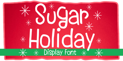 Sugar Holiday is a fun skinny font that you can use it for anything ranging from t-shirts, book designs, and greeting cards to stickers and posters, or anything that needs a casual touch. If you want to use it for Christmas or Valentine themed designs, it will be your perfect font to pick. Fall in love with its incredibly versatile style, and use it to create lovely designs!
 - Luengo by Hashtag Type,
$25.00 Luengo is a modern geometric sans serif font family. Rounded corners give a natural and overall home-felt feel with an accessible air and an elegant touch. Luengo is for display purpose, but it also looks great in longer copy, making this family of 5 weights perfect for a range of uses such as brand identities, packaging and editorial. Luengo offers ligatures and alternatives with manual kerning and spacing.
 - Rocinante Titling by XO Type Co,
$40.00 Rocinante Titling is a study in interior and exterior tension, with tightly-packed interiors and unexpected lightwells contrasting generous letterspacing. 5 weights and obliques on the same weight range as Havelock Titling, the family is a contrasting partner meant for combination. It’s made for creating contrast and tension in your work. Here’s a downloadable PDF specimen, and here's more about the process of getting from Havelock to Rocinante.
 - Diore by Olivetype,
$18.00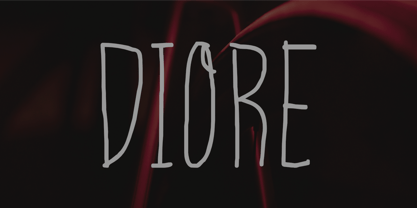 Meet Diore, a fun and playful handwritten font. It adds a unique and charming touch to your designs, with each stroke having its own personality. Use Diore in a range of projects, from social media graphics to website banners, - giving you so many creative possibilities. Diore features : Standard Latin Numbers, symbols, and punctuations Multilingual Support. Fully accessible without additional design software Simple Installations Works on PC & Mac Thank You.
 - Firelli by Typejockeys,
$60.00 Firelli is an original family of 14 styles including 7 weights and Italics. Delighting from thin to black, Italic swash caps, ligatures, and neat alternate characters. Big headlines will love Firelli’s incorruptible details. Longer texts will benefit from a wide-ranging family with its solid posture. Go, use everything Firelli has to offer, to design your contentful magazines, powerful annual reports, or even bedtime stories and fairy tales.
 - Berdicon by Beewest Studio,
$10.00 Verdicon is an elegant and distinctive serif font family that is a great solution for your projects. These include vertical and diagonal styles, each with eight weights ranging from thin to thick. It is a classic and versatile typeface, perfect for fashion, contrast, modern and legible designs. With it, you can create logos and banners, use them in advertising, packaging, book and magazine covers, titles, descriptions and more.
 - Black Animal by sizimon,
$15.00 Black Animal is handmade brush style font. Very cool for logos, product packaging, merchandise, social media & branding. And very easy to use to design t-shirts and other products. It contains a full set of lower & uppercase letters, a large range of punctuation, numerals, and multilingual support. To enable the OpenType Stylistic alternates, you need a program that supports OpenType features such as Adobe Illustrator CS, Adobe Indesign & CorelDraw X6-X7.
 - Taku by Thinkdust,
$10.00 Taku comes in two styles, Taku regular and Taku Solid. As one of the most creative faces to date, this is a beautiful piece aimed at a whole range of markets for print and digital work. Super creative, extremely eye catching, and almost obsessively accurate. Taku is a typographers dream, over 300 hours of work on aesthetics and technical details, so you can expect the most high quality typeface around.
 - Landsdowne Commercial by Greater Albion Typefounders,
$18.00 ‘Landsdowne Commercial’ is a development of one of our designer’s earlier public domain releases, ‘Landsdowne’. All glyphs have been completely redrawn and refined. An extensive range of stylistic alternates and ligatures have been added, as well as a completely new bold face and several forms of numerals. Landsdowne commercial is ideal for period-inspired design work, such as posters and book covers as well for clear elegant communications.
 - Magic Twanger NF by Nick's Fonts,
$10.00Hiya, kids! Hiya, hiya, hiya! was the customary greeting of Froggy (a rather cheap rubber toy), who played second banana to otherwise-perennial sidekick Andy Devine on the 1950s TV show, Andy's Gang. The Magic Twanger was the thing which, when plunked, brought on the cartoons and other kid-friendly fare. The Opentype version of this font supports Unicode 1250 (Central European) languages, as well as Unicode 1252 (Latin) languages. - Tinman Pro by No Bodoni,
$35.00 TinmanPro is a mildly stressed humanist sans serif type based on the University of California Oldstyle type designed by Frederick Goudy. The design captures the warmth and friendly character of Goudy�s original in a monotone sans. Broad Latin support along with small caps, fraction support and other typographic niceties are included in the ten font family. Weight range includes Regular, Medium, DemiBold, Bold and ExtraBold with matching italics for each.
 - Ziletti Pop by RM&WD,
$20.00 ZILETTI POP is a font used by Girolamo Ziletti in Venice in mid/late 1500. A typographic caracter characterized by a Venetian style cage with slight geometrical imperfections but with a great perceptual level. This is a multilayered variant with a wide range of possibility in variations in terms of end results. With the use of the color your artworks will have news optical effects. Ideal for Covers, Posters, Logos…
 - Christmas Worship by Letterara,
$14.00 Christmas Worship is an enchanting natural handwritten font. This versatile script font has a wide spectrum of applications ranging from greeting cards, logos to headlines and is guaranteed to add an elegant or romantic feel to your next project. Add it confidently to your projects, and you will love the results. This font is PUA encoded which means you can access all the beautiful glyphs and swashes with ease!
 - Leafing by Illushvara,
$15.00 Leafing is a modern script font mix featuring leaf and florals with a natural vibe. The script is suitable for a wide range of products, including headlines, logotype, wedding invitations, Valentine’s Day, branding, packaging, advertising, watermark, and much more! This font is PUA encoded which means you can access all of the magical glyphs and swashes with ease! It also features a wealth of special features including alternate glyphs and ligatures.
 - Acardia by Letteralle,
$23.00 I'd like to introduce you Acardia! a stunnig signature font. Font with natural flow and feminine style. Each letter is deliberately imperfect to make it look more natural and charming. Acardia comes with multilingual support, long range ligature, and ending swash from a-z. Acardia is perfect for many design needs such as merch, T-shirts, titles, book covers, social media posts, websites, events, and many more. Enjoy the font, Thanks!
 - Bright Bridge by Putracetol,
$28.00 Bright Bride - Beautiful Script Font Introducing Bright Bride, a stunning and elegant script font that exudes sophistication and beauty. This font was carefully crafted with the intention of adding a touch of glamour to any design project. Its clean lines and flowing curves create a sense of grace and charm, making it perfect for wedding invitations, branding projects, social media posts, and much more. For those seeking a romantic and feminine touch, Bright Bride is the perfect font choice. Its delicate strokes and intricate details add a level of elegance that is sure to catch the eye of any viewer. Pair it with soft pastels or classic black and white to create a stunning contrast that will make your designs stand out. One of the standout features of Bright Bride is its OpenType alternates and ligatures. These unique letter combinations add an extra level of creativity and customization to your designs. Plus, with full multilingual support, this font can be used for projects in a variety of languages. The Bright Bride font package includes three different file formats: OTF, TTF, and WOFF. This makes it easy to use the font across a variety of design software and platforms. Whether you're a professional graphic designer or a casual hobbyist, this font is sure to be a valuable addition to your design arsenal. If you're looking for a font that is both stunning and versatile, look no further than Bright Bride. Its unique combination of elegance and creativity make it a perfect fit for a wide range of projects. So why wait? Add Bright Bride to your font collection today and start creating designs that are truly unforgettable. In summary, Bright Bride is a beautiful and sophisticated script font with delicate strokes and intricate details. It comes with OpenType alternates and ligatures, multilingual support, and three different file formats: OTF, TTF, and WOFF. This font is perfect for wedding invitations, branding projects, social media posts, and more.
 - El Hombre by Chank,
$59.00El Hombre is a classic Chank Font from the earlier days of the internet. A consistent fan favorite since its initial release in 1999, this bouncey, blockey font has a sinsister charm and a sassy jaunt to it. It's now available on MyFonts for your personal or commercial use. ¡Muy guapo! - Cowgirl by By Meg Burk,
$25.00 An uppercase font that has versatile character. Got a story to tell? Cowgirl can help you tell it. Includes western-themed vector illustrations handmade by Meg Burk. I grew up spending almost every family vacation as a road trip across the southwestern US. In these adventures, I fell in love with learning about the nature around us; deserts, mountains, plains, piñon trees, rainbow trout, black bears, eagles, and more. I fell into freezing cold white water rapids, explored long-abandoned cliff dwellings, camped under the Milky Way, saw old cave markings, stone markings, preserved art, and read many a many old map legends. These memories are visceral and the inspiration that I get from them permeates my every day. Take a piece of these stories with you and use them in your designs, too. Handmade, meant to last a lifetime and inspire others for decades to come.
 - 8th Avenue by Our House Graphics,
$16.00 Inspired by the strange, blocky lettering on the sides of a set of a set of plastic kitchen containers in my childhood home, 8th Avenue is a sophisticated, somewhat syncopated font with a retro look and feel that at the same time brings a very modern attitude to your design. 8th Avenue works well as display font for packaging, headlines and logos. Those pastel turquoise plastic boxes from the early 1950s, with white screen printed letters reading FLOUR, SUGAR, COFFEE etc. on one side were a simple quiet presence in our home back then and for decades after. Seeing them, even that soft blue-green colour felt like home. SUGAR, the soul survivor of that set has become one of those mundane items of daily life that somehow become simple icons of another time, ripe with memories. Obviously I had to make a font. September 2014
 - P22 Graciosa by IHOF,
$29.95 P22 Graciosa is a five font family based upon designs for a metal type by Carlos Winkow (1882–1952), a German type designer who lived and worked in Spain in the early 20th Century. Graciosa is a sort of hybrid blackletter/text font, with simplified blackletter caps and a serifed lowercase with subtle script flare. There is a Regular, Black, an open version called White, and an engraved version called Gris. The version called Multi serves as a fill font to allow for multi-colored layering options. A revival of these designs was initiated by Matthias Beck in 2015. The character set was expanded for use in 21 languages (OpenType Standard). The digitization and reintroduction of these old fonts—created in Spain and practically forgotten—makes them regain a new life. This project was subsidized by the Spanish Ministry of Education, Culture and Sport.
 - Blooming Meadow by ParaType,
$25.00A set of original ornamental symbols was designed by Viktor Kharyk and licensed to ParaType in 2007. The name was inspired by the famous book “Champ Fleury” by Geoffroy Tory (1529) but the theme of blooming meadow was embodied much more literally. Each ornamental motive has a real prototype in flora. Mainly there are plants raising on Ukrainian wooded steppe. Plants were chosen for their Ukrainian and Latin names begin of proper letters from Ukrainian and Latin alphabets. The font is consisted of two styles: Day for normal and Night for reversed that reminds night lighting by its unexpected distribution of black and white areas. Fleurons may be used for creation of ornamental surfaces, composed borders and corners, decoration of any materials, and even as botanical illustrations. Blooming Meadow Day have been adjudged Award of Excellence in Type Design at TypeArt’05 international type design contest - Wholecar by Mans Greback,
$59.00 Wholecar is a train graffiti typeface. The letters are fun and friendly, with a happy personality and cartoonish quirkiness. A street style, Wholecar is drawn and created by Mans Greback, and is the perfect combination of cool and childish typography. This hip-hop styled comic typeface family comes in eight styles: Black, Inline, Invert, Regular and White. Additionally, the Wholecar Color, consisting of Noir, Pink and Silver, specifically created for Photoshop and Illustrator. Use characters [ ] { } ¤ # _ for train parts fitting the letters. Examples: [¤#¤_¤_¤#¤] [¤Graffiti¤] The font is built with advanced OpenType functionality and has a guaranteed top-notch quality, containing stylistic and contextual alternates, ligatures and more features; all to give you full control and customizability. It has extensive lingual support, covering all Latin-based languages, from North Europe to South Africa, from America to South-East Asia. It contains all characters and symbols you'll ever need, including all punctuation and numbers.
 - Blue Plaque by K-Type,
$20.00 Blue Plaque is a distressed font that simulates the low relief, white-painted lettering on English Heritage plaques attached to buildings where famous people have lived. For creating mock plaques, a blank disk, with the English Heritage title at the top and the logo at the bottom, is included at the brace left { keystroke, and also at the section § keystroke. A blank plaque without the English Heritage title and logo is included at the bar | keystroke. A distressed English Heritage logo is included at the asterisk * keystroke. he outer ring of the blue plaques, which is glazed in dark grey, is included at the brace right } keystroke, and also at the plusminus ± keystroke. Photoshop's Outer Bevel Layer Style is perfect for adding a relief appearance to the letters. Buyers are welcome to request a 1000px jpeg image of a blank blue plaque by emailing K-Type directly https://www.k-type.com/contact/
 - Eckhardt Poster Text JNL by Jeff Levine,
$29.00 Eckhardt Poster Text JNL continues Jeff Levine's series of sign painter-oriented fonts, named in honor of his good friend Albert Eckhardt, Jr. (who ran Allied signs in Miami, Florida from 1959 until his passing). Sign painters are the true heroes of lettering, for they make the alphabet and style fit the job. Printers and layout artists were constricted by metal and wood type; that is until photo lettering, then digital type opened up unexplored territories in design possibilities. There is a unique charm (and nowadays pretty much a lost art) to hand-lettering word copy in a way that draws the eye like an arrow to a target. Even a simple sanserif such as Eckhardt Poster Text JNL can have the effect of that hand lettering when applied to posters and pages with plenty of white space and matching type designs of the period.
 - Chordette for Education - Ukulele by Ukefarm,
$8.00 What is it? Chordette for Education is a ukulele chord font created specifically for schools and individual instructors. It can be used for creating song sheets, presentations, or adding chords to videos. This education version has a basic chord set for beginners which include finger positions and an option for 3D chords. It’s a favorite tool for teachers, music therapists, and musicians. What instruments are supported? Chordette for Education supports ukulele tuned GCEA. The fonts are available in black and white for Windows and Macintosh. The 2D chords include fingering numbers and the chords can be used for song sheets, presentation software, and video tutorials. Alternate chords and 3D chords for presentations are included. Is it free? Chordette for Education is priced at $8, which includes chord font sets for both Mac and Windows. How do I use it? For help and support, please visit https://ukefarm.com/chordetteEd/help.html
 - Eastman Condensed by Zetafonts,
$39.00 Discover here the Eastman Roman Family See the Eastman Grotesque Family Designed in 2020 for Zetafonts by Francesco Canovaro and Andrea Tartarelli with help from Solenn Bordeau and Cosimo Lorenzo Pancini, the original Eastman typeface family was conceived as a geometric sans workhorse family developed for maximum versatility both in display and text use. The original wide weight range has been complemented with three more additional widths, to give you maximum control over the appearance of text in your page. While Eastman Compressed and Eastman Condensed behave as space-saving condensed families, Eastman Grotesque adapts the family design style to humanist proportions. All share a solid monolinear design and a tall x-height that makes body text set in Eastman extremely readable on paper and on the screen. Influenced by Bauhaus ideals and contemporary minimalism, but with a nod to the pragmatic nature 19th century grotesques, Eastman has been developed as a highly reliable tool for design problem solving, and given all the features a graphic designer needs - from a wide language coverage (thanks to over one thousand and two hundred latin, Cyrillic and greek characters) to a complete set of open type features (including small capitals, positional numbers, case sensitive forms). The most impressive feature of all Eastman fonts remains the huge choice of alternate characters and stylistic sets that allows you to fine-tune your editorial and branding design by choosing unique, logo-ready variant letter shapes. Don’t want to lose too much time with the glyphs palette? Use the Eastman Alternate weights, thought for display use and presenting a selection of some of the more eye catching & unusual letter shapes available for the family.
 - Rubis by Nootype,
$45.00 Rubis is a contemporary serif typeface with a sharp aspect designed for long running text. It’s a family with a serious aspect but it keeps a certain charm. The idea behind Rubis was to create a typeface with flawless curves, every letter and symbol has been designed in this idea, it can be seen in the terminals which finish the letter with an extreme fluidity. It’s a family which mixes classical influence such as the calligraphic terminaison and the sharpness of a modern typeface. The Regular and Medium are optimized for long text while the Light and Black can be useful for Title. The range of style give a good flexibility to this family. It’s an excellent family for editorial use. Rubis consists in a 10 styles family, from Light to Black with their corresponding italics. Each font includes OpenType Features such as Small Caps, Proportional Figure, Tabular Figures, Numerators, Superscript, Denominators, Scientific Inferiors, Subscript, Ordinals, Fractions and ligatures. Rubis family supports Latin and Cyrillic, all these languages are covered: Latin language support: Afar, Afrikaans, Albanian, Asturian, Azeri, Basque, Bosnian, Breton, Bulgarian, Catalan, Cornish, Corsican, Croatian, Czech, Danish, Dutch, English, Esperanto, Estonian, Faroese, Filipino, Finnish, Flemish, French, Frisian, Friulian, Gaelic, Galician, German, Greenlandic, Hungarian, Icelandic, Indonesian, Irish, Italian, Kurdish, Latin, Latvian, Lithuanian, Luxembourgish, Malagasy, Malay, Maltese, Maori, Moldavian, Norwegian, Occitan, Polish, Portuguese, Provençal, Romanian, Romansch, Saami, Samoan, Scots, Scottish, Serbian, Slovak, Slovenian, Spanish, Swahili, Swedish, Tagalog, Turkish, Walloon, Welsh, Wolof Cyrillic language support: Adyghe, Avar, Belarusian, Bulgarian, Buryat, Chechen, Erzya, Ingush, Kabardian, Kalmyk, Karachay-Balkar, Karakalpak, Kazakh, Komi, Kyrgyz, Lak, Macedonian, Moldovan, Mongol, Permyak, Russian, Rusyn, Serbian, Tatar, Tofa, Tuvan, Ukrainian, Uzbek .
 - Blacker Pro by Zetafonts,
$39.00 Blacker Pro is the revised and extended version of the original wedge serif type family designed by Cosimo Lorenzo Pancini and Andrea Tartarelli in 2017. Blacker was developed as a take on the style that Jeremiah Shoaf has defined as the "evil serif" genre: typefaces with high contrast, oldstyle or modern serif proportions and sharp, blade-like triangular serifs. Due to the high contrast in the design - slightly reminescent of didone typefaces - Blacker has been developed in two optical subfamilies. The display version offers tighter tracking, higher contrast and sharper corners for maximum effect at big sizes, while the text variant offers better readability and screen rendering at smaller sizes, with lower contrast and looser spacing. In the pro version, two additional condensed variant families have been added (condensed display and condensed text) allowing for more freedom and versatility in typesetting where space constraints are present. Also, three titling uppercase-only variants have been added, with a slightly extended feel, and two decorative subfamilies (inline and diamond). Each of these seven variants has been developed in six weights from light to heavy, with matching italics, for a total of 69 styles covering a wide range of editorial and advertising uses. All Blacker Pro feature a revised and extended character set covering over two hundred languages using the latin, cyrillic and greek alphabets. Open type features include small caps, positional numerals, fractions, superior & inferior figures, alternate forms, and an extended set of standard and discretionary ligatures. With its bold personality, Blacker aims to be a modern classic used for bold statements and self-conscious brands, making your text look great both on paper and on the screens.
 - ITC Tactile by ITC,
$29.99ITC Tactile is a puzzle of subtle typographic contradictions. Capitals have traditional epigraphic proportions, but the lowercase has a uniform optical width. Light weights are stately and elegant, but bold designs are almost jolly. This paradoxical alphabet even combines two distinctively different serif designs. Designer Joe Stitzlein says, “I wanted to create a modern and dynamic serif face that draws its forms from antiquity. I also wanted to have as much fun as possible with the drawing and architecture of each letter. Hopefully I've created a very legible typeface that grabs the reader's eye in a nice, 'tactile' way.” The apparent inconsistencies of the design are the result of careful consideration. Of the seemingly odd serif design, Stitzlein explains, “The transitional serif is an entry point for the eye into the letterform, and the long slab is an exit, leading to the next letter.” The result is a typeface that's easy to read at text sizes but offers surprising details when enlarged to display sizes, setting ITC Tactile apart from more traditional designs. While this is his first commercial typeface design, Stitzlein has ample experience creating custom typefaces for corporate branding, including companies such as Silicon Graphics and Sempra Energy. His graphic design business has served a wide range of clients, including Apple Computer and the 2002 Salt Lake City Olympics. The ITC Tactile family is available in three weights, with complementary italic designs and a suite of small caps for each of the roman designs. Stitzlein drew the small caps to match the height of the lowercase x-height, which enables “bi-form” or “unicase” setting in display copy. - Astrid Grotesk by Eclectotype,
$40.00 Astrid Grotesk is a normalized version of Schizotype Grotesk. Normalized; not neutralized. Where many neo-grotesks appear cold with their harsh neutrality, Astrid has a warmth, eminating from its (for want of a better word) clunkiness. With the latest update, it becomes a true workhorse, with a range of widths and italics for the normal widths. Astrid Grotesk, while being clearly a neo-grotesk in appearance, has a personality all of its own. Standout characters include the f and t, and the default binocular g, unusual in neo-grotesks. And the right angled terminals on c, e and s. Stylistic sets offer up alternate forms of a, g, y, I, @, dutch IJ, german eszett and l. A full complement of numerals is included: proportional and tabular, lining and oldstyle, plus fractions, subscript and superscript. Note also that the tabular figures are duplexed across weights - very useful when highlighting specific entries in tables. The tabular figures feature also substitutes in fixed width (across all weights) comma and period, so your decimals line up perfectly always. Lastly, case sensitive forms of certain glyphs are included for all-cap settings. This typeface will be useful for corporate identities and branding work. It’s spaced more for text settings in the normal width, and gets more display-optimized as the width decreases, but with careful tracking, all styles can sing at display sizes. Bored of those other Swiss style typefaces? Astrid Grotesk could be the face you need to breathe new life into your designs. Coupled with Schizotype Grotesk, its more eccentric cousin, you've got an unorthodox branding system ready to use straight out of the box.
 - Fadista by Alex Beck,
$19.99 Fadista is an eccentric experimental typeface, inspired by the Portuguese fado music and letterings by the artist Stuart Carvalhais (1887–1961), created throughout the 1920ies and 1930ies. A strong and clean presence with a touch of quirky gives the typeface its overall character. Fadista includes various OpenType features that allow tailoring the type to custom needs, encouraging graphical exploration. Fadista is the result of meticulous research, graphic reinterpretation and systematization of the glyph palette, taking into account modern font standards. Balancing between a historic heritage and „hipster“ contemporary looks, Fadista represents a discourse about aesthetics, trends and currentness in graphic design. The stylistic variations of the glyphs in fadista work in an additive fashion, rather than completely altering the look of the typeface. This means that a basic framework of glyphs remains unaltered, while certain subgroups of characters are affected by the style choices. Through this behavior, stylesets in fadista work as a switch for the type of contrast you’d like entwined in the overall look of the typeface. Other unique features include stylistic alternates for specific glyph combinations, ligatures that allow internal character spacing and tiny diacritics that flow within cap height along normal height glyphs. Please note the lowercase characters within Fadista are uppercase alternates. Math operators are fully supported, as well as a wide range of symbols and punctuation. Supported Languages: Albanian, Danish, Dutch, English, Finnish, French, German, Icelandic, Italian, Malagasy, Norwegian, Portuguese, Romansh, Spanish, Swedish and Turkish. For further language support don‘t hesitate to get in touch. Fadista was awarded the Art Directors Club Bronze in the junior competition 2014 and the DDC Award 2014 in the category "Future“.
 - Roloi by Mayfield Type Foundry,
$15.00 Originally inspired by the numerals on a vintage clock face, Roloi is a layered numbers font in the deco lettering style, and includes a full set of automatic clock symbols. Its geometric forms are typical of the deco style, but stop well-short of pure geometry. The irregular stroke and character widths work together to give the forms a warm and energetic, yet cohesive, feel. Roloi offers two layering styles—the personable Fill and the more dynamic Inline. Designed to be layered over the background Regular style, they both lend the forms an added level of interest. Roloi also includes a clock symbol for any and every time of day, rounded to the nearest five-minutes. The regular weight provides the circular clock background, while the Fill and Inline styles produce the clock hands. If ligatures are activated in your text-editing program, type out any time—such as 9:32, 12:05, etc.—and the proper clock symbol will be automatically substituted. Go ahead, type any time out below! To stop the automatic clock symbol substitution, simply deactivate ligatures. Because the clock symbols are standard ligatures, every major modern browser will support their use on the web. With some programing they could even be used to make a lightweight, text-only clock. In addition to the clock symbols and basic numerals, Roloi’s glyph range covers numeric superiors and inferiors, standard and arbitrary fractions, currency symbols, all of the punctuation and symbols commonly associated with currency, unicode clock Face symbols, the A M P / a m p letters, and alternates of the 1, 2, and 4, accessible by selecting Stylistic Set 1.
 - Poligon by Halbfett,
$30.00 Poligon is a large family of geometric sans serif fonts. It is inspired by classic typefaces from the geometric-sans genre, like Futura and Avant Garde Gothic, whose shapes were constructed from circles and straight lines. Every character has been crafted to give it a distinct and individual feel. The family is an excellent choice for both corporate design and editorial design projects because of its range of weights, as well as its legibility in text. The typeface family ships in two different formats. Depending on your preference, you can install the typeface as two Variable Fonts or use the family’s eight static OpenType font files instead. Those weights run from Thin to Black. While the static-format fonts offer a good intermediary-step selection, users who install the Variable Fonts have vastly greater control over the stroke width in their upright and italic texts. The weight axes in Poligon’s Variable Fonts allow users to differentiate between almost 1,000 possible font weights. That enables you to fine-tune your text’s exact appearance on-screen or in print. But even the static fonts satisfy the need for flexibility, creating harmonious variations of texture and emphasis. Despite their rigid geometry, the fonts have a playful air to them. That playfulness and uniqueness can be dialed up by applying stylistic alternates via the fonts’ four Stylistic Sets. The first of these replaces “G”, “M”, and “&” with alternate, more outgoing shapes. Stylistic Set 2 has an alternate “ß”; Stylistic Set 3 has a “Q” with a longer tail and another “G”. Stylistic Set 3 has alternates for “A”, “K“, “Q”, “R”, “S”, “Y”, and “Z”.
 - FF Good Headline by FontFont,
$72.99 FF Good is a straight-sided sans serif in the American Gothic tradition, designed by Warsaw-based Łukasz Dziedzic. Despite having something of an “old-fashioned” heritage, FF Good feels new. Many customers agree: the sturdy, legible forms of FF Good have been put to good use in the Polish-language magazine ‘Komputer Swiat,’ the German and Russian edition of the celebrity tabloid OK!, and the new corporate design for the Associated Press. Although initially released as a family of modest size, the typeface was fully overhauled in 2010, increasing it from nine styles to 30 styles, with an additional 30-style sibling for larger sizes, FF Good Headline. In 2014, the type system underwent additional expansion to become FontFont’s largest family ever with an incredible 196 total styles. This includes seven weights ranging from Light to Ultra, and an astonishing seven widths from Compressed to Extended for both FF Good and FF Good Headline, all with companion italics and small caps in both roman and italic. With its subtle weight and width graduation, it is the perfect companion for interface, editorial, and web designers. This allows the typographer to pick the style best suited to their layout. As a contemporary competitor to classic American Gothic style typefaces—like Franklin Gothic, News Gothic, or Trade Gothic—it was necessary that an expanded FF Good also offers customers both Text and Display versions. The base FF Good fonts are mastered for text use, while FF Good Headline aims for maximum compactness. Its low cap height together with trimmed ascenders and descenders give punch to headlines and larger-sized copy in publications such as newspapers, magazines, and blogs.
 - Aquawax Fx by Zetafonts,
$39.00 Aquawax FX was developed by Francesco Canovaro as a new variant of the Aquawax family, one of the most beloved Zetafonts classics. This new typefamily is characterised by a contemporary and elegant design, that revisits the original design of 2008 with new geometric inventions, twisted with the current fluid zeitgeist. Aquawax FX builds on the original Aquawax family by adding counter-inktraps to the letterforms and emphasizing the inner contrast of curves and corners creating a smoother, flowing and dynamic look. While inktraps are a design feature that prevents ink from bleeding or filling small spaces in letterforms to achieve a cleaner, more readable look, anti-inktraps characterize the design with a distinctive watery appearance, suitable for logo design and titles. This watery effect is possible through a slight rounding of the inner and outer corners, keeping the original cuts at the letter terminals. A Space variant pushes FX experimentation furthermore, providing an alternate stencil-like style that takes legibility to the extreme, ready for logos and sci-fi headings. This does not limit the usability of Aquawax FX to mere display intent. The Aquawax FX font family includes two versions (Roman and Space), each with nine weights, ranging from Thin to Heavy, and matching italics. With a total of 36 variants plus one variable version, Aquawax FX is a versatile type family that can be used for a variety of design projects, from branding and packaging to editorial design and advertising. Aquawax FX offers a fresh re-interpretation of the original Aquawax letterforms and proportions, with a dynamic and flowing look that is sure to make your projects stand out.
 - Eastman Grotesque by Zetafonts,
$39.00 Designed in 2020 for Zetafonts by Francesco Canovaro and Andrea Tartarelli with help from Solenn Bordeau and Cosimo Lorenzo Pancini, the original Eastman typeface family was conceived as a geometric sans workhorse family developed for maximum versatility both in display and text use. The original wide weight range has been complemented with three more additional widths, to give you maximum control over the appearance of text in your page. While Eastman Compressed and Eastman Condensed behave as space-saving condensed families, Eastman Grotesque adapts the family design style to humanist proportions. All share a solid monolinear design and a tall x-height that makes body text set in Eastman extremely readable on paper and on the screen. Influenced by Bauhaus ideals and contemporary minimalism, but with a nod to the pragmatic nature 19th century grotesques, Eastman has been developed as a highly reliable tool for design problem solving, and given all the features a graphic designer needs - from a wide language coverage (thanks to over one thousand and two hundred latin, cyrillic and greek characters) to a complete set of open type features (including small capitals, positional numbers, case sensitive forms). The most impressive feature of all Eastman fonts remains the huge choice of alternate characters and stylistic sets that allows you to fine-tune your editorial and branding design by choosing unique, logo-ready variant letter shapes. Don’t want to lose too much time with the glyphs palette? Use the Eastman Alternate weights, thought for display use and presenting a selection of some of the more eye catching & unusual letter shapes available for the family.
 - Eastman by Zetafonts,
$39.00 Discover the complete Eastman type family: Eastman Grotesque and Eastman Condensed! Designed in 2020 for Zetafonts by Francesco Canovaro and Andrea Tartarelli with help from Solenn Bordeau and Cosimo Lorenzo Pancini, the original Eastman typeface family was conceived as a geometric sans workhorse family developed for maximum versatility both in display and text use. The original wide weight range has been complemented with three more additional widths, to give you maximum control over the appearance of text in your page. While Eastman Compressed and Eastman Condensed behave as space-saving condensed families, Eastman Grotesque adapts the family design style to humanist proportions. All share a solid monolinear design and a tall x-height that makes body text set in Eastman extremely readable on paper and on the screen. Influenced by Bauhaus ideals and contemporary minimalism, but with a nod to the pragmatic nature 19th century grotesques, Eastman has been developed as a highly reliable tool for design problem solving, and given all the features a graphic designer needs - from a wide language coverage (thanks to over one thousand and two hundred latin, cyrillic and greek characters) to a complete set of open type features (including small capitals, positional numbers, case sensitive forms). The most impressive feature of all Eastman fonts remains the huge choice of alternate characters and stylistic sets that allows you to fine-tune your editorial and branding design by choosing unique, logo-ready variant letter shapes. Don’t want to lose too much time with the glyphs palette? Use the Eastman Alternate weights, thought for display use and presenting a selection of some of the more eye catching & unusual letter shapes available for the family.