10,000 search results
(0.04 seconds)
- ITC Django by ITC,
$29.99Australian designer and art director Wayne Thompson has loved typography “ever since I received a battered second-hand Letraset catalog at the age of 10.” He based ITC Django on the handwriting of an acquaintance -- “a fellow I know who writes and illustrates children's books and is also a commercial artist” -- who called himself Django, after the jazz guitarist Django Reinhardt. “I felt that that name Django suited the funky, lively feel of the face,” says Thompson. But he adds, “Django has a split personality: it appears loose and easy at first, but after looking at it for some time I felt an edginess come through that was slightly psychotic.” The looseness of the lowercase contrasts with the spikiness of the capitals. The “edginess” is especially apparent in words in all caps. - Addlethorpe by Typodermic,
$11.95 Introducing Addlethorpe, the sleek and sophisticated three-layer metal typeface that will elevate your designs to the next level. With its unique combination of foreground, fill, and background layers, Addlethorpe offers endless possibilities for customization and creativity. Whether you’re designing for print or digital, Addlethorpe has you covered. The foreground layer, Addlethorpe 1, is perfect for use on light backgrounds, offering intricate detail that will catch the eye and draw the viewer in. But why stop there? Addlethorpe 2 is the perfect fill layer, allowing you to add color and depth to your elevated letters. And don’t forget about Addlethorpe 3, the rectangular background layer that fills in the blanks and ties your design together. With its clean lines and bold presence, Addlethorpe 3 is the perfect finishing touch. But Addlethorpe is more than just a pretty face. OpenType-aware programs allow for the use of lining or old-style numerals, while letter pair ligatures break up the monotony of repeated letters. And with Addlethorpe Web, you can enjoy all of this beauty and versatility with faster load times and simpler forms. So what are you waiting for? Give your designs the edge they deserve with Addlethorpe. Just be patient with your application – with all this detail and customization, it’s worth taking the time to get it right. Some Latin-based European writing systems are supported, including the following languages. Afaan Oromo, Afar, Afrikaans, Albanian, Alsatian, Aymara, Basque, Bemba, Bikol, Breton, Cape Verdean, Creole, Catalan, Cebuano, Chamorro, Chavacano, Danish, Dawan, Dholuo, Dutch, English, Estonian, Faroese, Fijian, Filipino, Finnish, French, Frisian, Friulian, Galician, Genoese, German, Guadeloupean Creole, Haitian Creole, Hiligaynon, Icelandic, Ilocano, Indonesian, Irish, Italian, Jamaican, Kaqchikel, Kikongo, Kinyarwanda, Kirundi, Lombard, Low Saxon, Luxembourgish, Makhuwa, Malay, Ndebele, Neapolitan, Norwegian, Novial, Occitan, Papiamento, Piedmontese, Portuguese, Quechua, Rarotongan, Romansh, Sango, Saramaccan, Sardinian, Scottish Gaelic, Shona, Sicilian, Silesian, Slovak, Slovenian, Somali, Sotho, Spanish, Swahili, Swazi, Swedish, Tagalog, Tetum, Tshiluba, Tsonga, Tswana, Tumbuka, Uzbek (Latin), Venetian, Võro, Walloon, Waray-Waray, Wayuu, Xhosa, Yapese, Zapotec Zulu and Zuni.
 - Thrifty by Typogama,
$19.00 Thrifty is a clean, contemporary typeface family created for branding and communication design. With a narrow form and clear letter forms, this family is both suited for display and title settings while equally remaining legible in smaller point sizes. Through it’s nine weights and accompanying italics plus a large glyph set that covers the majority of Latin based languages, Thrifty aims to offer a versatile and functional design. Thanks to the implementation of OpenType features, this family includes different sets of numerals, from tabular, hanging or scientific, it equally includes ligatures and free form fractions. Each weight equally offers a complete set of arrows and 99 different pictograms focused on themes of mobility and transport.
 - Decary Sans by Mans Greback,
$49.00 Decary Sans is a new vintage typeface. A sans-serif lettering provided in the styles Light, Regular and Bold, and each weight as Italic. Perfect for a logotype or headline, use this modern retro type to express genuine tradition while keeping the design up-to-date. The font is built with advanced OpenType functionality and has a guaranteed top-notch quality, containing stylistic and contextual alternates, ligatures and more features; all to give you full control and customizability. It has extensive lingual support, covering all Latin-based languages, from Northern Europe to South Africa, from America to South-East Asia. It contains all characters and symbols you'll ever need, including all punctuation and numbers.
 - Linotype Syntax Lapidar Serif Text by Linotype,
$29.99Modeled on the writings chiseled in stone in the second century B.C., Syntax™ Lapidar is an energetic, spirited typeface designed by Hans Eduard Meier in 2000. Linotype Syntax Lapidar Text and Linotype Syntax Lapidar Serif Text have five weights each, with both cap and lowercase letterforms. Lapidar Display and Lapidar Serif Display also have five weights each, with mostly all cap letterforms and many alternates. It's a terrifically fun and inventive family, and if you look closely, you can see the resemblance to the more modern and restrained Syntax™ relatives. Great for menus, artist books, travelogues, or advertising - and if used very sparingly, it could add just the right element of lapidary significance to corporate documents. - FF Alega by FontFont,
$59.99German type designer Siegfried Rückel created this display and sans FontFont in 2002. The family has 6 weights, ranging from Light to Bold (including italics) and is ideally suited for advertising and packaging, logo, branding and creative industries, poster and billboards as well as sports. FF Alega provides advanced typographical support with features such as ligatures, small capitals, alternate characters, case-sensitive forms, and stylistic alternates. It comes with a complete range of figure set options – oldstyle and lining figures, each in tabular and proportional widths. As well as Latin-based languages, the typeface family also supports the Greek writing system. This FontFont is a member of the FF Alega super family, which also includes FF Alega Serif. - FF Amman Sans by FontFont,
$79.99 German type designer Yanone created this sans FontFont in 2010. The family has 14 weights, ranging from Thin to Black (including italics) and is ideally suited for advertising and packaging, logo, branding and creative industries as well as poster and billboards. FF Amman Sans provides advanced typographical support with features such as ligatures, small capitals, alternate characters, case-sensitive forms, fractions, and super- and subscript characters. It comes with a complete range of figure set options – oldstyle and lining figures, each in tabular and proportional widths. As well as Latin-based languages, the typeface family also supports the Arabic writing system. This FontFont is a member of the FF Amman super family, which also includes FF Amman Serif.
 - Linotype Syntax Lapidar Serif Display by Linotype,
$29.99Modeled on the writings chiseled in stone in the second century B.C., Syntax™ Lapidar is an energetic, spirited typeface designed by Hans Eduard Meier in 2000. Linotype Syntax Lapidar Text and Linotype Syntax Lapidar Serif Text have five weights each, with both cap and lowercase letterforms. Lapidar Display and Lapidar Serif Display also have five weights each, with mostly all cap letterforms and many alternates. It's a terrifically fun and inventive family, and if you look closely, you can see the resemblance to the more modern and restrained Syntax™ relatives. Great for menus, artist books, travelogues, or advertising - and if used very sparingly, it could add just the right element of lapidary significance to corporate documents. - Linotype Syntax Lapidar Display by Linotype,
$29.99Modeled on the writings chiseled in stone in the second century B.C., Syntax™ Lapidar is an energetic, spirited typeface designed by Hans Eduard Meier in 2000. Linotype Syntax Lapidar Text and Linotype Syntax Lapidar Serif Text have five weights each, with both cap and lowercase letterforms. Lapidar Display and Lapidar Serif Display also have five weights each, with mostly all cap letterforms and many alternates. It's a terrifically fun and inventive family, and if you look closely, you can see the resemblance to the more modern and restrained Syntax™ relatives. Great for menus, artist books, travelogues, or advertising - and if used very sparingly, it could add just the right element of lapidary significance to corporate documents. - Kairos Variable by Monotype,
$314.99Kairos is equal parts traditional and digital. Inspired by 19th century wood type fonts called Grecians, it’s an octagonal slab serif at its core. The serif detailing makes it radiate in headlines, with the square serifs driving its performance in text. The 51 weights and widths—all with small caps—offer a flexible and usable contemporary palette of styles perfect for branding, advertising and packaging. Kairos is stout, but has energy. It often looks athletic, industrial, and stern, while the subtle rounded features can also give it a gentlemanly and gracious demeanor. Kairos Variables are font files which are featuring two axis and have a preset instance from Thin to Black and Condensed to Extended. - Brillian by Fontex,
$29.00 A lot of time and effort has been put into the process of creating the Brillian Font. A careful analysis of the current font market and overly increasing customer needs have shaped Brillian’s final appearance and content. We don't have a precise target audience for Brillian, since the amazing amount and structure of the chosen characters enables a very wide utilization. Its look and feel came from a different designing approach, so that it can successfully satisfy the needs of even the neediest. Shining with calm and dignity, while in the roots being aggressive, it has successfully connected classic and modern styles - representing its largest value. A most complete set of Cyrillic, Greek and Latin characters included.
 - Linotype Syntax Lapidar Text by Linotype,
$29.99Modeled on the writings chiseled in stone in the second century B.C., Syntax™ Lapidar is an energetic, spirited typeface designed by Hans Eduard Meier in 2000. Linotype Syntax Lapidar Text and Linotype Syntax Lapidar Serif Text have five weights each, with both cap and lowercase letterforms. Lapidar Display and Lapidar Serif Display also have five weights each, with mostly all cap letterforms and many alternates. It's a terrifically fun and inventive family, and if you look closely, you can see the resemblance to the more modern and restrained Syntax™ relatives. Great for menus, artist books, travelogues, or advertising - and if used very sparingly, it could add just the right element of lapidary significance to corporate documents. - Toiban by Sealoung,
$20.00 Toiban is a classy modern sans serif font. Each Toiban glyph has been modernly drawn and designed for this expansive new edition, which maintains the Swiss mantra of clarity, simplicity and neutrality for the demands of contemporary design and branding. The larger View version is drawn to show off Toiban's subtlety and is spaced with the headline in mind, while the Text size focuses on readability, using strong strokes and comfortable loose spaces. The Toiban struggles to be legible at a small size because of its compactness and closed aperture. The Toiban Micro's design is simplified and exaggerated to maintain impression in small, loosely spaced type, providing excellent legibility at microscopic sizes and in low-resolution environments.
 - Blacklist by Great Studio,
$18.00 Blacklist is a high-contrast typography inspired by transitional and contemporary typography. Fonts extend their use by giving weights ranging from thin to black. The natural curve, a swollen and sloping stem, grows in character as the font gains weight. While the thinner weight has lowered contrast and optical correction to create a warm and soft look. Featuring beautiful italics, excellent weight and extensive language support. Blacklist excels in display settings such as headlines, titles, branding projects, Logo design, packaging, magazine headings, advertising, short or long text. Blacklist also comes with two versions of Variable Regular and Italic to make it easier for designers to explore and perfect beautiful designs, unearthing lots of visual tones and hidden secrets.
 - FF Amman Serif by FontFont,
$79.99 German type designer Yanone created this serif FontFont in 2010. The family has 8 weights, ranging from Regular to Extra Bold (including italics) and is ideally suited for advertising and packaging, editorial and publishing as well as logo, branding and creative industries. FF Amman Serif provides advanced typographical support with features such as ligatures, small capitals, alternate characters, case-sensitive forms, fractions, and super- and subscript characters. It comes with a complete range of figure set options – oldstyle and lining figures, each in tabular and proportional widths. As well as Latin-based languages, the typeface family also supports the Arabic writing system. This FontFont is a member of the FF Amman super family, which also includes FF Amman Sans.
 - Announcement Board JNL by Jeff Levine,
$29.00 Many decades back, churches, schools and other buildings with a need to display an outdoor message often chose a sign making system utilizing characters silk screened onto metal pieces in a block chamfer style. Each piece had a crimp in the top of the metal which formed a hook to fit over the existing rails of a message panel. This allowed for a finished sign to be displayed within minutes, and a quick change of information was not very time-consuming. A popular version of these signs provided white letters and numbers on black backgrounds. This was the model for Announcement Board JNL, which is available in both regular and oblique versions. There are two different width blank panels on the broken and solid bars for those who wish to kern the letters tight to form a ribbon, however they were designed to have slight spacing in order to emulate the hand assembly of those vintage sign panels.
 - Nemocón by Andinistas,
$59.67 Nemocon is a display font family designed by Carlos Fabian Camargo G. Nemocon It is ideal for making attractive messages. Nemocon has over 2200 glyphs distributed in 6 files OT designed from handmade lettering and usability testing. • Nemocon Script (1382 glyphs): based on the rotation of a flat tip brush. Its letters correspond to the uninterrupted calligraphic logic, as well as similar ingredients as the ones used in font Brush Script by Robert E. Smith, created for the American Type Founders in 1942. • Nemocon Tuscan (375 glyphs): Inspired by representative types of wood from the 19th century, specifically speedball brawny Tuscan capitals with serifs fishtail shaped. • Nemocon Catchwords (115 glyphs) + Nemocon Catchwords Shadow (115 glyphs): categorically inflated words with and without shadows, to accompany, highlight and prioritize. • Nemocon Dingbats (114 glyphs) + Nemocon Containers(150 glyphs): unconventional pictograms consisting warm and comforting thoughts designed to highlight words or phrases which needed multicolored illustrations or drawings in black and white.
 - Gill Sans MT by Monotype,
$45.99 Gill Sans is a humanistic sans serif family that, while is considered by many to be quintessentially British in tone and concept, has been used in virtually every country and in nearly every application imaginable. Gill Sans has reached this level of near-ubiquity for one simple—and very good—reason: it is an exceptionally distinctive design with a potential range of use that is almost limitless. This toolkit family includes a wide range of styles including the standards such as Light—which is open and elegant—and a Regular that, with its flat-bottomed d, flat-topped p and q and triangular-topped t, has a more compact and muscular appearance. Its Bold styles tend to echo the softer, more open style of the light while the extra bold and ultra bold have their own vivid personalities, but each of them would make for an eye-catching headline. Take into account the family’s many weights, including condensed and extra condensed designs, and extended language support and you have yourself a tool you’ll be thrilled to return to, time and again. Gill Sans was designed by Eric Gill: a versatile, brilliant, and prolifically successful designer of the early part of the last century. One of the main reasons for the enduring success of his namesake design is that it is based on Roman character shapes and proportions, making it unlike virtually any other sans serif out there. Gill also worked his own warmth and humanity into his design, resulting in a typeface in which each weight retains a distinct personality of its own. Pair with serif fonts like Gill's own Joanna; or more modern offerings like Frutiger® Serif, Malabar™, Syntax® Serif, FF Scala®, or DIN Next™ Slab.
 - Cooper Nouveau by House Industries,
$33.00 Few fonts reach cult status. Despite its ubiquity—and perhaps because of its lack of subtlety—for a hundred years Cooper continues to draw the faithful. It’s even come to define an entire typographic genre and recently starred in its own documentary. Cooper Nouveau is Dave West’s imaginative contribution to the Cooper oeuvre. Drawn in 1966, Nouveau refreshes Oswald Cooper’s original italic with an energetic pitch, simplified contours, and a plump friendly figure. Uniform strokes and generous curves push the font’s playful personality and springy silhouette even further. A selection of swashed characters and ligatures offers options for lively logos and strong captions. While Cooper Nouveau looks laid-back and easy-going, it’s more than capable of pulling it’s own typographic weight. Put it to work where relaxed needs to project confident. Set Nouveau large for eye-magnet posters, packaging, and advertisements. Maximize its youthful energy for kids’ themes, craft action, and apparel bounce. Or set it alongside a master like Benguiat Buffalo or Chalet to show how Cooper Nouveau can communicate on paper and screens with an inherent ability to speak the language of style in many tongues. But like any cult icon: beware! Cooper has a way of setting the needle, and Nouveau just may become your go-to design fix. FEATURES ALTERNATES: Cooper Nouveau contains several alternate characters, which add flair to your designs and can help solve spacing issues LIGATURES: Many letter combinations in Cooper Nouveau form a ligature to solve spacing issues and produce more pleasing designs. COOPER NOUVEAU CREDITS Typeface Design: Dave West Digitization: Dave Foster Typeface Direction: Ben Kiel, with Ken Barber Like all good subversives, House Industries hides in plain sight while amplifying the look, feel and style of the world’s most interesting brands, products and people. Based in Delaware, visually influencing the world.
 - Smyrna by Ahmet Altun,
$19.00 Smyrna is a hand-drawn font family comes in two weights; light and regular. Thanks to its randomize effect, you can write 4 options for each letter. When the Smyrna Font used in OpenType-savvy applications, its Stylistic Alternates feature produce a random-like effect on the terminal points of the letters. So, typing is no longer monotony; it's returning full of fun. The name "Smyrna" comes from the city I live, Izmir. Smyrna is the name of the ancient city located at modern Izmir.
 - Puchiflit by sugargliderz,
$44.00 Puchiflit is a typeface disguised as a pen script. I didn't create this typeface by importing the letters on paper and tracing them into a computer with a draw application. So I think it's a pseudo-pen script typeface. By the way, I used a famous Japanese maker's felt-tip pen as a reference for line widths. I thought, "Isn't this what it would look like if I wrote with this pen? I drew a line in the draw application while fantasizing about this.
 - Hello Girly by Good Java Studio,
$19.00 Hello Girly is the perfect font for all your fun designs. The main font file is equipped with ordinary characters (A-Z, a-z, 0-9, ligature), as well as more than 300+ glyphs to support most Latin-based languages. So you can be sure they will work well together with other fonts! It is suitable for you to use in making t-shirt designs, quotes, labels, packaging, logo type, or long writing. Because we have compiled kerning and matrices that are tailored to your needs.
 - TAN The Laundry Room by TANTypeCo.,
$19.00 TAN - THE LAUNDRY ROOM is a fun display serif. Wonky yet composed and retains the legibility. *the italic font used in the display is TAN - ANGLETON (italic) — Our fonts are supported by most design software, please make sure it can read the OpenType fonts to be able to access all ligatures. Please be informed that while our font works well in Canva, but Canva itself doesn’t support advance opentype features such as special characters. For support, please don’t hesitate to contact us at tantypeco@gmail.com.
 - DarkPix - Personal use only

- Roughcast by Hanoded,
$10.00 Roughcast is a kind of outside plaster, composed of cement and pebbles. It’s not the best looking plaster and it is estimated that in the UK, a roughcast outer reduces the value of a house by 5%. I am in the middle of renovating our old farm, but I won’t cover it in roughcast! Roughcast font is actually quite an attractive brush font. I made it with a brush I found hiding underneath my stove (where it had been for a while). I cleaned it and used it to make a couple of fonts, including Roughcast. Roughcast is best used for packaging, book covers and posters.
 - Marker by Mix Fonts,
$13.00 Mix Marker is a playful and unique handwritten label font that adds a touch of human flair to your projects. Imagine writing your name on a mailing label with a marker – that’s the fun, casual look and feel of this special font. Each character was handdrawn with a basic everyday marker, and then carefully digitized, cleaned up, and converted into a font. Mix Marker is perfect for adding a handmade touch to DIY themed projects, or for giving your digital designs a handlettered feel. So why wait? Make what’s digital seem handwritten with Mix Marker. Mix Marker includes the dollowing characters: ABCDEFGHIJKLMNOPQRSTUVWXYZ abcdefghijklmnopqrstuvwxyz 0123456789 !@$#%^&*()`~• +=[]:;'”,.\|/?{}<>“”‘’-–—_…°¡¿₱¢€£¥ ÁÀÂÄÃÅĂĀĄÆĆČÇÐÉÈÊËĖĒĘÍÌÎÏĪĮŁŃÑÓÒÔÖÕØŌŐŒŚŠȘȚÚÙÛÜŰŪŲÝŸŹŽŻÞ áàâäãåăāąæćčçðéèêëėēęíìîïīįłńñóòôöõøōőœśšșțúùûüűūųýÿźžżþß
 - Toma Sans by JAM Type Design,
$- Toma Sans is a sans serif type family of seven weights plus matching italics. Influenced by the geometric-style sans serif faces that were popular during the 1920s and 30s, the fonts are based on geometric forms that have been optically corrected for better legibility. Toma Sans has a functional look with a friendly open touch. While the ExtraLight and the black weights are great performers in display sizes the light, regular and medium weights are well suited to longer texts. The small x-height and the restrained forms lend it a distinctive elegance. The typeface has an extended character set to support most European languages.
 - Michigan Signature by Cititype,
$19.00 Michigan Signature, is a monoline Calligraphy script font, the font looks slightly lower in a constant direction. Like making a quick signature, firm and strong decisions. feature 78 ligatures Support languages: Western Europe, Central / Eastern Europe, Baltic, Turkish, Romanian Lowercase beginning and ending swashes (titling and swash alternates) Alternates glyph This font is very elegant for your digital signature. Likewise for the brand (logotype). Its natural ligature makes this font great for writing quotes as well as the unique message text. This is a signature font that deserves a collection because Michigan Signature suits everyone. young and old, natural or elegant, it's up to you to package it. Thanks
 - Journeyman by Cafe.no,
$12.00 Journeyman is an all caps layered display typeface in the sign painter tradition. It has normal width caps in lowercase position and a wider caps in uppercase position. Letters in lowercase position are slightly more rounded than those in uppercase position thus providing two styles. Journeyman supports languages with latin characters and ligatures as well as Greek and Cyrillic. The normal front layer is Line while Silhouette is usually put at the back for a three dimensional effect. Other layer arrangements are possible. The type works well for shop displays, poster work, menus, signage and other purposes where you want the type to have impact.
 - Jan by Linotype,
$29.99Jan Regular combines an experimental, bold, mono-weight geometric sans serif with the Arabic writing system's means of joining letters. Adding in script-like letter connections, a feature that is found in both western cursive and Arabic type, as well as distinctly Arabic-like accents above and below certain letters, Michael Parsons has created a cross cultural typographic statement. Jan Regular is best used for headlines, and small strings of text, in sizes large enough to view and appreciate the unique counter forms within the letters. This font is one of 10 creations from the young Swiss designer Michael Parson included in the Take Type 5 collection, from Linotype GmbH." - Danish Script Initials JNL by Jeff Levine,
$29.00 A set of transfer patterns for sewing decorative monogram initials on clothing was manufactured by Women's Day magazine circa the 1940s. Designed by renowned Copenhagen-born industrial artist and letterer Gustav Boerge Jensen [April 8, 1898 - June 27, 1954], these initials have been redrawn into a digital font entitled Danish Script Initials JNL. Large initials are on the uppercase A-Z keys, while smaller initials are on the lower case a-z keys and are centered to the larger cap height. An ornament is provided on the asterisk key, and can be placed between the small initials and the larger initial for decorative effect.
 - Notorious by W Type Foundry,
$15.00 Notorious is a brush script typeface with features that come from gestural calligraphy plus a touch of personality, therefore, it delivers wider freedom in both rhythm and composition of words. As a result, this typeface is highly suitable to convey expression in a most natural way. Notorious is composed by two styles; the first one is black and the other one textured. Both generate a more natural look when it comes to writing. Every weight includes alternative characters, ligatures, numbers, final forms, swashes, extras and catchwords giving you more options in terms of fostering your creativity. If you are looking to create expressive and gestural messages Notorious is your ideal choice.
 - Jerosta by Keristyper Studio,
$14.00 Jerosta is a modern Sans Serif font with a dynamic and elegant style. Its clean and geometric lines give it a contemporary look while its unique letterforms add a touch of sophistication. With its versatile design, Jerosta can be used for a wide range of applications, from branding to editorial design and beyond. Featured: Standard Uppercase & Lowercase Numeral & Punctuation Multilingual : ä ö ü Ä Ö Ü ß ¿ ¡ Alternate & Ligature PUA encoded We recommend programs that support the Open Type feature and the Glyphs panel such as Adobe applications or Corel Draw, so you can use all the variations of the glyphs. Hope you enjoy our fonts!
 - Assakita by Alifinart Studio,
$15.00 Assakita simplifies elegance into one truly outstanding handwritten font. It maintains its classy calligraphic influences while feeling contemporary and fresh. This versatility will appeal to a wide range of crafty ideas, from letterheads and titles, to stationery. This font is PUA encoded which means you can access all of the glyphs and swashes with ease. The Assakita font features beautiful and stunning Stylistic Alternates. You can access this feature through software that supports the OpenType Feature or can be accessed via the Character Map on Windows or Font Book on a Mac. Please note that the Stylistic Alternate features are also available on Multilingual Accents. Thank you. Alifinart Studio alifinart@gmail.com
 - Mg Dalenaf by NJ Studio,
$19.00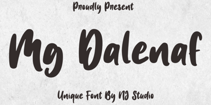 Hi...Thank for your visit :) Mg Dalenaf a unique font. It features unique characters that will take your projects to the next level! This font is PUA code which means you can easily access all the glyphs and swashes that are full of love! It also features many special features including glyphs. font designs that are made for various vector designs, printing such as digital wedding blogs, online shops, social media, while printing can be used in the field of product clothing, accessories, bags, pins, logos, business cards, watermarks and many others ... so it can make your product look cute and attractive, and also Multilingual support!!! Happy design ...
 - Hideko by Khaito Gengo,
$29.00 Hideko is a visually unique font that has the essence of both serif and san-serif fonts through integrating the body structure of san-serif while retaining the calligraphy from serif. Hideko was inspired by synthesizing Japanese calligraphy and western letters. During the process of creating Hideko, I attempted to make a font only for oriental use, but the result is a font with versatile uses. This multicultural font is most effectively used for oriental restaurants but is also ideal for western cafes, posters, books, etc. Along with the cultural synthesis of Japanese and western letters, Hideko features various ligatures, stylistic alternates, fractions, and languages as well.
 - Amora by Jen Wagner Co.,
$19.00 Amora is a messy, feminine, carefree script that is perfect for logos, posters, signage, and more! Fonts I paired with in the samples are Adobe Caslon, Proxima Nova (both available through www.typekit.com) and Bebas Neue. Comes with 79 ligatures for a totally unique hand-written feel! Includes: Upper + Lowercase Letters w/ alternates Non-English support 79 Ligatures Best for: Logos Branding Large format writing Feminine look + feel Paired with sans serifs (Proxima Nova, Bebas) and classic serifs (Adobe Caslon, Baskerville) Web headers Signage Wedding invitations and decor (table numbers, signage, balloons, etc.) Not best for: Small printing Long quotes (generally flows better with just a few words) Patterned backgrounds
 - Scribble Note by Hanoded,
$15.00 My family and I recently bought a fixer-upper farm from the 1930 and I have been renovating and building for the last three+ months. I have a lot on my mind (as you can imagine), so I write little notes to keep track of what I need to do. Of course, since I’m often in the middle of something that needs to be done NOW, these notes are kind of messy. I just finished the bathroom and toilet upstairs, so I could actually finish a new font! Scribble Note is an ode to all those messy notes I wrote. Comes with a cool Doodle pack as well!
 - Fossa by PushPrinciple,
$29.99 Fossa is an unconventional serif designed primarily as a display typeface. Its splayed, pinched vertical strokes and pointy wedge serifs give it a distinct flavour. The style for Fossa was initially conceived while studying the forms of Optima – in particular, the subtle taper towards the midpoint of the stems and strokes. Taking the idea of vertical strokes with a nipped waist to the extreme, Fossa was born. The sharper style created by these vertical strokes is echoed within the serifs, resulting in a contemporary wedge serif with an elegant but dramatic character. Available in five weights: ExtraLight, Light, Regular, Medium and Bold. OpenType features including ligatures and fractions.
 - Geyalu by Twinletter,
$15.00 Geyalu is a playful display font, relaxed but still elegant, a beautiful font made with natural handwriting, making your project look natural and charming, in its application this font is really fun you can use it as a text sentence or title and it still looks beautiful, very fitting for your project that requires writing Hands that are natural and pleasing to the eye of course. This typeface is ideal for usage in a variety of unusual graphic projects, including games, book titles, outdoor activities, posters, banners, quotes, branding, and other unique projects. So, what are you waiting for? Get this font right now!
