10,000 search results
(0.027 seconds)
- Gussian by Flawlessandco,
$9.00 Introducing "Gussian" - A Modern Sans Serif Font. Gussian is a contemporary sans serif font that effortlessly combines modern aesthetics with clean simplicity. There's some connected letters and some alternates that suitable for any graphic designs. This font support for some multilingual. Also contains uppercase A-Z and lowercase a-z, alternate character, numbers 0-9, and some punctuation. If you need help, just write me! Thanks so much for checking out my shop!
 - Heyday by Hemphill Type,
$30.00 Heyday is a font in its prime! This font was inspired by vintage style typography with the use of thick rounded serifs, while the shape of the letterform has a contemporary edge which brings it into the modern day. This combination of classic and modern creates a unique look and feel that enables the font to feel at home in any era. The Heyday family consists of a serif and sans weight.
 - Shirah 25 by LightHouse,
$49.00Shirah 25 started as a freehand study, while experimenting with ink and new nibs. Later on, when David decided to have a digital version, he drew it merely with the tablet, trying to keep the spirit of the ink and the nib. Shirah 25 is an OpenType/TTF Unicode font. - Anhattan by Stringlabs Creative Studio,
$25.00 Anhattan is a nostlagic retro script with a fun feel. Get inspired by its vintage aesthetic! This is a beautiful combination of timeless elegance and authentic calligraphy. It features an incredibly classic style, while still keeping a friendly feel. Anhattan is the perfect font for making original and outstanding designs.
 - Hasty Hand by Gerald Gallo,
$20.00 Hasty Hand is a hand-lettered sans serif font whose appearance suggests that it is the work of someone who writes in haste. The font has an uppercase and lowercase alphabet, numbers, punctuation, symbols, and miscellaneous characters. Hasty Hand is ideal for use where a very casual feel is desired.
 - Bridgera by Akrtype Studio,
$15.00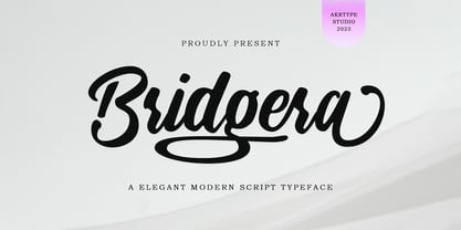 Bridgera script font is a magical script font carefully created with a touch of elegance. This is a beautiful combination of timeless elegance and authentic calligraphy. It features an incredibly classic style, while still keeping a friendly feel. Bridgera script font is the perfect font for making original and outstanding designs.
 - Shaheen pro Arabic by Zaza type,
$99.00 Shaheen pro is a version of Shaheen typeface, Shaheen pro is an Arabic and Latin typeface that embodies power and a tendency towards uniformity. While preserving the neat, minimalist look which is associated with it. The name, too, hints at the strong character of the typeface. Shaheen comes in 5 wights
 - Begiko 17 by Begiko,
$10.00 Begiko17 is a monoline typeface family which was designed to be a font of ease lecture with features in the rhythm and proportions of school writing. In addition to the standard characters, Begiko17 includes several useful mathematical characters. Its strength relies in the clarity, simplicity and harmony of its traces.
 - Andrew Dawkins by Violatype,
$14.00 Introducing the "Andrew Dawkins" font, a handwritten style font created directly by hand, resulting in beautiful, natural, and unique writing. Andrew Dawkins font is very suitable for branding, logotypes, magazines, quotes, wedding invitations, crafts, printed designs, and others. Andrew Dawkins font supports many languages around 90 languages, amazing isn't it?
 - Personal Invitation JNL by Jeff Levine,
$29.00 One of the lettering examples in the 1913 book “Instructions on Modern Show Writing” is a delightful calligraphic alphabet that’s perfect for everything from show cards to invitational notes to names on certificates. It has been digitally redrawn as Personal Invitation JNL, and is available in both regular and oblique versions.
 - Designator by TEKNIKE,
$39.00 Designator is a display modular monospace font. The typeface has a distinct technical geometry using sharp angled corners. "Designator" name is derived from Latin "designare" and means to mark, point out or to indicate. Designator is great for team sports, display work, invitations, writing, architecture, fashion, posters, logos and headings.
 - Bradbury Five by Device,
$39.00 A stylish cartoon sans reminiscent of lettering by Harvey Kurtzman on early issues of Mad, or other casual mid-century types. The three widths give full versatility for expressive, customised headlines and layouts, while the lighter weights can be used for text. Conveys an approachable, light touch with style and finesse.
 - Through Brush by Realtype,
$16.00 Through Brush consists of sophisticated handwriting, elegant, classy and modern. With a little bit of dirty curves it is made from the new trend typefaces now to look as close as possible to the natural brush writing, Through Brush is perfect for adding a modern and classy touch to your project.
 - Poetically Dark by Pitt's Hand,
$10.00 Poetically Dark is a font created to recall a certain type of dark and romantic writing from another century. Well-groomed letters, but written instinctively, as if in the throes of a creative frenzy. In a clash between the refined taste of the past and the ever-present speed of communication.
 - Casler by Letrasupply Typefoundry,
$20.00 Casler Font is a display font designed for any creative project that needs to be stand out. While get inspired by some vintage aphotecary labels, Casler Font wrapped as firm yet unique font display that consists over 1000 glyphs and 26 icon as extras. A terrific combo that gives experimentally mood in classic and modern style. Casler Font is a best thought for any advertisements usage, logos, headlines or headings, book covers and many more. A must have display font collection!
 - HGB Memento by HGB fonts,
$32.00 HGB Memento was designed to replace 12 bronze plaques with the names of those who died in World War I. The 12 plaques were stolen in 2016. Stone tablets were made on which the original writing was engraved using sandblasting. Memento is therefore suitable for commemorative plaques and for texts of a sacred nature. Extremely short ascenders and descenders allow very narrow lines. The design language of the Memento comes from the 1920s with echoes of Art Nouveau and Art Deco.
 - Kattys by Flawlessandco,
$9.00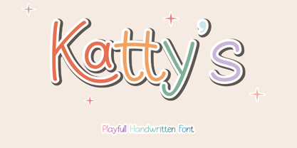 Introducing "Kattys" - a delightful and playful handwritten font that adds a touch of whimsy to any project. An Original typeface that suitable for any graphic designs such as branding materials, t-shirt, print, business cards, logo, poster, t-shirt, photography, quotes .etc This font support for some multilingual. Modern Sweet Retro that contains uppercase A-Z and lowercase a-z, alternate character, numbers 0-9, and some punctuation. If you need help, just write me! Thanks so much for checking out my shop!
 - TF Nukes by Teenage Foundry,
$19.00 Introducing TF Nukes – the boldest display style font that will capture the attention of your audience and make your message stand out! This bold, strong font is perfect for headlines, titles, and any other text that needs to make a statement. A bold and striking font style will make your message impossible to ignore, while the bonus illustrations will add an extra layer of creativity to your design. Features: Uppercase, Lowercase, Numeral, Punctuation, Multilingual & Alternates. For any questions please contact me 🙂 Thanks!
 - BB Casual Pro by Bold Studio,
$49.00 BB Casual™ (Std/Pro) is a font family that appears between a contemporary neo and geogrotesque design. The characteristic is formed by the intermediate step of the font classifications on the most relevant shapes: geometry (shape and with), contrast (text and display), white space (initial and terminal) and chiriographic elements (linework, punctuation, style and variant). The character set also has a large selection of matching symbols and superscripts. ● 2 Variants: characterized and simplified ● 20 Stylistic-Sets ● 34 Styles ● 41 OpenType features ● 95 Languages Support ● 41,854 Glyphs (1,231/Style) Designer: Bold Publisher: Bold Design date: 2019-2020 Release date: 2020 Version: 2.0
 - Brushstrike by Zetafonts,
$39.00 The Brush Strike Family is an exercise in dynamic, gestural brush type design by Francesco Canovaro. The typeface contains no lowercase set, but it doubles the uppercase with a strikethrough alternate set to be used for dynamic logo design and unusual word highlighting. Two weights are available with consistent design: the light weight (Brushstrike Light aka Lightstrike) can work together with the heavier regular weight but can also be used in white on dark background for light effects.
 - FS Dillon by Fontsmith,
$80.00 Bauhaus Geometric, economical, functional... The good, wholesome, modernist values that once fired up the tutors and students of the Bauhaus became the inspiration for FS Dillon after an exploration of the work of the pre-war art and design powerhouse in the Fontsmith studio. The font combines simplicity and directness with a characteristic Fontsmith warmth. Letterforms are compact, with a generous x-height, and built for maximum clarity and impact. The Bauhaus sought beauty through function. FS Dillon achieves it. Made for TV The weights of fonts for TV sometimes have to be adjusted so as not to “blow” on-screen. FS Dillon was originally drawn for the on-screen presentation branding of Film Four, whose primary colour was red. Black type on a red background looks heavier than white, so Dillon needed two weights that would allow white and black type to be used together, looking balanced and equal. Type design is an organic process. Years after developing FS Dillon, we revisited it, redrawing elements and adding italics to maintain consistency. Olympic You don’t get a much higher confirmation of the functional fitness of a typeface than to have it selected to guide visitors around an Olympic complex. FS Dillon was selected as the font for signage at some of the key venues at the London 2012 Olympic Park, helping to get spectators, athletes and officials from all over the world to their seats and starting blocks on time.
 - Ongunkan Younger Futhark by Runic World Tamgacı,
$45.00 The Younger Futhark, also called Scandinavian runes, is a runic alphabet and a reduced form of the Elder Futhark, with only 16 characters, in use from about the 9th century, after a "transitional period" during the 7th and 8th centuries. The reduction, somewhat paradoxically, happened at the same time as phonetic changes that led to a greater number of different phonemes in the spoken language, when Proto-Norse evolved into Old Norse. Also, the writing custom avoided carving the same rune consecutively for the same sound, so the spoken distinction between long and short vowels was lost in writing. Thus, the language included distinct sounds and minimal pairs that were written the same. The Younger Futhark is divided into long-branch (Danish) and short-twig (Swedish and Norwegian) runes; in the 10th century, it was further expanded by the "Hälsinge Runes" or staveless runes. The lifetime of the Younger Futhark corresponds roughly to the Viking Age. Their use declined after the Christianization of Scandinavia; most writing in Scandinavia from the 12th century was in the Latin alphabet, but the runic scripts survived in marginal use in the form of the medieval runes (in use ca. 1100–1500) and the Latinised Dalecarlian runes (ca. 1500–1910)
 - Anne's Hand by National Eating Disorders Assn,
$10.00 Anne's Hand is a custom handwriting font of Anne Hubbard, who tragically lost her battle with anorexia nervosa this past January. Anne loved to write, so her brother Richard designed a custom font of her handwriting as a tribute to her memory. All proceeds from its sale will go to the National Eating Disorders Association to support programs and services like the NEDA Navigators and Loss Support Network, programs that many families count on for support.
 - Maleha by Afkari Studio,
$13.00 Maleha Bold Modern Sans Serif Font Introducing Maleha, a bold and sophisticated modern sans serif font designed to elevate your projects with its confident and sleek aesthetic. Crafted with precision, Maleha embodies a perfect balance between professionalism and contemporary style. With two versatile styles—regular and slant—Maleha offers a dynamic range of possibilities, enabling you to effortlessly convey a sense of authority and modernity in your designs. The bold strokes and clean lines of Maleha's characters exude confidence, making it ideal for headlines, branding, editorial designs, logos, posters, and more. Its versatile nature ensures readability across various mediums while maintaining a strong visual impact. Maleha's boldness is matched by its adaptability; whether for digital or print, its clarity and elegance remain consistent. The regular style presents a crisp, clean appearance, while the slant adds a touch of dynamic flair, perfect for emphasis or adding a contemporary twist to your typography. Features: - Uppercase, Lowercase, Number, and Punctuation - Standard and Special Ligatures and alternates - Works on PC & Mac - Simple installations - Accessible in Adobe Illustrator, Adobe Photoshop, Adobe InDesign, and even works on Microsoft Word - Fully accessible without additional design software - Multilingual Support, ä, ö, ü, Ä, Ö, Ü, ß, ¿, and ¡. Unleash the power of expression and professionalism with Maleha, the bold modern sans serif font that effortlessly commands attention while conveying a sense of sophistication and modernity in every project.
 - Sedid by Fontuma,
$20.00 Sedid, “solidity; It is an Arabic term meaning “righteousness”. In particular, the correctness and soundness of a word is indicated by this word. The fact that I gave this name to the writing family is to point out its accuracy and robustness. This typeface, which is sans serif, consists of three families: ▪ Sedid: Font family containing Latin letters ▪ Sedid Pro: Font family including Latin, Arabic and Hebrew alphabets ▪ Sedid World: A family of typefaces including Latin, Cyrillic, Greek, Arabic and Hebrew alphabets Those who want to meet a new face of writing for their works and projects and make a difference in their work should meet the Sedid writing family. This typeface is as serious as it is affectionate, and solid as well as elegant. The Sedid font family can be used as a text and title font in all publishing and printing areas, magazines, newspapers, books, banner and poster designs, and websites. Sedid also has a pleasant-looking, flexible face with smooth lines and transitions. The inner and outer spaces of the font are proportioned so that the text can be read easily. Sedid font family consists of 14 fonts, seven plain and seven italic. The font family includes open type features, as well as a large number of ligatures, small caps, modifiers, and currency symbols of many countries.
 - Rocketeers by IKIIKOWRK,
$17.00 Introducing Rocketeers - Art Deco Type, created by ikiiko. Rocketeers is a condensed type with a simple Art Deco vibes. Inspired by the writing style of the 1930s era. A bold and sturdy aesthetic style characterizes this font. Some alternates styles can be adjust to explore different shapes. This typeface is perfect for an brand logo, vintage stuff, fashion stuff, clean design, magazine cover, invitation, poster & flyer, or simply as a stylish text overlay to any background image. What's included? Uppercase & Lowercase Number & Punctuation Alternates & Stylistic Multilingual Support Enjoy our font and if you have any questions, you can contact us by email : ikiikowrk@gmail.com
 - Samerang Display by Shaltype Co,
$12.00 Samerang is built manually by hands, and reform into a clean Typeface. It can be used for just Title or even writing. Inspired by Alt Retro-futuristic, bringing back the '70s-'80s poster feels into modern time. In this font, you will get: Over 303 Glyphs Contains 31 ligatures in 3 OpenType features Some Alternates Letters Get Samerang now! It will best use for any design requirement, many fonts will coming with a unique concept. Thank you! Best Regards, FM-STCO.
 - Interind Diary by Aminmario Studio,
$20.00 Introducing The new "Interind Diary" script font. A fashionable and super-chilled new handwriting font script with sexy stylish. Interind Diary font was created to look as close to a natural handwritten script as possible by including over 134 ligatures, and lowercase alternates.Comes with two styles of Regular and Italic. Mix and match lowercase regular with several lowercase alternatives to get your new ligature. Perfect for any awesome projects that need hand writing taste. With built in Opentype features, this script comes to life as if you were writing it yourself. It's highly recommended to use it in opentype capable software - there are plenty out there nowadays as technology catches up with design ... Other than Photoshop, Illustrator and Indesign, many standard simple programs now come with Opentype capabilities - even the most basic ones such as Apple's Text Edit, Pages, Keynote, iBooks Author, etc. Even Word has found ways to incorporate it. Thanks for checking out this font. I hope you enjoy it! AminMario
 - EasyPeasyLemonSqueezy by lgtm,
$25.00 There is an addiction to symmetry. When I draw, when I write, when I take pictures, when I design. So in this font. Best use in Headlines.
 - Gatsby SF by Scholtz Fonts,
$19.00Gatsby SF portrays the formal elegance of Art Deco, using the rounded shapes typical of the Art Deco movement. The upper case characters are decorated with a classical Art Deco motif, while lower case characters have been left unadorned for increased readability. Gatsby SF functions well as a display font and creates attention-attracting headers and subheaders. Fully professional, Gatsby SF contains a full character set - Upper and Lower case, all numerals, punctuation, symbols and accented characters. It is suitable for layout work in all major European languages. - Marketing Strategy JNL by Jeff Levine,
$29.00 Marketing Strategy JNL was inspired by some display signage used in an episode of the classic "Alfred Hitchcock Hour". Evoking the early-60s feel of kitchy advertising, this display font has a limited character set and is specifically designed for creating retro ad banners and point-of-sale attention getters as well as period piece signage. For those preferring a blank hexagon for spaces between words, one is located on the equal key. Marketing Strategy JNL is available in both regular (outline) and solid (white letters on black) versions.
 - Spekulatus by Bogstav,
$18.00 Spekulatus is a made up name, and that was what I needed for a font like this. I am not sure which category it fits in: grunge, square, handmade, rough or maybe even graffiti? Well, let's just say that it fits in all 5 - or perhaps even more? All letters are handdrawn, and messed up a bit with a thin fine white liner, leaving a gentle grungy and worn effect. I've added 5 different versions of each letter, which is quite nice - not having the same letters repeating all the time!
 - Odin by ITC,
$29.00The extravagant Odin was designed by Bob Newman in 1972. Its figures display constructed basic forms and when set into words, the typeface builds closely set lines. The strong serifs catch the reader's eye and draws it horizontally across the page. The forms of the capital letters are particularly distinctive. In the upper third, the stroke beginnings seem to form a roof over the body of the letter, fragmented by a fine white line that lends them independence and dominance. Odin is best used for headlines in display point sizes. - Playmax by OhType!,
$16.00 It is difficult to classify a typography that is made from different line fragments but precisely that is what makes it stand out from the rest, a construction that took months and multiple corrections that now make up a set of glyphs with is own identity based on the game between blacks and whites, standing out especially in large formats, posters, headlines, logos and titles. Playmax is a typeface with which you can find endless forms of customization, from its basic structure to the number of effects it supports.
 - Toadstool by Hanoded,
$15.00 My kids love toadstools, especially the red capped ones with the white spots (they’re called Amanita muscaria, a.k.a. fly agaric - in case you’re wondering). A couple of months ago you could find loads of them in the forest, but now they’ve all disappeared. Toadstool font will not disappear, however. It is a very legible, clean and neat text font with an uneven baseline, slightly bouncy glyphs and more diacritics than a forest has mushrooms. Use if for packaging, kids’ book covers and posters. This toadstool is the non-toxic variety, so go nuts.
 - Snippity Snap by Hanoded,
$15.00 Snippity Snap is a font made up of glyphs I cut out from black paper with some household scissors, then pasted onto white paper. When I was cutting out the shapes, my children asked me what I was doing, and when I told them, they thought it was pretty cool and started cutting out shapes from paper themselves. The result is a house filled with paper cuttings, which I keep finding everywhere - even in my bed. Snippity Snap is a very nice font for ads, book covers, packaging and children's books. Enjoy!
 - Blog Script by Sudtipos,
$39.00 Technology is making it so that we’re all connected without the need for the physical-presence kind of being connected. That is strange, fascinating, and has a certain magnetism that is very difficult to resist. What’s at stake is no less than the transformation of centuries of human behaviour, and that’s part of the fascination. But while our existence morphs and we rush headlong into our socially minimalist future, we use our present culture to helplessly signal our nostalgia about our past. We know what our future will be missing, and we’re already full of nostalgia about it, but we know that what little we can do about isn’t going to affect the outcome that much. So, almost in full hindsight now, the DIY implosion of the past few years must have really been a reaction to our technological dis/connection. In typography, the minimalist future is already here, with something as austere as the sans serif having become the preferred expression of progress and fortune, both part of the connected isolation we are undergoing. But when physical interaction must take place, like coffee shops and gin joints, our organic alphabets ride high and mighty. That sense of human heritage — elegance and exuberance in our writing, the use of flaws to charmingly brand our own individualism — keeps turning up in all kinds of places, most unexpected of which is the digital world. The overall message seems to be that we’re still creative, imaginative, and unique. In the digital world, on blogs where we write about our puny music and fashion preferences, we’re just articulating this individualism of ours, this third domain of existence our future seems eager to dismiss. These were the thoughts behind Blog Script, the second collaboration between Carolina Marando and Alejandro Paul, after their successful stint with the Distillery set of fonts. This typeface comes in two weights, alternates for most letters, and a strong aesthetic rooted in individuality and freedom of spirit. Use it to be alone together, to tell the world that we’re still human, for now.
 - Moskovi Script by Hipfonts,
$9.00 Introducing MosKovi Script, an enchanting and audacious typeface that seamlessly melds the captivating essence of vintage Soviet design with modern-day allure. This font exudes an air of mystery, evoking the clandestine charm of the Cold War era while breathing new life into the world of typography. Each stroke reflects the precision and strength of Soviet engineering, transporting you to a time when secrets were whispered in dimly lit alleys, and espionage thrived beneath the iron curtain. MosKovi Script's elegant curves and sharp edges intertwine like spies engaged in a delicate dance, daring you to uncover its hidden messages. Embark on a journey through history with MosKovi Script, a typographic marvel that captures the courage and resilience of a bygone era while captivating the hearts of modern design enthusiasts worldwide.
 - ITC Cyberkugel by ITC,
$29.99ITC Cyberkugel is the work of British designer Timothy Donaldson, who occasionally likes to write with an extra-fine ballpoint pen. I like the spindly scrawny forms that it gives me when I follow all the usual 'italic' writing conventions", he says. And there lie the origins of ITC Cyberkugel, although the creative process was moved from pen and paper to software and a Wacom tablet. "I like the fact that people will be buying it to give them a 'human', 'organic', 'non-digital' look, and yet no ink has soiled paper. Although the movements of the hand are still the essence, the whole thing was created in cyberspace." The name comes from combining cyberspace and Kugelschreiber, the German word for ballpoint pen. ITC Cyberkugel is a fresh interpretation of traditional calligraphy." - WildSong by Scholtz Fonts,
$19.00 WildSong was inspired by the exuberant flight and beautiful song of birds. While most brush scripts take their cue from mid-twentieth century samples, WildSong is a fresh, contemporary alternative. WildSong reflects a dynamic interplay between dark and light, creating a sense of drama while hinting at a calligraphic background. Words suggest a baseline, yet are not bound by it. Letters interweave in a seemingly random dance, sometimes connecting smoothly, then breaking that connection as a calligraphic scribe does intuitively. Exuberant swash alternatives to uppercase letters, as well as ligatures can be accessed through both the type and glyph palettes. The font contains over 235 characters - (upper and lower case characters, punctuation, numerals, symbols and accented characters are present). It has all the accented characters used in the major European languages.