10,000 search results
(0.033 seconds)
- Behrensschrift iF Plus by Ingo,
$29.00 Peter Behrens’ renowned art nouveau type from 1902 – with ornaments. Newly revised and neatly digitalized by Ingo Zimmermann In 1902, Peter Behrens (1869–1940), architect, designer and typographer, created a new ”German“ type which became very successful very quickly for the Rudhard’sche Gießerei (foundry which later became Gebr. Klingspor AG) in Offenbach am Main. It served, for example, as the official German type for the world expositions in 1904 and 1910. Behrens himself writes about the development of this type ”...For the actual form of my type, I took the technical principle of the Gothic script, the stroke of the quill feather. The proportions of height and width and the boldness of the strokes of the Gothic letters were also decisive for me in producing a German character. A cohesive character could be hoped for by avoiding all non-necessities and by strictly carrying out the design principle of holding the quill at an angle…“ By the way, when “long s” is activated, the typographically correct “round s” is automatically placed at the end of the word so that you need only pay attention to the correct s on syllable endings within words. When using “long s,” you must ensure the correct use of the rules for the Fraktur font: “round s” is always at the end of the word, also in compound words. For those of you who want to be even more correct, read the corresponding article in >> Wikipedia. Peter Behrens also drew matching ornaments for his typeface – we have likewise carefully revised these decorative touches and arranged them into a font. The "Behrens-Schrift" fits best on all topics that have something to do with art history or the time around 1900.
 - Swonderful by The Ampersand Forest,
$19.00 Everyone loves an Art Deco typeface. And there are hundreds of similarly-designed deco faces out there! But not one of them seems to have every form of every character that you want or need at any given moment. That’s why Swonderful was created! It has more letterform variations than you can shake a stick at (if you're inclined to shake sticks at things). With four variations of every uppercase form, two variations of every lowercase form (plus diacritical characters for the standard set), you’re bound to find the character you need for any given project, whether the style is French Art Deco, American Streamline Moderne, or Jazzy Midcentury Gaspipe. Just switch between stylistic sets! And you’ll find all those characters in three standard weights: Light, Regular, and Bold. They’re designed as a unicase, so they’re all height-compatible, and every set works with every other set, so you can mix and match to your heart’s delight!
 - Auchentaller by HiH,
$12.00 Auchentaller was inspired by a travel poster by Josef Maria Auchentaller in 1906. To our knowledge, it was never cast in type. Grado lies on the northern Adriatic, between Venice and Trieste. At one time the port for the important Roman town of Aquileia. With the decline of the Roman Empire, the upper Adriatic region came under the rule of the Visigoths, the Ostrogoths, the Byzantines, the Lombards, the Franks, the Germans, the Venetians and finally, in 1796, the Austrian Hapsburgs. So it remained until the dissolution of the Austro-Hungarian Monarchy in 1919, following World War I, when the seaport of Trieste was awarded to Italy. With Trieste came Montefalcone, Aquileia and Grado. The area was marked by years of political tension between Italy and Yugoslavia, exemplified by the d'Annunzio expedition to capture Fiume (Rijeka) in September, 1919. Some basic discussion of the period from 1919 to 1939 may be found in Seton-Watson’s Eastern Europe Between The Wars (Cambridge 1945) and Rothschild’s East Central Europe Between The Two World Wars (Seattle 1974). In 1965 I was traveling by train from Venice to Vienna. Crossing the Alps, the train stopped for customs inspection at the rural Italian-Austrian border, just above Slovenia. We were warned not to get off the train because there were still shooting skirmishes in the area. Through all this, Grado remained literally an island of tranquility, connected to the mainland by a only causeway and lines on a map. Auchentaller not only painted the beach scene at Grado, he moved there, living out the rest of his life in this comfortable little island town. His travel illustration contains the text from which the design of our font Auchentaller is drawn. The text translates: "Seaside resort : Grado / Austrian coastal land". Please see our gallery images to see a map locating Grado, as well as Auchentaller’s painting of the resort. Auchentaller is a monoline all-cap font, light and open in design , with a lot of typically art nouveau letter forms. Included in our font are a number of ligatures. As is frequently seen in designs by German speakers, the umlaut is embedded in the O & U below the tops of the letters. This approach led to two whimsies: a happy umlauted O and a sad umlauted U. This font has a clean, crisp look that is very appealing and very distinctive. Auchentaller ML represents a major extension of the original release, with the following changes: 1. Added glyphs for the 1250 Central Europe, the 1252 Turkish and the 1257 Baltic Code Pages. Add glyphs to complete standard 1252 Western Europe Code Page. Special glyphs relocated and assigned Unicode codepoints, some in Private Use area. Total of 336 glyphs. 2. Added OpenType GSUB layout features: pnum, liga, salt & ornm. 3. Added 116 kerning pairs. 4. Revised vertical metrics for improved cross-platform line spacing. 5. Revised ‘J’. 6. Minor refinements to various glyph outlines. 7. Inclusion of both tabular & proportional numbers. 8. Inclusion of both standard acute and Polish kreska with choice of alternate accented glyphs for c,n,r,s & z. Please note that some older applications may only be able to access the Western Europe character set (approximately 221 glyphs). The zip package includes two versions of the font at no extra charge. There is an OTF version which is in Open PS (Post Script Type 1) format and a TTF version which is in Open TT (True Type)format. Use whichever works best for your applications.
 - Mundo Sans by Monotype,
$50.99 Mundo Sans, by Carl Crossgrove for the Monotype Studio, is distinctive, approachable – and ready to tackle jobs both big and small. Its open counters and large x-height, which give the design a straight-forward no-nonsense mien, are softened by inviting calligraphic undertones. With 10 weights and a complementary suite of cursive italics, there is little outside the range of the Mundo Sans family. The light weights are elegant in packaging and brochure design, the medium are easy readers in digital blogs and print periodicals and the bold command attention in banners and headlines. Mundo Sans is at home in a wide range of sizes, and comfortable in everything from wayfinding to mobile apps. Mundo Sans takes on complicated branding projects with efficient grace. The family enables companies and products to express their brand seamlessly in websites, advertising, corporate messaging, packaging – virtually everywhere visible engagement is possible. A large international character set, that includes support for most Central European and many Eastern European languages, ensures ease of localization. Mundo Sans was originally released with seven weights. The family was updated with three new roman weights and their italics in 2019 that extend and diversify its range of use: a fine hairline weight, a book weight, slightly lighter than regular, and a demi that is subtly lighter than the medium. The design is also is a good mixer. It easily pairs with everything from refined Didones to stalwart slab serif designs. And if you need a more harmonious palette, look no further than Mundo Sans’ relative, Mundo Serif. The two designs harmonize with each other perfectly in weight, typographic color and proportion. Mundo Sans’ italics are true cursive designs, with fluid strokes and obvious calligraphic overtones. The flick of the down-stroke in the ‘a,’ the descending stroke of the ‘f’ and baseline curve of the ‘z’ add grace to the design and distinguish it from more mechanistic styles. Mundo Sans is a design with deep roots. It was originally drawn to pair with classic Renaissance book typefaces like Bembo® and ITC Galliard®. With a hint of diagonal stroke contrast and gentle flaring of strokes, Mundo Sans complements these designs with warmth and grace. Crossgrove says that Mundo isn’t meant to be showy or distinctive. It is intended to follow the tradition of sans serif designs that have a wide range of uses, enabling comfortable reading and clear expression. Crossgrove has designed a variety of typefaces ranging from the futuristic and organic Biome™ to the text designs of Monotype’s elegant Walbaum™ revival. His work for Monotype also often takes Crossgrove into the realm of custom fronts for branding and non-Latin scripts.
 - Quire Sans by Monotype,
$155.99 My goal was to make a design that might fit in anywhere,” says Jim Ford about his Quire Sans™ typeface. “I wanted it to be highly functional and sexy at the same time.” With one foot comfortably in the realm of oldstyle design and traditional book typography, and the other in evolving electronic media, the Quire Sans family does, indeed, fit in just about anywhere. As for sexy, someone once quotably wrote, “A great figure or physique is nice, but it's self-confidence that makes someone really sexy.” Yes, Quire Sans is sexy, performing confidently in virtually any setting. 2014-06-26 00:00:00.000 57.9900 F43063-S193385 42831 Neue Frutiger World Monotype https://www.myfonts.com/collections/neue-frutiger-world-font-monotype-imaging https://cdn.myfonts.net/cdn-cgi/image/width=417,height=208,fit=contain,format=auto/images/pim/10000/279026_ed8c8093fe1ac59ebe9e3ee1d9262c8e.png Neue Frutiger World is designed for global use with an impressive range of 10 weights, from Ultra Light to Extra Black, with matching italics. It embodies the same warmth and clarity as Adrian Frutiger’s original design, but allows brands to maintain their visual identity, and communicate with a consistent tone of voice, regardless of the language. Neue Frutiger World supports more than 150 languages and scripts including Latin, Greek, Cyrillic, Georgian, Armenian, Hebrew, Arabic, Thai and Vietnamese. “Before Neue Frutiger World it was not an easy task for western brands to find families in Arabic, Hebrew, Thai and Vietnamese which match with their Latin,” says Monotype type director Akira Kobayashi, who led the Neue Frutiger World project. “They may find a type with closer expression, but there was no guarantee if the bold version in the non-Latin family matches the bold in their Latin. Neue Frutiger World offers a better solution.” In addition to Neue Frutiger World’s linguistic versatility, it works hard across environments – suited to branding and corporate identity, advertising, signage, wayfinding, print, and digital environments. The Neue Frutiger World fonts can be paired with Monotype’s CJK fonts: M XiangHe Hei (Chinese), Tazugane Gothic (Japanese), Tazugane Info (Japanese), and Seol Sans (Korean). These were all designed to address brands’ needs to expand into Asian cultures and solve for global typographic challenges.
 - Victoria Smitters by Din Studio,
$29.00 It is critical to ensure that your design appearance represents the messages you deliver. However, it can be such a difficult task and time wasting to create a personal, lovely design. Therefore, Victoria Smitter is the answer to what you need. Victoria Smitter is a visually beautiful handwriting font which is perfect to show modern, elegant impressions in a personalized design to impress your customers and to make your messages more prominent than the others. It is designed in a cursive way in which the letters are connected to each other. Details on each letter and cursive wipes on the edges show high contrasts. Furthermore, this font is suitably applicable for big text sizes for better legibility. In addition, you can enjoy the available features here. Features: Stylistic Sets Ligatures Swashes Multilingual Supports PUA Encoded Numerals and Punctuations Victoria Smitter fits best for various design projects, such as brandings, posters, banners, invitations, greeting cards, magazine covers, quotes, printed products, merchandise, social media, etc. Find out more ways to use this font by taking a look at the font preview. Thanks for purchasing our fonts. Hopefully, you have a great time using our font. Feel free to contact us anytime for further information or when you have trouble with the font. Thanks a lot and happy designing.
 - Matrise Text Pro by CheapProFonts,
$10.00 A new font in the style of a dot matrix/needle-printer. I have used some slightly smaller dots when designing the diacritics - this makes them easier to separate from the main letters. I have also used variable letter widths (and kerning), as opposed to the technology's original monospaced design - this to make the text more readable. Matrise Text Pro features a more "oldstyle" look with spurs and notches, while Matrise Pro has a more modern/streamlined design. ALL fonts from CheapProFonts have very extensive language support: They contain some unusual diacritic letters (some of which are contained in the Latin Extended-B Unicode block) supporting: Cornish, Filipino (Tagalog), Guarani, Luxembourgian, Malagasy, Romanian, Ulithian and Welsh. They also contain all glyphs in the Latin Extended-A Unicode block (which among others cover the Central European and Baltic areas) supporting: Afrikaans, Belarusian (Lacinka), Bosnian, Catalan, Chichewa, Croatian, Czech, Dutch, Esperanto, Greenlandic, Hungarian, Kashubian, Kurdish (Kurmanji), Latvian, Lithuanian, Maltese, Maori, Polish, Saami (Inari), Saami (North), Serbian (latin), Slovak(ian), Slovene, Sorbian (Lower), Sorbian (Upper), Turkish and Turkmen. And they of course contain all the usual "western" glyphs supporting: Albanian, Basque, Breton, Chamorro, Danish, Estonian, Faroese, Finnish, French, Frisian, Galican, German, Icelandic, Indonesian, Irish (Gaelic), Italian, Northern Sotho, Norwegian, Occitan, Portuguese, Rhaeto-Romance, Sami (Lule), Sami (South), Scots (Gaelic), Spanish, Swedish, Tswana, Walloon and Yapese.
 - Black Jack Pro by CheapProFonts,
$10.00 The talented Ronna Penner has created many beautiful script fonts, and Black Jack’s quality was very good so only a few spacing issues had to be addressed. I've added some kerning pairs, and then added all the glyphs needed for the CheapProFonts language coverage. This font was an absolute joy to rework, and with its extended character set I hope it now finds many more users! ALL fonts from CheapProFonts have very extensive language support: They contain some unusual diacritic letters (some of which are contained in the Latin Extended-B Unicode block) supporting: Cornish, Filipino (Tagalog), Guarani, Luxembourgian, Malagasy, Romanian, Ulithian and Welsh. They also contain all glyphs in the Latin Extended-A Unicode block (which among others cover the Central European and Baltic areas) supporting: Afrikaans, Belarusian (Lacinka), Bosnian, Catalan, Chichewa, Croatian, Czech, Dutch, Esperanto, Greenlandic, Hungarian, Kashubian, Kurdish (Kurmanji), Latvian, Lithuanian, Maltese, Maori, Polish, Saami (Inari), Saami (North), Serbian (latin), Slovak(ian), Slovene, Sorbian (Lower), Sorbian (Upper), Turkish and Turkmen. And they of course contain all the usual “western” glyphs supporting: Albanian, Basque, Breton, Chamorro, Danish, Estonian, Faroese, Finnish, French, Frisian, Galican, German, Icelandic, Indonesian, Irish (Gaelic), Italian, Northern Sotho, Norwegian, Occitan, Portuguese, Rhaeto-Romance, Sami (Lule), Sami (South), Scots (Gaelic), Spanish, Swedish, Tswana, Walloon and Yapese. There is no yen currency symbol is this font.
 - Normandia by Canada Type,
$30.00 Designed over three years after the second World War, and published in 1949 by the Nebiolo foundry, Normandia was Alessandro Butti’s take on the fat face. As it usually was with Butti’s designs, this face effectively injected a catchy yet expertly calculated calligraphic spin into its source of inspiration — which was the essentially geometric/deco, thicker model of Bodoni’s very popular aesthetic. The metal Normandia saw some widespread use for a handful of years after its publication, not least because of the multitude of sizes in which it was available. It stepped out of the limelight by the mid-1950s, due to a combination of the popularity of cold type and Nebiolo’s refusal to retool its faces for new technologies. It was copied by a few small film typesetting outfits on both sides of the Atlantic, but never really found its way back to the mainstream. By the time computer type became the norm, Normandia was pretty much relegated to a type historian’s collection of anecdotes. This digital update of the classic series revives and refines the three original metal designs (Tonda/Regular, Corsiva/Italic, and Contornata/Outline) and expands the character set to more than 600 glyphs per font, including small caps, six types of figures, fractions and nut fractions, a full set of f-ligatures, some stylistic alternates, and other fine typography niceties.
 - Deberny by Typorium,
$15.00 The Deberny typeface is an interpretation–carrying a contemporary imprint–of a typographic style which appeared and spread at the end of the 19th century until the begining of the 20th. These typefaces were named Italian, Venetian, Veronese and were classified in the Hellenic category, a spontaneous typographic movement caracterized by triangular and heavy serifs. They found their inspiration among numerous references, from incised to slab serif typefaces and their extreme expressions in wood type letterforms. The Deberny font family is made of 26 styles in 3 complementary sets of style, offering a wide palette of visual resonance: • Deberny Line is ideally suited for editorial, branding, posters and billboards. It has sharp contrast between thick and thin strokes. Heavy horizontal strokes are not frequent in roman letters, but here they fit naturally with the italic letters. • Deberny Open is a stylish outline declination of Deberny Line Medium and Medium Italic. • Deberny Text is an adaptation of Deberny Line made for broader use. Its shapes are less contrasted, which makes it perfectly legible for print or screen reading in small size text. Old style figures and small caps complete Deberny Text in all its 8 styles. The Deberny typeface family supports Latin-based languages and will be available soon in Cyrillic and Greek. Deberny Narrow will be released this year in all its 26 styles.
 - Matrise Pro by CheapProFonts,
$10.00 A new font in the style of a dot matrix/needle-printer. I have used some slightly smaller dots when designing the diacritics - this makes them easier to separate from the main letters. I have also used variable letter widths (and kerning), as opposed to the technology's original monospaced design - this to make the text more readable. Matrise Pro has a more modern/streamlined design, while Matrise Text Pro features a more "oldstyle" look with spurs and notches... ALL fonts from CheapProFonts have very extensive language support: They contain some unusual diacritic letters (some of which are contained in the Latin Extended-B Unicode block) supporting: Cornish, Filipino (Tagalog), Guarani, Luxembourgian, Malagasy, Romanian, Ulithian and Welsh. They also contain all glyphs in the Latin Extended-A Unicode block (which among others cover the Central European and Baltic areas) supporting: Afrikaans, Belarusian (Lacinka), Bosnian, Catalan, Chichewa, Croatian, Czech, Dutch, Esperanto, Greenlandic, Hungarian, Kashubian, Kurdish (Kurmanji), Latvian, Lithuanian, Maltese, Maori, Polish, Saami (Inari), Saami (North), Serbian (latin), Slovak(ian), Slovene, Sorbian (Lower), Sorbian (Upper), Turkish and Turkmen. And they of course contain all the usual "western" glyphs supporting: Albanian, Basque, Breton, Chamorro, Danish, Estonian, Faroese, Finnish, French, Frisian, Galican, German, Icelandic, Indonesian, Irish (Gaelic), Italian, Northern Sotho, Norwegian, Occitan, Portuguese, Rhaeto-Romance, Sami (Lule), Sami (South), Scots (Gaelic), Spanish, Swedish, Tswana, Walloon and Yapese.
 - Niobium Pro by CheapProFonts,
$10.00 This font has been used for signage and wayfinding in the new Mbombela Stadium built for the FIFA World Cup 2010 - and it looks strangely appropriate there: the font has a certain hand-painted, relaxed charm so fitting of the south African culture. Interesting and bold choice of the architects. :) Anyway, the font has now been updated with our usual multilingual glyphset, and is ready to use around the world by soccer fans and typo fans alike. ALL fonts from CheapProFonts have very extensive language support: They contain some unusual diacritic letters (some of which are contained in the Latin Extended-B Unicode block) supporting: Cornish, Filipino (Tagalog), Guarani, Luxembourgian, Malagasy, Romanian, Ulithian and Welsh. They also contain all glyphs in the Latin Extended-A Unicode block (which among others cover the Central European and Baltic areas) supporting: Afrikaans, Belarusian (Lacinka), Bosnian, Catalan, Chichewa, Croatian, Czech, Dutch, Esperanto, Greenlandic, Hungarian, Kashubian, Kurdish (Kurmanji), Latvian, Lithuanian, Maltese, Maori, Polish, Saami (Inari), Saami (North), Serbian (latin), Slovak(ian), Slovene, Sorbian (Lower), Sorbian (Upper), Turkish and Turkmen. And they of course contain all the usual "western" glyphs supporting: Albanian, Basque, Breton, Chamorro, Danish, Estonian, Faroese, Finnish, French, Frisian, Galican, German, Icelandic, Indonesian, Irish (Gaelic), Italian, Northern Sotho, Norwegian, Occitan, Portuguese, Rhaeto-Romance, Sami (Lule), Sami (South), Scots (Gaelic), Spanish, Swedish, Tswana, Walloon and Yapese.
 - Austral Sans by Antipixel,
$15.00 Austral Sans is a hand-drawn layered font designed by Antipixel. Based in the Slab version, it is part of the Austral type family. This sans makes your work unique & noteworthy, because the possibilities of combinations of textures & styles create distictive results. Austral Sans comes in three weights, Regular, Light & Thin, which all share the same crooked look with irregular strokes and outlines. For these reasons this font can be used in a vast variety of projects, such as logos & branding, stationery, book covers, magazine design, clothing prints & tags, packaging, animated videos, and many more! Austral Sans has three sets of alphabets in uppercase and lowercase to avoid repeating the same character pattern, and giving the font a more natural handwritten feel. This is included in the Open-Type Contextual Alternates, which applies an automatic substitution of glyphs as long as the Open-Type features are activated. Also, Austral Sans offers other Open-Type features such as Stylistic Alternates, Ligatures, Discretionary Ligatures, Fractions, Superscript, Subscript, Denominator, Numerator, Scientific Inferiors & Kerning. This font has a very large glyph coverage and can be used in a wide range of languages, including English, Spanish, Italian, French, German, Polish, Czech, Vietnamese, Finnish, Icelandic, among many others. The style Maplines Thin is offered Free for commercial & personal use! Check Austral Slab!
 - Drummer by Harvester Type,
$20.00 Drummer is a large futuristic font family inspired by the Expansion TV series, old science fiction book covers and Honda Prelude and Porsche logos. The family contains a large number of styles and a lot of language support. 54 styles, 6 in width (Ultra Condensed, Condensed, Normal, Expanded, Extra Expanded, Ultra Expanded) and 9 in weight (Thin, Extra Light, Light, Regular, Medium, Semi Bold, Bold, ExtraBold, Black). The font also has a variable version. 573 glyphs, including 40 alternate characters. A lot of work has been done on the font. The fillets on the symbols have been well worked out and tested for a better visual and practical experience. The font combines the monospacing of many characters combined with kerning, which makes it very convenient for many purposes, such as vertical typography. The font is good in all sizes, both small and large, which makes it possible to use it anywhere. Branding, logos, titles, posters, texts, covers, merch, prints, web, titles, banners, games and design in games and much more. In the near future, it is planned to add another axis of variability - the slant. Consequently, the family itself will increase. It is also planned to add a small case (capital). If you want to say something about the font or get a font in other formats, then write to the mail: bunineugene@gmail.com .
 - Ferguson by Arterfak Project,
$14.00 Ferguson is a geometric slab serif which made with a mono-line concept and versatile style. Inspired by old western and magazine designs. Ferguson has a straight and consistent line to give neat looks. Ferguson is made for editorial and formal purposes. but still flexible to use it in other typographic projects. This font family has 6 weights and 2 widths that gives you many options on your designs projects. - Regular versions: Comes from Light, Normal, Medium, Bold, Black, and Ultra Black. Very recommended for editorial use such as body text, sub-headline, and tagline. The bolder weights are goods for headline too. Strong and geometric! Suitable for sports themes, social movement, masculine and logotypes. - Condensed versions: Available in Light, Normal and Bold. Great choice for a headline, and display. This condensed designed a bit minimalist than regular version to keep the readability. Also, there is Bold Shadow style to complete the vintage movement which happening now. Suitable for a poster, magazines, and clothing project. Ferguson font family has up to 28 accents: Afrikaans, Albanian, Catalan, Croatian, Czech, Danish, Dutch, English, Estonian, Finnish, French, German, Hungarian, Icelandic, Italian, Latvian, Lithuanian, Maltese, Norwegian, Polish, Portuguese, Romanian, Slovak, Spanish, Swedish, Turkish, Zulu. Fonts featured : - Uppercase - Lowercase - Numerals - Some symbols - Diacritics Thank you. Hope you like it and enjoy!
 - Clementine Sketch - Unknown license

- Clementine Sketch - 100% free

- Bonewire by astroluxtype,
$20.00 Thin, Ultra Condensed, Burned. Bonewire is distressed, shaky, rough, hand drawn. Title with it. Create graphics with it. Create patterns with it. Backgrounds. Frontgrounds. Double page spreadgrounds with it. Design with it. Headline with it. Text copy with it… no. Let it disappear like a signal at small sizes with Bonewire Burned (some call that Thin, or Ultra Condensed?) Bonewire Regular is the heavy version and Burned is the vampire thin version.
 - Schweimann Moderne NF by Nick's Fonts,
$10.00 Here's a typeface from the Art Nouveau era that is equally at home in the world of contemporary science fiction, which is quite an achievement. Both versions of this font support the Latin 1262, Central European 1250, Turkish 1254 and Baltic 1257 codepages.
 - Saturday Light by Bogstav,
$15.00 This font was made while listening to The Cure, and taking a trip down memory lane. However, the particular song I had in mind naming the font after, was already taken. But perhaps you can figure out which song I had in mind?
 - Big Heroes by Typefactory,
$14.00 Big Heroes is playful font which puts a smile on your projects and will inspire you to create something fun and memorable. It is perfect for headings, flyer, greeting cards, product packaging, book cover, printed quotes, logotype, apparel design, album covers, etc
 - Saulifriend by Brithos Type,
$11.00 Saulifriend feels incredibly elegant and flowing. It looks stunning on wedding invitations, thank you cards, quotes, greeting cards, logos, business cards and every other design which needs a handwritten touch. It features a varying baseline, smooth lines, gorgeous glyphs and stunning alternates.
 - Belle Allure by JBFoundry,
$10.00 Belle Allure is a font for schools. It is based on the continuity of movement and simple paths which let a fast and easy cursive writing. It respects the French habits and leans on a wide character set and on the OpenType properties.
 - Home Address JNL by Jeff Levine,
$29.00 Some vintage Beacon metal door letters used for identifying addresses on home and business buildings was spotted in an online auction from England. Those few letters were the inspiration for Home Address JNL, which is available in both regular and oblique versions.
 - Boomboyah by Letterara,
$10.00 Boomboyah is a natural dry brush font. This font has a striking look and a good flow that can add a stylish touch to your designs. It’s perfect for logos, quotes, posters, for clothing, and every other design which needs a unique touch.
 - Black Edge by Mirco Zett,
$10.00 Black Edge is a strongly stylized blackletter font, inspired by modern and minimalistic typography. It is particularly suitable for headlines, logos, packaging and t-shirts. This font-family also contains several ornamental elements, which are provided without charge when you acquire the font.
 - Single Line Deco JNL by Jeff Levine,
$29.00.png) A makeup ad in the December, 1937 issue of Modern Screen magazine inspired Single Line Deco JNL, an Art Deco monoline which is available in both regular and oblique versions. The font is based on the hand lettered headline touting “Modern Eyes”.
A makeup ad in the December, 1937 issue of Modern Screen magazine inspired Single Line Deco JNL, an Art Deco monoline which is available in both regular and oblique versions. The font is based on the hand lettered headline touting “Modern Eyes”. - Ongunkan Greek Script by Runic World Tamgacı,
$50.00 This beautiful writing, which belongs to the Greek culture, is in a good place among the world writing cultures. I wouldn't have done it if I didn't make the font in this article. Dozens of beautiful fonts all have the same elegant lines.
 - Anjara by 611 Studio,
$15.00 This typeface got its name from "anyar", which means "new/modern" in local Indonesian (Javanese). Just like it's name, this typeface gives a modern and simple look. Anjara's medium contrast makes it easily stand out in any compositions, especially it's bold version.
 - Beverage Stencil JNL by Jeff Levine,
$29.00 The brand marking on a vintage wooden shipping case for bottles of Mission Naturally Good Orange Soda inspired Beverage Stencil JNL, which is available in both regular and oblique versions. Mission was a popular soda in California from about 1929 through 1970.
 - Matinee Stencil JNL by Jeff Levine,
$29.00 The poster for a 1947 film entitled “The Unfaithful” was hand lettered in an extra-bold spurred serif design emulating a stencil typeface. This served as the working model for Matinee Stencil JNL, which is available in both regular and oblique versions.
 - Appelsin by Bogstav,
$15.00 Perhaps all people knows that oranges are healthy. One single orange provides almost every daily need of vitamin C. This font is called Appelsin, which is the danish word for orange. Perhaps this font is just as healthy for your designs as well? ;)
 - Spoiled by Trustha,
$15.00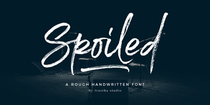 Spoiled is a rough handwritten brush font. It has a natural style which makes it perfect for branding, advertising, poster design, logo, book covers, magazines, packaging, website headers, greeting cards, apparel designs, merchandise, fashion campaigns, newsletters, album covers, and quote designs and more.
 - Tabina by ErlosDesign,
$12.00 Tabina is a sweet, romantic and timeless handwritten font. It looks stunning on wedding invitations,thank you cards, quotes, greeting cards, logos, business cards and every other design which needs a handwritten touch.It features a varying baseline, smoothlines, gorgeous glyphs and stunning alternates.
 - My Aunt Celia by Quadrat,
$25.00 My Aunt Celia was designed as a quaint, quasi-elegant display face using caps and small caps. The family consists of two fonts: regular and alternate which, between them, provide many special swash characters, tall caps and ligatures for lively, quirky, mixed settings.
 - Stuart Collins by Goodigital13,
$20.00 It looks stunning on wedding invitations, thank you cards, quotes, greeting cards, logos, business cards and every other design which needs a handwritten touch. add an eye-catching appeal to your logo designs, brand imagery, handwritten quotes, product packaging, merchandise & social media posts
 - Opening Night JNL by Jeff Levine,
$29.00 Add some twinkling lights to a bold Art Deco font such as Art Lesson JNL, and the result is a typeface which truly puts your name (or message) up in lights. Opening Night JNL conjures up images of Broadway plays and Hollywood premiers.
 - Astoria by Alan Meeks,
$45.00 Based heavily on Gill especially in the mid weights, Astoria has a subtle top left serif which makes it not quite a Roman and not quite a Sans. Designed specifically as a text face it still works very well as a headline font.
 - Movie Musical JNL by Jeff Levine,
$29.00 A lobby card for the 1929 movie musical “Broadway Melody” features the bulk of the film’s title hand lettered in a playful sans serif style. This design is now available as Movie Musical JNL, which is available in both regular and oblique versions.
 - Black Asgard by Letterara,
$16.00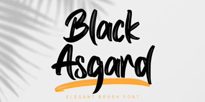 Black Asgard is a natural dry brush font. this font has a striking look and a good flow font that can add style to your designs. It’s perfect for logos, quotes, posters, clothing, and every other design which needs a strong touch.

