10,000 search results
(0.032 seconds)
- Bricklayers by RMU,
$30.00 Bricklayers is a gorgeous poster and headline font which allows its users to build their individual brick walls for print and web design. Heed the instruction how to build your own wall.
 - Recruitment JNL by Jeff Levine,
$29.00 A 1916 recruitment poster from World War I seeking men to join the Army’s Signal Corps provided the lettering inspiration for Recruitment JNL, which is available in both regular and oblique versions.
 - Nouveau Elegance JNL by Jeff Levine,
$29.00 The gently spurred serif hand lettering found on an advertisement for Berkshire Stockings (circa the 1920s) was the inspiration for Nouveau Elegance JNL, which is available in both regular and oblique versions.
 - Fife Gallery by Lemonthe,
$14.00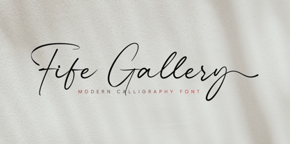 Fife Gallery is a stylish and incredibly elegant modern calligraphy font. It looks stunning on wedding invitations, quotes, greeting cards, logos, business cards and every other design which needs a handwritten touch.
 - Brobane by Letterniz,
$27.00 Brobane is a clean and lining brush script. It looks stunning on wedding invitations, thank you cards, quotes, greeting cards, logos, business cards and every other design which needs a handwritten touch.
 - Tobi Next by RodrigoTypo,
$35.00 Tobi Next is the improved version of Tobi pro, which in the extended version contains 213 ligatures, contains Greek and Cyrillic, as well as contains its basic version at a lower cost
 - Clarenwood JNL by Jeff Levine,
$29.00 Based on some examples of a Clarendon-inspired wood type design, Clarenwood JNL is a bold and effective titling font which harkens back to old times and advertising on a grander scale.
 - Moonlit Night JNL by Jeff Levine,
$29.00 The simple, hand lettered sans serif title on the 1935 sheet music for "Campus Moon" was the design model for Moonlit Night JNL, which is available in both regular and oblique versions.
 - Movie Screen JNL by Jeff Levine,
$29.00 The hand lettered opening titles from the 1944 Laurel and Hardy comedy “The Big Noise” served as the inspiration for Movie Screen JNL, which is available in both regular and oblique versions.
 - Himalaya by Arendxstudio,
$18.00 Introducing Himalaya Typeface a rounded vintage monoline. Himalaya is clean modern-vintage display font which inspired from old school letterpress 1.Uppercase,lowercase, numeral,punctuation & Symbol 2.Regular 3.Multilanguage 4.Alternate
 - Alleyster by Nurf Designs,
$19.00 Alleyster is a lovely curly script font in a modern calligraphic style and includes amazing handwritten characters. It’s perfect for logos, posters, headlines, and every other design which needs to stand out!
 - Amulet by G-Type,
$39.00 Amulet evolved after a trip to Dublin, Ireland. It has a Celtic calligraphic influence which must have subconsciously come from looking at ancient manuscripts and the Book of Kells in Trinity College.
 - Initiales Grecques by ARTypes,
$35.00The Initiales grecques were made by Firmin Didot ca 1800. When set at 22-pt, the AR font will match the size of the Corps Vingt-Deux from which it is derived. - Safina Bralyn by Arendxstudio,
$21.00 Safina Bralyn is a handwritten signature font which is very elegant and modern for you to use and your design interests be it for logos, branding names, posters, podcasts and so on.
 - Bentele-Unziale by ARTypes,
$25.00The Bentele-Unziale letters are transcribed from letters drawn by Prof. Ernst Bentele which are displayed in Hoffmanns Schriftatlas (1952). The size of the original is matched when set at 84 pt. - Rail Service JNL by Jeff Levine,
$29.00 The extra bold, squared Art Deco sans hand lettering found on a 1940s travel poster for the Pennsylvania Railroad inspired Rail Service JNL, which is available in both regular and oblique versions.
 - Stillhouse by Surplus Type Co,
$16.00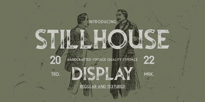 Stillhouse is a vintage serif font that features 2 styles - Textured & Solid. This typeface is great for achieving that rustic aesthetic which is popular in restaurant branding, apparel designs and product packaging.
 - Overnight JNL by Jeff Levine,
$29.00 Hand lettering on the cover of the 1932 sheet music for "Sleep, Come On and Take Me" was the basis for Overnight JNL, which is available in both regular and oblique versions.
 - Cabo Soft by Design A Lot,
$15.00 Cabo Soft is the 2.0 version of our original Cabo Rounded Typeface, created back in 2015. With this new version, Cabo Soft, we have brought multiple upgrades and updates compared with the original version. Some of those consist in the addition of more glyphs and accents, alternate designs for many of the glyphs (including an alternate for @, #, some of the numbers and more), and most importantly, we have done a slight update in the design of the letters, which we'll give more details in the following paragraphs. The main style and thought behind our Cabo fonts has always been the rounded corners and the soft and welcoming vibe that it gives. It's friendly and familiar, but also modern and slightly elegant, especially the Thin and Light styles. With Cabo Soft we have worked on adding an extra touch to the design of the letters by working on the termination edges of each letter. If Cabo Rounded had an exact round termination for each letter, with Cabo Soft we have developed a unique non-equally rounded shape that is applied to all types of terminations for each letter. This new design approach makes it have a more clean style, a more modern and unique look, but it also gives stylish, exclusivist and elegant vibes, while still being friendly and familiar. Thanks to it's variety in weights and styles, you can use Cabo Soft in almost any design project. It works well with headlines and paragraphs, it's a perfect match for logo design and branding, but can also do wonders in videos, signage and many other elements. The typeface covers most likely the entire Latin Alphabet, it comes with multiple design alternates for many of the letters, glyphs and numbers, with accents applied for all of the available alternates. As a finishing note, with the help of our Cabo Soft typeface you can create an friendly and welcoming designs, as well as stylish, elegant and exclusivist. It has all the necessary glyphs and accents for any Latin Alphabet projects, and you can play around with all of the alternates to create unique designs right from the start.
 - Petugas by Twinletter,
$14.00 Petugas is our newest font. This font is written in deep and dramatic handwriting. Each letter has a unique and beautiful character to be used as a title, word or sentence, which looks good and beautiful in every display design you make. Not limited to that, the bold calligraphy font is designed to keep paying attention to the beauty of each letter, there are alternate options for the letters which are certainly easy for you to access, so you can automatically customize the letters you want to enhance the visual appearance of your design project.
 - 1350 Primitive Russian by GLC,
$44.00 This rough font was inspired by a Russian Cyrillic hand of the 1350s “Russkaja Pravda” (a Russian text of common Laws). As a Pro font, it supports Western and Northern European, Icelandic, Baltic, Eastern, Central European and Turkish specific characters, as well as Old Russian glyphs, including many which fell out of use in the 1700s, except in religious texts — in all over 136 Russian glyphs. The upper and lower case have the same form and almost same size, like in the original texts, which had only one size and style.
 - VerticalFlipJJ by Ingrimayne Type,
$9.95 Many years ago I created two upside-down typefaces, UpsidedownJJ and UpsidedownTOC. They were based on monospaced or typewriter fonts, and were rotated 180 degrees, which is the same as a vertical flip followed by a horizontal flip. Recently I was reminded that this way of creating an upside-down typeface is not the only way to create an upside-down typeface--a simple vertical flip creates a different one. That is what this typeface is, a simple vertical flip. The original typeface on which this one is based is JetJaneMono.
 - Saturknight by Echopraxium,
$13.50 Saturnight Regular is a proportional and kerned typeface. The name is a variation of Saturnight, which is itself the anagram of Unstraight. This is because vertical lines are Unstraight sticks. It's a consequence of the Design rule * Glyphs are built from segments on a triangular tessellation (cf. poster 1) Note 1: Unstraight lines depend from the chosen tesselation orientation (here the tesselation has horizontal lines and thus Unstraight verticals). Note 2: The encoding is Windows Latin 'ANSI', which includes Icelandic characters (as illustrated by poster 3).
 - VerticalFlipTOC by Ingrimayne Type,
$9.95 Many years ago I created two upside-down typefaces, UpsidedownJJ and UpsidedownTOC. They were based on monospaced or typewriter fonts, and were rotated 180 degrees, which is the same as a vertical flip followed by a horizontal flip. Recently I was reminded that this way of creating an upside-down typeface is not the only way to create an upside-down typeface--a simple vertical flip creates a different one. That is what this typeface is, a simple vertical flip. The unflipped typeface from which VerticalFlipTOC is derived is TiredOfCourier.
 - School Project JNL by Jeff Levine,
$29.00 A set of self-adhesive poster board letters once made by the E-Z Letter Stencil Company and sold under the name "Quik Stik" was the model for School Project JNL. Ironically, the line was discontinued because they did not stick very well - the weight of the cardboard caused the letters (which used a rubber cement type of glue) to pull away from the surface they were mounted to. Unlike vinyl self-adhesive letters (which were formulated for indoor or outdoor use) these cardboard sets were relegated to indoors only; further restricting their usability.
 - Cute Panda by Zagach Letters,
$12.00 Cute Panda is an uppercase font by Zagach Letters. It’s a handwritten brush script which could be described as soft, fluffy and cute. Cute Panda has a variety of coded features to create unique text designs, stylistic alternates from A to Z and alternative numerals from 0 to 9 which makes your designs to look more natural, AE OE ligatures, currency symbols and punctuation. It is perfect for titles, headlines, greeting cards, stationery design, packaging, magazines, posters and more. Multilingual support. Extended Latin character base that covers most European languages.
 - Dungeon by Red Rooster Collection,
$45.00 Dungeon is a glyphic font family that combines elements of both sans serif and spur serif typefaces. It was designed exclusively for the Red Rooster Collection in 1998 by Steve Jackaman (ITF). The family is loosely based on Dick Jensen’s famous design “Serpentine,” which was created for the Visual Graphics Corporation (VGC) in 1972. Dungeon is available in four weights, each of which is optimized for legibility at any size. The family’s masculine feel has helped it to turn up in a variety of projects, ranging from brand identity to advertising.
 - Schwabacher by RMU,
$25.00 One of my favorite blackletter fonts - Schwabacher - redrawn and redesigned, whereby I took care to stick to the original forms as close as possible. This font which has its roots in the 15th century represents at the most the uprising humanism in this period. To get access to all ligatures, it is recommended to activate both Standard and Discretionary Ligatures. By using the OT feature Stylistic Alternatives you get the historical German umlauts which are small e above a, o, u, A, O, and U. This font contais also oldstyle figures.
 - Digideco by astroluxtype,
$20.00 Retro-futuristic robot terminal type. The 1930s Moderne Streamline decade meets the digital domain in this weird font. Use it in an ad for Ford Tri-Motor Airplane or a story about an out of control 1980s computer monster. Which? Help it find its place- as it is lost in time. Digideco is a minimal font set that includes upper and lowercase letterforms which can be used at various sizes but, we consider it a headline/display font, best applied larger than 36 points in size. Shall we play a game?
 - Jasan by Storm Type Foundry,
$49.00 Jasan is the Czech expression for ash tree (Fraxinus Excelsior) which provides great wood for tools and furniture. In a landscape it’s a rather inconspicuous tree which forms beautiful alleys. Jasan typeface represents a synthesis of many famous sans-serifs: despite the concept being strictly rational, it’s not at all cold. Simple shapes & human expression will make your projects nicely colored. It brings excellent clarity for printed and web publishing, visual identity & information systems. The 36-font family contains multi-lingual support including Cyrillics, Small Caps & rich palette of OpenType Features.
 - Travel East JNL by Jeff Levine,
$29.00 “Tropical Type” was Alf Becker’s 148th submission to “Signs of the Times” magazine (a publication for the sign trade) where for years Becker would provide a monthly lettering design to inspire other sign writers. This particular design has more of a Far East flair to it, and was redrawn digitally as Travel East JNL, which is available in both regular and oblique versions. Special thanks to Tod Swormstedt of the American Sign Museum and S.T. Media Group for providing the sample image from which the font was derived.
 - Grand Guignol by Comicraft,
$19.00 A gruesome operatic drama is about to unfold, a tragic performance of the macabre! We offer for your entertainment a series of unfortunate events full of shocks and lugubrious revelations which will chill you to the bone! We also offer you this font, which may have similar effects, including nausea, migraine, heart palpitations and stomach upset. Pretty, though, isn't it? Art Deco & Art Nouveau posters, this font pair defined the look of John's MARVEL'S FINEST book designs in the early 2000s, and Richard's comic ASK FOR MERCY in the 2020s!
 - Tooth & Nail by Set Sail Studios,
$12.00 Introducing Tooth & Nail; a rustic & hearty hand-painted dry brush font, designed to work in both all-caps as well as lowercase. It also includes a bonus vector pack, featuring 24 elements designed to boost your text and reaffirm it's hand-made style. With rough bold strokes and high quality textures throughout, Tooth & Nail is the perfect workhorse font for product packaging, promotional messages, handwritten quotes, home decor and branding projects. Tooth & Nail is reliable and familiar, like meeting someone for the first time and feeling like you've been reunited with an old friend. Tooth & Nail consists of 2 styles: 1. Tooth & Nail • A handwritten brush font containing upper & lowercase characters, numerals and a large range of punctuation. 2. Tooth & Nail Alt • This is a second version of Tooth & Nail, with a completely new set of lowercase characters. If you wanted to avoid letters looking the same each time to recreate a custom-made style, or try a different word shape, simply switch to this font for an additional layout option.
 - Silver South by Set Sail Studios,
$16.00 Introducing the Silver South Font Duo, a classy, contemporary pair of script and serif fonts. With a stylish didot-style serif font and a free-flowing, expressive script companion, Silver South offers beautiful typographic harmony for a diversity of design projects, including logos & branding, wedding designs, social media posts, advertisements & product designs. Silver South Script • A clean, free-flowing script font containing upper & lowercase characters, numerals and a large range of punctuation. Silver South Script Alt • This is a second version of Silver South Script, with a completely new set of upper & lowercase characters. If you wanted to avoid letters looking the same each time to recreate a custom-made style, or try a different word shape, simply switch to this font for an additional layout option. Silver South Serif • A classy serif font containing upper & lowercase characters, numerals and a large range of punctuation. Creates a perfect pairing contrast with the Silver South Script fonts. Script Ligatures • Silver South Script also includes 38 character ligatures. These double letters allow you to recreate a more natural, hand-drawn flow to your text.
 - We The People by K-Type,
$20.00 This typeface is extrapolated from the ‘We the People’ calligraphy of the handwritten US Constitution Preamble which employed a style based on German Text and Square Text exemplars from George Bickham’s penmanship copy-books, the most celebrated being The Universal Penman published in 1743. The original Constitution document was transcribed onto parchment by Jacob Shallus, a Pennsylvania Assistant Clerk, over a weekend in 1787. Shallus’s biographer, Arthur Plotnik (The Man Behind the Quill, 1987), notes that he was paid $30, a modest monthly wage at the time. He also suggests that the calligraphic headings, ‘We the People’ and ‘Article’, may have been inserted by Shallus’s 14 year old trainee son, Francis, “The manner in which the ‘Article’ headings are squeezed into the space Shallus allowed for them suggests a second hand—and perhaps not a very experienced one.” The unconventional backslant of the headings would seem to support this contention, and at the end of the document there is perhaps a novice’s inconsistency in the structure of the letter n between that used for ‘done’ and those used for ‘In Witness’. However, one has to admire the elegant swagger of the wavy t, h and l which the K-Type font extends to the b, f and k. Also, the simpler, Schwabacher-style W, an enlarged version of the lowercase w, is a little less flamboyant than the capital W from the German and Square texts in Bickham’s manuals. For designers using OpenType-aware applications, the typeface includes some Alternates, including a Bickham-style W, the letters t, h and n with added flourishes, two simpler forms of the A, and a few roman numerals for numbering articles. Also some ornamental flourishes and a round middle dot/decimal point. Punctuation marks are drawn in square, calligraphic style, but an alternative round period/full stop, for use with currency and numerals, is available at the period centered position (though placed on the baseline), accessed by Shift Option 9 on a Mac, or Alt 0183 on Windows. The full phrase, ‘We the People’, has been placed at the trademark keystroke and can be accessed by Option 2 (or Shift Option 2) on a Mac, or Alt 0153 on Windows. For designers who find the backslant awkward or unpleasant, the licensed typeface also includes two additional fonts which have a vertical aspect that may be more conducive to graphic design layouts. ‘We The People Upright’ and ‘We The People Upright Bold’ both retain the distinctive style, and the heavier weight is only slightly emboldened, just enough to add some punch.
 - Fleete by Greater Albion Typefounders,
$5.95 Fleete is a modern homage to the many late 19th century typefaces; often used for book titles, posters and newspaper headlines; which have an extreme contrast between hairline horizontal stems and serifs and heavy vertical stems. Greater Albion Typefounders have taken this basic idea, to be found across very many faces of the period and used just that one concept as the basis of a new typeface design, which manages to be elegant yet modern all at once. IF you need something for a section heading which stands out from body text, this is the font family for you. If you need headings on a poster or large scale web-page headings, this is the face you should try. If you need several weights of heading-no problem; Fleete comes in Regular, Bold and Shadowed, as well as a newly designed Sans Serif form.
 - Ceebo by Oliver Matelowski,
$55.00 Ceebo is a friendly sans-serif, which show some aspects of a humanist and grotesque typeface. It retained more details of writing and got some forms and characteristics of an italic. The font contains some alternative glyphs. It also contains some ligatures and discretionary ligatures. In addition, there are adjusted figures and additional character for uppercase letters, lowercase letters and small caps, which react by OpenType-Feature. The font was designed to stay legible also in small sizes: beside as possible open counters, a tall x-high, distinct vents and cuts, it especially are the details of the glyphs which make it discernable. The regular weight is slightly thinner than other sans-serif fonts, moreover the diacritics and small glyphs were designed for small sizes by taller and more open forms. The resulting “ruggedness” is mellowed by half-rounded stems and pointed stem ends.
 - FS Conrad by Fontsmith,
$50.00 Art into type In 2008, Fontsmith were approached by their friend, Jon Scott, to investigate whether a typeface could assume the aesthetic of one artist’s body of work. Jon’s not-for-profit charity, Measure, was organising an event for the artist, Conrad Shawcross, whose giant mechanical installation, entitled Chord, was going on public display in the long-disused Kingsway tram tunnel in Holborn. Chord explores the way we perceive time, as either a line or a cycle. Two enormous machines with dozens of rotating arms and moving in opposite directions, weave rope with almost infinite slowness. An unusual brief Phil Garnham visited Conrad in his Hackney studio to get a feel for his work and ideas. “Conrad is a very clever and philosophical guy. He struggled to see how typeface design had any relevance to him and his art. This was going to be a challenge.” The artist presented the type designer with a pile of rope and a huge diagram of sketches and mathematical workings. “This was, in essence, my brief.” Phil developed three concepts, the simplest of which ticked all the boxes. “The idea of the strokes in the letterforms appearing and ending at peaks or points of origin fitted perfectly with Conrad’s idea of time occurring and ending at two ends of the sculpture.” Two versions Phil planned modules for two versions of the typeface: one with five lines in the letterforms and one with seven. He then drew the modules on-screen and twisted and turned them to build the machine that is FS Conrad. “This is not a simple headline typeface,” says Phil. “It’s not a rigid structure. It has varying character widths, and it’s informed by real typographic insight and proportions so that it actually works as piece of functioning, harmonious type.”
 - Ongunkan Archaic Etrusk by Runic World Tamgacı,
$50.00 Etruscan was the language of the Etruscan civilization, in Italy, in the ancient region of Etruria (modern Tuscany, western Umbria, northern Latium, Emilia-Romagna, Veneto, Lombardy and Campania). Etruscan influenced Latin but was eventually completely superseded by it. The Etruscans left around 13,000 inscriptions that have been found so far, only a small minority of which are of significant length; some bilingual inscriptions with texts also in Latin, Greek, or Phoenician; and a few dozen loanwords. Attested from 700 BC to AD 50, the relation of Etruscan to other languages has been a source of long-running speculation and study, with its being referred to at times as an isolate, one of the Tyrsenian languages, and a number of other less well-known theories. The consensus among linguists and Etruscologists is that Etruscan was a Pre–Indo-European,and a Paleo-European language and is closely related to the Raetic language spoken in the Alps, and to the Lemnian language, attested in a few inscriptions on Lemnos. Grammatically, the language is agglutinating, with nouns and verbs showing suffixed inflectional endings and gradation of vowels. Nouns show five cases, singular and plural numbers, with a gender distinction between animate and inanimate in pronouns. Etruscan appears to have had a cross-linguistically common phonological system, with four phonemic vowels and an apparent contrast between aspirated and unaspirated stops. The records of the language suggest that phonetic change took place over time, with the loss and then re-establishment of word-internal vowels, possibly due to the effect of Etruscan's word-initial stress. Etruscan religion influenced that of the Romans, and many of the few surviving Etruscan language artifacts are of votive or religious significance.
 - Anisette Std by Typofonderie,
$59.00 A geometric Art Déco multi-widths type family Anisette has sprouted as a way to test some ideas of designs. It has started with a simple line construction (not outlines as usual) that can be easily expanded and condensed in its width in Illustrator. Subsequently, this principle of multiple widths and extreme weights permitted to Jean François Porchez to have a better understanding with the limitations associated with the use of MultipleMaster to create intermediate font weights. Anisette is built around the idea of two widths capitals can be described as a geometric sanserif typeface influenced by the 30s and the Art Deco movement. Its design relies on multiple sources, from Banjo through Cassandre posters, but especially lettering of Paul Iribe. In France, at that time, the Art Déco spirit is mainly capitals. Gérard Blanchard has pointed to Jean François that Art Nouveau typefaces designed by Bellery-Desfontaines was featured before the Banjo with this principle of two widths capitals. A simple sentence will be as diverse in its representations, as the number of Anisette variables available to the user. With Anisette, typography becomes a game, as to design any title page as flamboyant as if it has been specially drawn for it. Two typefaces, many possibilities The complementarity between the two typefaces are these wide capitals mixed with narrow capitals for the Anisette while the Anisette Petite – in its latest version proposes capitals on a square proportions, intermediate between the two others sets. Anisette Petite proposes capitals in a square proportion, intermediate between the two other sets, all of which are interchangeable. In addition, Anisette Petite also includes a set of lowercase letters. Its style references shop signs present in our cities throughout the twentieth century. Anisette, an Art Déco typeface Anisette: Reveal your typographic expertise Club des directeurs artistiques, 46e palmarès Bukva:raz 2001 Slanted: Contemporary Typefaces #24