4,322 search results
(0.013 seconds)
- Babaloo by Lisa Holtzman,
$9.00 Originally executed using a stick and sumi ink, Babaloo is Lisa's first digital font. While great in larger point sizes, Babaloo is surprisingly legible in small point sizes as well. Its quirky, spontaneous nature makes it ideal as a casual, fun, display font.
 - Andalusia Signature by Letterena Studios,
$9.00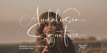 Andalusia Signature is an exquisite handwritten font, masterfully designed to become a true favorite. It maintains its classy calligraphic influences while feeling contemporary and fresh. This font is PUA encoded which means you can access all of the glyphs and swashes with ease!
 - Shaheen Arabic by Zaza type,
$29.00 Shaheen Arabic is an Arabic typeface that embodies power and a tendency towards uniformity. While preserving the neat, minimalist look which is associated with it. The name, too, hints at the strong character of the typeface. Shaheen Arabic comes in 5 wights
 - Sheree by Typadelic,
$14.95 Inspired by mid-century greeting card hand-lettering, Sheree is a unique serif font with some really fun qualities. While some characters are distinctly calligraphic and conformist in nature, Sheree bounces all over the baseline, displaying an unconventional attitude all her own.
 - Triplett by Monotype,
$40.99The capitals of the Triplett font bare a strong resemblance to Roman inscriptions, while the lowercase alphabet has been drawn with a rounded hand, inspired by the cursive uncial handwriting. Serifs are very small, giving a clean modern look to texts and headings. - Freight Display Pro by Freight Collection,
$39.00 Freight Display kicks it up another notch from the Freight Text family with more open counters and a bit more contrast. Those warmer proportions give balance for easily read headlines, running heads, and subheads while still standing tall if reversed-out at smaller sizes.
 - Charmer JNL by Jeff Levine,
$29.00 Found on the back of some sheet music to promote another song was the hand-lettered title "The Snake Charmer". While not everyone likes snakes, many designers do like the lettering of the Art Deco era, so Charmer JNL is designed from that lettering.
 - Kwodsity by Ingrimayne Type,
$12.95 The two Kwodsity fonts are derived from Kwersity, a narrow, blocky typeface with slab serifs and a high x-height. In Kwodsity Up the bottom edges and bottom serifs have been thickened, while in Kwodsity Down the top edges and serifs have been thickened.
 - ND Lupo by NeueDeutsche,
$25.00 ND Lupo is a modern typeface featuring mono linear strokes and captivating loop shape counters in select lowercase letters. Its elegant design exudes charm, while the clean lines ensure readability. Versatile and legible, perfect for logos, headlines, and creative projects, leaving a lasting impression.
 - Grimm by The Type Fetish,
$25.00 The origin of Grimm was to create a typeface in the spirit of Elliott Peter Earls' Subluxation, but somewhere in the process things shifted to a blackletter influenced uppercase while the lowercase became more roman. The end result is a quirky little blackletter display typeface.
 - Driade by IHOF,
$24.95 Driade is a font family based on personal calligraphic expression. It is exotic but still familiar, readable and graced with a human touch. The “Aged” style features irregularities found in Kothay’s original brush drawings. While the “Lined” pares the letterforms down to their basic forms.
 - Hermosa by sizimon,
$18.00 Beautifly is an elegant and flowing handwritten font. It features a varying baseline, smooth lines, gorgeous glyphs and stunning alternates. It maintains its classy calligraphic influences while feeling contemporary and fresh. Fall in love with this font and bring your projects to the highest levels!
 - Theater District JNL by Jeff Levine,
$29.00 Theater District JNL revisits the classic lettering of the 1930s Art Deco movement with this bold headline type. While many variations of this letter form exist, each interpretation evokes the approach to modernism and streamline embraced by architects and fashion designers of the period.
 - Quixotic Sans by Roland Hüse Design,
$25.00 Modern sans-serif font with an edge. Clean lines and sharp angles offer a contemporary feel while its generous x-height ensures clarity and readability. Quixotic Sans is perfect for headlines and logos, this font adds a professional and stylish touch to any project.
 - Montas by Nasir Udin,
$25.00 Montas is an elegant display serif with high contrast. Designed to be fit on a vintage-themed design project or the modern one. Its bolder weights are suitable for a striking headline, while the lighter weights are suitable for a short paragraph as well.
 - Sauce Grotesk by Creative Sauce,
$36.00 Sauce Grotesk is a compact typeface much like the classic unassuming sans serif grotesques but with softer features that shows fluidity and a sense of easiness. We wanted a typeface that can relate to a broader audience for maximum message clarity while maintaining aesthetic qualities.
 - Jacky Hand by Open Window,
$4.95 Jacky Hand is a waxy new font totally drawn by my 6 year old son while practicing his handwriting. This is a totally diverse font perfect for a wide range of uses from horror posters to childlike naiveté, or to inject some preppy school spirit.
 - Postale by Dear Alison,
$24.00 I recently came across an old travel journal I’d misplaced, and in it was a really rough sketch of an Italian post office. The sign lettering caught my eye while flipping through the pages, and while not my forte, I thought I’d take my stab at recreating sans-serif lettering as a font. The Postale family recaptures that old post signage and the vintage flair that appeals to me. A little reminiscing is always a good thing. You’ll find the Stylistic Alternates feature changes up the retro styled letters to a more modern sans serif styling for a handful of letterforms, if the vintage style of certain letters isn’t your cup of tea.
 - Pueblo by Monotype,
$29.99Like many of Jim Parkinson's alphabets, Pueblo began as poster lettering. It shows a range of influences: turn-of-the-century sign painting, old Speedball lettering books, and a touch of art nouveau. While developing Pueblo, Parkinson debated whether to make the ends of the serifs rounded or square. Rounded looked more like the work of a Speedball lettering pen, but squared stroke endings made the letters more legible at small sizes. The finished design sports serifs that are just slightly rounded. According to Parkinson, the design feature is “enough to be noticed at large sizes, while going virtually unnoticed at smaller point sizes,” adding to the versatility of this distinctive typeface. - Monthly Calendar JNL by Jeff Levine,
$29.00Monthly Calendar JNL is a companion font to Calendar Blocks JNL, and features classic wood type lettering and numerals from the 1800s. A set of large numbers are on their own keys, while the numbers 1-31 reside on the A-Z and a-e keys respectively. The days of the week are on the lower case “f” through “l” keys, while the names of the months are found on the “m” through “x” positions. An open rectangle is on the lower case “y” key, and a solid black rectangle is on the “z”. For those who wish to use the 23/30 and 24/31 configurations, they can be found on the left and right parenthesis. - Barbra by Nurrontype,
$17.00 Barbra is a display font family with unique letterforms and harmonization. It's bold, brutalist, gorgeus and emotional. While I developed Barbra, my mom passed away. It's broken my heart. So I tried to represent my mixed feeling in Barbra with the expressive curve in each letterform. Up and down, right to the left. The uppercase will make your headline stand out, fresh, and organic, even when you use it for your next logo project. While the lowercase is designed to make a harmonization when you put in words or sentences. FEATURES — Total glyph set: 246 — 4 Families (Regular, Italic, SemiCondensed Regular, Semicondensed Italic) — OpenType Features: — Lowercase — Uppercase — Ligatures — Numbers — Symbols — Diacritics — Stylistic Alternates
 - Quat by Ani Dimitrova,
$29.00 Quat is a sans serif type family designed by Ani Dimitrova. The family comes in 22 weights, ranging from Hairline to Black with extra drawn italics and small caps versions, and each style contains more than 700 glyphs. The Regular and Medium weights are perfect for body text while the extra drawn Italic gives an interesting texture to the text. The lightest weights work well in subtle headlines while the heaviest ones are perfect for posters, short texts, web, branding and screen design. All weights contain ligatures, proportional figures, tabular figures, old style figure, numerals and arrows, matching currency symbols and fraction. The range of styles give a good flexibility to this family.
 - Cephalonia by Design by Pascal,
$40.00 Cephalonia is a geometric sans-serif with a unique set of alternates that draw their inspiration from classical greek engravings. The crossbars in the alt characters O, E, F and D are the most notable examples of this greek influence. The landscape of Greece and in particular its islands were the inspiration behind the angular A, H and G, which conjure images of rolling hills and waves. Cephalonia's alternate Q and ampersand are completely original designs. Cephalonia combines the simplicity and elegance of the most famous geometric sans-serifs while adding original embellishments that make it something new and exciting. The end result is a typeface that can evoke a classic feeling while simultaneously holding an edgy contemporary feel.
 - Clavo by Dada Studio,
$29.00 Clavo was picked for the EXHIBITION CALL FOR TYPE - NEW TYPEFACES and is presented in the Gutenberg Museum in Mainz, Germany. Clavo is a multipurpose font family. Its warmth comes from subtle details, classical proportions and traditional forms, while harmonious structure prevents distraction while reading. This makes Clavo a universal typeface. In all sizes, from caption to display. The family consists of ten weights. They were not created in a linear way. The steps between the weights were adjusted carefully to avoid a mechanical graduation, in favor of optical harmony. Clavo covers all latin languages. It contains a wide set of numerals, small capitals, fractions and other OpenType goodies. And of course every weight comes with matching italics.
 - Samsekrat by IbraCreative,
$17.00 Samsekrat is an authentic serif typeface that exudes timeless elegance and sophistication. With its meticulously crafted letterforms, Samsekrat strikes a harmonious balance between tradition and modernity, making it versatile for a range of design applications. The serifs are distinct and refined, lending a classic aesthetic to the typeface, while subtle nuances in letter spacing and stroke weights contribute to its overall grace. Samsekrat’s authenticity shines through in its attention to detail, capturing the essence of traditional serif typography while maintaining a contemporary edge. This typeface is a testament to the craftsmanship and artistry behind authentic design, making it a compelling choice for projects that demand a touch of refined character and enduring style.
 - Stencil Round Ends by Creative Juncture,
$15.00 Stencil Round Ends, is just that, a stencil typeface with rounded terminations to each line rather than the squared terminations found in your typical stencil font. This design was developed while designing a typeface for engraving. The end mill tools used to engrave a font are round, thus the lines will all end with a rounded edge. While designing the engraving font I also designed this font to make sure that the single line version will have the desired aesthetic. Unlike many stencil fonts that have a limited range of glyphs I made this to contain the majority of letters, accents, ligatures, and mathematic symbols commonly used in most latin based languages.
 - Flax by Wilton Foundry,
$29.00Flax Regular lives in a somewhat unusual space... it is not a normal “handwriting” font, nor is it a formal script, or a rounded italic. Flax is a slightly more formal handwriting script that is extremely legible and useful- it can stretch from invitations to packaging, to menus, to brochures to ads. The rough hand-drawn finish gives Flax some of its unique character. This is almost unnoticeable in smaller point sizes while clearly visible in display sizes. While Flax is slightly formal, it has a very friendly presence - mainly from the unpretentious rounded characters and rough finish. Flax is available in Postscript, Truetype and Opentype for Mac and Windows. You will enjoy putting Flax to work! - Eligra by Eliezer Grawe,
$- Eligra is a modern and elegant sans-serif typeface family inspired by old and new classics like Helvetica and Gotham. Its geometric and precise strokes create a versatile and timeless font. However, Eligra has unique features, like its subtle swirls and curves, that add a dash of personality while still maintaining the font's simplicity and clarity. Eligra has more than 800 glyphs, with a large set of Latin, Cyrillic and Greek characters, several alternates, and different styles of numerals. It is clean, clear, stable, and contemporary, making it a perfect choice for branding projects, websites, advertisements, documents, presentations or any other occasion where you want to convey evenness while maintaining a contemporary and innovative look.
 - Mislab Std by Typofonderie,
$59.00 A brighter slab n’ sans in 18 styles Referred to as Egyptian’s in the early years of the nineteenth century, today slab serifs are primarily used in display sizes but seldom used in body text. With Mislab, Xavier Dupré has designed a brighter and more legible slab serif than most. Mislab aptly combines the strength of a slab serif with the lightness of a sans serif. Bold and thick serifs make for strong impact in display uses while performing extremely well under the most stressful body text conditions. A slight cursive feel adds spice to the text while its delicate rounded rectangular structure is naturally adapted to screen displays. The capitals have fully assumed serifs while the lowercases have more discreet versions. Notable features include sanserif endings on the lowercase a, c, e & s, inducing fluidity and enhanced readability. This highly versatile typeface brings clarity to headlines. Mislab will provide foolproof stability to your layouts. Mislab, a new design by Xavier Dupré Type Directors Club 2014 Tokyo TDC 2014 Communication Arts Typography Awards 2014 Club des directeurs artistiques, 45e palmarès Slanted: Contemporary Typefaces #25
 - Codec Pro by Zetafonts,
$39.00 Codec Pro is the newest incarnation of the Codec family, developed in 2017 by Francesco Canovaro, Cosimo Lorenzo Pancini and Andrea Tartarelli as a research on the subtleties and the variations on the theme of the geometric sans-serif design. The original typeface has been completely redesigned and expanded to feature a wide range of eleven weights, from the hairline thin to the bulky fat, while the character set has been extended to include not only latin, cyrillic and greek but also arabic, farsi and urdu scripts. A veritable swiss-knife for the designer, Codec Pro also includes a wide range of alternates and stylistic sets that cover all the subfamilies and the moods of the original type system. So while the standard set (Codec Cold) has terminals cut parallel or perpendicular to the baseline, emphasizing geometry for a more constructed look, stylistic set 4 (Codec Warm) uses open diagonal cuts and humanist shapes to give the typeface a gentler, warmer feeling. Set 3 (Codec Cold Logo) comes alive with funky ligatures, while Set 5 (Codec Warm Logo) stretches uppercase characters horizontally for a dynamic, unexpected effect
 - Starx by Koray Özbey,
$11.00 Starx is a variable display typeface with angular lines, offering a futuristic and dynamic aesthetic. It consists of three axes: angular, rounded, and slanted. The bold version embodies a strong and high-tech expression, while the italic and rounded versions convey a dynamic, sporty, and futuristic impact.
 - Makalu by Juraj Chrastina,
$29.00 Makalu is a funny flower font inspired by the lovely drawings of the famous illustrator Zdeněk Miler (best known for his small mole). His flowers are at the same time cartoony and realistic. Enjoy this choice of 27 original and distinctive illustrations while creating your designs.
 - Cat Blvck by The Design Speak,
$100.00 Another experimental typeface by Marshall. This typeface is almost difficult to read but that is almost the point. It features words or almost enclosed circles as well as thick strokes around the letter forms. The font has an mysterious edge while providing shock to whomever views it.
 - Thornback by Lauren Ashpole,
$15.00 Thornback is a hand-drawn font that uses quick, scribbled strokes to create it's slightly messy sans-serif characters. The detailed letters make it a good choice for headlines but it's also bold enough to add a homemade touch to smaller text blocks while keeping things legible.
 - Minangrasa by Mevstory Studio,
$25.00 Minangrasa is a blackletter inspired by traditional houses in West Sumatra, Indonesia which are shaped like cow horns. It's bold and fun with a retro twist. Using all caps results in very stylish text, while combining capital letters produces text that is very easy to read.
 - Wander Miles by Ironbird Creative,
$7.00 Wander Miles, our handcrafted sans serif font that perfectly captures the essence of adventure. Inspired by the wild and the spirit of exploration, our font exudes an organic sense of authenticity. Its carefully crafted design reflects the ruggedness of nature, while maintaining a subtle and versatile appeal.
 - Bodeg by Nermin K,
$6.00 Bodeg is a modern and cool looking sans serif font, using both sharp and curved edges to stand out from the crowd while maintaining a clean design which makes it adaptable to many situations. Add it confidently to your projects, and you will love the results.
 - Fragment by Ali Güzel,
$9.00 The font is designed inspired by the pieces. While it is being designed, it is aimed to give a sharp feeling and look balanced rather than being legible. So on logos, T-shirts, and all things printed, this font can be used if the content is appropriate.
 - HT Qays Sans by HadiTypeStudio,
$85.00 HT Qays Sans New Arabic Font performs equally well in print and on-screen and the designs can be used at very small sizes in packaging and catalogs, while massive print headlines – even complicated way-finding projects pose no stumbling blocks to the family’s typographic dexterity.
 - Little Bosquee by Doehantz Studio,
$12.00 Little Bossque is a modern sans serif family. Its variety of weights provide a range of choices that will help you find the best typographic color for your project. Lighter weights are well-suited for body text while heavier ones are ideal for high impact headlines