10,000 search results
(0.015 seconds)
- Plakato Pro by Underware,
$50.00 Plakato, a stencil love affair Plakato is a family of display fonts, consisting of various eye-catching styles, each of them very bold. Plakato is an identity toolkit, a heavyweight building block in case you need a strong personality, a small stencil font family to cut out your best ideas and grab all the attention. But just as with many other creations, its outcome is as divers as its multiple origins. Plakato comes in 16 eye-catching styles. The default stencil style comes in Regular & Italic. They both have 2 variations: one version, named Plakato Stencil, automatically creates borders around the text, putting any text into a graphic stencil in this way. Another version, the extruded three-dimensional version, guarantees even more attention for your message. Next to this there is also the Inline version, which is an optical play with a lot of lines. Plakato Inline has a supportive background layer, a separate font in case you want to add a background in a different colour. Then there is Plakato Paper, a manually teared version of Plakato offering a more physical look. This small family of eye-catching display fonts also contains a Neon font, an independent design in Plakato style, which can actually be used for making neon signs due to its construction. Plakato Neon comes with its own Dingbat font for that extra flush-flush. Plakato has also been redrawn on a C64, and with all its accompanying limitations been ported back and turned into a font: Plakato Game. Also this font comes with its own Dingbat font, full of emoji’s and icons for oldskool pleasure. Last but not least there is Plakato Build, constructed out of blocks. As if that wasn’t enough, there are various dynamic versions in the Plakato Play package, which offer a whole new range of possibilities for typographic expression, with new animation and interaction opportunities.
 - Roller Poster by HiH,
$12.00 Roller Poster is named after Alfred Roller. In 1902, Roller created a poster to advertise the 16th exhibit of Austrian Artists and Sculptures Association, representing the Vienna Secession movement. The exhibit was to take place in Vienna during January & February 1903. The location is not mentioned because everyone in Vienna knew it would be held at the exhibit hall in the Secession Building at Friedrichstraþe 12, a few blocks south of the Opernring, near the Naschmarkt. Designed by Joseph Maria Olbrich in 1897, the buiilding has been restored and stands today as one finest of the many fine examples of Art Nouveau architecture in Vienna (see vienna_secession_bldg.jpg). Because of its dome, it is called “the golden cabbage.” The poster itself is unique. The word “secession” is in one type style and takes up two-thirds of the elongated poster. At the bottom of the poster are the details in a different lettering style. It is this second style at the bottom that is the basis for the font Roller Poster. In keeping with our regular naming conventions, we were going to call it Roller Gezeichnete (hand-drawn), but the wonderful play on both words and the shape of the three S’s in secession was too compelling. In November 1965 there was an exhibit of Jugendstil and Expressionist art at the University of California. Alfred Roller’s Secession Poster was part of that exhibit. Wes Wilson was designing promotional material at Contact Printing in San Francisco. Among their clients was a rock promoter named Bill Graham, staging dance-concerts at Fillmore Auditorium. Wilson saw the catalog from the UC exhibit and Roller’s lettering. Wilson adapted Roller’s letter forms to his own fluid style. The result was the poster for the August 12-13, 1966 Jefferson Airplane/Grateful Dead concert at Fillmore put on by Graham (BG23-1). Wilson continued to use Roller’s letter forms on most of the posters he did for Graham through May 1967, when he stopped working for Graham. The posters were extremely successful and the lettering style along with Roller’s letter forms were picked up by other artists, including Bonnie MacLean, Clifford Charles Seeley, James Gardner, and others. The Secession poster and the Fillmore posters have inspired a number of fonts in addition to ours. Among them are JONAH BLACK (& WHITE) by Rececca Alaccari, LOVE SOLID by Leslie Carbarga and MOJO by Jim Parkinson. Each is different and yet each clearly shows its bloodlines. Our font differs in two ways: 1) the general differences in the interpretation of the letter forms and 2) the modification of the basic letter form to incorporate the diacriticals within the implied frame of the letter, after the manner of the original design by Roller. We borrowed Carbarga’s solution to the slashed O and used it, in a modified form, for other characters as well to accomplish the same purpose. We recommend that you buy ours and at least one of the other three. According to Alaccari, a version called URBAN was released by Franklin Lettering in the 70’s (and is shown on page 51 of The Solotype Catalog). For comparison of our font to original design, see image files roller_poster_2s.jpg of original poster and roller_poster_2sx.jpg showing reconstruction using our font for the lower portion (recontructed area indicated by blue bar). Please note the consistency of character width. In the lower case, 23 of the basic 26 letters are 1/2 EM Square wide. The ‘i’ is an eighth narrower, while the ‘m’& ‘w’ are one quarter wider. All the Upper Case letters are 1/8 EM wider than the lower case. This is to make it easier to fill a geometrical shape like a rectangle, allowing you to capture a little of the flavor of Wes Wilson’s Fillmore West poster using only a word processor. We have also included a number of shapes for use as spacers and endcaps. If you have a drawing program that allows you to edit an ‘envelope’ around the letters to distort their shape, you can really get creative. I used Corel Draw for the gallary images, but there are other programs that can accomplish the same thing. The image file “roller_poster_keys.jpg” shows the complete character set with the keystrokes required for each character (see “HiH_Font_readme.txt” for instruction on inserting the non-keyboard characters). The file “roller_poster_widths.jpg” shows the exact width of each character in EM units (based on 1000 units per EM square). You will notice that the font is set wide for readability. However, most programs will allow you to tighten up on the character spacing after the manner of Roller & Wilson. In MS Word, for example, go to the FORMAT menu > FONT > CHARACTER SPACING. Go to the second Drop-Down Menu, labeled ‘Spacing’ and select "condensed' and then set the amount that you want to condense ‘by’ (key on the little arrows); two points (2.0) is a godd place to start. Let your motto be EXPLORE & EXPERIMENT. Art Nouveau has always been one of my favorite movements in art -- I grew up in a home with a couple of Mucha prints hanging on the living room wall. Perhaps because of that and because I lived through the sixties, I have enjoyed researching and designing this font more than any other I have worked on. Let’s face it (pardon the pun), Roller Poster is a FUN font. You owe it to yourself to have fun using it.
 - Armalite Rifle Pro by CheapProFonts,
$10.00 Military style stencil type, badly bruised by shotgun fire, wear and tear. Now ready for action in more languages! Vic Fieger says: "The original letterforms were not the famous military stencil, but were drawn freehand then scanned into Photoshop. Next, they were altered using a series of brushes before being imported into a font. This font has been used in the Flash games Pandemic and Artillery." ALL fonts from CheapProFonts have very extensive language support: They contain some unusual diacritic letters (some of which are contained in the Latin Extended-B Unicode block) supporting: Cornish, Filipino (Tagalog), Guarani, Luxembourgian, Malagasy, Romanian, Ulithian and Welsh. They also contain all glyphs in the Latin Extended-A Unicode block (which among others cover the Central European and Baltic areas) supporting: Afrikaans, Belarusian (Lacinka), Bosnian, Catalan, Chichewa, Croatian, Czech, Dutch, Esperanto, Greenlandic, Hungarian, Kashubian, Kurdish (Kurmanji), Latvian, Lithuanian, Maltese, Maori, Polish, Saami (Inari), Saami (North), Serbian (latin), Slovak(ian), Slovene, Sorbian (Lower), Sorbian (Upper), Turkish and Turkmen. And they of course contain all the usual "Western" glyphs supporting: Albanian, Basque, Breton, Chamorro, Danish, Estonian, Faroese, Finnish, French, Frisian, Galican, German, Icelandic, Indonesian, Irish (Gaelic), Italian, Northern Sotho, Norwegian, Occitan, Portuguese, Rhaeto-Romance, Sami (Lule), Sami (South), Scots (Gaelic), Spanish, Swedish, Tswana, Walloon and Yapese.
 - Athelas Arabic by TypeTogether,
$89.00 Athelas Arabic, created by talented Iranian designer Sahar Afshar, is an elegant typeface for fine digital and printed books — perfect for Arabic literature’s captivating forms. Originally designed independently, it worked entirely on its own and yet already seemed a good fit for Athelas. So it was decided to give Athelas Arabic a thorough reworking to make them appropriate companions while maintaining the natural aesthetic qualities of Arabic. First, the Arabic letter sizes were readjusted so as to not appear larger next to the Latin, then weight and contrast were changed in the same way. Finally, the spacing and connections in the Arabic were considered to achieve comparable colour as the Latin in a block of text. Ultimately, both the Latin and Arabic are graceful designs based on classic proportions, prioritising the beauty, tranquility, and fluid nature of the wordsmith’s art. With extensive Middle Eastern language coverage and the expected OpenType features, Athelas Arabic is the counterpart for which Athelas Latin, Greek, and Cyrillic have been waiting. The graceful, elegant curves of the Athelas heritage have remained a hallmark in each script. With this release it will only gain a wider and quite appropriate audience. The complete Athelas family has been optimised for today’s varied screen uses, along with our entire catalogue.
 - Gens De Baton by HiH,
$10.00 Gens De Baton is based on a charming lower case alphabet that appeared in the Almanach des Enfants pour 1886 (Paris 1886) under the heading “Amusing Grammar Lessons.” Gens De Baton means simply “Stick People.” The unknown designer turned the bare letter forms into drawings of people for the enjoyment of the children for whom the almanac was intended. The letter forms themselves were based on the French Romain du Roi (King’s Roman), except for the ‘g’ and the ‘j’ -- which were based on Baskerville. The letters ‘w’ and ‘y’ were not included, as they are seldom seen in French. We have left the letters somewhat rough, as they appeared in the Almanach des Enfants , resisting the temptation to clean up all the lines and render them with digital perfection. We have used our HiH Firmin Didot to supply an upper case and auxiliary characters, as Didot was originally a modified version of Romain du Roi. It is interesting to observe the contrast between the polished look of the Didot upper case and the rough, hand-drawn look of the lower case. Purchasers of this font have our permission to use it for the amusement of adults as well as children. We recommend setting Gens De Baton at 24 points or larger.
 - Yorkten by insigne,
$- Clean and welcoming, the distinct look of Yorkten is remarkably satisfying to the eye. Straight to the point, Yorkton features a fashionable, geometric composition with angled main stems. There are no fewer than fifty-four fonts in the family, all of which are characterized by one of three widths – extended, normal or condensed. Each individual subfamily is equipped with eight weights from Thin to Black with respective Italics, giving Yorkten a breathtaking range of fonts to boast. The greater value for you, though, is its members’ ability to work well together. With a deep toolbox of weights and widths to choose from, this family provides you with significant value and a broad number of design solutions, making sure you have the tools you need for each challenge. So where should you use the font? Jeremy Dooley designed Yorkten’s underpinning structure to be compact. Combined with its superior features and terrific legibility, this versatile font can be used effectively for many jobs, whether in print or on screen. Use it freely for e-books and apps. Yorkten is particularly great for headlines, banners, posters, and websites. As with all insigne fonts, fonts that are well received by the market are expanded into future variants such as rounded or slab serif types. Yorkten’s later expansions will increase the versatility and functionality of the family. There’s no need to wait for these future releases, though. This new face already complements a number of other insigne faces, such as Grayfel, Look, or the Cabrito Superfamily. So what are you waiting for? Get Yorkten today and bask in the rich potential it offers! Get Yorkten and luxuriate in its straightforward multifunctionality!
 - Taca by Rúben R Dias,
$42.00 Taca is a typeface built around a shape that Portuguese designer Rúben R Dias calls a “squircle” — neither square nor circle. We usually associate the rounded, convex box with the television screens of the 1960s and Aldo Novarese’s classic typeface, Eurostile. But whereas Eurostile is cold and machined, Taca is warm and rugged, as if it was molded from clay or carved from stone. Taca’s organic nature is also derived from another unique feature: rounded crotches at the right angles where perpendicular strokes meet. This subtle finish, along with blunt stroke endings, softens the otherwise rigid skeleton. With such a strong conceptual vision, Taca could be relegated to the bin of experimental designs, severely limited in their application. But that fate is usually born of a less experienced maker. As a teacher, designer, and letterpress printer, Dias is a type user, keenly aware of the functional requirements of good type. Taca is therefore not a slave to its concept, but a working font family, effective in various sizes and environments. Its lettershapes break away from the base shape whenever it makes sense for legibility, while still maintaining the flavor of the design as a whole. That said, a set of squircle-shaped alternates give the user the flexibility to get more stylized if the situation calls for it. Fitting to its functional aims, Taca has many of the features one expects of a proper text font: upper and lowercase figures, case-sensitive punctuation, and Extended Latin language support. The simplicity, openness, and squareness of Taca’s forms also make it an ideal design for the pixel grid of screen displays.
 - Fantastic ML by HiH,
$12.00 Fantastic ML is an exuberant Art Nouveau font. It was originally released as “Modern Style” by Fonderie G. Peignot & Fils, Paris, France sometime before 1903. Since “Le style moderne” was the generic French name for Art Nouveau, it is possible that someone decided a less generic name was needed. The typeface became known as Fantastic. Compared to conventional text letters, it is just that. Fantastic has a whimsical, architectural feel. The typeface reminds me of a cross between Hoffmann’s Palais Stoclet in Brussels and Gaudi’s Sagrada Familia church in Barcelona. The letterforms themselves are similar to those by Ludwig von Zumbusch on the cover of “Jugend” in March, 1896, but with the addition of serifs. Fantastic ML is a decorative, all-cap font intended for display use and functions best at 18 points or larger. There are a total of 306 glyphs. In addition to the standard 1252 Western Europe Code Page with character slots up to decimal position 255, there are glyphs for the 1250 Central Europe, the 1252 Turkish and the 1257 Baltic Code Pages. However, some older applications may only be able to access the Western Europe character set (1252). The zip package includes two versions of the font at no extra charge. There is an OTF version which is in Open PS format and a TTF version which is in Open TT format. Use whichever works best for your applications.
 - Michiana Pro by BluHead Studio,
$39.00 Michiana Pro is my new, hand-crafted connecting script! I've been hand lettering cards and envelopes to my wife and family in this type style for years and decided it was time to make a font based on it. I typically start with a single thin stroke for each letter, then build up the weight of the heavy stroke, so there ends up being a lot of charming variations in terms of style and color. The overall finish is rough, yet friendly. Perfect for invitations, place cards, love notes, and with its large x-height, it sets nicely for text. I grew up running around the dunes and beaches along Lake Michigan in northwest Indiana, and I think the shoreline and dune grass has inspired my aesthetic. Michiana Pro takes the name from a small area along the lake between the Indiana and Michigan state lines. There are a lot of nice, modest homes nestled in the duneland forests. Thinking about what it's like back there, it's like having a bowl of steaming hot comfort food. So I hope Michiana Pro feels that way to you too. Michiana Pro features include: + extended character set for Western European language support + 1,205 glyphs + lowercase beginning and ending swashes + contextual initial and final letterforms + alternates for L, R, Z, f, g, p, t and y + 140+ ligatures + superior and inferior figures for unlimited fractions + ordinals (st, nd, rd, th) + 4 ornamental swashes + available in both OTF and TTF formats
 - Dearest - Unknown license

- Wellmere Sans by Greater Albion Typefounders,
$16.00 Wellmere Sans is humanist a ‘sans serif’ typeface combining distinctive character with easy legibility. The emphasis here is on elegant simplicity and clarity. No alternate forms, no ligatures, just good simple design and elegance giving clarity and ease of communication. Ideal for timeless presentation of information, signs, posters, computer displays and so forth.
 - Auldroon by Ingrimayne Type,
$12.00 Auldroon was inspired by the pseudo-medieval fonts that were fairly popular in the late 19th century. Auldroon comes in two variants. Auldroon-Eld was designed first and is a bit more compact than the regular version. Both are decorative and distinctive and neither was created with a specific use in mind.
 - Herman by Monotype,
$15.99 An edgy little number here; Herman was created using a chiselled marker pen and is handwritten as a slanted, bold font with a distinct marker contrast. Designed with two sets of all caps, and alternates that rotate the upper and lower case; Herman is a standout that’s charming and slightly retro, too.
 - Morning by Monotype,
$15.99 Morning’s spirited, bouncy cursive letterforms feel like a painter’s signature; it’s a familiar style but with something of a twinkle in its eye. The style of Morning looks to imitate wet brush and ink lettering, and dances between seriousness and play. You’ll find a mix of letter connections here, and some ligatures, too.
 - Public Notice JNL by Jeff Levine,
$29.00Public Notice JNL is based on a wood type alphabet originally shown in George Nesbitt’s 1838 catalog as “Gothic.” The image sample used for a model had only the basic A-Z characters, an ampersand and an exclamation point, so numbers and additional characters were designed and added to the digital version. - Palm Honey by PeachCreme,
$19.00 We were quite often asked to create heart font with modern letters, stepping back a little from a calligraphic look (Hi, Sophia Ronald!) Palm Honey beautifully works for modern wedding stationery projects. Palm Honey has beginning lowercase, ending lowercase, connecting heart lowercase alternates. You can test your custom text in the box above!
 - Betina Script by ParaType,
$30.00 The type family was designed at ParaType (ParaGraph) in 1992 by Alexander Tarbeev. Based on the handwriting of the German graphic artist Betina Kuntzsch. For use in advertising and display typography. Additional Latin letters (for the whole family) and Greek letters (for the normal style) were added by Gennady Fridman in 2006-2009.
 - Show Card Freehand JNL by Jeff Levine,
$29.00 The title and credits for the 1951 Dick Powell and Rhonda Fleming film “Cry Danger” were hand lettered in a freehand brush lettering often seen on store signs and show cards. Serving as the model for Show Card Freehand JNL, this pleasant and casual typeface is available in both regular and oblique versions.
 - Fleurons Three by Wiescher Design,
$39.50 Fleurons are embellishments and here is my third and so far nicest round. I found some old ones in London and made them more modern ones. These go very well with my scripts Nadine and Ellida and a lot of my other scripts!!! Yours once more in a beautiful mood, Gert Wiescher
 - CourtGesture by Ingrimayne Type,
$5.00 The CourtGesture family fonts are zany, absurd, whimsical typefaces that were inspired by nineteenth century faces that have one style on the top and another on the bottom. They are rather crudely drawn. The CourtGestureInside style was designed to be layered over letters of CourtGesture to fill in the tops with color.
 - Ornaments of Paris by Outside the Line,
$19.00 The Ornaments of Paris were inspired by a recent trip to Paris. Each tiny Paris icon is distilled from a church, a fence, a doorway, a railing, the Louvre, graphics in a store window, a feeling, a rainy day, a glass of wine... For more of the similar see Fleurons of Paris.
 - Chillerz by Hanoded,
$15.00 I was doodling away on a piece of paper, when I noticed that the weird letters I was producing were in fact a nice font. So, I decided to build it! Chillerz is a lovely, messy handmade script font. It comes with double letter ligatures, a healthy attitude and a relaxed fit.
 - Dainty Lady by Solotype,
$19.95You will see this in the old type catalogs as Dainty. Late in the nineteenth century, type founders developed a number of fonts with a "pen-drawn" look. They wanted to complete with the work of the hand lettering artists who were coming into their own, thanks to the new art of photoengraving - Erler Titling by RMU,
$30.00 Herbert Thannhaeuser’s 1953 titling font Erler-Versalien which was distributed by Typoart in hot-metal times, was carefully redrawn and redesigned. To preserve its handwritten character, irregularities in the letters’ strokes were left as they are. This font spreads best its beauty in book titles, magazines, diplomas, greeting cards or as initials.
 - Eurasian Stencinitials JNL by Jeff Levine,
$29.00Eurasian Stencinitials JNL are modeled from a set of crudely die-cut Old English capital letter stencils that were made in Japan in the Early 1960s. The interesting treatment of the letters (with a slight hint of Japanese calligraphy) has some added bamboo plants for balance and decoration in this digital version. - Outr by Outerend,
$20.00 The fonts "Outr" were created with the concept of typography in motion. These display fonts look unique as movie titles, TV show logos, game titles, and many other products, especially with edgy and tech designs on screens. These are more suitable for and work very well in 2D and 3D motion graphics.
 - Morning Paper JNL by Jeff Levine,
$29.00 Morning Paper JNL is part of a small series of fonts re-drawn from screen captures of original vintage newspaper headlines. The typefaces are classic wood and metal faces that were popular in all forms of print of the time. This sans is a companion to Final Edition JNL and Evening Paper JNL.
 - Renaissance Caps BA by Bannigan Artworks,
$19.95This is a revival font of a sixteenth century typeface. I kept this font as close as possible to the original letters, including the imperfections and irregularities, to preserve the look of antiquity. Some of the letters of the original sample were missing and had to be created from the available letters. - Bilground by Prioritype,
$17.00 Introducing Bilground - Handwritten Fonts Beautiful handwritten fonts with strong characters are now here to accompany your design projects. You can apply it to wedding designs, logos, quotes, social media posts, video content display etc. See some of the previews above for reference. Features: • Uppercase • Lowercase • Numeral • Punctuation • Multilingual • PUA Encoded • Opentype Features Thanks.
 - Team Deco JNL by Jeff Levine,
$29.00 In an online edition of Modern Screen Magazine for March of 1936, many of the article headlines were set in a bold, slab serif inline font which (although possessing some Art Deco traits) could double as a sports font. This is now available as Team Deco JNL in both regular and oblique versions.
 - Artwork Stencil JNL by Jeff Levine,
$29.00 Many great lettering examples were found in the 1939 French publication by Georges Léculier, "Modèles de Lettres Moderns" ("Models of Modern Letters"). One design in particular is a stencil alphabet so typical of the Art Deco movement of the 1930s. Artwork Stencil JNL is now available digitally in both regular and oblique versions.
 - Winttra Wonsy by HandletterYean,
$10.00 Winter is coming and Winttra Wonsy is here to celebrate it. Winttra Wonsy is a perfect addition to make your holiday and winter more exciting. Feel free to use it for any craft work, book cover, name card, poster, logo, magazine, cover, banner, t-shirt, or even artwork in a large scale.
 - Harvest Moon NF by Nick's Fonts,
$10.00The letterforms for this unusual display face were inspired by a 1930s ad for Tanguy Crepes, by an uncredited artist. Due to the ornate nature for this font, it has a limited character set, but does include all letters, numbers and punctuation for the Unicode 1252 Latin and 1250 Central European character sets. - RMU Trifels by RMU,
$35.00 RMU Trifels is a revival of Heinrich Wieynck’s great design which was released by Bauer in 1905. This beautiful Art Nouveau font comes with a long s and a historical form of the letter H. Border and adorning elements were added which you can reach by typing [alt] + P and [alt] + p.
 - Potato by ŁUBUDU,
$20.00 The Potato font was made using a technique everyone probably knows from childhood - the letters were cut out from a potato which was used as a stamp. It was designed for my cook book. One of its best features is OpenType Contextual Alternates that will automatically replace each glyph with it alternate characters.
 - Soulgate by Bluestype Studio,
$16.00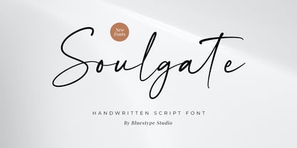 Hello ! This is our newest product font called Soulgate. Soulgate is a handwritten font that is naturally created and looks charming. The font you need is here for your design! This font is suitable for use on branding, social media, business cards, weddings, t-shirt designs, logotype, magazines, quotes, fashion, watermarks, invitations, signatures.
 - Mixed Drinks JNL by Jeff Levine,
$29.00 Mixed Drinks JNL derives its look from a set of gold foil self-adhesive letters made by a company called Cameo for the Schenley distilling company circa the late 1950s or early 1960s. The letters were used to personalize bottles of whiskey for your own bar or to give as a unique gift.
 - Bodoni Classic Swirls by Wiescher Design,
$39.50 Bodoni Classic Swirls breaks all the rules. The idea of Bodoni typefaces is no embellishments and here I go again and do another decorated set of Bodonis. But I find this is another very nice and useful typeface for all kinds of cards and certificates. Enjoy! Yours, again breaking the rules, Gert Wiescher
 - Groovy Boss by Eu Iturria Morante,
$36.00 Groovy Boss is a decorative type, inspired by the playful aesthetics from the 60s and 70s. Groovy and Boss were words used in those decades to refer to something as cool or trendy. Great for titles or short phrases, the curves and psychedelic forms of each letter will contribute to creating amazing compositions.
 - Zapf Renaissance Antiqua by Linotype,
$29.99The Zapf Renaissance Antiqua type family was designed by Hermann Zapf for the German Scangraphic Dr. Böger GmbH in Hamburg, from 1984–1986. The typefaces were engineered for use in digital CRT phototypesetting. This version was based on Scangraphic SH version (For Display use) and not on the SB version (for text use).
