10,000 search results
(0.011 seconds)
- From Where You Are - Personal use only

- From Where You Are by Kimberly Geswein,
$5.00 Created from real hand-painted letters, this font is designed to look like a painted sign.
 - Almost There Script by Zane Studio,
$20.00 Almost There Script is a new and modern new script in handmade calligraphy style, with decorative characters and a dancing baseline! So beautiful on invitations like greeting cards, branding materials, business cards, quotes, posters, and more. Almost There Script is equipped with 500 ligatures. Alternative characters are divided into several OpenType features such as Swashes, Collection Styles, Alternative Styles, Contextual Alternatives. The OpenType features can be accessed by using Open Type savvy programs such as Adobe Illustrator, Adobe InDesign, Adobe Photoshop Corel Draw X version, and Microsoft Word. And this font has provided Unicode PUA (special code font) so all alternative characters can be easily accessed by craftsmen or designers. Almost There Script: Uppercase & Lowercase International Language & Symbols Support Punctuation & Number PUA Unicode Range Stylistics Standard Alternative Stylistics Manage 1-28 Contextual Character Variants. If you don't have a program that supports OpenType features like Adobe Illustrator and CorelDraw X Version, you can access all alternative glyphs using Font Book (Mac) or Character Map (Windows).
 - Boxcar Willie NF by Nick's Fonts,
$10.00Based on a typeface originally called "Seven Flare", this offering has a warm, slightly naive grace and a casual nostalgic charm. In addition, kerning has been applied to all possible letter combinations, so that you can mix the upper and lowercase letters in any combination you please. Both versions of the font include 1252 Latin, 1250 CE (with localization for Romanian and Moldovan). - FS Sally Paneuropean by Fontsmith,
$90.00Bookish A little bit bookish, but quietly elegant and well-proportioned, FS Sally is a graceful font family. It’s a refreshingly uncomplicated design that brings sophistication to text and display type, and a distinctive aplomb to both large and small volumes of text. Hidden talents There’s more to FS Sally than meets the eye. Choose Standard for the Latin alphabet or Pro if you work with Cyrillic and Greek typography. There’s a large range of special features, including elegant small caps and a set of discretionary ligatures to add a traditional flavour to figures and fraction sets. Rhythmic There’s a rhythm and flow to FS Sally – the result of the classic but asymmetric design of its serifed feet and shoulders. The inward curve of the serif at the shoulder and the outward curve at the foot subliminally guide the eye through each letterform, and the flicked feet of the “a”, “d” and “u” add an extra kick of energy to the rhythm. The italic forms have their own flow, too, with a pen-like fluency that retains the formal discipline required for a text type. Regular to heavy FS Sally’s five weights, all with italics, cover every kind of print application. The regular weight is elegant in display and an easy read in longer texts. A subtle step up from the regular is the medium, which was created to deliver a stronger colour and finish in poorer printing conditions. The semibold offers a strong alternative to the regular at smaller sizes, and its intermediate feel suits it to sub-headings, title pages and calmer designs. The bold works excellently in book and title headings, and FS Sally Heavy lends weight and punch to poster headlines and logotypes. - Rally Symbols 2D by 2D Typo,
$24.00 The Rally Symbols 2D font family has been developed for integrated graphical motor racing design. First of all that includes rally, rally raid, cross-country rally and hill climb. With the Rally Symbols 2D - Signs font one can create quality road maps with rally routes and various symbol books. The font also includes symbols that can serve as workpieces to create competition logos and other design solutions. The Rally Symbols 2D - Arrow font has been specially developed for building tulip diagram road books. It includes various ready-made combination of traffic direction indicators and individual elements that can be combined together. The Rally Symbols 2D - Picto font can be used for the same purposes but also contains a range of convention that can help to find one’s bearings on the ground. This is a a wide range of icons or pictograms of various scenery, for example: different buildings, churches, cemetery, bridges, tunnels, different types of trees, posts, etc.
 - Sally Script BH by BluHead Studio,
$25.00Sally Script BH, is based on the handwriting of a BluHead friend. This fun design has a round, open feel which lends itself to conveying warm messages for that personal touch in all your cards, journals, etc. Plus, the character set includes support for many languages, along with some cool ligatures! - Kilroy Was Here - Unknown license

- JLR Lookee Here! - Unknown license

- Monkey Was Here by Intellecta Design,
$22.90 A collection of fonts by the type foundry Intellecta Design. Distressed and antique, use these fonts in display purposes for a stylized type design. Contains a limited amount of letter designs.
 - West Of Here by Gringo,
$20.00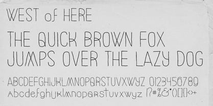
- Lookey Here JNL by Jeff Levine,
$29.00Lookey Here JNL is an "Alphading" - a term coined by Jeffrey N. Levine to describe dingbat fonts containing both images and letters and/or numbers. This one - partially based on the classic "Kilroy" icon from the World War II era is a newer, cleaner reworking of one of Jeff's early freeware fonts. The typeface used inside the images is Casual Lunch JNL, so you can match this text for a particular project. Limited character set. - Wall Street Gothic by BA Graphics,
$45.00A new gothic with the great new look for today. Universal, works for all applications. - Raw Street Wall by TypoGraphicDesign,
$25.00 - Raw Street Wall by Volcano Type,
$25.00 The typeface Raw Street Wall is designed for the Typo Graphic Design font foundry from 2011–2017 by Manuel Viergutz. A playful display type for headlines with a street-art graffiti-style by hand. Rough-look plus state-of-the-art automatic generated OpenType-features (like contextual alternates (calt)). 567 glyphs with extras like emoticons/icons, arrows, dingbats, symbols, geomatric shapes, catchwords and many alternative letters. Multilingual support with 27 languages. Have fun with this font & try the DEMO-FONT (with reduced glyph-set) FOR FREE! Example of use It’s your turn … for example everywhere where it makes sense. Maybe for use in magazines, posters, headlines and advertisement, plus as webfont for decorative headlines. Technical Specifications ■ Font Name: Raw Street Wall ■ Font Weights: Regular + DEMO (with reduced glyph-set) ■ Font Category: Display for headline size ■ Font Format: .otf (OpenType Font for Mac + Win) + .ttf (TrueType Font) ■ Glyph Set: 567 glyphs ■ Language Support: 27: Afrikaans, Albanian, Catalan, Croatian, Czech, Danish, Dutch, English, Estonian, Finnish, French, German, Hungarian, Italian, Latvian, Lithuanian, Maltese, Norwegian, Polish, Portugese, Romanian, Slovak, Slovenian, Spanisch, Swedish, Turkish, Zulu ■ Specials: Extras like emoticons/icons, arrows, dingbats, symbols, geomatric shapes, catchwords and many alternative letters plus OpenType-Features. ■ Design Date: 2011–2017 ■ Type Designer: Manuel Viergutz ■ License: Desktop license, Web license, App license, eBook license, Server license
 - AF Video Wall by ACME Collection,
$44.00 - The Great Wall by Gie Studio,
$9.00 The Great Wall, as the name of this font is created and inspired by a legendary world masterpiece, with a special uniqueness in a style that is very firm but looks elegant, so it is suitable for you to use for a variety of designs that accentuate the professional and charming. Various advantages of this font : This font consists of four (4) very interesting styles, please choose ! With a rather thick but consistent style line, accentuating the firmness and professionalism of the users of this font. This font is complete with Uppercase, Lowercase, Numeral, Punctuation, Multilingual support and ligature letters in each style. Can be applied in various software, such as Ms.office, Photoshop, Coreldraw, Adobe Illustrator, Inkscape and others. There are many purposes that are very suitable to use this font, among others: writing the name of a professional profession, for book covers, fashion branding, watches, jewelry, marketing products, magazines and more. With you using this font for any purpose, I hope your business will be more successful and known to the world as the name of this font. Thank you, I say for your visit and purchase.
 - Wall Sign JNL by Jeff Levine,
$29.00 Wall Sign JNL is a sign painter's chamfered sanserif found in an instructional manual from 1905. A popular lettering style of the day, it features an abridged vertical on the G, a flattened right side on the Q and a truncated horizontal on the 3.
 - Down The Wall by Hanoded,
$15.00 I have no great love for walls, especially when they are built to keep people out. When I started working on this font, I realized it looked a bit like protest graffiti, found on… yes, walls. Down The Wall is a great little font: it is handwritten, messy and in your face. It has no real baseline and glyphs jump all over the place. Use it for book covers, posters, album covers - anything really. It certainly would look good on a wall too! Comes with a whole bunch of diacritics, so whatever you have to say, the world will understand.
 - there goes the neighborhood - Unknown license

- Balls to the Wall - Unknown license

- Off The Wall JNL by Jeff Levine,
$29.00Off the Wall JNL is a unique typeface that combines graffiti-style lettering with a brick wall background. special keystroke features give you a complete "wall of text": { (left bracket) places a smaller closed end cap on the left side of the text. } (right bracket) places a medium closed end cap on the right side of the text. [ (left brace) places a regular closed end cap on the left side of the text. ] (right brace places a regular closed end cap on the right side of the text. | (vertical bar key) adds a space between words. \ (backslash) adds a larger space between words. - KR Home Is Where The Heart Is - Unknown license

- Ps Willy Small But Fine by Fontopia,
$13.99 Willy small but fine is a typeface with a wink. This display font is based on existing piquant form from the immediate vicinity. It is sexy, if you have an eye for. But it also should not be taken too seriously, especially because it has a humorous slant. The font has its origins in an art project. It is now made available for design around festifals, parties, invitations, etc.
 - Just Me Again Down Here - Personal use only

- Just Me Again Down Here - Personal use only

- A Fire Inside The Walls - 100% free

- You Wish You Were a Shirley - Unknown license

- city burn night after night and we spraypaint the walls - Unknown license

- Loppemarked by PizzaDude.dk,
$17.00 Loppemarked is Flea market in danish, and that’s where I got the inspiration to do these fonts from! Headline - chunky serifs here and there, and some are missing! No attempt to get it right…anywhere! Text - The letters are scribbled quickly, leaving not much attention to accuracy. Sans - With this font, there has been some effort to hit the same width of strokes, but it is still off here and there. All in all, the sweet innocence in these letters…I love it! <3</p>
 - CA Segundo by Cape Arcona Type Foundry,
$29.00 The inspiration for this font came from a wall-writing in Cuba. At first glance we thought: "There is something wrong with the wall-writing." But a closer look revealed, that it just mixed up different stroke-styles. That "feature" became the designing principle behind CA Segundo: Round characters like O, U or C are available either with a fat or a thin stroke, whereas other characters with orthogonal lines come in two different styles – uppercase characters emphasize the vertical strokes, while lower cases emphasize the horizontal strokes. This gives you the opportunity to design just while you type.
 - Munky by It's me Simon,
$15.00 Munky, a big bowl full of slab serif goodness. It's got a cheeky, playful look with large, heavy serifs. Its shapes have a few kinks here and there. I would say that adds to its charm—and it does. It's great for headlines and titles but is also very legible in sentence case. It works great for branding and packaging, books, invitations and anything where you want a laid-back vibe—without being too childish. If the font were a celebrity, it would be more John Candy than John Malkovich.
 - Valjean by Solotype,
$19.95Here is a wood type from Tubbs & Co., about 1900. Its lack of decoration reflects the changes that were rapidly occurring in the design of printed pieces at the beginning of the 1900s. There were several similar types in metal in the first decade of the 20th century. - South Central by Loshaj Foundry,
$9.00 "To us it ain't vandalism. It's just letting the people know: We grew up here. This is our neighborhood. And as they pass by they know where we're at." – Los Angeles gang member Graffiti is equivalent to local news, its intended purpose is to inform general populace where gang members are, where they operate, as far as territory lines, and which neighborhoods are at war. Gang Graffiti can be used for: – Marking territory with graffiti. – It's a form of gang advertisement. – Letting people know who's in the gang, living, dead, or in prison. – Which neighborhoods they are at war with. – Who are their allies. Graffiti has along history, specifically Los Angeles gang graffiti, which has has been around since the 1930s. South Central typeface includes uppercase letters, numbers, and select punctuation glyphs.
 - Transmogrified by PintassilgoPrints,
$24.00 Transmogrified started out as a special project for a client. It's a lovely sans serif font, casual, with sweet swirls over here and there. It is based on Transmogrifier , from which uppercase glyphs were selected. Next, new lowercase glyphs were drawn and a bold cut was also developed for added flexibility. Let your messages be transmogrified!
 - Pristine Light by Gerald Gallo,
$20.00 Some words from the foundry: The Pristine Light fonts are clean and crisp, sans serif, uppercase only. They were designed specifically for those applications where uppercase text is appropriate, such as display, headline, logotype, branding, and similar applications. There are numbers, punctuation, accented characters, symbols, and miscellaneous characters. For convenience the uppercase alphabet is repeated under their respective lowercase keys.
 - Sauerkrauto Pro by Martin Lexelius Core,
$33.00 In the late 90’s, there were many German cars coming into Malmö (where I lived at the time). I was blown away by the font on the license plates. So strange, so strong, peculiar – but still macho. I built the uppercase from my own photos. After this I completed the font with my own lowercase, small caps and punctuation.
 - Plain Nouveau JNL by Jeff Levine,
$29.00 The Women's Suffrage Movement gained women the right to vote in 1920. Up until then there were many ways undertaken to rally sympathy for the cause. In 1916 Alice Paul formed the National Woman's Party. That same year a song with the [exhaustive] sixteen word title "She's Good Enough to be Your Baby's Mother (And She's Good Enough to Vote with You)" yielded a hand lettered Art Nouveau sans serif design in the main portion of the title. This became the basis for Plain Nouveau JNL, which is available in both regular and oblique versions.
 - Monmica by Aga Silva,
$59.99 This is my latest release : monmica family - a set of three multilingual, handwritten stylish copperplate calligraphy fonts. The files listed here are containing 1118, 1229 and 2018, glyphs respectively. There are many open type features: fancy swashes, alternates, ligatures, contextual alternates, fractions etc. - all easily available at the click of a mouse. Those fonts allow for creating text in majority of languages where Latin script is used.
 - Lisboa Hebrew by Vanarchiv,
$52.00 Lisboa Hebrew is humanist sans-serif typeface base on the same design as the original Lisboa (2005). The main structure is more close to the Sephardic proportions, where the letterforms contains reverse contrast and the terminals following the same calligraphic approach (Humanist). There are some characters and figures designed as small caps which have the same proportions from Hebrew. Latin transliteration characters were also included.


