10,000 search results
(0.022 seconds)
- Mercedes1937 by scarab13,
$9.00 There is an interesting story about this vintage professional Mercedes typewriter I’ve used to make this font. My grandfather, who was a Yugoslavian partisan during the WWII captured it from a Wehrmacht command building during an attack, and he kept it in a perfect shape for so many years. After I inherited it, I wanted to share it’s uniqueness (as well as it’s story). I’ve intentionally kept it in it’s original condition - I haven’t replaced the ribbon that was some 34 years old (or more) before sampling the font, and it turned out really nice. One more important thing - I have used ONLY it’s original set of characters (Latin with some Balkan-based letters). With it’s untouched originality and uniqueness it fits to our modern culture perfectly. There are no compromises here - there are no popular @,#,$ and other characters you would expect in a font. You will get EXACTLY what’s on this genuine “Mercedes” typewriter with so much soul.
 - Makata by Cuda Wianki,
$29.00 MAKATA is highly modern and trendy. Use it in decorative headlines, logos, posters, covers and wherever you want use a stylish yet geometric letters. As a regular text font we strongly recommend to you our TOTEM. Thanks to alternate characters (each letter has 3 various versions) typing MAKATA is like painting. Words are very decorative and look like fashionable pattern. Of course there is a nice set of ornaments too to meet the needs of even the most demanding design.
 - Toronto Subway by Quadrat,
$35.00 Toronto Subway is based on the lettering originally used for station identification and signs by the Toronto Transit Commission (TTC) in the Toronto, Canada, subway system. The first subway line opened in 1954. However, the original lettering remains unique. The lettering on the original signage consists only of uppercase characters and a few bits of punctuation in two weights: Regular and Bold, introduced in 2004. The Toronto Subway fonts were developed from rubbings of the lettering etched into station walls and photographs of painted signs. The overall style of the lettering is very mechanical, almost naive, yet still having a certain amount of elegance. This style was followed as much as possible in creating the extra lowercase, punctuation and other special characters. The Toronto Subway family was expanded in 2014 with the addition of the Light and Black weights.
 - Pink Shark by Creativemedialab,
$15.00 Introducing Pink Shark, a fun and simple handwriting fonts. Perfect for DIY projects, labels, quotes, greeting cards, posters, wall art, branding, packaging, websites, photos, photography overlays, window art, signs, scrap booking, tags and so more! Pink Shark consists of a Regular and a cute 'Wrap' version and will make your project stand out!
 - HT Trattoria by Dharma Type,
$19.99 HT Trattoria is a lovely brush script with authentic and organic feel.It works best for packaging, magazines, marketing, labels, film and clothing. Holiday Type Project offers retro hand drawing scripts. Inspired by retro script on shopfront lettering, wall paint advertisements in Italy around 1950s. Check out the script fonts from Holiday Type!
 - Ornamental Deco 2D by 2D Typo,
$36.00 This font was inspired by Lviv ArtDeco architecture dominating in 1920s-30s. This collection of ornaments is a graphic representation of building decorative elements, mostly of metal tracery elements and wall bas-relief. This font can be used for a variety of purposes, in graphic design as well as in industrial design.
 - Hometown by Balpirick,
$15.00 Hometown is a Modern Handbrushed Font. Hometown is a bold and fun handwritten font. It’s playfulness make it great for creative projects, be it inspirational wall posters or for communicating your brand. Hometown also multilingual support. Enjoy the font, feel free to comment or feedback, send me PM or email. Thank you!
 - Alien Space by WNGSTD,
$15.00 Alien Space display font is a playful and modern font. Alien space family contains regular and outline fonts. Alien Space is perfectly suited for traditional media and the web. Great for logos, banners, posters, and graphic artists. Its playfulness makes it great for creative projects, inspirational wall poster, or for communicating your brand.
 - Cupid Darling by Reyrey Blue Std,
$12.00 Say hello to Cupid Darling. A sweet and playful display typeface. Cupid Darling is perfect for branding, logos, social media quotes, stickers, posters, vintage designs, wall art and more! This font will make your design looks great and fun! Features : · All Uppercase and Lowercase · Number & Symbol · Supported Languages · Alternates and Ligatures · PUA Encoded
 - Calliform by Lemonthe,
$12.00 Calliform is a modern script calligraphy font with an elegant classical touch, featuring sharp strokes and carefully designed curves. Equipped with 70 decorative alternate characters, it is a suitable choice for various design projects such as logos, branding, greeting cards, wedding designs, printing, advertising, packaging, wall decoration, titles, web design, and more.
 - Bat Liar by Sipanji21,
$16.00 Bat Liar is a spectacular decorative font with a Sharpness style and like a wings of bat for your design look awesome. It will elevate a wide range of design projects to the highest level, be it branding, headings, Movie Tittle, designs, invitations, signatures, logotype, wall art illustration, apparel, labels, and much more!
 - Escrow by Font Bureau,
$40.00 The Wall Street Journal commissioned Escrow. Cyrus Highsmith designed forty-four styles in this new Scotch series, which sets the tone of the front page of the Journal, envy of the newspaper industry. Escrow Banner, drawn by Richard Lipton based on Cyrus Highsmith’s design, is aimed at the very largest headlines or titles.
 - Donkey Sign Graffiti by Sipanji21,
$18.00 Donkey Sign is a spectacular decorative font with a Graffiti style and with a sign decorative inside for your design look awesome. It will elevate a wide range of design projects to the highest level, be it branding, headings, wedding designs, invitations, signatures, logotype, wall art illustration, apparel, labels, and much more.
 - HT Farmacia by Dharma Type,
$19.99 This is a monoline script without descenders. Its tail gives us cute and lovely impression, but it is also methodical and punctual. Holiday Type Project offers retro hand drawing scripts. Inspired by retro script on shopfront lettering, wall paint advertisements in Italy around 1950s. Check out the script fonts from Holiday Type!
 - Italiano Doc by RM&WD,
$35.00 ITALIANO DOC is a fontface inspired by the Italians Futurismo artists in the early of the 1900's. The font is completed with a Grunge Wall version, great Extra Icons and lighted futurist weigth. All the glyphs contained in the font, including OpenType variants that may only be accessible via OpenType-aware applications.
 - Tabloid Edition JNL by Jeff Levine,
$29.00 The headline across the October 7, 1918 edition of the UK’s Daily Mail stated: "Germany Asks the Allies for Peace". Set in extrabold sans serif lettering, it’s now available digitally as Tabloid Edition JNL in both regular and oblique versions. This is another “redrawn from the headlines” typeface from Jeff Levine Fonts.
 - Nouveau LX Stencil by Vanarchiv,
$31.00 The original design came from Berthold Herold typeface, designed by Hermann Hoffmann during 1913 (Art Nouveau style) in Germany. This project started from flyer printed during 1947 with movable type, the specimen was scanned as a source to development some of the uppercase letterforms. However the most unusual and tricky element from this sample is the leg from the uppercase (R) which is different from the original Herold design, until now I didn’t found where this version originally came from. This stencil typeface only contain the bold weight, but there are also available other versions without stencil cuts, like Nouveau LX and Nouveau LX Expanded.
 - Clay Handwriting Pro by SoftMaker,
$7.99 Digitized handwriting fonts are a perfect way to give documents the “very special touch”. Invitations look simply better when handwritten than when printed in bland Arial or Times New Roman. Short handwritten notes look authentic and appealing. There are numerous occasions where handwritten text makes a better impression. Clay Handwriting Pro is a beautiful typeface that mimics true handwriting closely. Use Clay Handwriting Pro to create stunningly beautiful designs easily. This typeface comes with alternative characters for sophisticated typography – all easily accessible as OpenType features. A “random” feature even allows for automated random switching between variations of the same character, resulting in type that looks authentically handwritten.
 - Modesto by Parkinson,
$25.00 Modesto is a loose-knit family based on a signpainters lettering style popular in the late-19th and early-20th centuries. It evolved from the lettering I used for the Ringling Bros. and Barnum & Bailey Circus Logo. The Modesto family was not planned. It just happened, a few fonts at a time over about fifteen years. In 2014 four new Italic fonts were added. There is a downloadable MODESTO USER MANUAL PDF in the Gallery section for this family.
 - Manufactory JNL by Jeff Levine,
$29.00 Manufactory JNL and its oblique counterpart were re-drawn from examples of a now-antique typeface used within many advertisements found throughout the pages of The American Stationer magazine, circa 1879. The term ‘manufactory’ was popular during this era; the word being a more archaic form of ‘factory’. There is a bit of Western flavor to this type design, as the spurred serifs and the top and bottom strokes are heavier than the vertical and mid-point stroke weights.
 - 1479 Caxton Initials by GLC,
$20.00 This family was created inspired from the two sets of rough initials fonts used by the famous William Caxton in Westminster (GB) in the late 1400’s. As it was normal for the time, there were not any differences between I and J, U and V. It is not a mistake. We have reconstructed the few other missing characters. This font was conceived as a supplement for our 1479 Caxton but may be used with all our Blackletters fonts.
 - Argonautica by URW Type Foundry,
$39.99 Argonautica is based on a relict of the future that was left on earth by time-travelling extra-terrestrials. In 1947, an UFO crashed in the New Mexico desert. There were unknown glyphs found on the spaceship which couldn�t be deciphered to date. Based on one of the unknown glyphs, Gabriele Lindemann developed a complete alphabet readable for human beings. Argonautica is particularly suited for colored typography and can be read much better with growing distance.
 - Hunterland by Aminmario Studio,
$20.00 Hunterland is a modern signature font. This font was created to look as close to a natural handwritten as possible by including some alternates lowercase, ligature and underlines. Perfect for any awesome projects that need hand writing taste. Comes with regular and italic. Built in Opentype features, this script comes to life as if you were writing it yourself. Also support multilingual. It's highly recommended to use it in opentype capable software - there are plenty out there nowadays as technology catches up with design ... Other than Photoshop, Illustrator and Indesign, many standard simple programs now come with Opentype capabilities - even the most basic ones such as Apple's Text Edit, Pages, Keynote, iBooks Author, etc. Even Word has found ways to incorporate it. AminMario
 - Retrim by Yumna Type,
$12.00 Be the center of attention through your sophisticated design with the awesome Retrim. It is a display font that portrays cute looks. While it’s easy to read thanks to all-capped characters, there are also distinctive styles or layers for optical effect. Slay your design with Retrim’s best features so you’ll look your best on what ever your design is, all the time. You also get 15 illustrations as special extra that you can use as you wish. Features: Ligatures Multilingual Supports Uppercase and lowercase PUA Encoded Numerals and Punctuation This font would looks great on your branding, logos, social media quotes, stickers, posters, wall art, merchandise, social media, and many more. Get more inspiration about how to use it by seeing the font preview. Thank you for purchasing our fonts. If you have any further questions, don't hesitate to contact us. Happy Designing.
 - Gravesend Sans by Device,
$39.00 Smart, legible and elegant, Gravesend Sans is a based on the unique typeface used for the iconic grass-green signage for the Southern Railway. In existence from 1923 to 1948, when the network was nationalised, the Southern Railway linked London with the Channel ports, South West England, the South coast resorts and Kent. The same design was also used for the ‘hawkeye’ signs on the London, Midland and Scottish Railway, differentiated by black letters on a yellow background. Reference for each letter was taken from vintage ‘target’ station nameplates and other platform signage. The rarest letters were the Q, seen in Queens Road Battersea, the X, seen in East Brixton, and the Z, used in Maze Hill, site of an infamous train crash in 1958. Being hand-made, the letters often differ in width and thickness. There was no lower case. The Bluebell Railway, a heritage steam line, runs over part of the old Southern Railway network and uses a very similar type. The design of the numbers differed considerably, but here have been taken from the Device 112 Hours font Smokebox. As well identifying platforms, they were used on the front of the steam engine’s smokebox, hence the name, and stylistically are more in keeping with the letters than some of the squarer versions that can be seen in old photographs. William Caslon IV is credited with the first Latin sans-serif type, shown in a 1816 Caslon specimen book. ‘Two Lines English Egyptian’, as it was called, was caps-only, and there are several other correlations between that type design and this one. Includes a selection of authentic arrows and manicules, plus abbreviated ligatures such as ‘St.’ (Saint or Street) ‘Rd.’ (Road) and ‘Jn.’ (Junction). The Cameo version includes many graphic banner elements that can be freely combined.
 - Gjallarhorn by Scriptorium,
$18.00Gjallarhorn is based on uncial-style lettering by artist Willy Pogany from his titles for Padraig Colum's classic collection of Scandinavian myths, The Children of Odin. It has various peculiar letter forms, and the font includes two or more different versions of many of the characters. An excellent example of stylized hand lettering by one of the great decorative artists of the Art Nouveau period. - Transdoshan Scratch by Edd's Aurebesh Fontworks,
$5.00 Working on a Star Wars project? This font is in Aurebesh, the main written language of the Star Wars universe. In this case I designed a font that looks like it has been scratched into a wall. All the additional letters from the Aurebesh character set are includes, as well as numbers and symbols.
 - Wild Gang Graffiti by Sipanji21,
$16.00 WIld Gang Graffiti font is a unique display font with a graffiti-like appearance. Use this font for any crafting project, apparel design, logotype, advertising, wall decoration, and pretty much anything that requires a personalized look. Take your designs to the next level with this stunning font! thanks for order and have a nice day
 - Eckhardt Freehand JNL by Jeff Levine,
$29.00Eckhardt Freehand JNL is the fourth font based on the lettering of sign painters and show card writers. Jeff Levine has chosen to name this “mini series” of fonts in honor of his friend Albert Eckhardt, Jr., a talented sign man who ran Allied Signs [in Miami, Florida] from 1959 until his passing in 2005. - Highbrow Cafetorium JNL by Jeff Levine,
$29.00Highbrow Cafetorium JNL is a very "minimalist" font in the sense that there's only the basic lower case characters and essential punctuation. The lettering is based on a neon-and-bulb wall sign for a long-closed cafeteria on Lincoln Road in Miami Beach, Florida. The 'b', 'd', 'k' and 'l' have unusually high verticals. - Street Air by Sipanji21,
$10.00 Street Air is a unique display font with a graffiti-like appearance, with three style font, Regular, outline, and Shadow style. Use this font for any crafting project, apparel design, logotype, advertising, wall decoration, and pretty much anything that requires a personalized look. Take your designs to the next level with this stunning font!
 - Printed Letters JNL by Jeff Levine,
$29.00Printed Letters JNL is from stamped impressions made by a children's sign making set by the Superior Marking Equipment Company of Chicago - circa the 1940's. The set consisted of individually mounted rubber stamps - easy enough for happy kiddies to print signs, name plates or (unfortunately for their parents) on the walls... Limited character set. - Astone Blood by Just Lett,
$18.00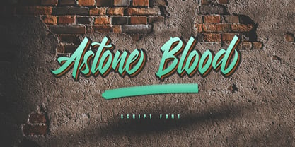 Astone Blood is a script font. It is perfect for graffiti, lettering, typography, calligraphy, posters, logotype, and more. This font is inspired by graffiti fonts on the street walls. Astone Blood has several alternate lowercase characters, and some lowercase ligature characters that make your design unique. Features: ~ UPPERCASE ~ lowercase ~ Numeral and Punctuation ~ Multilingual Support
 - HT Cartoleria by Dharma Type,
$19.99 This font has a lovely roundish shape and gives us cute and relax impression. But because it is upright, it has a well-ordered atmosphere. Holiday Type Project offers retro hand drawing scripts. Inspired by retro script on shopfront lettering, wall paint advertisements in Italy around 1950s. Check out the script fonts from Holiday Type!
 - Karara Shadow by Kufic Studio,
$20.00 Karara Shadow, a complete font set and additional font style of Karara. The word Karara means patience & steady. The style is achieved by practicing and studying the modern techniques to deliver high-end professional font. This specific font had a tint of wall chalking & texture. Carefully engraved and stenciled to delivery clean cuts and design.
 - Bandoleer by MADType,
$24.00 The inspiration for this versatile typeface came from both Art Deco and Military sources. It comes with both a clean geometric and hand drawn version so you don't have to get carpal tunnel sketching it out yourself. This typeface is equally at home stenciled with paint on a wall or used on a music poster.
 - Rough Print JNL by Jeff Levine,
$29.00 The Superior Marking Equipment Company was originally located in Chicago, Illinois and over the years produced a line of both commercial and toy rubber stamp printing sets which were used for making signs, posters, tickets and other printed items. Rough Print JNL reproduces the scanned images printed from one of the toy rubber stamp sets. The sample characters were smaller than one half inch in height and were further reduced during scanning. This gives the end result of a typeface which looks like rubber stamp imprints at small sizes, and very angular, distorted, somewhat grunge type when printed at larger sizes. There is a limited character set consisting of alphabet, numerals, some punctuation and currency symbols. No kerning was added to keep the hand-made appeal. Rough Print JNL is an all caps font with the letters and numbers jogged randomly on both the caps and lower case keystrokes. For a similar design with lower case, Amateur Printer JNL is recommended.
 - Meteora by Andinistas,
$19.95 Meteora is a font designed for headlines by Carlos Fabian Camargo Guerrero. Its purpose is to be useful tool for solving decorative problems in graphic design which require broken letters without ascending and descending strokes. Due to its vertical and horizontal proportions these letters are compact, appealing and special to compose headlines and featured with worn look in covers, magazines, posters and advertising material. The first Meteora sketches were made by hand, photocopying and deforming letters of an old Letraset catalog, specifically from slab serif typefaces from the Nineteenth Century. Hence, uppers cases and lower cases were merged in the same height x, obtaining a narrow width, endings with some serifs and stencil cuts here and there. The amount of low contrast between thick and thin strokes brings strength and consistency with the contours apparently brokens. Thus, developed features slab serif and sans-serif proposing empty and full shapes connoting decomposition and noise; and from a rigorous process of scanning letters I set up damaged letters, but drawn with the greatest possible thoroughness and high definition in 438 glyphs per font. Finally, in regular and bold variables I included opentype features with some discretionary ligatures and a few titling alternates. In Meteora bold all glyphs are framed simulating the effect of letters cut out of paper.
 - Bullish by Gerald Gallo,
$20.00 Bullish is a clean, contemporary, geometric font family. There are 12 fonts in the Bullish family, Light, Medium and Bold. Each with a lower case, small caps, lower case oblique and small caps oblique. The small caps versions have small caps in place of the lower case alphabets. The lower case and small caps versions have the same uppercase alphabet, numbers, punctuation, symbols and miscellaneous characters. The Bullish fonts are ideal for headlines, titles, branding, small blocks of text or wherever a fresh font is desirable.
 - Alt Gotisch by HiH,
$12.00 Alt-Gotisch Verzierte is a typeface of decorative initials that is Victorian in style and bears a close family resemblance to the many ornamental tuscans cut throughout the nineteenth century by British foundries. Instead of the bifurcated terminals of the archetypical tuscan (see Figgins Tuscan by HiH or Stereopticon by Dan X. Solo), these letters display what Nicolete Gray might call a “wedge and bite” design -- as if they started with the wedge serif of a latin form and someone came along and took a perfectly round bite out of the wedge. We need not dwell on the lack of teeth marks. The calligraphic curls and flourishes are often graceful, sometimes a bit contrived, but always complex. There is a busyness that marks the style of the period. If you ever see an old photograph of a well-appointed Victorian parlor, you will recognize that same quality of busyness. Overdone is a word that frequently comes to mind. Alt-Gotisch Verzierte means “adorned or decorated old gothic.” The typeface is attributed by Alexander Nesbitt to an unidentified German foundry of the nineteenth century (Decorative Alphabets and Initials, Dover, New York 1987, plate 92). The designer is unknown. Our font is supplied with a lower case that is similar to the upper case, but is 15% shorter and is simplified by the omission of the decorative vines. For the lower case, alternate letters A, E, & T; and ligatures LE, OT & LY have been supplied. In addition, a few small decorative vines were planted here and there for optional use. An accented upper case is not part of the original design and is not here supplied. This design is also seen under the name “Sentinel” -- as always, it is worthwhile to compare the completeness of the character set and the faithfulness of the rendering. We believe you will agree that we provide a balance of quality and value that is unmatched in the contemporary marketplace. Alt-Gotisch Einfach is a simplified version of Alt-Gotisch Verzierte. The vine-less lower case of the Verzierte font is the upper case in Einfach. For a lower case for Einfach, the letters were further simplified by stripping away the three-dimensional outline, down to the bare bones and bites, as it were. Einfach, in fact, means “simple” or “plain.” It is interesting to note that this bare bones & bite lower case bears (I have a special license to use two homonyms in the same sentence) a striking resemblance to the 15th & 16th century ornamental letters from Westminster Abbey shown in Plate 47 of Alexander Nesbitt’s Decorative Alphabets and Initials (Dover, New York 1987).