10,000 search results
(0.016 seconds)
- Corpulent by Suitcase Type Foundry,
$85.00Corpulent is a display font whose forms are extremely thick, up to the extent of being nearly illegible. In the 1980s, these construction principles were explored to their very limit. So if the lyrics of Eyes Without a Face resonate in your mind, the feet turn numb in super-tight trousers, and you fancy a big hair style, this font is the one for you. - Sky Clipper JNL by Jeff Levine,
$29.00 Sky Clipper JNL is a bold, Art Deco sans serif typeface derived from the hand lettered title on a 1940s-era “Big Little Book” entitled “Flying the Sky Clipper with Winsie Atkins”. The design is available in both regular and oblique versions. “Big Little Books” were published by the Whitman Publishing company and featured short stories printed in a tiny sized book format for young children.
 - Pecking Order by Hanoded,
$15.00 I keep chickens for eggs and meat, but the ones that have names cannot be eaten. ;-) As I was busy working on this font, the chickens were sitting in the window, looking at me and hoping they'd get a treat! Pecking Order is a cartoon and kids font. It comes with a wholesome, homemade goodness and extensive language support, including Sami, Greek and Vietnamese.
 - Linotype American Indian by Linotype,
$29.99German designer Georg Popp designed Linotype American Indian in 2002. This symbol font contains mostly-triangular elements, which were inspired by paintings and other arts practiced by the North American Plains Indians. The symbols in Linotype American Indian, and Popp's other fonts, add a delightful touch to any design, especially when used in repetition. Try setting them large in your next flyer or brochure. - Ad Lib by Image Club,
$29.99Ad Lib designed by Freeman Craw for the American Type Founders (ATF) in 1961. A bold Grotesque with irregular rectangular counters in round characters. This type was designed by cutting the letter images out and thus has some wood-cut character. Some lower case characters have slight inclination. Initially numerous alternative characters were provided. Unusual shapes make this typeface useful for advertising and display work. - Samsara by W Type Foundry,
$15.00 Samsara is a cursive typeface inspired by calligraphy tools. Its shapes and gestures convey an organic-modern style which generates the texture of a brush tip. Samsara not only has a great versatility, but also is suitably to create short texts such as branding and short messages. It comes with OpenType features, stylistic sets, special ligatures, and swashes, which were designed specially to let your imagination fly.
 - Artukge Script by Tebaltipis Studio,
$15.00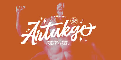 Introducing new latest from TebTipsudio, Artukge Script is a typeface with personality. You can use it as a logo, badge, insignia, packaging, headline, poster, etc The alternative characters in this font were divided into several OpenType features such as Stylistic Alternates, Stylistic Sets, and Ligature. The OpenType features can be accessed by using OpenType program such as Adobe Illustrator, Adobe Photoshop, and Adobe InDesign. Thank you!
 - Amalta by Infonta,
$30.00 Amalta is a Display typeface with calligraphic background. It inherits weight and letter constructions from the original brush lettering. Amalta's Latin and Cyrillic sets were designed simultaneously with an equal attention to details and overall pattern. They both include initial and final swash forms which can be used by a typographer's choice. Amalta is suitable for large sized typesetting: headlines, few-line texts, etc.
 - Quick Meal by Jeff Levine,
$29.00 Quick Meal JNL is a ‘hand lettered’ interpretation of Morris Fuller Benton’s 1905 design “Miehle Extra Condensed Title”, no doubt named for [or on behalf of] the manufacturer of printing and die cutting presses that were used for years within the printing industry. The type face is available in both regular and oblique versions. Quick Meal JNL is a pun on the pronunciation of ‘Miehle’.
 - Sukkergris by Bogstav,
$15.00 Need a catchy headline font with a clear handmade and organic look? Look no further, because Sukkergris is here to do the job! Each letter is handmade and manually cleaned up, but keeping the original quirky curves. I have added 6 different versions of each letter, which automatically cycle as you type. I also added a set of small caps, just because I think they look awesome!
 - Displace 2.0 by Serebryakov,
$35.00 Displace 2.0 is a display sans-serif font family. Displace 2.0 is a humanistic sans-serif based on the calligraphic shapes with a pronounced handwriting contrast and open forms typeface. It has a natural thick-thin swelling and shrinking of the strokes as if it were draw calligraphicaly. Displace font family includes five weights with italics: Light, Regular, Medium, Bold and Black. Try it!
 - Spur Wide JNL by Jeff Levine,
$29.00 Spur Wide JNL was modeled from an example of hand lettering from the antique French alphabet book L'Art du Tracé Rationnel de la Lettre. Heavy Roman style letters with spurs (often referred to as Latin) were most popular with sign painters and show card writers in the early part of the 20th century. Spur Wide JNL is available in both regular and oblique versions.
 - Chronic by PintassilgoPrints,
$24.00 Chronically strong, yet pacific. Chronically bold, yet friendly. This font was at first inspired by a HAP Grieshaber work and soon incorporated elements from pieces by Willem Sandberg, two astonishing artists who lived through two world wars. They had to struggle for freedom and consistently manifested, with words, works and actions, their absolute love of liberty. Both were chronically free. As this font intends to be.
 - Quatsity by Ingrimayne Type,
$5.00 Quatsity is a squarish or boxy serifed font with rounded corners. Quatsity is is suitable for titles or signage and legible enough for small blocks of text. Quatsity-Light was constructed in 1995 by blending two very different faces, a typeface very similar to Kwersity (with low contrast) and one similar to Qwatick (with high contrast). The other seven styles were added in 2020.
 - Prismatiq JNL by Jeff Levine,
$29.00Prismatiq JNL was modeled from lettering found in a French alphabet book from the turn of the last century - the type sample appearing online at an image sharing site. All of the imperfections of hand-lettering were left intact. This is a limited character set comprising A-Z, 1-0, basic punctuation, forward slash and dollar and cents signs, and is best used in large headline applications. - Maelie by Supfonts,
$15.00 Hello dears! This font is a new Calligraphic Script. Here is that: floating baseline, ligatures and multilingual support :) Maelie Script will look beautiful on holiday invitations, wedding invites and stationery, logos, and more. Test it out below to see how it could look for your next project! Includes: Uppercase and lowercase Numbers and punctuation Foreign language support Ligatures Check out my blog: https://www.instagram.com/zloillev pinterest.com/dmitriychirkov7
 - People Talk JNL by Jeff Levine,
$29.00 A title card with cast credits for the 1935 movie “The Whole Town’s Talking” (starring Edward G. Robinson and Jean Arthur) formed the basis for People Talk JNL. The hand lettered names were done in a slightly condensed slab serif – mostly rectangular in shape with rounded corners. A few characters take on their own unique appearance. People Talk JNL is available in both regular and oblique versions.
 - Hacky Sack NF by Nick's Fonts,
$10.00Ross George in his numerous Speedball chapbooks called the pattern for this typeface Stunt Roman. A studious observer may discern that many of the wackier letterforms were tamed to produce the popular font University Roman; however, this version remains unapoligetically true to the original. All versions of this font include the Unicode 1250 Central European character set in addition to the standard Unicode 1252 Latin set. - Peppermill JNL by Jeff Levine,
$29.00 A bold sans serif with occasional rule-breaking vertical serifs on some characters was found within page examples from the book "100 Alphabets Publicitaires" ("100 Advertising Alphabets"). Although a few of those vertical serifs extended above the cap height in the hand lettering, they were made more uniform to keep a consistency in the digital version known as Peppermill JNL. Available in both regular and oblique versions.
 - Vriegbe Script by Tebaltipis Studio,
$15.00 Introducing new latest from TebTipsudio, Vriegbe Script is a typeface with personality. You can use it as a logo, badge, insignia, packaging, headline, poster, etc The alternative characters in this font were divided into several OpenType features such as Stylistic Alternates, Stylistic Sets, and Ligature. The OpenType features can be accessed by using OpenType program such as Adobe Illustrator, Adobe Photoshop, and Adobe InDesign. Thank you!
 - Transaction SRF by Stella Roberts Fonts,
$25.00 Leave it to Ray Larabie to come up with an interesting typeface that looks as if it were printed straight out a store's register. Stella Roberts Fonts presents Transaction SRF, the perfect font for emulating cash register receipts and adding machine tapes. The net profits from my font sales help defer medical expenses for my siblings, who both suffer with Cystic Fibrosis and diabetes. Thank you.
 - General Chang JNL by Jeff Levine,
$29.00General Chang JNL is one of a number of fonts redrawn by Jeff Levine from the creative output of the late Alf R. Becker. Becker's alphabets were a monthly feature of Signs of the Times Magazine from the 1930s through the 1950s. Thanks to Tod Swormstedt of ST Media (who also is the curator of the American Sign Museum in Cincinnati, Ohio) for the resource material. - XXII Totenkult by Doubletwo Studios,
$21.99 The “XXII Totenkult” is inspired by the classical letterforms of old roman/renaissance typefaces and an ode to the decay. This is an allCapitals-font and the lowercase glyphs contain a variation of the uppercase. With activated “calt”-feature every second lowercase will be replaced by an alternate, this will give the font a more natural look. Detailed information here: XXII Totenkult on Behance.
 - Digital Sans Now by Elsner+Flake,
$59.00 Digital Sans Now combines and completes the many diverse requests and requirements by users of the past years. By now, 36 versions for over 70 Latin and Cyrillic languages have become available, including Small Caps. Digital Sans Now is also available as a webfont and reflects, with its simplified and geometric construction and its consciously maintained poster-like forms as well as with its ornamental character, the spirit of the decorative serif-less headline typefaces of the 1970s. The basic severity of other grotesque typefaces is here repressed by means of targeted rounds. Exactly these formal breaks allow the impression that it could be used in a variety of visual applications. Short texts, headlines and logos of all descriptions are its domain. It is because of this versatility that the typeface has become a desirable stylistic element, especially in such design provinces as technology, games and sports, and that, for many years now, it appears to be timeless. Additional weights designed on the basis of the original, from Thin to Ultra, the Italics, Small Caps and alternative characters allow for differentiated “looks and feels”, and, with deliberate usage, give the “Digital Sans Now” expanded possibilities for expression. The basis for the design of Digital Sans Now is a headline typeface created in 1973 by Marty Goldstein and the Digital Sans family which has been available from Elsner+Flake since the mid-1990s under a license agreement. The four weights designed by Marty Goldstein, Thin, Plain, Heavy and Fat, were originally sold by the American company Visual Graphics Corporation (VGC) under the name of “Sol”. Similarly, the company Fotostar International offered film fonts for 2” phototypesetting machines, these however under the name “Sun”. The first digital adaptation had already been ordered in the mid 1970s in Germany by Walter Brendel for the phototypesetting system Unitype used by the TypeShop Group, in three widths and under the name “Digital Part of the Serial Collection.” Based on the versions by VGC, Thin, Plain, Heavy and Fat, new versions were then created with appropriate stroke and width adaptations for data sets for the fonts Light, Medium and Bold as well as for the corresponding italics
 - Sign Panels JNL by Jeff Levine,
$29.00Alf R. Becker was a noted sign painter, designer and the creator of hundreds of unique alphabets which were published in the trade magazine Signs of the Times during the 1930s through the 1950s. Thanks to Tod Swormstedt of ST Media [and who is also the curator of the American Sign Museum in Cincinnati], Jeff Levine received some reference material on Becker's work. Becker displayed many of his type styles within decorative panels—a popular trend in the days when signs were hand-lettered. Using the reference material as a guide, Jeff has re-drawn twenty-six sign panels for adaptation to digital print work. While the designs in themselves are not thoroughly unique to Alf Becker, he has left behind some tangible examples of how sign painters embellished their lettering work. With the use of complementary colors and tones, these panels—joined with vintage lettering - classically recreate the warm and attractive advertising of years ago. - Robert Moore by Harvester Type,
$15.00 Robert Moore is a font that was specially designed for comics. A lot of work has been done. At first, glyphs were drawn manually using different markers, then they were transferred to the font. The font was tested on real printing and digital comics. The world of fonts for comics is big and I wanted to create even more variability for authors with one family, which is why a variable version was created containing two axes: weight and italics. This gives you more options. A large number of glyphs, multilingualism, ligatures, and a capital give even more scope for work and creativity. The name was created from the names of the authors of the comics Robert Kirkman and Alana Moore, so the Robert Moore font turned out. Although the font was made for comics, it is not limited to them. Posters, logos, covers, text, headings, prints, product design, web, interfaces are not all options for using the font.
 - Arial Nova by Monotype,
$45.99The Arial® Nova family takes Arial back to its roots. Character spacing has been adjusted and a number of subtle modifications were made to the design to return the shapes and proportions to those of the original 1982 design created for IBM's then new high-speed laser printers. Although these first Arial fonts, called "Sonora Sans" by IBM, were low-resolution bitmaps, it was apparent that the design could also be an important high-resolution digital typeface, and Arial was redrawn for Monotype's imagesetters in the late 1980s. In the process Arial evolved from its original design loosing some of its earlier personality. The restored Arial Nova family is made up of three weights of roman design of standard proportions and three weights of condensed - all with complementary italic designs. The Arial Nova family is also compatible with the fonts that Microsoft® provides in the Windows® 10 operating system. - Cowboya Tuscan by deFharo,
$15.00 Cowboya is a typography with concave Tuscan serif very contrasted and modernist inspiration with letters in small caps, includes 4 versions of the font that can be used by superimposed layers which results in multicolored typographic titles. For the design of this typeface I was inspired by the credit titles used in the black film directed by Frizt Lang in 1950 called "The House of the River", to the drawing of the original forms of the letters i added decorative elements to give the fonts a festive character, traditionally this type of decorative fonts that emerged in Italy in the nineteenth century were used in large headlines and posters that were closely related to circus shows, carnival or environments of the Far West American. I have also rounded the sharper joints of the antlers and counterforms to create a contrast with the sharp Tuscan serifs which brings a modern background of retro inspiration and soft shapes.
 - Rostrum by Canada Type,
$24.95The Rostrum fonts are a revival and expansion of a type called Oleander, designed in 1938 by Julius Kirn for the Genzsch & Heyse foundry in Hamburg. Many of the original uppercase letters had some blackletter remnants tacked onto them, so in this digital version they were relegated to the Rostrum Two font, while more contemporary forms were designed for the Rostrum One font. Characters from both fonts are interchangeable via software programs' font menus and glyph palettes in the Postscript and True Type versions, while the OpenType version takes advantage of the Ligatures, Contextual Alternates and Stylistic Alternates features to perform character substitutions. Rostrum finds the middle ground between italic and brush script, which makes it quite usable in all-caps settings. Its majuscules have a very distinct curl that makes the typeface effect-ready and very appealing in packaging design. Plenty of alternates and ligatures are sprinkled throughout the character set. - Brophy Script by Monotype,
$29.99Brophy Script is a bold connecting brush alphabet. This brush script typeface was designed in 1953 by the American type designer Harold Broderson. Broderson worked for ATF (the American Type Founders), who were the original publishers of this design. Brophy Script is a version with more handwritten letters than to its other version called Body. This a brush script face that mimics the show card style of lettering, which was very popular throughout the United States during the first half of the 20th Century. The letters appear as if they were drawn quickly and spontaneously with a wide, flat lettering brush. The lowercase letters connect to each other, cursive script style. Brophy Script is the perfect display face to provoke a nostalgic feeling for the 1950s. Anything having to do with apple pie, home cooking, or last minute sales would look great in this face. You could outfit a whole supermarket signage system in a snap with Brophy Script. - Hand Printing Press by Fontscafe,
$39.00 Hand printing typography revolutionized the way books were published. The earliest printing presses made it possible for newspapers to reach the doorstep every morning, for information to freely be shared among the masses for the first time on a large scale…and the fonts that were used in those classic times are forever embedded within the collective memories of societies across the planet. It is to this collective memory that we give a visual form with our new Hand Printing Press Pack. Up for grabs are a set of 10 Hand Printing fonts plus one "Stamps" elements font. The fonts are: the Normal, the Stencil, the Eroded, the Meshed and the Scraped in REGULAR and BOLD versions; each of them displaying a simplistic yet classic printing style and as often happens lately, we are also offering you an "elements" pack, the "Stamps" font, to go with these to create your customized stamp giving to your creations a touch of "official documentation".
 - Epoque Seria by Rafaeiro Typeiro,
$24.00 Époque Seria is that kind of person who looks really cute when angry. This font was derived from the Époque family. She is the little sister to Époque - a little shorter with her smaller x-height and — how do you say it in the typographic circle — your eyes are also smaller (and you know you squint when things get serious, isn't it?). The genealogy of these font face is undeniable, but Époque Seria has a ‘personality’ very different from her older sister. The reduction of the x-height also shakes somewhat with the cap that had crossbar. To accompany the package of standardization, the letters that don't have their straight axes were changed, which brought to the set more Cs and Gs contemporaries. In addition, other measures were taken as a greater softness in the variation of the weights and the abandonment of the black weight, being considered too heavy for this version.
 - PF Eef by Parachute,
$35.00 First conceived as the upper-and lowercase “e” for the logotype of independent publishers Elemental Editions, the letterforms were so well received that they were extended to an entire typeface and formed the basis for a bespoke font – Eef. The type design draws inspiration from the basic elements, the periodic table, functionalist vintage lettering and influences from other classic geometric typefaces with condensed cuts such as Futura and Trade Gothic. The extended set is now developed into a family consisting of three weights – Regular, Medium and Bold. While developing Eef it has been crucial to maintain the integrity of the geometrical shape in each glyph as much as possible, but also add subtle optical adjustments to make the forms more balanced and harmonic. Due to its detailed balance of simplicity, aesthetics and playfulness Eef works perfectly well in a corporate context as it does in editorial use or poster design. Eef feels most comfortable with text ranging from display to medium size.
 - F2F Czykago by Linotype,
$29.99The Face2Face (F2F) series was inspired by the techno sound of the mid-1990s, personal computers and new font creation software. For years, Alexander Branczyk and his friends formed a unique type design collective, which churned out a substantial amount of fresh, new fonts, none of which complied with the traditional rules of typography. Many of these typefaces were used to create layouts for the leading German techno magazine of the 1990s, Frontpage. Branczyk and his fellows would even set in type at 6 points, in order to make it nearly unreadable. It was a pleasure for the kids to read and decrypt these messages! The three fonts in the F2F Czykago family, F2F Czykago Light, F2F Czykago Semi Serif, and F2F Czykago Trans, were all inspired by the Apple system font Chicago. The F2F Czykago family, along with 38 other Face2Face fonts, is included in the TakeType 5 collection from Linotype. Branczyk designed 16 of these himself." - Nikola by Untype,
$29.00 Nikola is a text typeface that offers a wide range of possibilities. While its regular and medium weights were specially optimized for maximum performance, balanced for excellent legibility and carefully crafted to spread a scent of tradition on long text settings; its extreme weights, on the other hand, were designed with a more display use in mind, and thanks to the flexibility place at disposal by its many alternates, swashes, decorative cartouches, borders and ornaments, can deliver a vintage, reliable, dynamic, fancy and even playful inflection to the text. Nikola includes a large set of over 1400 glyphs, support for more than 200 latin script languages and 1.21 gigawatts of the finest type design generated by classic proportions, the elegance and formality of the early XX century and a glimpse of expressionism on terminals and serifs. Nikola was named after Nikola Tesla as a tribute to the pioneers of the electric age.
 - Surf Bum by Jeff Levine,
$29.00 The term “Surf Bum” was a slang phrase used to casually describe anyone who spent as much of their time as possible at the beach catching waves in the 1960s. The Revell Company was a well-established maker of plastic model kits such as military airplanes, monsters from Universal horror films and other such items when it hooked up with custom car designer Ed “Big Daddy” Roth to develop a model kit line capitalizing on the surfing fad that was sweeping the West Coast at the time. A number of crazy-looking hot rods, dune buggies and what-have-you were turned out, and one such kit (“Surfite”, with Figure) featured a futuristic one-person dune buggy. It was on the box for the model that the words “with Figure” appear in a casual, brush design type face. Those few letters were the inspiration for creating a new retro type face entitled Surf Bum JNL, which is available in both regular and oblique versions.
 - Ongunkan Adinkra Script by Runic World Tamgacı,
$80.00 The Adinkra alphabet is a way to write some of the languages spoken in Ghana and Ivory Coast, such as Akan, Dagbani, Ewe and Ga. It is a simplified version of the Adinkra symbols, and was introduced in 2015 by Charles M. Korankye, who has written a number of books about it. According to tradition, the Adinkra symbols were created by Nana Kwadwo Agyemang Adinkra, the King Gyaman people in the Ashanti region of Ghana from 1810 to 1820. Or they were created by Gyaman people, and the king liked them so much that he wore them on his clothes and named that after himself. The Adinkra symbols are used as decoration, logos, arts, sculpture, pottery and so on. The symbols represent sayings, proverbs or concepts, such as wisdom, authority, strength, unity, love adaptability, wealth, peace, war or agreement. Since Unicode codes have not been assigned yet, it is designed on a latin-based font. Please contact me if you want changes to the keyboard layout.
 - Softrobo Pro by Koval TF,
$15.00 Softrobo Pro is the further development of Softrobo font provided by Koval Type Foundry in 2008. Provided in 3 most popular formats: OpenType PS, TrueType and Type1. Fine-built, straight but not official, with soft corners is suitable for short texts, placards and advertising. It was inspired by the 1970s when people were mad about robots, space and so on. I decided to create a font as if it were a progressive font of the 1970s. This font supports the Latin-based languages: Albanian, Basque, Bielorussian (Latin), Breton, Catalonian, Chamorro, Croatian, Czech, Danish, Dutch (with Flemish), English, Estonian & Setu, Faroese, Finnish, French, Frisian, Gaelic (Irish), Galician, German (incl. eszett), Hungarian, Icelandic, Indonesian, Italian, Latvian, Lithuanian, Maori, Norwegian, Occitan, Portuguese, Rhaeto-Romance, Romanian, Saami (Lule & South), Slovak, Slovene, Sorbian Lower, Sorbian Upper, Spanish, Swedish, Tswana, and Turkish. It also supports the Cyrillic-based languages: Belorussian, Bulgarian, Crimian Tatar (Cyrillic), Karachay-Balkar, Kumyk, Macedonian, Russian, Serbian, and Ukrainian, Also included: ligatures, superior & inferior numbers set.
 - Basic Commercial by Linotype,
$57.99 Basic Commercial is a family of fonts based on historical designs from the hot metal type era. First appearing around 1900, these designs were created by type designers whose names have not been recorded, but whose skills cannot be overlooked. These typefaces were popular among groups and movements as diverse as the Bauhaus, Dadaism, and the masters of Swiss/International-Style typography. They influenced a variety of later grotesque fonts, such as Helvetica and Univers. Basic Commercial was distributed for many years in the United States under the name Standard Series. The typeface worked its way into many aspects of daily life and culture; for instance, it became the face chosen for use in the New York City subway system’s signage. The Basic Commercial family members have a clear and objective design. Their forms exhibit almost nothing unusual, but remain both lively and legible nonetheless. Perhaps for this reason, Basic Commercial’s design has been popular with graphic designers for decades.
 - Solar by Andinistas,
$34.00 Solar is a font family designed by Carlos Fabian Carmargo G. Its members, together or separate, can be used in packaging, posters, cards, invitations and logos that need expressive letters with craft features. First, a set of arbitrary ideas were designed on rough paper, and through changes five styles resulted to mix and compose bright words and phrases. Solar Script comes from crossbreeding and the collusion of primitive visceral strokes and calligraphy on textured paper. This way its letters were planned for empty and full areas deteriorated sometimes simulating irregular ink clots. Therefore, the simulate trajectories with bold brushstrokes made that it works especially well in sizes larger than 12 points. Its rhythmic vitality and energy give personality, reflected in uninterrupted rapid and logical talics with strokes. Solar Words has more than 115 words unstable and inclined. Solar Dingbats has more than 100 brightness generating drawings, Solar Sans and Serif are capitals combined with other members of the family.