10,000 search results
(0.045 seconds)
- Ongunkan Cypriot Linear C Sylla by Runic World Tamgacı,
$100.00 This font is an adaptation of the cyprus syllabic script to a Latin-based font. I tried to assign as many correct letters as possible, but there were too many characters so I had to fit them. Please review the alphabet table of Cypriot syllabic to use the Font. To see all the characters, you can see all the characters and add them to the text by selecting this font from the add character section on the word page. Cypriot syllabary The Cypriot syllabary was used in Cyprus from about 1500 and 300 BC and is thought to have developed from the Linear A. The earliest known inscriptions from between 1500 and 1200 BC are in an unknown language called 'Eteo-Cypriot', or 'True Cypriot', and the script in which they are written is called Cypro-Minoan. From around 1200 BC Cyprus began to be colonised by Mycenaean, Minoan and possibly Cretan Greek settlers, and they probably adapted the existing script to write their own language - the oldest known inscription in Greek dates from the 11th century BC. Cypriot Greek had much in common with Greek dialects of Arcadia and Pamphylia, which corresponds to the province of Antalya in Turkey.
 - MVB Sirenne by MVB,
$39.00A rare natural history book from the early 18th century served as inspiration for the MVB Sirenne typefaces. The artisan who engraved the book—likely a map engraver—had a distinctive style of lettering that was used on the descriptive captions for the many tropical fishes depicted in the book. The plates used to print the illustrations would have been copper, the letterforms hand-engraved. The designers at MVB Fonts found the distinctive quirks of the roman letterforms and the eccentric stress of the italic interesting enough to embark on developing digital fonts based on the engraved samples. As the captions were hand-lettered, there was a great degree of variation, making a direct “revival” impossible, so Alan Dague-Greene interpreted the characteristics of the letterforms into a workable typeface design. The challenge was to retain a rustic quirkiness to the forms, yet have a typeface that was useful for more than display. The solution was to make optical sizes. The “Six” faces are full of character, but strong and open for clarity at small sizes. The design of the “Text” faces is more subtle, so that they can be used for passages of text, but retain the feel of their model. MVB Sirenne “Eighteen” and “Seventy Two” are intended for display use. - Helios Antique by W Type Foundry,
$25.00 Helios Antique & Helios Stencil Check our PDF specimen for more details Helios type family is the result of a mixture between the early sans serif and the modern trends of our era. Its rational structure is subtly wider than the majority of the first sans, generating a higher impact in its uses. All the typeface terminals are more open in order to balance better the whites and blacks of Helios, and where the strokes meet it has a deeper contrast giving more legibility to the reader. Furthermore, in some letters it is possible to see some prominent features such as the leg of the "R" and the tail of the "Q", which are particular gestures that identify this type family. Helios Stencil is the tough version of this type family. All the stencil gaps were measured rigorously, thus in small sizes it conveys a neutral aesthetic whereas in big sizes a display logic appears. Helios Antique is composed by 36 styles, 782 glyphs and small caps. Besides, it has powerful OpenType features for each style, including alternates characters, ligatures, fractions, special numbers, arrows, extended language support and many more.
 - Vtg Stencil France No1 by astype,
$40.00 The Vtg Stencil fonts from astype are based on real world stencils from several countries. In the case of French stencils the challenge was special, because of the varieties of different widths and weights between the stencil sets – so I made France No. 1, No. 3 and No. 5. The most unique and eye-catching elements of typical French stencils are the figures 1, 2, 3, 7 and a specially 5. The figure 5 changes in style on smaller stencil sizes, its bobble getting replaced by something like a “breve”. The letters J and Q can differ in style too. While the local stencil lettering styles are gradually disappearing in other countries, there are regions in France, such as Normandy and Brittany, where these stencils are still in use today. They are used for technical lettering, which is what stencils were originally intended for, but also for ads and information signs in a more artistic or patriotic context. Over the time, these stencil letters became a globally recognized landmark of French design and French taste. All styles offering an extended Latin character set. » pdf specimen «
 - Zulia Pro by Sudtipos,
$59.00 Zulia is located in the west of Venezuela and it is the state in where Joluvian grew up. It is a region of sunshine, high temperatures, oil and cheerful people, although we choose the name to honor his mother who is from there (zuliana) and who is proud of her land and everything that it represents the area. Zulia is also his first typographic project. It is based on two of his favourite calligraphic styles: italic and brush pen. He started with simple and contrasted strokes on paper with brush and marker. After that he developed the full alphabet and its various options for each letter, starting from a set of handmade forms that could be connected in different ways according to the user needs. What motivates him to involve this style was to create a differentiation with his daily work by generating a heavier type, contrasted and low rise. Zulia finally got life of its own with the participation of Alejandro Paul and a feedback of techniques and skills that were generated with the duo work. Zulia is not just a typeface, Zulia is his love of letters.
 - Marker Makers by Colllab Studio,
$19.00 "Hi there, thank you for passing by. Colllab Studio is here. We crafted best collection of typefaces in a variety of styles to keep you covered for any project that comes your way! Making your brand visible, interesting and recognizable without having to get in the way of your customer’s experience is hard. It takes a lot of time, money and effort to make a clear brand. And maintaining it through all your customer touchpoints is even harder. Introducing, Marker Makers is a versatile marker font that takes inspiration from the boldness of graffiti and the playfulness of primary colors. It's a joy to use for any design project where you want your audience to pay attention, this is your go-to font and take your next project from good to WOW! Marker Makers comes with more than 400 glyphs, including punctuation, numbers and upper and lower-case letters you’ll have all the tools you need to create invigoratingly unique content. Whether it’s included on posters at trade shows or on the walls of any room in your office, no one will ever think it was boring! A Million Thanks Colllab Studio www.colllabstudio.com
 - One-Eighty - Unknown license

- Eerie House by Seemly Fonts,
$12.00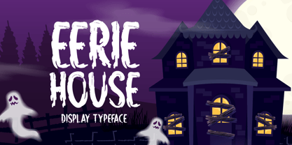 Eerie House is a creepy and dark-looking display font. It is perfectly suitable for any Halloween-related project or crafty idea! The only limit is your imagination.
 - Willow Pumpkin by Seemly Fonts,
$14.00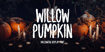 Willow Pumpkin is a creepy and dark-looking display font. It is perfectly suitable for any Halloween-related project or crafty idea! The only limit is your imagination.
 - Weekend Tabloid JNL by Jeff Levine,
$29.00Weekend Tabloid JNL is a classic sans serif wood type design that found its way into the setting of newspaper headlines during the pre-electronic age of publishing. - TB Valentine by TrueBlue,
$14.00This is a series of elegant ormnaments created for Valentine's day. Each ornament is designed with care to ensure that it can be used at the largest sizes. - Gore Girl by Remedy667,
$18.00 Are you ready for a scream? Gore Girl is your one-stop font for all the horror your heart desires. Inspired by teenage horror novels from the 90s, Gore Girl will keep you on the edge of your seat. Unleash your creativity and give your designs an unforgettable look with Gore Girl! Our Doubles Elimination feature is great for vintage posters, t-shirts, logos, and more - with menacing letterforms and spooky numbers that are sure to make a statement. Get ready to bring some horror to your designs - Gore Girl is here! Give your projects the splatter of life your fans love. Step into the darkness and show off your love for horror with Gore Girl today!
 - Bozon by ROHH,
$39.00 Bozon™ is a modern, minimalist geometric grotesk typeface. Letter shapes are crafted with the highest care for proportions and legibility. This clean, sharp sans serif is a great choice for all kinds of modern projects including branding, logo design and display use. Bozon™ family consists of 10 weights with corresponding italic styles, that give total of 20 styles. Italic styles were hand drawn to get sharp and fine letter shapes. The family has extended language support, as well as broad number of OpenType features, such as small caps, case sensitive forms, ligatures, stylistic sets, contextual alternates, lining, oldstyle, tabular, circled and small cap figures, slashed zero, fractions, superscript and subscript, ordinals, currencies and symbols.
 - Juicy by Positype,
$22.00 Juicy is different… in a good way. An art deco-inspired, high-contrast, upright semi-script, layered typeface best describes the playful letterforms that make up Juicy Pro (semi-connected) and Juicy Simple (unconnected). Great care has been taken to provide a wide complement of options and intelligent letter combinations thanks to OpenType. And that’s right, Juicy *is* a layered semi-script typeface. Pro and Simple variants provide a full character set (yep, lowercase). Pro variants include a wide variety of Stylistic, Swash, and Titling Alternates to really allow the expressiveness of the typeface shine… and all characters are available in the layered font counterparts… no shortcuts were taken on the delivery of this typographic chimera.
 - Skiltmaler by Imagi Type,
$15.00 Skiltmaler is the typeface that refers to the style of decorative arts during the Victorian era 1837 to 1901, the Victorian era was the period in which fly poster typography emerged. The large amount of colour in combination with large font sizes were created from movable metal type. As well as being made from wood, this was used to create the two-coloured typefaces. You would imagine this would be specific to the '3D' styled type seen on the poster to create the drop shadow. Skiltmaler works well with normal size text, but it works even better for large displays, short words, or even just to incorporate a few or single characters in a design.
 - Auster by Resistenza,
$39.00 Auster, A Sans with Flair! Auster packs sensational personality in its fine-tuned forms. Confident and quirky, yet comfortable to read, this distinctive san serif family stands out from the crowd. The curves cinch and strokes flair in unconventional places making Auster an unashamed rebel sure to turn heads. Originally designed during the TipoBrda Workshop in Slovenia. Resistenza spent 3 years developing this 2 style (roman & Italic), 20 weight family. The subtle reverse contrast characters were first painted with a flat brush, then polished in pencil on tracing paper before being carefully digitized, to include language support and all the opentype features you expect in a quality contemporary font. More About Opentype Features: https://bit.ly/opentype-rsz
 - VLNL Wood Burger by VetteLetters,
$35.00 We all love a good burger here at Vette Letters. We also love to prepare them ourselves. Grilling the patties, cutting the tomatoes and cucumber, nothing beats a home made hamburger. And the best and tastiest way to grill a burger is on a wood charcoal grill. So all in all we can safely say that burgers and wood are a pretty darn good combination. This made Donald Roos decide to design VLNL Woodburger, obviously based on 19th century American wood type alphabets. Donald decided to add cyrillic characters, as he strongly believed that Russians would be equally partial to home made burgers. VLNL Woodburger is not really polished font, it will give any design a rough sturdy edge.
 - Aldo New Roman by Indian Summer Studio,
$45.00 Aldo New Roman (1000+ glyphs, incl. medieval Latin, Cyrillic, some Greek, ornaments, small capitals, nut fractions...) Renaissance antiqua · Venetian types · Venetian serif · Humanist serif · Old style antiqua A modern version of the typeface cut by Francesco Griffo for Venetian printer Aldus Manutius around 1490 AD. Intentionally not the original Griffo / Aldus / Bembo — but the part of the large project on revival and further development (by drawing many additional glyphs, sometimes over 1000) of the 20th century's typewriters’ fonts. Triple pun here :: :: #1 Aldine Roman type; #2 Since it is equalized, modernized version — the parallel to the Times New Roman; #3 He called himself Aldus Pius Manutius Romanus — he was a new Roman during his Renaissance times.
 - ITC Orbon by ITC,
$29.99ITC Orbon font is the work of New York designer James Montalbano, inspired in part by a demo of black letter calligraphy in which letters were created out of only four or five basic strokes. I combined that idea with the notion of taking historical forms like German gothic blackletter and progressively paring them down to achieve a futuristic version, as if this old form naturally evolved over several hundred years to arrive at its post-modern incarnation." Text should be set in point sizes of 20 and higher for optimal legibility. ITC Orbon is a highly condensed font with unique, oblong shapes which are ideal for a number of display applications." - 3D Fantablock Beveled by Okaycat,
$24.50Fantablock is a bold, high impact text. The edges are beveled to create the illusion of 3D raised text. The bevel effect makes it easy to create an embossed or engraved look. Punchy outlines make Fantablock perfect for headlines, or any project you want to be really eye catching. It is intended for larger sizes, but with care can be set small too. To make it extra fun, a handful of the largely useless alternates, (like that dumb “currency” symbol) were replaced with big blocky hearts, stars, arrows, and even a crown. Check it out! Fantablock is extended, containing the full West European diacritics & a full set of ligatures, making it suitable for multilingual environments & publications. - Omerta by Anomali Creative,
$15.00 Omerta Blackletter Font Blackletter fonts have letters that are very bold and ornate. It is a Western calligraphy style that was used in Europe from 1100s to the 1600s. Blackletter is also known as Old English or Gothic script. During the 20th century, blackletter type styles were adopted by new audiences and came to be associated with punk, street art, and heavy metal. Omerta Blackletter Font Specifically developed to be suitable for perfect for tattoos clothing, labels and packaging, branding, or any Gothic-themed projects. Omerta Blackletter Font are great for Classic Calligraphic type projects and convey a sense of what’s to come. This font can be used with all software that can read standard fonts.
 - Systopie by Sardiez,
$20.00 Systopie is inspired by stories where fears about dehumanized futures are shown.
 - 1543 Humane Jenson by GLC,
$38.00 In 1543 the well-known “De humani corporis fabrica” treatise on anatomy by André Vesale, was printed by Johann Oporinus in Basel (Switzerland). Various typefaces were used for this work, mostly in Latin but including Greek characters. Its Jenson-type font was the one which inspired this font. It is a very elegant one, including the “long s”, a few abbreviation forms and ligatures. As it was a Latin text, there were no accented characters and a few capitals were absent. I had to reconstruct them. A render sheet, in the font file, makes all characters easy to identify on the keyboard. This font may be used as a “modern” one for web-site titles, posters and flier designs, publishing ancient texts... and anything else you want! One of the most elegant types ever cut, it stands up very well to enlargement, remaining as readable as in its original small size.
 - Qiduwy by Twinletter,
$15.00 Qiduwy is a futuristic and stylish font perfect for designing labels, retro, stamps, badges, Oktoberfest posters, packaging, titles, beer, logos, barbershops, whiskeys, tattoos, music, movies, or certificates. This font is perfect for a dark and mysterious look. Bold black lines make this font perfect for a classy and stylish look. The wide, bold typeface gives this font an upscale look. Sharp corners and edges add a touch of class. This is the perfect font for a dark and mysterious look.
 - Whatzis JNL by Jeff Levine,
$29.00Whatzis JNL is a collection of over 85 decorative question marks gathered from the Jeff Levine font collection and assembled into one convenient file for use in specialty projects where ad copy is based on questions or curiosity. No need to search through dozens of fonts for your background images, as they're all here. Ads such as "Have a question about your insurance?," "What's New at Harper, Jones and Harper?" or "Ask Us! - We are the Experts!"... or signs saying "May We Help You?" benefit from some well placed display question marks - especially when printed in contrasting colors or screened-back in halftones. - Rustic TC by Tom Chalky,
$19.00 Proudly introducing Volume Rustic, where hand-craftsmanship meets professional design. Each of these meticulously handcrafted fonts were thoughtfully designed to harmoniously complement one another, oozing the essence of authenticity, warmth, and the human touch. These fonts are tailor-made for projects that celebrate the organic, the handmade, the local, and everything that puts people at the center. Compatible & Multilingual The fonts are in the OpenType font format. OpenType fonts are accepted within the vast majority of design software (including mobile and tablet design apps). Multilingual support is also included for Basic Latin, Western European, Euro & Pan African Latin.
 - Tervia by Imagi Type,
$15.00 The Tervia Family Font is an oldstyle handmade typeface inspired by sign painting art. This font family consists of 4 layer-based fonts and 1 dingbats which very ideal as display font. It will help you create outstanding design for posters, logos, cards, labels and more design project that need creativity. Just play with the stylistic alternates using common Open-Type Features supported software and application and get the classic, fun, cool yet natural feel. Tervia Family font also includes extended characters for multilingual support. Here a link where you can see the alternate characters : https://goo.gl/ApLtuV
 - Authority by RetroSupply Co.,
$19.00 Inspired by public fonts in New York in the 1970s. Authority pays tribute to the almost unnoticed but powerful effect type have on our lives. From waiting on a cold morning to catch the 307 to Morton West High School, to the rain and snow worn stencil on a postal box. Public typography is a part of the little spaces in your lives where life actually happens. Government designed fonts were chosen to communicate authority and help grease the gears of the day-to-day grind. Authority beckons back to these days with it's mildly condensed feel, squared corners and weight presence.
 - Softie by Tail Spin Studio,
$20.00This typeface was designed to be used as the page heading font for MyFonts. Originally only the letters needed to make up the required phrases were drawn. Then amazingly enough, people started asking where they could get the font, so I decided to complete the character set, and named it Softie. This name was chosen because the round and rather bulbous shapes that make up the letters reminded me of marshmallows. Softie, almost good enough to eat. The Bold version, called Softie Bloated, was added in late 2003. Rumor has it that the name came to Steve after Thanksgiving dinner. - Greene And Hollins by Greater Albion Typefounders,
$15.00 Greene and Hollins of Wolverhampton were a rather smart gentleman’s outfitter, much frequented by my late grandfather and altogether redolent (in memory and actuality) of a bygone age of retail service and respect. I believe they’re out of business now, but we’re rather pleased to offer them this very small if rather random memorial. Greene and Hollins is a set of seven display typefaces, with uniform metrics, which can be overlaid to create multi-coloured ‘engraved’ effects. Also ideal to recreate traditional sign-writing, garment labels, signage and anything else where a period flare is required.
 - Rezak by TypeTogether,
$36.00 Nothing is hidden in the simplistic forms and overt aesthetic of Anya Danilova’s Rezak font family. Rezak is not a type family directly from the digital world, but was inspired by the stout presence of cutting letters out of tangible material: paper, stone, and wood. With only a few cuts, the shapes remain dark and simple. With more cuts, the shapes become lighter and more defined, resulting in a dynamic type family not stuck within one specific category. The Black and medium weights began as one approach before separating into display and text categories. The four text weights were created through pendulum swings in design direction that experimented with contrast, angles, tangent redirections, and the amount of anomalies allowed. The text weights are vocal when set larger than ten points and subtle at smaller sizes. The tech-heavy Incised display style came last, employing a surprising range of trigonometric functions to make it behave exactly as desired. Its look can result in something distinctive and emotional or completely over-the-top. Most normal typefaces change only in thickness; Rezak changes in intention, highlighting the relationship between dark and light, presence and absence, what’s removed and what remains. Rezak’s Black and Incised display styles are like a shaft of light in reverse and are perfect in situations of impact: websites, headlines and large text, gaming, call-outs, posters, and packaging. The tone works for something from youthful or craft-oriented to organic and natural products. Try these two in logotypes, complex print layering, branding, and words-as-pattern for greater experimentation. The text styles are bold, energetic, well informed, and round out the family with four weights (Regular, Semibold, Bold, Extrabold) and matching italics for a family grand total of ten. These jaunty styles work well in children’s books, call-outs, movie titles, and subheads for myriad subjects such as architecture, coffee, nature, cooking, and other rough-and-tumble purposes. Rezak’s crunchy letters are meant to expose rough, daring, or dramatic text. A further benefit is that this family is not sequestered within one specific genre or script, so it can be easily interpreted for other scripts, such as its current Latin and extended Cyrillic which supports such neglected languages as Abkhaz, Itelmen, and Koryak. Rezak’s push toward creativity and innovation, with an eye on typography’s rich history, reinforces our foundry’s mission to publish invigorating forms at the highest function and widest applicability.
 - Demon Beast Blackmetal by Sipanji21,
$19.00 Demon Beast is a font filled with dark and menacing vibes, making it a perfect choice to evoke an intense Black Metal atmosphere that aligns well with Halloween themes. Inspired by terrifying creatures and symbols associated with darkness, each character in the Demon Beast font portrays power and fear. With sharp lines and angular shapes, it exudes a strong and mysterious impression, creating an eerie and captivating aura. This font embraces gothic elements, featuring intricate artistic touches and sharp details. Each letter resembles icons related to the supernatural world, as if conjuring up frightening creatures from the depths of darkness. With Demon Beast, you can create text that is captivating, powerful, and enchanting. It is well-suited for use in designing posters, stickers, greeting cards, or graphic elements to celebrate Halloween, adding a mystical and spine-chilling touch necessary to set the right atmosphere for Halloween-related projects. If you're seeking a font that exudes a strong Black Metal aura and embodies terrifying darkness, Demon Beast is the perfect choice. With its captivating and mesmerizing appearance, this font will serve as a powerful asset in embodying the aesthetics associated with Halloween and the Black Metal music genre.
 - Kageb Bold by Product Type,
$13.00 Introducing Kageb Bold Serif Display Font, a font that exudes boldness and confidence. With its sharp and pointed serifs and thick lines, this display font makes a strong and impactful statement. The font is perfect for creating headings, titles, and logos that demand attention. Kageb Bold Serif Display Font is ideal for designs that require a bold and daring look. The font’s character is unmistakably strong and powerful, making it suitable for branding, advertising, and other marketing materials. It can also be used in editorial design, such as magazine layouts, where the boldness of the font can make a statement. With multilingual support, Kageb Bold Serif Display Font is accessible to a wider audience, enabling designers to reach out to different markets. Whether you’re designing for a fashion brand, a sports team, or an event, this font will give your design a bold and unforgettable presence. What’s Included : - File font - All glyphs Iso Latin 1 - We highly recommend using a program that supports OpenType features and Glyphs panels like many Adobe apps and Corel Draw, so you can see and access all Glyph variations. - PUA Encoded Characters – Fully accessible without additional design software. - Fonts include Multilingual support
 - Azbuka by Monotype,
$29.99 The Azbuka™ typeface family has its roots in a fairly pedestrian source. “The idea came in part from an old sign in London that read ‘SPRINKLER STOP VALVE’,” says Dave Farey, designer of the typeface. Like all good sign spotters, Farey took a photograph of the sign and filed it away for possible use in a lettering or typeface design project. In Prague a number of years later, the street signs reminded Farey of the London signage - and his camera came out again. Comparing the two back in his studio, he realized that the signs from London and Prague were not as similar as he initially thought. However, they were enough alike to serve as the foundation for a no-frills, 21st century sans serif typeface family. “I wanted to draw a wide range of weights, italic and condensed designs all in one go,” recalls Farey, “rather than add on to the family later.” His goal was to create a family that could be used for text and display copy, with sufficient weights to provide a broad typographic palette. Indeed, the completed design, created in collaboration with fellow type designer Richard Dawson, consists of twenty typefaces in eight weights ranging from extra light to extra black. The five mid-range designs have complementary italics. Seven condensed designs round out the family. Azbuka’s lighter weights perform remarkably well in blocks of text composition. “They’re clean and legible - and perhaps a little boring,” says Farey, “but they are perfect for copy with a down-to-earth, yet contemporary flavor.” The heavier weights are equally well suited for a variety of display uses. The designs are authoritative but not overbearing and will readily make a strong statement without calling attention to themselves. The condensed weights of Azbuka are ideal for those instances where you have a lot to say - and not much room to say it. The name Azbuka? It’s Russian for “alphabet.” And what more appropriate name could there be for this utilitarian, industrial-strength type family than alphabet? The Azbuka family is available as a suite of OpenType Pro fonts. Graphic communicators can now work with this versatile design while taking advantage of OpenType’s capabilities. The Azbuka Pro fonts also offer an extended character set that supports most Central European and many Eastern European languages
 - Cosmic Dude Demo - Unknown license

- Vergennes Demo - Unknown license

- MagicMedieval - Unknown license

- Ars Nova by PintassilgoPrints,
$24.00 Ars Nova is an up-to-date incarnation of the Art Nouveau flair. Suited for striking typographic effects. Suited for some nostalgic pleasure. Specially suited for creative minds. Cheers!
 - Classy Diner by Haiku Monkey,
$10.00Handwritten with care, and made bold and consistent with an art deco flair. If I owned a classy diner, this is how I'd like my chalkboard menus to look. - King15 by Typo5,
$5.95King15 is a beautiful script font based on signatures dated back from hundreds of years. Its asymmetry and ink imperfections give it a strong and a truly unique character.


