10,000 search results
(0.028 seconds)
- Mousse Script by Sudtipos,
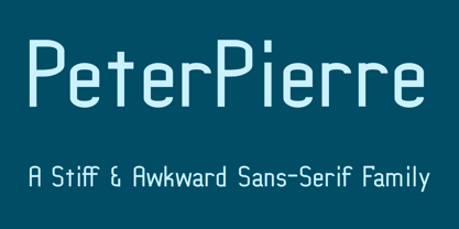
$79.00Mousse Script is based on Glenmoy, a 1932 Stephenson Blake typeface. Glenmoy a prime example of what display typography was in pre-WWII American ad art. It graced the pages of magazines, sold numerous products and services, then simply died out when the typographic trends shifted towards the more personalized, stylized and handwritten types of calligraphy. The current trend in typography is a revivalism that brings all of the distinctive display typography of the 20th century, without chronological discrimination, back in the name of ‘retro’. Who are we to deny the masses what they want? Mousse Script doesn’t just bring Glenmoy back from the ashes of the 20th century. It expands upon the limited metal character set nearly twice over and takes advantage of the latest type technologies. This makes Mousse Script a striking typeface, both functionally and visually. A simple, attractive display font on the surface, Mousse Script is unique in its bold upright calligraphy, something rarely found these days. The OpenType version of Mousse Script combines both the regular and alternate character sets into a single, cross-platform package that takes advantage of the extended typographic features of the OpenType format. - PeterPierre by Ingrimayne Type,
$6.95 - Areplos by Storm Type Foundry,
$53.00To design a text typeface "at the top with, at the bottom without" serifs was an idea which crossed my mind at the end of the sixties. I started from the fact that what one reads in the Latin alphabet is mainly the upper half of the letters, where good distinguishableness of the individual signs, and therefore, also good legibility, is aided by serifs. The first tests of the design, by which I checked up whether the basic principle could be used also for the then current technology of setting - for double-sign matrices -, were carried out in 1970. During the first half of the seventies I created first the basic design, then also the slanted Roman and the medium types. These drawings were not very successful. My greatest concern during this initial phase was the upper case A. I had to design it in such a way that the basic principle should be adhered to and the new alphabet, at the same time, should not look too complicated. The necessary prerequisite for a design of a new alphabet for double-sign matrices, i.e. to draw each letter of all the three fonts to the same width, did not agree with this typeface. What came to the greatest harm were the two styles used for emphasis: the italics even more than the medium type. That is why I fundamentally remodelled the basic design in 1980. In the course of this work I tried to forget about the previous technological limitations and to respect only the requirements then placed on typefaces intended for photosetting. As a matter of fact, this was not very difficult; this typeface was from the very beginning conceived in such a way as to have a large x-height of lower-case letters and upper serifs that could be joined without any problems in condensed setting. I gave much more thought to the proportional relations of the individual letters, the continuity of their outer and inner silhouettes, than to the requirements of their production. The greatest number of problems arose in the colour balancing of the individual signs, as it was necessary to achieve that the upper half of each letter should have a visual counterbalance in its lower, simpler half. Specifically, this meant to find the correct shape and degree of thickening of the lower parts of the letters. These had to counterbalance the upper parts of the letters emphasized by serifs, yet they should not look too romantic or decorative, for otherwise the typeface might lose its sober character. Also the shape, length and thickness of the upper serifs had to be resolved differently than in the previous design. In the seventies and at the beginning of the eighties a typeface conceived in this way, let alone one intended for setting of common texts in magazines and books, was to all intents and purposes an experiment with an uncertain end. At this time, before typographic postmodernism, it was not the custom to abandon in such typefaces the clear-cut formal categories, let alone to attempt to combine the serif and sans serif principles in a single design. I had already designed the basic, starting, alphabets of lower case and upper case letters with the intention to derive further styles from them, differing in colour and proportions. These fonts were not to serve merely for emphasis in the context of the basic design, but were to function, especially the bold versions, also as independent display alphabets. At this stage of my work it was, for a change, the upper case L that presented the greatest problem. Its lower left part had to counterbalance the symmetrical two-sided serif in the upper half of the letter. The ITC Company submitted this design to text tests, which, in their view, were successful. The director of this company Aaron Burns then invited me to add further styles, in order to create an entire, extensive typeface family. At that time, without the possibility to use a computer and given my other considerable workload, this was a task I could not manage. I tried to come back to this, by then already very large project, several times, but every time some other, at the moment very urgent, work diverted me from it. At the beginning of the nineties several alphabets appeared which were based on the same principle. It seemed to me that to continue working on my semi-finished designs was pointless. They were, therefore, abandoned until the spring of 2005, when František Štorm digitalized the basic design. František gave the typeface the working title Areplos and this name stuck. Then he made me add small capitals and the entire bold type, inducing me at the same time to consider what to do with the italics in order that they might be at least a little italic in character, and not merely slanted Roman alphabets, as was my original intention. In the course of the subsequent summer holidays, when the weather was bad, we met in his little cottage in South Bohemia, between two ponds, and resuscitated this more than twenty-five-years-old typeface. It was like this: We were drinking good tea, František worked on the computer, added accents and some remaining signs, inclined and interpolated, while I was looking over his shoulder. There is hardly any typeface that originated in a more harmonious setting. Solpera, summer 2005 I first encountered this typeface at the exhibition of Contemporary Czech Type Design in 1982. It was there, in the Portheim Summer Palace in Prague, that I, at the age of sixteen, decided to become a typographer. Having no knowledge about the technologies, the rules of construction of an alphabet or about cultural connections, I perceived Jan Solpera's typeface as the acme of excellence. Now, many years after, replete with experience of revitalization of typefaces of both living and deceased Czech type designers, I am able to compare their differing approaches. Jan Solpera put up a fight against the digital technology and exerted creative pressure to counteract my rather loose approach. Jan prepared dozens of fresh pencil drawings on thin sketching paper in which he elaborated in detail all the style-creating elements of the alphabet. I can say with full responsibility that I have never worked on anything as meticulous as the design of the Areplos typeface. I did not invent this name; it is the name of Jan Solpera's miniature publishing house, in which he issued for example an enchanting series of memoirs of a certain shopkeeper of Jindrichuv Hradec. The idea that the publishing house and the typeface might have the same name crossed my mind instinctively as a symbol of the original designation of Areplos - to serve for text setting. What you can see here originated in Trebon and in a cottage outside the village of Domanín - I even wanted to rename my firm to The Trebon Type Foundry. When mists enfold the pond and gloom pervades one's soul, the so-called typographic weather sets in - the time to sit, peer at the monitor and click the mouse, as also our students who were present would attest. Areplos is reminiscent of the essential inspirational period of a whole generation of Czech type designers - of the seventies and eighties, which were, however, at the same time the incubation period of my generation. I believe that this typeface will be received favourably, for it represents the better aspect of the eighties. Today, at the time when the infection by ITC typefaces has not been quite cured yet, it does absolutely no harm to remind ourselves of the high quality and timeless typefaces designed then in this country.In technical terms, this family consists of two times four OpenType designs, with five types of figures, ligatures and small capitals as well as an extensive assortment of both eastern and western diacritics. I can see as a basic text typeface of smaller periodicals and informative job-prints, a typeface usable for posters and programmes of various events, but also for corporate identity. Štorm, summer 2005 - Halfroy by Heypentype,
$20.00Halfroy is our answer to generic geometric sans trends exploding nowadays who creates sameness. Halfroy brings new sans perspectives by combining rounded and sharp edges to create delicate sans fonts. See the difference by looking at counter-shapes compared to outline, insides counter shapes you will sees a sharp edges while round but not geometrical on outlines. Halfroy gives your project unique visual impact whatever your design project is, but we recommend using thin, semibold to Fat as display then light and regular. Halfroy taken inspirations not from looking at other sans typeface, but its design inspirations comes from observing a land contour and geographical statistics in our city, Kota Batu. We found that our city geographic consist of steep slope like waves with sharp peaks and surrounded by small and third highest mountains peak on our country. From then on we begin visualize and applied on few letters. Take a look on our 'O', 'f', 's' letters, its like a stone carved letters. Its hard edges and soft edges outline clearly draws from our inspiration source. Even Halfroy looks stony, hard as individual letters, we treat this type with humanist approach in mind. Therefore you can sense a friendly yet casuals of typical sans serif fonts when it grouped together to form a words or sentences. We hope Halfroy will gives your design project a unique on its own. - Camplones by Miracledsign,
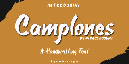
$8.00Camplones is a handwritten font that accentuates the style and curve of the hand when inking the ink on the paper by perfecting the shape of each character so that Camplones looks very beautiful when applied in a sentence. Camplones is specially shaped and made so that users feel the touch of a hand that lives in the character of the letters so that it has tremendous value when used in your templates, game fonts, wedding invitations or sales products which will surely be very attractive to consumers when they see it and will definitely love it. make the product look more elegant and will increase the selling value of your product. - Dodo by Indian Summer Studio,
$49.00Modern antiqua (Victorian, Scotch Roman) «Dodo», 2008–2019. Named so as a portmanteau of Bodoni – Didot. XIX-th century fonts, especially Victorian antiquas, were almost excluded from the modern use by their XX-th century's descendants. And these new books had lost too much of their former beauty, elegance. Their old noble spirit. This project, «Dodo» was started in 2008 year as the first then modern revival for the Old Imperial Russian book scotch antiqua, used 120–170 years ago in almost every printed book. Still keeping the spirit of the Steam æra. - Ace Attitude by Limelight Artistry,
$24.00Ace Attitude is a friendly, readable font with character and flair. When I started designing this font I wanted something that was readable as well as interesting and appealing. Something that showed character. When I look at this font now I think of an old fashioned aviator. One of those poeple that likes to show off and have fun but can still follow rules. This font is perfect for logo's and branding. But its also very versatile would be great in things like magazines, posters, packaging, billboards, etc. Ace Attitude has an impressive 179 Contextual alternates. These are like ligatures, but oh so much better. These contextual alternates will give any project that personal touch - all without any extra effort. All you have to do is make sure that they are turned on in your program. Unfortunately, these do not yet show up in the sample text. To help with this I have created a demo version of the font so that you can still try it out before you spend the money. Ace Attitude also has Over 800 glyphs and includes features such as small caps, ordinals, ligatures, fractions, tabular numbers, proportional numbers, subscript, superscript, numerators and denominators. - Plate Gothic by Monotype,
$29.00Around the turn of the twentieth-century, Steel and copper plate engraving was the most sophisticated and expensive method for producing business cards, stationery, and formal announcements. In engraved printing, the image is incised, or engraved into a hard, flat plate. Ink is applied to the plate, and then wiped off; leaving only the ink that is trapped below the surface in the incised areas. When the paper is pressed against the flat plate, the ink is drawn out of these areas and transferred to the paper. The results are twofold: printing which sits above the surface of the paper, and the reproduction very delicate lines and shapes. For business and formal printing, engraved printing was, and is, considered the best. The problem is that not everybody can afford the best. Type foundries, in the early 1900s, figured that if they could produce a typeface for traditional printing, which had appearance of engraving, they would be able to satisfy the needs of those forced to live with modest printing budgets. Engravers faces were born. Fredric Goudy’s Copperplate Gothic was one of the most popular. Plate Gothic is a version of this style updated for digital technology. It has all the charm and charisma as the metal type and yet is perfect for today's needs. - South Island by Rook Supply,
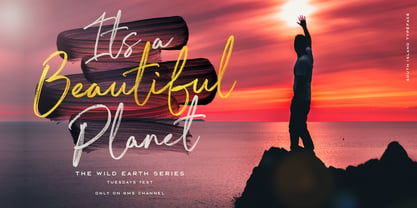
$14.00The goal with South Island was to make a font that looked authentically handwritten. Each character had to perfectly flow into the next and maintain a nice balance between variation and legibility. The typeface retains all the texture and grit of the original handwritten characters, making it especially powerful when used for large headers. South Island comes in a regular version, and a second version which contains alternate versions of each letter A-Z (both upper and lowercase). Try pairing it up with a more traditional serif or sans serif font for endless possibilities. - Modern Elvish by Typelove Fontworks,
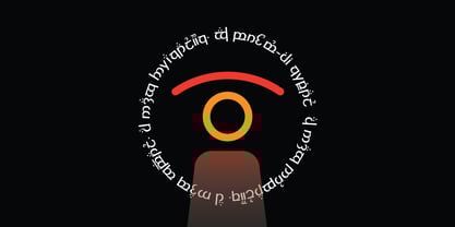
$9.00Modern Elvish is a humanist sans serif typeface created for the Tengwar “English” mode as popularized in the Lord of the Rings books and films. I imagined the famous elves of this lore living in contemporary times and needing a no nonsense modern typeface for their branding, communications and UX design. Use this typeface for your RPG, LARPing or Cosplay needs. This typeface uses advanced font features such as ligatures and contextual alternates to convert any English text. I would recommend typing in English first, then converting to a font of this typeface. - FWD Egyptian Tower by Fontwright Design,
$39.99FWD Egyptian Tower is a designers stack-able Display family best purchased as one package. The four versions can be manipulated in your favorite graphics or sign making application to achieve the different effects as shown in the font family ad designs. All fonts are tightly spaced and are very often intentionally overlapped creating a balance for each very unique wider bottomed character. Being stack-able, the designer can duplicate the original text layer and by changing the font on the lower of the two layers to another of the family can then add another available effect. This can be repeated to add other of the available effects. Then by converting the text of the lower text layers to curves or outlines and welding the characters of the words together, the overlaps can be eliminated. This process is fairly common practice for a graphic designer and quite easy once done a few times. - Manuel by profonts,
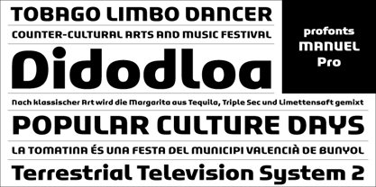
$51.99Manuel, a simple, almost mathematically constructed typeface, includes stylistic alternates for a number of upper case characters. This comes in very helpful when designing logo letterings. Manuel(a) is a very charming, self-confident und exciting typeface design. The idea was to try to apply a given design criteria (also see Volker Schnebel's Marita and Martin fonts) to every single character. In other words, start with a character and develop all of the others from it. This is quite easy for some characters but extremely difficult for others. This process generates creativity and the characters move away from the initial constructed sketch. Together in a typeface, the individual characters are now all of a piece and character. - Great Authorized by Haksen,
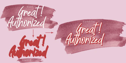
$16.00Great Authorized comes with natural taste of handwritten script. When you use with this font, I believe you will enjoy the sensation of the natural feel of this font, equipped with swashes and extrude features make the display even stronger for your projects such as posters, logos, advertisements, book covers and all brands for your requirement. I recommend for you to use photoshop or illustrator to make design with this font and let see when you will say WOW :) So what include when You want to use them ? - OTF - Ligatures - Numbers + Punctuation - Non-English support - Swashes - Extrude Please contact me if anything question,I'm glad to help :) Happy Designing, Haksen - McKellar Borussian NF by Nick's Fonts,
$10.00This unusual Gothic face was found in the 1882 McKellar, Smiths and Jordan specimen book under the name Borussian, a then-current variant of “Prussian”. This version is true to the original, so please note: a few of the uppercase characters—notably E and G—are rather unusual, so proceed with caution. All versions of this font include the Unicode 1250 Central European character set in addition to the standard Unicode 1252 Latin set. - Getlost by Alcode,
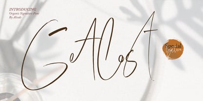
$18.00Getlost is an organic signature font inspired by natural brush typography. Written in rapid motion using a slightly dry brush pen. This will give you a fresh and elegant design. Getlost comes with uppercase and lowercase letters, large sets and small sets, numbers, alternative styles for several lowercase characters are also available that make your text and design more attractive. Try Getlost, enjoy the richness of OpenType features and let her fun and elegant excitement make you happy and enhance your creativity! You can use this font very easily. Included multilingual support and special ligatures - 946 Latin by Roman Type,
$35.00946 is a multilingual techno-style family developed by Berlin-based type designer Roman Wilhelm (RomanType). While more and more text families have recently been extended to a multilingual and multi-script level, not so much attention has been given to the more decorative styles. The 946 family does exactly that. A lot of care has been given to the various diacritics: they were designed a little more brutal, a little more European than with some other fonts of this category. Do also watch out for the non-Latin legs of this family. 946 is inspired by electronic music. When Roman found a second-hand Roland TR-606 drum machine in a store in his hometown back in 1995, he started to hang out with would-be DJs and musicians, trying to play the beats that went around the globe. When he started to study visual communication three years later, he was assigned the matriculation number of 946, which has now become the name of this family. Language support: Afrikaans, Albanian, Catalan, Croatian, Czech, Danish, Dutch, English, Estonian, Finnish, French, German, Hungarian, Icelandic, Italian, Latvian, Lithuanian, Maltese, Norwegian, Polish, Portuguese, Romanian, Slovak, Slovenian, Spanish, Swedish, Turkish, Vietnamese, Zulu. Do also watch out for the other script versions of this family! - Lektocy by Andreas Lang,
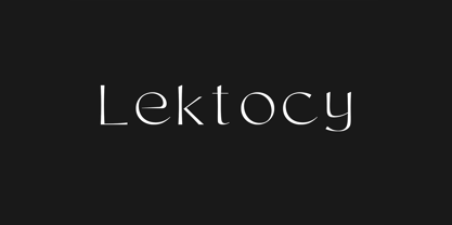
$50.00Are you looking for an elegant font for digital use? Then this trendy Lektocy font is just right for you! The modern font is perfect for graphic design, flyers, web design, book covers, greeting cards, print on demand, posters, banners or business cards and much more that can be filled with a luxurious text. - Thursday Afternoon by Bogstav,
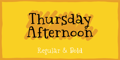
$15.00Nothing is as it really should be with Thursday Afternoon. The x-height is jumpy, letters are not in their right places, lines are crunchy, serifs are uneven...the list goes on...but in the end, Thursday Afternoon turns out as a legible and functional font. It has most of the moves from classic serif fonts, but then again it has a mind of its own! - Mirola by Nathatype,
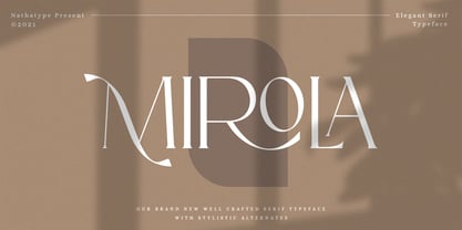
$29.00Looking make your brand unique and memorable? Maybe you wish to create advertisements that draw attention? If you can say “yes” to any of these then hold on to your seats and get ready for a modern, fun, and delightful experience! Mirola-Serif Font Mirola is a serif that is aimed to be used in modern style. It fits right in with your designs. It’s beautiful without trying too hard, it’s gorgeous without being apologetic, it’s brave in the face of uncertainty, these all represent you. Go ahead and use it on your website, for your social media branding, Pinterest banners, printed invitations, and more! Features: Stylistic Set Alternates Swashes PUA Encoded Numerals and Punctuation Thank you for downloading premium fonts from Nathatype - Fried Chicken by FontMesa,
$25.00The name of this font brings back memories of an old fried chicken restaurant in Willow Springs Illinois circa 1960’s and 1970’s, my family would all get in the car and take a long drive down to an old country road Illionis Rt 171 through a forest preserve where we’d come upon the old Willowbrook motel with a bar and restaurant next door. The restaurant was called Kegal’s, when you entered the building you had to walk through the smoky bar first to get to the restaurant, I can still see the hard wood floors with all the finish worn off from decades of foot traffic. Up until the mid 1960’s Kegal’s used to raise their own chickens behind the restaurant, back then fried chicken in the Midwest was either coated in flour or bread crumbs, Kegal’s was covered in a beautiful layer of golden bread crumbs. Before your meal arrived they’d bring a basket of dinner rolls along with crackers, bread sticks and country butter, on the side they’d serve coleslaw with a vinegar sauce, which is very common in the Midwest, the first time you try it your face puckers up like you just sucked on a lemon but you get used it over time. After waiting for what seemed like forever to a child the waitress comes out of the kitchen with a huge tray of that golden deliciousness and your mouth begins to water, in her other hand was another tray filled to overflowing with crinkle cut french fries all made by hand, I’d eat a hole handful of those french fries first then take a bite of that tender juicy farm raised chicken. Today a fine Italian restaurant occupies the old Kegal’s building and the motel is long gone, only my fond memories remain. Fast forward to 2020 and FontMesa has just made some Fried Chicken as an eight weight type font family with alternates. With the Fried Chicken slab serif font family we’ve broken some rules by removing a few of the slabs on certain letters for a unique homemade look. Fried Chicken is perfect for your next product label, t-shirt design, logo, headline or cookbook cover. Treat yourself to some good ol’ Fried Chicken today. - ITC Cancione by ITC,
$40.99ITC Cancione is the inspired work of California calligrapher and illustrator Brenda Walton. She gave a rough texture to her tall, thin all caps alphabet and its ornaments, making them look as though they were drawn with a brush on stone and then left to withstand years of weather and wear. The graceful letters are complemented by a variety of ornaments and flourishes as well as alternates and even stylized words making ITC Cancione perfect for greeting cards and stationery. - Monkton by Club Type,
$36.99The inspiration for this typeface family came from my childhood experiences at West Monkton, amidst an historic part of the South West of England. Studies of the original incised capitals of the Trajan column in Rome were analysed and polished for this modern version. The lower case letterforms and numerals were then created in sympathy, taking their proportions from the incised letters of local gravestones. Its name honours not only the area where the original alphabet was conceived and drawn, but also the people responsible for fostering my initial interest in letters. - Xirod - Unknown license
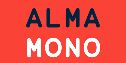
- Alma Mono by Great Scott,
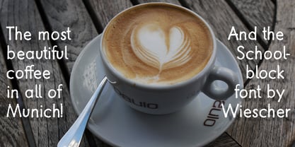
$22.00 - Schoolblock by Wiescher Design,
$39.50 - Payzant Pen NF by Nick's Fonts,
$10.00The inspiration for this exuberant exercise in penmanship was found in Frank H. Atkinson's A Show at Sho-Cards: Comprehensive, Complete, Concise, published in 1918, executed with the then-state-of-the-art Payzant Reservoir Pen. It retains its quaint charm, even after almost a century. Both versions of this font contain the complete Unicode 1252 (Latin) and Unicode 1250 (Central European) character sets, with localization for Romanian and Moldovan. - PIXymbolsFabricCare by Page Studio Graphics,
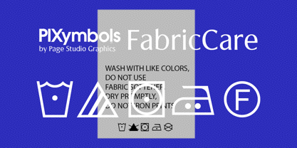
$39.00Standard fabric (or textile) care symbols used for creating clothing labels. This font has temperature setting symbols for washing, drying and ironing. It also includes bleach and dry cleaning symbols. This font uses a method that allows combinations of the washing, drying and dry cleaning symbols to create more symbols. Therefore, this font actually has a total of 73 unique fabric care symbols that can be created. - Underdoug by PizzaDude.dk,
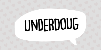
$15.00All caps font with squarish letters. At first sight, it may look a little bit ordinary, but watch it with massive text - then you will notice the bounciness and the contextual alternates that automatically switches between the 5 different versions of each letter! Comes with massive language support! - RMU Omega by RMU,
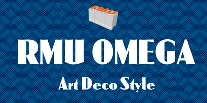
$30.00 - Safira March by Din Studio,
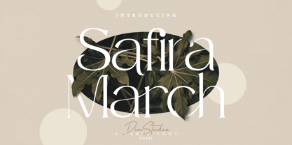
$25.00Hoping to make bold and statement projects? Trying to impress your audiences or costumers? How about a mix of tropical, style, and elegance? Then check this one out. Introducing Safira March- A Serif Font Family This gorgeous font will engage your audience and make your promotions and projects stand out. It comes with 9 different weights fonts. Bring your branding to life and add a touch of modernity and style with Safira March. Use it for headings, logos, business cards, printed quotes, invitations of all sorts, cards, packaging, and your website or social media branding. Our font always includes Multilingual option to make your branding globally recognized. Features: Standard Ligatures Stylistic Sets Multilingual Support (91 languages) PUA Encoded Numerals and Punctuation Thank you for downloading premium fonts from Din Studio - Boardwalk Avenue Rough by Fenotype,
$30.00Boardwalk Avenue Rough is a textured version of Boardwalk Avenue. It’s a robust type collection of three styles and two weights of each. It’s divided into Boardwalk Pen, Boardwalk Antiqua and Boardwalk Serif. Boardwalk Avenue’s core is a connected mono linear script that works fantastic when paired with either of the impressive serif styles. All the fonts work great on their own but try putting them all together for a complete display font setup for a project. Here’s a short introduction on what’s included: Boardwalk Avenue Rough Pen is a connected Script. It’s great for headlines, quotes or in packaging. It has a casual hand drawn vibe to it but it’s clean and legible. It’s equipped with automatic Contextual Alternates that keep the connections smooth and versatile. For instance when you type double letter another of them will automatically change to add variation. Or if you type “i” for example, as a first letter after space or after capital letter the code will add starting point to the letter to keep the letterforms more balanced. If you need more ambitious letterforms you can try Swash or Titling Alternates -there’s alternates for every standard letter and seek for even more alternates from the glyph palette. Boardwalk Avenue Rough Antiqua is a high contrast serif with strong character. It’s great for glamorous headlines or as a logotype. Boardwalk Avenue Rough Serif is a low contrast serif with bulky character. It’s great for strong and sturdy headlines or as a logotype. - TE Heading by Tharwat Emara,
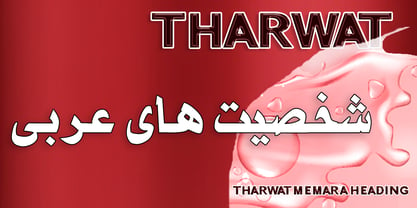
$20.00It is known as the THARWAT M EMARA HEADING (NASKH) Font for its extensive use in the copying and transmission of books because it helps the writer to write more quickly than any other font since the Islamic times and then THARWAT M EMARA HEADING(NASKH) font wrote the "HEADING" And the advantages of THARWAT M EMARA HEADING (NASKH)font are clarifying the letters and show their beauty and splendor - CCS Neue Rinjani by Creative Corner Studio,
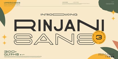
$29.00Neue Rinjani is a all-caps sans serif with Wide Stretch contemporary typographic, vintage futuristic art-deco touch Streamline influence of the 1930s and 1940s. A mix from the old Euro-American signage/advertising letters and modern clean sans serif, carefully mousecrafted to bring you the genuine feel of the era. If you're into classic/vintage letter designs, then this typeface suits best for you. - Marteks by Nathatype,
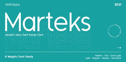
$20.00Ready to make your branding spark? If you need to create a big, bold logo for your business, work on a poster for an event, or whatever your project may be-then this is the perfect font for you. Marteks-A Sans Serif Font Family If we can give you many options then why not? Marteks is a package that will makes you super excited. With this family you will get many options to maximize your designs with stylish fonts. This font is more than just another sans serif font. It encapsulates the essence of luxury and modernity. Lose yourself in the romance of a crisp Fall morning, or soaking up the last drops of the sun in a golden harvest field. Perfect for headings, logos, business cards, printed quotes, wedding invitations, cards, packaging, and your website or social media branding. Features: Multilingual Support PUA Encoded Numerals and Punctuation Thank you for downloading premium fonts from Nathatype - Netra by Sign Studio,
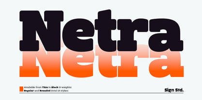
$15.00Netra Slab is a minimalist and modern font. Having 9 thicknesses from Thin to Black will provide an easy choice as needed. With 390+ characters it can support more than 30 languages. If you want typography that looks smooth then choose the Rounded version. This font is suitable for writing general text, titles, even for brand logos. - Softie by Tail Spin Studio,
$20.00This typeface was designed to be used as the page heading font for MyFonts. Originally only the letters needed to make up the required phrases were drawn. Then amazingly enough, people started asking where they could get the font, so I decided to complete the character set, and named it Softie. This name was chosen because the round and rather bulbous shapes that make up the letters reminded me of marshmallows. Softie, almost good enough to eat. The Bold version, called Softie Bloated, was added in late 2003. Rumor has it that the name came to Steve after Thanksgiving dinner. - Celestina by Piñata,
$-Celestina is the lively spirit, just like drops of ink on a piece of paper or clouds in the sky. The same spirit is maintained by the rounded letters of the script and by the characters' small whorls. Celestina has come to life as a result of a peculiar game in which I tried to bring together the letters with different tempers with help of calligraphic instruments. I wanted to create a very light and playful font which would look like a quick inscription on a piece of paper, but would also be easy to read in a text array. As I was working on the font, my cat Celestina has been very interested in the brush painting process, and I had no other option but to name the font after her! Celestina works perfect for both Moomins stories and personal blogs, as well as for the design of hand-made things, and even just then when you want to put yourself into a good mood! - Movie Script by Wiescher Design,
$39.50Movie Script is the script that was used in German movie-brochures. Those were small four page leaflets with a lot of sepia-colored pictures about the movie one was about to see. Today those things are collectors items. The script was also used on those hand-painted posters above the cinema entrance. I cleaned up the old script and made it just a little bit more readable, but overall I left it as it was. Of course I added the necessary glyphs for today's world, like Euro and so on. When I was a kid, my grandfather gave me 1 German Mark and I could go to the movies matinee, that was around 10:30 in the morning, the entrance cost something like 60 Pfennig and the rest was for peanuts and a drink. Still today I love my grandfather for that, movies introduced the world to me (no TV then). Your grandfather-loving designer Gert Wiescher - Quilt Patterns Three by Gerald Gallo,
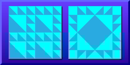
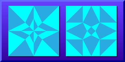
$20.00Quilt Patterns Three was inspired by the patchwork designs used in quiltmaking in early America. There is an assortment of 94 patterns located under the character set and shift+character set keys. Quilt Patterns Three is based on the nine patch pattern, a block that is 3 squares by 3 squares, the most basic and most common. The nine patch pattern can be subdivided into 6 squares by 6 squares, 9 squares by 9 squares, etc. Characters of Quilt Patterns Three can be typed in a vector drawing program and then converted to paths/outlines, color may then be added to various parts of a given pattern. Patterns can be stacked horizontally and vertically creating an infinite number of quilt designs. - Quilt Patterns One by Gerald Gallo,
$20.00Quilt Patterns One was inspired by the patchwork designs used in quiltmaking in early America. There is an assortment of 94 patterns located under the character set and shift+character set keys. Quilt Patterns One is based on the nine patch pattern, a block that is 3 squares by 3 squares, the most basic and most common. The nine patch pattern can be subdivided into 6 squares by 6 squares, 9 squares by 9 squares, etc. Characters of Quilt Patterns One can be typed in a vector drawing program and then converted to paths/outlines, color may then be added to various parts of a given pattern. Patterns can be stacked horizontally and vertically creating an infinite number of quilt designs.

