10,000 search results
(0.034 seconds)
- Magma Cracks by Yumna Type,
$25.00 People often have trouble finding a perfect, prominent font to express the project values. You need an instantly attractive font that is able to stand out your designs for something unique and special without consuming a lot of time and costing some money. For that reason we have everything you need. Magma Cracks is a capitalized display font in a visually attractive design along with the big, round, high contrast, cracking letter designs as its unique characteristics. It is suitably applicable for any unique, different font designs to help you emphasize your messages in the graphic designs. This font’s cracking designs can express dramatic, prominent nuances and give unique textures resulting in the artistic displays. Magma Cracks provides a clipart in accordance with the font theme as a bonus and features you can enjoy. Features: Multilingual Supports PUA Encoded Numerals and Punctuations Magma Cracks fits best for various design projects, such as brandings, headings, magazine covers, quotes, printed products, merchandise, social media, etc. Find out more ways to use this font by taking a look at the font preview. Thanks for purchasing our fonts. Hopefully, you have a great time using our font. Feel free to contact us anytime for further information or when you have trouble with the font. Thanks a lot and happy designing.
 - Restrict by Twinletter,
$12.00 Restrict is a san serif font that we design with a wide selection of beautiful characters and strong characteristics. Having a distinctive shape that is attractive to the eye and easy to read when you make it as a sentence is our main goal in designing this font. Not limited to that, the bold calligraphy font is designed to keep paying attention to the beauty of each letter, there are alternate options for the letters which are certainly easy for you to access, so you can automatically customize the letters you want to enhance the visual appearance of your design project. This charming font also offers the beauty of abstract typography harmony for a wide variety of design projects, including digital natural handwriting for designs, quote designs, for social media business designs, advertisements, trademarks, food and beverage promotion banners, text, posters, a signature, and all designs require handwriting or whatever design you want. What’s Included : File font Web Fonts Standard glyphs Ligature Works on PC & Mac Simple installations Accessible in Adobe Illustrator, Adobe Photoshop, Adobe InDesign, even work on Microsoft Word. PUA Encoded Characters – Fully accessible without additional design software. Fonts include multilingual support for; Afrikaans, Albanian, Croatian, Czech, Danish, Dutch, English, Estonian, Finnish, French, German, Hungarian, Italian, Norwegian, Polish, Portuguese, Slovak, Slovenian, Spanish, Swedish Thank you for your purchase! Hope you enjoy our font!
 - Miranda Wright by Din Studio,
$29.00 Miranda Wright is a captivating serif font designed in an exquisite and elegant style. Each letter is meticulously crafted with fine details, evoking a sense of sophistication and grace. What sets Miranda Wright apart are the last few letters, which feature graceful circular swings that add a touch of charm and uniqueness to the font.. The circular swings at the end of certain letters infuse this serif with a delightful flair. These subtle and graceful details add an air of playfulness and individuality to the font, setting it apart from conventional serif typefaces. The circular swings give the font a distinctive personality, making it ideal for creative projects that seek to stand out. Its legible and elegant letterforms make it suitable for both body text and headings, while the circular swings add a touch of character that enhances the overall visual appeal. Enjoy the available features here. Features: Stylistic Sets Ligatures Multilingual Supports PUA Encoded Numerals and Punctuations Miranda Wright fits in headlines, logos, posters, flyers, invitations, greeting cards, branding materials, print media, editorial layouts, website headers, and many more. Find out more ways to use this font by taking a look at the font preview. Thanks for purchasing our fonts. Hopefully, you have a great time using our font. Feel free to contact us anytime for further information or when you have trouble with the font. Thanks a lot and happy designing.
 - Posterama by Monotype,
$40.99 The Posterama™ typeface family contains 63 fonts and is a true journey through space and time. Designed by Jim Ford, each Posterama family contains 7 weights from Thin to Ultra Black, in 9 distinct families. What makes Posterama so unique and versatile are the eight alternative display families. By making use of a collection of alternative glyphs, Posterama sets an evocative flavor to visualize an entire century of futuristic reference points from art, architecture, poster design and science fiction into one family. Posterama Text is the base family. It has the most robust character set including upper and lowercase glyphs and pan-European language support (including Greek and Cyrillic). Note: all the other Posterama variants described below do not have lowercase letters or Greek and Cyrillic support. Posterama 1901 recalls the decoratively geometric style of Art Nouveau from the turn of the 20th century. Letterforms such as the slender, snaking ‘S’, the high-waisted ‘E’ and the underlined ‘O’ revive the spirit of Charles Rennie Mackintosh and the designers of the Viennese Secession. Posterama 1913 pays homage to the Armory Show, or 1913 Exhibition of Modern Art, which brought the revolutionary work of European artists such as Picasso, Duchamp and Kandinsky to the US for the first time to the shock and astonishment of press and public. Near-abstract, angular characters such as the ‘A’, ‘E’ and ‘N’ hint at cubism’s jagged and clashing planes. Posterama 1919 uses a small, but important, variation to set a tone when the Bauhaus was founded, and the surge in radical European typography that followed. The straight-sided, roundheaded ‘A’ adds a flavor of 1919 – this style of ‘A’ can still be seen in the Braun logo, designed in 1934. Posterama 1927 captures the year of Metropolis, The Jazz Singer and Paul Renner’s pioneering, geometric Futura typeface from 1927, which had a profound influence on design in the US and Europe. Posterama 1933 – With its low-waisted, sinuous designs, the Posterama 1933 typeface family echoes lettering of the Art Deco period, which in turn had its roots in Art Nouveau, the key influence on Posterama 1901. The two fonts make a great team and can be used interchangeably. Posterama 1945 features a few Cyrillic characters to conjure up an era when Russian art and political posters made their mark in cold war propaganda, espionage and also giant aliens and monsters. Posterama 1984 takes its typographic influences from George Orwell’s classic novel, publicity for the dystopian action and sci-fi movies (Blade Runner, Videodrome and Terminator) and games like Space Invaders and Pac-Man that made an impact at that time. Posterama 2001 was inspired by Stanley Kubrick’s science fiction masterpiece, which made extensive use of the Futura typeface. Posterama 2001 finds its cosmic orbit with its nosecone-style ‘A’ from NASA’s much-missed ‘worm’ logotype. There’s an echo, too, in Bauhaus designs from as early as 1920, whose minimalist, geometric lettering also featured a crossbar-less ‘A’.
 - Treatise by Zephyris,
$- Treatise was born in a notebook at the back of a boring lecture on immunology with the simple thought of “How can I make a serif more fun?” When writing a scientific treatise, there are not many options for making it enjoyable. However, some little quirks and fun features in the font can take the serious edge off the writing.... Treatise is a light and open serif with some design quirks, which give it a slightly calligraphic feel; a single -storey “a” and “g,” a visible stroke mark on the “o,” and a curved arm on the “k.” These features are subtle enough to fit into a paragraph of text but bold enough to give a title some character. The Treatise family includes a true italic and a heavy-struck style bold, and several OpenType features; standard and discretional ligatures, contextual alternatives, and different figure styles. The character coverage includes Basic Latin, Latin-1 Supplement, and Latin Extended-A and will support most Latin-alphabet languages, including languages with more exotic characters such as Icelandic and Maltese.
 - Marzano by FontMesa,
$35.00 Marzano is a geometric sans serif font that's ideal for headlines, logos, text and advertising, the name comes from the ever so sweet and wonderful San Marzano plum tomato grown in Italy. Marzano includes stylistic alternates, small caps, swash caps, case sensitive forms, old style figures, tabular figures, small caps figures, small caps old style figures, small caps question mark and exclamation point. Since a lot of people today like to type in code using the copyright and trademark symbols in place of a C or R we've decided, the first time to offer two registered trademark symbols, one that's the same size as the copyright symbol and an alternate version that's reduced in size and sits at the caps height. Marzano Slant is set at 6 degrees and is perfect for when you want the look of an italic but don't have the horizontal space in your page design for a full 12 degree italic. At FontMesa all of our italic fonts are cleaned up placing all nodes at extremas.
 - Microbrew Soft by Albatross,
$19.00 Microbrew Soft is the latest addition to the Microbrew family. Microbrew Soft includes a wide variety of textures while retaining soft edges and clean outlines. With 27 individual styles plus an eclectic set of ornaments and catchwords, the possibilities are limitless when it comes to how many faces the font family can wear in your design. Microbrew Soft sports a nice mix between wood type poster style and vintage letterpress. The more detailed styles work well at large sizes, and the cleaner styles add legibility at smaller sizes. Microbrew Soft is an all caps display font, but the lowercase act as alternates so adding variety to your letterforms is as easy as mixing uppercase and lowercase letters. To add to the realism, Microbrew Soft includes double-letter ligatures. Opentype features include automatic fractions, subscript numbers, superscript numbers, and double-letter ligatures. Don't let the name fool you, Microbrew Soft is very versatile and works great for almost any subject matter, including weddings, birthdays, restaurants, coffee shops, music, and many more.
 - Hello Eiffel by Yumna Type,
$15.00 Being loyal to your same old font will make your designs plain and dull. You need a prominent font to live up your messages without losing the essence of the content itself. Time to welcome Hello Eiffel, a font to help you deliver your desired messages without omitting the whole design. Hello Eiffel is a display font in simple, yet interesting letter shapes with which you can strengthen your desired messages to deliver without distracting attention on the text content itself. Despite its simplicity, Hello Eiffel remains interesting in modern styles to enhance the design’s aesthetic value. Its letters are legible enough to be flexibly applicable for various text sizes, and it gives you a clipart as a bonus. You can enjoy the available features here as well. Features: Multilingual Supports PUA Encoded Numerals and Punctuations Hello Eiffel fits best for various design projects, such as brandings, posters, banners, headings, magazine covers, quotes, printed products, merchandise, social media, etc. Find out more ways to use this font by taking a look at the font preview. Thanks for purchasing our fonts. Hopefully, you have a great time using our font. Feel free to contact us anytime for further information or when you have trouble with the font. Thanks a lot and happy designing.
 - Clover Font Duo by Pen Culture,
$15.00 Introducing The Clover, a stunning duo font that combines the timeless elegance of a serif typeface with the fluid grace of calligraphy. This versatile font set includes two complementary styles that work together seamlessly to add sophistication and charm to your design projects. The serif font is a classic and refined typeface that exudes elegance and professionalism. Its clean lines and sharp angles create a sense of precision and authority, making it perfect for formal documents, headlines, and branding materials. In contrast, the calligraphy font is a more decorative and ornate style that evokes a sense of fluidity and movement. Its graceful curves and flowing lines create a sense of beauty and grace, making it ideal for invitations, wedding materials, and other special occasions. When used together, the serif and calligraphy fonts complement each other perfectly to create a stunning visual contrast that captures attention and creates a lasting impression. Whether you're designing a logo, brochure, or wedding invitation, The Clover is the perfect choice for adding a touch of sophistication and style. I really hope you enjoy it – please do let me know what you think, comments & likes are always hugely welcomed and appreciated. More importantly, please don’t hesitate to drop me a message if you have any issues or queries. Thank you
 - Milky by Fenotype,
$35.00 Milky is a brisk Brush Script with smooth and bold characters. Milky is both legible and characteristic. It's strong and friendly, perfect for logotypes, packaging and other branding use. In addition to Milky Brush Milky family contains Milky Casuals which is an all caps sign painting style casuals drawn with the same proportions as Milky Brush. On top of that there's Milky Ornaments which contains ending swashes designed to be used with the Brush, and a selection of bold brush strokes with the Milky signature style to complete your designs. Milky Brush is equipped with Contextual Alternates that add variation to the text and help to maintain the smooth flow. Contextual Alternates are automatically on. For extra flair try Stylistic, Titling or Swash Alternates or seek for even more alternates from the glyph palette. Milky Brush is PUA encoded so you can access the alternates in any graphic design software.
 - Weekend Mood by Colllab Studio,
$9.00 Presenting Weekend Mood! An Aesthetic Font in 2 Versions. This font made with the perfect combination of each character. You can combine to get a unique combination. It looks original and can be used for all your project needs. Each glyph has its own uniqueness and when meeting with others will provide dynamic and pleasing proximity. This font can be used at any time and in any project. You can see in the presentation picture above, Weekend Mood looks unique and playful style on design projects. So, Weekend Mood can't wait to give its touch to all your design projects such as quotes, crafted, kids design, poster design, personal branding, promotional materials, website, logotype, product packaging, etc. WHAT'S INCLUDED? 1. Weekend Mood Regular (Version One) • The first version comes with uppercase, lowercase, numeral, punctuation, symbols, and Standard Latin Multilingual Support (Afrikaans, Albanian, Catalan, Danish, Dutch, English, French, German, Icelandic, Indonesian, Italian, Malay, Norwegian, Portuguese, Spanisch, Swedish, Zulu, and More). 2. Weekend Mood Alt (Version Two) • The second version comes with uppercase, lowercase, numeral, punctuation, symbols, and Standard Latin Multilingual Support (Afrikaans, Albanian, Catalan, Danish, Dutch, English, French, German, Icelandic, Indonesian, Italian, Malay, Norwegian, Portuguese, Spanisch, Swedish, Zulu, and More). A Million Thanks Colllab Studio
 - Rasthmon Brush by Tebaltipis Studio,
$15.00 Rasthmon Brush Typeface , with authentic dry brush imperfections, and a very bouncy baseline It has a perfectly paired complimentary marker font , and a super handy set of bonus Swash. Ideal for logos, handwritten quotes, product packaging, header, poster, merchandise, social media & greeting cards. Features Basic Latin A-Z and a-z Numbers Symbols PUA Encode Multilanguage Support To enable the OpenType Stylistic alternates, you need a program that supports OpenType features such as Adobe Illustrator CS, Adobe Indesign & CorelDraw X6-X7. There are additional ways to access alternates, using Character Map (Windows), Nexus Font (Windows), Font Book (Mac) or a software program such as PopChar (for Windows and Mac).
 - Kliptones Brush by ijemrockart,
$13.00 Kliptones Brush Typeface , with authentic dry brush imperfections, and a very bouncy baseline It has a perfectly paired complimentary marker font , and a super handy set of bonus Swash. Ideal for logos, handwritten quotes, product packaging, header, poster, merchandise, social media & greeting cards. Features : Basic Latin A-Z and a-z Numbers Symbols PUA Encode Multi language Support To enable the OpenType Stylistic alternates, you need a program that supports OpenType features such as Adobe Illustrator CS, Adobe Indesign & CorelDraw X6-X7. There are additional ways to access alternates, using Character Map (Windows), Nexus Font (Windows), Font Book (Mac) or a software program such as PopChar (for Windows and Mac).
 - Pink Lemonade by Nicky Laatz,
$22.00 A new fresh, bold brush font from Nicky Laatz. Pink Lemonade is Sweet, Casual and curvy...with subtle brush texture left in- perfect for head-turning statements and eye-catching branding. Pink Lemonade includes 45 natural-looking Opentype ligatures - perfect for making your words look freshly lettered, and like less of a font. Try alternating between having the ligatures active and not active for an even more natural look. Pink Lemonade will work wonderfully for beauty, posters, music brands, magazines, cosmetics, cook books, culinary art, book covers, sporting brands, bold headliners, and websites. Enjoy more inspiration using all Nicky Laatz's fonts on Instagram - @nickylaatz.
 - Palmona Plus by Ingo,
$46.00 A rustic black letter from the 1930ies — with stylistic alternates. The high degree of abstraction of this typeface allows it to appear modern, even though its shapes clearly show an origin from Fraktur and Gothic. The letters present the effect of woodcarving or silhouette cuttings as they are defined exclusively with straight lines and sharp corners. By doing without any bowls, the typeface becomes a stylistic entity with a decorative effect. Palmona is especially appealing in combination with bold illustrations. Some of the characters of Palmona are available in one or more alternate forms which can be accessed manually or automatically. Use of these alternates is most easily operated with OpenType-Functions Standard-Ligatures and Discretional Ligatures in the user program. With Standard Ligatures activated, problematic letter compositions are substituted with appropriate ligatures. Likewise, in certain letter combinations the alternates are inserted. The Discretional Ligatures include additional alternatives. Configuration of the characters of the Palmona font is according to Unicode ISO 8859-1 (Latin1). Consequently all characters for all European languages with Latin type are covered — including Turkish, the Baltic languages, East European and Scandinavian languages. Congruent with the time of its origin and typical for black letter typefaces, Palmona also includes a long s as well as — uncommon but definitely reasonable — a capital ß. Both characters are automatically applied with the activation of Discretional Ligatures, and the associated ligatures appear automatically as well. When using ”long s,“ you must ensure the correct use of the rules for the Fraktur font: ”round s“ is always at the end of the word, also in compound words. For those of you who want to be even more correct, read the corresponding >> article in Wikipedia.
 - Cryptocurrency by Bülent Yüksel,
$14.00 "Crypto Currency - Block Chain" quickly entered our lives and its use is increasing day by day. Blockchain became more popular in web, TV and printed works. It is necessary to use their logos when defining "Crypto Currencies". But it is not easy to access these logos fast. "Cryptocurrency Font Family" which I prepared for you, is a resource that you can reach without searching for too many logos. Cryptocurrency Font Family contains 200+ logos. These are the most popular "Block Chain" logos in recent years. The popularity rankings changed over time and you can contact me if you need new logos and changing logos. I can create the "Block Chain" logo you need or apply the changes. You can send your new logo and logo change requests to me at "buyuksel@hotmail.com". Subsequent corrections and additions will be completely free. After the first purchase, there is no additional payment for updates. When using Cryptocurrency Font Family, "Cryptocurrency No.00 Guide Map" is absolutely free to download and use. This will help you a lot to define coins. "Guide Map" contains the letter and the Unicode numbers. --- Contents --- Ardor ARDR, Bitcoin BTC, Bitcoin Cash BCH, Bitcoin SV BSV, Bitcoin Gold BTG, Bitcoin Diamond BCD, Bitcoin Private BTCP, Bitcoin Plus ZBC, Bitcoin Z BTCZ, Etherium ETH, Etherium Classic ETC, Xrp Ripple XRP, Ripple, Teher USDT, Litecoin LTC, Litecoin Cash LCC, Eos EOS, Binance Coin BNC, Monero XMR, Cardano ADA, Steller XLM, Tron TRX, Tezos XTZ, Unus Sed Leo LEO, Chain Link LINK, Cosmos Atom ATOM, Huobi Token HT, Neo NEO, Hedge Trade HEDG, Crypto.com CRO, Iota MIOTA, Dash DASH, Maker MKR, Usd Coin USDC, Ontology ONT, Nem XEM, Ve Chain VET, Dogecoin DOGE, Basic Attention BAT, Z Cash ZEC, Paxos Standard PAX, Ftx Token FTT, Decred DCR, Qtum QTUM, Syntehetix Network SNX, True Usd TUSD , Raven Coin RVN, Ox ZRX, Okex OKB, Algorad ALGO, Holo HOT, Centrality CENZ, Augur REB, ZB Token ZB, Seele SEELE, Omisego OMG, Swipe SXP, Waves WAVES, Horizen ZEN, Kucoin Shares KCS, Theta THETA, Nano NANO, Nervos Network CKB, Byton BTM, Lisk LSK, Molekular Futures MOF, Digibayt DGB, Bittorent BTT, Icon ICX, V Systems VSYS, Iost IOST, Abbc Coin ABBC, Komodo KMD, Nexo NEXO, Siacom SC, Monacoin MONA, Luna LUNA, Enjin ENJ, DxChain Token DX, Hyper Cash HC, Verge XVG, Bytecoin BCN, Steem STEEM, Zilliqa ZIL, Maidsafe Coin MAID, Energi NRG, Bitshares BTS, Digixdo DGD, Rif Taoken RIF, Aeternity AE, Block Stamp BST, Zcoin XSC, Matic Network MATIC, Quart QNT, Silverway SLV, Kyber Network KNC, Iexec Rlc RLC, Electironeum ETN, Ren REN, Status SNT, Status Euro EURS, Single Colleteral SAI, Nash Exchange NEX, Grin GRIN, Decentraland Mana MANA, Stratis STRAT, Solve SOLVE, Kick Token KICK, Aelf ELF, Golem GLT, Pumdi X NPXS, Enigma ENG, Metaversa Etp ETP, Digitex Futures DGTX, Elastos ELA, Gxchain GXC, Chiliz CHZ, Ripio Credit RCN, Aion AION, Fetch Ai FET, Loopring LRC, Dragon Coin DRG, Wayki Chain WICC, Thunder Token TT, Iotex IOTX, Nebulas NAS, Hedera Hashgraph HBAR, Bread BRD, Hyperion HYN, Ignis IGNIS, True Chain TRUE, Wax WAX, Tierion TNT, Wanchain WAN, Reddcoin RDD, Wink WIN, Gatechain Token GT, Diamond Platform DPT, Nuls NULS, Yap Stone YAP, Vertcoin VTC, Project Pai PAI, Denta Coin DCN, Ark ARK, Fun Fair FUN, Loom Network XMX, Edu Care EKT, Aragon ANT, Factom FCT, Populous PPT, Revain R, Harmony ONE, Qash QASH, Groestl Coin GRS, Civic CVC, Fantom FTM, Swiss Borg CHSB, Santiment Network SAN, Moeda Loyalty MDA, GoChain GO, Dent DENT, Edc Blockchain EDC, Storj STORJ, Divi DIVI, Pivx PIVX, Bancor BNT, Metal MTL, Loki LOKI, Wirex Token WXT, Bitkan KAN, Gnosis GNO, Network NEW, Thorchain RUNE, Odem ODE, Bibox Token BIX, Bosagora BOA, Oceon Protocol OCEON, Celer Network CELR, Chimpion BNANA, Mixin XIN, Veritasium VERI, Mine Bee MB, Bankera BNK, Bitcoin2 BTC2, Casino Coin CSC, Bitforex Token BF, Dynamic Trading DTR, Poseidon Network QQQ, Obyte GBYTE, Cloak Coin CLOAK
 - Abiah by Creativetacos,
$15.00 Abiah Sans Serif Typeface is a minimal sans serif font, which contains 5 weights and It features unique and modern sans serif look and feel. Perfect for gorgeous logos, titles, web layouts and branding. It looks gorgeous in all caps with a wide-set spacing if you want to try a classy look, or beautiful on its own in capital and lowercase letters for something completely timeless. Included Features: Font Weight: Regular, Thin, Light, Bold and Distorted
 - Wallgain by Keristyper Studio,
$14.00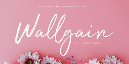 Introducing Wallgain A rustic, dapper handwritten font with a personal touch. With quick dry strokes and a signature style. Wallgain Handwriting Font multilingual support: Afrikaans, Albanian, Catalan, Danish, Dutch, English, Estonian, French, Finnish, German, Icelandic, Indonesian, Italian, Malay, Norwegian, Portuguese, Spanish, Swedish, Zulu, and many more. What’s Included : Standard & Multilingual glyphs Ligature Works on PC & Mac Simple installations Accessible in Adobe Illustrator, Adobe Photoshop, Adobe InDesign, and even work on Microsoft Word. Hope you enjoy our font!
 - Side Note Variable by Jamie Clarke Type,
$199.00 Hello! I’m SideNote Variable. I specialize in: Annotations Headings Friendly dialogue Social media marketing Looking both smart & casual I’m perfect for descriptions and explanatory text. Use me to deliver tricky information in a helpful, reassuring manner. I look friendly and relaxed but professional enough to make you look awesome. I add personality to otherwise dry information making it fun and easier to understand. I come with all sorts of useful features, like emoji, arrows, and underlines.
 - Geo Deco by Tipo Pèpel,
$28.00 Geodeco font family brings to you the recovery of the typographic forms from the beginning of the 20th century, with a strong ArtDecó flavour but from a new point of view: modernity and geometry. Modernity in the visual contrast between lowercase and capital letters, where rounded shapes are opposed to the breaks and graphic tensions of the strokes of the capital letters. which gives it an enormous originality. Generous doses of internal whites, assure a powerful legibility even with the spite of its short ascending and descending strokes. What we get is a coherent and martial look where fluidity and homogeneity is the main note. Soft and rounded minuscule, with large internal whites for super legibility, bombproof, especially on screens, where Geodeco lives with an astonishing naturalness. The capital letters, used alone as display, or as companions of the minuscule characters, give the family a touch of originality and exotic flavor. Like the spices in the food; a brief but intense note. Breaking the rectangular shapes so that the appearance of the letter comes out benefits from enlarging the internal whites and making them consistent with the white of the lower case. GeoDeco works very well in plain text with the obvious limitation that it is not a type for small bodies, but exceptionality weldon for plain text and signage. Maximum visibility, total beauty on screens. A family of this new century with the flavour of that epoch of experimentation that were the years 20. Extensive multilanguage support and almost all Opentype functionalities. Try it and it will convince you - for sure!
 - Sweynheym Pannartz by Proportional Lime,
$19.99 The font SweynheymPannartz is strongly modeled after an example Conrad Sweynheym and Arnold Pannartz used in their early printing venture in Subiaco, Italy which began around 1465. Their efforts were supported by Pope Sixtus the IV after they enthusiastically printed more books than they could sell. They not only brought printing to Italy, but also developed the first Roman style type. This font has over 600 defined glyphs to cope with modern needs, and also the ability to use several abbreviations common to that period. It also has an alternate minuscule “k” more modern in appearance for those that find the original too unusual.
 - Super Blues by Gatype,
$14.00 Super Blues elegant font designed when in a creative mood and perfect shape, inspired by the bold, natural look of serifs so beautiful for today's fashion. bold, balanced and varied, born for luxury and beauty. including uppercase letters, numbers, and various kinds of punctuation Super Blues is perfect for invitations, logos & branding, photography, advertising, watermarks, social media posts, product packaging, product designs, labels, wedding designs, stationery, special events or anything else needed to create a theme. Super Blues is built with OpenType features and includes initial and ending language styles, alternative characters for most lowercase letters, numbers, punctuation, alternatives, endings, and also supports other languages. Hope you enjoy our fonts and if you have any questions, feel free to message & I'll be happy to help :)
 - Monday Routines by Walkeren,
$21.00 Say hello to Monday! The day when your spirit is reborn. Monday Routines Font comes to complement your warm spirit to start all your fun activities. Monday Routines Font is a simple and bold signature font style designed with decisive and strong lines, provides an authoritative impression. You can use Monday Routines Font for any purposes such as branding, signatures, product packaging, titles of books or novels, or just on social media posts. Monday Routines Font includes some alternates, ligatures, and a complete set of uppercase and lowercase letters, as well as multi-language support, numbers, punctuation and comes with various swashes. Thanks so much for looking and please let me know if you have any questions. Just contact us
 - PROG.BOT - 100% free

- Rainbow Night by Nathatype,
$29.00You may want your designs to look sharp, professional, and interesting without exaggerations, but how would you do it amid the abundance of font options available to choose? Rainbow Night is a perfect answer to your design needs. Rainbow Night is an elegant, prominent display serif font to attract everyone who sees it. A serif font is a font with hooks and tiny scratches attached to the letters’ edges. The huge serif size adjacent to each other in such a font makes the letters look heavier. Moreover, this font is deliberately created in thick lines and strong contrasts as the characters of a display font to produce strong visual displays. Generally, such a display serif font can show elegant, classy nuances to assign a strong identity to the brand, to stand the desired messages out, and to get the messages easily recognized by readers. You can apply this font for various text sizes due to its great legibility. In addition, you can make use of the available features here as well. Features: Stylistic Sets Ligatures Multilingual Supports PUA Encoded Numerals and Punctuations Rainbow Night fits best for various design projects, such as brandings, posters, banners, headings, magazine covers, quotes, printed products, merchandise, social media, etc. Find out more ways to use this font by taking a look at the font preview. Thanks for purchasing our fonts. Hopefully, you have a great time using our font. Feel free to contact us anytime for further information or when you have trouble with the font. Thanks a lot and happy designing. - Enocenta by insigne,
$22.00 Enocenta is fully featured script face. Like a wild, untamed beauty in the moonlight, Enocentaís flowing calligraphy dances across the page. This contemporary typeface is not slavishly devoted to convention, and instead it defies it repeatedly. The face has bit more character than most high contrast script faces and attracts your readers eye. This spicy and flavorful collaboration between Jeremy Dooley and Cecilia Marina Pezoa. Enocenta is a five weight script typeface that offers a variety of options for you to design beautiful things. Enocenta is friendly and warm, and it's hairline weight is simple and clean while its bold is strong and draws attention. Its contemporary appearance is right home on the web or wherever your canvas may be, whether that is packaging, magazines and invitations. It's also a fantastic choice for branding and can be quickly converted into a distinctive logo when applying its options to customize the look and feel so the brand is unique. Enocenta is packed with alternates, swashes, ligatures, and also other techy perks. To discover its complete feature set, please use it with software that supports OpenType options for sophisticated typography. There are a number of purchase options for the face. The Pro fonts are loaded with the full set of alternates, ligatures and ornaments. The Standard types are contain no decorative alternates but are an affordable starting point for designers that don't need the full features.
 - Luckywish by Jafar07,
$12.00 Welcome to the world of Luckywish Sans-Serif Handmade Font, a special offering born from hands full of creativity and love. Combining the art of handwriting with the simplicity of a sans-serif, Luckywish font offers a magical script that fulfills all your wishes. Luckywish is a symbol of hope that shines through every stroke found in each character. Crafted with heartfelt dedication, this font showcases the natural beauty of handwriting, bringing warmth and joy to every design composition. Armed with a pen and imagination, Luckywish exudes a unique charm. Its relaxed and delicately intertwined style brings a friendly and inviting ambiance to every formed sentence. When used, this font will infuse happiness and a fresh spirit into every project you undertake. Luckywish is more than just a font; it's a loyal partner to designers, writers, and creators alike. With its sans-serif characteristics, this font is easy to use and suitable for a variety of creative projects, from logo designs to posters, from wedding invitations to company branding. In the palm of your hand, Luckywish offers a perfect balance between boldness and delightful gentleness. Each character is meticulously crafted to provide unparalleled harmony in every usage. It's time to let your hopes and imagination flourish with Luckywish. Let this font bring joy and inspiration into your design world. Get ready to witness your words and messages transform into mesmerizing works of art that capture hearts. Be part of this magical journey with Luckywish. Get the font now and enjoy limitless creativity with an unmatched personal touch.
 - Overspray - Personal use only

- Walken by Typodermic,
$11.95 You want a typeface that’s gonna command attention? You want a typeface that’s gonna make your message scream out, “Hey, look at me!”? Then you need Walken. This slab serif is built like a brick house, with sturdy letterforms and robust serifs that mean business. And don’t think you’re gonna get some plain vanilla lettering here. Oh no. Walken’s got some tricks up its sleeve. We’re talking custom letter pairs, baby. OpenType ligatures that’ll swap out some letter combinations and create a unique, unpredictable look. You’ll get a mix of stencil and non-stencil characters that’s gonna give your message a personality all its own. Now, if you’re not satisfied with just one tough look, Walken’s got you covered. We’ve got three, count ’em, three forceful options: Clean, Crisp, and Hard. So whether you’re aiming for a sleek, professional image or a rough-and-tumble vibe, we’ve got you covered. So what are you waiting for? You want a typeface that’s gonna make you stand out from the crowd? You want Walken. But be warned: this typeface means business. Most Latin-based European writing systems are supported, including the following languages. Afaan Oromo, Afar, Afrikaans, Albanian, Alsatian, Aromanian, Aymara, Bashkir (Latin), Basque, Belarusian (Latin), Bemba, Bikol, Bosnian, Breton, Cape Verdean, Creole, Catalan, Cebuano, Chamorro, Chavacano, Chichewa, Crimean Tatar (Latin), Croatian, Czech, Danish, Dawan, Dholuo, Dutch, English, Estonian, Faroese, Fijian, Filipino, Finnish, French, Frisian, Friulian, Gagauz (Latin), Galician, Ganda, Genoese, German, Greenlandic, Guadeloupean Creole, Haitian Creole, Hawaiian, Hiligaynon, Hungarian, Icelandic, Ilocano, Indonesian, Irish, Italian, Jamaican, Kaqchikel, Karakalpak (Latin), Kashubian, Kikongo, Kinyarwanda, Kirundi, Kurdish (Latin), Latvian, Lithuanian, Lombard, Low Saxon, Luxembourgish, Maasai, Makhuwa, Malay, Maltese, Māori, Moldovan, Montenegrin, Ndebele, Neapolitan, Norwegian, Novial, Occitan, Ossetian (Latin), Papiamento, Piedmontese, Polish, Portuguese, Quechua, Rarotongan, Romanian, Romansh, Sami, Sango, Saramaccan, Sardinian, Scottish Gaelic, Serbian (Latin), Shona, Sicilian, Silesian, Slovak, Slovenian, Somali, Sorbian, Sotho, Spanish, Swahili, Swazi, Swedish, Tagalog, Tahitian, Tetum, Tongan, Tshiluba, Tsonga, Tswana, Tumbuka, Turkish, Turkmen (Latin), Tuvaluan, Uzbek (Latin), Venetian, Vepsian, Võro, Walloon, Waray-Waray, Wayuu, Welsh, Wolof, Xhosa, Yapese, Zapotec Zulu and Zuni.
 - Blank Manuscript by Aah Yes,
$14.95Blank Manuscript allows you to produce sophisticated musical scoresheets even on basic Word Processors - anything from simple plain staves to complex full-page orchestral scores of your own design, to write in the notation yourself. The basic stuff is really easy and straightforward, but there's some quite advanced things you can do as well. So Copy and Save these Instructions. • The main stuff is simple and tends to follow the initial letter. Treble, Bass and Alto clefs are on upper case T B A (there are more clefs, below). The 5 Lines for the clefs are on L or l. • A small v will give a small vertical line (like a bar line) and a Big U will give a Big Upright - these can start or end a line or piece. • Time Signatures - type the following letters: Think of W for Waltz and it's easy to remember that 3/4 time is on W. Then from that they go up or down together like this: V=2/4 W=3/4 X=4/4 Y=5/4 Z=6/4 Compound Times are on H I J K like this: H=3/8 I=6/8 J=9/8 K=12/8 Common Time and Cut Common symbols can be found on semi-colon and colon respectively (all begin with Co- ). 2/2 3/2 are on lower case a and b, 7/4 and 7/8 are on lower case c and d, 5/8 is on small k (think POL-k-A) • Flat signs are on the numbers. Flat signs on LINES 1 to 5 are on numbers 1 to 5. Flat signs on SPACES 1 to 5 are on numbers 6 to 0 (space 1 being above line 1, space 5 being above the top line of the stave). Sharp signs are on the letters BELOW the long-row numbers. Which is q w e r t for the sharp signs on Lines 1 to 5, and y u i o p for sharp signs on spaces 1 to 5. Doing it this way means it works the same for all clefs, whether Treble, Bass, Alto, Tenor or any other. Sharp and Flat Signs always go in this order, depending on how many sharps or flats your key signature requires: Treble Clef Sharps t i p r u o e Flats 3 9 7 4 2 8 6 Bass Clef Sharps r u o e t i w Flats 2 8 6 3 1 7 = Alto Clef Sharps o e t i w r u Flats 7 4 2 8 6 3 1 • Guitar Chord Boxes are on G and g (G for Guitar) Upper Case G has a thick line across the top Lower case g has an open top, for chords up the fretboard TAB symbols are available: Six-string Tablature is on s & S for Six. Four-string Tablature is on f & F for Four. (Lower case has the "TAB" symbol on it, Upper Case has just the lines to continue.) Five-string tablature, is on lower case "j" (as in BAN-j-O) and of course L or l will continue the 5 lines. •RARE CLEF SIGNS including Tenor Clef, are on various punctuation marks, i.e. dollar, percent, circumflex, ampersand & asterisk, above the numbers 4 to 8. NOTE: The important symbols were kept on the letter and number keys, which are fairly standard all over, but some of the less important symbols are on various punctuation keys, which in different countries are not the same as on my keyboard. If it comes out wrong on your system, all I can say is it's right on the systems we've tried, and they'll be in here somewhere, probably on a different key. CLOSING THE ENDS OF THE LINES and BAR-LINES is done with the 3 varieties of brackets - brackets, brace and parentheses - Left/Right for the Left/Right end of the line. Parentheses L/R () which are above 9, 0 give a clef with a small vertical upright (the same as a bar line). Brace L/R and Brackets L/R (both on the 2 keys to the right of P on my keyboard) will close off a staff line with tall upright bars. Brace gives a double upright - one thick, one thin. Brackets give a single tall upright. A Big Upright is on Big U, (Big U for Big Upright) and a small vertical line is on small v (small v for small vertical). The Big Upright is the maximum height, and the small vertical is exactly the same height as a stave. And there's a tall upright Bar, on Bar (which is to the left of z on my keyboard, with Shift,) which is the same height as the bar on upper case U but twice as broad. • There's a staff intended for writing melodies, which is a little bit higher up than an ordinary treble clef giving a space underneath to put lyrics in - on m and M for Melody line. Lower case has the Treble Clef on, Upper case M has just the higher-up staff lines with no clef. (Use mMMMMMMM etc.) However this clef will be in the wrong place to put in sharp and flat signs, key signatures and so on, so if you use this clef you'll have to write the sharps, flats and key signature yourself. There's also a clef that's smaller (less tall) than the ordinary clef, but with the same horizontal spacing so it will align with other standard-sized clefs - on slash (a plain clef) and backslash (with a Treble Clef). • There are some large brackets for enclosing groups of staves, such as you'd use on large orchestral scores, on Upper Case N O P Q R, which can aid clarity. N and O on the left, Q and R on the right. P is a Perpendicular line to be used on both sides to increase the height of the enclosure, in this way but with the staff lines in between: N Q P P P P P P O R OTHERS —————————————— • Repeat marks are on comma (left) and period/full stop (right). • Hyphen is left as a sort of hyphen - it's a thin line like a single staff line, with the same horizontal spacing as ordinary staff lines - in case you want to draw a line across for a Percussion Instrument, or a Title or Lyric Line. • Space is a Space, but with HALF the width or horizontal spacing as ordinary staff lines, so 2 space symbols will be the same width as a clef symbol or line. • Grave (to the left of 1 on the long row, or hold down Alt and type 0096 then let go) gives a staff line that is one eighth the width of an ordinary staff line. • If you want manuscript in a clef and key which requires a flat or sharp sign in the space underneath the 5 lines, they’re on = equals and + plus . SYMBOLS • Many of these symbols will only be useful if you have worked out in advance which bars will need them, but they are here in case you've done that and wish to include them. • Symbols for p and f (piano and forte) are on 'less than' and 'greater than' < > (above comma and full stop) and m for mezzo is on Question, next to them. They can be combined to make mp, mf, ff, pp, etc. These signs -- and other signs and symbols like Pedal Sign, Coda Sign and so on -- can be found on various punctuation mark keys, including above 1, 2, 3 in the long row, and others around the keyboard. There's a sort of logic to their layout, but in different countries the keys are likely to give different results to what is stated here, so it's probably best to just try the punctuation and see if there's any you might want to use. (But on my keyboard a Coda sign is on circumflex - because of the visual similarity. Pedal sign is on underscore. A "Sign" symbol is on exclamation mark.) They were only included in case you really need them to be printed rather than handwritten. • However, a Copyright symbol is deemed necessary, and also included are a "Registered" symbol and a TradeMark symbol. They are found in the conventional places, and can be accessed by holding down ALT and typing 0169, 0174 or 0153 respectively in the numberpad section and letting go. • Staff lines with arco and pizz. above are on capital C and D respectively ---C for ar-C-o. • An empty circle above a staff line (to indicate sections by writing letters A, B, C or 1,2,3 inside for rehearsal marks) is on n. The actual signs for an A, B, C and D in a circle above the staff line can be produced by holding down ALT and typing 0188, 0189, 0190 and 0191 respectively and letting go. • The word "Page", for indicating page numbers, is on the numbersign key. • The two quotes keys, (quote single and quote double) have symbols representing "Tempo is", and "play as triplets", respectively. • INSTRUMENT NAMES There's a whole lot of Instrument Names built in (over a hundred) which can be printed out above the clef, and you do it like this. Hold down Alt and type in the given number in the numberpad section, then let go. For Piccolo it's 0130, for Flute it's 0131, Cornet is on 0154, Violin is on 0193, and the numbers go up to over 0250, it's a fairly complete set. There's also a blank which is used to align un-named clefs on 0096. Put them at the very beginning of the line for the best results. Here they are: WOODWIND Piccolo 0130 Flute 0131 Oboe 0132 Clarinet 0133 Eng Horn 0134 Bassoon 0135 Soprano Sax 0137 Alto Sax 0138 Tenor Sax 0139 Baritone Sax 0140 Saxophone 0142 Contrabassoon 0145 Recorder 0146 Alto Flute 0147 Bass Flute 0148 Oboe d'Amore 0149 Cor anglais 0152 Pipes 0241 Whistle 0242 BRASS Cornet 0154 Trumpet 0155 Flugelhorn 0156 Trombone 0158 Euphonium 0159 Tuba 0161 French Horn 0162 Horn 0163 Tenor Trombone 0164 Bass Trombone 0165 Alto Trombone 0166 Piccolo Cornet 0167 Piccolo Trumpet 0168 Bass Trumpet 0170 Bass Tuba 0171 Brass 0172 VOICES Vocal 0175 Melody 0176 Solo 0177 Harmony 0178 Soprano 0179 Alto 0180 Tenor 0181 Baritone 0182 Treble 0183 Bass 0197 (see also PLUCKED STRINGS) Descant 0184 Mezzo Soprano 0185 Contralto 0186 Counter Tenor 0187 Lead 0206 BOWED STRINGS Strings 0192 Violin 0193 Viola 0194 Cello 0195 Contrabass 0196 Bass 0197 Double Bass 0198 Violoncello 0199 Violin 1 0200 Violin 2 0201 Fiddle 0252 PLUCKED STRINGS Harp 0202 Guitar 0203 Ac. Gtr 0204 El. Gtr 0205 Lead 0206 Bass 0197 Ac. Bass 0207 El. Bass 0208 Slide Gtr 0209 Mandolin 0210 Banjo 0211 Ukelele 0212 Zither 0213 Sitar 0214 Lute 0215 Pedal Steel 0216 Nylon Gtr. 0238 Koto 0239 Fretless 0244 KEYBOARDS + ORGAN Piano 0217 El. Piano 0218 Organ 0219 El. Organ 0220 Harpsichord 0221 Celesta 0222 Accordion 0223 Clavinet 0224 Harmonium 0225 Synth 0226 Synth Bass 0227 Keyboards 0228 Sampler 0249 PERCUSSION and TUNED PERCUSSION Percussion 0229 Drums 0230 Vibes 0231 Marimba 0232 Glockenspiel 0233 Xylophone 0234 Bass marimba 0235 Tubular Bells 0236 Steel Drums 0237 Kalimba 0240 OTHERS Harmonica 0246 Mouth Organ 0247 FX 0251 Intro 0243 Verse 0245 Refrain 0248 Chorus 0250 un-named 0096 (this is a small spacer stave for aligning clefs without a name) ALSO copyright 0169 registered 0174 TradeMark 0153 Rehearsal marks 0188-0191 (giving A, B, C, D in a circle, an empty circle is on n ) Clef signs for Treble Bass Alto without any staff lines 0253-0255 An Alphabetic List of all signs: a 2/2 time b 3/2 time c 7/4 time d 7/8 time e sharp sign, centre line f Tab sign for 4-string tab g Guitar Chord Box, no nut h half-width stave I sharp sign, third space up j Tab sign for 5-string tab k 5/8 time l Lines - 5 horizontal lines for a stave m Melody Clef - a standard clef but placed higher up, with Treble sign n Stave with an empty circle above o sharp sign, fourth space up p sharp sign, space above stave q sharp sign, bottom line r sharp sign, fourth line up s Tab sign for 6-string tab t sharp sign, top line (fifth line up) u sharp sign, second space up v vertical line (bar-line) w sharp sign, second line up x Fretboard, four strings y sharp sign, first space up z Fretboard, five strings A Alto Clef B Bass Clef C “arco” above stave D “pizz.” above stave E Double Vertical Lines F Four Horizontal lines (for 4-string tab) G Guitar Chord Box with nut H 3/8 time I 6/8 time J 9/8 time K 12/8 time L Lines - 5 horizontal lines for a stave M Melody Clef - a standard clef but placed higher up, plain N Bounding Line for grouping clefs - top left O Bounding Line for grouping clefs - bottom left P Bounding Line for grouping clefs - Perpendicular Q Bounding Line for grouping clefs - top right R Bounding Line for grouping clefs - bottom right S Six Horizontal lines (for 6-string tab) T Treble Clef U tall, thin Upright line V 2/4 time W 3 / 4 time X 4/4 time Y 5/4 time Z 6/4 time 1 flat sign, first line up (the lowest line) 2 flat sign, second line up 3 flat sign, third line up 4 flat sign, fourth line up 5 flat sign, fifth line up (the top line) 6 flat sign, first space up (the lowest space) 7 flat sign, second space up 8 flat sign, third space up 9 flat sign, fourth space up 0 flat sign, space above stave - DIN Next Arabic by Monotype,
$155.99 DIN Next is a typeface family inspired by the classic industrial German engineering designs, DIN 1451 Engschrift and Mittelschrift. Akira Kobayashi began by revising these two faces-who names just mean ""condensed"" and ""regular"" before expanding them into a new family with seven weights (Light to Black). Each weight ships in three varieties: Regular, Italic, and Condensed, bringing the total number of fonts in the DIN Next family to 21. DIN Next is part of Linotype's Platinum Collection. Linotype has been supplying its customers with the two DIN 1451 fonts since 1980. Recently, they have become more popular than ever, with designers regularly asking for additional weights. The abbreviation ""DIN"" stands for ""Deutsches Institut für Normung e.V."", which is the German Institute for Industrial Standardization. In 1936 the German Standard Committee settled upon DIN 1451 as the standard font for the areas of technology, traffic, administration and business. The design was to be used on German street signs and house numbers. The committee wanted a sans serif, thinking it would be more legible, straightforward, and easy to reproduce. They did not intend for the design to be used for advertisements and other artistically oriented purposes. Nevertheless, because DIN 1451 was seen all over Germany on signs for town names and traffic directions, it became familiar enough to make its way onto the palettes of graphic designers and advertising art directors. The digital version of DIN 1451 would go on to be adopted and used by designers in other countries as well, solidifying its worldwide design reputation. There are many subtle differences in DIN Next's letters when compared with DIN 1451 original. These were added by Kobayashi to make the new family even more versatile in 21st-century media. For instance, although DIN 1451's corners are all pointed angles, DIN Next has rounded them all slightly. Even this softening is a nod to part of DIN 1451's past, however. Many of the signs that use DIN 1451 are cut with routers, which cannot make perfect corners; their rounded heads cut rounded corners best. Linotype's DIN 1451 Engschrift and Mittelschrift are certified by the German DIN Institute for use on official signage projects. Since DIN Next is a new design, these applications within Germany are not possible with it. However, DIN Next may be used for any other project, and it may be used for industrial signage in any other country! DIN Next has been tailored especially for graphic designers, but its industrial heritage makes it surprisingly functional in just about any application. The DIN Next family has been extended with seven Arabic weights and five Devanagari weights. The display of the Devanagari fonts on the website does not show all features of the font and therefore not all language features may be displayed correctly.
 - DIN Next Devanagari by Monotype,
$103.99DIN Next is a typeface family inspired by the classic industrial German engineering designs, DIN 1451 Engschrift and Mittelschrift. Akira Kobayashi began by revising these two faces-who names just mean ""condensed"" and ""regular"" before expanding them into a new family with seven weights (Light to Black). Each weight ships in three varieties: Regular, Italic, and Condensed, bringing the total number of fonts in the DIN Next family to 21. DIN Next is part of Linotype's Platinum Collection. Linotype has been supplying its customers with the two DIN 1451 fonts since 1980. Recently, they have become more popular than ever, with designers regularly asking for additional weights. The abbreviation ""DIN"" stands for ""Deutsches Institut für Normung e.V."", which is the German Institute for Industrial Standardization. In 1936 the German Standard Committee settled upon DIN 1451 as the standard font for the areas of technology, traffic, administration and business. The design was to be used on German street signs and house numbers. The committee wanted a sans serif, thinking it would be more legible, straightforward, and easy to reproduce. They did not intend for the design to be used for advertisements and other artistically oriented purposes. Nevertheless, because DIN 1451 was seen all over Germany on signs for town names and traffic directions, it became familiar enough to make its way onto the palettes of graphic designers and advertising art directors. The digital version of DIN 1451 would go on to be adopted and used by designers in other countries as well, solidifying its worldwide design reputation. There are many subtle differences in DIN Next's letters when compared with DIN 1451 original. These were added by Kobayashi to make the new family even more versatile in 21st-century media. For instance, although DIN 1451's corners are all pointed angles, DIN Next has rounded them all slightly. Even this softening is a nod to part of DIN 1451's past, however. Many of the signs that use DIN 1451 are cut with routers, which cannot make perfect corners; their rounded heads cut rounded corners best. Linotype's DIN 1451 Engschrift and Mittelschrift are certified by the German DIN Institute for use on official signage projects. Since DIN Next is a new design, these applications within Germany are not possible with it. However, DIN Next may be used for any other project, and it may be used for industrial signage in any other country! DIN Next has been tailored especially for graphic designers, but its industrial heritage makes it surprisingly functional in just about any application. The DIN Next family has been extended with seven Arabic weights and five Devanagari weights. The display of the Devanagari fonts on the website does not show all features of the font and therefore not all language features may be displayed correctly. - DIN Next Cyrillic by Monotype,
$65.00DIN Next is a typeface family inspired by the classic industrial German engineering designs, DIN 1451 Engschrift and Mittelschrift. Akira Kobayashi began by revising these two faces-who names just mean ""condensed"" and ""regular"" before expanding them into a new family with seven weights (Light to Black). Each weight ships in three varieties: Regular, Italic, and Condensed, bringing the total number of fonts in the DIN Next family to 21. DIN Next is part of Linotype's Platinum Collection. Linotype has been supplying its customers with the two DIN 1451 fonts since 1980. Recently, they have become more popular than ever, with designers regularly asking for additional weights. The abbreviation ""DIN"" stands for ""Deutsches Institut für Normung e.V."", which is the German Institute for Industrial Standardization. In 1936 the German Standard Committee settled upon DIN 1451 as the standard font for the areas of technology, traffic, administration and business. The design was to be used on German street signs and house numbers. The committee wanted a sans serif, thinking it would be more legible, straightforward, and easy to reproduce. They did not intend for the design to be used for advertisements and other artistically oriented purposes. Nevertheless, because DIN 1451 was seen all over Germany on signs for town names and traffic directions, it became familiar enough to make its way onto the palettes of graphic designers and advertising art directors. The digital version of DIN 1451 would go on to be adopted and used by designers in other countries as well, solidifying its worldwide design reputation. There are many subtle differences in DIN Next's letters when compared with DIN 1451 original. These were added by Kobayashi to make the new family even more versatile in 21st-century media. For instance, although DIN 1451's corners are all pointed angles, DIN Next has rounded them all slightly. Even this softening is a nod to part of DIN 1451's past, however. Many of the signs that use DIN 1451 are cut with routers, which cannot make perfect corners; their rounded heads cut rounded corners best. Linotype's DIN 1451 Engschrift and Mittelschrift are certified by the German DIN Institute for use on official signage projects. Since DIN Next is a new design, these applications within Germany are not possible with it. However, DIN Next may be used for any other project, and it may be used for industrial signage in any other country! DIN Next has been tailored especially for graphic designers, but its industrial heritage makes it surprisingly functional in just about any application. The DIN Next family has been extended with seven Arabic weights and five Devanagari weights. The display of the Devanagari fonts on the website does not show all features of the font and therefore not all language features may be displayed correctly. - DIN Next Paneuropean by Monotype,
$92.99DIN Next is a typeface family inspired by the classic industrial German engineering designs, DIN 1451 Engschrift and Mittelschrift. Akira Kobayashi began by revising these two faces-who names just mean ""condensed"" and ""regular"" before expanding them into a new family with seven weights (Light to Black). Each weight ships in three varieties: Regular, Italic, and Condensed, bringing the total number of fonts in the DIN Next family to 21. DIN Next is part of Linotype's Platinum Collection. Linotype has been supplying its customers with the two DIN 1451 fonts since 1980. Recently, they have become more popular than ever, with designers regularly asking for additional weights. The abbreviation ""DIN"" stands for ""Deutsches Institut für Normung e.V."", which is the German Institute for Industrial Standardization. In 1936 the German Standard Committee settled upon DIN 1451 as the standard font for the areas of technology, traffic, administration and business. The design was to be used on German street signs and house numbers. The committee wanted a sans serif, thinking it would be more legible, straightforward, and easy to reproduce. They did not intend for the design to be used for advertisements and other artistically oriented purposes. Nevertheless, because DIN 1451 was seen all over Germany on signs for town names and traffic directions, it became familiar enough to make its way onto the palettes of graphic designers and advertising art directors. The digital version of DIN 1451 would go on to be adopted and used by designers in other countries as well, solidifying its worldwide design reputation. There are many subtle differences in DIN Next's letters when compared with DIN 1451 original. These were added by Kobayashi to make the new family even more versatile in 21st-century media. For instance, although DIN 1451's corners are all pointed angles, DIN Next has rounded them all slightly. Even this softening is a nod to part of DIN 1451's past, however. Many of the signs that use DIN 1451 are cut with routers, which cannot make perfect corners; their rounded heads cut rounded corners best. Linotype's DIN 1451 Engschrift and Mittelschrift are certified by the German DIN Institute for use on official signage projects. Since DIN Next is a new design, these applications within Germany are not possible with it. However, DIN Next may be used for any other project, and it may be used for industrial signage in any other country! DIN Next has been tailored especially for graphic designers, but its industrial heritage makes it surprisingly functional in just about any application. The DIN Next family has been extended with seven Arabic weights and five Devanagari weights. The display of the Devanagari fonts on the website does not show all features of the font and therefore not all language features may be displayed correctly. - Klimaks by Kereatype,
$10.00 Klimaks is a modern serif font family whose design refers to the style of transitional serifs. In the process of working on Klimaks font, we have significantly revised the initial idea and expanded the areas of possible font application, while maintaining the original spirit of the project. Despite a large number of display details, the typeface looks great in small point sizes, and also when it is used in large text arrays. Klimaks - Luxury Serif Font has been crafted from scratch with a structural logic of its own: a fusion of pure geometry and optical balance. By combining a variety of styles Klimaks Font is suitable for Logo, greeting cards, quotes, posters, branding, name card, stationary, design title, blog header, art quote, typography Klimaks - Luxury Serif Font also suitable for art, modern envelope lettering or book design, happening style like the hand-drawn design or watercolor design theme, craft design, any DIY project, book title, wedding font, pop vintage design, or any purpose to make our art/design project look pretty and trendy.
 - Antica by Sudtipos,
$39.00 Antica has sharp triangular serifs, and in 8 weights with true italics, it forms a family that stylistically finds its origins in Latin styles of the nineteenth century. The font incorporates additional swashes, small caps and stylish alternates that advance the aesthetic from its roots and make it appropriate for modern design. Commonly named ‘Latin types’ did not vary in weight, but we decided to create Antica with a range that goes from thin to black and we also added extra curlicues to the letterforms. Antica borrows from the versatility and freedom granted to type founders of the nineteenth century – a time when the meteoric growth of mass-produced consumer goods led to an increased demand for publicity that needed fresh, attention grabbing typefaces. And as an homage to these Latin types we designed Antica to function well with an array of projects from stylized labels and formal editorial design requiring small type sizes to large-scale posters and billboards. The Antica family supports a wide variety of Latin alphabet-based languages.
 - ITC Panache by ITC,
$29.99Typefaces, like most other works of art, provide a small window into the personalities and sensibilities of the artists who create them. ITC Panache not only provides this window, it is also aptly named. Mr. Edward Benguiat the dreator of ITC Panache, has all the dash, verve (and panache) hinted at in the design, Creative, capable and prolific, Ed Benguiat has drawn hundreds of exciting and popular typeface designs. Benguiat's design goal was to create a sans serif typestyle that is versatile, utilitarian - and distinctive. We think he has succeeded admirably. ITC Panache's three weights mix exceptionally well to complement each other or provide emphasis where necessary. Extensive testing at text sizes and design fine-tuning has produced a typeface family which is remarkably homogenous and consistent in color. Text set in ITC Panache is inviting without dissapointment. It is exceptionally easy to read, even in long text blocks of copy or small point sizes. When set in larger sizes or used for headlines, ITC Panache's character traits becomes more apparent and pronounced to the reader. They help to create graphics with distinction and style. Big or small. a little or a lot. it's hard not to use ITC Panache well. If you could pigeonhole ITC Panache, it would probably be classified as a stressed sans", but this would not completely describe, or do justiceto, the design. There is a slight contrast in stroke weight, which becomes more pronounced as the familiy weight increases; but there is a more to distinguish ITC Panache from ather sans serifs. Perhaps most obvious is its high waist and correspondingly slight condensation of the top half of the "round" capitals. Both of these traits link ITC Panache with the sensuous forms of art nouveau creations. In contrast are the typicall old style "e" found in designs like Cloister and ITC Berkeley Old Style, and the two storied "g" common to the early 20th century sans serif designs. The capital "A" even has the cupped top found in Caslon designs. Part of the beauty of ITC Panache is that all of these seemingly unrelated desig traits are melded into a design of exceptional continuity." - Eigerdals Slab by insigne,
$30.00 Introducing Eigerdals Slab - the ultimate font for creating a cozy and inviting atmosphere in your designs. This slab-serif font family captures the essence of the mountains of Norway and the streets of Stockholm, making it the perfect choice for design projects that need a touch of Hygge. With its top-heavy characters, Eigerdals Slab has a more approachable and warm feel that sets it apart from other font choices. Plus, its tall x-height, brushed and smooth look makes it both readable and stylish. But that's not all, Eigerdals Slab comes loaded with practical OpenType features like ligatures, unicase alternates, and a set of upright italic swash alternates, that can be fully utilized in software like Quark and Adobe suite. Not only that, it also includes support for a wide range of languages. Eigerdals Slab is an extension of the Eigerdals family, and its distinctive look pairs perfectly with other text faces. Whether you're using it for display work or longer blocks of text, Eigerdals Slab is the perfect font for adding warmth and friendliness to your designs. Don't wait any longer, try Eigerdals Slab today and elevate your work to the next level!
 - Chilead by Groteskly Yours,
$12.00 Chilead is reminiscent of the early days of magazine publishing. Its elegant curves, high contrast and all-round heartwarming feel are perfect for art projects and typography across all mediums. Chilead is a sans serif font that looks great in titles, when used in larger sizes – but is not out of the place in a text either, which makes it a perfect choice for artists and designers who pursue not only the aesthetic qualities of the font, but also its functionality. Originally designed in 2019 and fully updated and expanded in 2022, Chilead offers users a large set of ligatures (both standard and discretionary) and a number of alternative forms for letters (such as a, v, w, y, etc). Chilead comes equipped with 600+ glyphs, which covers most of Latin-based scripts. Carefully kerned, Chilead is ready to be used in any project that requires a typeface that combines unique and stylish letterforms with a modern feel.
 - Rahere Sans Inline by ULGA Type,
$22.00 Rahere Sans Inline is a bold, no-nonsense display font featuring an inline that imbues the design with classic overtones while still looking modern. It’s imposing without being overpowering and practical but not boring. As part of the expanding Rahere typeface family, Rahere Sans Inline is specifically designed to complement both Rahere Sans and Rahere Roman Display, pairing beautifully when used for headings, stand-out quotes or drop caps. Whether you’re in design, marketing or advertising, Rahere Sans Inline is a versatile display font suitable for all types of applications including: Design, advertising - posters, leaflets, brochures, adverts, books and banners Publishing - magazine covers and editorials and book covers Music, film - DVDs and CDs Announcements - offers, events, birthdays and anniversaries Rahere Sans Inline is a capitals-only font with small caps in the lowercase slots and matching numerals, plus a few ligatures. The following languages are supported: Western Europe, Vietnamese, Central/Eastern Europe, Baltic, Turkish and Romanian.

