10,000 search results
(0.038 seconds)
- Mezzotint CF by Connary Fagen,
$25.00 Mezzotint CF is a daring and playful display typeface perfect for logotypes, posters, and editorial use. High-contrast strokes, flared serifs, aqueous connections, and inky terminals give Mezzotint CF its striking and rakish personality. Includes roman and italic sets across a single bold weight, with wide language support, optional ligatures, OpenType alternates, and more. Mezzotint CF pairs well with a contrasting, simple geometric sans-serif like Greycliff CF; for maximum effect, try a large difference in typeface size between the two. All typefaces from Connary Fagen include free updates, including new features, and free technical support.
 - Cerulya CF by Connary Fagen,
$35.00 Airy and delicate, Cerulya CF is a striking display typeface brimming with movement and grace. A unique semi-serif design with rounded teardrop terminals, Cerulya CF shines brightest at large sizes – perfect for logos, posters, headlines, and more. Includes five weights, roman and italic sets, and a selection of optional ligatures, swashes, and alternates. Cerulya CF pairs well with a contrasting, simple geometric sans-serif like Greycliff CF; for maximum effect, try a large difference in typeface size between the two. All typefaces from Connary Fagen include free updates, including new features, and free technical support.
 - Raqillas by Zamjump,
$13.00 Raqillas, its modern rough brush with original dry brush imperfections, and highly bouncy base line, is crafted to be simple and straightforward but unobtrusive, Ideal for logos, handwritten quotes, product packaging, headers, posters, apparel, merchandise, social media & greeting cards. Basic Latin A-Z and A-z Symbol Numerals PUA Encode Multilingual Support You need a program that supports OpenType features such as Adobe Illustrator CS, Adobe Indesign & CorelDraw X6-X7. There are additional ways to access alternatives, using the Character Map (Windows), Nexus Font (Windows), Font Book (Mac) or a software program such as PopChar (for Windows and Mac).
 - Modesty by Flawlessandco,
$9.00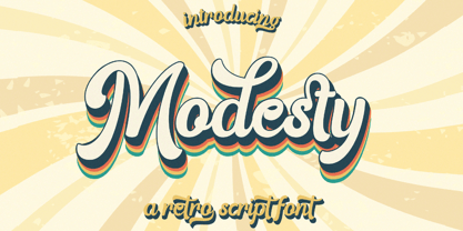 Modesty is an retro font type with a fun and groovy style that perfect for your retro vintage-themed projects. Try out some alternate characters for another visual result! There's some connected letters and some alternates that suitable for any graphic designs such as branding materials, t-shirt, print, business cards, logo, poster, t-shirt, photography, quotes .etc This font support for some multilingual. Also contains uppercase A-Z and lowercase a-z, alternate character, numbers 0-9, and some punctuation. If you need help, just write me! Thanks so much for checking out my shop!
 - Murays by Shakira Studio,
$9.70 I'm present to you, new retro serif called Murays! Murays is a display retro font with a fun and bold style that perfect for your projects such as poster design, branding materials, t-shirt, business cards, logo, photography, quotes, and more. Try out some alternate characters for another visual result! This font support for some multilingual. Also contains uppercase A-Z and lowercase a-z, alternate character, numbers 0-9, and some punctuation. What you get Letters, numbers, punctuation, multilingual support, alternate and ligature Regular and Outline version If you need help, just write me! Thanks so much for checking out my shop!
 - Dreamer by Fenotype,
$25.00 Dreamer is a soft and dreamy serif with serious vintage appeal. As Dreamer occupies the space with its large x-height and wide characters it’s effective for any display use where you need to communicate a friendly, fun and easy to approach feeling with a touch of charming nostalgia polished in modern days aesthetics. Dreamer is equipped with a large arsenal of OpenType features - Try Swash, Stylistic or Titling Alternates for less conventional letterforms. Keep Standard Ligatures and Contextual Alternates on to prevent certain letter combinations, such as ff and fi from colliding unintentionally. In total, Dreamer has more than 100 alternative characters.
 - Matterdi by Creativemedialab,
$20.00 Introducing Matterdi, an elegant High-Fashion serif family with tons of unique and fashionable ligatures. This versatile serif family contains 100+ unique, elegant ligatures and alternates. 9 weights available from Thin to Black which gives you many possibilities to layout your next projects. Perfect for word-marks, monograms, logos, branding projects, or to use as web font. Try Matterdi Bold for display titles or Matterdi Thin for a fashionable and elegant look. It is also perfect to pair with a hand-drawn script! How to access alternate? Adobe Photoshop go to Window - glyphs Adobe Illustrator go to Type - glyphs
 - Lunaris by Artisticandunique,
$38.00 The Lunaris font family has an elegant character with soft curved turns and includes 9 styles. If you want to try a modern or classic, elegant appearance, it can meet all your needs with its timeless structure that is ideal for your projects with capital and small letters. Lunaris is a versatile serif with a luxurious feel. You can easily use Lunaris in magazines, books, titles, websites, logos, clothing, invitations, branding, packaging, advertising, and more. CHARACTER RANGES : Basic Latin, Latin-1 Supplement, Latin Extended-A, Latin Extended-B, General Punctuation, Currency Symbols, CJK Symbols And Punctuation, Private Use Area (plane 0),
 - Dielust by Flawlessandco,
$9.00 Dielust is an retro font type with a fun and bold style that perfect for your retro vintage-themed projects. Try out some alternate characters for another visual result! There's some connected letters and some alternates that suitable for any graphic designs such as branding materials, t-shirt, print, business cards, logo, poster, t-shirt, photography, quotes .etc This font support for some multilingual. Also contains uppercase A-Z and lowercase a-z, alternate character, numbers 0-9, and some punctuation. If you need help, just write me! Thanks so much for checking out my shop!
 - Lovebright by Set Sail Studios,
$16.00 Lovebright is an expressive, untamed handwritten font, with exaggerated descenders and loops. It’s an engaging and charming choice for signature style logos, personable branding, display text, handwritten quotes & letters, and blog/social media posts. Lovebright includes a full alternate set of upper & lowercase characters, included as it’s own separate fonts. Use the alternate characters for a different text layout, or mix with the regular version to avoid repeating letters and recreate naturally inconsistent handwriting. Lovebright also includes 22 ligatures, these double letter combinations will help letters connect and flow more naturally. The ligatures will automatically generate when using the Lovebright fonts with most software. Please get in touch if you need any help with these. The Lovebright fonts contain language support for; English, French, Italian, Spanish, Portuguese, German, Swedish, Norwegian, Danish, Dutch, Finnish, Indonesian, Malay, Hungarian, Polish, Croatian, Turkish, Romanian, Czech, Latvian, Lithuanian, Slovak, Slovenian.
 - Lifehack by DearType,
$35.00 Dear type lovers, meet Lifehack - a casual script with a huge personality. Warm, amiable and organic, yet elegant, it is perfect if you want to convey individuality and style. The Lifehack family consists of the original Lifehack script, an Italic version, a narrow handdrawn Sans and a Basic version of limited glyph set with letters that do not connect. All fonts in the Lifehack family work easily together to create visually appealing logos, packaging, presentations, headlines or editorials. The combination of casual sans and a script has proven useful many times and thus preferred both for print and web. When it comes to OpenType features, Lifehack comes with swashes, stylistic alternates and initial/terminal forms for you to give a custom flare to your designs. All fonts have several weights and a lovely collection of goodies - various ornaments, borders and ribbons that complement the fonts' charm and uniqueness.
 - Youth Heritage by Heyfonts,
$15.00 Youth Heritage Font is a vintage bold script font that pays homage to the rich visual heritage associated with youthful exuberance and retro aesthetics , This typeface combines bold, expressive strokes with a script style reminiscent of classic hand-lettering from bygone eras, capturing the spirit of vintage design. Here's a detailed explanation of the key features and characteristics of the Youth Heritage Font: Features: Vintage Aesthetics: The Youth Heritage Font is designed to evoke a sense of nostalgia, drawing inspiration from vintage typography prevalent during the mid-20th century, Its design elements reflect the bold and charismatic lettering styles associated with retro signage and advertising. Bold and Expressive Strokes: One of the defining features of this font is its bold and expressive strokes. Each letter is crafted with confidence, making a strong visual impact. This characteristic contributes to the font's ability to command attention and stand out in various design applications. Script Style: The script style of the font imparts a handwritten and personalized feel. The cursive letterforms flow seamlessly, creating a sense of dynamism and adding a touch of informality to the overall design. Distinctive Lettering: Each letter in the font is crafted with attention to detail, featuring unique and distinctive characteristics. This ensures that the font maintains its individuality and offers a distinct typographic personality. Applications: Vintage Branding: The Youth Heritage Font is well-suited for vintage branding projects. Apparel Design: Designers in the fashion industry can leverage this font for apparel branding and graphic designs. Its bold script style adds a retro flair to T-shirts, hoodies, and other clothing items, giving them a timeless and stylish appeal. Retro Signage: The bold and expressive nature of the font makes it a perfect choice for retro signage and display purposes. Event Posters and Flyers: When designing promotional materials for events, concerts, or parties with a vintage theme, the Youth Heritage Font can contribute to a cohesive and visually appealing poster or flyer design. Social Media Graphics: Its bold and expressive script style can make posts and announcements more engaging and shareable.
 - Wolby by LetterMaker,
$16.00 Wolby is a rough and organic hand drawn typefamily which draws inspiration from a variety of sources such as sign painting, hand lettering, comic books, cartoons, health food, sticks and stones to name a few. The letter shapes were all originally created by writing with a pointed brush. The use of one writing tool results in an aesthetical harmony between the very different styles making them all fit together. The family consists of eight styles; upright and slanted caps in regular and bold, a layered block style in fill, outline and shadow styles and a lively script. Wolby is capapble of creating very different moods depending on which style you choose to highlight. Because of it’s aesthetics, range of styles and extensive language support, Wolby is especially suitable for use in advertising, packaging design and gritty branding & fashion design. When using the layered block styles you’ll get the best result by placing the shadow layer on the bottom, the fill in the middle and the outline layer on top. These can also be combined freely so you can use just shadow + fill, shadow + outline or fill + outline. The script style is armed with a set of ligatures and swash capitals which allow you to supercharge your designs.
 - Falstaff MT by Monotype,
$29.99 Falstaff first appeared with Monotype in 1931, an alphabet in the style of a wide, bold antiqua that was especially popular in the first third of the 19th century. Such typefaces distinguished themselves through their consistent basis in the transitional antiqua style. They are characterized by their extremely fine unflexed serifs with no curve connecting them to the thick strokes. The numerals with their generous curves and ball-like stroke endings and beginnings are particularly decorative. The vertical strokes are dominant and give lines of this typeface a column-like and therefore static look. Falstaff is today often used for book titling, especially for mystery novels. It is best used sparingly in middle and larger point sizes.
 - Rizado Script by Kostic,
$40.00 Rizado Script is a classy one-weight script typeface, made with “dolce vita” in mind. Its high contrast and pointy tone are recalling the fine nib handwriting of a meticulous and decisive person that hasn’t got free time to spare but surely knows how to enjoy his life. No quick and dry strokes, but rather wide, elegant and strong-minded temper that will bring a long-lasting touch to your packaging layouts. Sure, if you are looking for a good fit for some more ephemeral design such as a weekend high-class cocktail promotion, or a wedding invitation – this handy display typeface won’t let you down for a second. If you happen to go to Venice and enjoy their popular Aperitivo, you’ll be asked to choose between three types of bitter-reddish base drink. Rizado will bring you the same amount of pleasure, authority and uniqueness while you pick out one of the three ampersands or other alternate characters. According to the concept of Fellini’s lifestyle, “la dolce vita” is a luxury lifestyle full of cheerful worldly pleasure. But don’t let yourself be fooled by this moto, because Italians are famous for their modesty and sagacity as well. That’s why you’re always supposed to turn on the Contextual Alternates (to activate extra positional forms — isolated, initial and final) and keep your voice down and never set this typeface in all Capital letters. There are 391 total glyphs made to support West European, Central European and South East European languages.
 - Skicack by upirTYPO,
$17.00Skicack is scribbled form of classic bold font. Creates nice texture when used in small sizes (especially printed), and hard heavy look in big sizes. Comes with complete Central European character set, and few additional symbols (see gallery images). Ideal for headlines, CD covers, T-shirts, clothes designs, webpages, banners, and everywhere where you need something special! As you can see on gallery image, it´s really easy to create nice background-patterns, and as it is a font, you can scale it to any size! - Trade Gothic Inline by Linotype,
$29.00 Trade Gothic inline is a quirky display companion for Trade Gothic Next, offering five different voices, and a whole lot of personality. The lighter weights are graceful and elegant, embracing negative space to give the sense that the letters are halfway to disappearing. Designer Lynne Yun has incised the darker weights with a super thin inline that emphasises the heaviness of the letters, and creates a reassuring chunkiness. “If I kept the inlines the same, it created a lot of visual noise,” explains Yun. “I wanted each weight to be different enough, so in the end the weight and width of the letters was increasing and decreasing in size, and the inlines were too. The black is almost like an extra black, because the inline is smaller. It's about trying to have different voices for each weight.” Trade Gothic Inline is available in five weights, from light to black.
 - Zinc Boomerang - Unknown license

- Trigomy by Markus Reiter,
$24.90 Trigomy is a proportional pixel font designed on a 5 pixel grid. It is intended for either very small text or as huge display font for posters and the like. To get a crisp look this font should be used at 10 pt or multiples of 10 pt. (A tip for Adobe Creative Suite applications is to change the standard anti-aliasing method from “sharp” to “crisp” and to align the text to whole pixels. Also avoid centered text.) To get started with type design I thought it was best to start with a pixel font because you don't have to focus much on the design itself, but rather have to focus on how kerning and spacing works and the various features you can implement with OpenType. And of course I wanted to have a pixel font that had all that I was missing from other pixel fonts. We were learning trigonometry at the time I started designing Trigomy, and most of the time I misspoke it “trigometry”. So, when I had to come up with a name for my first font I thought: "Why not go with Trigomy?"
 - Bastia by Jen Wagner Co.,
$17.00 Bastia is a classy, bold upper and lowercase typeface that looks incredible in both large and small settings. Best used as a display for headings and logos, Bastia's clean lines and smooth curves give any project an extra touch of class. See how it looks when used for body text in the 11th sample image above. I also love combining Bastia and clean sans serifs for minimal logos (see the "Lucky Finch" sample logo). This download also includes a special outline version of the serif, so you can layer text or add some flair to your logos and display type. There are also alternates available for "k" and "s" that give each letter some extra curves (available via the special characters panel One thing to note about Bastia is the letter spacing. It was intentionally spaced for clean reading if you wanted to use it for body type, so I recommend setting the spacing a little tighter for display use (around -10 to -20 should do!). Includes: Bastia Bold (uppercase & lowercase) Bastia Bold Outline (uppercase & lowercase) Numbers & punctuation Foreign language support Alternates for "k" and "s" – available via the special characters panel
 - Mule Cargo by Menagerie Type,
$20.00 The Mule is a very special mix – it has a donkey father and horse mother, and they often inherit the best qualities of both. "The mule is an example of hybrid vigor, Charles Darwin wrote: The mule always appears to me a most surprising animal. That a hybrid should possess more reason, memory, obstinacy, social affection, powers of muscular endurance, and length of life, than either of its parents, seems to indicate that art has here outdone nature." They are typically very strong for their size compared to horses and are able to cope with bad weather better than donkeys. Mules rarely become ill and their behavior is Intelligent and sensitive. In the right home, they can make great companions for other equines, and wonderful pets. However, if they are unhandled or not correctly trained, mules have the potential to be dangerous. The inner shapes of Mule Cargo are almost identical between the Regular and the Heavy weight. This shared genom make them very powerful pair and a useful design tool for display purposes.
 - Meta Language - Unknown license

- Pickey Pop by Nathatype,
$29.00 Pickey Pop is a delightful display font that combines a thick weight, low contrast letters, and charming swinging endings. With its playful and bold design, this typeface brings a sense of joy and vibrancy to any creative project. The thick weight of this font adds a strong and confident presence to each letter. The boldness of the strokes creates visual impact and ensures legibility even at smaller sizes. This display font demands attention and stands out effortlessly in any design composition. In contrast to its bold weight, Pickey Pop features low contrast letters. This design choice gives the font a sense of solidity and consistency. The uniform strokes contribute to a clean and contemporary appearance, making it a versatile choice for a wide range of design applications. What makes this font truly special are the swinging endings found in select letters. These whimsical details add a touch of playful movement and uniqueness to the font. The swinging letter endings bring a sense of rhythm and energy, infusing your designs with a joyful and dynamic quality. For the best legibility you can use it in the bigger text. Enjoy the available features here. Features: Stylistic Sets Ligatures Multilingual Supports PUA Encoded Numerals and Punctuations Pickey Pop fits in headlines, logos, attention-grabbing titles, product packaging, branding materials, editorial layouts and website headers. Find out more ways to use this font by taking a look at the font preview. Thanks for purchasing our fonts. Hopefully, you have a great time using our font. Feel free to contact us anytime for further information or when you have trouble with the font. Thanks a lot and happy designing.
 - Raylig by Khaiuns,
$16.00 Raylig is a graceful serif but full of energy, Raylig is an experimental project full of selfishness in it, this project was designed by khaiuns in May 2021, he made it himself so it took about 4 months. Raylig is a desire to present the perfect font for your wide variety of projects so that this type of font can be selected for branding, especially in the UI / UX industry, also suitable for typographic layout for magazines, posters, books, etc. With hard work and spending a lot of time, comes the Raylig Serif font that has interesting things, such as: 10 styles: 5 Original, 5 Alternative 650 glyphs in each style Support for more than 190+ languages: Expanded Latin, and many other languages Each style has 33 really cool alternatives, and find something interesting Raylig also has classic characters, but it is also perfect for your modern design, you can see it on display, such as in thin body size (light), Raylig makes a neutral impression, but when the size is getting bigger (Bold), users are taken on a fun search to find interesting movements, graphic peculiarities, and unusual solutions. All letter patterns are perfectly adjusted. I hope you have a blast using Raylig. Thanks for use this font ~ Khaiuns X zelowtype
 - Karita by Nathatype,
$29.00 Your design project is your brand’s introduction to the public, so it is crucial to do it in the right way. An inappropriate font can totally change your messages and damage your work. For that reason, Karita is here to assist you with your needs. Karita is a classic, elegant, professional display serif font to increase the product and brand values promoted. This font looks more prominent than the others and shows strong, yet elegant impressions to attract customers. Continuity elements on every little scratch of the letters’ edges lead your eyes to follow one letter to another in line with serif font characters. Besides, this font type has thick lines and strong contrasts to attract customers and to show firm impressions. For a legibility reason, you can use this font for big text sizes. You can enjoy the available features here as well. Features: Stylistic Sets Ligatures Multilingual Supports PUA Encoded Numerals and Punctuations Karita fits best for various design projects, such as brandings, posters, banners, headings, magazine covers, quotes, invitations, name cards, printed products, merchandise, social media, etc. Find out more ways to use this font by taking a look at the font preview. Thanks for purchasing our fonts. Hopefully, you have a great time using our font. Feel free to contact us anytime for further information or when you have trouble with the font. Thanks a lot and happy designing.
 - Apple Pie by FontMesa,
$25.00 You might call this a Bodoni Ornate font that Bodoni never made, close examination of this old 1800s font and it's plain to see that the top half of the letters is very Bodoni in appearance. Apple Pie is a revival of and old font from the William Hagar Type Foundry, which I've been able to date back to 1850. The William Hagar type specimen book from the 1850s only shows this font as a caps only typeface plus numbers, later in 1869 MacKellar Smiths and Jordan offered this font with a lowercase. Over a two year period I was able to collect enough letters to begin production of this old decorative font, the type specimen books only showed a small line of text for this font so I would search through old documents on eBay and also shows relating to Ephemera. I could have easily developed a new font based on a very small sample of letters but I wanted to wait and find as many letters as possible, I was unable to find the Q, X, Z and ten lowercase letters so those missing letters are of my own design. New to this font is the addition of an all Caps Greek character set, accented letters for Eastern Central and Western European countries is also within this font. Fill fonts are available for the Apple Pie font, you will need an application that works in layers such as Adobe Photoshop, Adobe Illustrator or Corel Graphics in order to use the Fill fonts. Some Fill fonts may be used as stand alone fonts but the versions for Apple Pie look best when layered behind the parent or main Apple Pie fonts. Be sure to check out the left and right hands located on the Less Than and Greater Than keys.
 - Mirantz by insigne,
$32.00 Y’all ready for this? Now starting for Insigne: the new serif Mirantz. This rookie all-star plays a precise game every game, cutting at all the right angles to leave your reader impressed and ready to see more. You can always count on Mirantz to lead with solid mechanics and a clean style, but don’t be surprised when the face keeps it real with a little individual flare and creativity. This personal touch is nothing short of elegance in every appearance. So what makes us love this rookie above the other great players in the field? Contrast, for one. Mirantz brings more contrast to the game than most serifs out there. The serifs on this face have a crisp, sharp wedge that naturally draws the reader’s eye. You can’t help but fall in love with its clean, natural style. Mirantz also features a tall x-height and regular proportions that can play a number of positions on the page and still stay strong through the last half of the copy or even the final period. Mirantz is a solid powerhouse player, containing a complete set of small capitals and nine weights from thin to bold. It can play well both down low and up top with its subscripts and superscripts and can move your reader’s eye easily across the copy with its titling capitals, condensed and extended variants, and open style figures. With its options covering more than 72 Latin-based languages, look for this newcomer to have international success in the near future. It you haven’t set your draft picks for this next round of projects, think hard before passing up Mirantz. A capable serif like this one is a guaranteed asset to any team of fonts. Production assistance from Lucas Azevedo.
 - Coomeec by Linotype,
$29.99 Although Andi AW. Masry designed his Coomeec typeface with one eye on comic books, this is more than just another cartoon font. Even in our short profile of the font below, we're sure you'll find enough to be surprised by the calligraphic aesthetic and the wide range of potential uses of Coomeec. Typography had been one of Andy AW. Masry's hobbies before he turned professional in 2008 and formed his own agency in Jakarta in Indonesia. The former construction engineer had already spent many hours of his leisure time in following his pastimes of designing, photography and Latin typography. Fascinated by the close interaction between text and image in comic books, one of his first projects was the development of his font Coomeec™. The condensed letters of Coomeec seem to have more in common with a calligraphic brush typeface than a more conventional cartoon font. With the characteristic line forms of a brush font, the not unextensive variations in line thickness and numerous small embellishments to the glyphs, Coomeec can be used to enhance your projects with animated effects. You can achieve this not just in the larger font sizes; the font is also very legible in small sizes thanks to its large x-height. There are certain unusual letter forms, such as that of lowercase 'g', 's' and uppercase 'Y', that provide Coomeec with a touch of the exotic. As Coomeec has numerous character alternatives, you can use it not only to create diverse designs but also to ring the changes with the character of the text itself. There are variants for most lowercase letters, some of which exhibit only minor differences, such as the lack of a curlicue on the 'b', a modified downstroke on the 'h' and an elongated base for the 'k'. In the case of other letters, such as the 'q' and the 'r', there are significant disparities between variants. The uppercase characters are also available in a lively swash style with significantly extended terminals. Among the range of characters of Coomeec are oldstyle and lining figures designed for proportional and tabular setting. All alternatives are available in the form of the corresponding OpenType versions. Coomeec comes in two weights; Regular and Bold, each with its Italic version. The form of the slightly inclined Italic characters is identical to that of their upright counterparts with the exception of the lowercase 'f', which has an ascender in its Italic version. As an OpenType Pro font, the glyphs available for Coomeec ensure that it can be used to set not only western European but also central European texts. Coomeec is not just at home when used to set headlines. The excellent legibility of this individual and vibrant typeface means that it's also ideal for setting shorter texts. The various alternative letters provide the designer with the opportunity to vary the textual appearance, and to choose between creating a more formal or more light-hearted effect. Coomeec is not only available in an OpenType version but is also obtainable as a web font, so that you can employ its exotic features to good effect when creating internet pages.
 - ZF Gently by ZooFont,
$22.00 Gently, newly released by ZooFont, is a sans serif typeface that harmoniously combines straight lines and curves in a clean form. The stable form, which has its origins in handwriting, and the look of analog sensibility are enough to inspire confidence. Gently has a total of 9 weights, so it can be used freely anywhere, from body text to headlines. In addition, the height of the letters is economically calculated to achieve a reasonable line spacing, ensuring comfortable readability in various digital media. A cool breeze blows, a soft smile spreads across your lips, When I'm with you, the love in my heart seems to awaken. Your sweet whispering voice makes my heart flutter. Gently has the following features: 9 weights (from Ultra light to Ultra Black) extended latin 450+ glyphs fixed width numbers The Latin extension offers more than 130 languages with extensive multilingual Latin support for Western, Central, and Southeastern Europe.
 - BUNK by AdultHumanMale,
$20.00 BUNK is an 11 font system that can be layered in different ways to create various classic titling effects, think Old Timey signage 'COME IN WE'RE OPEN'. It's a display font that produces the different results by mixing and matching the various fonts together. Bunk's layer combos give you the control to create brilliant bevel, convex and 3-D styles. Each font contains the same metrics, so when your title is set, copy and paste-in-place to create layers of different weights/styles to build out your desired effect. Unlike other Layered Fonts out there, BUNK has upper case and lower case as well as currency symbols and lots of foreign characters too. Over 180 glyphs!. Five of the fonts (Shades 1,2,3,4,5) are clearly dependent on each other to create a complete font, so theses are only available in the Full family pack (11 fonts) or in the Layer Kit Family pack (7 fonts).
 - Futura Round by URW Type Foundry,
$39.99 Futura is THE prototype of a geometric or constructed linear sans serif and the font most commonly font of its kind used to date. Futura, very much influenced by the Bauhaus movement in Germany, was designed in 1927 by Paul Renner. Although being around for almost 90 years, Futura seems eternally young and fresh which also explains its continuous popularity with designers and typographers. Futura simply means efficiency and functionality documented by both its many usages as corporate type (e.g. Volkswagen, formerly IKEA, Vuitton, Shell, formerly HP, SMA and many more) as well as in various famous film projects (e.g. Kubrick, Anderson etc.). Futura’s iconic status was probably established when it walked on the moon with the Apollo 11 crew in 1969. It was used for the lettering of the plaque that was left up there. Now, URW has expanded its range of Futura styles by Futura Round with 14 additional styles.
 - Engria by Eclectotype,
$40.00 Engria is a type family of four weights with corresponding italics that treads the fine line between sans and serif. There are serifs, of a sort, inspired by the brush. Not the marks made by a brush, but the actual splayed shape the bristles make when clamped together. Wedge-like chunks that resemble engraved forms, as the name Engria hints at. But it also has the appearance of a stressed, flared sans. This mixed approach lends a unique voice. Highly legible at text sizes, as indeed it is optimized for, Engria does however shine at display sizes thanks to its characteristic details – flared stems, angular counterforms, rugged ink traps and fluid curves. (I would recommend tracking it a little tighter at larger sizes.) Engria started life way back in 2014, and has been worked and reworked tirelessly to get to this finished product. My intent was to really push the idea of the white shapes being as important, if not more so, than the black. Engria is equipped for typographically demanding applications, boasting as it does an array of OpenType features, including small caps, automatic fractions, stylistic sets, various figure styles, arrows, case sensitive forms and more. It will make a very useful addition to your typographic arsenal, with a flare (ahem) for editorial work, but the individuality for packaging, branding, and logo work.
 - Hinzatis by Aga Silva,
$39.99 It is up to you how big and voluptuous statement you will be making with this font, as Hinzatis is about old Hollywood glamour and attitude. With lots of options encoded in handy open type files you can easily fine-tune your text for best visual effect. Looks perfect when placed as: titles, headers, labels, names, business cards, just to name a few. Open-type Pro version features 1200 + characters including initial and terminal letters, numerous caps styles, ligatures and alternates. Other versions feature over 1000+ characters and focus mostly on foreign languages with accented letters (incl. Vietnamese); So depending on option you choose you can create realistic and multilingual hand-calligraphy on all of your creations!
 - Boldgia by Portograph Studio,
$23.00 This typeface has a unique and attractive appearance. Boldgia looks great when combined with solid character fonts. For branding projects, logos, wedding designs, social media posts, advertisements, product packaging, product designs, labels, photography, watermarks, invitations, stationery, and anything requiring handwritten taste, Boldgia is perfect. What’s Included : Ton of glyphs Ligature & Alternate Works on PC & Mac Simple installations Accessible in Adobe Illustrator, Adobe Photoshop, Adobe InDesign, even work on Microsoft Word. PUA Encoded Characters – Fully accessible without additional design software. Fonts include multilingual support for; Afrikaans, Albanian, Czech, Danish, Dutch, English, Estonian, Finnish, French, German, Hungarian, Italian, Latvian, Lithuanian, Norwegian, Polish, Portuguese, Slovak, Slovenian, Spanish, Swedish. Your purchase has been received! Thank you!
 - Knockbold by Portograph Studio,
$23.00 This typeface has a unique and attractive appearance. Knockbold looks great when combined with solid character fonts. For branding projects, logos, wedding designs, social media posts, advertisements, product packaging, product designs, labels, photography, watermarks, invitations, stationery, and anything requiring handwritten taste, Knockbold is perfect. What’s Included : Web Font Ton of glyphs Ligature & Alternate Works on PC & Mac Simple installations Accessible in Adobe Illustrator, Adobe Photoshop, Adobe InDesign, even work on Microsoft Word. PUA Encoded Characters – Fully accessible without additional design software. Fonts include multilingual support for; Afrikaans, Albanian, Czech, Danish, Dutch, English, Estonian, Finnish, French, German, Hungarian, Italian, Latvian, Lithuanian, Norwegian, Polish, Portuguese, Slovak, Slovenian, Spanish, Swedish. Your purchase has been received! Thank you!
 - Maybeline Script by Bal Studio,
$14.00 Thank you for viewing the Maybeline Script! Maybeline Script is a modern, handwritten, modern script font with an organic base, a style that's romantic, fun, and catchy. has several alternatives with different doodles. It is more effective and efficient when used for your job design. Maybeline Script can make your text more attractive, suitable for wedding invitations, cards, letterheads, name boards, product packaging, labels, news, posters, badges, headers, signatures, t-shirt logos and so on. It features 317 glyphs, with OpenType features and style sets, as well as international support for most Western languages. Maybeline Script can be used for both Commercial and Personal projects. If you have any questions, feel free to contact me via email. Thank you!
 - Xova Layered by Cerri Antonio,
$30.00 XOVA Base, Color One, Color Two, Color Three and Color Four, is a 5 font system that can be layered in different ways to create infinite title effects used commonly in poster and 3D logo design. XOVA’s layer combinations give you complete control in producing styles like, modern, 3D, beveled. It can be used alone and/or in layered and allows you adjust leading and kerning. Each font contains the similar metrics, so when your title is set, copy and paste-in-place to create layers of different weights/styles to build out your desired effect. XOVA works great in any graphics application that allows you to utilize layers or 3D effects.
 - Sweet Jasmine by Nathatype,
$25.00 Are you having trouble finding a perfect font for your projects? Using an inappropriate font will only show unprofessional, uninteresting projects and leave bad impressions to the audience. Therefore, let us introduce you to our script font to help you create lovely, unique, prominent designs. This is Sweet Jasmine. Sweet Jasmine is a handwriting-like script font created with mixing the natural handwriting elements with natural nuances to produce warm, flowing-looking designs. Its letters are interconnected in high contrasts, and it is suitable to apply for big text sizes because it has somewhat complicated font style details to ease the font to read. In addition, you can enjoy the available features here. Features: Ligatures Stylistic Sets Multilingual Supports PUA Encoded Numerals and Punctuations Sweet Jasmine fits best for various design projects, such as brandings, posters, banners, headings, magazine covers, quotes, invitations, name cards, printed products, merchandise, social media, etc. Find out more ways to use this font by taking a look at the font preview. Thanks for purchasing our fonts. Hopefully, you have a great time using our font. Feel free to contact us anytime for further information or when you have trouble with the font. Thanks a lot and happy designing.
 - Poppy Spoor by Yumna Type,
$15.00 Would you like a legible, professional, prominent font? Well, if that is what you want, you will probably have trouble finding one as it is a time-wasting process and is a hard challenge. Let us introduce you to a perfect font for any project, the Poppy Spoor. Poppy Spoor, unlike the other display fonts, is a display font with rather square letters to show you fun, soft, modern impressions due to the thin line designs in low contrasts. This font type, giving you a clipart as a bonus, is legible and is better applied for big text sizes. You can maximize your designs with Poppy Spoor’s features to remain the best in every design at any time. Features: Alternates Ligatures Multilingual Supports PUA Encoded Numerals and Punctuations Poopy Spoor fits best for various design projects, such as brandings, posters, banners, headings, magazine covers, quotes, invitations, name cards, printed products, merchandise, social media, etc. Find out more ways to use this font by taking a look at the font preview. Thanks for purchasing our fonts. Hopefully, you have a great time using our font. Feel free to contact us anytime for further information or when you have trouble with the font. Thanks a lot and happy designing.
 - Benson Script by Kyle Wayne Benson,
$10.00 Benson Script is a script that is desperately trying to be anything but a script. With 3 contrast levels, and 2 styles, the six styles of Benson Script are an experiment in the diversity of a single stem width. Modernism’s desire to fit all elements within geometric constraints and adhere to strong verticals has spread throughout type design, but has had little to do with the frills and ornaments of script. Cutting a script down to its bare bones is an offensive idea to many—almost seeming insulting to its genre. Benson Script bridges that genre gap between frill and function. As a matter of genre Benson Script errs on the side of modernism, and adds flair as a last resort. Read more about her open type features, and the development process here.

