10,000 search results
(0.028 seconds)
- Quercus Whiteline by Storm Type Foundry,
$69.00 Quercus is characterised by open, yet a little bit condensed drawing with sufficient spacing so that the neighbouring letters never touch. It has eight interpolated weights with respective italics. Their fine gradation allows to find an exact valeur for any kind of design, especially on the web. Quercus serif styles took inspiration from classicistic typefaces with vertical shadows, ball terminals and thin serifs. The italics have the same width proportion as upright styles. This “modern” attitude is applied to both families and calls for use on the same page, e g in dictionaries and cultural programmes. Serif styles marked by “10” are dedicated to textual point sizes and long reading. The sans-serif principle is rather minimalistic, with subtle shadows and thinned joints between curved shapes and stems. Quercus family comprises of the usual functionality such as Small Caps, Cyrillics, diacritics, ligatures, scientific and aesthetic variants, swashes, and other bells & whistles. It excels in informational and magazine design, corporate identity and branding, but it’s very well suited for book covers, catalogues and posters as well. When choosing a name for this typeface I've been staring out from my studio window, thinking helplessly without any idea in sight. Suddenly I realised that all I can see is a spectacular alley of oaks (Quercus in Latin) surrounding my house. These oaks were planted by the builders of local ponds under the leadership of Jakub Krčín in the fifteenth century.
 - Quercus Serif by Storm Type Foundry,
$69.00 Quercus is characterised by open, yet a little bit condensed drawing with sufficient spacing so that the neighbouring letters never touch. It has eight interpolated weights with respective italics. Their fine gradation allows to find an exact valeur for any kind of design, especially on the web. Quercus serif styles took inspiration from classicistic typefaces with vertical shadows, ball terminals and thin serifs. The italics have the same width proportion as upright styles. This “modern” attitude is applied to both families and calls for use on the same page, e g in dictionaries and cultural programmes. Serif styles marked by “10” are dedicated to textual point sizes and long reading. The sans-serif principle is rather minimalistic, with subtle shadows and thinned joints between curved shapes and stems. Quercus family comprises of the usual functionality such as Small Caps, Cyrillics, diacritics, ligatures, scientific and aesthetic variants, swashes, and other bells & whistles. It excels in informational and magazine design, corporate identity and branding, but it’s very well suited for book covers, catalogues and posters as well. When choosing a name for this typeface I've been staring out from my studio window, thinking helplessly without any idea in sight. Suddenly I realised that all I can see is a spectacular alley of oaks (Quercus in Latin) surrounding my house. These oaks were planted by the builders of local ponds under the leadership of Jakub Krčín in the fifteenth century.
 - Quercus Sans by Storm Type Foundry,
$69.00 “Quercus” is characterised by open, yet a little bit condensed drawing with sufficient spacing so that the neighbouring letters never touch. It has eight interpolated weights with respective italics. Their fine gradation allows to find an exact valeur for any kind of design, especially on the web. Quercus serif styles took inspiration from classicistic typefaces with vertical shadows, ball terminals and thin serifs. The italics have the same width proportion as upright styles. This “modern” attitude is applied to both families and calls for use on the same page, e g in dictionaries and cultural programmes. Serif styles marked by “10” are dedicated to textual point sizes and long reading. The sans-serif principle is rather minimalistic, with subtle shadows and thinned joints between curved shapes and stems. Quercus family comprises of the usual functionality such as Small Caps, Cyrillics, diacritics, ligatures, scientific and aesthetic variants, swashes, and other bells & whistles. It excels in informational and magazine design, corporate identity and branding, but it’s very well suited for book covers, catalogues and posters as well. When choosing a name for this typeface I've been staring out from my studio window, thinking helplessly without any idea in sight. Suddenly I realised that all I can see is a spectacular alley of oaks (Quercus in Latin) surrounding my house. These oaks were planted by the builders of local ponds under the leadership of Jakub Krčín in the fifteenth century.
 - Moreva by HIRO.std,
$17.00 Moreva is a new casual modern script font. This font describes about girly, feminist, elegant, catchy, dynamic, humanist, easy to use and will bring a good harmony when the letters are connected and paired each other. FEATURES - Support Opentype Features - Support Ligatures - Automatic stylistic alternates am an ar at att bb bl cl ct dd fl el elt em en er et ett ff gg gt hh il im in ir it itt kk ll lt mm nn nt oo ol olt om on or ot ott pp rr ss se sh sk sl so st tt the um un ur utt yl yt Sl Sk St Sh Gl Gh Kl Kh Ch Cl Bl Bh - Uppercase - Lowercase - Numbering and Punctuations - Multilingual Support - Works on PC or Mac USE Moreva works great in any branding, logos, magazines, apparel, wedding designs, social media posts, advertisements, quotes, product packaging, product designs, label, photography, watermark, invitation, stationery and any projects that need handwriting taste. Enjoy using! Thanks. HIRO.std
 - Typologic by Ahmad Jamaludin,
$17.00 Introducing Typologic, a font that effortlessly fuses geometric simplicity with the vibrant pop culture styles of the swinging 60s and 70s. This versatile typeface offers not just one, but 8 distinct font families, each with its own unique character. You'll find Condensed, Normal, Semi Expanded, Expanded, and stylish shadow versions. But that's not all—when you choose Typologic, you also get a treasure trove of 56 FREE BONUS ASSETS, featuring retro mascot illustrations that perfectly complement your creative projects. Features: Typologic Main FIle 56 free bonus assets that are Retro Mascot Illustrations Has 8 fonts : Condensed, Normal, Semi Expanded, Expanded, Condensed Shadow, Normal Shadow, Semi Expanded Shadow, Expanded Shadow Instructions (Access special characters, even in Cricut Design) Unique Letterforms Works on PC & Mac Simple Installations Accessible in Adobe Illustrator, Adobe Photoshop, Microsoft Word even Canva! PUA Encoded Characters. Fully accessible without additional design software. Come and say hello over on Instagram! Thank you, Dharmas Studio
 - RF Dewi by Russian Fonts,
$32.00 Dewi is a modern neo-grotesque multi-typeface family with closed forms. It includes 4 versions: condensed, normal, extended, expanded. In each version there are 16 font styles: 8 regulars and 8 italics (64 styles in total). The family contains weights from thin to black. Everything is ready to solve absolutely any graphic tasks. Dewi helps to create a unique and vibrant design consonant with the spirit of our days. Сontours remains neutral in a small size but when you work with large sizes Dewi shows his strong and confident character. Ideally suited for web design, logos and branding, navigation, printing, advertising and packaging, infographic, poster design, music covers and so many more. This typeface will be a real workhorse for you. Opentype features: old-style figures, tabular and tabular old-style, slashed zero, ligatures, fractions and automatic frations, circuled numbers, arrows and stylistic alternates for arrows, superscript and subscript. Multilingual support: Latin, latin extended, cyrillic and cyrillic extended (more than 70+ languages)
 - Spooky Zombie by Ahmad Jamaludin,
$11.00 Just in time for your Halloween projects hopefully :) Introducing SPOOKY ZOMBIE! A font that's ready to cast a spooky spell on your designs. This eerie display font is the perfect choice for all your Halloween-related projects and crafty ideas. Plus, we've included an Outline version of the font as a little bonus. When you get Spooky Zombie, you'll also receive 26 spook-tacular Halloween doodles that perfectly complement your hair-raising projects! What's Included? Spooky Zombie Main File 26 free doodles with a Halloween theme Regular and Outline version Instructions (Access special characters, even in Cricut Design) Unique Letterforms Works on PC & Mac Simple Installations Accessible in Adobe Illustrator, Adobe Photoshop, Microsoft Word even Canva! PUA Encoded Characters. Fully accessible without additional design software. Multilingual Supports: (Afrikaans, Albanian, Catalan, Croatian, Czech, Danish, Dutch, English, Estonian, Finnish, French, German, Hungarian, Icelandic, Italian, Lithuanian, Maltese, Norwegian, Polish, Portuguese, Slovenian, Spanish, Swedish, Turkish, Zulu) Thank you, Dharmas Studio
 - Earwig Factory by Typodermic,
$11.95 Picture this: a wild and zany world filled with popping colors, energetic beats, and a touch of surrealism. That’s the world of Earwig Factory, a font that’s as vibrant and playful as it is versatile. With its jumbled cut-outs and scattered letters and numerals, Earwig Factory is a font that defies convention. But that’s not all: when you use it in OpenType-savvy programs, the letters and numerals become even more dynamic, pseudorandomized to create a more realistic and unpredictable feel. It’s like every time you use the font, you’re getting a new and unique experience. But why stop there? With Earwig Factory, you can also create your own color and texture layers using the “letters” and “cards” styles. Want to make your font even more eye-catching? Simply add an additional “cards” layer and offset it slightly to create a drop shadow effect. The possibilities are endless, and the results are always electric. So why settle for a boring, predictable font when you can unleash the zany power of Earwig Factory? Whether you’re designing a poster, a logo, or anything in between, this font will add a touch of irreverence and excitement that’s impossible to ignore. So go ahead, let your creativity run wild, and see what Earwig Factory can do for you! Most Latin-based European writing systems are supported, including the following languages. Afaan Oromo, Afar, Afrikaans, Albanian, Alsatian, Aromanian, Aymara, Bashkir (Latin), Basque, Belarusian (Latin), Bemba, Bikol, Bosnian, Breton, Cape Verdean, Creole, Catalan, Cebuano, Chamorro, Chavacano, Chichewa, Crimean Tatar (Latin), Croatian, Czech, Danish, Dawan, Dholuo, Dutch, English, Estonian, Faroese, Fijian, Filipino, Finnish, French, Frisian, Friulian, Gagauz (Latin), Galician, Ganda, Genoese, German, Greenlandic, Guadeloupean Creole, Haitian Creole, Hawaiian, Hiligaynon, Hungarian, Icelandic, Ilocano, Indonesian, Irish, Italian, Jamaican, Kaqchikel, Karakalpak (Latin), Kashubian, Kikongo, Kinyarwanda, Kirundi, Kurdish (Latin), Latvian, Lithuanian, Lombard, Low Saxon, Luxembourgish, Maasai, Makhuwa, Malay, Maltese, Māori, Moldovan, Montenegrin, Ndebele, Neapolitan, Norwegian, Novial, Occitan, Ossetian (Latin), Papiamento, Piedmontese, Polish, Portuguese, Quechua, Rarotongan, Romanian, Romansh, Sami, Sango, Saramaccan, Sardinian, Scottish Gaelic, Serbian (Latin), Shona, Sicilian, Silesian, Slovak, Slovenian, Somali, Sorbian, Sotho, Spanish, Swahili, Swazi, Swedish, Tagalog, Tahitian, Tetum, Tongan, Tshiluba, Tsonga, Tswana, Tumbuka, Turkish, Turkmen (Latin), Tuvaluan, Uzbek (Latin), Venetian, Vepsian, Võro, Walloon, Waray-Waray, Wayuu, Welsh, Wolof, Xhosa, Yapese, Zapotec Zulu and Zuni.
 - Violety Dreams by Nathatype,
$29.00 Violety Dreams is a serene and elegant serif font that will transport your designs to a realm of beauty and sophistication. With its timeless letterforms and delicate swinging strokes on select letters, this typeface evokes a sense of tranquility and grace. This serif uniqueness in its graceful swinging strokes, which adorn certain letters, adding a touch of whimsy and charm. These elegant extensions create a sense of movement and fluidity, capturing the essence of grace and elegance. Inspired by the ethereal nature of dreams and the delicate beauty of violet flowers, Violety Dreams embodies a sense of tranquility and enchantment. The serif letterforms are meticulously crafted to exude elegance and sophistication, while the swinging strokes add a unique touch of whimsicality. This font strikes a perfect balance between classic charm and imaginative flair. The letterforms are designed with precision and clarity, ensuring legibility and readability. Each letter retains its distinctive shape, while the swinging strokes create a visual interest and draw the eye. You can use it in big text sizes to be greatly legible and enjoy the available features here. Features: Stylistic Sets Multilingual Supports PUA Encoded Numerals and Punctuations Violety Dreams is well-suited for headings, titles, invitations, wedding stationery, luxury branding, editorial layouts, branding materials, and any design project that calls for an elegant and dreamy typography. Find out more ways to use this font by taking a look at the font preview. Thanks for purchasing our fonts. Hopefully, you have a great time using our font. Feel free to contact us anytime for further information or when you have trouble with the font. Thanks a lot and happy designing
 - Malik by Zetafonts,
$39.00 Taking its name from the arabic word for "king", Malik is a flared sans serif typeface family designed in 2020 by Andrea Tartarelli. The designer wanted to find a way to bridge the classical letterforms of Roman Old Style typefaces with the readability of contemporary sans typefaces. This was achieved by using the so-called flared serif that emerges gradually from the stem of the letter, ending in a sharp angle. It's something that also reminds of the peculiar shapes of the Simoncini Method, invented by italian type designer Francesco Simoncini to get a sharper definition of letterforms. To this blend of classical elegance and modernist expertise, Malik adds the calligraphic influence of modern masters like Frederic Goudy or Ed Benguiat, visible in signature details like the reverse contrast uppercase B, or the calligraphic lowercase k. Malik also means "owner", and this font surely wants to rule the page. It manages to be extremely readable when used in body text size, but looks surprising and expressive in display use. The inclusion of the Malik Heavy Display weight, with its black texture balanced by deep inktraps, allows for striking logo design. The weight range of the family is extremely wide, including a Book alternative to the Regular weight for fine-tuning readability, a range of light display weights and a solid choice of bold weights for branding, all coming with matching true italics. The 16 cuts of Malik have been equipped with all the features you need to solve your editorial and design challenges, including a wide language coverage (thanks to over one thousand latin and cyrillic characters) and a complete set of open type features (including small capitals, positional numbers, case sensitive forms). Alternate characters and stylistic sets allow you to fine-tune your editorial and branding design by choosing variant letter shapes. Malik is the typeface for everyone who wants to design like a king...or like he doesn't care who the king is!
 - DT Decopolis Hotel by Dragon Tongue Foundry,
$9.00 DT Decopolis Hotel is a sharply stylised Sans Serif Art Deco font, crafted with a wide oval, dissected and contrasted against precision straight edges and pixel sharp corners. The Capitals have a raised centre line, aligning with the tall lowercase height. A nostalgic looking Art Deco font referencing the 1920's to 1940's during the Golden age of Hollywood, Art Moderne and the rise of luxury items from 100 years ago. Totally geometric with great variations in glyph widths designed to attract attention and create Headlines. DT Decopolis Hotel is a display font with clean simple lines, intended to create a sleek elegance that displays the sophistication of a by-gone era. With both upper and lower-case, this font is Great for Logotypes, Headlines, Strap-lines and smaller descriptive text to give that authentic Art Deco look and feel. Evoking the Art Deco Era of the Great Gatsby, glamorous Hotels and Movie Theatres of the period. Packed with over 500 glyphs, you will enjoy the uniqueness of this typeface! Inspired by 1920's Art Deco, Artisual Deco is a 2020's celebration dedicated to the hundred-year-old history of geometric design. This retro typeface will be the perfect fit for your logo designs or graphic project. DT Decopolis Hotel is a perfect choice for designs with a luxurious but minimalist look and feel. Useful in headlines, logos or product packaging it will match perfectly against sloped script fonts. The typeface works perfectly in both All-Caps or full Upper and lower case. Use with Contextual/Standard Ligatures turned on when possible. to allow the letters to match their neighbours. This will also enable larger Caps for the first letter of a new sentence.
 - Madrigalle by Scholtz Fonts,
$36.00 Madrigalle was seven months in the making and may be described as a contemporary copperplate. When designers look for a font that is both elaborate and strong, they generally have to go back to styles of a previous period, possibly produced recently but not contemporary in their look and feel. In Madrigalle, I believe that I've produced a font that is contemporary but has the boldness and delicacy that mark the fonts of previous generations. I feel that most fonts that derive their style from the complexity of their characters place too much emphasis on upper case characters, and that lower case characters are very conservatively treated. I have tried, with Madrigalle, to redress this imbalance and to introduce informality and vigor to the genre. Madrigalle comes in three options: Two simpler options, Madrigalle Nocturne - slightly less elaborate, and Madrigalle Minuet - slightly more elaborate. Each of these options may be easily used in packages that don't support the Character Map OpenType feature. The Professional Option, Madrigalle Expert, combines all the features of Nocturne and Minuet and has a large number of additional opentype character alternatives. It takes full advantage of Opentype features to provide the designer with a wide range of options, enabling him to give an individual stamp to his work. I recommend that packages such as InDesign and Illustrator, which support Character maps, be used with Madrigalle Expert in order to make full use of this font’s OpenType features. (Just select GLYPHS from the TYPE palette, and set your creativity free!) All Madrigalle styles contain the accented characters used in the major European languages. Try Madrigalle, use it for invitations, advertising media, fashion media, music media, contemporary cosmetics, anything romantic... the list is endless!
 - Mattock Germany Script by Alit Design,
$19.00 Presenting the Mattock Germany font duo from alitdesign. The Mattock Germany font duo is inspired by spontaneous and dynamic signature strokes with ink textures that bring the Mattock font to life. The Mattock font looks unique and charming which makes the design using the Mattock font look more prominent and cool. German font with elegant serif characters and has a unique character when combined with the Mattock font creates an elegant, natural and different design. The Mattock Germany duo font is perfect for new font collections on your computer, tablet and smartphone to create unique designs, logos, quotes. The duo Mattock Germany font is perfect for magazine cover designs, brochures, pamphlets. Instagram ads, Canva Design and so on with unique and modern concepts. Besides that, this font is very easy to use both in design and non-design programs because all changes and glyphs are supported by Unicode (PUA). The Mattock Germany duo font contains 769 + 569 glyphs with many unique and interesting alternative options. Language Support : Latin, Basic, Western European, Central European, South European,Vietnamese. In order to use the beautiful swashes, you need a program that supports OpenType features such as Adobe Illustrator CS, Adobe Photoshop CC, Adobe Indesign and Corel Draw. but if your software doesn't have Glyphs panel, you can install additional swashes font files.
 - Bilya Layered by Cerri Antonio,
$30.00 Since 2010 I started my research and experimentation in layered fonts, and I immediately understood that the future of creative graphic fonts is precisely the exploration of it. Over the years I have tried different expressions on the use of the layered system ... but I realized that my propensity to use colors in the font led me to the creation of BILYA. The real creative cue of BILYA is the wonderful childhood memories where nostalgia for them generated the creation of it, which I dedicate to all lovers of glass marbles classic game and beyond. BILYA Base, Outline, Color One, Two, Three, Four, Five and Color Six is a 8 font system that can be layered in different ways to create infinite title effects used commonly in poster and logo design, in flat gradient color style for spectacular 3D emboss styles or realistic 3D logos design projects. BILYA’s layer combinations give you complete control in producing styles like, modern, 3D, beveled. It can be used alone and/or in layered and allows you adjust leading and kerning. Each font contains the similar metrics, so when your title is set, copy and paste in same position to create different layers styles combinations to build out your desired effect. BILYA works great in any graphics application that allows you to utilize layers or 3D graphics effects.
 - Centennial Script by Canada Type,
$24.95 Centennial Script was designed and cut by Hermann Ihlenburg in 1876 (the centennial of American independence, hence the typeface's name) for the MacKellar, Smiths & Jordan foundry in Philadelphia. Ihlenburg was then only 33 years old, and these beautiful forms put him on his way to become the most prolific and innovative deco, ornamental and script typeface designer and punch cutter of the nineteenth century. In trying to be a true homage to the history of the new world, Centennial Script transcends its then-contemporary deco fashion to embrace script elements historically similar to lettering found on maps or political documents of the 18th century. Letters like the p and s extend themselves high and mighty to accentuate words and lines of text in a fancy hand-drawn manner. The dots on the i and j are those of a careful scribe who acknowledges the importance of the document being lettered. The lowercase letters connect with two slight angular motions of the hand, also very carefully and elegantly. Even the ligatures and ending swashes Ihlenburg made for this face were reminiscent of a mapmaker's patient hand, though Ihlenburg's elegant touch in them cannot be mistaken. Although Centennial Script was one of the few Ihlenburg faces to make it to film type technology, the transition was neither credited nor faultless. The film type version was a bit sloppy in the way the connectors were made, so the lowercase needed a lot of manual work to typeset properly. To alleviate such waste of time for the user of this digital version, the connectors were redrawn according to the original metal ones made by Ihlenburg himself, and tested thoroughly in print to ensure the quality of the typeface's flowing cursive nature. This wasn't an easy task, and very time-consuming, since the changing angles on both ends of the connection made it impossible to escape from having to build every lowercase letter with both left and right connectors that would fit with the rest of the letters. This is one typeface that couldn't be revived in any other manner than the way it was originally made, regardless of more than 130 years of technological advances since the face was designed. Centennial Script comes in all popular font formats, and supports most Latin-based languages. Also included is an Alts fonts that contains alternates, ligatures, snap-on swash endings, some ornaments, as well as a complete set of the lowercase without left side connectors, for a more natural combination when following a majuscule, or just in case the user finds it fit to set the copy in a non-connecting script instead of the face's original connected flow. Centennial Script Pro, the OpenType version, combines the main font with the Alts font in a feature-packed single font. Use the ligature feature to set wordmarks like Mr, Ms, Mrs, Dr, and &Co, the stylistic alternates feature to replace some letters with their alternative forms, the contextual alternates feature for better uppercase-lowercase sequences, and the titling feature to set your text in a disconnected script. Centennial Script is the only script we currently know of that can be set connected or disconnected simultaneously, either using the titling feature in the OpenType Pro version, or manually in the other formats.
 - Aprilis by Eurotypo,
$34.00 Are you looking for a new casual and organic script font? Please, take a look to the Aprilis! In times of early Roman calendar, "Aprilis" followed and preceded "Martius" "Maius" when spring came, was green nature and flowers burst into colours to greet the sun. And Aprilis font was conceived in April... The Aprilis font is the perfect blend of elegant and casual. (It is best used in OpenType-aware software). With the total number of 625 glyphs, is equipped with plenty of OpenType features. Uppercase letters can alternate between at least two different forms and lowercase letters have leastways four choices more to avoid repetition. These effects include start and end forms of lowercase letters, which are automatically substituted in at beginnings or ends of words. To activate the optional glyphs you may click on Swash, Contextual, Standard Ligatures, Stylistic or Discretionary Ligatures buttons in any OpenType savvy program or manually choose the characters from Glyph Palette. Also, there’s a set of 50 ornaments designed to support the font (access the ornaments through the Glyph Palette). The Aprilis font might be the choice to use on creating headlines, logos & posters for branding and packaging purposes. Hope you enjoy.
 - URW Dock Condensed by URW Type Foundry,
$35.99URW Dock Condensed is the matching complement for the URW Dock. Including 20 additional condensed styles the URW Dock Condensed is the space-saving alternative in the URW Dock family. URW Dock is a contemporary geometric type family rooted in the square sans genre. Inspired by the square sans typefaces of the 60s, it is a reinterpretation and enhancement particularly designed for today’s requirements of a multipurpose font: to work excellent in print and screen environments. Including a wide range of styles, an extended character set and a careful composition, it has the ability to give brands, artworks, and interfaces a modern, professional and unique touch. Its high legibility and clear informative and technological appearance are perfectly suitable for infographics, signage and way-finding systems. And especially when embedded in app, gaming and infotainment software it will display its strength. While the upright styles communicate a clear, instructional and informative message, the italics express an industrial, dynamic and forward-thinking spirit. An extensive language support, several figure sets and a wide range of OpenType Features will make the URW Dock font family a perfectly suitable partner for a wide range of print, web and app projects. - Neue Haas Grotesk Text by Linotype,
$33.99The original metal Neue Haas Grotesk™ would, in the late 1950s become Helvetica®. But, over the years, Helvetica would move away from its roots. Some of the features that made Neue Haas Grotesk so good were expunged or altered owing to comprimises dictated by technological changes. Christian Schwartz says Neue Haas Grotesk was originally produced for typesetting by hand in a range of sizes from 5 to 72 points, but digital Helvetica has always been one-size-fits-all, which leads to unfortunate compromises."""" Schwartz's digital revival sets the record straight, so to speak. What was lost in Neue Haas Grotesk's transition to the digital Helvetica of today, has been resurrected in this faithful digital revival. The Regular and Bold weights of Helvetica were redesigned for the Linotype machine; those alterations remained when Helvetica was adapted for phototypesetting. During the 1980s, the family was redrawn and released as Neue Helvetica. Schwartz's revival of the original Helvetica, his new Neue Haas Grotesk, comes complete with a number of Max Miedinger's alternates, including a flat-legged R. Eight display weights, from Thin to Black, plus a further three weights drawn specifically for text make this much more than a revival - it's a versatile, well-drawn grot with all the right ingredients. The Thin weight (originally requested by Bloomberg Businessweek) is very fine, very thin indeed, and reveals the true skeleton of these iconic letterforms. Available as a family of OpenType fonts with a very large Pro character set, Neue Haas Grotesk supports most Central European and many Eastern European languages. - TT Livret by TypeType,
$39.00 If you still think that an antiqua is a typeface with a strong historical character that difficult to apply in modern realities, meet the new typeface from TypeType! TT Livret is an elegant, modern and functional antiqua featuring a calm text and an expressive display subfamily. TT Livret useful links: Specimen | Graphic presentation | Customization options This font looks harmonious in books and other periodicals, on posters or on magazine covers. The scope is not limited to the printing industry, because TT Livret looks aesthetically pleasing wherever text is used. The text subfamily has uniwidth proportions and a calm spirit, oval round characters, free spacing and more open apertures. The glossy display subfamily is proportional and has round signs that are as close to a circle as possible, the apertures are closed, and the spacing is dense. The font has an intermediate subfamily - Subhead, which can look more relaxed when used as text font, or be contrasting and used as a display font. In TT Livret, we have embodied the idea of an antiqua that will be comfortable to use in modern realities. This is a functional font, where the text face does not distract from reading, and the display face, on the contrary, attracts attention. The TT Livret font family consists of 32 faces: 15 upright, 15 oblique, and 2 variable fonts. Each face has 1031 glyphs. The font contains 26 OpenType features, as well as a large number of ligatures. There are many alternative characters in italics, which are especially diverse in Cyrillic.
 - Sophistic by Redy Studio,
$19.00 Sophistic – Luxurious Script Font Fashion and luxury are the first things that come to mind when you see or hear this font. Sophistic is an authentic and luxurious font that is dynamic with a hand-drawn stroke. It is full of life and movement which will add a modern sensibility to your graphic designs. Think runway shows, model and designer photography, fashion mags, beauty, cosmetics, and jewelry marketing campaigns. See how good it looks in tandem with other script font styles? Watch out because consumer appetite for luxe products is at an all-time high! This curly font can also be used for wedding invitations or to define your blog header. Sophistic features: A full set of upper & lowercase characters Numbers & punctuation 23 Gorgeous ligatures Uppercase beginning swashes Lowercase beginning swashes Lowercase ending swashes Lowercase alternates characters Multilingual symbols PUA Encoded Characters – Fully accessible without additional design software. Feel free to give me a message if you have a problem or question. Thank you so much for taking the time to look at one of our products.
 - Million Boomer by Colllab Studio,
$15.00 Presenting Million Boomer! A Smooth Handwritten Font. This font made with the perfect combination of each character. You can combine with Extra to get a unique combination. It looks original and can be used for all your project needs. Each glyph has its own uniqueness and when meeting with others will provide dynamic and pleasing proximity. This font can be used at any time and in any project. You can see in the presentation picture above, Million Boomer looks stylish and unique on design projects. So, Million Boomer can't wait to give its touch to all your design projects such as quotes, poster design, personal branding, promotional materials, website, logotype, product packaging, etc. WHAT'S INCLUDED? 1. Million Boomer • It comes with uppercase, lowercase, ligatures, numeral, punctuation, symbols, alternate, and Standard Latin Multilingual Support (Afrikaans, Albanian, Catalan, Danish, Dutch, English, French, German, Icelandic, Indonesian, Italian, Malay, Norwegian, Portuguese, Spanisch, Swedish, Zulu, and More). 2. Extra Dingbat • Included 17 Dingbats. You can feature all with typing c_1 until c_17 A Million Thanks Colllab Studio
 - Just Moving by Colllab Studio,
$15.00 Presenting Just Moving! A Chic Handwritten Font with natural strokes. This font made with the perfect combination of each character. You can combine with Extra to get a unique combination. It looks original and can be used for all your project needs. Each glyph has its own uniqueness and when meeting with others will provide dynamic and pleasing proximity. This font can be used at any time and in any project. You can see in the presentation picture above, Just Moving looks unique and so flow style on design projects. So, Just Moving can't wait to give its touch to all your design projects such as quotes, poster design, personal branding, promotional materials, website, logotype, product packaging, etc. WHAT'S INCLUDED? Just Moving • It comes with uppercase, lowercase, ligatures, numeral, punctuation, symbols, Many Ligatures, Alternates, and Standard Latin Multilingual Support (Afrikaans, Albanian, Catalan, Danish, Dutch, English, French, German, Icelandic, Indonesian, Italian, Malay, Norwegian, Portuguese, Spanisch, Swedish, Zulu, and More). Extra Swashes • Included 10 Underline Swashes. You can feature all with typing c_1 until c_10 A Million Thanks Colllab Studio
 - Rakochuk by Twinletter,
$17.00 Rakochuk is the ideal font for your project if you want a typeface that has a classic, retro, and vintage vibe in a condensed form. This typeface has a unique shape that will bring a classic touch to your project and was designed with attention and detail in mind. Not only that, but Rakochuk includes ligature and alternate characteristics, providing you greater freedom in its application, especially when you need a more personal touch in your design. This typeface is appropriate for international projects due to its linguistic support. If you want to bring an elegant classic, retro, or vintage feel to your project, consider Rakochuk. Get it now and set your project out from the crowd! What’s Included : - File font - All glyphs Iso Latin 1 - Alternate, Ligature - Simple installations - We highly recommend using a program that supports OpenType features and Glyphs panels like many Adobe apps and Corel Draw so that you can see and access all Glyph variations. - PUA Encoded Characters – Fully accessible without additional design software. - Fonts include Multilingual support
 - Fried Chicken by FontMesa,
$25.00 The name of this font brings back memories of an old fried chicken restaurant in Willow Springs Illinois circa 1960’s and 1970’s, my family would all get in the car and take a long drive down to an old country road Illionis Rt 171 through a forest preserve where we’d come upon the old Willowbrook motel with a bar and restaurant next door. The restaurant was called Kegal’s, when you entered the building you had to walk through the smoky bar first to get to the restaurant, I can still see the hard wood floors with all the finish worn off from decades of foot traffic. Up until the mid 1960’s Kegal’s used to raise their own chickens behind the restaurant, back then fried chicken in the Midwest was either coated in flour or bread crumbs, Kegal’s was covered in a beautiful layer of golden bread crumbs. Before your meal arrived they’d bring a basket of dinner rolls along with crackers, bread sticks and country butter, on the side they’d serve coleslaw with a vinegar sauce, which is very common in the Midwest, the first time you try it your face puckers up like you just sucked on a lemon but you get used it over time. After waiting for what seemed like forever to a child the waitress comes out of the kitchen with a huge tray of that golden deliciousness and your mouth begins to water, in her other hand was another tray filled to overflowing with crinkle cut french fries all made by hand, I’d eat a hole handful of those french fries first then take a bite of that tender juicy farm raised chicken. Today a fine Italian restaurant occupies the old Kegal’s building and the motel is long gone, only my fond memories remain. Fast forward to 2020 and FontMesa has just made some Fried Chicken as an eight weight type font family with alternates. With the Fried Chicken slab serif font family we’ve broken some rules by removing a few of the slabs on certain letters for a unique homemade look. Fried Chicken is perfect for your next product label, t-shirt design, logo, headline or cookbook cover. Treat yourself to some good ol’ Fried Chicken today.
 - Big Mock by Yumna Type,
$15.00 A font is a crucial element of a design, but it can be a complicated challenge to choose a proper font for your project. An improper design will likely damage your whole designs and make your hard work useless. That is why Big Mock is the perfect font for you. Big Mock is a display font with strong characters and unique styles to assist you to pop up your messages easily. It exists in uppercases and thick weights to show bold, prominent displays. The similar letters’ proportions and the low contrasts will affect the legibility rates. You can use such a font for big text sizes to be greatly legible. Big Mock gives you an extra clipart as a bonus. You can also make use of the available features here. Features: Ligatures Multilingual Supports PUA Encoded Numerals and Punctuations Big Mock fits best for various design projects, such as brandings, posters, banners, headings, magazine covers, quotes, printed products, merchandise, social media, etc. Find out more ways to use this font by taking a look at the font preview. Thanks for purchasing our fonts. Hopefully, you have a great time using our font. Feel free to contact us anytime for further information or when you have trouble with the font. Thanks a lot and happy designing.
 - Recolors by Din Studio,
$29.00 It can be a time-consuming, difficult process to find an elegant font to present classic impressions to your audience despite the abundant options available for you. Moreover, it takes the risks to disappoint and to leave bad impressions to your audience without having the right font. Therefore, let us introduce you to our serif font, Recolor. It is a capitalized serif font to help you create elegant, classic nuances on your designs. Our serif font has tiny lines to add formal, professional touches on each quality, consistent letter to ease the reading process. However, such capitalized font designs are eligible to apply for big text sizes for a legibility reason. Additionally, you can enjoy the available features here. Features: Multilingual Supports PUA Encoded Numerals and Punctuations Recolor fits best for various design projects, such as brandings, posters, banners, headings, magazine covers, quotes, printed products, merchandise, social media, etc. Find out more ways to use this font by taking a look at the font preview. Thanks for purchasing our fonts. Hopefully, you have a great time using our font. Feel free to contact us anytime for further information or when you have trouble with the font. Thanks a lot and happy designing.
 - Silk Script by Canada Type,
$29.95Silk Script is a revival and elaborate expansion of a 1956 Helmut Matheis script called Primadonna, which strangely remained a metal face and never made the leap into the film age. Silk Script has the unmistakable high contrast and elegance of formal scripts, yet both its majuscules and minuscules show much more complex and visually appealing art than traditional copperplate or Spencerian calligraphy. When set properly, it adds just the needed extra touch of artistic flair to designs that are not visually satisfying with the usual high-contrast elegant scripts. Silk Script comes in two styles, with the Alt font containing form variations on almost every letter, allowing for flexibility and precision in choice typesetting. Plenty of more alternates are available throughout the character sets of both fonts. Both styles also boast expanded character sets that include support for Central and Eastern European languages, as well as Baltic, Celtic, Esperanto, Maltese and Turkish. Silk Script Pro unifies both styles in one font, for 550 characters of sheer elegance and handy OpenType features including stylistic alternates, discretionary ligatures and class-based kerning. - FS Albert by Fontsmith,
$80.00 The x factor How do you make a font like FS Albert unique, distinctive? “When designing a font I try to question every letter,” says Jason Smith, “but all you need is a few that have an x factor. With FS Albert, they’re the lowercase ‘a’ and ‘g’ and the uppercase ‘I’ and ‘J’. “I remember a friend saying, ‘Why on earth have you designed the ‘a’ like that? Isn’t it too friendly for this kind of font?’ And, in a way, that’s what I wanted – honesty and warmth, because a lot of big brands at the time really needed to show a more human side.” Range of weights and styles FS Albert is a charismatic type: a warm, friendly sans serif face with a big personality. Open, strong and amenable, and available in a wide range of weights and styles, FS Albert suits almost every task you put it to. Fontsmith has crafted five finely-tuned upright Roman weights and four italic weights, as well as a special Narrow version to provide the best coverage and give headlines and text an easy-going character. The chunky kid “FS Albert was inspired by – and named after – my son, who was a bit of a chunky kid,” says Jason Smith. “I designed an extra bold weight because I always felt that the really big font heavy weights had the most personality. “I recently told Albert this story. He laughed, and forgave me for thinking he was a fat baby. He liked the big personality bit, though.” 1000s of glyphs Not content with a character set that covered Europe and the whole of the Western world, the studio decided to go further afield. There are now FS Albert character sets that cover western and eastern European languages, including those of Russia, as well as Cyrillic, Arabic and Greek scripts. In fact, the font now covers more than 100 languages, making it ideal for bringing a consistent typographic style to the communications of global brands.
 - FS Albert Paneuropean by Fontsmith,
$90.00The x factor How do you make a font like FS Albert unique, distinctive? “When designing a font I try to question every letter,” says Jason Smith, “but all you need is a few that have an x factor. With FS Albert, they’re the lowercase ‘a’ and ‘g’ and the uppercase ‘I’ and ‘J’. “I remember a friend saying, ‘Why on earth have you designed the ‘a’ like that? Isn’t it too friendly for this kind of font?’ And, in a way, that’s what I wanted – honesty and warmth, because a lot of big brands at the time really needed to show a more human side.” Range of weights and styles FS Albert is a charismatic type: a warm, friendly sans serif face with a big personality. Open, strong and amenable, and available in a wide range of weights and styles, FS Albert suits almost every task you put it to. Fontsmith has crafted five finely-tuned upright Roman weights and four italic weights, as well as a special Narrow version to provide the best coverage and give headlines and text an easy-going character. The chunky kid “FS Albert was inspired by – and named after – my son, who was a bit of a chunky kid,” says Jason Smith. “I designed an extra bold weight because I always felt that the really big font heavy weights had the most personality. “I recently told Albert this story. He laughed, and forgave me for thinking he was a fat baby. He liked the big personality bit, though.” 1000s of glyphs Not content with a character set that covered Europe and the whole of the Western world, the studio decided to go further afield. There are now FS Albert character sets that cover western and eastern European languages, including those of Russia, as well as Cyrillic, Arabic and Greek scripts. In fact, the font now covers more than 100 languages, making it ideal for bringing a consistent typographic style to the communications of global brands. - Dobro by Sudtipos,
$39.00 Strings vibrating against wood. Counterpoints. Strong beated rhythms and smooth flexible melodies. Repetitive sequences and syncopations. Sweeps and slides. Folk and tradition. That's how Dobro sounds. Inspired by the spirit of bluegrass music and the aesthetic of its wood type gig posters,this typeface explores certain concepts of rhythm and seeks to translate a piece of this universe into writing. Meant to be used in large sizes, Dobro is a 6-font set designed to work nicely together. It comes in 4 different weights, one color font with miscellaneous and connectors, plus frames and borders that pay tribute to vintage wood type catalogues. As an old company motto used to say: "Dobro means good in any language!" ––––––––––––––––––– IMPORTANT INFO ––––––––––––––––––– When you license Dobro you will download a pack with OpenType fonts but also a Color Font version of Dobro Drunk. (To use color fonts Photoshop CC 2017 /2018, Illustrator CC 2018 or QuarkXpress 2018 is required). If you create outlines in illustrator you can also modify the colors! Dobro Drunk BW OTF font (works like any font but is black & white.) Web files are only black and white until browsers support color fonts.
 - Neonline by Ditatype,
$29.00 Neonline is a captivating display font that combines rounded letterforms with a subtle neon-inspired style. With its elegant uppercase characters and unique design, this typeface adds a touch of sophistication and modernity to your projects. The defining feature of Neonline lies in its rounded shapes, which exude a sense of softness and approachability. Each letter is meticulously crafted with smooth curves, creating a harmonious and pleasing aesthetic. The rounded forms give the font a friendly and inviting appearance, while the subtle neon style adds a hint of excitement and vibrancy. Neonline infuses a sense of allure and intrigue into each character. The font captures the essence of neon signs, casting a subtle glow that evokes a contemporary atmosphere. The neon style adds a touch of modernity and visual interest without overwhelming the design. The uppercase letterforms of Neonline are refined and sophisticated, commanding attention with their rounded shapes. The moderate boldness of the letters strikes a balance between impact and legibility. Enjoy the various features available in this font. Features: Alternates Multilingual Supports PUA Encoded Numerals and Punctuations Neonline perfect for headlines, branding materials, titles, and designs that call for a touch of elegance with a hint of neon inspiration. Whether you're creating posters, logos, packaging, or anything in between, this font will elevate your projects with its unique charm. It particularly shines in applications related to fashion, beauty, technology, and modern lifestyle themes. Find out more ways to use this font by taking a look at the font preview. Thanks for purchasing our fonts. Hopefully, you have a great time using our font. Feel free to contact us anytime for further information or when you have trouble with the font. Thanks a lot and happy designing.
 - Allay by Twinletter,
$15.00 Allay is a display font with a distinctive and appealing shape that may be used in a wide range of creative design projects. Each letter shape is created using a variety of combinations that provide a one-of-a-kind, innovative, entertaining, and unmistakably aesthetic impression when used. This typeface also comes with typical ligatures and can be used in other languages. This font is perfect for games, sporting events, branding, banners, posters, movie titles, book titles, quotes, logotypes, and more. of course, your various design projects will be perfect and extraordinary if you use this font because this font is equipped with a complimentary font family, both for titles and subtitles and sentence text, start using our fonts for your amazing projects.
 - Forgotten Futurist by Typodermic,
$11.95 Are you ready to travel back in time? To a world of neon lights, high-tech logos, and a retro-futuristic style that defined an era? Then you’re ready for Forgotten Futurist. This industrial typeface is the perfect blend of old and new, with a vintage feel that still looks cutting-edge. Its letterforms are inspired by the 1960s and 1970s, when technology was just starting to take off and the world was full of possibilities. But Forgotten Futurist is more than just a tribute to the past. Its rounded technical corners and sleek lines are timeless classics, just as relevant today as they were decades ago. And with ten different styles to choose from, including Ultra-Light, Extra-Light, Light, Book, Regular, Semi-Bold, Bold, Heavy, Black, and italics, you’ll have all the flexibility you need to create a truly unique design. So if you want to add some retro-futuristic flair to your next project, look no further than Forgotten Futurist. It’s the typeface of the future, inspired by the past. Most Latin-based European writing systems are supported, including the following languages. Afaan Oromo, Afar, Afrikaans, Albanian, Alsatian, Aromanian, Aymara, Bashkir (Latin), Basque, Belarusian (Latin), Bemba, Bikol, Bosnian, Breton, Cape Verdean, Creole, Catalan, Cebuano, Chamorro, Chavacano, Chichewa, Crimean Tatar (Latin), Croatian, Czech, Danish, Dawan, Dholuo, Dutch, English, Estonian, Faroese, Fijian, Filipino, Finnish, French, Frisian, Friulian, Gagauz (Latin), Galician, Ganda, Genoese, German, Greenlandic, Guadeloupean Creole, Haitian Creole, Hawaiian, Hiligaynon, Hungarian, Icelandic, Ilocano, Indonesian, Irish, Italian, Jamaican, Kaqchikel, Karakalpak (Latin), Kashubian, Kikongo, Kinyarwanda, Kirundi, Kurdish (Latin), Latvian, Lithuanian, Lombard, Low Saxon, Luxembourgish, Maasai, Makhuwa, Malay, Maltese, Māori, Moldovan, Montenegrin, Ndebele, Neapolitan, Norwegian, Novial, Occitan, Ossetian (Latin), Papiamento, Piedmontese, Polish, Portuguese, Quechua, Rarotongan, Romanian, Romansh, Sami, Sango, Saramaccan, Sardinian, Scottish Gaelic, Serbian (Latin), Shona, Sicilian, Silesian, Slovak, Slovenian, Somali, Sorbian, Sotho, Spanish, Swahili, Swazi, Swedish, Tagalog, Tahitian, Tetum, Tongan, Tshiluba, Tsonga, Tswana, Tumbuka, Turkish, Turkmen (Latin), Tuvaluan, Uzbek (Latin), Venetian, Vepsian, Võro, Walloon, Waray-Waray, Wayuu, Welsh, Wolof, Xhosa, Yapese, Zapotec Zulu and Zuni.
 - Rottran by Ekahermawan,
$12.00 Rottran is a rounded serif font. Rottran is including with more than 100+ alternates characters (PUA Encoded) and ligatures characters that give you a wide range of typographic design results. Rottran is a versatile font for many design project such as logo design, branding, poster, magazines, labels, merchandise, invitation, presentation, advertising and so much more! FEATURES: OpenType support Playfull to use (with ligatures and alternates options) Multilingual support PUA Encoded If you need support or more information about this item please kindly contact me : ekahermawanputu@gmail.com Thank you so much I really hope you enjoy when using it!
 - Kathak by Ekahermawan,
$14.00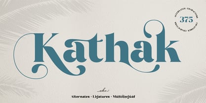 Please welcome Kathak. Kathak is a display serif font. Kathak is specially designed to make your typography design result looks more beautiful with tons of alternates and ligatures characters. Kathak is versatile font for many different projects such as logo, branding, poster, magazines, labels, merchandise, invitation, presentation, advertising, quotes and so much more! FEATURES: OpenType support Playfull to use (with ligatures and alternates options) Multilingual support PUA Encoded If you need support or more information about this item, please kindly contact me : ekahermawanputu@gmail.com Thank you so much.. I really hope you enjoy when using it!
 - Distrela by Ekahermawan,
$25.00 Introducing, Distrela is a romantic serif family that consists of 6 weights from ExtraLight to ExtraBold. Distrela comes with lots of alternates and ligatures characters that are specially designed with a romantic theme to make your design projects look more beautiful such as logo design, wedding, branding, poster, magazines, labels, merchandise, invitation, presentation, advertising and so much more! FEATURES: OpenType support Playful to use (with ligatures and alternates options) Multilingual support PUA Encoded If you need support or more information about this item, please kindly contact me: ekahermawanputu@gmail.com Thank you so much...I really hope you enjoy when using it!
 - Liak by TypeClassHeroes,
$29.00 Liak is a sans serif family. Design with various width and weight that you can explore and combine creating rhythm and texture for comfortable reading. This font supports more than 100 Latin-based languages and has extensive Cyrillic and Greek support for languages like Russian, Bulgarian, Ukrainian, and many more.In variable version, it allows multiple options when designing, adapting to different composition solutions. Feature Uppercase & Lowercase Number & Symbol International Glyphs (Cyrillic & Greek) Multilingual support Ligature Feel free to drop us a message any time and follow my shop for upcoming updates Shoot me on email at: Suandana_Ipandemade@hotmail.com Hope you enjoy it.
 - Kopitha by Ekahermawan,
$15.00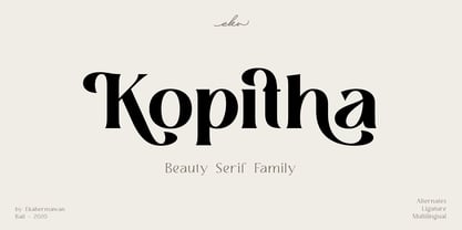 Kopitha is a beauty serif family with 5 weights from Light to ExtraBold. Kopitha also includes alternate characters (PUA Encoded) and ligatures to give you a wide range for create an unique typographic design results. Kopitha is suitable font for many different projects such as logo, branding, poster, magazines, label, merchandise, invitation, presentation, advertising, quotes and so much more! FEATURES: OpenType support Playfull to use (with ligatures and alternates options) Multilingual support PUA Encoded If you need support or more information about this item please kindly contact me : ekahermawanputu@gmail.com Thank you so much I really hope you enjoy when using it!
 - Frastha by Ekahermawan,
$20.00 Frastha font is unique and beauty display family with 7 weights from Thin to Bold. Frastha also includes a bunch of alternate characters (PUA Encoded) and ligatures to give you a wide range for create an excellent typographic design results for many different projects such as logo, branding, poster, magazines, labels, merchandise, invitation, presentation, advertising, quotes and so much more! FEATURES: OpenType support Playfull to use (with ligatures and alternates options) Multilingual support PUA Encoded If you need support or more information about this item please kindly contact me : ekahermawanputu@gmail.com Thank you so much.. I really hope you enjoy when using it!
 - Maringue by Shaltype Co,
$12.00 MARINGUE is Retro Western Font that is well-produced by hand and generate into a clean form, that will be best when used in any placement like logo, poster, t-shirts, or any display. Build manually, and reform into a clean Typeface. Natural stroke from original hand-lettering. It can be used for just Titles or even writing. In this font, you will get : Over 234 glyphs Ligatures in OpenType features Support for 66 languages. Get MARINGUE now! It will be best used for any design requirement, many fonts will come with a unique concept. Thank you! Best Regards, PUDJI PANGESTOE STUDIOS