10,000 search results
(0.029 seconds)
- HardTimes Roman by Wiescher Design,
$39.50 HardTimes has been hard work, designing a handmade typeface must always have the right balance between rough and smooth, specially with this Times-like face. It has the big European glyph-set, so that it can be used all over the continent I come from. I gave this font extensive kerning. Times are too hard for boring typefaces, so try this one for a change. -Your hardworking type designer, Gert Wiescher
 - Hillray by Sarid Ezra,
$15.00 A NEW STYLISH BOLD FONTS WITH LIGATURE & ALTERNATES, Hillray! Hillray is a stylish bold sans that contains ligatures and alternates each characters! You can make a unique branding with this fonts. This stylish bold fonts also included extrude and outline style that will compliments the regular style! This fonts suitable to use for poster, branding, merchandise, and any street art style! Also support multilingual and already PUA Encoded! Thank You!
 - Brafteng by Alcode,
$12.00 Brafteng is a new decorative font family. This font has a very beautiful and elegant opentype feature, so it can make users happy and can increase creativity or productivity, you can use this font very easily. Includes: Multiligual Support Special Ligatures Try Brafteng, enjoy the richness of OpenType features and let her fun and elegant excitement make you happy and enhance your creativity! You can use this font very easily.
 - Wouldkat by Joachim Frank,
$11.00 Inspired by an old house font of an anthroposophical hospital in Germany, this font was created: coarse, irregular, with corners and edges. In nature there are no right angles, no symmetries, no evenness: and so is this font. Tis is not a fine font, Like a woodcut this font roars: Look at me, I am here! Ideal for posters, leaflets, posters, billboards. Designed by Joachim Frank (Germany) in 2021
 - Lishbona Naskh by Vanarchiv,
$66.00 This font family is simplified Arabic which was inspired from the modern Naskh style, where the reverse contrast is low and the counter forms are open. The original design is from the Lisboa Sans typeface (Latin), published on 2005 and after some years, this multi-script family is the compromise and balance between these two different scripts. This typeface contains characters for setting Arabic, Persian and Urdu languages.
 - Fonseca by Nasir Udin,
$10.00 Fonseca is a modern sans serif inspired by art deco and typography poster in early 20th century. The key of this all-caps family is simple straight geometric forms and modernized letterforms. This display family is perfect for headlines, posters, logos, branding projects, magazines, and packaging. The modernized retro-look makes this family great to presents any contents related to travel, history & culture in the present/modern way.
 - Foucher by Larin Type Co,
$14.00 Foucher - this beautiful font is light and elegant, will emphasize your individuality in any project. You can also use them to create a logo or use for small businesses, branding, t-shirts, book covers, stationery, marketing, blog, magazines, and more. This font includes a basic set of letters and a complete set of alternatives set as well as numbers, fractions, and basic punctuation. This font supported PUA encoded.
 - Blacker Valentine by Letterara,
$12.00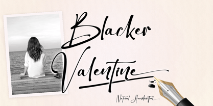 Blacker Valentine is a elegant handwritten font that is simple and unique looking. This customizable font will look great on a variety of design ideas such as Christmas themes, valentine's, posters, invitations, weddings, branding projects, social media posts, magazines, book covers, and more! This will add a fun and friendly touch to any of your projects! This font is PUA encoded which means you can access all glyphs and sweeps easily.
 - Rikafu by Twinletter,
$15.00 Introducing Rikafu Arabic font. Create beautiful Arabic and Islamic ornament designs using this exclusive font. All characters and alternates are beautifully styled. With this stunning font going for a stunning display, you’re sure to add a classic touch of elegance to your projects while presenting them in a variety of styles from modern to classic. This Arabic Style font will be your ultimate tool in creating high-end and luxurious designs.
 - Krazy Kracks NF by Nick's Fonts,
$10.00This playful offering, suggestive of Cooper Black on some serious drugs, is based on the so-called “California” style of lettering used extensively in travel posters of the 30s to the 50s. This version is based on its interpretation by Carl Holmes in a Walter T. Foster artbook entitled ABC of Lettering. Both versions of this font include the complete Unicode Latin 1252 and Central European 1250 character sets. - Fremont by Larin Type Co,
$16.00 Fremont This is a beautiful and elegant hand drawn font, will underline your individuality in any project. Its relaxed feel makes this font incredibly versatile, fitting a wide range of designs. You can also use them to create a logo or templates, invitations, blog, branding, marketing, book covers, magazines, advertising, stationery, logo design and much more. This font is easy to use has OpenType features, and supported PUA encoded.
 - First love FD by Letterara,
$14.00 First Love Font Duo is the perfect calligraphy font: Elegant, Sweet, innocent, light, and charming, this one-of-a-kind typeface will add a unique charm to any design project! The connected heart feature makes this font even more charming. This font is PUA encoded which means you can access all of the glyphs Alternate, Titling and Swashes with ease! It features a varying baseline, gorgeous glyphs, and stunning alternates.
 - Kleist Fraktur by RMU,
$25.00 In the late 1920s Walter Tiemann cut this font for Klingspor Brothers in Offenbach am Main. It comes close to Luthersche Fraktur and, though quite slender, possesses a good gray value and readability. This blackletter font fits excellently into narrow columns. Kleist Fraktur contains a bunch of useful ligatures, and by typing 'N - o - period', marking this combination and activating OT feature Ordinals you get an oldstyle numbersign.
 - Vallenta by Letterara,
$14.00 Vallenta is a bold script font that is simple and unique looking. This customizable font will look great on a variety of design ideas such as Christmas themes, valentine's, posters, invitations, weddings, branding projects, social media posts, magazines, book covers, and more! This will add a fun and friendly touch to any of your projects! This font is PUA encoded which means you can access all glyphs and sweeps easily.
 - Crazy Party by Sarid Ezra,
$15.00 Crazy Party is a quirky handmade font that will make all your project more unique and handy. This font also including a unique lowercase and uppercase with very different weight. Combining the uppercase and lowercase in one word will make your project even more stunning. You can use this font for quotes, your cover book or playing with words in your instagram post. This font also support multilingual!
 - Cantiqe by XdCreative,
$25.00 Cantiqe the rational serif with a circular/ball terminal and strong vertical contrast and fine horizontal hairlines, This makes Cantique a blend of elegant and beautiful. Cantiqe Incredibly versatile is perfect for fashion branding or editorial designs. this font fits a wide pool of designs, elevating them to the highest levels. Add this font to your favourite creative ideas and notice how it makes them come alive! Thank You _xdCreative
 - Spring Has Come by Stefani Letter,
$12.00 Spring has come is a stylish modern handwritten script. It has an unique, striking look which can be used to make any design stand out. Incredibly versatile, this font fits a wide pool of designs, elevating them to the highest levels. Add this font to your favorite creative ideas and notice how it makes them come alive! This font is PUA encoded which means you can access all of the glyphs.
 - Facegraph by hiroki kanda,
$14.00 If you are looking for a more individual typeface, This font is the best choice. This font is a very useful typeface for situations where you want to be a little playful, products for children, brands that want to give a soft impression, and those that want to stand out on social media posts. I'm sure that just using this typeface will create a graphic with a fun atmosphere.
 - Helena Handbasket NF by Nick's Fonts,
$10.00The 1888 edtion of James Conner's Sons United States Type Foundry specimen book listed this little gem simply as "Antique Light". Its original, rather anemic outlines have been beefed up and its serifs have been rounded, with the result that this face will get noticed wherever it goes. Both versions of this font include the complete Latin 1252 and CE 1250 character sets, with localization for Romanian and Moldovan. - Honey Valentine by Yoga Letter,
$15.00 "Honey Valentine" is a modern handwritten font. This font can be used for all your work and needs, especially related to Valentine's Day, wedding, winter, photography, engagement, promotions and more. This font is very easy to use because it has been specially designed, and there is also a guide for using letter decorations in the preview. This font comes with swashes, alternatives, basic characters, multilingual support, numbers, and punctuation.
 - Honest Punch by Sarid Ezra,
$15.00 Honest Punch is a bold and strong quotable font that you can use for any purposes. This font is very suitable for tagline and branding. With readability and clear looks, this font is perfect for quote. Honest Punch contains unique lowercase and uppercase that you can use at the same times in a word that will make your design more attractive. This font also contains ligature, underline, and support multilingual.
 - 99 Names of ALLAH Random by Islamic Calligraphy75,
$12.00 We have transformed the “99 names of ALLAH” into a font. That means each key on your keyboard represents 1 of the 99 names of ALLAH Aaza Wajal. The fonts work with both the English and Arabic Keyboards. We call this Calligraphy "Random" because we don't follow any one principle to write the names, some overlap some don't, some letters are big and some are small. All the letters, harakat, decorative letters and symbols may differ from one name to another.(in the zip file you will find a pdf file explaining the differences in the "harakat", pronunciation and spelling according to the Holy Quran). Decorative symbols are at a minimum. Decorative letters used in this calligraphy: "Mim, Aain, Sin, HHe, He, Kaf". Purpose & use: - Writers: Highlight the names in your texts in beautiful Islamic calligraphy. - Editors: Use with kinetic typography templates (AE) & editing software. - Designers: The very small details in the names does not affect the quality. Rest assured it is flawless. The MOST IMPORTANT THING about this list is that all the names are 100% ERROR FREE, and you can USE THEM WITH YOUR EYES CLOSED. All the “Tachkilat” are 100% ERROR FREE, all the "Spelling" is 100% ERROR FREE, and they all have been written in accordance with the Holy Quran. No names are missing and no names are duplicated. The list is complete "99 names +1". The +1 is the name “ALLAH” 'Aza wajal. Another important thing is how we use the decorative letters. In every font you will see small decorative letters, these letters are used only in accordance with their respective letters to indicate pronunciation & we don't include them randomly. That means "mim" on top or below the letter "mim", "sin" on top or below the letter "sin", and so on and so forth. Included: Pdf file telling you which key is associated with which name. In that same file we have included the transliteration and explication of all 99 names. Pdf file explaining the differences in the harakat and pronunciation according to the Holy Quran. Here is a link to all the extra files you will need: https://drive.google.com/drive/folders/1Xj2Q8hhmfKD7stY6RILhKPiPfePpI9U4?usp=sharing
 - Garalda by TypeTogether,
$49.00 Type designer Xavier Dupré’s Garalda is a charming 21st century family that renews a legacy of finesse. As paragraphs on a page, Garalda’s overall impression is of a workaday personality, committed to the main purpose of the job: easy long-form reading. But setting it in display sizes proves something different: This reinvented Garamond is anything but basic. The Garalda story begins with the serendipitous finding of a book typeset in a rare Garalde, called Tory-Garamond, with which Dupré was not immediately familiar. This Garamond was used in bibliophile books in the decades surrounding 1920, but after that it became déclassé for an unknown reason. Dupré found the italic styles especially charming and discovered the family was probably the mythical Ollière Garamond cut from 1914. He obtained low resolution scans of the typeface and used them, rather than high resolution scans, as the basis for his new type family. This allowed Dupré the mental freedom to experiment and remix as he saw fit, culminating in a contemporary family with heritage. As seen in the simplistic rectangular serifs, Garalda is a humanist slab serif, but with a mix of angles and curves to give the classic shapes a fresh, unorthodox feeling. While almost invisible in paragraph text, these produce a graphic effect in display work. The set of ligatures in the roman and italics lend themselves to unique display use, such as creating lovely logotypes. In the italics, some swashes inspired by different historic Garamonds are included, sometimes breaking their curves to be more captivating. Just look at how the italic ‘*-s’ ligatures create ‘s’ with a cursive formation rather than merely a flowing slant. And how the roman ‘g’ link swings as wide as a trainer’s whip. These are all balanced by squared serifs in the roman to keep an overall mechanised regularity. The Garalda family comes in eight styles, includes some of the original arrows and ornaments, and speaks multiple languages for all typesetting needs, from pamphlets to fine book printing. The complete Garalda family, along with our entire catalogue, has been optimised for today’s varied screen uses.
 - Dom Loves Mary by Correspondence Ink,
$39.99 Dom Loves Mary has a baby brother! Check out Fratello Nick here: http://www.myfonts.com/fonts/correspondence-ink/fratello-nick/ The DomLovesMary font family has all you need to create unique, custom stationery products. THE INSPIRATION BEHIND THE DOMLOVESMARY FONT FAMILY: DomLovesMary is named in memory of Dominic and Mary Sementelli, Debi’s in-laws. Dom and Mary were opposites who were truly “made for each other”. A snazzy dresser, Mary was feisty, loved to dance, sing, and be the life of the party. Dom was cool, calm and collected and was happy to shine the spotlight on the love of his life. They balanced each other out in a really great way. Going through some of her in-laws old photos, Debi found their wedding album. She was struck by the beautiful look on their faces as they got ready to start their life together. She saw the excitement, joy and anticipation of them envisioning “Una Bella Vita!” (A beautiful life!) She decided to create a hand-lettered font with them in mind represented by two totally different lettering styles that were, like Dom and Mary, “made for each other”. It’s her way of honoring them and sharing their beautiful life with all of the couples just starting theirs together. They truly had “Una Bella Vita” and we hope you do too. WHAT'S UNIQUE ABOUT THE DOMLOVESMARY FONT FAMILY: The SCRIPT & TEXT FONTS are lettering styles that were made to compliment each other. With a vintage, classic feel, they will add elegance to your design, while the TEXT serves to offer support with easy to read simplicity. In addition to the standard character set, each of the uniquely styled script fonts includes a collection of flourished ornaments. Use them to create corners, headers or other embellishments to complete the look. And if you really want to fancy things up, we offer two sets of 72 additional flourishes that were specifically made to add to upper and lower case letters for easy customization. Dress them up with one, two or more. It’s like choosing simple pearls or piling on the glitz! Or combine several to create unique flourished ornaments of your own. To add even more panache, we're pleased to present our ready made set of most frequently used ADD-ON WORDS. Created with the wedding client in mind, this set of 66 includes envelope friendly titles: Mr and Mrs, Mr, Mrs, Miss, Ms, Doctor, the Doctors, as well as words to fill out your invitation suite: RSVP, Respond, Save the Date, Accommodations, Directions and more! Easily create Bride and Groom signs or Thank You cards or tags with the click of a key. Or use angled words like “and, at, to, on, for, from and of” to add a special touch to your large groups of copy. PACKAGES: We are pleased to have a variety of customers. From professional invitation designers to DIY brides, publishing companies and website / blog designers among others. So we've created packages to help fit their diverse needs. Purchase just one of our beautiful DomLovesMary SCRIPT fonts, each with its collection of included flourishes or the PRO VERSION complete with ALL THREE script fonts and a combined total of over 100 flourished ornaments. Add our TEXT font, a set of FLOURISHES or ADD-ON WORDS. Love the idea of customizing your letters with all the possible combinations? We offer a special price when you purchase both sets of flourishes. Or choose our Accoutrements Package containing both sets of FLOURISHES for letter customization as well as our ADD-ON WORDS. Want to have it all? The “DomLovesMary Total Design” package is for you. Each of these packages are offered at a 25% savings. WHAT PROGRAM WILL YOU USE?: All of the font options come in both Pro and Standard format fonts. For those with programs that can take advantage of OpenType features (click on the link to see if the program your using is one of them) the Pro fonts are for you. http://www.typotheque.com/fonts/opentype_feature_support/ For others without the ability to use Open Type features, we provide all of the script fonts that comprise the Pro Version as separate versions (Regular, Contextual and Stylistic). If you are using a program like Microsoft Word, and want all three script fonts, you can still purchase the Pro Version (a $50.00 savings), and install the individual fonts bundled in the Standard Fonts folder. We have set it up so they will appear separately as DomLovesMary, DomLovesMary Contextual and DomLovesMary Stylistic in your fonts list. Exciting news! In an effort to help our customers access all the goodies that are normally only available in Open Type Capable programs (like the flourished ornaments that come with our script fonts), we have found a simple application that allows you to do just that. For this reason, we've made sure to unicode all of our characters and glyphs so that they will work in this type of program. There may be others, but we checked this one out and found that it works. Check out PopChar
 - 112 Hours by Device,
$9.00 Rian Hughes’ 15th collection of fonts, “112 Hours”, is entirely dedicated to numbers. Culled from a myriad of sources – clock faces, tickets, watches house numbers – it is an eclectic and wide-ranging set. Each font contains only numerals and related punctuation – no letters. A new book has been designed by Hughes to show the collection, and includes sample settings, complete character sets, source material and an introduction. This is available print-to-order on Blurb in paperback and hardback: http://www.blurb.com/b/5539073-112-hours-hardback http://www.blurb.com/b/5539045-112-hours-paperback From the introduction: The idea for this, the fifteenth Device Fonts collection, began when I came across an online auction site dedicated to antique clocks. I was mesmerized by the inventive and bizarre numerals on their faces. Shorn of the need to extend the internal logic of a typeface through the entire alphabet, the designers of these treasures were free to explore interesting forms and shapes that would otherwise be denied them. Given this horological starting point, I decided to produce 12 fonts, each featuring just the numbers from 1 to 12 and, where appropriate, a small set of supporting characters — in most cases, the international currency symbols, a colon, full stop, hyphen, slash and the number sign. 10, 11 and 12 I opted to place in the capital A, B and C slots. Each font is shown in its entirety here. I soon passed 12, so the next logical finish line was 24. Like a typographic Jack Bauer, I soon passed that too -— the more I researched, the more I came across interesting and unique examples that insisted on digitization, or that inspired me to explore some new design direction. The sources broadened to include tickets, numbering machines, ecclesiastical brass plates and more. Though not derived from clock faces, I opted to keep the 1-12 conceit for consistency, which allowed me to design what are effectively numerical ligatures. I finally concluded one hundred fonts over my original estimate at 112. Even though it’s not strictly divisible by 12, the number has a certain symmetry, I reasoned, and was as good a place as any to round off the project. An overview reveals a broad range that nonetheless fall into several loose categories. There are fairly faithful revivals, only diverging from their source material to even out inconsistencies and regularize weighting or shape to make them more functional in a modern context; designs taken directly from the source material, preserving all the inky grit and character of the original; designs that are loosely based on a couple of numbers from the source material but diverge dramatically for reasons of improved aesthetics or mere whim; and entirely new designs with no historical precedent. As projects like this evolve (and, to be frank, get out of hand), they can take you in directions and to places you didn’t envisage when you first set out. Along the way, I corresponded with experts in railway livery, and now know about the history of cab side and smokebox plates; I travelled to the Musée de l’imprimerie in Nantes, France, to examine their numbering machines; I photographed house numbers in Paris, Florence, Venice, Amsterdam and here in the UK; I delved into my collection of tickets, passes and printed ephemera; I visited the Science Museum in London, the Royal Signals Museum in Dorset, and the Museum of London to source early adding machines, war-time telegraphs and post-war ration books. I photographed watches at Worthing Museum, weighing scales large enough to stand on in a Brick Lane pub, and digital station clocks at Baker Street tube station. I went to the London Under-ground archive at Acton Depot, where you can see all manner of vintage enamel signs and woodblock type; I photographed grocer’s stalls in East End street markets; I dug out old clocks I recalled from childhood at my parents’ place, examined old manual typewriters and cash tills, and crouched down with a torch to look at my electricity meter. I found out that Jane Fonda kicked a policeman, and unusually for someone with a lifelong aversion to sport, picked up some horse-racing jargon. I share some of that research here. In many cases I have not been slavish about staying close to the source material if I didn’t think it warranted it, so a close comparison will reveal differences. These changes could be made for aesthetic reasons, functional reasons (the originals didn’t need to be set in any combination, for example), or just reasons of personal taste. Where reference for the additional characters were not available — which was always the case with fonts derived from clock faces — I have endeavored to design them in a sympathetic style. I may even extend some of these to the full alphabet in the future. If I do, these number-only fonts could be considered as experimental design exercises: forays into form to probe interesting new graphic possibilities.
 - Achates by Karandash,
$29.00 Good, faithful Achates… Named after the trusty Trojan that followed Aeneas throughout his adventures, Achates is a humanist sans workhorse well suitable for broad range of design projects. Its soft, delicate and almost cursive shapes define warm and friendly typeface that is legible and easy on the reader's eye. Following into the footsteps of its namesake, it is humble, informal yet stable and trustworthy. Ideally suited for advertising and packaging, editorial and publishing, logo, branding and creative industries, poster and billboards, small text and signage as well as web and screen design. Achates provides a broad range of advanced typographical features such as language localization, alternates, stylistic alternates, extended ligatures, fractions and case-sensitive forms. It comes with a complete figure range set of old-style, lining and tabular figures. The family has extensive multilingual support, covering more than 70 Latin-based languages and specially designed Cyrillic with Bulgarian and Russian localization. As Achates was a humble hero, a devoted friend and faithful companion to Aeneas on his journey to greatness, so this font can be your trusty sidekick on your creative path. The marvelous Agate is also named after the Trojan hero. It is considered as the stone to call on for support when you need stability and grounding in your life. Along with its supportive energy, the Agate stone has been long admired for its incredible beauty. So… a Trojan hero or a thing of beauty – it is up for you to decide… or just maybe both!
 - Biro Script Plus by Ingo,
$50.00 An authentic script from the tip of the ball point pen. This hasn’t been seen yet: A typeface which truly looks as if it were handwritten. Calligraphy is, actually, the art of fine writing. And actually, written scripts as typeface for the computer are 100% nonsense. And yet, an obvious thought: Create a typeface which truly derives from everyday handwriting. And since we, if we write at all, utilize practically only a ball point pen anymore, then a modern cursive writing form must look like just that. As a counterpart to the artistic ”handwritings“ which have long been available as typeface, the thought of digitalizing a truly ”ugly“ handwriting is appealing. After all, time and again there is the need for a text to look ”handwritten“. Biró Script is written freehand with a ball point pen. Finally a truly individual script! Biró Script includes more than 300 authentic ligatures in addition to the customary alphabet. By the way, the most convincing effect is obtained with a font size of about 18 to 22 points, at which the thickness of the stroke is now about the same as that of a real ball point pen. There's a difference between the anglo-american forms of some characters (esp. the numerals 1 and 7, but also capitals I and F) and how it's written in the rest of the world. For those of us who aren’t used to the world-wide usual forms, Biró Script includes a US version with the appropriate characters.
 - PF Das Grotesk Pro by Parachute,
$79.00 Das Grotesk was inspired by earlier nineteenth-century grotesques, but it is much more related to American gothic designs such as those by M.F. Benton. Due to their pure geometric structure, most grotesque typefaces tend to have a rather monotonous and lifeless appearance, thus failing to express the ideals of the modern creed. Das Grotesk on the other hand is a lively design with several distinguishable characteristics which attract attention when set at large sizes, whilst they become subtle and blend evenly at small sizes, fostering a neutral identity. This is a very legible and space-saving typeface with a narrow structure. It was designed with slanted curved ends and sheared terminals applied on several straight strokes. It has two-storey ‘a’ and ‘g’ but includes single-storey alternates. The family consists of 14 weights ranging from Extra Thin to Black (including true-italics). It provides simultaneous support for Latin, Cyrillic and Greek and is loaded with several advanced typographic features such as small caps. Download its complehensive PDF Specimen Manual for further details.
 - Endorphin by Tall Chai,
$15.00 Endorphin is a stylish oblique sans-serif font family with weights ranging from Thin (100) to Black (900). Features: Available in 9 weights Over 550 glyphs supporting extended Latin Ideal for display texts: Titles, Logos and Headlines etc. Perfect for branding and rebranding Supports OpenTypes features like Ligatures and Stylistic Alternates Symbols for 10 major currencies including Bitcoin provided in all weights Description: The Endorphin font signifies racing forward. Each oblique character manifests that feeling of achievement and happiness that one gets after a great workout or after a refreshing game. Every character effortlessly integrates with modern design standards and interfaces. The fonts are professional and have a strong personality in them. This makes Endorphin perfect for use in modern apps and websites. Endorphin is built for the designing and marketing squads. It has a trendy geometric characteristic which is ideal for any branding and rebranding. Endorphin has lot of OpenType features (like ligatures and alternates) and the Extended Latin character set supports over a hundred languages. Race Forward!
 - Finalist Round Slab by Bülent Yüksel,
$19.00 The font was intended primarily to have a stronger body. It has a simple geometrical surface. This font has a strong personality, that makes it perfect for use in headline sizes but means it also works gracefully within text blocks. "Finalist Round Slab" is carefully crafted and a unique slab serif. Use for websites, print, motion graphics, logo design, packaging design, t-shirts and more. The designation “Finalist Round Slab Regular” forms the central point. The first figure of the number describes the stroke thickness: Thin to Black. "Finalist Round Slab" comes 7 weights and italics total 14 types. The family contains a set of 450+ characters. Case-Sensitive Forms, Classes and Features, Fractions, Superior, Inferior, Denominator, Numerator, Old Style Figures just one touch easy In all graphic programs. You can enjoy using it. UPDATES: - 30 December 2015 Opentype Feature (fractions) and some kerning. - 11 June 2018 Solving some UNICODE problems on the internet. - 12 March 2019 Some error has been fixed. - 19 November 2019 Some error has been fixed. - 16 August 2021 New Version - 2.0 Some error has been fixed.
 - Syncopate Pro by Stiggy & Sands,
$29.00 The Syncopate Pro Family is a unicase design where the traditional lowercase x-height has been abandoned and a single uppercase height rules the design of all of the alpha and numeric glyphs. Some uppercase glyphs are copied to their lowercase slots, where other lowercase glyphs such as the a, e, and r, are scaled up to uppercase heights. This motif allows for a vast array of typesetting possibilities. A modern and stylish sans inspired by the many trendy sans serif typefaces that are prevalent today, the Syncopate Pro Family, primarily intended for display and headline use, also works well for limited text runs. The thin and regular weights and wide body impart a certain level of elegance, while the unicase approach keeps the look lively and fresh. The bold weight imparts a powerful substantiality, lending a strong corporate presence to any design. Opentype features include: - Stylistic Alternates for a collection of alternate Small Caps - Full set of Inferiors and Superiors for limitless fractions - Lining and Proportional figure sets
 - Varietta by Sudtipos,
$39.00 Varietta is the result of my fascination with photographing the type designs of some marquees in Spanish markets. In them you can see many letter designs with reversed contrast and in different widths, probably based on the possibilities of photocomposition. At the same time I was working on the expansion of the Hastile typeface designed by Alessandro Butti for the Nebiolo foundry in Italy in the late 1930s, of which I had not seen any digitization. As I am not a fan of perfect revivals, I thought it could be interesting to connect Spain and Italy in a single typeface. The first step was to expand Butti's design to 27 styles, ranging from thin condensed to black expanded. To look for the Spanish connection and its characteristic inverse contrast I took advantage of the current technology that allows variable typefaces with many axes. From this, three scenarios of horizontal contrast were incorporated (top, bottom and mixed) which allows infinite possibilities of use. The final result is a collection of 108 static typefaces or a single variable file.
 - Balivia by Ardyanatypes,
$10.00 Introducing the bold serif font that was made to provide more choices for your designs, this is Balivia Serif Bold Family, Balivia comes with many choices from Thin to Black, to give you the choice of using it. of each of these styles, has a different taste, is very suitable for use in various design needs and really gives a special, elegant and modern impression. Balivia is very suitable for use in any design. Such as wedding invitations, branding, fashion, book titles, business cards, posters, and many more that can be combined with Balivia Bold Serif Family. Balivia is also equipped with many languages, so it is very easy to use for the needs of every country and language, is also equipped with alternative stylistic to make your design more attractive, and also has ligatures and discretionary ligatures to be used as decorative fonts. A guide to accessing all alternatives can be read at: http://adobe.ly/1m1fn4Y how to access alternate? Photoshop go to Window - glyphs Illustrator go to Type - glyphs
 - Shackie Handpainted by Mans Greback,
$59.00 Shackie Handpainted is a striking custom lettering font, embodying the charm and flair of a script brush. This logotype font is perfect for projects requiring a cool and edgy touch, such as T-shirt designs and sign painting. With its unique hand-painted style, Shackie Handpainted brings a distinctive appeal to your creative work. The font's dynamic brushstrokes lend it the authentic feel of a sign painter's masterpiece, making it an excellent choice for projects that call for custom lettering and a personal touch. The Shackie Handpainted font family includes six expressive styles to suit various design needs: The weights Thin, Regular and Bold, with each thickness as Italic. The font is built with advanced OpenType functionality and has a guaranteed top-notch quality, containing stylistic and contextual alternates, ligatures and more features; all to give you full control and customizability. It has extensive lingual support, covering all Latin-based languages, from Northern Europe to South Africa, from America to South-East Asia. It contains all characters and symbols you'll ever need, including all punctuation and numbers.
 - White Lotus by Mans Greback,
$59.00 White Lotus is a beautifully wild handwriting typeface. This thin script font will give any project the attention it deserves. Use it for a vivid logotype or cute headline to give your work that extravagant look. Use underscore _ to make an underline swash. Example: Love_letter Use asterisk * to make a flower. Example: White*Lotus Use multiple underscores and asterisks to make different underlines and flowers. Hand______writer*** The White Lotus family consists of the styles Regular as well as two Alternate styles. It comes in the weights Regular and Black, and each font as Italic. Together making up a package of 12 high-quality fonts. The font is built with advanced OpenType functionality and has a guaranteed top-notch quality, containing stylistic and contextual alternates, ligatures and more features; all to give you full control and customizability. It has extensive lingual support, covering all Latin-based languages, from Northern Europe to South Africa, from America to South-East Asia. It contains all characters and symbols you'll ever need, including all punctuation and numbers.
 - Resgak by Kulokale,
$30.00 Resgak is a contemporary serif font with 20 fonts, ranging from thin to extra black with its matching italics, Resgak offers many possibilities to be applied in many graphic or editorial projects. Lighter weights are suitable for body text, and the heavier weights are perfect for striking headlines. Resgak is perfect for many different projects such as logos and branding, invitations, stationery, social media posts, advertisements, printed quotes, product packaging, product designs, labels, photography, watermark, special events and many more. This font is encoded with Unicode PUA, which allows full access to all additional characters without having special design software. Mac users can use Font Book, and Windows users can use Character Map to view and copy one of the extra characters to paste into your favorite text editor / application. I highly recommend using a program that supports OpenType features and Glyphs panels such as Adobe Illustrator, Adobe Photoshop CC, Adobe InDesign, or CorelDraw, so you can see and access all Glyph variations. We hope you enjoy the font and have fun! Thank You.
 - Kardinal by Ani Dimitrova,
$30.00 Kardinal is a sans serif humanistic type family. The family has 16 weights, ranging from Thin to Black with extra drawn italics and small caps versions. The Kardinal type family is ideally suites for small text, books and magazines, branding, posters, as well as web and screen design, headlines and more. Kardinal comes in 16 styles with extended language support. All weights contain standard ligatures, proportional figures, tabular figures, old style figure, numerals and arrows, matching currency symbols and fraction. The construction of characters combines clean grotesque style and calligraphic features with humanist fragrance. Out standing for the designs are the small serifs. They are giving the letters movement and freshness, as well as contribute to a better readability in different volume texts and including lots of details that give it a unique personality. The Regular and Medium weights are perfect for body text while the italic give an interesting texture to the text. The range of styles give a good flexibility to this family. The fonts are carefully hinted and perfect for digital use.
 - Radiata by Untype,
$30.00 Type designer Sergio Leiva delivers another highly inspired text typeface that honours both, nature and type tradition. Radiata looks strong on its structure yet delicate on its terminals and serifs, and bring a sense of modern rationality to the composition because its proportions and vertical stress at the time thata flourishes organically and full of details on display settings. The family has 10 weights, ranging from Thin to Heavy (plus matching italics) including 3 weights especially optimised for long text settings. Ideally suited for book text, editorial and publishing, advertising and packaging, logo, branding and creative industries, small text as well as web and screen design. Radiata provides advanced typographical support with features such as ligatures, small capitals, alternate characters, swashs, case-sensitive forms, fractions, and super- and subscript characters. It also comes with a complete range of figure set options – oldstyle and lining figures, each in tabular and proportional widths. Considering all this Radiata is a must have for every designer or type user looking for a versatile and reliable workhorse.
 - LiebeErika by LiebeFonts,
$29.00 Ever since we started publishing on MyFonts in 2009, we've received requests for a typeface to complement our popular dingbat fonts. So here it is: LiebeErika. Friendly and polite, rather thin, extra narrow, and of course‚ carefully hand-crafted. LiebeErika’s casual and warm style is perfectly suited for invitations and personal correspondence. It’s even in the name: German phrase, Liebe Erika‚ translates to, Dear Erika, the beginning of a personal letter. But LiebeErika is not limited to English or to the German character set. It supports many other languages, too! LiebeErika comes with a stunning variety of ligatures and alternative forms available through OpenType features. (Please make sure your software supports OpenType if you wish to use the advanced features.) The font contains over 500 glyphs, so it’s actually two or three fonts in one. If you like this font, you may want to look at LiebeOrnaments, our perfectly matching set of swashes and curls to complement LiebeErika. By the way: LiebeErika gets along great with our wide range of illustrative fonts such as LiebeCook, LiebeFish, and LiebeTweet.
 - Gradl Highstep by HiH,
$8.00 Gradl Highstep is an archetypical Art Nouveau face by the prolific and mysterious Max Joseph Gradl. It epitomizes the visual language of elegance and sophistication. It seems strange that so little information is available today about Max Gradl: He seems to have been well known in his day. In addition to his jewelry design, he did advertising work for customers in Naples, London and New York in addition to customers in cities all over Germany. Gradl Highstep is an all-cap font with a wide range of ligatures: 094=SA, 123=CH, 125=CK, 126=TS, 167=FA, 172=PA, 177=TA, 188=WA and 190=YA. In addtion, 137=Gradl’s dated monogram “MJG 1903,” 175=LLC abbreviation, 181=alternate S. This is a subtle font with thin, variable strokes. It is best used at 28 points and larger to give it the presence it needs to be be appreciated. Gradl Highstep Initials is a companion font, incorporating a deft line drawing of a fashionable woman of the period who is every bit as elegant as the underlying font.