10,000 search results
(0.03 seconds)
- Bellazio by Rockboys Studio,
$25.00 Bellazio is a new modern brush font, incredibly adaptable to all sorts of designs. It is suitable for any branding, product packaging, invitation, quote, t-shirt, label, poster, logo that you wish to create.
 - Venily by Khurasan,
$10.00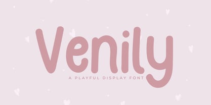 Introducing Venily - a playful display font that is very fresh and unique style handmade. Venily Typeface is perfectly suited to logo, stationery, poster, apparel, branding, wedding invitation, card, tagline, layout design, and much more !!
 - Jeztec Empire by Ronin Design,
$15.00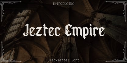 Jeztec Empire is an unique blackletter style, this font will give you stunning design. Jeztec Empire font is ideal for logo design, labels, posters or pretty much anything else that requires a unique touch.
 - Hypertype by Fargun Studio,
$14.00 Hypertype is my new elegant serif display font that will bring a touch of style and luxury to your projects. It is perfect for branding, logotypes, blog headlines and many more your design needs.
 - Pro Sotan by Differentialtype,
$10.00 Pro sotan is a rounded sans serif font family that comes with 9 weights and matching italics. This font is ideal for typing in documents, headlines, packaging, logos, advertisements, corporate identities and much more.
 - Karamboule by Bogstav,
$17.00 ALL CAPS font with an organic crunchy look. Very good for posters and stuff that needs a organic look. Multilingual support and 6 different versions of each letter - these cycles automatically AS you type!
 - Alpha Delta by Wiescher Design,
$39.50 The standard paperclip is the basic idea behind this Alpha Delta. By working on it, I changed it so that it doesn't look too much like a paperclip any more. Things happen, Gert Wiescher
 - Grandes by Creativework Studio,
$9.00 Grandes is a bold script font, grandes is perfect for design illustrations on t-shirts, logos, product brands, Use it to add that special vintage touch to any design idea you can think of.
 - Capetown Signature by MJB Letters,
$15.00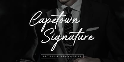 Capetown Signature is a modern and classic script font, perfect for signatures, branding, logos, photography, looks very clean and elegant, it will give the impression of luxury to your design. What’s include: – Ligature – Swash
 - Copperplate Modern by Wiescher Design,
$39.50 Copperplate Modern is my personal version of Copperplate with lowercase letters that contrast the standard rounded capitals. For good measure I designed a glitzy "Chrome" version for each weight. Yours very glitzy Gert Wiescher
 - Resiliency by Alphabet Agency,
$15.00 Resiliency font family offers 6 font; 3 weight in regular and italic that provides a variety of looks and possible combinations. Resiliency offers great looks on esports themed designs and other sports in general.
 - Foda Freestyle by Fo Da,
$99.99 Foda FreeStyle is a display Arabic font with High contrast that will surly get your attention, comes in single weight. It can be used for headlines, sub heads, posters, advertising and other many purposes.
 - Rhapsodie by Type Associates,
$24.95 Rhapsodie was originally developed from some freehand calligraphy that I used for a series of posters. It has proved effective in headlines and is remarkably legible and strong with some interesting, somewhat cursive capitals.
 - Vintage Badges by Decade Typefoundry,
$28.00 An awesome premium quality set of 26 layered badges. It’s a very versatile, “old timey” look, vintage and that can be used as logos, member badges, company badges, stamps, price reductions and much more.
 - Ames' Weathered by Greater Albion Typefounders,
$16.00 Ames’ Weathered is the ‘antique’ accompaniment to our Ames’ typeface families. It has that ‘tumbled’, weather knocked about look. Just the thing for posters, headings and signage where there’s a need to suggest age.
 - Altra Mano by Kate Brankin,
$32.00 Altra Mano is based on the designer’s second style of handwriting, one that is more refined and controlled. Altra Mano is a decorative display typeface ideal for headlines, logotypes, magazines, posters and short text.
 - Foda Slab by Fo Da,
$20.00 Foda Slab is a powerful Arabic slab typeface that has two styles : Regular and Hollow. With 886 glyphs Foda Slab has many ligatures which makes it suitable for headlines and other different graphic contexts.
 - Letter Gothic M by URW Type Foundry,
$35.99Letter Gothic was designed for IBM between 1956 and 1962 for use on the Selectric typewriter. Letter Gothic is a monospaced, sans serif face that can be useful for technical documentation and tabular work. - Guilloche B by Wiescher Design,
$24.00 »Guilloche B« is a set of graphics that join with each other to form very sophisticated, op-art-like borders. Try them on lots of different assignments, they form very surprising bands or patterns.
 - Rockdones by Rockboys Studio,
$18.00 Rockdones is a new modern brush font, incredibly adaptable to all sorts of designs. It is suitable for any branding, product packaging, invitation, quote, t-shirt, label, poster, logo that you wish to create.
 - Gourds by Oliveira 37,
$24.00 The Gourds is a geometric font that has its personality in extreme forms without losing its identification with the legibility and recognition of its characters. indicated for titles and sub-titles or even logos.
 - Ketamine One MF by Masterfont,
$59.00 A practical font family with 3 weights for all your day by day design needs: headlines, signage etc. An extended sans serif typeface with rounded endings that provides unique industrial appearance without losing legibility.
 - Rockstone by Rockboys Studio,
$20.00 Rockstone is a new modern brush font, incredibly adaptable to all sorts of designs. It is suitable for any branding, product packaging, invitation, quote, t-shirt, label, poster, logo that you wish to create.
 - CentreForward by The Northern Block,
$12.80 CentreForward is an 8 font family consisting of 4 weights with italics. A smooth modular font that draws on ideas observed in the 1982 Football World Cup. Influential players: Paolo Rossi, Socrates, Zico & Tardelli.
 - Gianna by Jonahfonts,
$35.00 Gianna is designed for many applications for that calligraphy look. Invoking Contextual-Alternates all lower case text followed by a space will automatically prompt its Glyph Terminal, including many ligatures complete with latin diacritics.
 - Letter Gothic L by URW Type Foundry,
$89.99 Letter Gothic was designed for IBM between 1956 and 1962 for use on the Selectric typewriter. Letter Gothic is a monospaced, sans serif face that can be useful for technical documentation and tabular work.
 - Batish MF by Masterfont,
$59.00 A practical font family with 4 weights for all your day by day design needs: headlines, signage etc. An extended sans serif typeface with rounded endings that provides unique softness appearance without losing legibility.
 - Orange Melon by Motokiwo,
$15.00 Orange Melon, a bold script font that is suitable for headline, logotype, apparel, invitation, branding, packaging, advertising etc. This typeface is comes in uppercase, lowercase, large range of punctuation, symbols & numerals, also support multilingual.
 - Champions by TypeDrift,
$15.00 Champions is our best-selling typeface that has been completely rebuilt, from the ground up. Now featuring special characters, alternate glyphs and a sans serif version. This is the font champions are made of.
 - Sunday Mood by DRM Works,
$9.99 Sunday Mood is a beautiful new modern monoline script font that suits for watermark, branding, logo, invitations, stationery, wedding designs, social media posts, advertisements, product packaging, product designs, labels, photography, special events, and more.
 - Boldatin by Patria Ari,
$10.00 Boldatin font family, a slab display typeface with different styles (regular, slanted, condensed, condensed slanted) with total of 24 fonts and 6 weight that suit for your project like signage, poster, banner, flyer, etc.
 - Aahill by Khurasan,
$10.00 Introducing Aahill Typeface - a font that is very fresh and unique style handmade. Aahill Signature Typeface is perfectly suited to logo, stationery, poster, apparel, branding, wedding invitation, card, tagline, layout design, and much more !!
 - Astro Serif by Typehead Studio,
$15.00 Introducing Astro, a charming serif font designed to bring an elegant and classic touch to your designs. Crafted with meticulous attention to detail and inspired by mid-millennium Serifs, Astro seamlessly blends traditional sophistication with contemporary elements, making it suitable for a variety of design projects, both print and digital. Enchanting Letter Shape Designs: Astro exudes charm with its letter design that is heavily inspired by the mid-millennium Serifs often found in European and American designs. Each letter is carefully carved to create a charming and luxurious impression. Unique Alternative Glyphs: Astro is not just a font; it is a standout typographic masterpiece. By offering several unique alternative glyphs, such as the letters a, g, and k, Astro gives designers the freedom to express their creativity in a unique and personal way. Mid-Millennium Serif Elegance: Astro features smooth lines and proportions, creating an elegant impression characteristic of mid-millennium Serifs. This design provides a timeless classic touch making it suitable for a variety of design needs, including books, magazines, posters and other printed materials. Ease Readability: While the Astro exudes striking elegance, its design also prioritizes readability and comfort. Each letter is created with balanced proportions and optimal contrast, ensuring text appears clear and easy to read, whether on a large or small scale. Flexible Use: Astro is designed to provide flexible use across a variety of design platforms. From the logo design to the magazine layout, Astro adapts beautifully, maintaining a consistent feel that enhances the aesthetic quality of the design. European and American inspiration: Astro creates a bridge between European and American typographic styles, combining the best elements of both traditions. This makes it the perfect choice for projects that combine elements from both continents. Astro is more than just a font, it is an artistic statement that leaves an unforgettable impression on any design project. Suitable for designers who appreciate classic beauty and modern uniqueness, Astro brings a special and charming feel to every character it creates.
 - Morvien by Alit Design,
$19.00 Introducing Morvien Typeface - a bold and dynamic display font that brings a unique edge to your creative projects. With its distinctive torn shapes and powerful design, Morvien Typeface is the perfect choice for film titles, game interfaces, comic book lettering, superhero themes, and music posters. This font is not just a typeface; it's an artistic statement that adds a touch of drama and excitement to your visual creations. Torn Shapes Design: Morvien Typeface stands out with its edgy and torn shapes, giving your text a rebellious and energetic vibe. Each character is carefully crafted to convey a sense of dynamism and movement. Display Style: Morvien Typeface is designed specifically for display purposes, ensuring that your headlines and titles command attention. The bold and impactful strokes make it ideal for creating a strong visual impact. Ligatures and Alternatives: Morvien Typeface includes a rich set of ligatures and alternative characters, providing you with creative flexibility. Experiment with different combinations to customize your text and make it uniquely yours. 633 Characters: Morvien Typeface boasts an extensive character set with 633 characters, offering a wide range of options for your design needs. Whether you're working on a detailed project or a quick creative piece, Morvien Typeface has you covered. Multilingual Support: Morvien Typeface is crafted with global compatibility in mind, supporting multiple languages. Now you can express your creativity in various linguistic contexts without compromising on style. Versatile Usage: Morvien Typeface is well-suited for a variety of creative projects, including film titles, game interfaces, comic book lettering, superhero-themed designs, and music posters. Its versatility makes it a go-to choice for projects that demand a bold and expressive typographic style. Elevate your design projects with Morvien Typeface and let your text speak with intensity. Embrace the torn shapes, explore ligatures, and make a lasting impression with this powerful and versatile display font. Your creativity knows no bounds with Morvien!
 - Landslide by Ana's Fonts,
$12.00 Landslide is a cute handwritten font family with: 4 fonts: regular, bold, italic and bold italic, each hand-drawn separately for a true handwritten feel a bonus set of ornaments (A-Z, a-z and 0-9) to help decorate your text Each font includes: A-Z, a-z, 0-9, accents punctuation and symbols Ligatures Landslide is perfect for any design that needs a handwritten feel, such as signatures, notes and quotes, logos and branding.
 - ZT Kofimoya by Zelow Type,
$14.00 ZT Kofimoya is a brand new font that offers two distinct styles to choose from. The first style features a stiffer sans concept with a somewhat square shape, giving it a modern and assertive appearance. The second style is a normal sans, with a slightly rounded shape, providing a softer and friendlier look. With these two different styles, ZT Kofimoya offers flexibility in design and can be used for a variety of purposes. Thanks for using this font ~ Zelowtype
 - Vianova Serif Pro by Elsner+Flake,
$59.00 The font superfamily Vianova contains each 12 weights of Sans and Slab and 8 weights of the Serif style. The design from Jürgen Adolph dates back into the 1990s, when he studied Communication Design with Werner Schneider as a professor at the Fachhochschule Stuttgart. Adolph started his carrier 1995 at Michael Conrad & Leo Burnett. He was responsible for trade marks as Adidas, BMW, Germanwings and Merz. He has been honored as a member of the Art Directors Club (ADC) with more than 100 awards. On February 26, 2014, Jürgen Adolph wrote the following: “I was already interested in typography, even when I could not yet read. Letterforms, for instance, above storefronts downtown, had an irresistible appeal for me. Therefore, it is probably not a coincidence that, after finishing high school, I began an apprenticeship with a provider of signage and neon-advertising in Saarbrücken, and – in the late 1980s – I placed highest in my field in my state. When I continued my studies in communications design in Wiesbaden, I was introduced to the highest standards in calligraphy and type design. “Typography begins with writing” my revered teacher, Professor Werner Schneider, taught me. Indefatigably, he supported me during the development of my typeface “Vianova” – which began as part of a studies program – and accompanied me on my journey even when its more austere letterforms did not necessarily conform to his own aesthetic ideals. The completely analogue development of the types – designed entirely with ink and opaque white on cardboard – covered several academic semesters. In order to find its appropriate form, writing with a flat nib was used. Once, when I showed some intermediate designs to Günter Gerhard Lange, who occasionally honored our school with a visit, he commented in his own inimitable manner: “Not bad what you are doing there. But if you want to make a living with this, you might as well order your coffin now.” At that time, I was concentrating mainly on the serif version. But things reached a different level of complexity when, during a meeting with Günther Flake which had been arranged by Professor Schneider, he suggested that I enlarge the offering with a sans and slab version of the typeface. So – a few more months went by, but at the same time, Elsner+Flake already began with the digitilization process. In order to avoid the fate predicted by Günter Gerhard Lange, I went into “servitude” in the advertising industry (Michael Conrad & Leo Burnett) and design field (Rempen& Partner, SchömanCorporate, Claus Koch) and worked for several years as the Creative Director at KW43 in Düsseldorf concerned with corporate design development and expansion (among others for A. Lange & Söhne, Deichmann, Germanwings, Langenscheidt, Montblanc.”
 - Vianova Slab Pro by Elsner+Flake,
$59.00 The font superfamily Vianova contains each 12 weights of Sans and Slab and 8 weights of the Serif style. The design from Jürgen Adolph dates back into the 1990s, when he studied Communication Design with Werner Schneider as a professor at the Fachhochschule Stuttgart. Adolph started his carrier 1995 at Michael Conrad & Leo Burnett. He was responsible for trade marks as Adidas, BMW, Germanwings and Merz. He has been honored as a member of the Art Directors Club (ADC) with more than 100 awards. On February 26, 2014, Jürgen Adolph wrote the following: “I was already interested in typography, even when I could not yet read. Letterforms, for instance, above storefronts downtown, had an irresistible appeal for me. Therefore, it is probably not a coincidence that, after finishing high school, I began an apprenticeship with a provider of signage and neon-advertising in Saarbrücken, and – in the late 1980s – I placed highest in my field in my state. When I continued my studies in communications design in Wiesbaden, I was introduced to the highest standards in calligraphy and type design. “Typography begins with writing” my revered teacher, Professor Werner Schneider, taught me. Indefatigably, he supported me during the development of my typeface “Vianova” – which began as part of a studies program – and accompanied me on my journey even when its more austere letterforms did not necessarily conform to his own aesthetic ideals. The completely analogue development of the types – designed entirely with ink and opaque white on cardboard – covered several academic semesters. In order to find its appropriate form, writing with a flat nib was used. Once, when I showed some intermediate designs to Günter Gerhard Lange, who occasionally honored our school with a visit, he commented in his own inimitable manner: “Not bad what you are doing there. But if you want to make a living with this, you might as well order your coffin now.” At that time, I was concentrating mainly on the serif version. But things reached a different level of complexity when, during a meeting with Günther Flake which had been arranged by Professor Schneider, he suggested that I enlarge the offering with a sans and slab version of the typeface. So – a few more months went by, but at the same time, Elsner+Flake already began with the digitilization process. In order to avoid the fate predicted by Günter Gerhard Lange, I went into “servitude” in the advertising industry (Michael Conrad & Leo Burnett) and design field (Rempen& Partner, SchömanCorporate, Claus Koch) and worked for several years as the Creative Director at KW43 in Düsseldorf concerned with corporate design development and expansion (among others for A. Lange & Söhne, Deichmann, Germanwings, Langenscheidt, Montblanc.”
 - Vianova Sans Pro by Elsner+Flake,
$59.00 The font superfamily Vianova contains each 12 weights of Sans and Slab and 8 weights of the Serif style. The design from Jürgen Adolph dates back into the 90th, when he studied Communication Design with Werner Schneider as a professor at the Fachhochschule Stuttgart. Adolph started his carrier 1995 at Michael Conrad & Leo Burnett. He was responsible for trade marks as Adidas, BMW, Germanwings and Merz. He has been honoured as a member of the Art Director Club (ADC) with more than 100 awards. On February 26, 2014, Jürgen Adolph wrote the following: “I was already interested in typography, even when I could not yet read. Letterforms, for instance, above storefronts downtown, had an irresistible appeal for me. Therefore, it is probably not a coincidence that, after finishing high school, I began an apprenticeship with a provider of signage and neon-advertising in Saarbrücken, and – in the late 1980s – I placed highest in my field in my state. When I continued my studies in communications design in Wiesbaden, I was introduced to the highest standards in calligraphy and type design. “Typography begins with writing” my revered teacher, Professor Werner Schneider, taught me. Indefatigably, he supported me during the development of my typeface “Vianova” – which began as part of a studies program – and accompanied me on my journey even when its more austere letterforms did not necessarily conform to his own aesthetic ideals. The completely analogue development of the types – designed entirely with ink and opaque white on cardboard – covered several academic semesters. In order to find its appropriate form, writing with a flat nib was used. Once, when I showed some intermediate designs to Günter Gerhard Lange, who occasionally honored our school with a visit, he commented in his own inimitable manner: “Not bad what you are doing there. But if you want to make a living with this, you might as well order your coffin now.” At that time, I was concentrating mainly on the serif version. But things reached a different level of complexity when, during a meeting with Günther Flake which had been arranged by Professor Schneider, he suggested that I enlarge the offering with a sans and slab version of the typeface. So – a few more months went by, but at the same time, Elsner+Flake already began with the digitilization process. In order to avoid the fate predicted by Günter Gerhard Lange, I went into “servitude” in the advertising industry (Michael Conrad & Leo Burnett) and design field (Rempen& Partner, SchömanCorporate, Claus Koch) and worked for several years as the Creative Director at KW43 in Düsseldorf concerned with corporate design development and expansion (among others for A. Lange & Söhne, Deichmann, Germanwings, Langenscheidt, Montblanc.”
 - Harmonique by Monotype,
$31.99 Harmonique is an incised serif typeface designed for both text and display purposes. It’s a type family of two styles that work in harmony together to add distinction and personality to your own typographic compositions. Harmonique’s low contrast forms have the appeal of a humanist sans serif typeface. Its subtly flared terminals evoke the craft and skill of a signwriter’s steady hand, creating an authentic and pleasing aesthetic. Harmonique Display is more calligraphic in its structure – as if drawn by a wide-nibbed pen. This style is accentuated by aggressively barbed serifs and chiselled arcs in its counters and bowls. These strong characteristics help to define a flamboyant, confident style that will provide impact and flair to your headlines, titles and identity designs. Practical features include 48 ligatures that will enhance titling possibilities with their all-capital pairings – these are accesssed by turning on Discretionary Ligatures and then selecting either Sylistic Set 1 or 2. There are also a number of alternate caps that will subtly enhance your titles and headlines – access these via Stylistc Sets 3 and 4. Small Caps are included too (along with their matching diacritics) – adding another layer of versatility to this typeface. Proportional Lining figures are available as an option if you prefer them to the default Old Style figures. There are 32 fonts altogether, with 8 weights in roman and italic from Light to Ultra in both text (low contrast) and display (high contrast) styles. Harmonique has an extensive character set (650+ glyphs) that covers every Latin European language. Key features: 8 weights across two styles in both roman and italic 48 Ligatures 11 Alternates Small Caps Full European character set (Latin only) 650+ glyphs per font.