10,000 search results
(0.043 seconds)
- Mantika Sans Paneuropean by Linotype,
$67.99With its well-defined characters that are readily legible even in the small font sizes, Mantika Sans by Jürgen Weltin is ideal for typesetting. The elaborately designed and highly individual set of italics enhances the attractiveness of the font.Jürgen Weltin developed the Mantika™ Sans sans serif font using older designs for an serif font as his inspiration. Nothing more than the merest suggestion of the original serifs has survived. Bevelled line endings and the slight variation in thickness of verticals, in particular, provide Mantika Sans with a very dynamic character that evokes manuscript. Short ascenders and descenders give the font a compact appearance that is also underscored by its condensed proportions. Weltin has achieved his aim of producing a typeface with excellent legibility even in small sizes not just by means of the x-height, which is tall in comparison with the capital letters, but also by using clearly defined and well differentiated designs for critical letters, such as i", "I" and "l". Lower case "i", for example, has a serif while the "l" has a curved base.In addition to uppercase numerals, Mantika Sans also has lowercase or old style numerals that have been designed so that they can be used in both tabular and proportional settings. The uppercase numerals are slightly shorter than the uppercase letters, ensuring that the latter can be sympathetically incorporated within continuous text.The Mantika Sans italics are very unusual. They are inclined at only 4.5° (the usual angle for italics is 10 - 12°) and so appear to be almost upright. In addition, they also have quite distinctive forms. The overall effect calls attention to their curvilinear, manuscript character, enhances contrasts and further emphasizes the terminals. Weltin explains: "Within the variety of forms of the italics there are many contrasting terminal elements that create dynamism. The result is a diversity of interaction between the rounded and angular forms". Mantika Sans Italic thus has all the features of a display typeface, but can also be happily used on its own to set longer text passages. Mantika Sans is available in two weights; Regular and Bold, both of which have corresponding italics sets. Mantika Sans has been designed so that the widths of the four related cuts are identical, meaning that a change of font within a single layout will have no effect on justification. In addition, the members of the Mantika Informal font family, designed by Jürgen Weltin in 2010, also have the same thickness. Other font families having weights with equal thickness can be found in the "Linotype Office Alliance series".The Mantika Sans character sets are paneuropean. There are characters for setting texts in Eastern European languages, Greek and Cyrillic. There is also a range of special symbols, including right-angled brackets, subscript and superscript lower case letters, together with numerals, arrows and many different bullet points.As a vibrant and highly legible text font, Mantika Sans has a broad spectrum of potential applications. Its unusual italics are not just perfect for use in display text. The fact that it has only four cuts means that Mantika Sans is particularly suitable for office use or for the setting of business reports. Its excellent legibility even in the small font sizes also makes it ideal as a text for electronic reading devices; this also applies to Mantika Informal.At the 3rd International Eastern Type Design Competition Granshan 2010, Mantika Sans was awarded in the category Greek text typefaces." - Mantika Sans by Linotype,
$50.99 With its well-defined characters that are readily legible even in the small font sizes, Mantika Sans by Jürgen Weltin is ideal for typesetting. The elaborately designed and highly individual set of italics enhances the attractiveness of the font.Jürgen Weltin developed the Mantika™ Sans sans serif font using older designs for an serif font as his inspiration. Nothing more than the merest suggestion of the original serifs has survived. Bevelled line endings and the slight variation in thickness of verticals, in particular, provide Mantika Sans with a very dynamic character that evokes manuscript. Short ascenders and descenders give the font a compact appearance that is also underscored by its condensed proportions. Weltin has achieved his aim of producing a typeface with excellent legibility even in small sizes not just by means of the x-height, which is tall in comparison with the capital letters, but also by using clearly defined and well differentiated designs for critical letters, such as i", "I" and "l". Lower case "i", for example, has a serif while the "l" has a curved base.In addition to uppercase numerals, Mantika Sans also has lowercase or old style numerals that have been designed so that they can be used in both tabular and proportional settings. The uppercase numerals are slightly shorter than the uppercase letters, ensuring that the latter can be sympathetically incorporated within continuous text.The Mantika Sans italics are very unusual. They are inclined at only 4.5° (the usual angle for italics is 10 - 12°) and so appear to be almost upright. In addition, they also have quite distinctive forms. The overall effect calls attention to their curvilinear, manuscript character, enhances contrasts and further emphasizes the terminals. Weltin explains: "Within the variety of forms of the italics there are many contrasting terminal elements that create dynamism. The result is a diversity of interaction between the rounded and angular forms". Mantika Sans Italic thus has all the features of a display typeface, but can also be happily used on its own to set longer text passages. Mantika Sans is available in two weights; Regular and Bold, both of which have corresponding italics sets. Mantika Sans has been designed so that the widths of the four related cuts are identical, meaning that a change of font within a single layout will have no effect on justification. In addition, the members of the Mantika Informal font family, designed by Jürgen Weltin in 2010, also have the same thickness. Other font families having weights with equal thickness can be found in the "Linotype Office Alliance series".The Mantika Sans character sets are paneuropean. There are characters for setting texts in Eastern European languages, Greek and Cyrillic. There is also a range of special symbols, including right-angled brackets, subscript and superscript lower case letters, together with numerals, arrows and many different bullet points.As a vibrant and highly legible text font, Mantika Sans has a broad spectrum of potential applications. Its unusual italics are not just perfect for use in display text. The fact that it has only four cuts means that Mantika Sans is particularly suitable for office use or for the setting of business reports. Its excellent legibility even in the small font sizes also makes it ideal as a text for electronic reading devices; this also applies to Mantika Informal.At the 3rd International Eastern Type Design Competition Granshan 2010, Mantika Sans was awarded in the category Greek text typefaces."
 - Guanabara Sans by Plau,
$20.00 Guanabara is the third release of Plau Type Foundry. It started from the need of a wayfinding typeface that had personality enough to be the brand typeface for a city. The city of Rio de Janeiro, with its never-ending curves and all year long summer weather provided the constraints and requirements of this typeface. From there, it evolved to be a workhorse, with 8 weights from Thin to Black and matching true italics. It just had to have the features that all us designers have grown to love, such as alternate letters (a, g and r for the romans), tabular and proportional figures in lining and oldstyle set-ups as well as small caps, fractions and all that jazz (I mean, samba). And it needed to be recognizable and distinct. For that, design features like tapered R legs, capitals with classic proportions and calligraphic finishes on the terminals proved crucial. And last, but not least, like Rio, it had to welcome many cultures. We came to think of it as the “Typeface from Ipanema”, with a classic, timeless look, swinging elegance and joyful attitude.
 - Primot by Plau,
$49.00 Primot is an upright script heavily influenced by italian gelaterias . After releasing 3 sans serifs , we were looking for an opportunity to design a display type with less constraints for legibility and expression. We started playing with brush lettering and looking into vintage scripts from different eras. Some cool things that made it into Primot were some unusual vertical connections and the sweet brush flairs in the letter endings. From that point on, we set out to create a beautiful looking vertical script – something we don’t see that often – in which each word set could would make a nice piece of graphic design (think logos, video game titles, shop windows etc.). We also made it smart by including hand-lettering inspired features such as initial and final forms for letters, contextual alternates and swashes. The result is a versatile 900+ glyphs display typeface, suitable for a wide range of applications. We hope you have as much fun with it as we had designing it! And while we’re here, you may like that it also pairs beautifully with our sturdy sans-serif family Motiva Sans .
 - Dragonflight Pro by Fontforecast,
$29.00 Dragonflight Pro is a script collection of four modern calligraphy fonts. Each glyph was hand-drawn with a brass folded pen dipped in ink. The tip of the folded pen resembles the shape of a dragonfly’s wing, hence the name. By tilting the pen variations in line width are made. This produces fun, expressive letters with a spontaneous personality. The regular and rough version of Dragonflight Pro have alternate glyphs that can either be accessed by the swashes feature, stylistic set 1, or the glyphs panel, depending on the application you are using. There are lots of discretionary ligatures that offer even more variation. By typing _1 to _10 you can access bonus swashes that are part of Dragonflight Pro Regular and Rough. Both fonts have 567 glyphs. Dragonflight Pro Sans is an all caps font with 402 glyphs, also hand-drawn with the folded pen, that compliments the other styles perfectly. Dragonflight Pro Extra offers an additional 117 swashes, doodles and ink splatters. With Discretionary Ligatures activated you can type an underscore in front of a letter and (when available) this gives you the rough version of the glyph.
 - Eigerdals Slab by insigne,
$30.00 Introducing Eigerdals Slab - the ultimate font for creating a cozy and inviting atmosphere in your designs. This slab-serif font family captures the essence of the mountains of Norway and the streets of Stockholm, making it the perfect choice for design projects that need a touch of Hygge. With its top-heavy characters, Eigerdals Slab has a more approachable and warm feel that sets it apart from other font choices. Plus, its tall x-height, brushed and smooth look makes it both readable and stylish. But that's not all, Eigerdals Slab comes loaded with practical OpenType features like ligatures, unicase alternates, and a set of upright italic swash alternates, that can be fully utilized in software like Quark and Adobe suite. Not only that, it also includes support for a wide range of languages. Eigerdals Slab is an extension of the Eigerdals family, and its distinctive look pairs perfectly with other text faces. Whether you're using it for display work or longer blocks of text, Eigerdals Slab is the perfect font for adding warmth and friendliness to your designs. Don't wait any longer, try Eigerdals Slab today and elevate your work to the next level!
 - Gobsmacked by Hanoded,
$15.00 Gobsmacked is a rather new English word. It has been around since 1959 and was used mostly around Liverpool at that time. The word means: ’astounded’, ‘flabbergasted’ (another nice word!) or ‘speechless’. Gob could be of French or Scottish Gaelic origin and means ‘mouth’. Gobsmacked font was created using a brush and black gouache. The result is a very eroded, very legible and quite unique brush font. I have created alternates for the lower case letters, plus two double letter ligatures (oo and ss). Use it for any design that needs a little brushwork; I am sure the result will leave you gobsmacked!
 - Arigola by Hashtag Type,
$27.97 Arigola is a beautiful slab serif defined by its Art Nouveau spirit that gives it a particular charm; one that is eye pleasing and helps distinguish products against its competitors. Naturally highlighting words to give a striking title and create an extra visual weight, Arigola embraces natural forms inspired by the living world with great rhythm. Arigola offers an excellent range of alternative characters to add personality to projects and stand out from the crowd with its own voice. Full details include 4 weights with over 500 characters, manually edited kerning and a range of OpenType features.
 - Filarion by Locomotype,
$15.00 Filarion is inspired by a bit of 60s typography. At first glance it looks contrasting but is executed in a different way. The lines are drawn irregularly so that it looks casual and not stiff. From a clean basic form (Regular), Filarion was developed into three different variants, namely Bulbous, Noetic and Print. Each of them has an oblique style. So you will get 8 fonts from Filarion family. This font is suitable for use as a title in broadcast videos, movies or poster designs. It can also be used on quotes and other promotional materials that require extra attention.
 - Break Walkout by Aldedesign,
$19.00 Break Walkout is a simple, yet classy signature typeface. It includes beautiful swashes that will add an organic feel to any design project! This font is a stylish signature font that is inspired by modern photography. It’s easy to use, to create a stunning watermark for your photos, invitations, branding. It also works great as a business signature or on other branding materials. - PUA encoded = Accessible in Adobe Illustrator, Adobe Photoshop, Adobe InDesign, even work on Microsoft Word. - PUA Encoded Characters - Fully accessible without additional design software. How to access alternate glyphs? you can see it on this link: http://goo.gl/1vy2fv
 - Zirkle by Ingrimayne Type,
$9.00 Zirkle is a monoline font in which the upper-case letters were designed from circles or bits of circles, with interior straight lines. It was the first font I designed in Fontographer when Fontographer was still in version 2 and the most advanced Macintosh was the Macintosh II. I have heard from people who like it, but it was designed not to meet some need but to play with the geometry of circle-based letters. ZirkStressed is a “squared” version that was the result of playing with a font distortion program, which in this case produced a result that seemed interesting.
 - Debira by Nasir Udin,
$25.00 Debira is a contemporary display wedge-serif typeface. Its sharp and longer serif makes Debira a versatile type family that can be used in many different themes of design projects, from classic style to modern. It comes in seven weights from thin to bold with matching italics. Its mixture of weights provide a wide range of styles that will help you find the best vibe for your projects, for headlines or a short paragraph. The set of special ligatures can be perfect mates for your brand. It is well suited for book covers, editorial, branding, advertising and more.
 - Flawless Flygirl PB by Pink Broccoli,
$16.00 Flawless Flygirl is a quirky sans-serif font inspired by the titling sequence from the 1964 film, "The World of Henry Orient". Fun and full of personality, it is one of those lettering styles that was a joy to flesh out and make into a typeface filled with double letter ligature alternates to keep the typesetting weird and wonderful. With a pseudo unicase character set, and offbeat letter weighting, Flawless Flygirl is fun to typeset, with ligature combinations that are pleasant surprises. You’ll find this Flawless Flygirl is ready to dance to the beat of your designs.
 - French Plug by HiH,
$8.00 Frank H. Atkinson was a popular Art Nouveau sign painter in Chicago, Illinois. He designed signs for the Cadillac Motor Car Co., Chicago Academy of Fine Arts and the department store Marshall Field. Oddly enough, he even designed signs for other sign painters. In 1908 he published a book, Sign Painting, which sold well. French Plug, a bold, rounded, all-cap design in an American Art Nouveau style from that book. It has a relaxed, easy-going informality that is useful for ads and flyers. It also would have fit very nicely with many French posters of the period.
 - Bandung Signature by Arendxstudio,
$19.00 Introducing a new font called Bandung Signature inspired by urban script fonts with sharp and beautiful letters that create fonts that are modern, trendy and elegant. Bandung Signature came with OpenType features such stylistic alternates, stylistic sets & ligatures good for logotype, poster, badge, book cover, tshirt design, packaging and any more. Features : • Character Set A-Z • Numerals & Punctuation (OpenType Standard) • Accents (Multilingual characters) • Ligatures • Alternates There it is! I really hope you enjoy it - comments & likes are always welcome and accepted. More importantly, don't hesitate to send a message if you have a problem or question.
 - Andes by Latinotype,
$29.00 Andes, designed by Daniel Hernández, is a display typeface that has neo-humanist characteristics. Its different terminals, among other elements, give it a look of mixed typography. Andes is a typeface with 10 Upright weights, 10 Italics & Condensed version , ranging from Ultra Light to Black, each of the same x-height. This typeface contains additional italic glyphs (a, y, z, g) that help to emphasise text or words. Andes is based on the design of Merced and both of them share several features. This type is well-suited for use in retail, magazines, logotypes, books, etc.
 - Psychopath Note by Pitt's Hand,
$7.00 I work as a comic letterer for an Italian publisher. I created this font to write the Italian version of a Batman comic. We needed a style of writing that simulated imprecise handwriting that could change in letters and space. I didn't have one, so I decided to make one by myself. It is the first font created with criteria, and after having adjusted it, I propose it to you here. Valid for lettering comics, or for titles and graphic design when you need a simulated handwritten note, which is credible but still easy to manage.
 - Kalperica by Keristyper Studio,
$14.00 Kalperica is a futuristic font for the design of minimalist characteristics that has a digital world feel of the metaverse. This font is good for logo design, Social media, Movie Titles, Books Titles, short text even long text letters, and good for your secondary text font with sans or serif. Featured: Standard Uppercase & Lowercase Numeral & Punctuation Multilingual : ä ö ü Ä Ö Ü ß ¿ ¡ Alternate & Ligature PUA encoded We recommend programs that support the OpenType feature and the Glyphs panel such as Adobe applications or Corel Draw. so you can use all the variations of the glyphs. Hope you enjoy our fonts!
 - Pineapple Daydream by Hanoded,
$15.00 I bought a pineapple the other day, because my kids really like pineapples. Ok, ok, it may not sound like something special to you - but keep in mind that pineapples in Holland are an expensive fruit. We mostly get the canned ones (which I don’t like too much). Anyway, when I was slicing up the pineapple, I thought I should name a font after this bizarre, but tasty, fruit. And so I did. Pineapple Daydream is a handmade serif. I am not sure how to classify it, but I am sure you’ll figure that out. Comes with a plantation of diacritics.
 - Laser Vision by Hanoded,
$15.00 I seem to be in my comic book font fase. It's not that I have tons of comics lying around (I actually have none), but when I was a kid, I used to read them all the time. Laser Eyes is a handmade comic book font. It is a little rounded, a little fat and very useful. You don't really have to put it to work in an actual comic book; it will feel at home just about anywhere. Laser Vision comes with two sets of alternate glyphs that cycle as you type, plus extensive language support, including Cyrillic and Vietnamese.
 - Flanders Script by Letterhend,
$15.00 Flanders is a bold and modern script that will fulfil your design needs for sporty themes, logotype, quotes, watermarks and more. This has many OpenType features like ligatures, stylistic alternates, contextual alternates, swashes, as well as multi-language support. Flanders Shadow is a complementary font that allows you to create extrude/shadow effect in a snap without needing any graphic software tool! We hope you enjoy the font, please feel free to comment if you have any thoughts or feedback. Or simply send me a PM or email me at letterhend@gmail.com or visit letterhend.com for freebies. Thanks for purchasing and have fun!
 - Kingswell by eyetype,
$20.00 Kingswell TYPOGRAPHY Kingswell a work that is purely a result of handwriting, has a natural characteristic. this is perfect for invitations, signatures, blogs, social media, business cards, product brands. Kingswell a work that is purely handwritten, has its own characteristics with the style of monoline It is perfect for invitations, signatures, blogs, social media, business cards, product brands, also equipped with 63 ligature. FILE INCLUDE Kingswell (OpenType,PUA) OpenType features can be accessed by using OpenType smart programs such as Adobe Photo Shop, Adobe Illustrator, Adobe Indesign, Corel Draw and Microsoft Office. can also be accessed through the character map.
 - Kono by Thinkdust,
$10.00 Kono is a font straight from the modern, gritty, warfare computer game genre. Rough and ready, with letters that double as numbers and look fit to be sprayed on a bunker wall, Kono brings you a bleak example of the near-future, where pragmatism rules out over artistry. Kono itself, ironically, is stylistically crafted to capture this feeling, carefully selecting the perfect mix between flat, straight lines and rounded corners, using wide, squat characters to mimic practical architectural styles. Kono is great for capturing a bleak but somewhat heroic attitude, whether you want to use that to encourage optimism or advertise pessimism.
 - Gabriela Stencil by Latinotype,
$29.00 Gabriela Stencil is a classic font family with a unique character designed by Antonio Mejía Lechuga in collaboration with Latinotype Team. This font, well-suited for headlines, has features that emphasise its modern and elegant personality, inspired by the style of the 19th-century Didone typefaces. The x-height—sized at 50% of the cap height —and short ascenders and descenders make Gabriela Stencil a highly readable font and ideal for headlines, short text, branding and publishing projects. The family comes in 6 styles, from Thin to Black, plus matching italics and contains a 433-character set that supports 206 different languages.
 - Andes Italic by Latinotype,
$29.00 Andes, designed by Daniel Hernández, is a display typeface that has neo-humanist characteristics. Its different terminals, among other elements, give it a look of mixed typography. Andes is a typeface with 10 Upright weights, 10 Italics & Condensed version, ranging from Ultra Light to Black, each of the same x-height. This typeface contains additional italic glyphs (a, y, z, g) that help to emphasise text or words. Andes is based on the design of Merced and both of them share several features. This type is well-suited for use in retail, magazines, logotypes, books, etc.
 - Qebram by Sealoung,
$25.00 Qebram is a custom font for your logo & branding. This font is a very strong and excellent branding font that can be used in any company that wants to make its image look modern and high-tech because every character is designed for a good logo. So let's create your own logo with this font. You can easily create & use your quality logo with just a Desktop License. Qebram Font is ready with: Ligatures Support multilingual Ready with Lowercase and Uppercase characters Numbers Punctuation Hope you enjoy our fonts and if you have any questions feel free to message & I'm happy to help :)
 - Vageli by Valentino Vergan,
$14.00 Vageli is a unique font duo that combines a beautiful nostalgic uppercase and a wavy vintage lowercase, this combination gives the typeface a distinctive and trendy appearance. The typeface is very creative, this makes it perfect for creating projects that will really standout. Vageli comes with elegant ligatures, alternative characters and multi-language support. Vageli is perfect for making creative designs such as posters, brand packages, logos, social media designs and much more. If you are looking for something modern and unique for your next project, Vageli is the font for you. I hope you enjoy using the Vageli typeface.
 - Andes Rounded by Latinotype,
$29.00 Andes Rounded, designed by Daniel Hernández, is a display typeface that has neo-humanist characteristics. Its different terminals, among other elements, give it a look of mixed typography. Andes is a typeface with 10 Upright weights, 10 Italics & Condensed versions, ranging from Ultra Light to Black, each of the same x-height. This typeface contains additional italic glyphs (a, y, z, g) that help to emphasise text or words. Andes is based on the design of Merced and both of them share several features. This type is well-suited for use in retail, magazines, logotypes, books, etc.
 - Gart Serif by Vitaliy Gotsanyuk,
$25.00 Gart Serif is a serif font that combines traditional Antiques from the 18th century with modern solutions. Compared to other Antiques, Gart Serif stands out with its "display" metrics that enhance its character without compromising readability. With a variety of weights, Gart Serif can have an elegant demeanor seen in its thin weight or a more robust and sturdy presence in its bold rendition. It serves well for setting large amounts of text as well as for short headlines. Gart Serif comprises 5 weights, 642 glyphs, basic Cyrillic and extended Latin, several stylistic sets, ligatures, numeral sets, and a variable font.
 - Seven Seas by Hanoded,
$15.00 Some time ago, my son asked me to name all Seven Seas. I had to think for a bit, because I can think of more than 7 seas (the North Sea, the Caspian Sea, the South China Sea, the Sea Of Okhotsk, etc.), but apparently these are not part of the BIG Seven. It turns out that even oceans count as ‘seas’. Long story short, I created a font, had to think of my son’s question and named the font Seven Seas. Seven Seas is a hand made serif that comes with swashed alternatives for a lot of glyphs.
 - Sorca by Flawlessandco,
$9.00 Introducing "Sorca" - A Display Typeface Font. Dive into the world of sophistication and uniqueness with "Sorca," a captivating display typeface font that is adorned with wavy and distinctive letter details. There's some connected letters and some alternates that suitable for any graphic designs such as branding materials, t-shirt, print, business cards, logo, poster, t-shirt, photography, quotes .etc This font support for some multilingual. Also contains uppercase A-Z and lowercase a-z, alternate character, numbers 0-9, and some punctuation. If you need help, just write me! Thanks so much for checking out my shop!
 - Bassanova by Julia Bausenhardt,
$35.00 Bassanova is a dynamic display font inspired by lettering on the "Love in the Afternoon" movie poster by Saul Bass. The font captures the minimalistic, yet very distinct look that is so typical for his designs. Bassanova offers four versions for each letter that change automatically and give the font a handlettered feel. It also contains over 100 discretionary ligatures to add even more dynamic letter combinations to the mix. This cool all-caps typeface fits a wide range of design applications, and it features a full international character set. Please activate Open Type Features to get the most out of this font.
 - Mynaruse by insigne,
$22.00 Mynaruse is an elegant and regal roman inscriptional titling family. It has sharp and elongated serifs that give the face extra punch. The face shines in settings that call for elegance and splendor. Mynaruse’s six weights range from a fine, delicate thin to a powerful and solid heavy weight. Mynaruse includes many useful OpenType features, including a set of swash alternates, alternate titling forms, ligatures and miscellaneous alternates. OpenType-capable applications such as Quark or the Adobe suite can take full advantage of the automatically replacing ligatures and alternates. This family also includes the glyphs to support a wide range of languages.
 - CCS Wakatobi by Creative Corner Studio,
$19.00 Introducing Wakatobi, our newest font creation that exudes power and beauty through its condensed sans serif display. With a distinctive character and unique form, Wakatobi is a formidable typeface designed to captivate attention. Ideal for magazine spreads, covers, and posters in large print, this massive font is tailored for titles and wide spaces. Specifically crafted for covers and posters, Wakatobi ensures it doesn't go unnoticed, making a bold impact without compromising style or legibility. Whether in large-scale designs or smaller point sizes, Wakatobi stands out, delivering a visual punch that resonates with both impact and elegance.
 - Modica by Monotype,
$25.99 Modica is a strong and agile Geometric Sans type family comprising 18 fonts. This typeface began life as “Meccanica” – a quirky, heavy, engineering typeface, that later evolved into the more conservative “Technica” type family. And now, the typeface has been distilled down to its simplest and most perfect form to become “Modica”. Modica is a nimble typeface that can handle a multitude of applications – everything from body copy to retail fashion to corporate identities... why not put Modica to task today? Key features: • 9 weights in Roman and Italic • Full European character set (Latin only) • 450+ glyphs per font.
 - Konstans by Flawlessandco,
$9.00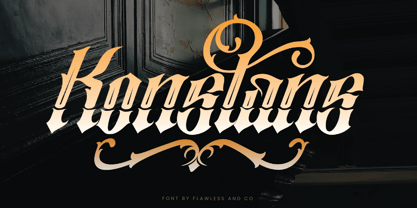 Konstan is a Blackletter font with an authentic and unique style on each character that gives a bold touch to any design you create. There's some connected letters and some alternates that suitable for any graphic designs such as branding materials, t-shirt, print, business cards, logo, poster, t-shirt, photography, quotes .etc This font support for some multilingual. Also contains uppercase A-Z and lowercase a-z, alternate character, numbers 0-9, and some punctuation. for more license, you can check in flawlessand.co If you need help, just write me! Thanks so much for checking out my shop!
 - Welmock by Keristyper Studio,
$14.00 Welmock is a display/decorative font based on a vintage royal fantasy font with modified ornaments that make it look prettier. This font is good for logo design, Social media, Movie Titles, Books Titles, short text even long text letters, and good for your secondary text font with sans or serif. Featured: Standard Uppercase & Lowercase Numeral & Punctuation Multilingual : ä ö ü Ä Ö Ü ß ¿ ¡ Alternate & Ligature PUA encoded We recommend programs that support the OpenType feature and the Glyphs panel such as Adobe applications or Corel Draw. so you can use all the variations of the glyphs. Hope you enjoy our fonts!
 - Draken Dream by Flawlessandco,
$9.00 Introducing "Draken Dream" - A Modern Elegant Sans Duo Font. Experience the epitome of modern elegance with "Draken Dream," a striking sans-serif font duo that seamlessly marries sophistication with contemporary design. There's some connected letters and some alternates that suitable for any graphic designs such as branding materials, t-shirt, print, business cards, logo, poster, t-shirt, photography, quotes .etc This font support for some multilingual. Also contains uppercase A-Z and lowercase a-z, alternate character, numbers 0-9, and some punctuation. If you need help, just write me! Thanks so much for checking out my shop
 - Bandoong by Arendxstudio,
$19.00 Introducing a new font called Bandoong inspired by urban script fonts with sharp and beautiful letters that create fonts that are modern, tendy and elegant. Bandoong comes with OpenType features such as stylistic alternates, stylistic sets & ligatures and is perfect for logotypes, posters, badges, book covers, tshirt design, packaging and more. Features : • Character Set A-Z • Numerals & Punctuations (OpenType Standard) • Accents (Multilingual characters) • Ligature • Alternate • Swash There it is! I really hope you enjoy it - comments & likes are always welcome and accepted. More importantly, don't hesitate to send a message if you have a problem or question.
 - Iron Metals by Sipanji21,
$20.00 "Iron Metal" is a display font with a modern, space, and futuristic theme. This font reflects elements of technology, strength, and resilience often associated with modern and futuristic designs. The use of a space theme can also add elements of exploration and the wonders of the universe to your design. "Iron Metal" is highly suitable for design projects that aim to emphasize these aspects, including space-themed designs, cutting-edge technology, advertisements for futuristic products, and much more. With "Iron Metal," you can create designs that convey durability, strength, and a challenging vision of the future.