10,000 search results
(1.486 seconds)
- AB One by AB Studio,
$23.99 AB One is a captivating sans-serif font family that effortlessly blends modern aesthetics with a dynamic, fluid formality inspired by the world of architecture. This versatile typeface offers three distinct weights, each carefully crafted to cater to a range of design needs. Key Features: Dynamic Fluidity: AB One embodies the dynamic essence of architectural forms, showcasing a graceful flow and a sense of movement. The font's letterforms possess an inherent flexibility that adds a touch of vibrancy to your designs, making it an excellent choice for contemporary projects that demand energy and liveliness. Sleek and Modern: The light weight of AB One radiates a modern, minimalist charm, perfect for creating a sleek and refined impression in your design projects. Its clean lines and well-balanced proportions ensure readability while evoking a sense of cutting-edge sophistication. Three Distinct Weights: The AB One font family offers three carefully crafted weights to provide versatility in your design work. Sans-Serif Elegance: As a sans-serif typeface, AB One represents a harmonious marriage of legibility and style. Its straightforward, elegant letterforms make it suitable for a wide range of applications, including branding, advertising, editorial design, and web interfaces. Inspired by Architecture: Drawing inspiration from the world of architecture, AB One captures the essence of structural elegance and sophistication. This font is an ideal choice for projects that require a touch of architectural finesse. Versatile Application: AB One's adaptability allows it to excel in a variety of design contexts. It seamlessly integrates with other design elements, providing a harmonious and engaging visual experience. AB One is a typeface that thrives on the principles of sleek modernity and architectural inspiration, making it a go-to choice for designers who seek to infuse their projects with a touch of dynamic fluid formality.
 - Patched by Mans Greback,
$39.00 Patches is a multi-faceted, victorian-era serif typeface for when you need something more than plain text. Get that extra attention while adding a genuine, original appearance to your message. Patches was designed from scratch to give a sense quality and depth. Its designer Mans Greback has created a typeface with a complex structure, yet one that will be easy to master. This work will suit every style, taste and skill level. It is a decorative and completely hand-drawn design in vintage lettering, with the perks and flexibility of present-day technology, which is exactly what you'd expect from a modern typeface. Whether you are making a decorative floral headline, drawing a cowboy logo, or creating a unique design based on this ornamental font, the hopes are that Patches can give you a set of tools and inspiration to bring out the best of your artistry. Standing on the shoulders of giants, it was inspired by a wide range of works, and will hopefully be able to continue to teach and inspire future artists. Or at least help you become a better designer when you're designing an elegant and classic headline. Set the coloring of Patches to light gold and cream tones to apply a luxurious look, or in dark tones for a more rugged impression. Bold, bright colors will make it appear In the mid-1800s, decorative design flourished in the Western major cities. Victorian style thrived and encouraged techniques such as enamelling, embroidery and calligraphy. From the 1880s onwards, there were a series of reactions to higher Victorian tastes, with Art Deco reaching the heights of the 20th century. However, the Victorian art persisted popularity, as it changed to more sophisticated designs which made it more attractive to specific professions and groups. The evolution of the Victorian style in the mid-20th century was a key factor in the succession of the movement. Classic shops and salons, sport designs and traditional festivals, and later Rock'n'Roll and Harley Davidson-themed graphics inspired the continued development of the art. Aspiring to carry on this tradition, this typeface family consists twelve different high-quality variations. The main ones are Patched and Patched In – an outlined variation – and each one provided in five weights: Thin, Light, Medium, Bold and Black. Additionally, the two rough fonts Hangaround and Prospects, that tries to grasp the rough, earthy atmosphere of a shady motorcycle club. The font is built with advanced OpenType functionality and has a guaranteed top-notch quality, containing stylistic and contextual alternates, ligatures and more features; all to give you full control and customizability. It has extensive lingual support, covering all Latin-based languages, from North Europa to South Africa, from America to South-East Asia. It contains all characters and symbols you'll ever need, including all punctuation and numbers.
 - Boomboyah by Letterara,
$10.00 Boomboyah is a natural dry brush font. This font has a striking look and a good flow that can add a stylish touch to your designs. It’s perfect for logos, quotes, posters, for clothing, and every other design which needs a unique touch.
 - Scarytale by Fractal Font Factory,
$10.00 I present to your attention a new font - Scarytale I had a desire to make a vintage style with a cute but scary story. It is a multi-layered, multilingual vintage typeface that works well for fabulous books, T-shirts and logos.
 - Higher Jump by Letterara,
$14.00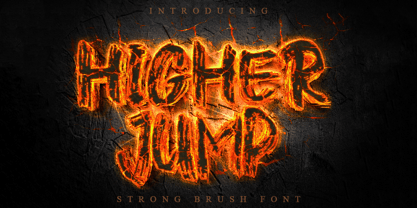 Higher Jump is a natural dry brush font. This font has a striking look and a good flow that can add a stylish personality to your designs. It’s perfect for logos, quotes, posters, clothing, and any design which needs a strong touch.
 - Weird Words by Sarid Ezra,
$15.00 Weird Words is a weird and trendy font based sans that have unique looks. This font contains uppercase and lowercase that have different form. You can use the lowercase and uppercase in the same word that will make your text more stand out! You can use this font for the social media post, poster, and suitable for headline. This font also support multi language.
 - Spicy Hour by PizzaDude.dk,
$17.00 Spicy Hour can be used for all your dishes and designs that needs that extra seasoning. Just mix, and you are ready to go! The ingredients includes contextual alternates, which in this case means that every letter has 5 different versions, which automatically cycles as you type. In other words, it spices up your text! Multilingual support is also a part of the dish!
 - TG Praktikal by Tegami Type,
$30.00 TG Praktikal is new modern geometrics sans with 8 styles & 1 variable font. Inspired by geometrics and gothic typefaces like Bell Centinel, Whitney and Metric, with an additional touch of monospace characters. That makes that TG Praktikal has a unique character set and fit perfectly for body text. Coupled with 3 flavors that can provide different impressions, including approximately 90 multilingual with various OpenType features.
 - Birdspring Signature by Rillatype,
$14.00 Birdspring Signature is a font that can meet your needs to make handwriting that has strong characteristics. This font is perfect for use in branding, wedding invitations, packaging, and so on. This font also equipped with up to 14 ligatures that will make every word you write more eye catching. We hope you enjoy the font, for more question feel free to ask us at rillatype@gmail.com.
 - Foreign Skies by PizzaDude.dk,
$17.00 Foreign Skies is that hastily written brush font you're going to need, if you're looking for an authentic brush font. I am aware that Foreign Skies doesn't always meet the criteria of a professional signletteres demands of "perfect strokes" - but that is the basic idea! It is super legible, even at small sizes, but at the same time it is uneven, bouncy, clumsy and rough!
 - Identa by Sudtipos,
$39.00 Because we know that you will never get tired of using them and that you will always need a new tool for Identity Design, we created Identa. Conceived to translate corporate and humanist ideals in its typographic form, it seeks a dialogue between neutrality and contemporaneity. With a pragmatic attention to functionality that does not forget aesthetics. It is a Sans serif model, accessible and well-founded. All-terrain, workhorse that seeks to be reliable and durable. It solves any type of content with efficiency, intelligence and professionalism. Its clean forms and x-height make it a very competent face for both short identifiers and long text bodies, ideal for display use where legibility and personality must match new design needs within a company. It is available in eight styles, ranging from its White version to the darker Vantablack, each optimally set with its respective italic variables, and a Dingbats font designed to solve everyday cases. Each font contains 737 glyphs, macro and micro aesthetic details inspired by current visual communication systems and trends. The dingbats font includes 303 signs and is a set of icons and symbols that can be used in multiple environments, both for print and digital media. This typeface family seeks to meet the needs of brand designers looking to create an assertive appearance, whatever the case. It is a solid and self-confident typeface, without appearing overly constructed; on the contrary, its nuance makes it look fresh.
 - Mexcellent by Typodermic,
$11.95 Welcome to the world of Mexcellent, a tri-linear stripe typeface that is sure to add a touch of jubilation to your designs! Inspired by the custom font created for the iconic 1968 Mexico City Olympic Games, this font will transport you to a world of vibrant colors and striking patterns. With Mexcellent, you can experiment with layers to produce an endless array of captivating color effects. Let your imagination run wild as you explore the countless possibilities that this font has to offer. Whether you’re designing a poster, a flyer, or even a social media graphic, Mexcellent will make your message pop. The cool stripes and playful angles will add a touch of flair and panache to your creations, setting them apart from the rest. Your audience will be captivated by the unique and innovative style that you bring to the table. So what are you waiting for? Try Mexcellent today and discover the joyous and dynamic world of tri-linear stripe typography! Most Latin-based European writing systems are supported, including the following languages. Afaan Oromo, Afar, Afrikaans, Albanian, Alsatian, Aromanian, Aymara, Bashkir (Latin), Basque, Belarusian (Latin), Bemba, Bikol, Bosnian, Breton, Cape Verdean, Creole, Catalan, Cebuano, Chamorro, Chavacano, Chichewa, Crimean Tatar (Latin), Croatian, Czech, Danish, Dawan, Dholuo, Dutch, English, Estonian, Faroese, Fijian, Filipino, Finnish, French, Frisian, Friulian, Gagauz (Latin), Galician, Ganda, Genoese, German, Greenlandic, Guadeloupean Creole, Haitian Creole, Hawaiian, Hiligaynon, Hungarian, Icelandic, Ilocano, Indonesian, Irish, Italian, Jamaican, Kaqchikel, Karakalpak (Latin), Kashubian, Kikongo, Kinyarwanda, Kirundi, Kurdish (Latin), Latvian, Lithuanian, Lombard, Low Saxon, Luxembourgish, Maasai, Makhuwa, Malay, Maltese, Māori, Moldovan, Montenegrin, Ndebele, Neapolitan, Norwegian, Novial, Occitan, Ossetian (Latin), Papiamento, Piedmontese, Polish, Portuguese, Quechua, Rarotongan, Romanian, Romansh, Sami, Sango, Saramaccan, Sardinian, Scottish Gaelic, Serbian (Latin), Shona, Sicilian, Silesian, Slovak, Slovenian, Somali, Sorbian, Sotho, Spanish, Swahili, Swazi, Swedish, Tagalog, Tahitian, Tetum, Tongan, Tshiluba, Tsonga, Tswana, Tumbuka, Turkish, Turkmen (Latin), Tuvaluan, Uzbek (Latin), Venetian, Vepsian, Võro, Walloon, Waray-Waray, Wayuu, Welsh, Wolof, Xhosa, Yapese, Zapotec Zulu and Zuni.
 - Gangnam by Ditatype,
$29.00 Gangnam is a captivating display font that dances to its own rhythm, embodying the spirit of the vibrant Gangnam district. Gangnam strikes the perfect balance between subtlety and impact, with a weight that is not bold, allowing the Korean-inspired letterforms to take center stage. The characters in Gangnam showcase a unique Korean touch, capturing the essence of the dynamic and stylish district. The large letters, while not bold, maintain a visible presence, creating an overall design that is both graceful and attention-grabbing. Gangnam is not just a font; it's a visual journey through the eclectic streets of Gangnam. In addition, enjoy the features here. Features: Alternates Ligature Multilingual Supports PUA Encoded Numerals and Punctuations The Korean-inspired design ensures that Gangnam infuses a sense of style and cultural authenticity into any project. Gangnam fits in headlines, logos, posters, flyers, branding materials, greeting cards, print media, editorial layouts, and many more designs. Find out more ways to use this font by taking a look at the font preview. Thanks for purchasing our fonts. Hopefully, you have a great time using our font. Feel free to contact us anytime for further information or when you have trouble with the font. Thanks a lot and happy designing.
 - Sleeve Notes by Wing's Art Studio,
$12.00 Sleeve Notes: A font from the analogue age. Inspired by album covers and hand-written song lyrics. Sleeve Notes is an experimental script font and all-caps pair with a loose hand-written style that explores the golden-age of record stores, vinyl albums, cassettes and CDs. It imagines our teenage selves kicking back with a coke (oversized headphones on) discovering a new band and studying the notes on their latest album. Besides production credits, the best sleeves (otherwise known as liner notes) included photos, cool artwork and hand-written song lyrics that gave the listener a human connection to the mind of the artist. This font embraces it's subtle ink blotches and rough edges; all imperfections that build to create a sense of a hastily written lyric, set-list or just a fun little scribble. The package includes six fonts in total; the regular script with two complete sets of alternatives, then two sets of all-caps, and finally the special characters font that features a decorative alphabet plus symbols and underlines. For authentically retro, hand-made looking lettering, it's a great choice and offers the flexibility few other fonts can match. Check out all the visuals to see it action!
 - Ebisu by Thinkdust,
$10.00 Ebisu is a sans serif family consisting of 10 different weights. Designed by Alex Haigh in 2010, and influenced by one of his original designs from 2008 Hiruko - Ebisu loses the soft sans serif curves, for a more robust geometric styling. But it’s much more than a geo-replica. The lowercase characters also have a more exaggerated sharpness that gives the whole family a unique look and feel. The kerning has been individually crafted for each letter, with vigorous attention - to ensure that each letter from is produced in a way that works with every member of the set, for a tightly knit sans serif family. It speaks many languages too. The open type features have an extended character set to support Eastern and Western European languages. With each weight conveying a different personality, Ebisu is set to become the modern new sans serif family to sit alongside you classics for versatility, cleanliness and a crafted edge.
 - Kronix by Hazztype,
$20.00 Introducing Kronix, a geometric, futuristic font that embodies the essence of technology in the digital age. Kronix combines sleek lines, precise angles, and contemporary design elements to create a visually striking font perfect for technology-themed projects. Its clean and minimalist letterforms embody the essence of modernity and sophistication, capturing the attention of tech-savvy audiences. With its crisp edges and precise spacing, this font creates a harmonious visual rhythm that adds a touch of elegance to any design. Kronix is versatile and adaptable, making it suitable for a wide range of applications, including websites, mobile apps, and branding materials. Its modern aesthetic aligns perfectly with the fast-paced advancements in technology, allowing your design to stay relevant and visually impactful. Whether you're designing a tech magazine cover, creating a sci-fi movie poster, or developing a high-tech product packaging, Kronix is the ultimate choice for adding a geometric, futuristic flair that captivates the imagination and elevates your design to the forefront of modern technology.
 - Laborat by Monotype,
$50.99 Typeface Laborat™, designed by Kristína Jandová, is a Grotesk typeface that combines the geometry of a circle and a square. The visual message of geometry is applied to stylistic sets and modified by special characters, including abstract forms or symbols, that turn the typeface into a visual “graphic” language. The basic character of the typeface lies in the default set based on the circle-like shapes of letters. The stylistic sets 01 to 03 are characterized by different geometrical modifications of the growing character and the idea “from circle to square” applied on the letters a, f, g, l, r, t, u, y. By using these different alterations of consistent letterforms, it offers a playful space for everyone. The first inspiration of the typeface origins in Paul Renner’s Futura sketches, that were a celebration of geometrical playfulness of modernism meeting constructivism. It is modified into a new contemporary “wave” of typography as a graphical method. Laborat comes in six weights, from Hairline to Heavy.
 - Gummies by Heyfonts,
$15.00 Gummies - The fat bubble font is a stylish and playful typeface that features rounded and inflated letterforms, resembling bubbles. The letters are often chunky, with exaggerated curves and soft edges, giving them a plump and rounded appearance. This type of font is popular for its fun and whimsical nature, making it suitable for designs targeting a young audience or those looking to create a lighthearted and energetic atmosphere. The thick and rounded letterforms give a sense of friendliness and approachability, adding a touch of playfulness to any text. The fat bubble font is versatile and can be used in various design applications, such as logos, headlines, posters, invitations, stickers, or website headers. It adds a touch of personality and uniqueness to designs, helping them stand out and grab attention. Overall, Gummies font is an eye-catching and cheerful typeface that captures the joy and energy of bubbles, making it a popular choice for designs that want to exude a sense of fun and playfulness.
 - VLNL Boulangerie by VetteLetters,
$35.00 VLNL Boulangerie was originally an incomplete set of early 20th century wood type letters, that Donald Roos found in a dust covered carton box stashed away somewhere at the Royal Academy in The Hague. Charmed by the letter forms Donald decided to print them on paper with a printing press. Next he digitised the prints as they came out, including small imperfections and damages. The missing characters were composed and added digitally to complete the alphabet. (See if you can spot those!?) We think VLNL Boulangerie is a little French in appearance (hence the name), it's joyful, warm, a little crunchy and round-ish. It defenitely has that ‘je-ne-sais-quoi’ that seperates it from most wood type grotesques. It can be perfect for lettering on a storefront window of – let's say a bread shop or a lunchroom. Or a logo for a downtown hipster café. VLNL Boulangerie hardly has any limitations actually.
 - Capitolina by Typefolio,
$39.00 Capitolina is a family of 10 typefaces with a contemporary design style, based on different historical models. The original shape of serifs was a reference to 19th century’s Clarendon types though this inspiration remains as a subtle feature of the final design. Even subtler are the calligraphic influences, better noticed in the italics. The result is a set of typefaces that look more ‘constructed’ than ‘written’, referring to a rationalist style. However, it has a distinct approach to the aesthetic treatment of typographic forms that resembles the humanist tradition. Available in five weights of roman and italic types, Capitolina has a wide glyph palette that contains 800 glyphs in each font. Besides supporting basic Latin, western, central, and southeastern European sets, it has several OpenType features, such as case-sensitive forms, small capitals, ligatures, localized forms, number forms, fractions and more. Capitolina is, therefore, a great choice for projects in editorial design and other related applications.
 - Dozed by Craft Supply Co,
$20.00 Introducing Dozed – Condensed Sans Serif Font Dozed is a modern typeface that combines simplicity and style. With its low contrast design, this font offers a sleek and contemporary look, perfect for a wide range of projects. Streamlined Aesthetics Dozed – Condensed Sans Serif font boasts a minimalist charm that effortlessly captures attention. Its clean lines and compact characters make it an ideal choice for both digital and print applications. Enhanced Readability Dozed prioritizes readability without sacrificing aesthetics. The condensed style ensures that your content fits seamlessly within limited space, making it a practical choice for posters, flyers, and websites. Versatile Applications Whether you’re designing a website, crafting a logo, or working on a branding project, Dozed adapts beautifully to various design contexts. Its versatility shines in headlines, subheadings, and body text. Endless Possibilities With Dozed, your creativity knows no bounds. Its adaptability, modern aesthetics, and user-friendly design make it a valuable addition to your font collection, opening up endless possibilities for your design projects.
 - Tolyer by Typesketchbook,
$25.00 Tolyer font is an extra large super family of 50 fonts! In many cases quantity doesn’t mean quality but here we have such a big abundance of contrast, styles, weights and special effects in one place that it actually doesn’t pay attention to the fact this is an all caps family. When it comes to strong headlines, titles, posters, masculine brand names Tolyer type family is probably one of the best choices in sans serif typography. You could easily pick from low to high contrast outlines, uprights and obliques, 3D effects or different artistic textured styles to make your work diverse, expressive and attractive. Tolyer font offers you maximum readability even in poor display conditions like low quality printing or low resolution monitors. In some cases poor print quality could even add more value to the final result, because Tolyer has a lot of potential to be used in difficult conditions. Letterpress and high embossing are one of those print effects that really suit Tolyer best. Use it in high contrast with background environment, higher ink flow, don’t think about the dot gain and you should definitely use a textured paper – this is what Tolyer really likes and deserves. It will thank you for this with authentic look, classic vintage style and strong but attractive presence.
 - Axiforma by Kastelov,
$55.00 Axiforma was designed with the single idea of creating a font that starts with the letter A, because let's face it, this is the best letter. For those of you who didn't see it coming, Axiforma is a /drum roll/ geometric sans in 20 weights. If you are thinking "Oh boy, another geometric sans", you clearly know your stuff. Yet, Axiforma is different in at least three crucial ways: 1) It's made by me 2) It's not free 3) It's polite and humble Additionally, Axiforma is packed with Opentype such as oldstyle numbers, fractions, case sensitive alternates, localized forms, stylistic sets, cyrillic alphabets (Bulgarian & Russian) and many more. Basically it's quite extensive and kinda great. Upon using Axiforma, clients will start to behave differently around you and may even start paying you. Your spouse will start working out again just to gain your attention and your kid will become instantly popular at school. After all you are using Axiforma and rumors do spread quickly. That's what we are talking about - raw font power. With Axiforma regular typed text is suddently transformed into first class design. That includes branding, posters, headlines, display, presentation materials, websites, logotypes, etc. The world will now be your playground. To sum it up, Axiforma is badass, thus you should have it and use it everywhere.
 - Hipweee by Storictype,
$9.00 Introducing Hipweee Layered Font Hipweee, A new carefully crafted layered rounded Typeface. The Ideas of this fonts are from wide range of reference, baby, kids, school, cafe, food desert & beverages are our main focus for this fonts. So the looks of this fonts must be in the wide range of the reference above. It’s Versatile, Fun, Cute and Beauty feel that you get in Hipweee Typeface Hipweee Created with 7 Layer : Base, Extrude, Shadow, Dot, Flower, Hatch & Inline. Perfect fitted layer to give you a more contrast, more bold look of the title. Our creation on the display to give you a reference what it looks like on your project. such as Branding, Header, Logotype, Poster, and etc. It shows that Gemoy clearly can accommodate various design style. Language Support : Afrikaans, Albanian, AsuBasque, Bemba, Bena, Breton, Catalan, Chiga, Colognian, Cornish, Croatian, Czech, Danish, Dutch, English, Estonian, Faroese, Filipino, Finnish, French, Friulian, Galician, German, Gusii, Hungarian, Indonesian, IrishItalian, Kabuverdianu, Kalenjin, Kinyarwanda, Latvian, Lithuanian, Lower Sorbian, Luo, Luxembourgish, Luyia, Machame, Makhuwa, Meetto, Makonde, Malagasy, Maltese, Manx, Morisyen, North Ndebele, Norwegian , Bokmål, Norwegian Nynorsk, Nyankole, Oromo, Polish, Portuguese, Quechua, Romanian, Romansh, Rombo, Rundi, Rwa, Samburu, Sango, Sangu, Scottish Gaelic, Sena, Serbian, Shambala, Shona, Slovak, Soga, Somali, Spanish, Swahili, Swedish, Swiss, German, Taita, Teso, Turkish, Upper Sorbian, Uzbek (Latin), Volapük, Vunjo, Western, Frisian, Zulu
 - Coco Gothic Pro by Zetafonts,
$39.00 Inspired by a biography of Coco Chanel and trying to capture the quintessential mood of classical fashion elegance, Cosimo Lorenzo Pancini designed Coco Gothic looking for the effect that the first geometric sans typefaces (like Futura, Kabel or the italian eponyms like Semplicità) had when printed on paper. The crisp modernist shapes acquired in printing charme and warmth through a slight rounding of the corners that is translated digitally in the design of Coco Gothic. This signature touch is enhanced by the inclusion of light humanist touches to the proportions of the letters, resulting in the unique mix that makes Coco Gothic one of our best sellers, with a look that is both contemporary and vintage. After six years from the original project (that has spawned in the meanwhile successful families like Cocogoose and Coco Sharp), we went back to the design to completely redraw and expand the original family, creating with a Pro version that has better on-screen readability, a wider weight range, variable type versions and more language coverage (with Coco Gothic Arabic adding a new script to the latin, greek and Cyrillic of the original). Coco Gothic Pro comes in three subfamilies, each with seven weights with matching italics and featuring an extended character set with open type support for small caps, ligatures, alternates, European languages, Greek and Cyrillic alphabets. The original, body-text optimised Coco Gothic and Coco Gothic Alternate subfamilies have been kept for compatibility with the previous version, while a new Coco Gothic Display subfamily has been developed with a complete redesign aimed at display usage, featuring tighter spacing and optimised letterforms. A distinguishing feature of Coco Gothic Pro is the inclusion of ten alternate historical sets that allow you to use the typeface as a true “typographic time machine”, selecting period letterforms that range from art deco and nouveau, to modernism and to eighties’ minimalism. Equipped with such an array of historical variants, Coco Gothic Pro becomes an encyclopedia of styles from the last century, ready to transform itself and adapt to the mood of your text.
 - Klanting by Kulokale,
$17.00 Klanting is a stylish, clean, and modern condensed sans font, with style that is very different from the others. This font comes in two styles, Regular and Oblique Version. Klanting is well-suited for posters, social media, headlines, magazine titles, clothing, large print formats - and wherever you want to be seen. Inspired by the style of design that is currently popular, and this is the answer to all the needs of every idea that you will pour in this modern era. We highly recommend using a program that supports OpenType features and Glyphs panels such as Adobe Illustrator, Adobe Photoshop CC, Adobe InDesign, or CorelDraw, so you can see and access all Glyph variations.
 - Maguare Style by Sensatype Studio,
$15.00 A Modern Stylish Serif Font that we created special for elegant and Fashion branding needs that we created special for elegant branding needs, with extra ligature and alternates in unique shape will be ready to add value of your brand. It so nice to leverage designer or product owner that need solutions to make their design look more classy and modern. And specially for this font, We prepared any ligatures, and any alternate characters to help you create unlimited variations for your creative needs. Maguare Modern Stylish Serif Font ready with: Lowercase and Uppercase characters Numbers and Punctuations Preview as a inspirations that you can do with Foghe font Available for PC and Mac Wish you enjoy our font.
 - La Graziela by Letterhend,
$19.00 Please welcome our newest script typeface, La Graziela. A Beautiful and classy script that has many swashes that allows you to create beautiful lettering instantly. it has many stylistic set alternates that you can choose from. This font perfectly made to be applied especially in logo, and the other various formal forms such as invitations, labels, logos, magazines, books, greeting / wedding cards, packaging, fashion, make up, stationery, novels, labels or any type of advertising purpose. Features : uppercase & lowercase numbers and punctuation multilingual ligatures alternates swashes PUA encoded We highly recommend using a program that supports OpenType features and Glyphs panels like many of Adobe apps and Corel Draw, so you can see and access all Glyph variations.
 - Bork by Harbor Type,
$50.00 🏆 Selected for Tipos Latinos 9. Bork is a display typeface that was inspired by an exercise in blackletter calligraphy. The style’s characteristic dark texture is seen mainly in the lowercase, with uniform spacing (where counterspace equals letterspace), shapes that recall the straight, interrupted strokes used in that style of writing, and the peculiar construction of certain letters. On the other hand, the uppercase aims for a more conventional roman construction, making it more legible for modern-day readers. It features an extensive character set that includes contextual and stylistic alternates, superior/inferior figures, arbitrary fractions, as well as several unusual ornaments, symbols and punctuation. Bork is especially suited for use in book covers, headlines, packaging and logotypes.
 - Motobreath by Epiclinez,
$18.00 Introducing Motobreath, the bold typeface that is sure to turn heads. This font is inspired by the energy and power of hard rock music and the thrill of the racing car scene. With Motobreath as your secret weapon, you'll instantly add excitement and attitude to any design project. The simple angles yet energetic lines give this typeface an unmistakable edge that sets it apart from other fonts on the market. Whether you're looking to create a bold headline that demands attention or a logotype that conveys strength and power, Motobreath has got you covered. Motobreath features : Standard Latin Numbers, symbols, and punctuations Multilingual Support. Fully accessible without additional design software Simple Installations Works on PC & Mac Thank You.
 - Chevron by Altered Ego,
$45.00For that tight fit, STF Chevron is perfect. An ultra-condensed display font, with a complete character set. The name? It's named after an oil company, but the shapes of the serifs reflect that as well. With some art deco overtones, try Chevron in places that you might want a simple art deco typeface. How should you use it? It's perfect for posters, packaging and advertising, CD covers and publications. Fully hinted and exquisitely kerned, Chevron will be one of your favorite faces for tall copy that need to get noticed. It's really ideal for calendars, when you want big numbers without losing space for writing in the date fields. License it today! - Lightron by Sensatype Studio,
$15.00 Newon is an Unique Neon Light Font with Floating shape make your design look unique and modern A new Display Font that we created special for Headline, Title and more stand out typography needs, with extra ligature that will add your variations. It's so perfect to add your style and headline overview. And specially for this font, we crafted for unique style and modern feels so enjoy to create any project that will show your main idea out. Newon Neon Light Font ready with: Any options to get creative variations (combination of Ligature Characters) Preview as a inspirations that you can do with this font Ready with Uppercase & Lowercase characters Wish you enjoy our font. :)
 - Laurentian by Monotype,
$29.99 Maclean's is a weekly Canadian newsmagazine with a broad editorial mission. A typical issue covers everything from violence on the other side of the globe to the largest pumpkin grown in a local county. In 2001, Maclean's invited Rod McDonald to become part of the design team to renovate" the 96-year-old publication. The magazine wanted to offer its readers a typographic voice that was professional, clean, and easy to read. Above all, the typeface had to be able to speak about the hundreds of unrelated subjects addressed in each issue while remaining believable and uncontrived. A tall order, perhaps? Now add in that this would be the first text typeface ever commissioned by a Canadian magazine. McDonald, who some have called Canada's unofficial "typographer laureate," took on the challenge. McDonald used two historic models as the basis for Laurentian's design: the work of French type designer Claude Garamond, and that of the English printer and type founder, William Caslon. From Garamond Laurentian acquired its humanist axis, crisp serifs and terminals that mimic pen strokes. Caslon's letters are less humanistic, with a more marked contrast in stroke weight and serifs that appear constructed rather than drawn. These traits also made their mark on Laurentian. Using these two designs as a foundation, McDonald drew Laurentian with the narrow text columns and small type sizes of magazine composition in mind. He gave his letters strong vertical strokes and sturdy serifs, a robust x-height and a slightly compressed character width A tall order, per McDonald's genius is evident in the face's legibility, quiet liveliness and in the openness of the letters. The result is a typeface that not only met Maclean's demanding design brief, but also provides exceptional service in a wide variety of other applications. Laurentian is available in three weights of Regular, Semi Bold and Bold, with complementary italics for the Regular and Semi Bold, and a suite of titling caps."
 - Generic by More Etc,
$15.00 The Generic Typeface Collection is a series of sans-serif typefaces inspired by the craftsmanship of graphic design, typesetting, and printing in the analogue era – before Adobe, Macintosh computers and desktop publishing – when dinosaurs ruled the earth. With the use of various typesetting apparatuses or dry transfer type, photo copiers, and shooting layouts and paste-ups to film, the printed results was not as exact, precise and predictable as it is today. When examining old prints, it is difficult not to like the way that characters in over- or underexposed film have a special type of vibe to them that is often sadly lost in today’s pursuit of total perfection. Encouraged by this, I saw a need for a collection of typefaces that are non-clinical and non-conformist, and some that are coarse, rough and distorted – errors that might come from poor exposure when put on film, enlargements from small point texts, or maybe quality loss from successive generations of photocopies. Or all of the above. This is an attempt to incorporate spirit and personality into a set of typefaces without losing distinction. You might call it a homage to non-perfection. I call it human. The Generic Typeface Collection consists of 11 fonts divided into four series. The three standard series – the Formal Release series, the Coarse Copy series, and the Rough Display series – all contain three fonts each. The Extra Splendor series contains a couple of shadow fonts for that little extra sparkle. Formal Release – Handcrafted & Clean The Formal Release series features sans-serif typefaces for everyday use. They are handcrafted and clean, human and uncomplicated. The Formal Release series contains three typefaces that add tons of personality to any text. G10 FR ‘Slim’ – a slightly under-exposed and clean typeface in a regular weight (228 glyphs - 1 alternate) G20 FR ‘Classic’ – a properly exposed clean typeface in a bold weight (228 glyphs - 1 alternate) G30 FR ‘Bulky’ – a heavily over-exposed clean typeface in an ultra weight (228 glyphs - 1 alternate) Coarse Copy – Dirty & Rough The Coarse Copy series features non-conformist typefaces that are worn and rough, maybe after going through that bad copier a few times too much. The Coarse Copy series contains three sans-serif typefaces that add tons of spirit to any text without compromising too much on legibility. Try them on in poster-sizes and everyone will know that you mean business. G40 CC ‘Slender’ – an under-exposed coarse typeface in a regular weight (228 glyphs - 1 alternate) G50 CC ‘Typic’ – a properly exposed coarse typeface in a bold weight (228 glyphs - 1 alternate) G60 CC ‘Huge’ – a heavily over-exposed coarse typeface in an ultra weight (228 glyphs - 1 alternate) Rough Display – Faded & Decorative The Rough Display series features attention-seeking decorative typefaces in three feature-packed fonts. Faded and gritty like the image distortion and degradation from successive generations of photocopies, they are eye-catching typefaces intended to stand out in bigger point sizes. Use these typefaces for signage, headlines and similar situations were a strong typographic statement is desired. We have packed no less than 1,334 alternate characters and 212 discretionary ligatures into this series for a greater chance of not having characters that look exactly the same more than once. G70 RD ‘Slinky’ – an under-exposed rough and decorative typeface in a regular weight (741 glyphs – 448 alternates – 66 discretionary ligatures) G80 RD ‘Standard’ – a properly-exposed rough and decorative typeface in a bold weight (748 glyphs – 448 alternates – 73 discretionary ligatures) G90 RD ‘Swollen’ – a heavily over-exposed rough and decorative typeface in an ultra weight (748 glyphs – 448 alternates – 73 discretionary ligatures) Extra Splendor – Sparkling & Extraordinary The Extra Splendor series features two shadow typefaces for that little extra sparkle. One clean shadow to be used with G20 FR ‘Classic’, and one rough shadow to be used with G80 RD ‘Standard’. Having the shadows separate from the main typeface adds another layer of expressiveness in that you can try out color combinations for that extra splendor. Tips for matching (applies to both the base font and the shadow font): Set the kerning to Metric, not optical. Increase tracking to accommodate for the shadows extra width. G25 ES ‘Classic Shadow’ – a clean shadow to be used with G20 FR ‘Classic’ (228 glyphs – 1 alternate) G85 ES ‘Standard Shadow’ – a rough shadow to be used with 80 RD ‘Standard’ (227 glyphs) OpenType features – alternate characters and discretionary ligatures – can be accessed by using OpenType friendly professional design applications, such as Adobe Illustrator, Adobe InDesign, and Adobe Photoshop.
 - FF Fago Monospaced by FontFont,
$67.99 FF Fago Thanks to his many years of involvement in major corporate type projects, Ole Schäfer had the necessary resources from which to construct his FF Fago™. The result is an extended family that provides comprehensive typographic support and whose qualities come to the fore in all relevant contexts ? from print to office through internet and wayfinding systems. FF Fago The sizable x-height together with the generous and open design of the characters ensure that the sans serif Fago remains clearly legible even in small point sizes or in potentially difficult situations, such as on wayfinding systems. A subtle contrast in line weight and letter forms that are reminiscent of those of an antiqua typeface provide the font with a restrained yet friendly and lively tone. Available in five weights, each with three different kerning widths and matching genuine italic variants, FF Fago is equipped for practically every situation. There are also small caps, oldstyle and lining figures, a selection of ligatures and geometric symbols. The range of potential applications of this universal font is almost inexhaustible ? it can be used in packaging design, on signs, posters and even for setting longer text sections. Fago is the ideal partner for those working on major corporate projects! FF Fago Correspondence Sans und Correspondence SerifThe Correspondence versions of Fago have been optimized for use in the business environment and in office communication. The carefully modified characters have a particularly robust feel, so that the clear, easily differentiated glyphs allow for straightforward communication even on screen. With these aims in mind, Schäfer has not only adjusted the x-height, but has provided certain letters in the sans variant ? such as the lowercase "i", the "r" and the uppercase "I" ? with serifs. Correspondence Serif, on the other hand, has been conceived as a slab serif throughout and in appearance has the look of the letters produced by the old office typewriting machines. An individual note has been added by providing a few unusual serif forms, as for example in the case of the "m", the "v" and the "y". Both Correspondence Sans and Serif are available in two weights with complementary italic versions and thus are ideally suited for use with standard office programs. This is all rounded off with a selection of office symbols. FF Fago Monospaced The use of a few typographic tricks is necessary to ensure that the letters of the alphabet appear to have the same width. Narrow letters such as "r" and "i" have been made to seem more expansive by using prominent serifs while the broader letters ? a good example is the "m" ? have the forms seen in a condensed font. And it is thanks to this design strategy that Fago Monospaced has the character of old typewriter text. What was once unavoidable because of the technology of the time is now a welcome alternative that can be used for the purposes of emphasis. As an additional supplement to the Fago superfamily, Fago Monospaced can be used, for example, to set short notes or draw attention to special text passages. There are three weights, in their original form without italic variants or small caps, but offering an alternative, technical form of the "0" with a crossbar.
 - Mirantz by insigne,
$32.00 Y’all ready for this? Now starting for Insigne: the new serif Mirantz. This rookie all-star plays a precise game every game, cutting at all the right angles to leave your reader impressed and ready to see more. You can always count on Mirantz to lead with solid mechanics and a clean style, but don’t be surprised when the face keeps it real with a little individual flare and creativity. This personal touch is nothing short of elegance in every appearance. So what makes us love this rookie above the other great players in the field? Contrast, for one. Mirantz brings more contrast to the game than most serifs out there. The serifs on this face have a crisp, sharp wedge that naturally draws the reader’s eye. You can’t help but fall in love with its clean, natural style. Mirantz also features a tall x-height and regular proportions that can play a number of positions on the page and still stay strong through the last half of the copy or even the final period. Mirantz is a solid powerhouse player, containing a complete set of small capitals and nine weights from thin to bold. It can play well both down low and up top with its subscripts and superscripts and can move your reader’s eye easily across the copy with its titling capitals, condensed and extended variants, and open style figures. With its options covering more than 72 Latin-based languages, look for this newcomer to have international success in the near future. It you haven’t set your draft picks for this next round of projects, think hard before passing up Mirantz. A capable serif like this one is a guaranteed asset to any team of fonts. Production assistance from Lucas Azevedo.
 - Rainclouds by Hanoded,
$15.00 I was doodling away with a sharpie pen on a rainy day. Hey… wait a minute. A rainy day, a font called Rainclouds… Yep, that’s right, it is called Rainclouds for that reason! ;-) Rainclouds is a fat marker font with a lot of texture and a lot of mouth.
 - Glerosion by IbraCreative,
$17.00 Glerosion – A Retro Cartoon Sans Serif Font Glerosion, a retro cartoon sans-serif font, exudes a playful and nostalgic charm that effortlessly transports viewers to a bygone era. With its whimsical and rounded letterforms, Glerosion captures the essence of classic cartoon aesthetics, reminiscent of beloved animated shows from the mid-20th century. The font strikes a harmonious balance between a timeless simplicity and a distinct vintage flair, making it a versatile choice for a range of creative projects that seek to evoke a sense of lightheartedness and retro appeal. Glerosion’s characters possess a delightful quirkiness, embodying the spirit of yesteryear while maintaining a modern edge that lends itself well to a variety of design applications, from branding to editorial design and beyond. Glerosion is perfect for branding projects, logo, wedding designs, social media posts, advertisements, product packaging, product designs, label, photography, watermark, invitation, stationery, game, fashion and any projects. Fonts include multilingual support for; Afrikaans, Albanian, Czech, Danish, Dutch, English, Estonian, Finnish, French, German, Hungarian, Italian, Latvian, Lithuanian, Norwegian, Polish, Portuguese, Slovak, Slovenian, Spanish, Swedish.
 - Attendance by TanveerType,
$12.00 Attendance is a bold and playful font that can be used for logos, t-shirts, branding and many other projects.
 - Hunterra by Variatype,
$14.00 Hunterra is a strong character font that especially designed for identity proeject, very suitable for your branding, and logo design.