10,000 search results
(0.021 seconds)
- Slm by Antiochus,
$30.00 We produce original printing press letter fonts, for example from the journal Southern Literary Messenger (circa 1830 - 1870). The only one in the world. What makes our fonts so attractive to the eye, are the myriad imperfections. It's not an approximation to the printing-press letters--- these are the actual letters, complete with all their manifold differences. If you look closely you will notice that the letter 'e' say, each time it is printed, is slightly different. These differences arise from the mechanical action of the inked-wooden press on the paper, and cannot be faked by artificial means. The eye subconsciously picks up this text as the actual printing press letters. Edgar Allan Poe published many of his great works in the Southern Literary Messenger, as did many other great nineteenth century writers, ie. Henry Wadsworth Longfellow, Nathaniel Hawthorne &c.
 - Garrulous by Missy Meyer,
$12.00 Looking for a tall, skinny, rounded serif font, with a fun hand-written feel? Look no farther than Garrulous! Garrulous is a mixed-case font, with the lowercase letters standing just as tall as the uppercase, so you can mix and match uppercase and lowercase in the same word for an extra fun look. It also comes with 32 double-letter ligature pairs, 17 uppercase and 15 lowercase, so you won't have the exact same letter twice in a row. As usual, the letters in Garrulous have been cleaned up extensively, to make everything sharper and easier for crafters and for any print projects. And I've included over 300 extended Latin characters for language support. Garrulous includes: - Standard characters A-Z, a-z, 0-9, and punctuation - 32 double-letter ligature pairs - Over 300 extended Latin characters for language support
 - Blackberry Macarons by PeachCreme,
$13.00 Say hello to the Blackberry Macarons Font Trio! Heart-warming Script, Display, and Sans Serif fonts that will brighten your design. Blackberry Macarons Display - includes all caps regular and multilingual letters, punctuation, numbers, and as a bonus the letters A, K, M, Q, R with beautiful swashes to keep your designs attractive :) Blackberry Macarons Script - has all uppercase and lowercase letters, numerals, punctuation, and 42 fancy ligatures as well to add a cheesy flair to your words. Blackberry Macarons Sans - a cute and fun hand-drawn typeface with a little imperfect look that works great to add a handmade touch to your projects. Includes a full set of regular letters, numbers, and punctuation. Sweet and quirky, the Blackberry Macarons Font trio is perfect for recipes, book illustrations, lettering, fun packaging, greeting cards and so much more!
 - Toronto Subway by Quadrat,
$35.00 Toronto Subway is based on the lettering originally used for station identification and signs by the Toronto Transit Commission (TTC) in the Toronto, Canada, subway system. The first subway line opened in 1954. However, the original lettering remains unique. The lettering on the original signage consists only of uppercase characters and a few bits of punctuation in two weights: Regular and Bold, introduced in 2004. The Toronto Subway fonts were developed from rubbings of the lettering etched into station walls and photographs of painted signs. The overall style of the lettering is very mechanical, almost naive, yet still having a certain amount of elegance. This style was followed as much as possible in creating the extra lowercase, punctuation and other special characters. The Toronto Subway family was expanded in 2014 with the addition of the Light and Black weights.
 - Undulate by Ingrimayne Type,
$10.00 Undulate was designed as an alternating-letter font in which two sets of characters alternate. The alternating is done automatically in applications that support the OpenType feature contextual alternatives (calt). Some individual characters look strange in isolation but they fit into a wave-like pattern in which shapes that bulge up alternate with shapes that bulge down. Undulate has monospaced and monoline letters. The letter spacing is very tight to accentuate the ripple pattern. The family includes an outline style that can be used in a layer above the regular style to add color. Undulate was not designed for any particular use but as a challenge to fit letters into a particular geometric shape. The unusual patterns that a result are eye-catching and may be useful for advertising or signage and in other places where one wants attention-grabbing lettering.
 - Banan by Arabetics,
$39.00 An isolated letters display typeface design which emphasizes the vertical stems and has an overall Arabian tales and oriental look and feel. All letters start with a prominent vertical stem shaped as pirate sword and ends in very narrow stroke. Banan font family has two members, regular and left-slanted italic styles. This font family design follows the guidelines of Mutamathil Taqlidi type style with one glyph for every basic Arabic Unicode character or letter, as defined in the latest Unicode Standards, and one additional final form glyph, for the freely-connecting letters in traditional Arabic cursive text. Banan employs variable x-height values. It includes only the Lam-Alif ligatures. Soft-vowel diacritic marks, harakat, are selectively positioned. Most of them appear by default on the same level, following a letter, to ensure that they would not interfere visually with letters. Tatweel is a zero-width glyph. Keying the tatweel key before Alif-Lam-Lam-Ha will display the Allah ligature. Banan includes both Arabic and Arabic-Indic numerals, in addition to standard punctuations.
 - Faber Fraktur by Ingo,
$22.00 A modern black-letter, so to speak. Composed of a few basic elements with a wide-quill ductus. Faber Fraktur was based on the idea that it must be possible to create a modern black-letter type. The typeface is ”constructed“ according to the same principles as a script without serifs: as few varied basic forms as possible, omission of frills which make the type difficult to read and repetition of similar forms. The typical contrasting strokes of the original handwritten black-letter script are retained nonetheless. The elements of this typeface were even pre-formed with the quill. All characters are reduced to their basic skeleton. The fanciness and manifold ”breaks“ or fractures typical of black-letter typefaces are considerably reduced to just a few essentials. Faber Fraktur is a very legible type perfectly suitable for long texts. It does not appear nearly as foreign and archaic as the old black-letter fonts. The capital letters especially have a charm of their own radiating a kind of playfulness in spite of their severe form.
 - Senorita Cyrillic Script by Ira Dvilyuk,
$16.00 The hand-drawn script Señorita was handwritten with a dry brush and will look great on branding design, posters, apparel, logotype, website header, fashion design, wedding card design, and more. Hand-drawn script font Señorita contains a full set of uppercase letters and 2 full sets of lowercase letters and 43 ligatures - which can be used to create a handwritten calligraphy look. Use alternate lowercase and double-letter ligatures to create a perfect hand-painted look in your creations. The Cyrillic part of the font contains the uppercase letters and lowercase letters and 17 ligatures, giving a realistic hand-lettered style. Multilingual Support for 32 languages: Latin glyphs for Afrikaans, Albanian, Basque, Bosnian, Catalan, Danish, Dutch, English, Estonian, Faroese, Filipino, Finnish, French, Galician, Indonesian, Irish, Italian, Malay, Norwegian Bokmål, Portuguese, Slovenian, Spanish, Swahili, Swedish, Turkish, Welsh, Zulu. And Cyrillic glyphs support for Russian, Belorussian, Bulgarian, Ukrainian, and Kazakh languages. (Does font support more Cyrillic languages just type a message in the text box below and see if all characters you’ll need are there.)
 - Sedona by Jeff Kahn,
$29.00 Sedona is a quirky, all capitals, display font that evokes the American West, Native Americana, vacations, travel, campgrounds, rustic lodges, needle point, Christmas, holidays, Arts and Crafts movement, quilts, tiles, and alpine resorts. It is based on an isometric grid and individual shapes that conform to the grid's structure. Each letter or glyph is made up of numerous triangular shapes. The letters have gaps of space that create a dynamic texture. Our mind connects the triangles to complete the letter and recognize the familiar letterform. Sedona will create a unique identity for book cover titles, editorial headings, packaging, logotypes and signs. Create multicolored letters by selecting individual shapes within each letter and apply various colors. Simply convert type in Adobe Illustrator or InDesign with these two steps: 1. "Creating Outlines", 2. "Release Compound Path". You may also want to "Ungroup" the letters. Great care was taken to align the shapes perfectly. There are no overlapping or misaligned shapes. Sedona includes punctuation, numerals, and basic math glyphs.You will find some additional and alternate glyphs in the "Glyph Palette". Sedona does not include a lowercase or diacritics for foreign languages. You may type in lowercase but the letters will appear as uppercase.
 - Drafty Windows by Ali Hamidi,
$10.00 Drafty Windows is a cute, quirky and whimsical script font. Whether you use it for cartoon related designs, children games or just any creation that requires a lovely touch, this font will be an amazing choice.
 - Serif Sketch by Cititype,
$14.00 Serif Sketch simplifies elegance into one truly outstanding display font. Whether you’re looking for fonts for Instagram or calligraphy scripts for DIY projects, this font will turn any creative idea into a true piece of art!
 - Learn Write by Letterafandi Studio,
$12.00 Learn Write is a playful handwritten font. Whether you’re using it for crafts, digital design, presentations, or making greeting cards, this font has the potential to become your favorite go-to font, no matter the occasion!
 - Futuristic by WAP Type,
$10.00 Futuristic is modern display font with an incredibly futuristic feel. Whether you’re looking for fonts for Instagram or calligraphy scripts for DIY projects, this font will turn any creative idea into a true piece of art!
 - Factory Heroes by Ali Hamidi,
$10.00 Factory Heroes is a cool, playful and friendly display font. Whether you use it for cartoon related designs, children games or just any creation that requires a lovely touch, this font will be an amazing choice.
 - Amazingly Beautiful by Ali Hamidi,
$10.00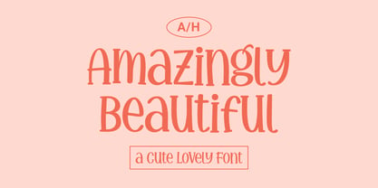 Amazingly Beautiful is a cute, quirky and whimsical display font. Whether you use it for cartoon related designs, children games or just any creation that requires a lovely touch, this font will be an amazing choice.
 - Gray Light by Ali Hamidi,
$10.00 Gray Light is a fun and friendly brushed display font. Whether you’re looking for fonts for Instagram or calligraphy scripts for DIY projects, this font will turn any creative idea into a true piece of art!
 - Snowy Owl by Ali Hamidi,
$10.00 Snowy Owl is a cute, joyful and fun display font. Whether you use it for cartoon related designs, children games or just any creation that requires a lovely touch, this font will be an amazing choice.
 - Dellena by DM Studio,
$20.00 The Dellena Handwritten Font is a captivating and versatile typeface that combines the charm of natural handwriting with a contemporary aesthetic. With its flowing letterforms and clean, legible design, this font offers a wide range of creative possibilities for your projects, from branding and invitations to social media graphics and more. Features: Handwritten Elegance: Dellena Handwritten Font exudes the elegance and authenticity of a handwritten script. Its graceful letterforms offer a personal and human touch to your designs, making it ideal for projects that require a blend of elegance and approachability. Clean and Legible Design: Despite its handwritten style, this font maintains excellent legibility. Each character is carefully crafted to ensure readability at various sizes. Whether it's in print or on a digital screen, your text will remain clear and accessible. Versatile Application: This font is incredibly versatile and well-suited for a variety of design projects. Use it for branding, invitations, social media posts, blog headlines, and more. Its adaptability makes it suitable for both personal and professional use. Uppercase and Lowercase Letters: The font includes both uppercase and lowercase letters, providing creative flexibility for your designs. You can mix and match cases to create visually appealing typography that suits your project's needs. Punctuation and Symbols: In addition to the alphabet, Dellena Handwritten Font includes a comprehensive set of punctuation marks, numerals, and common symbols. This ensures consistency and ease of use when incorporating the font into your design projects. Easy to Install and Use: Installing and utilizing the Dellena Handwritten Font is straightforward. It is compatible with both Windows and Mac operating systems and can be easily integrated into popular design software, including Adobe Photoshop, Illustrator, and InDesign. Elevate your designs with the elegance and versatility of the Dellena Handwritten Font. Let its flowing letterforms and clean design add a touch of personal and human connection to your projects. Whether you're crafting branding materials, invitations, or digital content, this font offers a stylish and readable solution for your typographic needs.
 - Contouration by Intellecta Design,
$19.90inspired by and advertise lettering publishing from 1920's - Passions Conflict by TypeSETit,
$24.95 Embellished uppercase letters accompany this beautifully elegant extended script.
 - Angry Ronin by Artcity,
$16.00 Font designed for lettering dialogue baloons in comic books.
 - Evangeliaire Uncial by Intellecta Design,
$14.90an approach to the uncial medieval style of letters - KG Next To Me by Kimberly Geswein,
$5.00 Hand sketched lettering in a chalkboard, Pinterest inspired style.
 - KG Second Chances by Kimberly Geswein,
$5.00 Hand sketched lettering in a chalkboard, Pinterest inspired style.
 - Annabelle JF by Jukebox Collection,
$32.99 A flowing script font named after the designer's mother.
 - Orange Whip by G. Alex Gonzalez,
$10.00Get that vintage sign lettering look with Orange Whip. - Dooddle by Gerald Gallo,
$20.00 Dooddle is a casual hand-lettered serif outline font.
 - Cafe Fumante by Funk King,
$5.00 A cup of coffee with every letter on it.
 - Hilde CAPS by JOEBOB graphics,
$9.00 Based on the lettering of Hilde Rikken (age 9).
 - Fatality by Artcity,
$9.00 Font designed for lettering dialogue baloons in comic books.
 - KG Alphabet Regurgitation by Kimberly Geswein,
$5.00 Fun, mixed, jumbled lettering in a variety of styles.
 - Kids Serif by m u r,
$15.00An child's serif font, also known as "spiky" letters. - Casagrande by Italiantype,
$39.00 Casagrande Collection has been designed in 2020 by the Italiantype Team (Manuel Alvaro, Valentino Coppi and Mario De Libero), working in close collaboration with Italian lettering artist, illustrator and calligrapher Alberto Casagrande, with help from the Zetafonts Team (Francesco Canovaro, Andrea Tartarelli and Cosimo Lorenzo Pancini). The goal of the project was to use as inspiration Alberto's colorful, vintage themed digital illustration style to develop a suite of closely related typefaces that, used together, would allow designers to replicate the nostalgic charme of Italian poster and product design from the thirties and the forties. Two color overprints, coarse dithering, handmade calligraphy, reminiscences of art deco, hints of modernism and pop culture references: all this and more mixed in a exuberant and playful collection, created with illustrators, poster artists and book cover designers in mind. The final product is 24-font package with six display families with styles varying from the thirties-inspired Antifascista (3 weights + 3 dithering weights) and Deco (3 weights + 3 inline weights), to the modernist Casabau (5 weights), to the geometric Grind (4 widths), to the vintage elegance of the two script families, Reclame and Casatiello. The collection is complemented by a two-color icon set font, Casagrande Ornaments, allowing any designer to easily explore the creative possibilities of this incredibly powerful creative collection. Please Note: Casagrande Antifascista Ombra simulates fine dithering and may be processor intensive for some older computers. Use Casagrande Antifascista if it slows down your system.
 - Toby Font by Ingo,
$19.00 A playful handwriting of a child Twelve-year old Tobias Düsel designed the characters of this font in 2002 during his family’s furlough in the USA. He drew the alphabet freehand in pencil on a piece of stationery, and clearly had examples of the well-known college and military fonts in mind. The characters in their basic form are geometrically thought out, as well as the construction of the shadows. But remarkably, while drawing, Tobias Düsel did not reach for the obvious aid of a ruler. In fact, the strokes of the letters are not linear, rather are recognizably well-balanced with declining and increasing straights as can be seen in polished classical fonts. Originally this font consists only of upper case letters — all other characters (punctuation marks, figures and similar) have been modified from the components of the capital letters. Complementary to the original Outline-Shadow-Version TobyFont Empty, the variations TobyFont Inside and TobyFont Full are also available. ”Empty“ is, so to speak, the frame of the typeface as “Inside” is the filling, and “Full” is the sum of both. All three versions have the exact same body size so that they can be placed over one another congruently. In this way the effect of a font in two or three colors can be attained. TobyFont is excellently suitable for designing “picturesque” or “hand-carved” contents; large weights are especially charming and striking.
 - Cherry Blossoms by Positype,
$15.00 It’s spring and the Cherry Blossoms are in bloom… and so is the new typeface by Neil Summerour and Positype. Cherry Blossoms is the new relaxed script family in the same vein as Good Karma. Produced from hand and sumi brush of Neil Summerour, Cherry Blossoms is a natural brush textured font family. Cherry Blossoms is blooming with personality, reliable and genuine movements, and a wide range of letter options to befit any project needing an honest hand-lettered look. Each typeface comes with an expansive set of stylistic alternates (upper AND lowercase), that harmonize wonderfully when you have the Opentype Ligature feature active. Additionally, special double-letter smart ligatures have been produced for specific combinations in need of more expressive flair, as well as a few swashes that work with the economical strokes originally produced from the sumi brush. To further expand the usefulnesss of this bright script, a separate Caps/Lowercase font has been added that provides the simple contrast needed to bring the script fonts forward. Rather than limit the personality of this script, various styles have been produced to compliment the original Regular… Wide and Tight as well as the afforementioned Simple’ fonts are included in hopes of helping you find the perfect variation needed for your composition. Cherry Blossoms is the second release of the Positype Relaxed Script Collection of typefaces—all focused on fluid, effortless script fonts for simple use.
 - Brotherhood by 38-lineart,
$19.00 The current trend is social media, friendship connection applications and personal web portfolios. This media is used to tell about existence, most people like to upload photos on social media networks, even for personal web portfolios, sometimes people prefer to see the side of daily activities rather than products which are offered. Photos are visual responses, and there are many stories that can be told from a photo. But it will look more interesting if it is added with captions. The very appropriate caption is a text in handwriting. This is what inspired us to create attractive handwriting for social media and networking. We started to do a little research to see the trends of this type of font. Here are some of our notes; 1. Texts are usually in the form of relaxed, non-connected handwriting. 2. There are several connected glyphs, usually by the letters 'o', 'i' and 'y'. And double letters like ‘ll’ and ‘tt’. We anticipate this by making ligature for common texts written concatenated. 3. For personal web portfolio needs, provide affirmation as a characteristic. So the first letter is usually in the form of uppercase which is more prominent than the lowercase rhythm. Prominent but still in proportion. So this is "Brotherhood", a handwritten font that you can use for personal brands, captions and even paragraph writing. Expand your friendship and make your business more closely to your customers as a "Brotherhood" with this font.
 - Shameless by Positype,
$79.00 I will spare you the long-winded description this time and all of the motivations and witty innuendoes. Quite frankly, I forgot about creating this typeface and it sat on my hard drive for almost a year. Luckily, my daughter Isobel saw the initial drawings one day and ask me about those pretty letters and I remembered… yep, that happened. That said, time made this a better typeface… with fresh eyes and time, much was redrawn, retooled and expanded to something I truly enjoy playing with. Shameless makes extensive use of Contextual alternates to create a proper ebb and flow from letter to letter. Interestingly, there are only a handful of ligatures… instead many special combinations are accounted for solely by relying on Contextual Alts. Mix in Stylistic Alts, Swashes, responsive Titling Alts, numerous Style Sets, etc and you can have a lot of fun. I created 2 versions. A ‘Standard’ version that has 2200+ characters and a ‘Deluxe’ version that has 2400+ characters and an interesting caveat… I plan on expanding the Deluxe version any time I have an idea to add to the typeface… and as such, buyers will receive all of those updates at no charge (with updates going directly to the distributors). You get what you pay for… no insane discounts. Oh, and if you are wondering… Shameless is based on my handwriting using Kuretake Zig CocoIro pens. I love these pens.
 - Austin Antique by HiH,
$10.00 “More is better” may have been the motto of Richard Austin of Austin and Son’s Imperial Letter-Foundry on Worship Street at Finsbury Square in London when he designed and cut his Antique typeface. The year it was created is uncertain, but it is known to have appeared in a specimen book produced in 1827. At first glance, the upper case letters of Austin Antique look very much like Figgins Antique. But, upon examination, one will note that the Austin face is much darker. In general, the letters designed and cut by Richard Austin have fatter strokes, larger serifs and smaller counters -- more metal and less daylight. The premise was that the darker the letter, the more attention an ad using the typeface would receive. In old pictures of London and Paris one may see walls crowded with posters and “bills” -- competing for the attention of the passerby. Morris and Updike aside, the early nineteenth century marked the beginning of a commercial as well as industrial revolution. Patterns of commerce were changing. With new methods of marketing came the need for new typefaces to support the new methods. Foundries found the display types were very profitable and competed most energetically and creatively for the trade. There was a lot of trial-and-error. Some ideas faded away. Others, like the Antiques or Egyptians, were refined and developed. From them came the Clarendons that were to prove both popular and long lasting -- because they worked. Their job was to sell goods, not please the aesthetic sensibilities of the critics. They did their job well. Austin Antique has a full Western European character set, plus the following ligatures: ct, st, fi, fl, ff, ffi and ffl. Tabular numbers. Surprisingly readable.
 - Tescellations by Ingrimayne Type,
$9.95 Though there are many thousands of digital typefaces available, none seem to be made exclusively of letters that tessellate, a complete tessellating alphabet. This void is now filled with not one typeface, but a group of typefaces, the Tescellations kinship group. Even though I am aware of only one use for this typeface--writing about tessellations--that does not mean there are not hundreds or perhaps thousands of other uses. These typefaces are a byproduct of two maze books I designed, Puzzling Typography and Puzzling Typography A Sequel. I found the challenge of making mazes from tessellations, including letter tessellations, intriguing and these typefaces are a byproduct that endeavor. There are seven members of this typeface kinship group. I tried to select the the glyphs that fit together best to form Tescellations; it is the most readable of the lot. The reason for an Italics version is that I needed one for the maze project. In constructing it, I tried to include as many different lower-case glyphs as I could rather than just skew the regular version. A purist might insist that the tessellation deal with the counters. My approach was to worry only about the exterior of any letter that has an interior, but for anyone who who might object to the counters, versions with filled counters are included. What did not fit into Tescellations was dumped into Tescellations Two, which is somewhat of a ransom-note type of face. It comes in two styles, a regular version and a version in which the counters are removed. TescellationPatterns shows how many of the characters in these typefaces tessellate. It has over 100 tessellation patterns, each on only one character. Simply type several lines with any character and make sure the leading is the same as the font size, and you have an instant tessellation pattern of a letter.
 - Cantoni by Debi Sementelli Type Foundry,
$59.99 I have a new baby sister! Check her out in her crib: Cinque Donne The Cantoni Font family is a hand lettered font with a variety of standard and alternate characters that play together well. And with a total of 1265 glyphs, you can play for as long as you like. Now Cantoni and Cantoni Pro also come in BOLD! Additional features include: Roman numerals, Fractions, Ordinals, Ornate and Old Style numbers, Greek symbols, a set of Flourishes, Ornaments and DIY Wedding Words and Images. It also includes Western and Central European, Romanian and Turkish language support. Named after my large Italian family, the unique variety of letters based on my own fluid upright style of brush lettering, reminds me of every family I know. There are creative and conservative siblings, crazy in a good way cousins, affable aunts and corny joke telling uncles who somehow come together and form one cohesive unit. In the same way, using the Open Type features to insert a “wild t”, begin a name with a “flashy f” or end a word with a “rambling r”, the font comes to life. The party starts. The fun begins. And soon they're all laughing and dancing up and down the baseline. Like a family gathering to celebrate a special occasion, there is a palpable sense of joy expressed through the letters and images, not unlike the sharing of good food, memorable stories and lots of laughter. While Cantoni Basic gets the party started, the Cantoni Font Family Total Design offers a complete package of options for your unique creations. On behalf of the whole Cantoni family, thanks for joining in the fun. I'll see you on the dance floor. Enjoy! Debi Check out my other script fonts Belluccia and Dom Loves Mary offered through the Correspondence Ink Foundry here at MyFonts!