8,947 search results
(0.016 seconds)
- Falansia by Crowntype Studio,
$14.00 Falansia is a modern Calligraphy font created in an elegant and professional style with alternate characters. perfect font for creating signature logos and watermarks for photography studios or personal photography logos, best for initial logos or brand signatures. Falansia includes a full set of beautiful handwritten upper and lower case letters, numbers, assorted punctuation marks. All lowercase letters include starting and ending strokes, providing a realistic handwriting style.
 - Hub 191 by Fateh.Lab,
$14.00 Hub 191 is a very Cheerful font, and with a very different style from the rest. Its weight is superior in posters, social media, headlines, magazine titles, clothing, large print formats - and anywhere you want it to be seen. Inspired by the design style that is currently popular, and this is the answer to all the needs of every idea that you will pour in this modern era.
 - Aristelle by My Creative Land,
$25.00 Aristelle Family is a beautiful, hand-lettered script that was created using Leonardt III EF nib. Aristelle Script is full of OpenType features such as initial and terminal swashes, ligatures, and ornaments and is best used in an OpenType-aware software. Aristelle Sans and Sans Condensed are well additions to the Aristelle Script and all three fonts shall help you create organic, stylish, and full-of-character designs.
 - Ashagi Signature by Liartgraphic,
$20.00 Hello guys! How are you guys? I bet it's great! Introducing our latest product, we call this product the Ashagi signature font Ashagi signature is a monoline script type font With a unique and firm touch Ashagi signature font is great to use on: fashion magazines, logos, photography, landing pages, flyers, social media and so on What's included - Ashagi signature - multilingual support - alternative - ligatures Thank you, best regards Liarttyype
 - Gayesha by Putracetol,
$21.00 Introducing a beautiful romantic script font called "Gayesha", a lovely and sweet swirly letter font. So girly ,full of love and feminime. Come with open type feature with a lot of alternates and end swash, its help you to make great lettering. Gayesha best uses for heading,cover, poster, logos, quotes, product packaging, header, merchandise, social media & greeting cards and many more. This font is also support multi language.
 - Rhosalia Signature by Liartgraphic,
$20.00 Hi guys! How are you guys? I bet it's great! Introducing our latest product, we call this product the Rhosalia Signature font Rhosalia Signature hight is a script monoline type font With a unique and firm touch Rhosalia Signature font is great to use on: fashion magazines, logos, photography, landing pages, flyers, social media and so on What's included - multilingual support - alternatives - ligatures Thank you, best regards Liarttyype
 - Jungle Fever Shaded NF by Nick's Fonts,
$10.00Here’s a different take on my face Jungle Fever, patterned after Neuland Black, originally designed by Rudolph Koch for Gebr. Klingspor in 1923. A “sunrise” shading pattern has been employed to add visual impact and warmth to headlines. Best used in sizes of 48 point and above. All versions of this font include the Unicode 1250 Central European character set in addition to the standard Unicode 1252 Latin set. - Kiyosace by Olivetype,
$23.00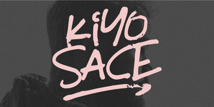 Kiyosace is an authentic brush font with very cool textures and a natural feel. It's perfect for posters, headlines, and logotypes. Its rough and tough style gives it a unique authenticity that sets it apart from the rest. Kiyosace font includes : Standard Latin Uppercase and Lowercase Numbers, symbols, and punctuations Swashes Multilingual Support. PUA Encoded and fully accessible without additional design software Simple Installations Works on PC & Mac Thank You.
 - Somia by Creativemedialab,
$22.00 Somia font is a modern, attractive and beautiful font. It has many alternates characters with nice curves that you can arrange to create a nice logo lettering or use as a poster display. Add a few alterations to it to make beautiful eye-catching words. Somia font is best for logo lettering, headlines, product packaging, t-shirt design, wedding theme, poster, book covers, wedding invitations, Christmas and more.
 - Chinese Monoline by Attype Studio,
$19.00 Chinese Monoline is a Chinese style monoline font, with a modern twist. It has 2 styles: regular and slant. Chinese Monoline is perfect for branding and promotional material for Asian-themed designs The fonts works best as display typefaces or as beautiful headline fonts, but can also be used in other ways to create stunning designs. Features : - Chinese Monoline Family Font - Ligatures - Multilingual, US Roman, Latin 1 Support
 - Geetype by G-Type,
$46.00 Inspired by a piece of cigarette pack lettering designed by the renowned poster and type designer A.M. Cassandre (perhaps best known for his Peignot typeface), Geetype evokes a 1920s & 30s mood and is an unusual, eye-catching single weight display face. Think vintage hand lettered poster campaigns, Hollywood's golden era and a time when smoking was positively encouraged. Think Greta Garbo, another 'g' with strong, emotional screen presence.
 - Bhilligod by Ridtype,
$100.00 Bhilligod is inspired by the flow of fine art, which seeks to present beautiful and fantastical paintings that are romantic in nature, such as history and tragedy. This style was popular worldwide in the 18th and 19th centuries and became an important part of European and Western culture. Therefore, we are very enthusiastic to show our best work in romantic artwork, which we apply in blackletter-style font work.
 - Luxenage by skillyas studio,
$23.00 Luxenage is our latest font that we made with care, We do our best to make this font good for you. It will add a luxury spark to any design project that you wish to create! This Font is very suitable for beautiful logos, posters, vintage signage, magazine, photography, vintage lettering, and any other design project. FEATURES: • Additional Accents • Multilingual Support • Kerning • Alternates • Ligatures COMPATIBLE OS: • Mac OS • Windows
 - Ateros by HansCo,
$17.00 INTRODUCING, ATEROS – Modern logo typeface! ATEROS is a futuristic font with unique style in UPPERCASE that will make your design looks hi-tech and modern. You can use this font for any purpose, especially to make logotype. You can mix and match the uppercase and lowercase to make your logo more readable. This font also provides some alternative characters, check and get the best version of yours. Enjoy!
 - Buttermilk Farmhouse by Make Media Co,
$12.00 If you're anything like me, you're absolutely in love with all things farmhouse! That gorgeous, rustic style is just about everywhere lately, and I just can't get enough! So, in honor of this elegant trend, I've created, Buttermilk Farmhouse - a rustic, delicate calligraphy script that can be used on everything from signage, to branding, to editorials. Don't be shy, give this baby a test drive and see what you can do!
 - Caldense Stencil by Tiago Cândido,
$20.00 The typeface was baptized as “Caldense" in order to honor the city of Caldas da Rainha, a small city in Portugal, the typography's birth place. It has three weights, Regular, Demi Bold and Bold and it is a stencil font, sans serif and grotesque. Each character was based on a grid and was built in modules, having round edges and straight finishes. The font is best used in titles.
 - Bertie by ITC,
$29.99Bertie was designed by Alan Meeks in 1986, an ornamented typeface with a light and elegant look. Such typefaces were at their peak in the middle of the 19th century, when they were created for the advertisements of booming industries. The sophisticated Bertie is based on forms of the transitional period and is best used in headlines with point sizes of 18 or larger to highlight its unique details. - Felt-Tip Futhark by Thomas Käding,
$1.00The vikings searched in vain for hundreds of years over much of the northern hemisphere, but their dreams of writing with felt-tip pens went unfulfilled--until now! This is a novelty font containing the 24 runes of the Futhark, but with a modern bent. In addition to regular, bold, oblique, and bold oblique, we have included two outline styles. Also included is a PDF page identifying the characters. - Gafegus by Sealoung,
$19.00 Introducing the new classy Modern style Serif!!! Gafegus is a modern, elegant and classy serif typeface, best used for displaying titles, logos, branding, magazines, product packaging and invitations. Gafegus has unique alternates and ligatures, all of which can be accessed by the OpenType control or directly from the Character or Glyphs window. This font is PUA encoded so you can use additional glyphs in most graphic design software
 - Andasia by Din Studio,
$20.00 Andasia Script beautiful calligraphy with natural and handwritten style. It brings a beautiful and modern typeface that best used for weddings, branding, logotype, and quotes. Features: Beautiful Ligatures PUA Encoded Multilingual Support Numerals and Punctuation Swash (a-z) Note: Every swash and ligatures already included in Andasia Script (ttf, otf, woff) I hope your project design would be more beautiful with this Andasia Script. Happy Design :) Thank You!
 - Frank Ruhl MF by Masterfont,
$59.00 The most popular Hebrew typeface, designed in 1908 by Raphael Frank and Otto Rühl. OpenType Pro Excellent support for Niqqud (Vowels). All marks are programmed to fit each glyph's shape and width. OpenType Pro includes new advanced features like Dagesh Hazak, ShevaNa, Qamatz Katan, Holam Haser and wide letters. Best used with Adobe InDesign CC that support complex Hebrew text. Please check these advanced features in this link: https://tinyurl.com/ybgdsxme
 - Facegraph by hiroki kanda,
$14.00 If you are looking for a more individual typeface, This font is the best choice. This font is a very useful typeface for situations where you want to be a little playful, products for children, brands that want to give a soft impression, and those that want to stand out on social media posts. I'm sure that just using this typeface will create a graphic with a fun atmosphere.
 - Kymmera Deco NF by Nick's Fonts,
$10.00The dreams that you dare to dream really can come true when you perk up your headlines with this re-imagining of Saul Bass's 1982 glitzy Deco classic, Rainbow Bass. For best results at large sizes, choose the TrueType version, rendered at a full 2,048 UPM. Both versions include the complete Latin 1252, Central European 1250 and Turkish 1254 character sets, as well as localization for Moldovan and Romanian. - Fresh Squeezed by LetterBalm,
$19.99 A Splashy font inspired by all things liquid and wet, the goal was to create a fun and realistic representation of water in the form of a letter. Water parks, Juice bars, your backyard pool party or your box of fresh squeezed orange juice, any time you need a good splash.
 - Kendrick by Monotype,
$15.99 A heavy-set but lively font, Kendrick’s dense strokes were hand-painted using a thick wet brush. This all-caps set of letters is bold but brushy, textured and expressive; fun but very much meaning business. Kendrick is streetwise and no-nonsense, but with a big cheesy grin to boot.
 - The Weekend Warrior font, designed by the talented David Kerkhoff, is a vibrant and dynamic script that seems to capture the essence of adventure and spontaneity found in leisurely weekend pursuits. ...
- Kari by Positype,
$39.00 Kari is a complete redraw and expansion of the award-winning typeface originally released in 2005. Featuring both upright and ‘italic’ styles, this soft and curvy script is perfect for packaging, expressive headlines, and fun settings. Feature-rich and flexible, Kari is stocked full of alternate characters, swashes, titling options, expanded numeral sets, new dingbats, and a lot more… and for the first time, the much-requested ‘Medium’ weight is now available.
 - Ad Words by Outside the Line,
$19.00 Just in time for the sale season. Ad Words is a font of words you would use if you did retail ads. Some words in script, some print, some bold, some not. Plus 2 starbursts. Enlarge the starbursts and then reverse one of the words out of it… like Now! Win! or Free! Other Outside the Line fonts work with this one, check out Architectural Lettering Regular and Bold, Plz Print or Plz Script.
 - Linotype Seven by Linotype,
$29.99Linotype Seven is part of the Take Type Library, chosen from the contestants of Linotype’s International Digital Type Design Contests of 1994 and 1997. This prize-winning font was designed by the German artist Christian Vornehm. The font looks as though hastily drawn with a wide, bristly brush, as though the scribe was in a hurry. Linotype Seven is loaded with energy and spontaneity. It is intended exclusively for short headlines in larger point sizes. - PS Fournier Std by Typofonderie,
$59.00 Style and elegance in 14 styles PS Fournier, created by Stéphane Elbaz, is designed in tribute to Pierre Simon Fournier. Fournier was the prolific Parisian type designer whose work is best known for its iconic representation of French transitional style. PS Fournier elegantly represents the transition to the modern era of typography. Featuring three optical sizes, PS Fournier is designed to perform in any context. The Pierre Simon Fournier heritage Pierre Simon Fournier (1712—1768) was a leading innovative type designer of the mid-18th century. Early in his career, the young Pierre Simon developed a strong aesthetic that he cultivated throughout his life. His art is representative of the pre-revolutionary “Age of Enlightenment” (Siècle des Lumières). Precursor of the Modern style, Fournier’s body of work deeply influenced his times, and created the fertile ground from which the Didot family and Giambattista Bodoni developed their own styles. During the historical period of the 18th century, Fournier exemplified the intellectual pursuits of the times with his own research on type, documenting in detail the typefounding process. He also offered a unique vision: he is the first to clearly comprehend the concept of “type family,” sorting a set of similarly styled alphabets by sizes, width, and by x-heights. In addition, Fournier is one of the earliest advocates of the point system to organize the practice of typography, the point system that contemporary typographers continue to use to this day. The refined and discreet elegance of PS Fournier With a close look at the family, one finds you’ll find that the difference between the optical sizes (Petit, standard and Grand) is more than a contrast variation between the thin and the thick; the eye can also denote a palette of distinct tones: More streamlined and robust in the smaller sizes (Petit), more refined and detailed in the larger sizes (Grand). The PS Fournier standard family is designed to adapt to any situation with its intermediate optical size, from body copy to headlines. With a bit of tracking, PS Fournier Petit will make the smallest captions perfectly readable. However, Petit family is not limited to body and captions — its “slabby robustness” will make a relevant headline choice as well. PS Fournier Grand presents a higher contrast adapted to large text sizes, displays or banners. Its refined elegance makes it a perfect choice for Design, Fashion or Luxury publications. As a “modern” type PS Fournier Grand features a larger x-height than the preexistent old style typefaces such as Garamond or Jenson. These proportions provide any basic text set in PS Fournier Grand a strong typographic texture. As a result, the PS Fournier global family is a versatile alternative to the Modern typefaces commonly used in the publishing industry. The optical sizes, the large range of weights, and the design variations make this family adaptable to captions, paragraphs, and pages, as well as to large texts and displays. A leading-edge typography in the 18th century In the spirit of modernity, Pierre Simon Fournier did not find any use for the conventional swashes still produced by peers such as Caslon or Baskerville. Nevertheless the French designer created many inventive elements to decorate the page and set delightful variations in the text itself. To this regard PS Fournier includes a large set of glyphs variations, ligatures and more than one hundred glyphs for borders, rules and ornaments or — as called in French — “vignettes.” PS Fournier: A tribute to the French modern typography era by Stéphane Elbaz
 - Wood Sans by TypoGraphicDesign,
$19.00 The typeface Wood Sans is designed from 2021 for the font foundry Typo Graphic Design by Manuel Viergutz. The display typeface is a digital version of original wood letters from a german flea market find. 8 font-styles (Clean, Clean Invest, Clean Mix, Rough, Rough Misprint, Rough Alt, Rough Dark & Icons) with 450 glyphs (Adobe Latin 2) incl. 100+ decorative extras like icons, arrows, German Capital Sharp S, dingbats, emojis, symbols, geometric shapes, catchwords, decorative ligatures (type the word #LOVE for ♥︎or #SMILE for ☺ as OpenType-Feature dlig) and stylistic alternates (3 stylistic sets). For use in logos, magazines, posters, advertisement plus as webfont for decorative headlines. The font works best for display size. Have fun with this font & use the DEMO-FONT (with reduced glyph-set) FOR FREE! ■ Font Name: Wood Sans ■ Font Styles: 8 font-styles (Clean, Clean Invert, Clean Mix, Rough, Rough Misprint, Rough Alt, Rough Dark & Icons) + DEMO (with reduced glyph-set) ■ Font Category: Display for headline size ■ Font Format:.off (for Print) + .woff (for Web) ■ Glyph Set: 450 glyphs (Latin 2 incl. decorative extras like icons) ■ Language Support: 69 languages: Afrikaans, Albanian, Asu, Basque, Bemba, Bena ,Breton ,Catalan ,Chiga ,Cornish ,Danish ,Dutch ,English ,Estonian ,Faroese ,Filipino ,Finnish ,French ,Friulian ,Galician ,German ,Gusii ,Indonesian ,Irish ,Italian ,Kabuverdianu ,Kalenjin ,Kinyarwanda ,Luo ,Luxembourgish ,Luyia ,Machame ,Makhuwa-Meetto ,Makonde ,Malagasy ,Manx ,Morisyen ,North Ndebele ,Norwegian Bokmål ,Norwegian Nynorsk ,Nyankole ,Oromo ,Portuguese ,Quechua ,Romansh ,Rombo ,Rundi ,Rwa ,Samburu ,Sango ,Sangu ,Scottish Gaelic ,Sena ,Shambala ,Shona ,Soga ,Somali ,Spanish ,Swahili ,Swedish ,Swiss German ,Taita ,Teso ,Uzbek (Latin) ,Volapük ,Vunjo ,Welsh ,Western Frisian ,Zulu ■ Design Date: 2021 ■ Type Designer: Manuel Viergutz
 - Mythring by Ditatype,
$29.00 Myhtring is a spine-chilling display font that will cast a spell of fear on your designs. Designed in uppercase and with a bold weight, this typeface demands attention and exudes an aura of darkness and mystery. Each letter is meticulously crafted with details resembling menacing plant roots with sharp edges, adding an eerie and sinister touch to the font. With its bold weight and uppercase design, this font creates a powerful and impactful presence. The root-like details in each letter of Myhtring give the font an organic and unsettling appearance, as if the letters are entangled with malevolent and ancient roots. These haunting details add a sense of otherworldly energy and create an atmosphere of foreboding and suspense. The combination of bold weight and sharp-edged root details gives this font a sinister and enigmatic look, evoking images of dark and sinister forces lurking in the shadows. The letters seem to possess an aura of malevolence, making it an ideal choice for projects that delve into the horror and the supernatural. For the best legibility you can use this font in the bigger text sizes. Enjoy the available features here. Features: Alternates Multilingual Supports PUA Encoded Numerals and Punctuations Mythring fits in headlines, logos, movie posters, flyers, invitations, branding materials, print media, editorial layouts, headers, and any horror-themed project. Find out more ways to use this font by taking a look at the font preview. Thanks for purchasing our fonts. Hopefully, you have a great time using our font. Feel free to contact us anytime for further information or when you have trouble with the font. Thanks a lot and happy designing.
 - Mayfair by Canada Type,
$24.95The long awaited and much requested revival of Robert Hunter Middleton's very popular classic is finally here. Mayfair Cursive was an instant hit for Middleton in 1932, and it went on being used widely until late into the 1970s, in spite of it never having crossed over to film type technology. Like a few of its contemporary designs, most notably the work of Lucien Bernhard, Mayfair is a formal script that is somewhat based on traditional italic forms with swash uppercase, but also employs subsidiary hairline strokes in some of its lowercase as an emphasis to the script's cursive traits. Why these gorgeous letters never made the leap into photo typesetting is a mystery to us. But here they are now in digital form, almost three quarters of a century since they first saw the light in metal. Mayfair was redrawn from original 48 pt specimen. It also underwent a major expansion of character set. Plenty of swash characters and ligatures were added. An alternate set of lowercase was also made, in order to give the user a choice between connected and disconnected variations of the same elegant script. Mayfair ships in all popular font formats. While the Postscript Type 1 and True Type versions come in two fonts (Mayfair and Mayfair Alt), the OpenType version is a single font containing all the extra characters in conveniently programmed features that are easily accessible by OpenType-supporting software applications. We are quite sure today's graphic designers will be appreciative of having access to the face that all but defined menus, romance covers, wine and liquor labels and chocolate boxes for almost two 20th century generations. - Conthey Inline by ROHH,
$29.00 Conthey Inline™ is your new retro-display best friend! The one and only, unique IN-AND-OUT typeface with strong personality and outstanding flexibility. This display sans features amazing variable fonts letting you adjust not only width of the letters, but also let you fluently transition from thin inline styles to thin outline ones. This mechanics opens a world full of layering possibilities as well as a great fine-tuning ability. The family consists of 39 OpenType fonts - 18 pure inline/outline styles in 3 widths (Narrow, Condensed, Normal) and 21 styles carefully prepared and tuned for layering. For even greater flexibility 3 variable fonts are included in the set. In addition to flexible width and inline-outline transitioning, this playful typeface features 4 different inline styles to spice up things even more! All styles were meticulously crafted with the highest attention to detail in the letterforms as well as spacing. Conthey Inline is a sibling of Conthey, a display unicase family as well as Lutschine, a versatile modern narrow display typeface. Conthey Inline composes perfectly with its family members, covering a very broad range of design scenarios. All these typefaces are a part of big type system containing also a workhorse sans serifs such as Rothorn and Montreux Grotesk. You will have a lot of success using Conthey Inline for any kind of playful, vintage/retro, organic, friendly and stylized designs. Especially, industries such as food & beverage, travel, hospitality, fashion, healthcare, sports, lifestyle, music, art, entertainment and products for youth are perfect areas to make Conthey Inline shine with all its charm.
 - Pickey Pop by Nathatype,
$29.00 Pickey Pop is a delightful display font that combines a thick weight, low contrast letters, and charming swinging endings. With its playful and bold design, this typeface brings a sense of joy and vibrancy to any creative project. The thick weight of this font adds a strong and confident presence to each letter. The boldness of the strokes creates visual impact and ensures legibility even at smaller sizes. This display font demands attention and stands out effortlessly in any design composition. In contrast to its bold weight, Pickey Pop features low contrast letters. This design choice gives the font a sense of solidity and consistency. The uniform strokes contribute to a clean and contemporary appearance, making it a versatile choice for a wide range of design applications. What makes this font truly special are the swinging endings found in select letters. These whimsical details add a touch of playful movement and uniqueness to the font. The swinging letter endings bring a sense of rhythm and energy, infusing your designs with a joyful and dynamic quality. For the best legibility you can use it in the bigger text. Enjoy the available features here. Features: Stylistic Sets Ligatures Multilingual Supports PUA Encoded Numerals and Punctuations Pickey Pop fits in headlines, logos, attention-grabbing titles, product packaging, branding materials, editorial layouts and website headers. Find out more ways to use this font by taking a look at the font preview. Thanks for purchasing our fonts. Hopefully, you have a great time using our font. Feel free to contact us anytime for further information or when you have trouble with the font. Thanks a lot and happy designing.
 - Cursed Stone by Ditatype,
$29.00 Cursed Stone is a spine-chilling display font that will transport your designs to a realm of dark enchantment. Designed in large letters and with a bold weight, this typeface demands attention and exudes an aura of haunting mystery. Each letter is meticulously crafted with eerie stone texture details, adding an ominous and cursed touch to the font. The large size of the letters enhances the font's imposing presence, making it impossible to ignore. The stone texture details in each letter of this font bring an authentic and sinister feel, as if the font was chiseled from the depths of an ancient cursed monument. These haunting details add an element of mystique and darkness, immersing the viewer into a world of malevolent enchantment. The combination of bold weight and stone texture gives Cursed Stone a rugged and formidable look, evoking images of cursed relics and forbidden ruins. The letters appear to hold secrets from the past, carrying a haunting energy that captures the imagination. For the best legibility you can use this font in the bigger text sizes. Enjoy the available features here. Features: Alternates Multilingual Supports PUA Encoded Numerals and Punctuations Cursed Stone fits in headlines, logos, movie posters, flyers, invitations, branding materials, print media, editorial layouts, headers, and any horror-themed project. Find out more ways to use this font by taking a look at the font preview. Thanks for purchasing our fonts. Hopefully, you have a great time using our font. Feel free to contact us anytime for further information or when you have trouble with the font. Thanks a lot and happy designing.
 - Monotalic by Kostic,
$30.00 Monotalic was created as a fun experiment, exploring better solutions for the monospaced type design. Most monospaced (fixed-width) typefaces have the same main design problem regarding the lowercase – filling the empty space around l, f, i, j and r. That usually brings the addition of slab serifs to those narrow characters, causing many monospaced fonts to look and feel alike. Monotalic solves that problem by adopting the handwritten (or cursive) form for those problematic characters, which allows them to be defined in more strokes, thus getting a better distribution of form in that fixed-width space. On the other hand, cursive writing usually lacks the legibility of a Roman (Regular upright) style, so Monotalic was created to be a hybrid, taking the best of both worlds. Monospaced fonts today are mostly used for coding. Modern code editors use colored text in order to differentiate between different kinds of code. So, in that environment there’s actually no need for traditional text styling by adding Italics, Bold or other styles, because the code lines are overstated as it is. That is why Monotalic focuses on one style only, in three widths and four weights. The weights allow users to choose the perfect contrast of text on screen, depending on their monitor resolution and background color in the editor. Movie scripts are almost exclusively set in 12pt Courier. It became the industry standard because when set in the specific “screenplay format" it helps with the breakdown of the schedule and budgeting process of the film production. Although it looks completely different, text set in Monotalic (Normal width) will take the same amount of space as Courier.
 - 99 Names of ALLAH Compact by Islamic Calligraphy75,
$12.00 We have transformed the “99 names of ALLAH” into a font. That means each key on your keyboard represents 1 of the 99 names of ALLAH Aaza Wajal. The fonts work with both the English and Arabic Keyboards. We call this Calligraphy "Compact" because as you can see everything is very close and decorative symbols are at a maximum. The first "alef" has neither a "hamzit wasel" nor a "fatha", this indicates to skip that first alef so instead of saying "AR-RAHMAAN" you say "R-RAHMAAN". (in the zip file you will find a pdf file explaining the differences in the "harakat", pronunciation and spelling according to the Holy Quran). The calligraphy is anything but traditional & we have used all the decorative letters except for the "Ye". In other calligraphy you don't usually find the decorative letters: "Dal, Ra & Ye" but we like them and we use them, the important thing is that they don't change the pronunciation or the meaning. Decorative letters used in this calligraphy: "Mim, Aain, Sin, HHe, He, Kaf, Alef, Ta, Dal, Ra & Saad". Purpose & use: - Writers: Highlight the names in your texts in beautiful Islamic calligraphy. - Editors: Use with kinetic typography templates (AE) & editing software. - Designers: The very small details in the names does not affect the quality. Rest assured it is flawless. The MOST IMPORTANT THING about this list is that all the names are 100% ERROR FREE, and you can USE THEM WITH YOUR EYES CLOSED. All the “Tachkilat” are 100% ERROR FREE, all the "Spelling" is 100% ERROR FREE, and they all have been written in accordance with the Holy Quran. No names are missing and no names are duplicated. The list is complete "99 names +1". The +1 is the name “ALLAH” 'Aza wajal. Another important thing is how we use the decorative letters. In every font you will see small decorative letters, these letters are used only in accordance with their respective letters to indicate pronunciation & we don't include them randomly. That means "mim" on top or below the letter "mim", "sin" on top or below the letter "sin", and so on and so forth. Included: Pdf file telling you which key is associated with which name. In that same file we have included the transliteration and explication of all 99 names. Pdf file explaining the differences in the harakat and pronunciation according to the Holy Quran. Here is a link to all the extra files you will need: https://drive.google.com/drive/folders/1Xj2Q8hhmfKD7stY6RILhKPiPfePpI9U4?usp=sharing
 - 99 Names of ALLAH Complete by Islamic Calligraphy75,
$12.00 We have transformed the “99 names of ALLAH” into a font. That means each key on your keyboard represents 1 of the 99 names of ALLAH Aaza Wajal. The fonts work with both the English and Arabic Keyboards. We call this Calligraphy "complete" because this is the only calligraphy where the complete set of decorative letters have been used. The calligraphy is more on the traditional side, letters don't overlap, the "ye" at the end of the names doesn't have the two dots, and a decorative "ye" has been included. The first "Alef" doesn't have a "hamzit wasel" nor a "fatha", this indicates to skip the pronunciation of that first letter. So instead of saying "AR-RAHMAAN" you say "R-RAHMAN". (in the zip file you will find a pdf file explaining the differences in the "harakat", pronunciation and spelling according to the Holy Quran). In other calligraphy you don't usually find the decorative letters: "Dal, Ra & Ye" but we like them and we use them. Decorative letters used in this calligraphy: "Mim, Aain, Sin, HHe, He, Kaf, Tah, Dal, Ra, Alef, Ye & Saad". Purpose & use: - Writers: Highlight the names in your texts in beautiful Islamic calligraphy. - Editors: Use with kinetic typography templates (AE) & editing software. - Designers: The very small details in the names does not affect the quality. Rest assured it is flawless. The MOST IMPORTANT THING about this list is that all the names are 100% ERROR FREE and you can USE THEM WITH YOUR EYES CLOSED. All the “Tachkilat” are 100% ERROR FREE, all the "Spelling" is 100% ERROR FREE, and they all have been written in accordance with the Holy Quran. No names are missing and no names are duplicated. The list is complete "99 names +1". The +1 is the name “ALLAH” 'Aza wajal. Another important thing is how we use the decorative letters. In every font you will see small decorative letters, these letters are used only in accordance with their respective letters to indicate pronunciation & we don't include them randomly. That means "mim" on top or below the letter "mim", "sin" on top or below the letter "sin", and so on and so forth. Included: Pdf file telling you which key is associated with which name. In that same file we have included the transliteration and explication of all 99 names. Pdf file explaining the differences in the harakat and pronunciation according to the Holy Quran. Here is a link to all the extra files you will need: https://drive.google.com/drive/folders/1Xj2Q8hhmfKD7stY6RILhKPiPfePpI9U4?usp=sharing
 - Allrounder Grotesk by Identity Letters,
$40.00 A true workhorse. The only Grotesk you’ll ever need. Allrounder Grotesk is a neutral, powerful Neogrotesk member of the Allrounder superfamily. An unobtrusive teamplayer as well as an excellent soloist, this hard-working sans-serif typeface is ready for any task you’ll throw it at. A workhorse that lives up to its name, Allrounder Grotesk consists of ten weights ranging from a delicate Air to a powerful Black with 900+ glyphs per font. Each weight is accompanied by carefully hand-corrected italics. Allrounder Grotesk supports more than 200 Latin-based languages, containing the complete “LatinPlus” glyph set developed by Underware. It also provides you with plenty of OpenType features and additional goodies: small capitals, ten sets of figures, case-sensitive forms, ligatures, superiors, fractions and arrows. Equipped like this, you’ll be ready for any kind of sophisticated typesetting scenario you might encounter. With Allrounder Grotesk, you’ve got a sans that works great for body text, yet looks crisp and clean in headlines and display sizes. Whether annual reports, magazine and editorial layouts, nonfiction books, branding and packaging work, large-scale advertising, forms and contracts, or contemporary posters: Allrounder Grotesk is up for it. This multitalented font family was developed in a 2-year process by Moritz Kleinsorge. It was the first release of the Allrounder superfamily, a series of typefaces sharing the same color and horizontal metrics (cap height, small cap height and x-height): a typesetting system whose components match each other perfectly. Any other part of this design kit, e. g., Allrounder Antiqua or Allrounder Monument, may be easily combined with Allrounder Grotesk. Perfect Pairing: Allrounder Antiqua + Allrounder Grotesk Allrounder Antiqua is the ideal complement to Allrounder Grotesk. They both share common vertical metrics and a common color. This allows you to pair both typefaces within the same layout—even within the same paragraph—without creating visual disruption. Head over to the Family Page of Allrounder Antiqua to get more information about this typeface. Design Trick: Bilingual Design With the Allrounder Superfamily Combining Allrounder Grotesk with Allrounder Antiqua is an ideal approach for bilingual designs, wherein both languages get the same emphasis yet are distinguished with two different typefaces. It's also best practice to set headlines in a different typeface than the body text if they harmonize with each other. Allrounder Grotesk and Allrounder Antiqua provide you with the perfect pair for this purpose. In any kind of design, in any type of medium, working with Allrounder fonts is effortless. That’s why Allrounder got its name.