10,000 search results
(0.039 seconds)
- Neutrinos by Burghal Design,
$29.00Neutrinos includes seven assorted dingbats, and like all Burghal Design fonts, includes upper and lower case letters, as well as numbers, symbols, punctuation, and accented foreign characters. Neutrinos is cholesterol free and contains no artificial sweeteners. - Rezak by TypeTogether,
$36.00 Nothing is hidden in the simplistic forms and overt aesthetic of Anya Danilova’s Rezak font family. Rezak is not a type family directly from the digital world, but was inspired by the stout presence of cutting letters out of tangible material: paper, stone, and wood. With only a few cuts, the shapes remain dark and simple. With more cuts, the shapes become lighter and more defined, resulting in a dynamic type family not stuck within one specific category. The Black and medium weights began as one approach before separating into display and text categories. The four text weights were created through pendulum swings in design direction that experimented with contrast, angles, tangent redirections, and the amount of anomalies allowed. The text weights are vocal when set larger than ten points and subtle at smaller sizes. The tech-heavy Incised display style came last, employing a surprising range of trigonometric functions to make it behave exactly as desired. Its look can result in something distinctive and emotional or completely over-the-top. Most normal typefaces change only in thickness; Rezak changes in intention, highlighting the relationship between dark and light, presence and absence, what’s removed and what remains. Rezak’s Black and Incised display styles are like a shaft of light in reverse and are perfect in situations of impact: websites, headlines and large text, gaming, call-outs, posters, and packaging. The tone works for something from youthful or craft-oriented to organic and natural products. Try these two in logotypes, complex print layering, branding, and words-as-pattern for greater experimentation. The text styles are bold, energetic, well informed, and round out the family with four weights (Regular, Semibold, Bold, Extrabold) and matching italics for a family grand total of ten. These jaunty styles work well in children’s books, call-outs, movie titles, and subheads for myriad subjects such as architecture, coffee, nature, cooking, and other rough-and-tumble purposes. Rezak’s crunchy letters are meant to expose rough, daring, or dramatic text. A further benefit is that this family is not sequestered within one specific genre or script, so it can be easily interpreted for other scripts, such as its current Latin and extended Cyrillic which supports such neglected languages as Abkhaz, Itelmen, and Koryak. Rezak’s push toward creativity and innovation, with an eye on typography’s rich history, reinforces our foundry’s mission to publish invigorating forms at the highest function and widest applicability.
 - Hellow Script by Create Big Supply,
$15.00 Introducing Hellow Script, a delightful and versatile handwriting script font that brings a touch of elegance and femininity to your design projects. With its pretty and girly style, Hellow Script adds charming and effortless beauty to your typography. This font is incredibly user-friendly, allowing you to install it effortlessly and start creating stunning designs right away. From logos to labels, magazines to books, greeting cards to wedding invitations, packaging to fashion, and beyond, Hellow Script is the perfect choice for a wide range of creative applications. Hellow Script features a seamless combination of uppercase and lowercase letters, providing you with endless possibilities to create eye-catching and personalized designs. The font also includes numbers and punctuation, ensuring your text remains cohesive and well-designed. With its multilingual support, Hellow Script enables you to communicate your message effectively in various languages. The font incorporates ligatures and alternate characters, adding a touch of uniqueness and enhancing the natural flow of your typography. Hellow Script is designed with PUA (Private Use Area) Encoding, granting you easy access to special characters and alternate glyphs. This feature-rich font empowers you to create captivating designs that stand out and leave a lasting impression.
 - Magritte by Molly Suber Thorpe,
$17.99 Magritte is a serif display font with surrealist sensibilities. This is an ideal font for dreamy, unexpected branding, advertising, and merch. It has uppercase and lowercase alphabets, dozens of beautiful ligatures and dingbats, and even includes support for Modern Greek. Magritte has 600 glyphs in Latin and Greek consisting of: the complete Latin alphabet (with all accent marks), the complete Modern Greek alphabet (with all accent marks), 50 ligatures and stylistic alternates, 24 fun dingbats and arrows, numerals including oldstyle figures and fractions, extensive symbols, punctuation, and diacritical markings. The OpenType ligatures are the fun part. To get the most out of Magritte, use software that supports Open Type fonts (Adobe programs, Corel Draw, Affinity Designer, etc). This type family has tons of built-in OpenType ligatures and alternates, which are what make it so customizable and decorative. You can always access the ligatures, alternates, and dingbats through your software's glyphs panel. Languages Magritte includes the Latin and Greek alphabets with all accent markings. The most common languages it supports are: English, Catalan, Danish, Dutch, French, German, Greek, Italian, Norwegian, Portuguese, Spanish, and Swedish.
 - Moodboard by Mans Greback,
$59.00 Moodboard is a unique blend of hand-drawn and AI-generated design, bringing a fresh twist to the retro serif font. With bold rounded letterforms and a funky vibe, Moodboard is perfect for young-at-heart audiences. Its combination of sketch and machine learning makes it usable and versatile, while still retaining its cool new-retro feel. Use Moodboard in logotypes, headlines, and graphics for a standout, youthful look. Its designer Mans Greback has created an exceptional mix of vintage and modern design elements in Moodboard font. Choose Moodboard for your next project to add a touch of fun and boldness to your designs! The Moodboard family consists of six high-quality fonts: Regular, Italic, Light, Light Italic, Bold and Bold Italic The font is built with advanced OpenType functionality and has a guaranteed top-notch quality, containing stylistic and contextual alternates, ligatures and more features; all to give you full control and customizability. It has extensive lingual support, covering all Latin-based languages, from Northern Europe to South Africa, from America to South-East Asia. It contains all characters and symbols you'll ever need, including all punctuation and numbers.
 - URW Dock Condensed by URW Type Foundry,
$35.99URW Dock Condensed is the matching complement for the URW Dock. Including 20 additional condensed styles the URW Dock Condensed is the space-saving alternative in the URW Dock family. URW Dock is a contemporary geometric type family rooted in the square sans genre. Inspired by the square sans typefaces of the 60s, it is a reinterpretation and enhancement particularly designed for today’s requirements of a multipurpose font: to work excellent in print and screen environments. Including a wide range of styles, an extended character set and a careful composition, it has the ability to give brands, artworks, and interfaces a modern, professional and unique touch. Its high legibility and clear informative and technological appearance are perfectly suitable for infographics, signage and way-finding systems. And especially when embedded in app, gaming and infotainment software it will display its strength. While the upright styles communicate a clear, instructional and informative message, the italics express an industrial, dynamic and forward-thinking spirit. An extensive language support, several figure sets and a wide range of OpenType Features will make the URW Dock font family a perfectly suitable partner for a wide range of print, web and app projects. - Mantika Sans Paneuropean by Linotype,
$67.99With its well-defined characters that are readily legible even in the small font sizes, Mantika Sans by Jürgen Weltin is ideal for typesetting. The elaborately designed and highly individual set of italics enhances the attractiveness of the font.Jürgen Weltin developed the Mantika™ Sans sans serif font using older designs for an serif font as his inspiration. Nothing more than the merest suggestion of the original serifs has survived. Bevelled line endings and the slight variation in thickness of verticals, in particular, provide Mantika Sans with a very dynamic character that evokes manuscript. Short ascenders and descenders give the font a compact appearance that is also underscored by its condensed proportions. Weltin has achieved his aim of producing a typeface with excellent legibility even in small sizes not just by means of the x-height, which is tall in comparison with the capital letters, but also by using clearly defined and well differentiated designs for critical letters, such as i", "I" and "l". Lower case "i", for example, has a serif while the "l" has a curved base.In addition to uppercase numerals, Mantika Sans also has lowercase or old style numerals that have been designed so that they can be used in both tabular and proportional settings. The uppercase numerals are slightly shorter than the uppercase letters, ensuring that the latter can be sympathetically incorporated within continuous text.The Mantika Sans italics are very unusual. They are inclined at only 4.5° (the usual angle for italics is 10 - 12°) and so appear to be almost upright. In addition, they also have quite distinctive forms. The overall effect calls attention to their curvilinear, manuscript character, enhances contrasts and further emphasizes the terminals. Weltin explains: "Within the variety of forms of the italics there are many contrasting terminal elements that create dynamism. The result is a diversity of interaction between the rounded and angular forms". Mantika Sans Italic thus has all the features of a display typeface, but can also be happily used on its own to set longer text passages. Mantika Sans is available in two weights; Regular and Bold, both of which have corresponding italics sets. Mantika Sans has been designed so that the widths of the four related cuts are identical, meaning that a change of font within a single layout will have no effect on justification. In addition, the members of the Mantika Informal font family, designed by Jürgen Weltin in 2010, also have the same thickness. Other font families having weights with equal thickness can be found in the "Linotype Office Alliance series".The Mantika Sans character sets are paneuropean. There are characters for setting texts in Eastern European languages, Greek and Cyrillic. There is also a range of special symbols, including right-angled brackets, subscript and superscript lower case letters, together with numerals, arrows and many different bullet points.As a vibrant and highly legible text font, Mantika Sans has a broad spectrum of potential applications. Its unusual italics are not just perfect for use in display text. The fact that it has only four cuts means that Mantika Sans is particularly suitable for office use or for the setting of business reports. Its excellent legibility even in the small font sizes also makes it ideal as a text for electronic reading devices; this also applies to Mantika Informal.At the 3rd International Eastern Type Design Competition Granshan 2010, Mantika Sans was awarded in the category Greek text typefaces." - Mantika Sans by Linotype,
$50.99 With its well-defined characters that are readily legible even in the small font sizes, Mantika Sans by Jürgen Weltin is ideal for typesetting. The elaborately designed and highly individual set of italics enhances the attractiveness of the font.Jürgen Weltin developed the Mantika™ Sans sans serif font using older designs for an serif font as his inspiration. Nothing more than the merest suggestion of the original serifs has survived. Bevelled line endings and the slight variation in thickness of verticals, in particular, provide Mantika Sans with a very dynamic character that evokes manuscript. Short ascenders and descenders give the font a compact appearance that is also underscored by its condensed proportions. Weltin has achieved his aim of producing a typeface with excellent legibility even in small sizes not just by means of the x-height, which is tall in comparison with the capital letters, but also by using clearly defined and well differentiated designs for critical letters, such as i", "I" and "l". Lower case "i", for example, has a serif while the "l" has a curved base.In addition to uppercase numerals, Mantika Sans also has lowercase or old style numerals that have been designed so that they can be used in both tabular and proportional settings. The uppercase numerals are slightly shorter than the uppercase letters, ensuring that the latter can be sympathetically incorporated within continuous text.The Mantika Sans italics are very unusual. They are inclined at only 4.5° (the usual angle for italics is 10 - 12°) and so appear to be almost upright. In addition, they also have quite distinctive forms. The overall effect calls attention to their curvilinear, manuscript character, enhances contrasts and further emphasizes the terminals. Weltin explains: "Within the variety of forms of the italics there are many contrasting terminal elements that create dynamism. The result is a diversity of interaction between the rounded and angular forms". Mantika Sans Italic thus has all the features of a display typeface, but can also be happily used on its own to set longer text passages. Mantika Sans is available in two weights; Regular and Bold, both of which have corresponding italics sets. Mantika Sans has been designed so that the widths of the four related cuts are identical, meaning that a change of font within a single layout will have no effect on justification. In addition, the members of the Mantika Informal font family, designed by Jürgen Weltin in 2010, also have the same thickness. Other font families having weights with equal thickness can be found in the "Linotype Office Alliance series".The Mantika Sans character sets are paneuropean. There are characters for setting texts in Eastern European languages, Greek and Cyrillic. There is also a range of special symbols, including right-angled brackets, subscript and superscript lower case letters, together with numerals, arrows and many different bullet points.As a vibrant and highly legible text font, Mantika Sans has a broad spectrum of potential applications. Its unusual italics are not just perfect for use in display text. The fact that it has only four cuts means that Mantika Sans is particularly suitable for office use or for the setting of business reports. Its excellent legibility even in the small font sizes also makes it ideal as a text for electronic reading devices; this also applies to Mantika Informal.At the 3rd International Eastern Type Design Competition Granshan 2010, Mantika Sans was awarded in the category Greek text typefaces."
 - Neospace Expanded by deFharo,
$21.00 Neospace Expanded is an avant-garde typeface designed for technology and science fiction lovers. With its elegant geometric minimalism, Neospace redefines typographic aesthetics with a perfect fusion between modern and futuristic. Geometric Inspiration Designed with an expanded proportion and thin thickness, it exudes its own high-tech, futuristic and space style. Each Neospace character has been sculpted from the letter “O”, using the mathematical proportions of the Fibonacci sequence in curves, metrics and kerning, adding a golden ratio to each character. This meticulous approach ensures exceptional readability and a unique aesthetic that evokes a sense of order and precision. Three styles: Regular, which provides a modern and clean look; the Dot Layer, which adds a touch of color and creativity to typographic titles; and the Bold version, which evokes the feeling of futuristic and sophisticated electronic circuits, bringing a sense of avant-garde and advanced technology to your projects. Neospace allows you to create typographic titles in various colors, imitating the sophistication of futuristic electronic circuits. Limitless Versatility Neospace goes further by offering alternative letters and signs, multiple sets of numbers and capital letters, as well as monetary and cryptocurrency symbols. In addition, it incorporates complex OpenType functions that further enrich the design possibilities, allowing even greater customization in your typographic designs.
 - Odds by DearType,
$30.00 Say hello to Odds - a versatile, chunky casual sans with lots of personality! It’s fresh, friendly and easy to read. It is also a great mix of boldness and cuteness, so it definitely captures attention. The Odds family comes in five distinct fonts styles : - Odds - an artistic handwritten-style sans - Odds Sans - a typical neat and clean sans (caps and small caps which you can mix & match) - Odds Narrow - a cute handwritten narrow sans (uppercase and lowercase), and two awesome sets of goodies: - Odds Extras - borders, arrows, speech bubbles, etc. - Odds Symbols - palm leaves, plants, fruits and other useful objects. Odds works great on a variety of mediums from web to print, but you can find it particularly useful if you're designing food packaging (actually any packaging) and clothes. Other awesome usages include posters, signage, ads, printed and personalized cards, t-shirts, sale banners, everything kids related - merchandise, toys, you name it. Its quirky character and fat letters make up for bold and friendly presentation while the slender letters of the Odds Sans and Odds Narrow are perfect for plain text. And yes, all fonts have Cyrillic! They also have some neat ligatures and alternates to spice up your designs and create more interest!
 - Helsa Display by ParaType,
$39.00 Helsa is a slim and eccentric serif for headings and short texts. It’s a modern interpretation of the narrow Elseviers of the early 20th century. The letterforms are based on Dutch samples, and in the details there are references to both American type catalogs and letters from the foundries of Wolf and Herbeck. Due to the compact proportions of characters and the high contrast of strokes, Helsa doesn’t take up much space in the line and allows you to increase the type size freely, drawing the viewer's attention to the text. The typeface is suitable for branding museums and exhibitions, alternative music bands, independent clothing and perfume brands, and for any topic related to design or history. Helsa’s character set has more than 1600 characters. It supports hundreds of languages, including extended Cyrillic, Greek, and Vietnamese, as well as many OpenType features: fractions, ligatures, old style and tabular numerals, titular letter alternates, and more. There are variants of dashes and other punctuation marks specifically for uppercase typing. In addition to letters, the typeface contains arrows, numbers in circles (in fact, in ovals), symbols of various types of plastic, card suits and much more. Helsa typeface was made at Paratype in 2020-2022.
 - Rekusen by Product Type,
$15.00 Rekusen is a modern and bold sans-serif display font that stands out with its cleanness. Perfect for branding, headlines, and editorial design, this font is sure to make a statement. The unique combination of thick and thin strokes creates a dynamic and eye-catching appearance that draws attention to your message. In addition to its stylish design, Rekusen also features a wide range of alternate characters and ligatures that allow for creative customization and increased versatility. With alternates and ligatures, this font provides endless possibilities for unique and impactful designs. And with support for multiple languages, it can be used across a variety of projects with ease. Whether you’re designing a logo, creating a poster, or crafting a website, Rekusen is a powerful tool that will help you achieve your design goals with style and sophistication. Its modern, clean, and versatile design makes it a perfect fit for any project that needs a touch of boldness and professionalism. What’s Included : - All glyphs Iso Latin 1 - We highly recommend using a program that supports OpenType features and Glyphs panels like many Adobe apps and Corel Draw, so you can see and access all Glyph variations. - PUA Encoded Characters – Fully accessible without additional design software. - Fonts include Multilingual support
 - Fadetho by Twinletter,
$17.00 Introducing Fadetho, a display font that captivates and brings elegance to each of your projects. With a relaxed and elegant theme, Fadetho is the perfect solution for creating charming and creative looks. Fadetho’s excellent features make it an attractive choice. With the available ligatures and alternates, you can combine beautiful characters and create unique and classy typography designs. Not only that, Fadetho is also multilingual, allowing you to reach an international audience and adapt this font to multiple languages. This gives you flexibility and expands the potential of your project. The elegant style and touch of elegance in every Fadetho lettering make it the perfect choice for projects that require a special feel. Let this font add an exclusive touch to your designs. Choose Fadetho as your loyal partner in creating stunning and classy looks. Get this font now and let its beauty and elegance inspire your creations. What’s Included : File font All glyphs Iso Latin 1 Alternate, Ligature Simple installations We highly recommend using a program that supports OpenType features and Glyphs panels like many Adobe apps and Corel Draw so that you can see and access all Glyph variations. PUA Encoded Characters – Fully accessible without additional design software. Fonts include Multilingual support
 - Bion by Type Forward,
$38.00 Bion is a contemporary geometric sans serif with a down-to-earth attitude. It is distinguished by a high x-height, vertically cut terminals, and a minimal stroke contrast, giving it a distinctive, sharp look that is both timeless and universally appealing. Bion comes with 40 weights in a single variable file, ranging from Hairline to Black. We also included Upright, Italic, and Condensed variations to give you a fresh and diverse look for poster and title designs. Whatever message you want to get across, Bion has you covered - with support for 220 languages and 1,220 glyphs in total, as well as Extended Latin, Cyrillic and Greek scripts and an exhaustive list of typographic symbols. Our latest typeface also arrives packed full of OpenType features, including an alternative glyph set that will transform the way your text looks, giving it a more squarish appearance and offering additional visualization options. The Bion type family also includes an extensive set of standard and discretionary ligatures, tabular and small figures, fractions, and language localizations. These features work in static and variable fonts alike, providing a ready-made solution to all your advanced typographic needs. This functional, pragmatic typeface is clean and easily readable, making it an ideal choice for both print and on-screen media.
 - Blackbill by Sabrcreative,
$25.00 Introducing Blackbill Script, an elegant and expressive script font that effortlessly captures the beauty of handwritten calligraphy. With its fluid strokes, delicate curves, and impeccable letterforms, Blackbill Script adds a touch of sophistication and charm to your designs. Whether you're creating wedding invitations, logos, packaging, or branding materials, this versatile script font will make your text stand out with its unique personality. The Uppercase and lowercase letters of Blackbill Script offer a seamless flow and harmonious balance, allowing you to create visually appealing typography. From romantic and graceful to bold and expressive, this font offers a wide range of styles to suit different design needs. With its inclusion of numbers and punctuations, Blackbill Script ensures that your message is conveyed with clarity and professionalism. With multilingual support, Blackbill Script enables you to reach a global audience and communicate in various languages. It ensures that your designs can resonate with diverse cultures and create an inclusive experience for your viewers. Blackbill Script features PUA encoding, providing easy access to a collection of alternate characters and ligatures. These decorative elements and letter variations add versatility and creative flair to your designs, allowing you to customize and personalize your text for a unique look.
 - Gyllene Elgen by Mans Greback,
$69.00 Gyllene Elgen, created by Mans Greback, is a delicate and captivating handwriting font that exudes romance and charm. With its thin, beautiful lines, and loopy, decorative swirls, this typeface brings a touch of elegance and sophistication to your design projects. Perfect for invitations, personal notes, and other heartfelt communications, Gyllene Elgen captures the essence of delicate, handcrafted beauty. The font was inspired by the golden hues of the Swedish landscape during autumn, as well as the mythical golden elk that roams the forests. Mans Greback sought to bring this enchanting story to life through the graceful curves and fine details of Gyllene Elgen. The font is built with advanced OpenType functionality and has a guaranteed top-notch quality, containing stylistic and contextual alternates, ligatures, and more features; all to give you full control and customizability. It has extensive lingual support, covering all Latin-based languages, from Northern Europe to South Africa, from America to South-East Asia. It contains all characters and symbols you'll ever need, including all punctuation and numbers. Mans Greback is a Swedish typeface designer, celebrated for his innovative and diverse portfolio. With a keen eye for detail and innovative designs, Mans has earned a reputation for creating fonts that resonate with people across the globe, inspiring creativity and capturing the imagination.
 - Clover Font Duo by Pen Culture,
$15.00 Introducing The Clover, a stunning duo font that combines the timeless elegance of a serif typeface with the fluid grace of calligraphy. This versatile font set includes two complementary styles that work together seamlessly to add sophistication and charm to your design projects. The serif font is a classic and refined typeface that exudes elegance and professionalism. Its clean lines and sharp angles create a sense of precision and authority, making it perfect for formal documents, headlines, and branding materials. In contrast, the calligraphy font is a more decorative and ornate style that evokes a sense of fluidity and movement. Its graceful curves and flowing lines create a sense of beauty and grace, making it ideal for invitations, wedding materials, and other special occasions. When used together, the serif and calligraphy fonts complement each other perfectly to create a stunning visual contrast that captures attention and creates a lasting impression. Whether you're designing a logo, brochure, or wedding invitation, The Clover is the perfect choice for adding a touch of sophistication and style. I really hope you enjoy it – please do let me know what you think, comments & likes are always hugely welcomed and appreciated. More importantly, please don’t hesitate to drop me a message if you have any issues or queries. Thank you
 - Chopard by Larin Type Co,
$16.00 Chopard is an elegant and modern sans-serif font family. It includes upright and Italic style, each of them has six weights from light to bold. This is a multi-purpose font that is perfect for any project, it is contrasted, modern and easy to read. With it, you can create logos, use in advertising, packaging, book covers and magazines, headings, descriptions and much more. Todes includes stylistic alternates for uppercase and lowercase, with them you can add dynamics to the font and make your project more individual and stylized. This font is easy to use has OpenType features.
 - Lota Grotesque by Los Andes,
$29.00 Lota Grotesque was designed by Daniel Hernández with the collaboration of Rodrigo Fuenzalida and Latinotype Team in digital editing. The family comes in 7 weights with matching italics and includes alternative versions that provide high versatility and functionality. The whole font family is composed of 4 subfamilies that share exactly the same number of characters and styles but with differences in programming and default characters. Lota Grotesque contains a 760-character set that supports 219 languages and includes alternative characters, discretionary ligatures, small caps, and a variety of figures and fractions—a wide range of typographic tools to meet different design needs.
 - FF Dax Compact by FontFont,
$59.99 German type designer Hans Reichel created this sans FontFont in 2004. The family has 6 weights, ranging from Light to Black and is ideally suited for editorial and publishing and small text. FF Dax Compact provides advanced typographical support with features such as ligatures, alternate characters, case-sensitive forms, fractions, super- and subscript characters, and stylistic alternates. It comes with a complete range of figure set options – oldstyle and lining figures, each in tabular and proportional widths. This FontFont is a member of the FF Dax super family, which also includes FF Dax and FF Daxline.
 - Betting Soker by Alcode,
$20.00 Betting Soker is an casual handwitten fontinspired by natural brush typography. Written in rapid motion using a slightly dry brush pen. This will give you a fresh and elegant design. Betting Soker comes with uppercase and lowercase letters, large sets and small sets, numbers, alternative styles for several lowercase characters are also available that make your text and design more attractive. Try Betting Soker, enjoy the richness of OpenType features and let her fun and elegant excitement make you happy and enhance your creativity! You can use this font very easily. - Included multilingual support and special ligatures
 - Fright Maiden by Letterhend,
$16.00 Introducing, Fright Maiden - A serif typeface font with bold and horror feel. This font has unique shape, very suitable for horror, thriller and spooky theme design. This font also perfectly made to be applied especially in logo, and the other various formal forms such as invitations, labels, logos, magazines, books, novels, labels or any type of advertising purpose. Features : altermate and ligatures numbers and punctuation multilingual PUA encoded We highly recommend using a program that supports OpenType features and Glyphs panels like many of Adobe apps and Corel Draw, so you can see and access all Glyph variations.
 - Harlan by Trial by Cupcakes,
$29.00 Harlan is from another place and time. But not just one specific place or time– with its barely-there, knife's-edge serifs, and its smooth curves and flourishes, Harlan feels both vintage and modern; both feminine and masculine. Inspired by the Baltimore bar "WC Harlan", which in turn was inspired by the old candle-lit bars of France, the tucked-away osterias of Italy, and the antique books and journals one might find in a patron's hand. It's a font you'll reach for when you're looking for something refined and elegant, but not too stylized or stuffy.
 - Hardly by Amarlettering,
$15.00 Hardly is a delicate and elegant script font with a modern and sophisticated appearance. Its thin letterforms feature fluid strokes and subtle curves, creating a graceful and refined feel. The font is perfect for designs that require a sense of elegance and sophistication, such as wedding invitations, branding, or editorial design. Hardly is a versatile script font that can be used for both body text and headlines, and its delicate yet readable style makes it perfect for a variety of design projects. This font is PUA encoded which means you can access all the glyphs and ligatures with ease!
 - Kaleidos Rough by Melvastype,
$32.00 Kaleidos Rough lining is a brush script. It has two versions; Kaleidos Rough and Kaleidos Textured. The rough version has rough edges to mimic authentic brush strokes. The textured version also has those rough edges and in addition it has a brush stroke texture to mimic dry ink. Both versions are sketched and drawn with a pointed brush pen. Kaleidos Rough has plenty of alternates, ligatures and swashes so you can build interesting-looking words and headlines. Although Kaleidos Rough is condensed and quite tightly spaced it is clear and legible. Also check out Kaleidos Smooth, a clean and smooth version of Kaleidos.
 - Rogue Korner by Sohel Studio,
$16.00 Rogue Korner is a retro display serif font that exudes a classic charm and bold character. With its design inspired by retro styles, this font brings an elegant touch and evokes a sense of the past. Each letter is meticulously crafted with careful attention to detail and proportion, resulting in a visually appealing and unique appearance. Rogue Korner is perfect for projects that require a vintage feel, such as posters, logos, packaging, and promotional materials that aim to capture a nostalgic and sophisticated atmosphere. This font will add a special touch to your designs and captivate viewers with its retro allure and distinctiveness.
 - Signage by Fontador,
$36.00 Signage is not made up of grid-based dots. They are optical corrected and there is always the same distance between the dots, with the aim to create more harmonic letterforms. The dots also vary gradually in size to reflect the thickening and thinning of strokes, giving the letterforms a sophisticated overall look. Signage comes up with 3 weights and 3 italics and is perfectly suited for logos, brands, magazines and special for signage systems and mobile devices. The language support includes Western, Central and Eastern European character sets, as well as Baltic and Turkish languages.
 - FF Nuvo Mono by FontFont,
$68.99 German type designer Siegfried Rückel created this sans FontFont in 2011. The family has 10 weights, ranging from Regular to Black (including italics) and is ideally suited for film and tv, logo, branding and creative industries, software and gaming as well as web and screen design. FF Nuvo Mono provides advanced typographical support with features such as ligatures, small capitals, alternate characters, case-sensitive forms, super- and subscript characters, and stylistic alternates. It comes with tabular oldstyle, proportional oldstyle, and tabular lining figures. This FontFont is a member of the FF Nuvo super family, which also includes FF Nuvo.
 - Elegant Hand Script by TypoGraphicDesign,
$19.00 KONZEPT/BESONDERHEITEN Der schludrige und raue handgeschriebene Charakter, geben der Schrift eine hohe Wiedererkennung und eine gewisse Einzigartigkeit. Das Motto lautet handgemacht, rau und elegant. EINSATZGEBIETE Das dreckige, elegante Aussehen der handgeschriebenen Schrift würde sich über folgende Gebiete sehr freuen und sich dort dreckig heimisch fühlen: Logos/Wortmarken aller Art, Flyer für fast jede Party, PlattenCover, Comic-Cover und Graphic Novel Lettering, Plakat Design, Movie-Font, als Headlineschrift für print und digitale Magazine, Bücher und Webseiten u.v.m. TECHNISCHE INFORMATIONEN Überschriften | Auszeichnungsschrift | dreckige Handschrift »elegant hand script«. OpenType Schrift mit 223 Glyphen & 1 Schriftschnitt (regular). Symbole und Ligaturen (mit diakritischen Zeichen & €)
 - Norman Variable by Resistenza,
$110.00 Norman Variable contains all the weights in between Norman Regular and Norman Fat. Get to know Norman, elegant and fashion forward. This new condensed and high contrast serif font is based on expansion giving a sense of self confidence. The oblique ax was specially added to get a contemporary and innovative sense. Norman is young and idealist, he has a distinctive sense of style. A complete set of ligatures and stylistic alternates is included, this will help the designer to customize and give a special look to any layout. We recommend to use it for big title, magazine, editorial purposes and display.
 - Rozanova by Variable Type Foundry,
$22.99 Rozanova glyph proportions and shapes make it functional, legible and with personality. The personal character of its shapes makes Rozanova a versatile, dynamic, recognizable, legible and functional typeface, perfect for editorial projects, corporate use, and strong brand identity design such as posters, logotypes and packaging. This typeface shows two version shapes: geometric and humanist. Rozanova consists of a standard version (geometric) and an alternative version (humanistic), each in 9 weights (ranging from Thin to Black) with matching italics. The font also includes OpenType features, like case-sensitive forms, and the whole 503 character set supports more than 200 languages.
 - Mollen by Eko Bimantara,
$19.00 Mollen is sans serif font family that designed to be functional. Each glyphs are shaped by geometrical form with specific visual structure: Simple and clean form with low contrast stroke, rounded 'o' in the normal width, mix diagonal and straight cuts on terminals and finials. Low capitals, with flat top and low descenders. With this personality, Mollen meant be fit for modern, contemporary and technological nuance. Mollen consist of 48 font with 8 weight: From Thin to ExtraBold and 3 width: Condensed, Narrow and Normal. With each matching Italics. It also contain 425 glyphs and several opentype features.
 - Japanese Emperor by Putracetol,
$28.00 Japanese Emperor is a font inspired Japanese style and the only fonts with shapes and styles that exactly resemble the Japanese characters & this font is easy to read and can be applied to all media and all can use this font without exception This font is suitable for your projects such as logos, wedding invitations, branding, landing pages, apparel, posters, headlines, greeting cards, invitation cards, social media, crafting, quote and more. This font can be used and supported in various programs and OS, such as procreate, cricut, windows, macOS and others. This font is also support multi language.
 - Graphemic by Picatype,
$18.00 Inspired by the medieval print design, the look of the sans serif typeface is strong and beautiful. It brings charming curves and satisfying patterns to traditional thick fonts. I like to use this font for printed material and titles - the height attracts attention and creates a visually attractive modern medieval feel. Graphemic fonts include two fonts - Regular and Light. Graphemic offers broad language support, upper and lower case letters, extended numbers and punctuation. Specifically suitable for: Posters, Blockbusters, films, trailers, headlines, titles, logos, branding, scripts, display & bold 'goods'. Thank you for viewing! (and more thanks for the purchase)
 - Janora Outline by RagamKata,
$14.00 Janora is a retro display serif font that exudes a classic charm and bold character. With its design inspired by retro styles, this font brings an elegant touch and evokes a sense of the past. Each letter is meticulously crafted with careful attention to detail and proportion, resulting in a visually appealing and unique appearance. Janora is perfect for projects that require a vintage feel, such as posters, logos, packaging, and promotional materials that aim to capture a nostalgic and sophisticated atmosphere. This font will add a special touch to your designs and captivate viewers with its retro allure and distinctiveness.
 - Winstreak by Letterhend,
$14.00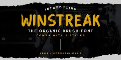 Winstreak is a unique brush typeface with bold and strong feel. This font is perfectly made for logos, and the other various formal forms such as invitations, labels, magazines, books, greeting / wedding cards, packaging, fashion, make up, stationery, novels, labels and more. Features : Uppercase & Lowercase Numbers and Punctuation Ligatures and Alternates Multilingual Support PUA encoded We highly recommend using a program that supports OpenType features and Glyphs panels like many of Adobe apps and Corel Draw, so you can see and access all Glyph variations. Email us to letterhend@gmail.com if you need something! Happy Designing!
 - Ida by ParaType,
$30.00 Ida is a simple and utilitarian typeface reminiscent of late 19th/early 20th Century grotesques, yet having a warm and friendly nature. Closed apertures and low contrast combined with elegant skeleton of individual characters create an impression of both rationality and comfort. Technically the font is modern and functional but still calls forth the emotion of a valve radio. Ida comes in 18 styles – 6 roman weights with companion italics and 6 narrow widths. One can also benefit from the use of small caps, alternate characters and indices. The typeface was designed by Maria Kharlamova (Selezeneva) and released by ParaType in 2017.
 - Genia by Product Type,
$15.00 In every glyph, Genia is lovely and charming. It has a strong, uncompromising style with regulated letterforms and a contemporary edge. Each typeface in the family can stand alone, be lively, and forceful in its own right, and there’s a balance between harsh lines and gentle curves. This typeface also comes with 16 different families to help you create outstanding projects. of course, your various design projects will be perfect and extraordinary if you use this font because this font is equipped with a font family, both for titles and subtitles and sentence text, start using our fonts for your extraordinary projects.
 - Sella Mella by Crowntype Studio,
$12.00 Sella Mella is a script type family of four fonts. It is inspired by Lovely Fonts and has a soft and welcoming look. Sella Mella can be used for branding, packaging and wherever you need a script font that is easy to read and smooth. Sella Mella has many ties, strokes, and alternative characters that will make your designs unique and beautiful. You can also purchase Sella Mella as a Font Family and adjust the weight of Sella Mella seamlessly between Italic and Bold weights. Note that you need design software that supports the Font Family. Thank You...
 - Bank Of England by K-Type,
$20.00 Bank of England is loosely based on the blackletter lettering from Series F English twenty pound banknotes introduced in 2007. The font takes inspiration from German Kanzlei (Chancery) typefaces and the English calligraphers John Ayres and George Bickham. For designers using OpenType-aware applications, Bank of England includes Swash versions of all uppercase letters and ampersand, Alternates for nine lowercase letters and capital Z, and sixteen ornamental flourishes. Western European accented characters are included, and also a simplified St. Edward’s Crown (Elizabeth II’s coronation crown) at the Section (§) and PlusMinus (±) keystrokes (Windows Alt-0167 and Alt-0177).