10,000 search results
(0.038 seconds)
- The Goblick by Allouse Studio,
$16.00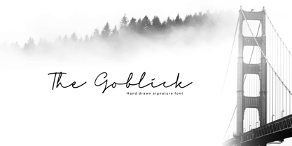 Proudly Presenting, The Goblick a Handdrawn Signature Font. The Goblick is perfect for any titles, logo, product packaging, branding project, megazine, social media, wedding, or just used to express words above the background. The Goblick also come with initial swash and Multi-Lingual Support. Enjoy the font, feel free to comment or feedback, send me PM or email. Thank You!
 - Roundwell by Javanice Studio,
$16.00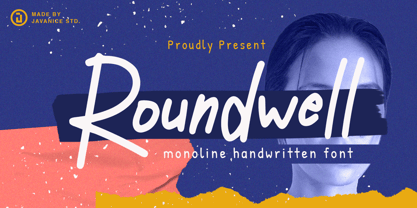 Introducing Roundwell by Javanice Studio Roundwell is A Moniline Handwritten Font Roundwell is perfect for branding project, apparel, labels, magazines, books, greeting / wedding cards, packaging, fashion, make up, stationery, and any type of advertising purpose or just used to express words above the background. This font includes multilingual support. Enjoy the font, feel free to comment or feedback, send me PM or email.
 - Cool Crayon by Hanoded,
$15.00 Cool Crayon is a nice typeface I created with the black crayola from my 3 year old son's crayola box. It was broken (because he tends to throw them around), but I managed to get the glyphs onto a sheet of paper. Cool Crayon is similar to Crayon Crumble, but is rounder and thicker. Cool Crayon comes with extensive language support.
 - Standard Jeglek by Allouse Studio,
$16.00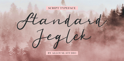 Standard Jeglek a Script Typeface Font. Standard Jeglek come along with Ligatures, Swash, and Multi-Lingual Support to fulfill your need. Standard Jeglek is perfect for any tittle, logo, product packaging, branding project, megazine, social media, wedding, or just used to express words above the background. Enjoy the font, feel free to comment or feedback, send me PM or email. Thank You!
 - Yel Yeah by Allouse Studio,
$16.00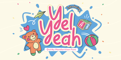 Yel Yeah a Quirky Handwritten Font tha will bring an fun and playful impression. Yel Yeah is perfect for any tittles, logo, product packaging, branding project, megazine, social media, wedding, or just used to express words above the background. Yel Yeah also come with Multi-Lingual support. Enjoy the font, feel free to comment or feedback, send me PM or email. Thank You!
 - Marvelo by Gian Studio,
$12.00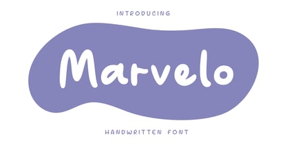 Introducing Marvelo is a comic display font that is fun adn clean. Suitable for use on quotes, displays, logos, branding, social media post, advertisements, product packaging, product designs, labels, photography, watermarks, invitations and more. Displayed fonts: Uppercase, Lowercase, Numbers, Symbols, Accents also Multilingual Support Enjoy the font, feel free to comment or feedback, send me a PM or email. Thank You!
 - Smilecake by Balpirick,
$15.00 Smilecake is a Cute Fun Handwritten Font. Smilecake Cute is a neat and casual handwritten font. Whether you’re looking for fonts for Instagram or calligraphy scripts for DIY projects, this font will turn any creative idea into a true piece of art! Smilecake also multilingual support. Enjoy the font, feel free to comment or feedback, send me PM or email. Thank you!
 - Par Avion by Greater Albion Typefounders,
$15.00 Par Avion's design draws something of its inspiration from the wings of the old BSA Motorcycles logo and was developed in parallel with our Vinea typeface family. “Par Avion” means ‘By Air’ - remember those little blue stickers in the Post Office - for sending Air Mail? We think this typeface design has a lovely streamlined feel of the early jet-era about it.
 - Technobaby JF by Jukebox Collection,
$32.99 Technobaby is a funky futuristic font done with modular letterforms. This typeface arose from playing around with the basic rounded rectangle shape. Jason wanted to see how many different letters he could create by simply changing the locations of the slots cut into the rectangles. Overall it lends the font a very cohesive and unique look. Get your "mod" on with Technobaby!
 - Numis by Tyler Jamieson Moulton,
$11.00 Numis was born out of a coin collecting hobby. A quick survey of coins from the late medieval to modern periods to today led to this unicase design. The rounded corners and smoothed edges are meant to evoke a the slightly worn letterfaces found on old coins; a process that tends to bolden the text before being rubbed away completely.
 - Glamoria by Balpirick,
$15.00 Glamoria is a Modern Monoline Script Font. Glamoria Script is an enchanting handwritten font. This versatile script font has a wide spectrum of applications ranging from greeting cards to headlines and is guaranteed to add a romantic feel to your next project. Glamoria also multilingual support. Enjoy the font, feel free to comment or feedback, send me PM or email. Thank you!
 - Mocha Cherry by Allouse Studio,
$16.00 Proudly Present, Mocha Cherry a Handwritten Fun Sans with Two Styles, Inline and Regular. Mocha Cherry is perfect for product packaging, branding project, megazine, social media, wedding, or just used to express words above the background. Mocha Cherry also come with Multi-Lingual Support. Enjoy the font, feel free to comment or feedback, send me PM or email. Thank You!
 - Angels Cookie by Balpirick,
$15.00 Angels Cookie is a Modern Fat Handbrushed Font. Angels Cookie is a fun and sweet brushed handwritten font. Whether you’re looking for fonts for Instagram or calligraphy scripts for DIY projects, this font will turn any creative idea into a true piece of art! Angels Cookie also multilingual support. Enjoy the font, feel free to comment or feedback, send me PM or email.
 - Scenarie by Genetype,
$16.00 Introducing Scenarie Display Typeface: Streamlined Elegance Redefined Unveil the art of sophistication with Scenarie Display – a condensed sans serif font meticulously designed to streamline your designs. From sleek logos to space-efficient layouts, Scenarie Display offers a modern and refined touch. Embrace the power of condensed typography Enjoy the font, feel free to comment or feedback, send me PM or email. Thank you!
 - Antiokhia by Allouse Studio,
$16.00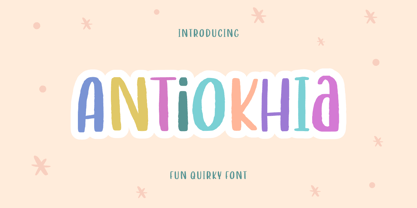 Antiokhia a Playful Quirky Font that will give you an playful, lovely and young impression. Antiokhia is perfect for any tittles, logo, product packaging, branding project, megazine, social media, wedding, or just used to express words above the background. Antiokhia also come with Multi-Lingual Support. Enjoy the font, feel free to comment or feedback, send me PM or email. Thank You!
 - Credit Crunch by Comicraft,
$29.00 Here in the heart of Santa Monica, in the disused 1940s aircraft hangar we like to call the Comicraft Studios, we know that times are tough. As we were driving to “work” in the back of our chauffeur driven Humvee limo, sipping martinis out of the navels of Playboy bunnies and wondering what font we should release next, we decided it was time to reach out to the poor people. Yes, we felt it was time to create a font for the huddled masses yearning to breathe free, for the wretched refuse of our teeming shores. A font, if you will, for the tempest-tossed. It’s a little skinny and might be described as pinched and starved, but it’s guaranteed to see you through this current economic crisis as only the 26 letters of the alphabet can. It was a tall order, but Jazzy JG Roshell created this one while he was in line at the bank, waiting for his personal bailout. Meticulously crafted using one of those ballpoint pens attached to the cashier’s station by elastic, Credit Crunch is the Hamburger Helper of comic book fonts. It’s kind of a hybrid -- just like the Priuses our trophy wives drive to their personal plastic surgeons -- and it’s solar powered and also comes with a tank full of good old fashioned Biro ink. The Recession, Climate Change AND Global Hunger will probably end mere minutes after you crack open your life’s savings to buy this font. How can you afford NOT to...? See the families related to Credit Crunch: Credit Extension.
 - Encercle Draft by Typodermic,
$11.95 With Encercle Draft, you can create circles and other shapes containing numbers up to 999999. Here's how it works: hold shift and type the number of digits, followed by a number. If you want the number 25, hold shift, type 2 followed by 25. If you want the number 250, hold shift, type 3 followed by 250. You can also type letters, periods, slashes, hyphens, question marks and exclamation points. Create an inverse white-on-black effect using your application's Bold feature. Easily change shapes by selecting a different font style from your application's font menu. Encercle Draft is available in the following shapes. Circle Square Box (wide rectangle) Box with rounded ends (tab) Diamond Circle inside a diamond Hexagon Hexagon rotated Octagon Triangle up Triangle down Triangle right Triangle left Quote bubble with left tail Quote bubble with right tail Quote bubble with no no tail Cloud (thought bubble) Encercle Draft uses OpenType technology. Most current graphic design applications support basic OpenType features but there are a few exceptions including AutoCAD, SketchUp, Solidworks and Canva. Encercle Draft will work in Affinity, Inkscape, GIMP, Adobe apps (not Photoshop Elements), Microsoft apps (not Powerpoint), Sibelius and more. Encercle Draft includes a PDF manual with examples. There's also an advanced feature which allows you to create solid-colored backgrounds. For a thicker, sans-serif style, check out Encercle Sans. For more complex layered effects with a different selection of typefaces and shapes, check out Numbers with Rings. Encercle PDF user manual.
 - Loraine by Homelessfonts,
$49.00 Homelessfonts is an initiative by the Arrels foundation to support, raise awareness and bring some dignity to the life of homeless people in Barcelona Spain. Each of the fonts was carefully digitized from the handwriting of different homeless people who agreed to participate in this initiative. MyFonts is pleased to donate all revenue from the sales of Homelessfonts to the Arrels foundation in support of their mission to provide the homeless people in Barcelona with a path to independence with accommodations, food, social and health care. Loraine was born in London. She was an ordinary, hardworking family person, with nothing to worry about beyond paying the rent at the end of the month or keeping the fridge full. Until in 2009 she came to Barcelona on holiday. Soon after she arrived her passport was stolen from her and she had a series of problems with the British embassy. Somebody had made illegal use of her passport. So Loraine found herself in a strange place, unable to get home. She didn’t know anyone there and her circumstances meant she couldn’t ask for help from England, either. She had to sell all her possessions and, in time, learn to speak Spanish. “Living in the street is a wonderful adventure,” she says. In the street she discovered a new city, a new country and a new culture. “There are lots of people who prefer to sleep under the stars.” She also made lots of friends who helped her in a completely unfamiliar world.
 - Encercle Sans by Typodermic,
$11.95 With Encercle Sans, you can create circles and other shapes containing numbers up to 999999. Here's how it works: hold shift and type the number of digits, followed by a number. If you want the number 25, hold shift, type 2 followed by 25. If you want the number 250, hold shift, type 3 followed by 250. You can also type letters, periods, slashes, hyphens, question marks and exclamation points. Create an inverse white-on-black effect using your application's Bold feature. Easily change shapes by selecting a different font style from your application's font menu. Encercle Sans is available in the following shapes. Circle Square Box (wide rectangle) Box with rounded ends (tab) Diamond Circle inside a diamond Hexagon Hexagon rotated Octagon Triangle up Triangle down Triangle right Triangle left Quote bubble with left tail Quote bubble with right tail Quote bubble with no no tail Cloud (thought bubble) Encercle Sans uses OpenType technology. Most current graphic design applications support basic OpenType features but there are a few exceptions including AutoCAD, SketchUp, Solidworks and Canva. Encercle Sans will work in Affinity, Inkscape, GIMP, Adobe apps (not Photoshop Elements), Microsoft apps (not PowerPoint), Sibelius and more. Encercle Sans includes a PDF manual with examples. There's also an advanced feature which allows you to create solid-colored backgrounds. For a thinner, classic architecture/drafting style, check out Encercle Draft. For more complex layered effects with a different selection of typefaces and shapes, check out Numbers with Rings. Encercle PDF user manual.
 - Hanna by Wilton Foundry,
$29.00Hanna has its roots in the Plato and Cilantro fonts published earlier by Wilton Foundry. It is an informal roman and very legible at any size - a rare combination for many applications. Hanna was specifically designed to generate additional income for an orphanage in Ethiopia. Hanna Teshome runs an orphanage of roughly 140 children in Addis Ababa, Ethiopia. She is an amazing lady with a deep passion for orphan kids as well as innocent kids that find themselves in jail because their mothers have been imprisoned - they are treated as prisoners and are typically sexually abused - it is not uncommon for them to commit suicide when they are released from jail at age 18. Most of the orphans end up with Hanna because one or both of their parents have died from AIDS. Hanna relies entirely on donations to keep her orphanage running and this font is a small but tangible way for you to help make a difference in the lives of the orphan kids. I am committed to helping Hanna after visiting the orphanage several times and seeing the jails from where the kids have been rescued. Hanna is my hero because she stepped out of her comfort zone, with no financial support, to take care of the kids. My hope is that you will use this font as a messenger of good. All of Wilton Foundry royalties for this font will go to the support of Hanna’s orphanage in Ethiopia. Thank you in advance for your support on behalf of Hanna and the kids! - Balkiez Hellenistic by Bykineks,
$15.00 Entered into the bykineks culture typeface edition. This 2nd edition typeface is inspired by the meander curves and waves often found in the culture and art of the Hellenistic era. The specifications for this font are bold typeface script, high contrast slope classification, stress axis, and X height. Comes with various alternatives for each upper and lower case letters. small offer a variety of silicates or optimal shapes for a given placement, having binding and sweeping characteristics. Suitable for coffeeshop branding needs, web design, stickers, apparel, invitation cards, and others. Consists of 503 glyphs support Languages : Afrikaans, Albanian, Asu, Basque, Bemba, Bena, Breton, Chiga, ColognianCornish, Croatian, Danish, Dutch, Embu, English, Esperanto, Estonian, Faroese, Filipino, Finnish, French, Friulian, Galician ,Double,Germany,Gusii,Hungary,Inari Sami,Indonesia,Ireland,Italy,Jola-Fonyi,Kabuverdianu,Kalaallisut,Kalenjin,Kamba,Kikuyu,Kinyarwanda,Lithuania,Lower Sorbia,Luo,Luxembourg,Luyia,Machame, Makhuwa-Meetto , Malagasy, Malt Manx, Meru, Morisyen, North Ndebele, Norwegian Bokmål, Norwegian Nynorsk, Nyankole, Oromo, Polish, Portuguese, Quechua, Romansh, Rombo, Rundi, Rwa, Samburu, Sango, Sangu, Sobia ,Shambala , Somalia, Spain , Swahili, Swedish, Swiss German, Taita, Teso, Turkish, Upper Sorbian, Uzbek (Latin) Volapük, Vunjo, Walser, Zulu.
 - Standbyte by Din Studio,
$29.00 Standbyte is an exquisite script font that beautifully captures the essence of cursive handwriting with delicate brush details. This typeface combines the fluidity of handwritten script with the artistic touch of brush strokes, resulting in a captivating and elegant design. Standbyte's flowing letterforms emulate the natural movement of cursive handwriting, giving it a sense of authenticity and warmth. The brush details add a touch of artistic flair, creating subtle variations in stroke width that infuse the font with a handcrafted charm. Its flowing, interconnected letters lend themselves well to creating seamless and eye-catching appearance. Because of its legibility you can use this font in a variation of text sizes. Enjoy the available features here. Features: Multilingual Supports PUA Encoded Numerals and Punctuations Standbyte fits in headlines, logos, posters, flyers, invitations, greeting cards, branding materials, print media, editorial layouts, website headers, and many more. Find out more ways to use this font by taking a look at the font preview. Thanks for purchasing our fonts. Hopefully, you have a great time using our font. Feel free to contact us anytime for further information or when you have trouble with the font. Thanks a lot and happy designing.
 - Linotype Maral Armenian by Linotype,
$104.99Linotype Maral is based on an historic Armenian typeface which was originally designed by Henrik Mnatsakanyan. Hrant Papazian has revieved and digitized this four weight type family . Armenian keyboard drivers for Mac OS 9 (and under) as well as for Windows are included when any of the Linotype Maral fonts are purchased. These drivers must be installed before the fonts may be used properly. Linotype Maral will not function properly under Mac OS X, unless you are using the OpenType-format version, which does not work under OS 9! The Linotype Maral family includes four fonts: Linotype Maral Regular, Linotype Maral Oblique, Linotype Maral Bold, Linotype Maral Bold Oblique. The Armenian language is written with its own script. This script and its language are written and spoken in the Republic of Armenia and by the Armenian Diaspora. The Armenian alphabet first appeared around 406 A.D. Its creation is attributed to St. Miesrop Mashtots (died 441), but it is most likely an independent modification and extension of the Greek alphabet created by Gregorian denomination.* * (Source: The book Schrift- und Buchkunst, by Albert Kapr [Leipzig: 1982], references Quadra della storia letteraria della Armenia by Ph. Lukias Somal for this information) - FS Pele by Fontsmith,
$50.00 Iconic Conjuring memories of chunky typefaces from the late-60s and early-70s, and named after the world’s greatest footballer of that and probably any other era, FS Pele is one of a set of Fontsmith fonts designed specifically for headlines and other prominent applications. “We wanted to create fonts that could be integral to the design of posters, album covers and magazines,” says Jason Smith. Welcome to FS Pele, iconic, like its namesake (though, perhaps, a little less nimble). Big Pele, little Pele There was only one Pele. But there are two sizes of FS Pele. FS Pele One, with the finer counters and details, adds considerable weight and style at large sizes, especially in big block headlines on posters. FS Pele Two’s thicker “slots” make it a better choice for smaller-sized text. A load of blocks FS Pele began as an exercise by Phil Garnham in turning squares into legible letters, via the least means necessary. The idea extended his ideas about logo-making, and the search for a stamp-like brand mark that lends authority, stability and instant identification. “The thought that the type was a 2D/3D jigsaw of slotted, architectural pieces was almost an after-thought. I wanted to create a strong, stacking, block aesthetic for the most contemporary poster design. “At the time there were a lot of designers creating their own versions of the same thing but I wanted to take the blocker forms to the next step, and infer a more legible text without sacrificing the idea.”
 - FS Pele Variable by Fontsmith,
$199.99Iconic Conjuring memories of chunky typefaces from the late-60s and early-70s, and named after the world’s greatest footballer of that and probably any other era, FS Pele is one of a set of Fontsmith fonts designed specifically for headlines and other prominent applications. “We wanted to create fonts that could be integral to the design of posters, album covers and magazines,” says Jason Smith. Welcome to FS Pele, iconic, like its namesake (though, perhaps, a little less nimble). Big Pele, little Pele There was only one Pele. But there are two sizes of FS Pele. FS Pele One, with the finer counters and details, adds considerable weight and style at large sizes, especially in big block headlines on posters. FS Pele Two’s thicker “slots” make it a better choice for smaller-sized text. A load of blocks FS Pele began as an exercise by Phil Garnham in turning squares into legible letters, via the least means necessary. The idea extended his ideas about logo-making, and the search for a stamp-like brand mark that lends authority, stability and instant identification. “The thought that the type was a 2D/3D jigsaw of slotted, architectural pieces was almost an after-thought. I wanted to create a strong, stacking, block aesthetic for the most contemporary poster design. “At the time there were a lot of designers creating their own versions of the same thing but I wanted to take the blocker forms to the next step, and infer a more legible text without sacrificing the idea.” - Dederon Serif by Suitcase Type Foundry,
$75.00Dederon Serif has been specifically designed for book setting. Preliminary sketches were drawn in 2004. Its inspiration – particularly its weight and width proportions – can be traced to the Liberta typeface from the TypoArt type foundry in former Eastern Germany. After a careful study of the model, the design of Dederon branched off into its own direction, finding its distinctive voice and becoming a wholly original type family. Dederon Serif kept most of the elements typical for the Old Style Roman lettering, such as the angle of the stress, the medium x-height, and lower contrast. In large sizes, the typical shapes of the letters stand out – the calligraphic feel characteristic for the Czech typefaces by Oldrich Menhart, the unusual serifs hinting at the angle of the pen, the shapes of the stems, or the terminals of dots and ears. Upon finishing the serif version, a Serif-serif variant called Dederon Serif was added. The construction principles are also derived from the Old Style Roman model, which lends the lettering its open, humanist feel. Yet the design also conforms to the rules of the modern Serif serif. Most characteristics of Dederon Serif match the serif version – the weight of individual cuts, the width proportions, x-height, ascenders' and descenders' length, and the slope of the italics. Each version of Dederon Open Type Std contains the standard Western Latin character set and the Central European characters; a number of basic and accented ligatures, small caps; old style, small caps and caps, table, fraction and superscript numerals; expert glyphs and alternative characters. This brings the total to a comfortable 820 glyphs per weight, permitting truly professional use in the most demanding projects. - Dederon Sans by Suitcase Type Foundry,
$75.00Dederon Serif has been specifically designed for book setting. Preliminary sketches were drawn in 2004. Its inspiration — particularly its weight and width proportions — can be traced to the Liberta typeface from the TypoArt type foundry in former Eastern Germany. After a careful study of the model, the design of Dederon branched off into its own direction, finding its distinctive voice and becoming a wholly original type family. Dederon Serif kept most of the elements typical for the Old Style Roman lettering, such as the angle of the stress, the medium x-height, and lower contrast. In large sizes, the typical shapes of the letters stand out — the calligraphic feel characteristic for the Czech typefaces by Oldrich Menhart, the unusual serifs hinting at the angle of the pen, the shapes of the stems, or the terminals of dots and ears. Upon finishing the serif version, a sans-serif variant called Dederon Sans was added. The construction principles are also derived from the Old Style Roman model, which lends the lettering its open, humanist feel. Yet the design also conforms to the rules of the modern sans serif. Most characteristics of Dederon Sans match the serif version — the weight of individual cuts, the width proportions, x-height, ascenders' and descenders' length, and the slope of the italics. Each version of Dederon Open Type Std contains the standard Western Latin character set and the Central European characters; a number of basic and accented ligatures, small caps; old style, small caps and caps, table, fraction and superscript numerals; expert glyphs and alternative characters. This brings the total to a comfortable 820 glyphs per weight - PT Serif Pro by ParaType,
$50.00PT Serif Pro is an universal type family designed for use together with PT Sans Pro family released earlier. PT Serif Pro coordinates with PT Sans Pro on metrics, proportions, weights and design. It consists of 38 styles: 6 weights (from light to black) with corresponding italics of normal proportions; 6 weights (from light to black) with corresponding italics of narrow proportions; 6 weights (from light to black) with corresponding italics of extended proportions; and 2 caption styles (regular and italic) are for texts of small point sizes. The letterforms are distinguished by large x-height, modest stroke contrast, robust wedge-like serifs, and triangular terminals. Due to these features the face can be qualified as matched to modern trends of type design and of enhanced legibility. Mentioned characteristics beside conventional use in business applications and printed stuff made the fonts quite useable for advertising and display typography. Each font next to standard Latin and Cyrillic character sets contain alphabet glyphs of title languages of the national republics of Russian Federation and support the most of the languages of neighboring countries. The fonts were developed and released by ParaType in 2011 with financial support from Federal Agency of Print and Mass Communications of Russian Federation. PT Serif family together with PT Sans won the bronze in Original Typeface category of ED-Awards 2011. Design – Alexandra Korolkova with assistance of Olga Umpeleva and supervision of Vladimir Yefimov - Yugoslavia - Personal use only

- Madriz by SilverStag,
$14.00 Introducing Madriz, a slab serif font with a retro feel that's perfect for any project that needs a touch of old-school charm. With over 32 fonts in one font family, Madriz offers a wide range of styles to suit any need. You can choose from Thin to Black weights and Regular to Extra Expanded widths to create your perfect look. Madriz is inspired by the old-school signage of Madrid, Spain. The name "Madriz" is actually the affectionate nickname that Madrileños, the people of Madrid, gave to their city. The font's bold, blocky letters capture the essence of Madrid's vibrant and historic streets. Madriz's versatile nature makes it a great choice for a wide range of projects. Its bold, retro style is perfect for showcasing heritage brands or giving a modern touch to classic designs. Madriz can also be used to create a sense of nostalgia, making it ideal for retro-themed projects or campaigns. Here are some of the ways you can use Madriz: Titles and headings: Madriz's bold, eye-catching style is perfect for titles and headings. Text blocks: Madriz's wide range of weights and widths makes it suitable for text blocks, from body copy to large paragraphs. Logos and branding: Madriz's retro charm makes it a great choice for logos and branding. With its 32 font styles and support for over 90 languages, Madriz is an incredibly powerful tool for any designer. It can be used to create a variety of looks, from classic and elegant to modern and edgy. Whether you're working on a print project, a web design, or an app, Madriz has the potential to make a lasting impression. Madriz is the perfect font for anyone who wants to add a touch of old-school charm to their designs. With its wide range of styles and features, Madriz is sure to make a statement in any project. Would you like to get 5 completely free fonts worth over $75? No tricks, no hidden words, terms or anything. Just subscribe to my newsletter, make sure to check your email to approve the subscription, add me to your contacts so that the emails don't end up in spam folder and you will get 5 fonts for free. The fonts are packed with alternates, ligatures and some even come with extra goodies. Happy creating everyone!
 - Fragilita by SilverStag,
$24.00 Introducing Fragilità, a captivating serif font that embodies the delicate balance of classic elegance and modern innovation. With its exquisitely crafted characters, high contrast, and subtle ligatures, Fragilità seamlessly blends the charm of yesterday with the spirit of today. Fragilità's unique design harmoniously blends elements of both retro and modern aesthetics. Its condensed letterforms evoke a touch of nostalgia, reminiscent of classic serif fonts from the past. Yet, the font's modern sensibilities shine through in its circular O, Q, and C characters, which retain their full circularity, adding a touch of contemporary sophistication. Fragilità's high contrast between the thick and thin strokes of its characters ensures exceptional readability across various mediums. Whether gracing the pages of a book, adorning a website, or captivating viewers on a digital screen, Fragilità remains effortlessly legible. Fragilità's extensive library of ligatures adds a touch of refinement and sophistication to your text. These intricate pairings of letters flow seamlessly together, creating a sense of continuity and elegance that elevates your written expression. Fragilità's comprehensive support for over 92 languages makes it an invaluable tool for anyone seeking a versatile font that can transcend cultural boundaries. With its adaptability to a wide range of languages, Fragilità ensures that your message resonates with audiences worldwide. We understand that quality fonts shouldn't be a luxury reserved for a select few. That's why Fragilità is available for an incredibly affordable price of just $24, making it accessible to designers and creative professionals of all levels. With its exquisite design, exceptional readability, and ligature-rich character, Fragilità is a font that will elevate your creative projects to new heights. Whether you're crafting elegant body text, designing eye-catching headlines, or creating captivating marketing materials, Fragilità will add a touch of timeless elegance and modern sophistication to your work. Embrace the delicate balance of classic charm and modern innovation with Fragilità, your new go-to serif font for all your creative endeavors. Would you like to get 5 completely free fonts worth over $75? No tricks, no hidden words, terms or anything. Just subscribe to my newsletter, make sure to check your email to approve the subscription, add me to your contacts so that the emails don't end up in spam folder and you will get 5 fonts for free. The fonts are packed with alternates, ligatures and some even come with extra goodies. https://view.flodesk.com/pages/63594052b967a943dd6cc528 Happy creating everyone!
 - Tautier by Sihan Wu,
$25.00 Tautier is a display font based on the specimen of Enge Mediaeval-Antigua, published in 1900 from the Bauer Type Foundry. It is intentionally redrawn to keep its overall narrow proportions. Based on the existing basic alphabets, Tautier is redrawn to appear more classical and friendly, as you can notice in the rounded corners around the beaks, as well as the lachrymal terminals in lowercases. Tautier is a display typeface suitable for large applications, for example, headlines for editorial design, branding, webpages, and environmental design. It currently comes as a single-styled typeface disposed to extend with an italic version.
 - Franklin Gothic Raw Semi Serif by Wiescher Design,
$19.50 When drawing a new font, there is a time when the final form is found – almost – but the curves are not slick and clean yet, that's what I call the "raw" form. Raw – no sweeteners added! In this family I redefined this moment in type development for the eternally beautiful "Franklin Gothic". I call the design "Franklin Gothic Raw". This packet is the semi-serif addition. There never was a Franklin-Gothic with serifs but actually the font lends itself perfectly to a slab-serif. I started with adding a half serif and eventually add a full slab-serif later on.
 - Deroma Slab by Yahya Type,
$20.00 We are so excited to announce our new Deroma Slab - Slab version of Deroma Serif. Deroma Slab - is an editorial slab serif font (regular and italic) It beautifully combines a vintage look with a modern flair. Deroma Slab will be perfect for many projects: logo, wedding designs, social media posts, advertisements, product packaging, product designs, label, photography, watermark, invitation, or whatever project you’re working on. WHAT’S INCLUDED? Deroma Slab regular (uppercase & lowercase) Deroma Slab italic (uppercase & lowercase) Numbers & punctuation Ligature & Huge Stylistic alternate Multilingual support. Still got a question? Send me a message and I’ll be happy to answer! qura.yahya@gmail.com
 - The Gaston Swisea by Zeenesia Studio,
$15.00 Introducing The Gaston Swisea The Gaston Swisea a Handbrush font with a strong texture character.The Gaston Swisea is made by handwriting directly on the paper with a coarse type brush, to produce a strong and consistent texture. The Gaston Swisea can be used for various projects such as stationery invitations, social media, logos, weddings, branding, graphic design to support the project you want to work on. We hope you enjoy the font, please feel free to comment if you have any thoughts or feedback. Or simply send me a PM or email me at zeenesia@gmail.com. Thanks for purchasing and have fun!
 - Tomato by Canada Type,
$22.95Tomato is the digitization and quite elaborate expansion of an early 1970s Franklin Photolettering film type called Viola Flare. This typeface is an obvious child of funk, the audio-visual revolution that swept America and put an end to the art nouveau period we now associate with the hippy era. Funk is of course little more than jazz with a chorus and an emphatic beat. Nevertheless, it became the definition of cool in the 1970s, thanks to blaxploitation movies with excellent soundtracks like Shaft and Superfly. Funk began as a commercial audio experience, then later expanded its signature to cover everything, from design to fashion to the later birth of disco, which is really a further simplification of funk. Funk had very strong and unique typographical elements, particularly a kind of titling with an essentially western, wooden core that suddenly changed and flared in unexpected areas until a very individual brand was achieved. Everything that can be tacked on to the alphabet was used towards that individuality. Things like curls, swirls, swashes, ligatures were always plentiful in funk, sometimes giving the titling a specific gender, sometimes bulging, sometimes speeding, sometimes fading in the distance, sometimes doing nothing but crazily aligning with other design elements, but the result was always a fascinating creature that seemed to invariably want to dance and have fun. Tomato was built in exactly that spirit. The original film type certainly had enough swashes and curls to be an unmistakable funk font in itself, but our further expansion of it cements it and makes it the definite font for the genre. With as many as 12 different possibilities for some letters, the designer's choices for a titling set in Tomato are virtually limitless. The Postscript and True Type versions of Tomato come in five fonts, including two fonts for alternates, one font for ligatures, and one font for swashes. These are split into two affordable packages. The entire family package is also available at an even more affordable price, and includes complimentary Cyrillic, Greek, Turkish, and Central European versions of Tomato. A Tomato Pro OpenType version is also available. It is a single font that includes over 650 characters, glued together with extensive programming for convenience of use in OpenType-friendly applications, where you can watch the letters morph and dance as you push the buttons and change the options of your OT palette. Now you know which font will come to mind when someone says the word "funky". - Weingut Script by FaceType,
$34.00 Blossoms, leaves, buds and tendrils create fragile objects of words and letters. · Weingut Script Flourish is a decorative display font with high contrasts, perfectly hand-drawn to the tiniest details. The font is trimmed to fairly large font sizes and is highly suitable for chapter titles or book jackets as well as Headlines, Invitations and wine labels :), although also impressing with an astounding legibility in small typesettings. Inspired by the handmade Blätterschrift from the 19th century Mettenleiter’s Schriftenmagazin, its basic structure is related to the English Script which makes it a perfect wedding font. The Weingut Family – noticable bouquet, beautiful structure with full fruit and a long finish. · Design with bicoloured capitals: In Weingut Script and Weingut Flourish, leaves and letters are available separately. You can stack them and apply different colours to the foreground and background. · Decoration and patterns: Weingut Swashes and Ornaments offers extra decorative elements in a separate font. Leaves, flourishes and borders available on their own or merged to ornaments. · Please make sure to use an application that supports the layering of text (two-coloured capitals) and OpenType features (contextual alternates). Be aware if you intend to combine Weingut Script Flourish and Weingut Flourish that these two do not go together. The floral outlines differ slightly and inaccurate overlaps will be the end result. · View other fonts from Georg Herold-Wildfellner: Sofa Serif | Sofa Sans | Mila Script Pro | Pinto | Supernett | Mr Moustache | Aeronaut | Ivory | Weingut · Language Report for Weingut Script / 151 languages supported: Abenaki, Afaan Oromo, Afar, Afrikaans, Albanian, Alsatian, Amis, Anuta, Aragonese, Aranese, Arrernte, Arvanitic, Asturian, Aymara, Basque, Bikol, Bislama, Breton, Cape Verdean, Catalan, Cebuano, Chamorro, Chavacano, Chickasaw, Cofan, Corsican, Danish, Dawan, Delaware, Dholuo, Drehu, Dutch, English, Estonian, Faroese, Fijian, Filipino, Finnish, Folkspraak, French, Frisian, Friulian, Galician, Genoese, German, Gooniyandi, Greenlandic, Guadeloupean, Gwichin, Haitian Creole, Han, Hiligaynon, Hopi, Icelandic, Ido, Ilocano, Indonesian, Interglossa, Interlingua, Irish, Italian, Jamaican, Javanese, Jerriais, Kala Lagaw Ya, Kapampangan, Kaqchikel, Kikongo, Kinyarwanda, Kiribati, Kirundi, Klingon, Latin, Latino Sine, Lojban, Lombard, Low Saxon, Luxembourgish, Makhuwa, Malay, Manx, Marquesan, Meriam Mir, Mohawk, Montagnais, Murrinhpatha, Nagamese Creole, Ndebele, Neapolitan, Ngiyambaa, Norwegian, Novial, Occidental, Occitan, Oshiwambo, Palauan, Papiamento, Piedmontese, Portuguese, Potawatomi, Qeqchi, Quechua, Rarotongan, Romansh, Rotokas, Sami Southern, Samoan, Sango, Saramaccan, Sardinian, Scottish Gaelic, Seri, Seychellois, Shawnee, Shona, Sicilian, Slovio, Somali, Sotho Northern, Sotho Southern, Spanish, Sranan, Sundanese, Swahili, Swazi, Swedish, Tagalog, Tetum, Tok Pisin, Tokelauan, Tshiluba, Tsonga, Tswana, Tumbuka, Tzotzil, Uzbek, Venetian, Volapuk, Voro, Walloon, Waraywaray, Warlpiri, Wayuu, Wikmungkan, Wiradjuri, Xhosa, Yapese, Yindjibarndi, Zapotec, Zulu, Zuni
 - Kage Pro by Balibilly Design,
$25.00 Greetings: We are introducing an advanced version of the Kage font released and received great exposure from users and worldwide font enthusiasts. The massive development puts forward experimentation on the alternate letters. We redesign each shape to make it more functional and comfortable when text size escalation occurs. In addition to rejuvenating the letterform, we also apply an oblique style to provide diverse style choices. Learn more about Kage Pro here: Graphics presentation | Type Specimen | The Inspiration: The radical exploration world of fashion inspires us. It leads our minds to the Neo-classical type style created during the age of enlightenment in the 18th century. It has a reasonably extreme contrast from the previous serif style, making the impression that it is emitted more expensive and classy. Organically, this Neo-Classical typeface is closely related to the fashion world, especially in Europe, and even spread across the globe. Fashion and this typeface reflect each other. After, we boldly observed Japanese fashion designer Rei Kawakubo. Famous for radical & deconstructive fashion, which makes the world of fashion more flexible and dynamic. The Design: As well as the typeface that we made, we started it with a cultural foundation of the Didone typeface. We tried to deconstruct the appearance. The decoration that better reflected the dynamic of fashion implemented in the fashionable alternate and calligraphical stylistic set ended with ball terminals. The versatile impression created is like taking off a scarf on the model's hair during a fashion show. The deconstructive image is combined with a legibility structure like the appearance of the Neo-Classical style. Kage Pro is designed to visualize a costly and exclusive image of a thing, product, world clothing brand, famous fashion magazine, etc. The modern transitions of each letterform are softer, so when repositioning and escalating the size of this font, it will remain beautiful without injuring other elements. So, Kage Pro is a bold choice on headlines and more prominent media with a portion of 50% even more. The Feature: Kage Pro has 11 upright and 11 oblique styles from thin to black; all family-style consist of one variable font with 2 axes. The total number of glyphs is 1,665 in each style. She comes with tons of swirly ligatures and stylistic alternates in Advance OpenType features, including: Case-sensitive forms, small caps, standard and discretionary ligatures, stylistic alternates, ordinals, fractions, numerator, denominator, superscript, subscript, circled number, slashed zero, old-style figure, tabular and lining figure. Support multi-language including Western European, Central European, Southeastern European, South American, Oceanian, Vietnamese.
 - We The People by K-Type,
$20.00 This typeface is extrapolated from the ‘We the People’ calligraphy of the handwritten US Constitution Preamble which employed a style based on German Text and Square Text exemplars from George Bickham’s penmanship copy-books, the most celebrated being The Universal Penman published in 1743. The original Constitution document was transcribed onto parchment by Jacob Shallus, a Pennsylvania Assistant Clerk, over a weekend in 1787. Shallus’s biographer, Arthur Plotnik (The Man Behind the Quill, 1987), notes that he was paid $30, a modest monthly wage at the time. He also suggests that the calligraphic headings, ‘We the People’ and ‘Article’, may have been inserted by Shallus’s 14 year old trainee son, Francis, “The manner in which the ‘Article’ headings are squeezed into the space Shallus allowed for them suggests a second hand—and perhaps not a very experienced one.” The unconventional backslant of the headings would seem to support this contention, and at the end of the document there is perhaps a novice’s inconsistency in the structure of the letter n between that used for ‘done’ and those used for ‘In Witness’. However, one has to admire the elegant swagger of the wavy t, h and l which the K-Type font extends to the b, f and k. Also, the simpler, Schwabacher-style W, an enlarged version of the lowercase w, is a little less flamboyant than the capital W from the German and Square texts in Bickham’s manuals. For designers using OpenType-aware applications, the typeface includes some Alternates, including a Bickham-style W, the letters t, h and n with added flourishes, two simpler forms of the A, and a few roman numerals for numbering articles. Also some ornamental flourishes and a round middle dot/decimal point. Punctuation marks are drawn in square, calligraphic style, but an alternative round period/full stop, for use with currency and numerals, is available at the period centered position (though placed on the baseline), accessed by Shift Option 9 on a Mac, or Alt 0183 on Windows. The full phrase, ‘We the People’, has been placed at the trademark keystroke and can be accessed by Option 2 (or Shift Option 2) on a Mac, or Alt 0153 on Windows. For designers who find the backslant awkward or unpleasant, the licensed typeface also includes two additional fonts which have a vertical aspect that may be more conducive to graphic design layouts. ‘We The People Upright’ and ‘We The People Upright Bold’ both retain the distinctive style, and the heavier weight is only slightly emboldened, just enough to add some punch.
 - TF Bleedwax by Teenage Foundry,
$19.00 TF Bleedwax Font - an eerie and spine-chilling typeface perfectly suited for Halloween-themed designs. This font exudes a horror style, created specifically to send shivers down your spine. Each letter is meticulously crafted to resemble dripping blood, giving your designs a blood-curdling and macabre feel. With its gory and unsettling appearance, "TF Bleedwax" font is sure to add a terrifying touch to any Halloween project, horror movie poster, haunted house flyer, or spooky party invitation. Let this font unleash a wave of fear and make your designs stand out in the dark and creepy night. Multilingual contained: Afrikaans, Albanian, Asu, Basque, Bemba, Bena, Breton, Catalan, Chiga, Cornish, Danish, Dutch, English, Estonian, Filipino, Finnish, French, Friulian, Galician, German, Gusii, Indonesian, Irish, Italian, Kabuverdianu, Kalenjin, Kinyarwanda, Luo, Luxembourgish, Luyia, Machame, Makhuwa-Meetto, Makonde, Malagasy, Manx, Morisyen, North Ndebele, Norwegian Bokmål, Norwegian Nynorsk, Nyankole, Oromo, Portuguese, Quechua, Romansh, Rombo, Rundi, Rwa, Samburu, Sango, Sangu, Scottish Gaelic, Sena, Shambala, Shona, Soga, Somali, Spanish, Swahili, Swedish, Swiss German, Taita, Teso, Uzbek (Latin), Volapük, Vunjo, Zulu. For any questions please contact me 🙂 Thanks!
