10,000 search results
(0.053 seconds)
- Wild Love by Angele Kamp,
$28.00 Wild love is an amazing collection of fonts that has everything you font lovers dream of. This beautiful collection comes with two fonts that pair perfectly together that will make designing Instagram quotes, websites & invitations so much easier and fun. WHAT’S INCLUDED WILD LOVE SCRIPT (OTF) A lovely script font that includes 67 ligatures with letter combos that give you that gorgeous hand-lettered look. This font also includes 52 alternate start & end swashes for all of the lowercase characters. WILD LOVE SANS (OTF) This is an all caps font that pairs perfectly with the script font
 - Concierge JNL by Jeff Levine,
$29.00 On occasion, one type design's influence can result in a completely different end result. Take the hand lettering found on a 1920s piece of sheet music for the song "Let Me Call You Sweetheart". The simple sans with a few Art Nouveau-inspired characters started out as the basic design of Concierge JNL, but shortly after beginning the project, the lettering took on more of an Art Deco flavor. Add to this the many rounded-edge characters that have a bit of a techno look to it and the typeface takes on many different design characteristics.
 - Ongunkan Iberian Script by Runic World Tamgacı,
$50.00 The Iberian scripts are the Paleohispanic scripts that were used to represent the extinct Iberian language. Most of them are typologically unusual in that they are semi-syllabic rather than purely alphabetic.[1] The oldest Iberian inscriptions date to the 4th or possibly the 5th century BCE, and the latest from end of the 1st century BCE or possibly the beginning of the 1st century CE. The characters in this font do not contain all the characters of the Iberian script. If there are friends who need all the characters, contact me so that I can install the font on the system.
 - AM Sans One by URW Type Foundry,
$39.99 When designing AM Sans One, it was a great challenge for me to develop a modern sans serif, which despite the large number of existing fonts in this sector has its own unique character. Starting point for the design concept was the cap O, designed as a rectangle with rounded corners, and not as usual as a circle or oval. The O should form the basis for the whole alphabet. Another feature are the characters with oblique starting and end strokes such as "A, V, W". These have not exactly straight, diagonal lines, but have a slight curvature. Thus, these letters do not look too geometric. Also the cap K deviates slightly from the usual shape which makes AM Sans One different from other already existing fonts. I could well imagine applying this font for areas such as engineering or architecture.
 - Samba by Linotype,
$29.99The Samba family was inspired by the lettering art of J. Carlos, a Brazilian illustrator during the early 20th century. Turned into a workable series of fonts by the contemporary Brazilian designers Tony and Caio de Marco, Samba is especially recommended for use in logos, flyers, posters, and tattoos! This family offers the user a chance to mix three different styles of lettering into one coherent design, which can be very useful in solving certain design problems. While the regular Samba face is made up of mono-line letters, the style of Samba bold offers much more of a thick to thin contrast. The Samba Expert set displays lavish swash endings, which were inspired by Brazilian metal work. The Samba family was one of the winners selected during the 2003 International Type Design Contest, sponsored by Linotype GmbH. - Levato by Linotype,
$29.99 Levato, the first font designed by Felix Bonge, is an Antiqua that is full of character and is refined but by no means sterile. This typeface provides for a wide range of options for creating individual designs. It was not really Felix Bonge's intention to create a whole font family when, as a second year student, he began several exercises in contrast and proportion as part of the typeface design course of Professor Veljovi? at Hamburg University of Applied Sciences. However, these initial studies developed into a project that Bonge persisted with over the following years while working towards his degree. He continually had new insights and ideas that he was able to exploit for his font. Of particular importance, he claims, was a calligraphy seminar, which prompted him to completely rework his concept. It took him several years before his extensive font Levato™ was ready. Although the forms of Levato are ultimately derived from Renaissance Antiqua, Bonge has slightly increased the relative contrast in his version. This gives the font a graceful appearance that is further emphasized by the reduced x-height and the associated prominence of the ascenders. And, in addition, the relatively fine serifs, which are almost linear at their ends, infuse Levato with a hint of classical Antiqua á la Bodoni. At the same time, Bonge cleverly compensates for the sterilising tendency of this font form. Soft and rounded serif attachments and rounded line apexes offset the severe nature of the font and provide it with an aura of vivacity. This effect is promoted by the calligraphic-like foot of the lowercase h, n and m and the not quite horizontal bars of the uppercase E and F. Overall, Bonge has succeeded in creating a refined and yet very dynamic typeface. Levato is available in five weights; Light, Regular, Medium, Bold and Black, in each case with the corresponding italic versions. Bonge treats Levato Italic as a genuine cursive typeface. Its letters are thus slightly narrower than the analogous upright letters and their forms are considerably more curvilinear. All the versions of Levato boast an enormous range of characters to meet all possible requirements. In addition to four sets of minuscule and majuscule numerals for tabular and proportional typesetting, there are also small caps, numerous ligatures, ornamental characters and even swash variants of letters. With their generous, sweeping curves, the swash variants (available as OpenType versions) can be used for striking titling effects or as initials.
 - Hand Of Joy by Open Window,
$19.95 Fantastic, elegant, informal handwriting. It's Hand of Joy! Comes with alternate (end of word) characters with extra swooshes.
 - Aillek by Twinletter,
$18.00 Introducing Aillek, a retro-condensed font with multilingual support and a distinctive look that will enhance any project. Aillek lends a touch of retro charm to any design with its lofty letterforms and alternate characters. Your design becomes more dynamic and interesting thanks to its ligatures options. Aillek is ideal for producing vintage flyers, logos in retro style, nostalgic social media graphics, and more. It is perfect for branding initiatives, packaging design, book covers, and more due to its condensed letterforms. It is adaptable for any project that needs to reach a large audience thanks to its multilingual support. Aillek is a must-have for any designer, marketer, or anyone looking to add a dash of nostalgia to their work because of its distinctive design and features. It’s ideal for those who want to add a touch of nostalgia to their designs as well as for those who want to create designs that evoke nostalgia and vintage aesthetics. Make Aillek your go-to font for all your retro-condensed design needs by taking advantage of this opportunity. Don’t wait, get this special font right away, and start making designs that will be remembered. What’s Included : - File font - All glyphs Iso Latin 1 - Alternate, Ligature - Simple installations - We highly recommend using a program that supports OpenType features and Glyphs panels like many Adobe apps and Corel Draw so that you can see and access all Glyph variations. - PUA Encoded Characters – Fully accessible without additional design software. - Fonts include Multilingual support
 - Faya by Clevus,
$16.00 Proudly present Faya stencil modern ligature. Faya is a font designed with a modern stencil style that blends classic elements with elegant contemporary touches. Featuring ligatures that offer design flexibility, Faya is suitable for various graphic design needs, including posters, banners, logos, and more. Don't forget to use all caps too in your mixing and matching - it adds contrast and impact to your type design. Design tips! : Tighten your letterspacing for larger titles to create a range of looks. Crafted with meticulous attention to detail, Faya's letterforms are bold, sharp, and geometrically-shaped, catching the eye with their visually appealing design. The font boasts high clarity and legibility, offering a range of different letter variations such as elegant uppercase and lowercase letters. With its clean yet stylish appearance, Faya is perfect for modern and minimalist design applications. Font Features : Lettres, numbers, symbols, and punctuation, alternates and ligatures No special software required they may be used even in canva, any basic program /website apps that allows standard fonts That's it folks! Multilingual Support Language Support: Danish, English, Estonian, Filipino, Finnish, French, Friulian, Galician, German, Gusii, Indonesian, Irish, Italian, Luxembourgish, Norwegian Bokmål, Norwegian Nynorsk, Nyankole, Oromo, Portuguese, Romansh, Rombo, Spanish, Swedish, Swiss-German, Uzbek (Latin) Follow My Shop For Upcoming Updates Including Additional Glyphs And Language Support. And Please Message Me If You Want Your Language Included or If There Are Any Features or Glyph Requests, Feel Free to Send me A Message. Kindly check over on Instagram! https://www.instagram.com/clevustudio/ Have a Good Day !
 - Ruth Script by Estudio Calderon,
$68.99 Ruth Script is perfect for neon signs, we took as referents some of these signs found in the street, especially those hanging in bars, billiard halls, motels and night clubs, we also took into consideration the Photo-lettering One Line manual to solve ligatures and alternatives (We want to thank Ed Ronthaler for that treasure to study and learn). The scripts can be considered as a compendium of connections, aesthetic and functional alternatives, where all the possible word combination is a universe depending on the language and the user's creativity. We have developed a project that offers to our customers a bridge that connects the brush with the digital typography through a partial vowels and consonants control and ligatures with opentype programming. We know that the scripts make typography users, fall in love. That is why we have created a type font that achieves all the demands and requests for any project where our font can be applied. Ruth Script was designed with patience and love, with the purpose of recovering the work done by those people who have been working as letterer during decades and that have left us hundreds of guides, books and videos. A great legacy! We want to invite you to use Ruth Script in your projects and fall in love with ESTUDIO CALDERÓN's new daughter. ENJOY IT!
 - Whipsmart - Personal use only

- Ongunkan Sweden Dalecarlian Run by Runic World Tamgacı,
$50.00 The Dalecarlian runes, or dalrunes, was a late version of the runic script that was in use in the Swedish province of Dalarna until the 20th century.The province has consequently been called the "last stronghold of the Germanic script. When Carl Linnaeus visited Älvdalen in Dalarna in 1734, he made the following note in his diary: The peasants in the community here, apart from using rune staves, still today write their names and ownership marks with runic letters, as is seen on walls, corner stones, bowls, etc. Which one does not know to be still continued anywhere else in Sweden. The Dalecarlian runes were derived from the medieval runes, but the runic letters were combined with Latin ones, and Latin letters would progressively replace the runes. At the end of the 16th century, the Dalecarlian runic inventory was almost exclusively runic, but during the following centuries more and more individual runes were replaced with Latin characters. In its last stage almost every rune had been replaced with a Latin letter, or with special versions that were influenced by Latin characters.
 - Explorer by Fenotype,
$30.00 Explorer - a classy typeface collection. Explorer collection includes following: • 8 Fonts - a clean and textured version of each • Catchwords • Swooshes • Pictures Explorer’s core is a strong script type with straight edges. All the fonts are designed to work nice together. Here’s a short introduction to the styles: •Explorer Script is equipped with Contextual Alternates that make the connections between letters smooth. In addition it has Swash, Stylistic and Titling Alternates for standard characters for more customised look. Explorer Script has three weights. •Explorer Sans is a wide all caps sans-serif that doesn’t shy away from taking it’s own space. Explorer Sans has two weights. •Explorer Condensed is a sturdy all caps condensed sans-serif with rounded edges. Explorer Condensed has two weights. •Explorer Serif is a bulky all caps serif. •Explorer Swoosh is a collection of strokes and swooshes designed to go with the Script. Try adding a connecting one in the end of a word written with Script or place a loose swoosh above or below a word. •Explorer Catchword is a collection of catchwords designed to go with Explorer fonts.
 - Open Book ING by Ingrimayne Type,
$9.00 OpenBookING is a gimmick or novelty font that has letters on pages of a book. It is caps only and monospaced. The letters on the upper-case keys are on the left-handed pages of an open book and the letters on the lower-case keys are the same letters but on the right-handed pages of an open book. One could alternate upper and lower case keys to get letters on complete books, but the Opentype feature of contextual alternatives (calt) does this automatically. Several previous typefaces from IngrimayneType used the calt feature to alternate shapes that fit together in an interlocking pattern, such as alternating concave and convex shapes. OpenBookING uses the calt feature in a different way, to alternate two halves of a symmetrical shape. To provide two copies of numbers and common symbols, some non-alphabetical characters are unavailable because their slots were taken by the second form of the number or common symbol. If stylistic set one (ss01) is turned on, spaces are replaced with empty pages. This may leave you with unwanted spaces at the end of lines, and to eliminate them, turn off the feature (or change the font) for these spaces. The empty pages can be used in a layer to add color to the text. There is also a second set of empty pages with a filled page that can also be used in layers. (See poster for examples.) These pages are on the (logicalnot multiply) and (register divide) characters for the first set and on the (ordmasculine ellipsis) and (macron trademark) keys for the second set. Finally, OpenBookING has a large set of accented characters if anyone should need them. The letters used on the books were derived from the font Myhota-Bold. For a related typeface of letters on book covers, see NewLibrary. OpenBookING has limited uses and is priced accordingly.
 - Rival Sans by Mostardesign,
$25.00 A sans serif with a dynamic look for complex typographic work. Rival Sans is a sans serif font family possessing many strengths. Its 32 fonts and 2 styles, make Rival Sans a very versatile family and suitable for many graphic design projects such as branding, signage, editorial creation, advertising, packaging, broadcasting or logo creation. With the endings cut at 10 degrees and sharp cuts on the top of the stems of certain characters (like the l, b or the d) Rival Sans gives dynamism and readability to the lengthiest of editorial content. This beveled font design also gives rhythm to a text's sentences as well as a very functional look. All these design details give this new font family a modern, energetic and humanistic look. Rival Sans also has many powerful OpenType features such as case sensitivite forms, small capitals, old style and tabular figures, slashed zero, ligatures, fractions,and alternative characters to give personality to graphic design projects. Designed also for complex editorial content, this typeface has a powerful home kerning system called "Pro Kerning". With more than 2500 pairs of glyphs and many languages, Pro Kerning optimizes headlines, subtitles, texts as well as long paragraphs in real time. In addition to these extended features, the italic styles of this fonts family have been drawn as fully-fledged styles with different designs from their regular version so that the italic texts look like calligraphic phrases. Rival Sans has an extended character set with over 930 glyphs. This family covers over 130 languages from Western Europe, Eastern Europe and Central Europe. In addition to all the features of its kind, Rival Sans is part of a very complete "type system" with style variants such as the serif version Rival Serif or the slab version Rival Slab. With all these typefaces, you have 62 styles to make your own vibrant and professional graphics or web creations while maintaining consistency in your creations.
 - Poliphili by Flanker,
$19.99 Hypnerotomachia Poliphili, which can be translated in English as “Dreaming Love Fighting of Poliphilus”, is a romance about a mysterious arcane allegory in which the main protagonist, Poliphilo, pursues his love, Polia, through a dreamlike landscape. In the end, he is reconciled with her by the “Fountain of Venus”. The author of the book is anonymous, however, an acrostic formed by the first, elaborately decorated letter in each chapter in the original Italian reads “POLIAM FRATER FRANCISCVS COLVMNA PERAMAVIT”, which means “Brother Francesco Colonna has dearly loved Polia”. Despite this clue, the book has also been attributed to many other authors. The identity of the illustrator is less certain than that of the author. It was first published in Venice, in December 1499, by Aldo Manutio. This first edition presents an elegant and unique page layout, with refined woodcut illustrations in an Early Renaissance style and a refined Roman font, cut by Francesco da Bologna, which is a revised version of the type used in 1496 for the De Aetna of Pietro Bembo. The print quality is very high for the time, but nevertheless it presents many inconsistencies and imperfections due to the non-ideal inking and adherence of the matrix to the paper. For that reason numerous samples of the original have been used to create every single glyph which will result in an appropriate reconstruction and not a mere and humble reproduction. Some letters like \J, \U and \W were extrapolated, because they are not part of the original alphabet of the period. Some letters like \Q, \X, \Y, \Z and \h have been updated to more modern variants, but the original shape is accessible by Stylistic Alternates Opentype Feature, which also changes the shape of the \V and the \v. The original numerals \zero, \one, \tree, \four and \six have been accompanied by reconstructions of the missing numbers and extended by modern figures. Finally, swashed lower cases and original scribal abbreviations were also included. The font has joined by a matching Italic variant, closely inspired from Aldo Manuzio's 1501 "Vergilius", the first book printed entirely in Italic type by Francesco da Bologna.
 - Karela by Blancoletters,
$39.00 English description Karela is a humanist slab serif family. Karela is also the Basque word for gunwale, this is, the widened edge at the top of the side of a boat, where the edge is reinforced with wood or other material and to which the thwarts are attached. Gunwales resemble the way slab serifs reinforce vertical stems giving a more robust appearance to the letters. The sturdy, solid and often mechanical structure that is customary in slab serif or mechanistic typefaces is softened in Karela applying subtle tweaks as: humanist proportions, slightly curved endings in ascenders, and curved edges in serifs. The influence of calligraphy is noticeable all over the character set, especially in counters and letters with instrokes like “m”, “n” and “r”, and it becomes explicit in the italics. On the other hand, its low contrast, generous x-height and the constant width of characters across weights makes it very convenient for editorial uses when low resolution is a concern. Karela pursues to give a human touch to a strong and highly functional structure. It seeks for the ideal combination of strength, precision and warmth of the wooden parts painstackingly handcrafted by ancient boat builders. Besides its 12 standard styles, Karela offers also four additional fonts called "grades". Grades are subtle changes in stroke weight in order to compensate for differences in printing media or display conditions of text layouts. To minimize these subtle changes without a reflow of the text they have to be designed with the same character width of the base style. Karela offers 4 grades for its Regular weight: Grade Minus 5, Grade Minus 5 Italic, Grade Plus 5 and Grade Plus 5 Italic. This makes possible to counteract the effect of changes in paper, temperature, paper, background color… In addition, Karela takes this no‑reflowing idea from grades and extends it to the whole range of styles, allowing to play with any of its weights without undesirable text reflows. Enjoy the layout stability while you experiment and play with variations! Karela presents also a wide range of Opentype features for a professional text layout.
 - Compiler by Identity Letters,
$39.00 Legible, technical, clear—with a hint of retro: Compiler is a no-frills font family straight from the heart of a microprocessor. Inspired by console typefaces, the humanist sans serif typeface combines a large x-height with striking serifs on certain letters such as i and l. Those serifs evoke the aesthetics of monospace typefaces for programming. Even though Compiler is a proportional typeface, this detail improves glyph recognition and helps differentiate between individual letters. Combined with vertical stroke ends, which allow for particularly even spacing, the serifs make for an extremely legible typeface. (Even in small sizes.) Brand recognition guaranteed: Compiler is ideal for applications that require a mechanical flavor without appearing offish. You can use it for websites, apps, branding, corporate design, annual reports, signage, and many other areas with perfect results. Compiler consists of two font families; the second one is Compiler Plain. In Compiler Plain, the signature letters lose their serifs and the forms of "a" and "g" are simplified. This way, the shapes are neutralized. The technical impression recedes into the background. Both families can be combined smoothly: you might use the standard Compiler fonts for display sizes and Compiler Plain styles for body copy. For total design control, you can toggle each of the defining design elements individually from Compiler to Compiler Plain and vice versa. Just use Stylistic Sets to fine-tune your Compiler fonts. Compiler provides you with 8 weights in 4 variations: Upright, Italics, Plain Upright and Plain Italics. That's a total of 32 fonts. Each style contains more than 860 glyphs, including advanced typographic tools such as proportional and tabular figures (both lining and old-style) or small caps—something you'll rarely find in this genre. Other glyphs are optimized for display sizes, such as circled figures and various arrows. There's also a set of glyphs designed for web use: with symbols for shopping carts, hamburger menus or checkboxes, you can implement your web projects elegantly and consistently without relying on third-party tools (like an external icon font). Powered by highly productive OpenType functions, Compiler is an intermedia workhorse straight from cyberspace.
 - Allencon by Scriptorium,
$18.00Allencon is a lovely font based on freehand calligraphy. It has a bold, decisive look, with various aspects of the characters regularized to give a consistent appearance in print while preserving the personality of the lettering. It includes variant versions of many of the characters, particularly elongated characters for the ends of words at the ends of lines - great for poetry. - Beagle Sign by Attype Studio,
$14.00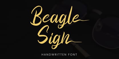 Beagle Sign is a stylish signature font with ending stylistic set that make amazing combination. perfect for any product like branding, invitation, stationery, wedding designs, social media posts, advertisements, product packaging, product designs, label, photography, watermark, special events or anything. Features: - Beagle Sign.otf - Multilingual Support - ligature - Ending stylistic set - Support Opentype features --- Hope you enjoy with our font! Attype Studio
 - David Hadash Sans by Monotype,
$50.99Monotype Imaging is pleased to present David Hadash (New" David), the full family of typefaces by Ismar David, in its intended authentic form. The Estate of Ismar David has sought to revive this jewel of Twentieth-Century design by granting an exclusive license to Monotype Imaging to implement it in industry-standard format. Never before has the typeface in its full set of sub-styles been made available to the design community. David Hadash consists of three style families, Formal, Script, and Sans. Each of these appears in three weigths: regular, medium, and bold. Originally devised as a companion to the upright Formal style, the Script style has a beauty and grace all its own that allows it to be used for full-page settings also. While it is forward-leaning and dynamic, it does not match any of the existing cursive styles of Hebrew script. Ismar David created an eminently readable hybrid style which is like no other by inclining the forms of the upright while blending in some features of Rashi style softened with gentle curves. One can say that the Script style is the first truly italic, not just oblique, typeface for Hebrew script. Although the proportions of the Sans style are very similar to those of the Formal style, its visual impression is stunningly different. If the Formal style is believably written with a broad-point pen, the Sans is chiseled in stone. Rounded angles turn angular and stark. The end result is an informal style that evokes both ancient and contemporary impressions. David Hadash (Modern) supports the writing conventions of Modern Hebrew (including fully vocalized text) in addition to Yiddish and Ladino. David Hadash Biblical is a version of the Formal style that supports all the complexities of Biblical Hebrew, including vocalization and cantillation marks. " - Lovely Valentine by Gilar Studio,
$16.00 Lovely Valentine is a was inspired by a recent trip to London, England where I happened upon a bustling pub with beautiful typographic signage. Lovely Valentine delivers a multitude of Opentype features, For a number of capital and lowercase letters, large swashes expand above and below the characters. Contextual swashes are also applied to some characters when placed at the beginning or end of a word adn mettalian font as bonus This font is made in a modern style with a very beautiful beginning and ending.elegantly,very casual and suitable for your various design needs I'ts.Perfect for logo,branding, tittle, social media posts, advertisements, product packaging, product designs, label, photography, watermark, special event,magazine,web design. The alternative characters were divided into several Open Type features such as Swash, Stylistic Sets. The Open Type features can be accessed by using Open Type savvy programs such as Adobe Illustrator, Adobe InDesign, Adobe Photoshop Corel Draw X version, And Microsoft Word. And this Font has given PUA unicode (specially coded fonts). so that all the alternate characters can easily be accessed in full by a craftsman or designer. You can mix and match with Opentype feature: More than 395 of glyphs Alternates Titl Uppercase Stylistic sets from ss01 to ss02 Multilingual Language If you don't have a program that supports OpenType features such as Adobe Illustrator and CorelDraw X Versions, you can access all the alternate glyphs using Font Book (Mac) or Character Map (Windows). To Access Alternate Characters Click The Link Below: Adobe illustrator CS https://www.youtube.com/watch?v=geL0Ye02Ryk Adobe illustrator CC https://www.youtube.com/watch?v=V25yiUh8BcE Ms Word https://www.youtube.com/watch?v=HxkhZiCuwEw Coreldraw X7 https://www.youtube.com/watch?v=UBVsufJjons Adobe Photoshop CC https://www.youtube.com/watch?v=BYKXl58AdNY Indesign CS https://www.youtube.com/watch?v=HgZTCxKG14Q Check my other Font here : https://gilarstudio.com/
 - David Hadash Script by Monotype,
$50.99Monotype Imaging is pleased to present David Hadash (New" David), the full family of typefaces by Ismar David, in its intended authentic form. The Estate of Ismar David has sought to revive this jewel of Twentieth-Century design by granting an exclusive license to Monotype Imaging to implement it in industry-standard format. Never before has the typeface in its full set of sub-styles been made available to the design community. David Hadash consists of three style families, Formal, Script, and Sans. Each of these appears in three weigths: regular, medium, and bold. Originally devised as a companion to the upright Formal style, the Script style has a beauty and grace all its own that allows it to be used for full-page settings also. While it is forward-leaning and dynamic, it does not match any of the existing cursive styles of Hebrew script. Ismar David created an eminently readable hybrid style which is like no other by inclining the forms of the upright while blending in some features of Rashi style softened with gentle curves. One can say that the Script style is the first truly italic, not just oblique, typeface for Hebrew script. Although the proportions of the Sans style are very similar to those of the Formal style, its visual impression is stunningly different. If the Formal style is believably written with a broad-point pen, the Sans is chiseled in stone. Rounded angles turn angular and stark. The end result is an informal style that evokes both ancient and contemporary impressions. David Hadash (Modern) supports the writing conventions of Modern Hebrew (including fully vocalized text) in addition to Yiddish and Ladino. David Hadash Biblical is a version of the Formal style that supports all the complexities of Biblical Hebrew, including vocalization and cantillation marks. " - David Hadash Biblical by Monotype,
$50.99Monotype Imaging is pleased to present David Hadash (New" David), the full family of typefaces by Ismar David, in its intended authentic form. The Estate of Ismar David has sought to revive this jewel of Twentieth-Century design by granting an exclusive license to Monotype Imaging to implement it in industry-standard format. Never before has the typeface in its full set of sub-styles been made available to the design community. David Hadash consists of three style families, Formal, Script, and Sans. Each of these appears in three weigths: regular, medium, and bold. Originally devised as a companion to the upright Formal style, the Script style has a beauty and grace all its own that allows it to be used for full-page settings also. While it is forward-leaning and dynamic, it does not match any of the existing cursive styles of Hebrew script. Ismar David created an eminently readable hybrid style which is like no other by inclining the forms of the upright while blending in some features of Rashi style softened with gentle curves. One can say that the Script style is the first truly italic, not just oblique, typeface for Hebrew script. Although the proportions of the Sans style are very similar to those of the Formal style, its visual impression is stunningly different. If the Formal style is believably written with a broad-point pen, the Sans is chiseled in stone. Rounded angles turn angular and stark. The end result is an informal style that evokes both ancient and contemporary impressions. David Hadash (Modern) supports the writing conventions of Modern Hebrew (including fully vocalized text) in addition to Yiddish and Ladino. David Hadash Biblical is a version of the Formal style that supports all the complexities of Biblical Hebrew, including vocalization and cantillation marks. " - David Hadash Formal by Monotype,
$50.99Monotype Imaging is pleased to present David Hadash (New" David), the full family of typefaces by Ismar David, in its intended authentic form. The Estate of Ismar David has sought to revive this jewel of Twentieth-Century design by granting an exclusive license to Monotype Imaging to implement it in industry-standard format. Never before has the typeface in its full set of sub-styles been made available to the design community. David Hadash consists of three style families, Formal, Script, and Sans. Each of these appears in three weigths: regular, medium, and bold. Originally devised as a companion to the upright Formal style, the Script style has a beauty and grace all its own that allows it to be used for full-page settings also. While it is forward-leaning and dynamic, it does not match any of the existing cursive styles of Hebrew script. Ismar David created an eminently readable hybrid style which is like no other by inclining the forms of the upright while blending in some features of Rashi style softened with gentle curves. One can say that the Script style is the first truly italic, not just oblique, typeface for Hebrew script. Although the proportions of the Sans style are very similar to those of the Formal style, its visual impression is stunningly different. If the Formal style is believably written with a broad-point pen, the Sans is chiseled in stone. Rounded angles turn angular and stark. The end result is an informal style that evokes both ancient and contemporary impressions. David Hadash (Modern) supports the writing conventions of Modern Hebrew (including fully vocalized text) in addition to Yiddish and Ladino. David Hadash Biblical is a version of the Formal style that supports all the complexities of Biblical Hebrew, including vocalization and cantillation marks. " - Wild Loops by Michael Rafailyk,
$9.00 Wild Loops is a handwritten monolinear typeface for wild ideas. Inspired by the marker sketches and graffiti on the walls, the font perfectly complements Doodle illustrations. It speaks to a young audience and looks a bit crazy with stretched Ascenders and Descenders. At the same time, the font is elegant and will work well for invitations, greetings, clothing brands and jewelry. The main feature of the font is a smart Contextual Alternates that substitute different versions of letters depending on its position in the word (at the beginning, middle, and the end of a word), which makes the writing more natural. View PDF Specimen: https://michaelrafailyk.com/typeface/specimen/WildLoops.pdf Contextual Alternates: ACDEFGHIJKMRSUWZabcdefghjlmnqrstvwxyzАДЕЁЗІЇКЛМНСШЩЯгдеёжзклмнстухцщьΑΕΖΗΙΚΛΜΞΥΆΈΉΪϲÀÁÂÃÄÅĄĂĀẢẠẮẰẲẴẶẤẦẨẪẬȦĎĐÐÈÉÊËĚĒĖẺẼẾỀỂỄƐĞǦĠÌÍÎÏĮĪĨỈỊİṂŘŔŠŚȘŽŹŻçğģǧġņṇřŕŗşṣýỳÿỷỹỵžźżЈјЅѕўӯ123456789. Stylistic Alternates: ABCDEFGHIJKLMNQRSUVWXZabcdefghjklmnqrstvwxyzАВДЕЁЗІЇКЛМНСТШЩЯгдеёжзклмнстухцщьΑΕΖΗΙΚΛΜΞΥΆΈΉΪκϲÀÁÂÃÄÅĄĂĀẢẠẮẰẲẴẶẤẦẨẪẬȦĎĐÐÈÉÊËĚĒĖẺẼẾỀỂỄƐĞǦĠÌÍÎÏĮĪĨỈỊİṂŘŔŠŚȘŽŹŻçğģǧġņṇřŕŗşṣýỳÿỷỹỵžźżЈјЅѕўӯ123456789&. Ligatures: jj ll. Superscript, Subscript, Fractions: ⁰¹²³⁴⁵⁶⁷⁸⁹ ₀₁₂₃₄₅₆₇₈₉ ½ ¼ ¾. Glyph count: 994. Languages count: 104. Languages: Afar, Afrikaans, Albanian, Asturian, Azerbaijani (Latin), Basque, Belarusian, Bislama, Bosnian, Breton, Bulgarian, Catalan, Chamorro, Chewa (Latin), Croatian (Latin), Cornish, Corsican, Czech, Danish, Dinka, Dutch, English, Erzya, Estonian, Faroese, Finnish, French, Frisian, Friulian, Fula, Gaelic (Scottish), Galician, German, Greek, Greenlandic, Guarani, Hausa (Latin), Hungarian, Icelandic, Igbo (Latin), Indonesian, Irish, Italian, Karelian, Kashubian, Kinyarwanda (Ruanda), Kirundi (Rundi), Kumyk, Kurdish (Latin), Ladin, Latvian, Lithuanian, Luxembourgian, Macedonian, Malagasy (Latin), Malay (Latin), Maltese, Maori, Marshallese, Moksha, Mongolian (Cyrillic), Northern Sotho, Norwegian, Occitan, Oromo (Afan, Galla), Papiamentu, Polish, Portuguese, Quechua, Rhaeto-Romance, Romani (Latin), Romanian, Russian, Rusyn, Sami, Samoan, Sardinian, Serbian, Shona, Slovak, Slovene, Somali, Sorbian, Spanish, Swahili (Kiswahili), Swedish, Tagalog, Tatar (Cyrillic, Latin), Tongan, Tsonga, Tswana, Turkish, Turkmen (Latin), Ukrainian, Ulithian, Uzbek (Latin, Cyrillic), Venda, Vietnamese, Walloon, Welsh, Wolof (Latin), Xhosa, Yapese, Yoruba (Latin), Zulu. The promo images used illustrations from the city walls of Groningen and Wrocław, photos of Cottonbro, Karolina Grabowska, Marlene Leppänen, Zhugewala from Pexels, and photos of Kevin Grieve, Liwei Zhang, Nathan Dumlao from Unsplash.
 - TT Phobos by TypeType,
$35.00 TT Phobos useful links: Specimen | Graphic presentation | Customization options TT Phobos is a pliable display serif with a soft and gentle character. The features of the typeface are the moderate contrast between bold and thin strokes, pliable visual compensators, and the counter-clockwise bend of internal ovals. In addition to 6 weights and 6 italic, TT Phobos also includes two original decorative fonts, inline and stencil. Despite its pliability and display character, TT Phobos is dynamic enough and is well suited for text arrays even in large text blocks. The serifs of letters are completely asymmetrical and bring in dynamics when reading the text from left to right. Thanks to the harmonious contrast of black and white forms and internal negative spaces of the letters, as well as its broad letter spacing, the typeface is well read in small sizes. In this case, the character of the letters is completely preserved, partially thanks to the exaggerated elegant visual compensators. The ornamental pattern used in TT Phobos Inline varies for capital and lowercase letters. Capital letters implement a more complex double inline with a rhombic element in the middle, and in the lower case features a simplified form of the inline, made in a single movement. Thanks to the original cutting, TT Phobos Stencil stands out for its expression, and the rounded cuts add even more visual style to the font. TT Phobos consists of 14 faces: 6 weights (Light, Regular, DemiBold, Bold, ExtraBold, Black), 6 Italics, inline and stencil. There are 17 ligatures in TT Phobos, including several Cyrillic ones. The typeface has stylistic alternates, which adds an italic effect to the upright fonts, and a little solemnity of the upright version to the italics. In addition, we have not forgotten about the old-style figures and other useful OpenType features, such as ordn, sups, sinf, dnom, numr, onum, tnum, pnum, liga, dlig, salt (ss01), frac, case.
 - enen - Unknown license

- Quarter Braille by Echopraxium,
$20.00 Presentation QuarterBraille (Abbreviated as "QB" thereafter) is a decorative, steganographic and lattice font. Its core design concept is that Braille dots are represented as "quarters of a square"[1]. This is illustrated by posters 1 and 2 (NB: these glyph parts will be called "QB dots" thereafter). The other glyph parts (see poster 3) are purely decorative and meaningless in terms of Braille dots encoding[2]. All glyph parts are meant to generate a wide variety of patterns from horizontal and vertical combinations of glyphs. There is also a graphic convention to differentiate uppercase from lowercase letters with the presence or absence of shape subparts (in the "endings", "quarter of a circle with a ring" and "quarter of a diamond with a small square in the middle") like shown by poster 4. This font is suitable for very short texts (e.g. logos, acronyms, quotes, ambigrams, pangrams, palindromes, etc...) but on the other hand it may be used for steganographic purpose like geocaching as well as fictive alphabets (e.g. Alien/SciFi/Fantasy/Antique civilizations). Posters 1. Font Logo: the displayed text is " Quarter " followed by " Braille". There's a rainbow layer above the text to highlight the "QB dots", this is achieved by A..Z glyphs with "only QB dots" (codes 230..255) 2. Anatomy of a Glyph (L) and "QB Dots" (quarters of a square) 3. Glyphs Parts: Square and Cross (Inverted square), Circle and Inverted Circle (with or without the small circle in the middle), Diamond (with or without the small square in the middle), Inverted Square and Circle, Shape combos, Ending 4. Uppercase vs Lowercase (tiny shape subparts are shown in red) 5. Sample 1: Bathroom sink with QB tiles on the credence 6. Sample 2: Hands knuckle tatoos: "LOVE/HATE"[4] 7. Sample 3: Poker Hand: pocket Aces. It's an Ace of Hearts (Ah) on the left and an Ace of Spades (As) on the right. Like in regular cards, the card value (e.g. Ah) is displayed twice: at the top and rotated by 180 degrees at the bottom. This poster also illustrates that QB could be used to print embossed playing cards with tactile and visual display of card values. 8. Sample 4: Pangram: "Adept quick jog over frozen blue whisky mix" 9. Sample 5: Latin Magic Square: "SATOR AREPO TENET OPERA ROTAS" (NB: for compensation of the 2/3 glyph ratio, letters on each line are separated by a space: "S A T O R", ...). 10. Sample 6: Quote of Mahatma Gandhi: "Learn as if you will live forever, live like you will die tomorrow.". This is also a demonstration of border glyphs combinations. 11. Sample 7: Steganography use case: the text is a sequence of 64 aminoacids (1 Letter notation), this protein was described in a research paper "The complete Aminoacid sequence of an amyloid fibril protein AA of unusual size (64 residues) 1975". 12. Sample 8: Border Glyphs with the provided styles and mixed styles. The words are the same than in poster 9 ("SATOR AREPO TENET OPERA ROTAS"). Despite the 2/3 glyph ratio, the "TENET cross" was achieved by both inserting spaces in horizontally ("T ENE T") and by using the "thin borders glyphs". Notes a. Border glyphs[3] are meant to enhance the esthetics of text samples displayed with QB b. Special characters (e.g. *$()[].,;:&@# ...) are provided and follow the NABCC (North American Braille Computer Code) convention. c. A..Z Glyphs with only the "QB dots" are provided as demonstrated by posters 1 and 2 (A/N: this was very useful to create them). d. Glyph Map: 32..64: Special characters - 161..187: "Thin variant" of Border glyphs, 192..229: Border glyphs, 230..255: A..Z with only the "QB dots" - Codes 176 an 181 are "regular SPACE" (empty glyph). Footnotes 1. There is indeed two shapes which represent the braille dot: the "quarter of a square" and the "quarter of a cross". It's because a cross may be considered as an "inverted square" because the square corners are merged in the center. 2. That's why the SPACE glyph is only made of decorative/meaningless glyph parts (i.e. no "QB dots"). 3. For other fonts with border glyphs, please take a look at my other "decorative Braille fonts" (GoBraille, HexBraille, KernigBraille, StackBraille, MaBraille, DiamondBraille, LorraineBraille). 4. LOVE/HATE knuckle tatoos are inspired by the anthology scene from "The Night of the Hunter" movie (Charles Laughton 1955), it also appearead in "Do The Right Thing" movie (Spike Lee 1989). Disclaimer This font is not appropriate and not meant to print text documents in Braille for the blind readers audience.
 - Nirma by madeDeduk,
$15.00 Introducing Nirma Display Typeface, use this font for any branding, product packaging, invitation, quotes, t-shirt, label, poster, logo etc. Feature Uppercase & Lowercase Number & Symbol International Glyphs Multilingual support Feel free to drop us a message any time and follow my shop for upcoming updates Shoot me on email at: dedukvic@gmail.com and find more previews on my Instagram here : https://www.instagram.com/acekelgondolayu/?hl=en Hope you enjoy it.
 - Mollie Rocky by madeDeduk,
$15.00 Mollie Rocky is a modern groovy family font that is retro typography designs and stylish. The thick and thin stems of the each letters makes a unique retro font. Feature 9 Weight UPPERCASE & Lowercase Number & Symbol International Glyphs Alternative & Ligatures If you need anything else just shoot me on email at: dedukvic@gmail.com Or find more previews on my Instagram here : https://www.instagram.com/acekelgondolayu/?hl=en Hope you enjoy it.
 - Tuff by Stone Type Foundry,
$49.00 Tuff began with Magma. Set as text, they appear to be similar and are quite comfortable as typographic companions. The child-safe softness of Tuff owes something to the letterforms of the earliest extant Greek Manuscript, The Persae by Timotheos in the 4th Century BC. It is beholden to Morris Fuller Benton's original Souvenir, and its revival by Ed Benguiat. My own Stone Informal was also an influence.
 - Plinc Buffalo by House Industries,
$33.00 Just as its eponymous ancestors graced vast Western vistas, Buffalo fills broad horizontal typographic topography with distinctive dignity. Buffalo’s migration across a visual landscape that straddles two millennia saw it survive the threat of extinction similar to its mammalian ancestors and emerge with rotund relevance. Now fortified with modern character sets and digital flexibility, nothing espouses an artisanal post-western industrial craft renaissance quite like Buffalo. Legendary lettering artist and type designer Ed Benguiat created the original film version of Buffalo for Photo-Lettering Inc. Working under the direction of the current Photo-Lettering partners, Dutch type designer Donald Roos digitized and expanded Buffalo while expertly maintaining the organic nuances found in the original version. Like all good subversives, House Industries hides in plain sight while amplifying the look, feel and style of the world’s most interesting brands, products and people. Based in Delaware, visually influencing the world.
 - Rubens by Wooden Type Fonts,
$15.00 A sans serif with splayed ends, descenders of the lower case dropping below the baseline, very tall x-height.
 - AdamGorry-Lights - Personal use only

- AdamGorry-Inline - Personal use only

- Cinque Donne by Debi Sementelli Type Foundry,
$44.99 Cinque Donne means “Five Women” in Italian. It was inspired by the five sisters in my family as well as a group of five high school friends I have known for 46 years, aka “The Club Girls”. The Pro version has 3370 glyphs with all the bells and whistles! Women are connectors, encouragers and supporters. Young, old, shy, extroverted, when you put us together, somehow we make a beautiful impact on each other’s lives. This is what Cinque Donne does in a visual way. Some letters are simple and prefer to sit quietly. Others are flourished and proud and like the limelight in the middle of a word. And then there are alternates that are flexible and work in any number of surprising places. Stylistic sets can add a vivacious feel while contextual alternates bring better understanding. Classic or contemporary, subdued or flamboyant, these letters represent the variety of women that make life interesting for us all. Within the varied glyphs, I hope you find characters that remind you of the special women in your life. Let Cinque Donne salute them on the page! The Cinque Donne Family includes: Cinque Donne, Cinque Donne Bold, Cinque Donne Swash and Cinque Donne Pro. Check out the Buying Choices tab to see special discounted combinations! Crafters: All of my fonts have been specially coded for PUA (Private Use Area) so you can access all of the swashes and alternates using Character Map (PC) or Character Viewer (Mac) or with any number of apps including PopChar. If you would like to purchase PopChar at a special discount email me and I will send you the link. Cinque Donne Pro and Cinque Donne Swash include Swash, Stylistic and Titling Alternates, Contextual Alternates, Standard and Discretionary Ligatures, Roman Numerals & Fractions.
 - Gotti by Resistenza,
$39.00 Introducing Gotti. Where Timeless Precision Meets Seventies Flair We are thrilled to unveil our latest creation, Gotti font family, born and meticulously crafted during an inspiring journey to Goteborg. This typeface seamlessly fuses the Bauhaus essence with the spirited vibes of the seventies, resulting in a font that's not just a visual treat but a design experience. Gotti draws its creative fuel from the geometric elegance of the Bauhaus movement, prioritising functional simplicity and razor-sharp lines. However, its design journey doesn't end there. Imbued with the unmistakable energy of the Seventies, Gotti emerges as a font family that encapsulates both nostalgic charm and contemporary boldness. At its core, Gotti boasts a geometric skeleton that has been intricately designed to redefine precision. Ranging from light to black, the weight variations offer a broad spectrum of expressive possibilities. Gotti is perfect for display use, advertising, and branding, it transforms your creative vision into a visual masterpiece. Stand out with confidence, whether it's a captivating logo, a compelling headline, or an unforgettable advertisement. Elevate your brand identity with Gotti. It brings strategic branding to life, communicating sophistication and modernity. Your advertising materials become memorable works of art, leaving a lasting impression on your audience. Curious about the magic Gotti can bring to your designs? Our showcase reveals real-world applications, demonstrating its adaptability and aesthetic appeal. See for yourself how this font family turns ordinary designs into extraordinary visual experiences. Follow us on social media for updates, inspiration, and a glimpse behind the scenes. Have questions or just want to share your thoughts? We're here for you!
 - Natom Pro by Mostardesign,
$25.00 A family of fonts with rhythm. Natom Pro is a modern and geometric font family adapted to the professional requirements of graphic designers, web designers and mobile application developers. Comprised of 19 styles including 8 styles designed especially for the design of headlines, Natom Pro is a very versatile family of fonts that can be used in many projects such as editorial design, branding or corporate identity creation, design of posters or logos, the creation of websites or the development of mobile applications. This font, with a resolutely contemporary aspect, also hides a unique typographic design since it has 2 distinct styles (Title and Roman) which have 2 different typographic rhythms in order to graphically differentiate the appearance of titles, subtitles and long paragraphs. With this design of rhythmically differentiated glyphs according to the styles, the headlines have a very graphic aspect while the long texts have a more classic aspect in order to keep optimal readability in all scenarios. Its architecture is also very modern since it was designed and drawn with particular attention to the geometry of the forms with clear and open endings cut at 90 degrees. The number of styles has also been simplified with the most used thicknesses (Extra Light, Light, Regular, Medium, Bold and Black) in order to speed up your graphic design process. For the more experienced designers, Natom Pro is also available in a variable version. Natom Pro is also equipped with powerful OpenType features like case sensitivity, true small caps, full ligature set, tabular figures for tables, « old styles figures » to elegantly insert figures into your sentences, numbers circled or even alternative characters to satisfy the most demanding professionals.
 - Structia by Typodermic,
$11.95 As you consider the words you need to convey, it’s clear that you’re looking for something that feels just as precise and intentional as the message you’re promoting. Structia is a typeface that does not shy away from its influence—it leans into the hard edges and geometries that are typically associated with brutalist architecture. And yet, even as it draws inspiration from an austere and somewhat daunting aesthetic, Structia also possesses a sense of control and discipline that is undeniably alluring. At the core of Structia’s appeal is its mechanical precision. Every line, every curve, is carefully calculated and crafted to create a sense of mathematical accuracy that is difficult to resist. There is no room for error or imperfection in Structia—every stroke is sharp and precise, with chamfered corners that add an extra layer of texture and visual interest. This is not a typeface that allows for ambiguity—it demands clarity and specificity, and it delivers both with remarkable consistency. But Structia is more than just a collection of angular shapes and precise lines. It is a typeface that conveys a sense of scientific accuracy and chilly logic—a kind of elegance and refinement that is unexpected. There is a beauty in the way that Structia balances the hard-edged geometries of brutalism with a sense of control and finesse that is undeniably modern. It is a typeface that feels at once futuristic and timeless—a design that can be used in a wide variety of contexts and still feel fresh and relevant. And then there are the two effect styles—Structia Panel and Structia War—which take the basic geometry of the typeface and push it even further into the realm of science fiction. Structia Panel feels like something you might see on a spacecraft or in the architecture of an alien planet, with thin, laser-like struts that give it a futuristic edge. Structia War, meanwhile, takes the concept of Structia Panel and adds a layer of battle damage, as if the letters have been through a cosmic conflict and emerged victorious. In the end, Structia is a typeface that demands attention and respect. It is not a typeface that will fade into the background or blend in with the crowd—it is a design that is meant to be noticed and admired. And yet, even as it draws your eye with its hard-edged geometries and precise lines, it also possesses a sense of elegance and refinement that is undeniably alluring. Structia is a typeface that balances the old and the new, the hard and the soft, the mechanical and the human—and the result is something truly remarkable. Most Latin-based European, and some Cyrillic-based writing systems are supported, including the following languages. A Afaan Oromo, Afar, Afrikaans, Albanian, Alsatian, Aromanian, Aymara, Bashkir (Latin), Basque, Belarusian (Latin), Bemba, Bikol, Bosnian, Breton, Bulgarian, Cape Verdean, Creole, Catalan, Cebuano, Chamorro, Chavacano, Chichewa, Crimean Tatar (Latin), Croatian, Czech, Danish, Dawan, Dholuo, Dutch, English, Estonian, Faroese, Fijian, Filipino, Finnish, French, Frisian, Friulian, Gagauz (Latin), Galician, Ganda, Genoese, German, Greenlandic, Guadeloupean Creole, Haitian Creole, Hawaiian, Hiligaynon, Hungarian, Icelandic, Ilocano, Indonesian, Irish, Italian, Jamaican, Kaqchikel, Karakalpak (Latin), Kashubian, Kikongo, Kinyarwanda, Kirundi, Komi-Permyak, Kurdish (Latin), Latvian, Lithuanian, Lombard, Low Saxon, Luxembourgish, Maasai, Macedonian, Makhuwa, Malay, Maltese, Māori, Moldovan, Montenegrin, Ndebele, Neapolitan, Norwegian, Novial, Occitan, Ossetian, Ossetian (Latin), Papiamento, Piedmontese, Polish, Portuguese, Quechua, Rarotongan, Romanian, Romansh, Russian, Sami, Sango, Saramaccan, Sardinian, Scottish Gaelic, Serbian, Serbian (Latin), Shona, Sicilian, Silesian, Slovak, Slovenian, Somali, Sorbian, Sotho, Spanish, Swahili, Swazi, Swedish, Tagalog, Tahitian, Tetum, Tongan, Tshiluba, Tsonga, Tswana, Tumbuka, Turkish, Turkmen (Latin), Tuvaluan, Uzbek (Latin), Venetian, Vepsian, Võro, Walloon, Waray-Waray, Wayuu, Welsh, Wolof, Xhosa, Yapese, Zapotec Zulu and Zuni.


