10,000 search results
(0.032 seconds)
- Andriani by Hatftype,
$15.00 Andriani is an elegant display typeface. It is characterized by its sleek and sophisticated appearance, making it suitable for use in headlines, headings and other prominent design elements. The elegant display typeface exudes timeless charm with its graceful, thoughtfully crafted letterforms. Each character is imbued with a sense of sophistication, featuring subtle serifs or exquisite details that enhance the overall aesthetic. The typeface features a harmonious balance between sleek strokes and subtle ornate elements, contributing to a refined and luxurious appearance. The design of this typeface reflects attention to detail, with curves and lines seamlessly intertwining to create a seamless flow. The letterform conveys a sense of luxury and refinement, making it an ideal choice for high-end branding, invitations and editorial designs that desire a touch of class. Whether used in large headlines or smaller display settings, elegant display typefaces attract attention and leave a lasting impression. Its timeless appeal ensures versatility across a wide range of design applications, adding a touch of sophistication and refinement to any project.
 - Binario by Tarallo Design,
$14.99 Binario is a simple and friendly font with three weights and matching obliques. The geometric and modular characteristics of this typeface subtly reference the Art Deco and early modernist periods. It is an ideal choice for achieving a clean, distinctive, and contemporary aesthetic, making it suitable for branding, posters, and screen-based designs. The light weight of Binario is good for body text. The regular weight exudes confidence, making it suitable for both body and heading text. For impactful headlines, the bold weight is superb. The clear weight distinction of this family make it easy to create organized text. Binario was designed in Siena, Italy taking some inspiration from train stations and shop signage. The name Binario means train platform in Italian. Other aspects that informed the design of this font are modularity and efficiency. The interior rounded forms of the letters (counterforms) are based on shape of the Roman arch. Binario has a sibling, Binario Soft. This version has gently rounded stroke ends, which make a softer impression on the page.
 - Aquatix by ryan creative,
$10.00 Aquatix which has a simple and minimalist design. In this font, there are no serifs or extra lines that stand out at the ends of the letters, making them appear more defined and easier to read. Aquatix can be used in both modern and contemporary designs, and is suitable for use on a variety of media such as computer screens, display posters, magazines, typography and other digital media. so it is suitable for use in designs that require clarity and firmness in each letter. FEATURES; -Uppercase, -Support Foreign, Numbers and Punctuation -Regular, Italic. -Input Otf, ttf & Woff Files. -Works on PC. -Simple installation. -Accessible in Adobe Illustrator, Adobe Photoshop. Adobe InDesign, it even works in Microsoft Word. -Fully accessible without additional design software. Aquatix is coded with Unicode PUA, which allows full access to all additional characters without having to design any special software. Mac users can use the Font book, and Windows users can use the Character map to view and copy any extra characters to paste into your favorite text editor/app. Thank you for visiting ;)
 - TG Glifko by Tegami Type,
$30.00 TG Glifko is a new contemporary sans-serif grotesque typeface with a combination of large and small aperture, make Glifko feel quirky, dynamic, and unusual. TG Glifko works excellent for display applications and still looks gorgeous in small size. It comes in seven different weights, from ultra-light to extra black, and matches with italic. They also supported various OpenType features, like stylistic alternates, case-sensitive forms, numerators, denominators, superscripts, subscripts, fraction, and multilingual support, coverage more than 200 languages. We are pleased to see our typefaces used by many people. If you are one of them who use our typefaces in your project, feel free to send some in-use sample images to us at info@tegamitype.com. We may upload them on our social media and our website www.tegamitype.com If you have any question or concerns regarding our products, please send us an email at info@tegamitype.com
 - PF Bague Sans Pro by Parachute,
$79.00 PF Bague Sans Pro is a versatile monoline typeface with a distinct and eye-catching personality. Despite its inspiration from early 20th century geometrics, it diverts from the mechanical rigidity of those typefaces by incorporating humanist characteristics, such as subtle variations in stroke width and open counter shapes with vertical endings. This is a very clean and legible typeface with a warm and well-balanced texture which is ideal for intense editorial use in magazines and newspapers. Bague Sans’ most remarkable feature is its vast array of uppercase alternates and ligatures which truly shine when set at display sizes. This typeface is automatically transformed into a flexible, charming and stylish typeface with strong modern aesthetics. From classic to modern, from excessive to neutral. Bague Sans Pro is a multipurpose typeface which offers enormous possibilities and variations for editorial design, branding and corporate identity. Bague Sans Pro signifies freedom and personal style. This superfamily includes 18 weights from Hairline to Ultra Black with a consistent and well-refined structure. Each style consists of 1063 glyphs with more that 330 alternates and ligatures and an extended set of characters which support simultaneously Latin, Cyrillic and Greek. Download the complehensive PDF Specimen Manual to explore the unlimited text variations of Bague Sans Pro.
 - Flece Display by Putracetol,
$26.00 Flece Display - Modern Sans Font is a versatile font that offers the perfect blend of modern style and elegance. It features two distinct styles: calligraphy and sans serif, providing a unique combination that is both luxurious and contemporary. This font is well-suited for various design projects, including logos, titles, book covers, headlines, magazines, products, invitations, and weddings, where a touch of sophistication and visual impact is desired. In addition to its stunning aesthetic, Flece Display also offers a range of features and a comprehensive font package. The font includes both calligraphy and sans serif styles, allowing you to switch seamlessly between the two to achieve the desired look for your design. It provides an extensive collection of characters and glyphs, ensuring versatility and creative possibilities. With its modern and elegant style, Flece Display - Modern Sans Font is the ideal choice for creating impactful and visually stunning designs. Whether you're designing a logo for a high-end brand, crafting attention-grabbing titles, or creating sophisticated invitations, this font will elevate your design projects with its luxurious and contemporary aesthetic. With its versatile features and comprehensive font package, Flece Display offers both convenience and creative flexibility, making it a valuable asset for designers.
 - Golden Record by Mans Greback,
$59.00 Golden Record is an elegant all caps sans serif typeface with a tall, classic, and high-quality feel. Its timeless design is perfect for adding a touch of sophistication to any project. The font's classiness evokes a sense of luxury and opulence, making it ideal for high-end branding and design applications. Golden Record is a versatile typeface family consisting of the styles Light, Regular, Bold, and Outline, each available in Italic, offering a wide range of creative possibilities. The idea for Golden Record came to life when Mans Greback was inspired by the elegance of vintage vinyl records and their iconic gold labels, merging classic aesthetics with modern design principles. Mans Greback is a Swedish typeface designer known for crafting high-quality fonts with a focus on versatility and aesthetics. He created Golden Records to provide designers with a unique and sophisticated typeface for upscale projects. Greback is committed to delivering exceptional quality in every font he designs, consistently pushing the boundaries of typography.
 - Civane Serif by insigne,
$35.00 Civane Serif maintains the epic grandeur of Civane with a text-friendly typeface. Inspired by the great tales of old, the grandeur of Civane is refined into a serif font with sharp serifs. Civane Serif is a contemporary sans-serif typeface with a robust character set. The Civane Serif family of typefaces supports 48 Latin-based Western, Central, and Eastern European languages, as well as the Baltic States and Turkey. Ligatures, small caps, embellishments, and a wide range of numerals are all accessible in OpenType, including proportional and tabular-width numbers, old style figures, fractions, inferiors, and superiors. Civane Serif is one of the finest choices for serif text setting. The italic or bold weights, as well as the roman set in titling caps, will impart a feeling of serene dignity on posters and webpages. Civane Serif's craftsmanship shines through with its higher contrast modern design, perfect for high-end premium goods and services.
 - Hispanic by ryan creative,
$10.00 Introducing Hispanic fonts that have strong looking designs. In this font there is an additional taper at each end of the letter so that it seems more concentrated. Hispanic has more than 120 Ligatures that you can use in both modern and contemporary designs, and are suitable for use in a variety of fashion media, posters, model magazines, typography, promotions and other digital media. FEATURES; Uppercase and lowercase letters. Support Foreign, Numbers and Punctuation. Alternative, Ligatures Regular & Italic. Works on PC. Simple installation. Accessible in Adobe Illustrator, Adobe Photoshop. Adobe InDesign, it even works in Microsoft Word. Fully accessible without additional design software. Hispanic is encoded with Unicode PUA, which allows full access to all additional characters without having to design any special software. Mac users can use the Font book, and Windows users can use the Character map to view and copy any extra characters to paste into your favorite text editor/app. Thank you for visiting, Have a nice day;)
 - Structural Glass JNL by Jeff Levine,
$29.00 A page from the 1931 Vitrolite catalog showing illustrations of store fronts and building exteriors utilizing the material provided a classically Art Deco type example. The business name “Sylvin” did not offer many characters to work with, so completion of the digital type design was simply left to imagination. The end result is Structural Glass JNL, which is available in both regular and oblique versions According to Wikipedia: “Pigmented structural glass, also known generically as structural glass and as vitreous marble, and marketed under the names Carrara glass, Sani Onyx, and Vitrolite, among others, is a high-strength, colored glass. Developed in the United States in 1900, it was widely used around the world in the first half of the 20th century in Art Deco and Streamline Moderne buildings. It also found use as a material for signs, tables, and areas requiring a hygienic surface. Over time, the trademarked name “vitrolite” became a generic term for the glass.”
 - Macondo Pro by JVB Fonts,
$30.00 The first purpose of this typeface was to provide an original and systematized style of calligraphy adapted into a modern digital font. The forms are inspired by some illustrations created for a tarot card game, itself inspired by the work of Colombian literature Nobel prize winning author, Gabriel García Márquez, "Cien Años de Soledad". Early versions of this font were made in 1997, but recently in 2009 it was substantially improved. Macondo includes several cap swashes and other stylish alternates. Macondo, as original typographic proposal was selected at Tipos Latinos 2012 Biennial, now the complete set of extended range for this typeface is prepared and improved to be commercialized. The new Macondo Pro can be available with extended capabilities of OpenType, as old style numbers, Swash Caps, slashed zero, some end-position lowercase, fractions, super and sub numbers, some stylish lowercase and discretional and/or contextual ligatures. The font also supports cyrillic, Greek and some East Europe languages.
 - Prored by Tour De Force,
$25.00 Prored is an avantgarde sans serif typeface that contains 5 weights – Light, Regular, Bold, ExtraBold and Black. It is small and compact font family with own characteristic expression, constructed to be safe choice for all kinds of typographic tasks. With specific curved endings that are adhered on baseline, Prored includes tiny note of singularity – just enough to make it’s own identity recognizable and catchy. Taller x-height gives an afterimage of a bit narrowed look, but with rational proportions and well balanced weights, 5 of them are really sufficient and capable to handle extreme typographic issues. Especially charming is Black which can be used also as display typeface in situations where elegant solutions are required in combination with stronger visibility. Beside Central Europe, Prored also contains glyphs for Turkish and Baltic languages. Highly neutral impression recommends Prored as an excellent choice for branding campaigns or new identities. Recommended for use in: branding campaigns, identities, editorial publications, packages, web design, as web font and many more.
 - Keyugah by Product Type,
$13.00 Keyugah is a classic serif font that exudes elegance and sophistication. Its timeless design makes it perfect for any project that requires a touch of refinement, from wedding invitations to high-end branding materials. With its clean lines and understated serifs, Keyugah is easy to read and works well in both print and digital media. Its versatility is further enhanced by its multilingual support, which allows you to use it in a wide variety of projects for a global audience. Whether you’re creating a logo for a luxury brand, designing a book cover, or crafting an elegant website, Keyugah is a reliable choice that will elevate your project to the next level. What’s Included : - All glyphs Iso Latin 1 - We highly recommend using a program that supports OpenType features and Glyphs panels like many Adobe apps and Corel Draw, so you can see and access all Glyph variations. - PUA Encoded Characters – Fully accessible without additional design software. - Fonts include Multilingual support
 - Trade Gothic Next Soft Rounded by Linotype,
$53.99 In 1948, Mergenthaler Linotype released the first weights of Trade Gothic, designed by Jackson Burke. Over the next 12 years, Burke, who was the company’s Director of Typographic Development from 1948 through 1963, continued to expand the family. Trade Gothic Next is the 2008 revision of Jackson Burke’s design. Developed over a prolonged period of time, the original Trade Gothic showed many inconsistencies. Under the direction of Linotype’s Type Director Akira Kobayashi, American type designer Tom Grace, a graduate of the MA Typeface Design in Reading, has redesigned, revised and expanded the Trade Gothic family. Many details were improved, such as the terminals and stroke endings, symbols, and the spacing and kerning. Moreover, there are newly added compressed widths and heavy weights perfect for setting even more powerful headlines. Trade Gothic Next brings more features and better quality for today’s demanding typographers. Trade Gothic Next Soft Rounded introduces a new friendliness and warmth to the family.
 - Serat by Wahyu and Sani Co.,
$24.00 Serat is a medium contrast flared serif with mixed up styles of classic typefaces which is highly influenced by early stages of Latin based hand writing. The lowercase are modernized versions of Carolingian minuscules, vertical stems which touch the baseline have been modified to have horizontal cut for simpler look and keep the calligraphic style for terminals & stroke ends. Then the uppercase are flared serif which were influenced by Roman inscriptional capitals. The font name was taken from the Javanese word "serat" which means writing (noun). It comes with some unique features, such as: - Carolingian style alternate for some letters (a,e,f,g,t), also comes with separated stylistic set for long 's', and long left leg 'x' and alternative ampersand. - Discretionary ligatures for all caps titling. - Standard Ligatures. - Tabular and Proportional for both Lining and Old-style figure. - Fraction with Nominator and Denominator. - Superscript and Subscript for numbers, etc. Serat would be suitable for "classic" themed work; poster, book cover, branding, videography, etc.
 - Blackline by Rhd Studio,
$19.00 Black line style - New modern & fresh script with handwritten and script style makes this font look elegant, natural, stylish and perfect for any extraordinary project that requires a handwritten feel. I am made with love and unique!! Blackline includes a full set of beautiful handwritten upper and lower case letters, numbers, assorted punctuation marks and bindings. All lowercase letters include starting and ending strokes, providing a realistic handwriting style. What did you get, honey? You will get : - Alternative Ligatures & Styles - Fonts include multilingual support for; Afrikaans, Albanian, Catalan, Danish, Dutch, English, Icelandic, Italian, Spanish, Portuguese, German, Swedish, Norwegian, Polish, Indonesian, Zulu To use beautiful strokes, you need a program that supports OpenType features such as Adobe Illustrator CS, Adobe Photoshop CC, Adobe Indesign, and Corel Draw. but if your software doesn't have Glyphs panel, you can install additional font swash file: If you have any questions about the latest fonts, please give us a short message thank you Rhd Studio
 - Pasek by Edyta Demurat,
$16.00 The inspiration for this font was a two-sided piece of paper. The glyphs were created by bending strips of this paper, then scanned and recreated digitally.
 - Bulldog Hunter Std by Club Type,
$36.99 Slab Serif version of the Bulldog family. Hunter family lends itself to on-screen use for web design - the letterforms being legible and robust at small sizes.
 - Bright Dream by Supersemarletter,
$11.00 Bright Dream is a cute and quirky handwritten font. It will add an incredibly sweet and joyful touch to your designs. Add this beautiful font to each of your creative ideas and notice how it makes them stand out! Honestly it's works perfectly for headlines, logos, posters, packaging, T-shirts and much more. Font Features : Regular Version Character set A-Z in Uppercase and Lowercase Numerals and Punctuation Accented Characters Multiple Languange Supported Format File OTF Recomended to use in Adobe Illustrator or Adobe Photoshop with opentype feature. If you have any questions, just send me a message and I'm glad to help.
 - Botham Grotesque by Aiquitype,
$15.00 Introducing Botham Grotesque, a versatile typeface meticulously crafted to embody the essence of modernity and sophistication. This exquisite font, classified under the renowned Grotesque category, boasts four distinct styles that seamlessly blend form and function. Its clean lines and balanced proportions lend a professional, making it an ideal choice for a myriad of applications, from corporate branding to editorial design. What’s Include ? 1. Uppercase, Lowercase, Number and Punctutation 2. Ready 4 Style : Condensed, Semi Condensed, Reguler and Semi Ektended 3. Multilingual Support 4. Ligature and Alternate 5. Installed on Mac and Windows 6. PUA Encode Enjoy our Font.
 - P22 Chai Tea by IHOF,
$24.95 P22 Chai Tea is unique among brush lettering scripts. Its sweeping strokes and luxurious use of horizontal space lend personality and warmth to any project. Its sturdy letterforms make it ideal for logos, stationery, titling and packaging. The Pro version is stacked with alternative characters and ligatures programmed to substitute contextually in programs that support OpenType features. In addition, Chai Tea Pro contains Central European Language support that also includes many ligatures with accented characters.
 - Eleonora by Three Islands Press,
$24.00Eleonora tends to defy standard categories. Had the typeface been designed in about 1790, it might've been called a "late transitional face" and lumped together with Bell and Bulmer. But it's a modern typeface, showing more restraint in its finer details than even Baskerville. Also noteworthy: it has no traditional, script-like italic but a more severe oblique with baseline serifs and other roman features. Has regular, italic, bold, and bold italic styles. - Joseph Sophia by Fargun Studio,
$14.00 Joseph Sophia! A new fresh ans modern hand lettered font with decorative characters and a dancing baseline. So beautiful on invitation like handicraft, greeting cards, branding materials, business cards, quotes, posters, and more design concepts. Features : Unique ligatures Stylistic sets Basic Latin A-Z and a-z Numbers International Symbols included Punctuation Please send a message if you have questions or problems, and don't hesitate to say hello on Instagram https://www.instagram.com/fargunstudio/ Thank you.
 - Sweet Dreams by Fargun Studio,
$14.00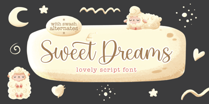 Sweet Dreams! A new fresh ans modern hand lettered font with decorative characters and a dancing baseline. So beautiful on invitation like handicraft, greeting cards, branding materials, business cards, quotes, posters, and more design concepts. Features : Unique ligatures Stylistic sets Basic Latin A-Z and a-z Numbers International Symbols included Punctuation Please send a message if you have questions or problems, and don't hesitate to say hello on Instagram https://www.instagram.com/fargunstudio Thank you.
 - At Tupats by Arttype7,
$12.00 At Tupats is inspired by the name of a common food from Indonesia during Eid: ketupatfood. This font is in the Arabic style but for writing latin characters and words. The ligatures, stylistic sets, and contextual features of this font will make your writing similar to Arabic calligraphy. It is very suitable for writing in a Middle Eastern style and for use in restaurants, magazines, souvenirs, web, and many Ramadhan-themed projects.
 - Polish Dirty News by 066.FONT,
$9.99 Polish Dirty News is a display font that draws inspiration from the distinctive aesthetic of 90s zines, and exudes a varied and extravagant style that lends a certain nonchalance to projects. Its expressive and daring letters are perfect for creative projects such as posters, invitations or branding materials. Polish Dirty News perfectly captures the striking look and distinctive character of the text, which is associated with the unique spirit of that decade. Remastered in 2022.
 - Sofia Carolyn by Balpirick,
$15.00 Sofia Carolyn is a Modern Monoline Script Font. Sofia Carolyn is a delicate, elegant and flowing handwritten font. It has beautiful and well balanced characters and as a result, it matches a wide pool of designs. Fall in love with its incredibly versatile style and use it to create spectacular designs! Sofia Carolyn also multilingual support. Enjoy the font, feel free to comment or feedback, send me PM or email. Thank you!
 - Schism One by Alias,
$55.00 Schism is a modulated sans-serif, originally developed from our Alias Didot typeface, as a serif-less version of the same design. It was expanded to three sub-families, with the thin stroke getting progressively heavier from Schism One to Schism Three. The different versions explore how this change in contrast between thick and thin strokes changes the character of the letterforms. The shape is maintained, but the emphasis shifts from rounded to angular, elegant to incised. Schism One has high contrast, and the same weight of thin stroke from Light to Black. Letter endings are at horizontal or vertical, giving a pinched, constricted shape for characters such as a, c, e and s. The h, m, n and u have a sharp connection between curve and vertical, and are high shouldered, giving a slightly square shape. The r and y have a thick stress at their horizontal endings, which makes them impactful and striking at bolder weights. Though derived from an elegant, classic form, Schism feels austere rather than flowery. It doesn’t have the flourishes of other modulated sans typefaces, its aesthetic more a kind of graphic-tinged utility. While in Schism Two and Three the thin stroke gets progressively heavier, the connections between vertical and curves — in a, b, n etc — remain cut to an incised point throughout. The effect is that Schism looks chiselled and textural across all weights. Forms maintain a clear, defined shape even in Bold and Black, and don’t have the bloated, wide and heavy appearance heavy weights can have. The change in the thickness of the thin stroke in different versions of the same weight of a typeface is called grading. This is often used when the types are to used in problematic print surfaces such as newsprint, or at small sizes — where thin strokes might bleed, and counters fill in and lose clarity, or detail might be lost or be too thin to register. The different gradings are incremental and can be quite subtle. In Schism it is extreme, and used as a design device, giving three connected but separate styles, from Sans-Didot to almost-Grotesk. The name Schism suggests the differences in shape and style in Schism One, Two and Three. Three styles with distinct differences, from the same start point.
 - Schism Three by Alias,
$55.00 Schism is a modulated sans-serif, originally developed from our Alias Didot typeface, as a serif-less version of the same design. It was expanded to three sub-families, with the thin stroke getting progressively heavier from Schism One to Schism Three. The different versions explore how this change in contrast between thick and thin strokes changes the character of the letterforms. The shape is maintained, but the emphasis shifts from rounded to angular, elegant to incised. Schism One has high contrast, and the same weight of thin stroke from Light to Black. Letter endings are at horizontal or vertical, giving a pinched, constricted shape for characters such as a, c, e and s. The h, m, n and u have a sharp connection between curve and vertical, and are high shouldered, giving a slightly square shape. The r and y have a thick stress at their horizontal endings, which makes them impactful and striking at bolder weights. Though derived from an elegant, classic form, Schism feels austere rather than flowery. It doesn’t have the flourishes of other modulated sans typefaces, its aesthetic more a kind of graphic-tinged utility. While in Schism Two and Three the thin stroke gets progressively heavier, the connections between vertical and curves — in a, b, n etc — remain cut to an incised point throughout. The effect is that Schism looks chiselled and textural across all weights. Forms maintain a clear, defined shape even in Bold and Black, and don’t have the bloated, wide and heavy appearance heavy weights can have. The change in the thickness of the thin stroke in different versions of the same weight of a typeface is called grading. This is often used when the types are to used in problematic print surfaces such as newsprint, or at small sizes — where thin strokes might bleed, and counters fill in and lose clarity, or detail might be lost or be too thin to register. The different gradings are incremental and can be quite subtle. In Schism it is extreme, and used as a design device, giving three connected but separate styles, from Sans-Didot to almost-Grotesk. The name Schism suggests the differences in shape and style in Schism One, Two and Three. Three styles with distinct differences, from the same start point.
 - Schism Two by Alias,
$55.00 Schism is a modulated sans-serif, originally developed from our Alias Didot typeface, as a serif-less version of the same design. It was expanded to three sub-families, with the thin stroke getting progressively heavier from Schism One to Schism Three. The different versions explore how this change in contrast between thick and thin strokes changes the character of the letterforms. The shape is maintained, but the emphasis shifts from rounded to angular, elegant to incised. Schism One has high contrast, and the same weight of thin stroke from Light to Black. Letter endings are at horizontal or vertical, giving a pinched, constricted shape for characters such as a, c, e and s. The h, m, n and u have a sharp connection between curve and vertical, and are high shouldered, giving a slightly square shape. The r and y have a thick stress at their horizontal endings, which makes them impactful and striking at bolder weights. Though derived from an elegant, classic form, Schism feels austere rather than flowery. It doesn’t have the flourishes of other modulated sans typefaces, its aesthetic more a kind of graphic-tinged utility. While in Schism Two and Three the thin stroke gets progressively heavier, the connections between vertical and curves — in a, b, n etc — remain cut to an incised point throughout. The effect is that Schism looks chiselled and textural across all weights. Forms maintain a clear, defined shape even in Bold and Black, and don’t have the bloated, wide and heavy appearance heavy weights can have. The change in the thickness of the thin stroke in different versions of the same weight of a typeface is called grading. This is often used when the types are to used in problematic print surfaces such as newsprint, or at small sizes — where thin strokes might bleed, and counters fill in and lose clarity, or detail might be lost or be too thin to register. The different gradings are incremental and can be quite subtle. In Schism it is extreme, and used as a design device, giving three connected but separate styles, from Sans-Didot to almost-Grotesk. The name Schism suggests the differences in shape and style in Schism One, Two and Three. Three styles with distinct differences, from the same start point.
 - Prototype by Barnbrook Fonts,
$30.00 Prototype is a typeface with a very contemporary identity crisis—is it old or new? uppercase or lowercase? serif or sans-serif? Prototype tries to be all things to all people. There have been many attempts at creating a universal typeface, one that rationalises the alphabet and removes the inconsistencies of upper and lower case, applying an unreasonable logic to something that has grown organically ...and is already perfectly usable! Prototype was the same experiment carried out at a time when design was experiencing an identity crisis of its own—letterforms that try to be all things to all people but end up being something else entirely.
 - Cafe Society JNL by Jeff Levine,
$29.00 Vintage sheet music was initially a partial inspiration for what started out as a simple retro typeface, but the basic hand-lettered design from the Art Deco era lent itself to some further experimentation. Geometric shapes were added to the original monoline letters and numerals and the end result was a marvelous display face called Cafe Society JNL. During the 1930s, "Cafe Society" was popular slang for the financially privileged during the Great Depression who dined at fine cafes while others who were able to eat out did so at diners and cafeterias. Available along with Cafe Society JNL is the original version, Cafe Society Monoline JNL.
 - Venice Serif by Unio Creative Solutions,
$5.00 Introducing “Venice Serif - Font Family” – a functional serif type system with a sleek structure which gives a strong personality while still maintaining high readability. Developed in three weights with matching obliques. The full set of weights (Light, Regular and Bold) counts more than 350 glyphs. The end result is a family with full multilingual capabilities and a coverage of several languages based on the Latin alphabet. This fashionable font family is the ideal choice for advertising, corporate design, packaging, editorial and branding. Specifications: - Files included: Venice Light, Venice Regular, Venice Bold with corresponding obliques - Multi-language support (Central, Eastern, Western European languages) - OpenType features
 - Dez Yinznat Stencil by Dezcom,
$35.00 Dez Yinznat Stencil is a condensed stencil sans serif inspired by the industrial city of Pittsburgh, PA USA. Stencil type was often used in the steel mills, scrap metal yards, railroads, warehouses, and other industrial institutions of Pittsburgh and is almost a signature for the City. The name comes from combining two colloquial expressions common to Pittsburgh. “Yinz” is used there like "Y'all" is used in Southern States. "n'at" or sometimes "N@" is used to replace “and that” when ending a phrase. This font is dedicated to the hard-working people who made Pittsburgh what it is, N@. High-tech subjects can also find a friend in Dez Yinz'nat.
 - Slim Nouveau JNL by Jeff Levine,
$29.00 At times, one source of inspiration can generate more than one idea. This was the case with the 1918 sheet music for the song "You're Still an Old Sweetheart of Mine". The cover displays the title in a hand lettered narrow Art Nouveau Sans serif style. A number of characters were revised and the overall font was compressed by 25% to create a whole new look and feel. The end result became Slim Nouveau JNL. This was the same material used to originally model Easy Money JNL, which is truer to the original lettering design. The font is available in both regular and oblique versions.
 - Sinah by Linotype,
$29.99Linotype Sinah is part of the Take Type Library, selected from the contestants of Linotype’s International Type Design Contests of 1994 and 1997. Designed by the German artist Peter Huschka, Linotype Sinah is a rounded, ornamental font with many strokes ending in teardrop forms. The letters of this wide-running font do not share a common base line. The capital S and the lower case l both drop under it although neither have descenders. Overall, Linotype Sinah has an almost Asian or Indian feel. The font must be used with generous line spacing and is intended exclusively for headlines or shorter texts in point sizes of 12 or larger. - Linotype Go Tekk by Linotype,
$29.00Linotype Go Tekk is a part of the Take Type Library, selected from the contestants of Linotype’s International Digital Type Design Contest. The font was designed by the German artist Critzler and is available in three weights, thin, medium and black. Go Tekk is a cool, constructed with unusual cross strokes, appearing in almost every character at exactly the same height. The capital letters do not end on the baseline, rather drop even farther down than the descenders of the lower case letters, making it necessary to allow for generous line spacing. Linotype Go Tekk is a relatively static font designed exclusively for headlines and displays. - Beneta by Linotype,
$29.99Karlgeorg Hoefer designed Beneta in 1991, inspired by the Littera beneventana, the script of the Benedictine scribes from the 10th to the 12th century. During this time, scribes began to use wider pens and set them at a 45 degree angle to the paper, which caused their scripts to have radical stroke contrasts. This script was mainly used for books and certificates but disappeared by the end of the 13th century. Beneta revives the characteristics of this historic script, changing a line of text into an almost ornamental space. Beneta should be used in middle to larger point sizes for shorter texts and headlines. - Funky Rhythm by Epiclinez,
$18.00 Funky Rhythm is a luxurious signature script font with a natural flow. This font is a good choice for an Instagram post, movie titles, album cover, book/ebook title, YouTube cover, and of course high-end, sophisticated branding design. So what's included: Basic Latin, numbers, symbols, and punctuations Simple Installations: works on PC & Mac Multilingual Support includes Afrikaans Albanian Catalan Danish Dutch English Estonian Finnish French German Italian Norwegian Portuguese Spanish Swedish Zulu. Accented Characters : ÀÁÂÃÄÅÆÇÈÉÊËÌÍÎÏÑÒÓÔÕÖØŒŠÙÚÛÜŸÝŽàáâãäåæçèéêëìíîïñòóôõöøœšùúûüýÿžß Accessible in Adobe Illustrator, Adobe Photoshop, Adobe InDesign, even works on Microsoft Word PUA Encoded and fully accessible without additional design software Thank you! We hope you enjoy our font!
 - Sequel 100 Wide by OGJ Type Design,
$35.00 Sequel 100 Wide is a static sans-serif or neogrotesque with generous horizontal proportions. A variant of the original Sequel Sans, it considerably expands the stylistic scope of the Sequel superfamily. In addition to its wider letterforms, it has got a larger x-height, slightly shifting the historical flavor from the 1950s to the 1960s. Yet, at its core, it’s as clean and functional as the main font family, with perfectly horizontal stroke endings and vertical terminals. Six weights from 45 (Regular) to 95 (Black), matching italics, and limitless possible interpolations by means of two Variable Fonts offer a rich typographic palette for any situation.