10,000 search results
(0.026 seconds)
- NoPain by Ingrimayne Type,
$9.00 The letters of NoPain went to a party and had a bit too much to drink. The four NoPain typefaces, regular and bold of NoPainRight and NoPainLeft, were formed by distorting the letters of the wide-serifed font Valgal.
 - Occidental Tourist NF by Nick's Fonts,
$10.00Dave West's eponymous Futura Casual, designed for Photo-Lettering, Inc. in the 1960s, inspired this loosy-goosy take on a classic face. Both versions of the font contain the complete Unicode Latin 1252 and Central European 1250 character sets. - Semrawut by Andrey Font Design,
$9.00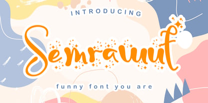 Semrawut is a lovely and timeless handwritten font. It is the best choice for creating eye catching logos, branding and quotes. This font is PUA encoded which means you can access all of the glyphs and swashes with ease!
 - Madisson by Ditatype,
$29.00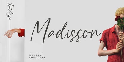 Madisson is a modern signature font. With a classy and natural style, it brings a classy and chic typeface. Madisson best used for weddings, branding, logotype, invitation, and quotes. Features: - Beautiful Ligatures - PUA Encoded - Multilingual Support - Numerals and Punctuation
 - Nadianne by Monotype,
$40.99Aldo Novarese, the famous Italian type designer (ITC Novarese, Eurostile, and many others), designed Nadianne. The elegant, readable Agfa Nadianne looks as good on an invitation as it does on a business letter. Featured in: Best Fonts for Tattoos - Franca by René Bieder,
$29.00 Franca is a neo-grotesk family in nine weights plus matching italics. The inspiration for the design came through the constant interest in new interpretations of the classic grotesk model and a study of "neutral“ typefaces like Helvetica, Univers or Normal Grotesk. During the studies, additional attention was given to the American representatives of the genre, resulting in the initial impetus for a reinterpretation, combining both paths into one contemporary design. This is reflected in the name, blending together the names of the most popular typefaces of each genres, (Fran)klin and Helveti(ca). Due to its large x-height and plain design, the family is perfectly suited for all kinds of text. Its mid-weights are optimized for usage in long paragraphs, while the bolder weights, due to a short descender and ascender, create a compact and confident look in headlines or short copy. In order to create strong and dynamic italics, the oblique glyph shapes come with a faint calligraphic hint, defined by a higher stroke contrast and a steeper connection between stems and arcs in, for example, h n m and u. This is followed by different standard shapes for a and y, supporting the dynamic movement of the lowercase in general. A wide range of OpenType features such as ligatures, old style figures, fractions, case-sensitive shapes and many more, are available for professional and contemporary typesetting. This is completed with eleven alternative glyph sets, enabling a quick customization of the typeface. The family supports up to 92 languages and comes with 500+ glyphs per font.
 - Vala by Monotype,
$29.99 Vala™ dances across printed pages and shines on screen. This is a high-energy design that blends the grace of an English Roundhand script with the gravitas of an extra bold Bodoni. There is even a bit of romance in the design. Vala speaks with a resonant voice – and knows few bounds. The typeface enhances print headlines, subheads, cover art and packaging. The design also brings its distinctive melding of verve and poise to banners, headings, navigational links and branding in web sites, blog posts, games and apps. Oscar Guerrero found inspiration for Vala in shop window lettering near his home in Bogotá, Colombia. “The capital A, R and V caught my attention and I photographed the window for future reference,” he explains. “Later I started to draw more letters inspired by the ones in the window.” Guerrero admits that he has always admired the work of Giambattista Bodoni and allowed his classic Didone designs to infuse Vala. Striking contrast in stroke weights, lively ball-terminals and a large x-height give Vala the grace and force of a Waikiki wave. Not satisfied with just a basic character set, Guerrero also took advantage of OpenType’s capabilities and drew a complete set of swash capitals, a bevy of fancy ligatures, and a suite of lowercase alternative designs. The result is that Vala easily emulates custom lettering in posters, headlines and logotypes. The “romantic” part of Vala? Guerrero dedicated the design to his girlfriend, Valentina, and named it after her.
 - Distinct Style by Set Sail Studios,
$14.00 Get stylish with Distinct Style, a fashionable and contemporary pair of signature & sans fonts designed to perfectly compliment one another. With a fast-flowing script font and a two-weight modern sans serif, the Distinct Style duo offers typographic harmony for your professional design projects, including; logos, branding, magazines, blog posts, social media, advertisements & product designs. Distinct Style includes 4 font files, designed to work as perfect companions or simply as strong standalone typefaces; 1. Distinct Style Script • A classy fast-flowing signature font containing upper & lowercase characters, numerals and a large range of punctuation. 2. Distinct Style Script Alt • This is a second version of Distinct Style Script, with a completely new set of upper & lowercase characters. If you wanted to avoid letters looking the same each time to recreate a custom-made style, or try a different word shape, simply switch to this font for an additional layout option. 3. Distinct Style Sans Light • A stylish, modern sans-serif font containing uppercase only characters, numerals and a large range of punctuation. Creates a perfect pairing contrast with the Disticnt Style Script fonts. 3. Distinct Style Sans Bold • A bolder version of the Distinct Style Sans font. Add some contrast to your text by pairing this with the Sans Light version, or use at smaller sizes. Distinct Style Script contains 64 Ligatures, accessible by turning on 'Discretionary Ligatures' with any software supporting OpenType features. Fonts include multilingual support for; English, French, Italian, Spanish, Portuguese, German, Swedish, Norweigen, Danish, Dutch, Finnish, Indonesian, Filipino, Malay.
 - Ricardo by Bureau Roffa,
$19.00 Rather than confining itself to a single style, Ricardo combines the best of two worlds: the conceptual clarity of a geometric design with the legibility and warmth of a humanist design. Its open counters, crisp joints, and even texture allow for effective use in long-form text settings, while its simple geometric shapes combined with some unexpected details make it highly suitable for display settings such as branding and marketing. Ricardo contains seven carefully chosen weights, ranging from ExtraLight to ExtraBold. The Medium weight functions as a slightly darker alternative to the Regular. Ricardo’s 812 glyphs per style support over a hundred languages, and also include arrows and case-sensitive punctuation. The Ricardo family consists of three subfamilies: Ricardo, Ricardo ALT, and Ricardo ITA. Ricardo contains the most conventional forms, and is the most suitable option for long-form text. Ricardo ALT contains simplified shapes for the a, j, u, and t, which are also accessible through Stylistic Set 2 within Ricardo (in opentype-savvy applications). The cursive-like italics of Ricardo ITA provide a slightly more eccentric alternative to the standard italics. Furthermore, all styles contain stylistic alternates that swap the blunt apexes in A, M, N, V, W, v, w, y, and 1 for pointier ones. These are also accessible through Stylistic Set 1. Other opentype goodness includes: (discretionary) ligatures, smallcaps, case-sensitive forms, fractions, nine sets of numerals, and more. David Ricardo (1772-1823) is considered the first of the classical economists, and combined ground-breaking mathematical abstractions with an understandable down-to-earth way of explaining his ideas.
 - Sport by Bogusky 2,
$40.00The most watched and celebrated sports are A-Z, with the lower case showing the same sports flopped. The numbers 1-0 are an assortment of Olympic sports. - Modern Aesthetic by Nirmana Visual,
$22.00 Modern Aesthetic Inspired by Renaissance Design Era. Modern Aesthetic offers beautiful typographic harmony for a diversity of design projects, including logos & branding, social media posts, advertisements & product designs.
 - Finesolla by Rockboys Studio,
$19.00 Finesolla is a cool brush script font. It’s perfect for creating logos, product branding, posters, social media posts and much more! Ignite your creativity with this fun font.
 - Spooky Bluest by Forberas Club,
$16.00 Introducing Spooky Bluest by Forberas, yet playful but still serious. You can use this as decorative material for your upcoming project. Your review and response are most welcome.
 - Shift Comic by Alma Type,
$19.00 Shift Comic is the usual alternative to many similar typefaces. It’s based on my handwriting. I decided to make a thinner variety than most available on the market.
 - Beijing by Solotype,
$19.95One of the many Solotype experiments in developing fonts with an ethnic flavor, this one is a bit less obvious than most. The lowercase seems to work well. - Retro Brown by Nirmana Visual,
$22.00 Retro Brown, Inspired by 70s Design Era. Retro Brown offers beautiful typographic harmony for a diversity of design projects, including logos & branding, social media posts, advertisements & product designs.
 - Seaside by AndrijType,
$17.50 This contrast grotesque works well in text sizes and in large ones. Here are two sub-families: contrast and most contrast Display. Ideal companion for Osnova type family.
 - Quirky Fashion by Nirmana Visual,
$19.00 Quirky Fashion Quirky Fashion offers beautiful typographic with 2 style : Regular & Italic, harmony for a diversity of design projects, including logos & branding, social media posts, advertisements & product designs.
 - Esport Graph by Nirmana Visual,
$22.00 Introducing Esport Graph Inspired by Esport style, Esport Graph offers Futuristic typographic harmony for a diversity of design projects, including logos & branding, social media posts, advertisements & product designs.
 - Kidspace by Monoco Type,
$18.00 Kidspace is playful style font, with alphabet, numbers, symbol, and multilingual feature. You can use this on kids project, logo, social media post, book cover, and other project.
 - Argaka Fashion by Nirmana Visual,
$24.00 Argaka Fashion, contemporary of Serif Display font, Argaka Fashion offers beautiful typographic harmony for a diversity of design projects, including logos & branding, social media posts, advertisements & product designs.
 - La Signora by Nirmana Visual,
$24.00 La Signora Inspired by Renaissance Design Era. La Signora offers beautiful typographic harmony for a diversity of design projects, including logos & branding, social media posts, advertisements & product designs.
 - La Barokah by Nirmana Visual,
$19.00 La Barokah , Contemporary of Bold Serif Typeface, La Barokah offers beautiful typographic harmony for a diversity of design projects, including logos & branding, social media posts, advertisements & product designs.
 - Duffle Bag JNL by Jeff Levine,
$29.00Duffle Bag JNL continues Jeff Levine's series of stencil fonts. Most are from authentic, vintage sources; this one is an original... and with a sports theme to boot! - Abaddon by Scriptorium,
$18.00Abaddon has been one of our most popular fonts since it was first released in the mid-90s. It's based on lettering by Alphons Mucha with some modernization. - Accent Swiss Cheese - Unknown license

- Novelo by AcidType,
$60.00 Novelo is a 9 weight neo-grotesk typeface family. Featuring; over 800 characters and symbols, including over 100 ligatures, with extended language support, and true italics. The wide selection of alternate characters allows for deep customisation, making the Novelo family a powerful and flexible toolkit for the modern designer.
 - MFC Viper Monogram by Monogram Fonts Co.,
$19.95 The inspiration source for Viper Monogram is the 1934 Book of American Types by American Type Founders. Found in that specimen book, was a sophisticated two-color monogram design called Hollywood Combination Initials, which was available in limited size metal castings. This wonderful monogram style is now digitally recreated, revived, and updated for modern use! Viper Monogram supports one and two letter monograms, but due to its super condensed style works best for three letter monograms. The default typing style for Viper Monogram is an all horizontal all caps setup which can be used for headlines and titling. Type in Capitals for an outline effect, lowercase for a solid effect. By enabling OpenType Contextual Alternates, you can type diagonal top-aligned monograms up to three letters. By typing in all lowercase, and layer a copy of the lowercase with Stylistic Alternates enabled, you can create a two-color effect. Viper Monogram is available in Pro format Opentype fonts only due its unique setup. Download and view the MFC Viper Monogram Guidebook if you would like to learn a little more.
 - Mule Cargo by Menagerie Type,
$20.00 The Mule is a very special mix – it has a donkey father and horse mother, and they often inherit the best qualities of both. "The mule is an example of hybrid vigor, Charles Darwin wrote: The mule always appears to me a most surprising animal. That a hybrid should possess more reason, memory, obstinacy, social affection, powers of muscular endurance, and length of life, than either of its parents, seems to indicate that art has here outdone nature." They are typically very strong for their size compared to horses and are able to cope with bad weather better than donkeys. Mules rarely become ill and their behavior is Intelligent and sensitive. In the right home, they can make great companions for other equines, and wonderful pets. However, if they are unhandled or not correctly trained, mules have the potential to be dangerous. The inner shapes of Mule Cargo are almost identical between the Regular and the Heavy weight. This shared genom make them very powerful pair and a useful design tool for display purposes.
 - Malambo by Sudtipos,
$59.00 The master of the dancing brush, Angel Koziupa, and the node-obsessed perfectionist, Alejandro Paul, offer up another bucket of fun with Malambo. This time Koziupa allows his brush to jitter one whole millimeter, and Paul digitizes with two eyes instead of his usual three. Follow your heart, but consume an ounce of peroxide first. Full of energy and cheeky mischief, Malambo tells the eye amusing stories of mirrorless shaving accidents, wine mistakenly poured over the morning cereal, and someone who trips over his own shadow on the dance floor, yet keeps on dancing. And dancing is what this typeface is all about. Malambo is a traditional Argentine dance performed by the gauchos (the Argentine equivalent of 19th century North American cowboys?). The gauchos are still around in the less than touristic areas of Argentina. And although they dance quite passionately and make the heartiest parrillas, most of them probably don't know what a font is. But you know, and we know. And that's something. Malambo was selected as the Best in show display font at the Biennial Letras Latinas.
 - PB Roman Uncial Vc by Paweł Burgiel,
$32.00 PB Roman Uncial Vc is a font face designed for imitate Roman uncial writing style found in manuscripts from 4th to 5th century. All characters are handwritten by use ink and reed pen (calamus), scanned, digitized and optimized for best quality without lost its handwritten visual appearance. Character set support codepages: 1250 Central (Eastern) European, 1252 Western (ANSI), 1254 Turkish, 1257 Baltic. Include also additional characters for Cornish, Danish, Dutch and Welsh language, spaces (M/1, M/2, M/3, M/4, M/6, thin, hair, zero width space etc.), historical characters (overlined Roman numerals, abbreviations, I-longa, historical ligatures for "nomina sacra" and "notae communes") and wide range of ancient punctuation. OpenType TrueType TTF (.ttf) font file include installed OpenType features: Access All Alternates, Localized Forms, Fractions, Alternative Fractions, Ordinals, Superscript, Tabular Figures, Proportional Figures, Stylistic Alternates, Stylistic Set 1, Historical Forms, Historical Ligatures. Include also kerning as single 'kern' table for maximum possible backwards compatibility with older software. Historical ligatures for "nomina sacra" and "notae communes" are mapped to Private Use Area codepoints.
 - TWIGS 4 kids by TypoGraphicDesign,
$- The typeface TWIGS 4 kids was originally designed for a garden exhibition for children by Daniela Costa, Julia Stanossek, Alexander Branczyk and Manuel Viergutz. 4 font-styles (Einerseits, Andererseits, Invert, Icons) with 495 glyphs (Adobe Latin 1) incl. decorative extras like icons, arrows, dingbats, emojis, symbols, geometric shapes, catchwords, decorative ligatures (type the word #LOVE for ❤ or #SMILE for ☻ as OpenType-Feature dlig) and stylistic alternates (20+ stylistic sets). For use in logos, magazines, posters, advertisement plus as webfont for decorative headlines. The font works best for display size. Have fun with this font & use the DEMO-FONT (with reduced glyph-set) FOR FREE! Font Specifications ■ Font Name: TWIGS 4 kids ■ Font Weights: Einerseits, Andererseits, Invert, Icons + DEMO (with reduced glyph-set) ■ Font Category: Display for headline size ■ Glyph Set: 495 glyphs (Adobe Latin 1) ■ Specials: Decorative extras like arrows → emojis, ornaments, geometric shapes, catchwords, decorative ligatures (type the word #LOVE for ❤ or #SMILE for ☺ as OpenType Feature. dlig) and stylistic alternates (20 stylistic sets) ■ Design Date: 2005–2020 ■ Type Designer: Manuel Viergutz
 - PB Beneventan XIc by Paweł Burgiel,
$32.00 PB Beneventan XIc is a font face designed for imitate Beneventan minuscule (also called Lombardic, Casinense, Langobarda, littera Longobarda, Longobardisca) from southern Italy found in 11th century manuscripts. All characters are handwritten by use ink and pen, scanned, digitized and optimized for best quality without lost its handwritten visual appearance. Character set support codepages: 1250 Central (Eastern) European, 1252 Western (ANSI), 1254 Turkish, 1257 Baltic. Include also additional characters for Cornish, Danish, Dutch and Welsh language, spaces (M/1, M/2, M/3, M/4, M/6, thin, hair, zero width space etc.) and historical characters (mediaeval abbreviations, ligatures, ancient punctuation). OpenType TrueType TTF (.ttf) font file include installed OpenType features: Access All Alternates, Localized Forms, Fractions, Alternative Fractions, Ordinals, Superscript, Tabular Figures, Proportional Figures, Case-Sensitive Forms, Stylistic Alternates, Contextual Alternates, Stylistic Set 1-14, Contextual Ligatures, Historical Ligatures, Standard Ligatures. Include also kerning as single 'kern' table for maximum possible backwards compatibility with older software. Additional glyphs are mapped to Private Use Area codepoints. OpenType features automatically exchange some default glyphs by stylistic alternates and create ligatures for better historical appearance.
 - PB Roman Uncial IIc by Paweł Burgiel,
$32.00 PB Roman Uncial IIc is a font face designed for imitate Roman uncial writing style found in manuscripts from 1st to 2nd century. All characters are handwritten by use ink and reed pen (calamus), scanned, digitized and optimized for best quality without lost its handwritten visual appearance. Character set support codepages: 1250 Central (Eastern) European, 1252 Western (ANSI), 1254 Turkish, 1257 Baltic. Include also additional characters for Cornish, Danish, Dutch and Welsh language, spaces (M/1, M/2, M/3, M/4, M/6, thin, hair, zero width space etc.), historical characters (overlined Roman numerals, I-longa, historical ligatures for "nomina sacra" and "notae communes") and wide range of ancient punctuation. OpenType TrueType TTF (.ttf) font file include installed OpenType features: Access All Alternates, Localized Forms, Fractions, Alternative Fractions, Ordinals, Superscript, Tabular Figures, Proportional Figures, Stylistic Alternates, Stylistic Set 1, Historical Forms, Historical Ligatures. Include also kerning as single 'kern' table for maximum possible backwards compatibility with older software. Historical ligatures for "nomina sacra" and "notae communes" are mapped to Private Use Area codepoints.
 - Yorklyn Stencil by House Industries,
$33.00 Yorklyn Stencil includes three fonts, each optimized for use at different size ranges. Grande has greater contrast and more delicate breaks designed to be used at larger sizes where finer details are more conspicuous. Medium and Petite are intended for smaller sizes where the breaks and contours must be more resilient. We embedded several OpenType layout features, including traditional fractions and nut fractions. We extensively tested Yorklyn Stencil in what might be the broadest range of media and conditions in the annals of Northwestern Delaware typefounding history. From the ceramic kilns of Heath Ceramics to our studio’s stucco facade, Yorklyn Stencil’s robust curves and deceptively delicate breaks will withstand a wide variety of harsh conditions with unprecedented aplomb. Whether you’re hand cutting a stencil to buzz your bespoke restaurant bar stools or simply looking for a practical yet illustrative display font, Yorklyn Stencil’s elegant efficacy will enhance any creative composition. Like all good subversives, House Industries hides in plain sight while amplifying the look, feel and style of the world’s most interesting brands, products and people. Based in Delaware, visually influencing the world.
 - FS Elliot Paneuropean by Fontsmith,
$90.00Rooted Rooted in 1960s Brit modernism and infused with a fresh, contemporary spirit, FS Elliot is a future-proof, workhorse sans serif, well-suited to any assignment. Open and harmonious, its clear, fluid shapes lend words a distinctive and optimistic bounce. Britishness FS Elliot came out of a desire to create something squarely in the British modernist tradition, drawing on influences such as Design Research Unit’s portfolio of type for famous British brands and products, and Margaret Calvert and Jock Kinneir’s work on the British road sign system. Nick Job took the openness and simplicity of that style and injected warmth and wide appeal, coming up with a highly practical, multi-purpose family of faces. Enduring appeal “The great thing about having an eye on the future,” says designer Nick Job, “is that most of it is unknown. It’s what encourages us to take risks. And it leaves an uncertainty which, I believe, gives the best work its enduring appeal.” FS Elliot is available in a Pro version with full language support and a full range of Roman, Cyrillic and Greek weights. - Things by PizzaDude.dk,
$20.00 OMG! I never thought I'd finish this font! Actually, the idea came to me in the late 1990-ies, but the sketches lied at the bottom of the "fonts I will complete one day In the future" pile ... also called "fonts I most likely won't complete...EVER" pile! :) Anyway, I started up with letters for both upper and lowercase, no numbers or punctuation. I figured if people ever purchased this font, all they would need were upper- or lowercase letters. But the rest of the glyphs seemed to miss out, so I made the numbers and some punctuation. But I still found the font incomplete...therefore I redid all the punctuation (from "standard" punctuation to "picturish" punctuation) and added two additional sets of letters. Meaning that there is 4 different versions of letters to choose from: 2 different lowercase, and 2 different lowercase. I had a lot of fun drawing this font, and some fun doing the detective work finding out how the MANY lettershapes should look! I hop you too have fun using this font! :)
 - Steel Grrrder by ULGA Type,
$9.00 Steel Grrrder is a robust, industrial-style stencil typeface family consisting of six weights, from light to black, with corresponding italics. Suitable for all kinds of display purposes including posters, film titles, book covers, magazines, advertising, logos, packaging, signage and games design, Steel Grrrder is especially useful where the message needs some serious geometric bite behind it. Steel Grrrder is best categorised as a constructivist sans family. The character shapes are sharp, angular and slightly condensed - it’s a rigid, no-frills, no-curves, mega-metallic design. Legible? Not really. Readable? I think not. In your faceable? Absolutely! This is a tough display typeface, designed to work in the most demanding typographic situations. It won’t buckle under pressure or wilt when the heat’s turned up. Forged from carbon steel and wrapped in a layer of Graphene, Steel Grrrder is unashamedly rugged, a rock-hard pound-for-pound boxer specialising in thumping knockouts. The Steel Grrrrder extended family also includes a six-weight joining script and two display fonts, Groove & Nutjob - all designed to work with each other.
 - Scribonius GTSLB by Intellecta Design,
$30.00 Blackletter typefaces, also known as Gothic, Fraktur, or Old English, have been used in the headings and initial chapters of books. This style of typeface is recognizable by its dramatic thin and thick strokes, and in some fonts, the elaborate swirls on the serifs. Blackletter typefaces are based on early manuscript lettering and evolved in Western Europe from the mid twelfth century. They are best used for headings, logos, posters, and signs, as they are not easy to read in body texts. Blackletter was type that emulated the most common handwritten scripts of the era and was used for books of hours and initial chapters of books Brazilian type designer Paulo W created this font ideally suited for advertising and packaging, festive occasions, editorial and publishing, logo, branding and creative industries as well as poster and billboards. An elegant and clean typeface, with two harmonic blackletters styles, the bold lowercases with beaufitul ornamented initials. A classic decorative design around an antique theme: The headings of gothic texts, this font works great in display purposes. ENJOY
 - Magnesit Stencil by Rekord,
$22.00 Sporty and brawly, Magnesit Stencil creates impact everywhere it lands. Impressive headlines are its specialty, but it feels right at home used in packaging, branding and poster design. With a very tall x-height, wide language support and minimalistic yet playful appearance, it can take on any serious typographic job. Four distinct styles expand the possibilites even further: the straight to the point Regular, the friendly Soft and the determined Hard styles share metrics across related Magnesit and Magnesit Dark families, so you can mix and match to achieve exactly the effect you need. The SuperSoft style unique to the Magnesit Stencil family carries the concept to the extreme, mixing soft organic curves with rigid modularity inherent to stencil signage. Magnesit Stencil works great with illustrations, the generous shapes can be easily filled with strong imagery to great effect. Based on the best-selling Grim, Magnesit is a vast improvement of the concept with long awaited addition of lowercase, reworked proportions, spacing and kerning, expanded language support and useful icons to satisfy even the most demanding typographers’ needs.
