10,000 search results
(0.061 seconds)
- Bridgetown by Edcreative,
$17.00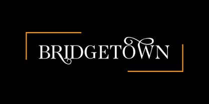 Bridgetown is a beautiful, elegant, clean and stylish font equipped with several additional glyphs so that it is even more attractive to complement your design. This font is perfect for wedding cards, t-shirts, branding logos, posters, mug designs and more
 - Mein Schatz by Font-o-Rama,
$25.00Mein Schatz's (in English: Darling) characteristic feature is the availability of ligatures in the expert set. The font offers – among others – the ligatures sh, sp, st, tz and alternatives for f, l and z. The expert set’s majuscules have curved elements in addition, thus allowing designers to put the typeface to highly individualistic use for displays and logos. Another feature of the font are the two different figure systems. Further to the normal table figures, Mein Schatz also offers old style figures, mainly for use in continuous text. Table figures as well as old style figures are available in all four cuts, i.e. regular, bold, italic and bolditalic. Furthermore designers will enjoy the additional curved ornaments. The curved ornaments and ligatures don’t only add a playful character to the typeface but also hence the name. - Ultras Liberi - Unknown license

- Kirsty - Unknown license

- Alpha by URW Type Foundry,
$39.99 Alpha is a modern Sans Serif design, very elegant and readable but still also economic. Alpha is offered in regular, bold and italic, with the bold italic still in the works. Alpha is strikingly clear and without any flourishes. Its pretty large x-height guarantees excellent readability, and the design is easily recognized.
 - Spectre by Letteralle,
$23.00 Spectre is an allcaps display font. With bold and sharp shapes, this font is able to bring a fierce and bold impression to your designs. Spectre is perfect for editorial projects, Logo design, Music Album, Clothing Branding, product packaging, magazine headers, or simply as a stylish text overlay to any background image.
 - Reborn 190 by Wontenart,
$20.00 is a font from the sans serif family that is bold and bold and has character, an update from the previous “Akira Monoletter” font. This font was made to support the languages of countries that require a dialogue arrangement of letters that have special marks. thus forming this special font. thank you
 - Cathedral Display by Clint English,
$25.00 Cathedral is a display typeface with regular, semi bold, and bold weights with alternate glyphs for select characters. This font comes with bonus vector graphics that accompany the font. The bonus vector graphics have editable stroke weights, so they can match each type weight, or any other need you have in mind.
 - Prosa GT by Gartype Studio,
$20.00 Introducing Prosa GT is a condensed sans serif which has styles from thin to black to make your design more variative and unique. Good for bold branding, titling and headline who has come to be seriously and fun. This typeface can be so serious, fun, and bold it depends on for what purpose.
 - Nugetto by ZetDesign,
$15.00 Nugetto is a font with a groovy theme. This font has bold, pointed, and circular strokes so it looks very bold but still has a lot of flexibility. This font is very suitable for non-formal writing such as party celebrations, Halloween, food, holidays, and is also suitable for writing on logos...
 - Mooncrack by Lemonthe,
$14.00 Mooncrack is a brush-style font with bold, masculine strokes. This typeface captures attention with its thick and bold letterforms, making it an ideal choice for design projects that require a strong visual presence. It is suitable for various design projects such as logos, branding, posters, quotes, packaging design, labels, and much more!
 - Chrone by Genetype,
$21.00 Introducing Throne Serif Typeface: Unleash Masculine Elegance Experience the epitome of masculine sophistication with Throne Serif – a font designed to embody strength and refinement. From commanding headlines to timeless logos, its bold serifs exude confidence. Elevate your designs with a touch of masculine charm – explore Throne Serif and make a bold statement today.
 - Gremlin by Hazztype,
$20.00Gremlin is a modern sans-serif font designed with an extended width for a bold and impactful presence. Its clean and sleek lines contribute to a contemporary aesthetic, making it suitable for a variety of design applications. The bold weight of Gremlin ensures that your message stands out with confidence and authority. - Matroos Arabic by Eraqy TF,
$20.00 Matroos, translated as "Full" in English, is a new bold Arabic typeface created to be used for bold titles. It comes in two weights in a display way to make it legible for contemporary use in various creative projects including branding, headlines and posters. Features 25 bonus stickers in the glyph set.
 - Escato by Sayurihuynh,
$8.00 Escato is a modern sans serif font family with a simple design and a little break-rule, consisting of 5 styles ranging from Regular, Bold, Round, Bold Round, and Outline. Escato is suitable for products with simple but sophisticated and equally creative designs, such as magazine, book look, business card, logo, branding, etc.
 - Rigide by Gerald Gallo,
$20.00 Rigide is a clean, contemporary, geometric, condensed font family. There are 6 fonts in the Rigide family, Rigide Light, Rigide Light Oblique, Rigide Medium, Rigide Medium Oblique, Rigide Bold and Rigid Bold Oblique. The Rigide fonts are ideal for headlines, titles, branding, small blocks of text or wherever a fresh font is desirable.
 - Oxtail by MAC Rhino Fonts,
$36.00 This typeface has its roots in the Egyptienne-family which became popular in the beginning of the 19th Century. To make the family more unique and personal, ”twists” have been crafted throughout the design. All together a family of 6 weights, including: Medium, Medium Italic, Bold, Bold Italic, Black and Black Italic.
 - Besley Clarendon by HiH,
$12.00 Besley Clarendon ML is our version of the Clarendon registered by Robert Besley and the Fann Street Foundry in 1845. Besley Clarendon ML represents a significant change from the slab-serif Antiques & Egyptians that had become so popular in the prior three decades. Like Caslon’s Ionic of 1844, it brackets the serifs and strongly differentiates between the thick and thin strokes. Besley Clarendon is also what today is considered a condensed face, as a comparison to the various contemporary Clarendons will show. Robert Besley’s Clarendon was so popular that many foundries quickly copied it, a fact that caused him to complain vigorously. The reason it was so widely copied is simple ó it was extremely useful. It provided the attention-getting boldness to highlight a word or phrase, yet at the same time was compact and easier to read than the fat faces and antiques of the period. It wasn't until sixty years later that the concept of a typeface family of different weights was developed with DeVinne and Cheltenham. Until then, Clarendon served as everyone’s all-purpose bold face. It can be used for ads, flyers, headers or even short text. Don't leave home without it. Besley Clarendon ML includes the following features: 1. Glyphs for the 1250 Central Europe, the 1252 Turkish and the 1257 Baltic Code Pages. Added glyphs to complete standard 1252 Western Europe Code Page. Special glyphs relocated and assigned Unicode codepoints, some in Private Use area. Total of 353 glyphs. 158 kerning pairs. 2. OpenType GSUB layout features: pnum, salt, liga, dlig, hist and ornm. 3. Inclusion of tabular (std) and proportional (opt) numbers. 4. Kreska-accented letters.
 - Golden Brown by Flawlessandco,
$9.00 Introducing "Golden Brown" - An Elegant Sans Serif Font. Step into a world of refined beauty with "Golden Brown," an elegant sans serif font that not only exudes sophistication but also offers a range of alternate characters and ligatures to elevate your design possibilities. There's some connected letters and some alternates that suitable for any graphic designs such as branding materials, t-shirt, print, business cards, logo, poster, t-shirt, photography, quotes .etc This font support for some multilingual. Also contains uppercase A-Z and lowercase a-z, alternate character, numbers 0-9, and some punctuation. If you need help, just write me! Thanks so much for checking out my shop!
 - IronOn by Fontasmic,
$16.99 The IronOn fonts are a collection of geometric display faces that were inspired by the iron-on t-shirt lettering of the 70s. The original source came from a submitted sample to the MyFonts "What the Font" forums, and while it had similarities to ITC Machine, it could not be tied to any existing typeface. And so, this new geometric sans family was born, exhibiting a more open letterstyle with several weights and widths, with a complete capital and lowercase set, no allcaps set here. Ideal for packaging, T-shirts, advertising, or for industrial applications like signage and newsletter headlines, this powerhouse font family offers a unique rigid flexibility.
 - Montessa by Flawlessandco,
$9.00 Unveil a new era of design with "Montessa," a contemporary alternate script font that seamlessly blends modern aesthetics with a touch of timeless elegance. With its fluid strokes and versatile alternates, Montessa transforms any project into a sophisticated masterpiece. There's some connected letters and some alternates that suitable for any graphic designs such as branding materials, t-shirt, print, business cards, logo, poster, t-shirt, photography, quotes .etc This font support for some multilingual. Also contains uppercase A-Z and lowercase a-z, alternate character, numbers 0-9, and some punctuation. If you need help, just write me! Thanks so much for checking out my shop!
 - Breathing Fresh by sizimon,
$20.00 Breathing Fresh is a handwritten script font. This font is perfect for quotes, branding, ornaments, shirts, mugs, headings, blogs, logos, invitations and more! What's Include : PUA encode & Opentype ( It is full of Tails and glyphs ) Multilingual support Use the fonts for: logos, branding materials, wedding sign, wedding website card, farmhouse signs, sign bridal, shirts, pantry labels, sign bridal shower, business cards, greeting cards, wall decor, social media, planner prints and websites. • This font works with any application Microsoft Word, Adobe Photoshop, Microsoft Paint, Corel, Adobe Illustrator, Cricut Design Space, and many others! If you have any question please do not hesitate to contact me. Thank You!
 - Crayscale by Flawlessandco,
$9.00 Introducing "Crayscale" - a captivating blackletter Victorian font that exudes elegance and timeless charm. Inspired by the ornate lettering styles of the Victorian era, Crayscale is meticulously crafted to bring a touch of vintage sophistication to your designs. There's some connected letters and some alternates that suitable for any graphic designs such as branding materials, t-shirt, print, business cards, logo, poster, t-shirt, photography, quotes .etc This font support for some multilingual. Also contains uppercase A-Z and lowercase a-z, alternate character, numbers 0-9, and some punctuation. If you need help, just write me! Thanks so much for checking out my shop!
 - Floure by Flawlessandco,
$9.00 Introducing "Floure" - a delightful handwritten sans serif font that combines the charm of handwriting with the simplicity of a modern sans serif typeface. With its organic and friendly letterforms, Floure adds a touch of warmth and approachability to your designs. There's some connected letters and some alternates that suitable for any graphic designs such as branding materials, t-shirt, print, business cards, logo, poster, t-shirt, photography, quotes .etc This font support for some multilingual. Also contains uppercase A-Z and lowercase a-z, alternate character, numbers 0-9, and some punctuation. If you need help, just write me! Thanks so much for checking out my shop!
 - Vialog Signs by Linotype,
$29.99The 14 symbol and arrow fonts in Vialog Signs were designed to accompany Vialog, a specially developed font family for the transportation industry and information systems typography. These functional and clever signs harmonize with the Vialog alphabets perfectly and they can also be used on their own or with other fonts. The extensive sets have not only the symbols for common transportation industry requirements, but also symbols for the numerous electronic and sporting devices of modern life. Included are four weights of arrows (to match the weights of the Vialog fonts), Sport Signs, Conduct Signs, Communication Signs, Community Signs, Direction Signs, and Transport Signs. - Ragna by Flawlessandco,
$9.00 Introducing "Ragna" - A Modern Elegant Sans Serif Font. Experience the pinnacle of modern elegance with "Ragna," a sleek and refined sans serif font that not only exudes contemporary sophistication but also offers a rich set of alternatives and ligatures to elevate your design versatility. There's some connected letters and some alternates that suitable for any graphic designs such as branding materials, t-shirt, print, business cards, logo, poster, t-shirt, photography, quotes .etc This font support for some multilingual. Also contains uppercase A-Z and lowercase a-z, alternate character, numbers 0-9, and some punctuation. If you need help, just write me! Thanks so much for checking out my shop!
 - Gamora by Flawlessandco,
$9.00 Introducing "Gamora" - A Modern Elegant Serif Font. Discover the perfect balance of modernity and elegance with "Gamora," a stunning serif font that offers not only refined character but also a wealth of alternatives and ligatures to enhance your design versatility. There's some connected letters and some alternates that suitable for any graphic designs such as branding materials, t-shirt, print, business cards, logo, poster, t-shirt, photography, quotes .etc This font support for some multilingual. Also contains uppercase A-Z and lowercase a-z, alternate character, numbers 0-9, and some punctuation. If you need help, just write me! Thanks so much for checking out my shop!
 - Maove by Flawlessandco,
$9.00 Introducing "Maove" - Modern Elegant Sans Serif Font. Experience the epitome of modern elegance with "Maove" a sophisticated sans serif font that combines contemporary style with a wealth of alternative characters and ligatures to enhance your creative versatility. There's some connected letters and some alternates that suitable for any graphic designs such as branding materials, t-shirt, print, business cards, logo, poster, t-shirt, photography, quotes .etc This font support for some multilingual. Also contains uppercase A-Z and lowercase a-z, alternate character, numbers 0-9, and some punctuation. If you need help, just write me! Thanks so much for checking out my shop!
 - Lightbound by Flawlessandco,
$9.00 Introducing "Lightbond" - an exquisite blackletter Kufic typeface that fuses ancient calligraphic traditions with a contemporary twist. Inspired by the elegance and geometric precision of Kufic script, Lightbond brings a sense of mystique and cultural richness to your designs. There's some connected letters and some alternates that suitable for any graphic designs such as branding materials, t-shirt, print, business cards, logo, poster, t-shirt, photography, quotes .etc This font support for some multilingual. Also contains uppercase A-Z and lowercase a-z, alternate character, numbers 0-9, and some punctuation. If you need help, just write me! Thanks so much for checking out my shop!
 - Starhigh by Flawlessandco,
$9.00 Introducing "Starhigh" - a captivating and beautifully handwritten font that adds a touch of elegance and charm to your designs. With its graceful letterforms and delicate strokes, Starhigh brings a sense of beauty and sophistication to any project. There's some connected letters and some alternates that suitable for any graphic designs such as branding materials, t-shirt, print, business cards, logo, poster, t-shirt, photography, quotes .etc This font support for some multilingual. Also contains uppercase A-Z and lowercase a-z, alternate character, numbers 0-9, and some punctuation. If you need help, just write me! Thanks so much for checking out my shop!
 - Daytona by Monotype,
$50.99 The Daytona™ typeface family grew out of a desire to provide improved fonts for use in televised sporting events. Jim Wasco drew the design as sturdy squared letters based on humanist shapes and proportions. Letters were kept narrow for economy of space, and inter-character spacing was established for easy reading. While televised sporting events may have initially been his target, the design considerations he incorporated into the Daytona family also enabled it to perform well in a variety of other video and on screen environments. Daytona Variables are font files which are featuring two width axes and have a preset instance from Thin to Fat.
 - Goldwyre by Mofr24,
$11.00 Introducing Goldwyre, an extraordinary typeface meticulously crafted to captivate and inspire. With its seamless blend of elements from medieval to modern times, Goldwyre stands out as a truly unique font that embodies the essence of timelessness and elegance. Drawing inspiration from the intricate beauty of Gothic Blackletter and enriched with bold calligraphic strokes, this typeface exudes a mesmerizing charm that effortlessly bridges the gap between the past and the present. What sets Goldwyre apart from other typefaces is its ability to seamlessly combine medieval and modern aesthetics. By skillfully integrating the ornate and elaborate forms of Gothic Blackletter with contemporary design elements, Goldwyre offers a truly captivating typographic experience. This fusion of styles creates a font that is both classic and contemporary, making it an exceptional choice for projects that require a touch of sophistication and versatility. In addition to its captivating design, Goldwyre is available in two weights: regular and bold. The regular weight showcases the delicate intricacies of the typeface, while the bold weight accentuates its bold calligraphic strokes, adding a sense of strength and impact to any design. This versatility allows designers to explore a range of creative possibilities, whether it's designing eye-catching posters, compelling marketing materials, engaging titles, stylish T-shirt designs, or attention-grabbing headlines. Goldwyre is also a highly functional typeface, offering extensive multilingual support to cater to diverse audiences. It features a wide range of characters and diacritical marks, ensuring that it can effectively communicate in various languages and scripts. This broad language coverage expands the possibilities for global projects, making Goldwyre an excellent choice for international brands, publications, and design agencies. When conceptualizing Goldwyre, our design team aimed to create a typeface that harmoniously blends the grandeur of medieval typography with the sleekness of modern design. We wanted to pay homage to the rich history of typography while infusing it with a contemporary twist, resulting in a font that seamlessly integrates into both traditional and modern contexts. The deliberate fusion of styles and the meticulous attention to detail in Goldwyre's creation reflect our passion for typography and our commitment to delivering exceptional design solutions. Goldwyre was born out of a desire to provide designers and creatives with a captivating and stylish typographic solution that effortlessly merges the beauty of the past with the demands of the present. We believe that design is a powerful tool for self-expression, and with Goldwyre, we sought to empower designers to create visually striking and evocative designs that leave a lasting impression. Its timeless appeal and versatile nature make it the perfect choice for those who seek to elevate their projects and make a bold statement. Pairing Goldwyre with related families or other typefaces can further enhance its visual impact. It complements well with minimalist sans-serif fonts, such as Futura or Helvetica, providing a striking contrast between the intricate forms of Goldwyre and the clean lines of the sans-serif typefaces. This combination creates a harmonious balance, allowing designers to play with different aesthetics and create visually dynamic compositions. In conclusion, Goldwyre is more than just a typeface; it's a captivating journey through time. With its seamless blend of medieval and modern elements, extensive multilingual support, and versatile weights, Goldwyre empowers designers to create visually stunning designs across a wide range of applications. Whether you're designing posters, marketing materials, titles, T-shirt designs, or headlines, Goldwyre is the ultimate choice for those seeking to infuse their projects with a touch of timeless elegance and captivating beauty. Experience the magic of Goldwyre and unlock the true potential of your designs.
 - Buddy by Hackberry Font Foundry,
$24.95 Buddy is the new companion sans for Contenu, the book font family designed for my book on font design design. Originally, I called it Compagnon, but that seemed to pompous. Then I called it Aide, but that was too formal and dry. It's a loose, free, easy to read sans, so when my wife suggested Buddy, it clicked. This is the 4-font Buddy family of Regular, Italic, Bold, & Bold Italic. I made a new, more limited feature set for these fonts due to their designed usage, but there are still small caps, small cap figures, oldstyle figures, numerators, and denominators. The bold is closer to a black, and the italics are only slightly slanted obliques. If you need a strong black in caps, use the small caps of the bold.
 - Mistress Benedict Brush by Joanne Marie,
$10.00 Introducing Mistress Benedict Font Duo - a pair of hand brushed fonts attentively designed to work together, helping to produce beautiful typography! This pack of two fonts works so well together and can be used for so many projects, from food packaging to a simple quote that you upload to Instagram. Use them on your t-shirts, mugs, cushions, handmade card designs, anything you like! What do you get? Benedict Font has a neat, handwritten style to it and it's tall ascenders gives that added elegance. With it also being hand brushed Benedict is perfect for all hand lettering typographic designs and works well for short advertising headlines and sub-headers. Benedict has a full set of uppercase and lowercase alternates giving you a different style - it's like two fonts in one! Mistress Benedict Brush includes ligatures, discretionary ligatures and a full set of alternate characters. It also has international character support. Mistress Benedict Caps was hand brushed with the same brush pen and is the perfect companion for Benedict. It's an all caps font where the alternates are actually the lowercase letters. It looks gorgeous on it's own too! Like the brush version, Mistress Benedict also supports international languages. Well, there it is! I really hope that you enjoy using this font duo and please ask if you have any questions. Jo
 - Gandur New by Blackletra,
$50.00 Gandur is a display textura in three weights, split into two families: Alte — the German word for old — and New. Gandur was inspired by other geometric texturas, specially Max Bittrof’s Element (1933). The design began by adhering to a strict hexagonal grid, but during its development, slowly moved from a purely geometric to a more pen-based design (this is especially true in the heaviest weights). The differences between Alte and New are essentially morphological, with reflections in the character set and OpenType features. Gandur New has a more humanistic, contemporary structure and is more ‘romanized’ then Alte. Gandur New also features small capitals. Gandur Alte, on the other hand, remains truer to historical forms, most notably: S s X x Z z. Gandur Alte also features the long-s, which can be accessed via a Stylistic Set or the glyph palette. (As is historically accurate, a short-s will be used at the end of words automatically when the historical Stylistic Set has been activated).
 - Cohort by insigne,
$22.00 Cohort is a strong and crisp geometric sans serif. Cohort uses a rounded rectangle as its central motif. Although the geometric design is minimalistic, Cohort has a variety of unique letterforms that keep the design from being too predictable and maintains a bit of beautiful nuance with plenty of legibility. Cohort's six different weights give it a great deal of versatility, from its sharp and potent black weight to the fresh and razor sharp thin. Cohort can be used for logotypes, headlines or short blocks of text. Cohort includes many useful OpenType features, including a set of upright italic swash alternates, ligatures, small caps, fractions and old style figures, sharper and more unique counterforms and simplified characters for titling. OpenType-capable applications such as the Adobe suite or Quark can take full advantage of automatically replacing ligatures and alternates. This family also includes the glyphs to support a wide range of latin based languages.
 - Gandur Alte by Blackletra,
$50.00 Gandur is a display textura in three weights, split into two families: Alte — the German word for old — and New . Gandur was inspired by other geometric texturas, specially Max Bittrof’s Element (1933). The design began by adhering to a strict hexagonal grid, but during its development, slowly moved from a purely geometric to a more pen-based design (this is especially true in the heaviest weights). The differences between Alte and New are essentially morphological, with reflections in the character set and OpenType features. Gandur New has a more humanistic, contemporary structure and is more ‘romanized’ then Alte. Gandur New also features small capitals. Gandur Alte, on the other hand, remains truer to historical forms, most notably: S s X x Z z. Gandur Alte also features the long-s, which can be accessed via a Stylistic Set or the glyph palette. (As is historically accurate, a short-s will be used at the end of words automatically when the historical Stylistic Set has been activated).
 - Predy by Eurotypo,
$55.00 In the era of digital types, the round handmade cursive continues to intrigue many type designers, probably by their beautiful and graceful calligraphic origins. However, what is certainly true, is that all good traditional pen-formed script may be suitable for a wide range of fine graphic works. The Predy typeface is based on the famous style of the 19th Century: The English handwriting made by pen. It is a connected cursive in the tradition of the “ronde”. This typeface is constructed upon their vigorous ascenders with loops, two times the lengths of the descenders with an extremely short x-high. The uppercase is a classical modern roman typeface (Didona) that are accompanying with a set of accurate flourished capitals as alternates of the calligraphic style. Predy font comes with a set of decorative glyphs including old style figures, terminal letters, ligatures, alternates and swashes. This font will lend elegance and sophistication to a wide variety of design projects like wedding, invitations cards, logotypes, packaging and posters.
 - Halogen Slab by Positype,
$29.00 When I released Halogen, I asked ‘Who doesn't want or need an expansive contemporary extended sans that has a sense of style and swagger… what if it had a lowercase, small caps and various numeral options… how could you say no?’ Go, click on the Halogen link and read on, if you're interested. Halogen was well-received, so I decided to take it further with Halogen Slab (the name kinda tips you off as to what kind of typeface it is, don't ya think?). As always, I prefer not to take short cuts and provide an anemic offering of glyphs — a modern typeface offered today must provide more than just the basics and this one does — lowercase, smallcaps, old style numerals, tabular forms, stylistic and titling alternates, fractions, case-sensitive features, and even an alternate uppercase ordinal set is included. Now go make cool print and digital things with it, and share them with me.
 - Donnerstag by insigne,
$22.00 Donnerstag is an extended slab serif and a new companion to insigne's Montag, Dienstag and Mittwoch typefaces. Donnerstag conveys power and personality with its strong slab letterforms and ball terminals. Donnerstag's seven different weights give it a great deal of versatility, from its beefy and masculine black weight to the delicate and feminine hairline. Because of Donnerstag's width, this typeface is best used for logotypes, headlines or short blocks of text. Donnerstag includes many useful OpenType features, including a set of upright italic swash alternates, ligatures, small caps, fractions and old style figures, alternates for the ball terminals and simplified characters for titling. OpenType-capable applications such as the Adobe suite or Quark can take full advantage of automatically replacing ligatures and alternates. This family also includes the glyphs to support a wide range of latin based languages. For complementary companions, be sure to check out the rest of the typeface super family, also available from insigne.

