10,000 search results
(0.014 seconds)
- Art Topic JNL by Jeff Levine,
$29.00 Art Topic JNL is a round-cornered square sans serif in the Art Deco style, and was modeled from a 1930 WPA (Works Progress Administration) poster for the Federal Arts Project.
 - MS Reference Specialty by Microsoft Corporation,
$29.00MS Reference Specialty is a unique font that was originally developed for inclusion in a Microsoft product. The MS Reference Specialty font is available in TrueType with a custom character set. - Kurly by Bogusky 2,
$34.50I was working on an unrelated job with curls and wondered how I could apply them to a font. Well, here it is, all pair-kerned. A little silly but fun. - Auro by Typogama,
$19.00 Auro is a friendly, rounded sans serif that was created as a contemporary typeface solution for branding, editorial use or any other application that requires legibility with a touch of personality.
 - Eroxion BT by Bitstream,
$50.99Eroxion was designed by Eduardo Manso in 1997. It is a good example of degenerative typographic design, borrowing from techniques first explored in the early 1990s by the designers at Letterror. - Rebeca JY by JY&A,
$39.00JY Rebeca was our first attempt using Fontographer to develop a typeface from scratch. It possesses some experimental characteristics in its design, e.g. the mixture between a transitional and modern typeface. - Cordial by Elemeno,
$25.00Cordial is a solid, friendly font. Like other informal script fonts, Cordial works in nearly any context. This font was originally named Pulpatoon, but the designer's wife made him change it. - Template Basic JNL by Jeff Levine,
$29.00 Template Basic JNL was inspired by a simple sans serif lettering template used in the days of ink and technical pen renderings, and is available in both regular and oblique versions.
 - Dublon by ParaType,
$30.00 The typeface was designed for ParaType (ParaGraph) in 1994 by Oleg Karpinsky basing on his original artwork. A decorative face in Op-Art style. For use in advertising and display typography.
 - Tes by Alien,
$60.00 The Tes family was designed specially for a limited-edition book about Nikola Tesla and Resonance Waves. It needed to be modern and complete for a multilingual version of the book.
 - TRGrunge by Ingrimayne Type,
$9.00 As its name suggests, TRGrunge is a rough, grungy font that is surprisingly readable. Derived in 1997 from a 1989 sans-serif face, it was expanded with additional characters in 2021.
 - Simple Fact by Bogstav,
$10.00 Simple Fact is a family of 4 fonts and 2 sets of drawings. All fonts and drawing was made with the same inky pen, leaving a slightly blurred and rugged look
 - Thanks Valentine by Sakha Design,
$12.00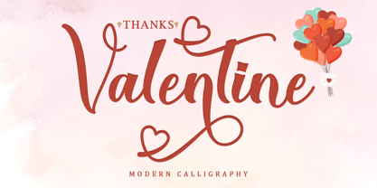 Thanks Valentine is a lovely and delicate script font that exudes elegance and class. This font was particularly crafted for those who need a beautiful and refreshing look to their designs.
 - Designers Gothic by Jonahfonts,
$30.00 Occasionally a designer needs the combination of caps and lower case glyphs for a particular purpose, visually or otherwise. Designer’s Gothic was designed with the Caps equal to the x height.
 - Liliming by Cubo Fonts,
$25.00 That font was designed for Liliming, a famous Shanghainese feminine fashion brand. As the brand itself, it shows a solid background - a former typewriter machine feeling - and a fresh creative touch.
 - Pekora by Typoforge Studio,
$15.00 To design the font Pekora I was inspired by a You And Me Monthly published by National Magazines Publisher RSW Prasa that appeared from May 1960 till December 1973 in Poland.
 - Arsis by URW Type Foundry,
$35.99 Arsis Regular Font was designed by Gerry Powell in 1937. It is a Serif (Antiqua) Modern Style font. Arsis Regular font attributes include roman serif, Didone, elegant, formal, modern style, feminine.
 - Catalistefa Signature by Letterena Studios,
$9.00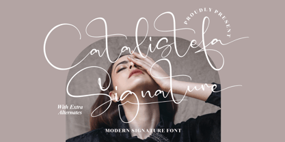 Catalistefa Signature is a lovely and delicate script font that exudes elegance and class. This font was particularly crafted for those who need a beautiful and refreshing look to their designs.
 - File Clerk JNL by Jeff Levine,
$29.00 File Clerk JNL was based on Cushing, a typeface found within the pages of the 1901-02 Pettingill & Co. (Boston) specimen book, and is available in both regular and oblique versions.
 - Verena by Autographis,
$39.50 Verena was written with a common felt marker pen, scanned and worked over, to keep just the right amount of roughness. The result is a very readable and usable handwritten font.
 - Bandoeng by HRDR,
$19.00 Bandoeng was inspired by the cover of the 1920 Nebiolo book. It is perfect for product logo, signage, branding projects, headlines, posters, packaging, clothing brand logos, Vintage design and much more.
 - Timelord by Comicraft,
$19.00 VWORP! VWORP! This font will travel through the four dimensions of time and space to materialise on your hard drive. TIMELORD was created for Telos publishing's line of DOCTOR WHO novellas.
 - Planta by Monotype,
$25.00 Planta is a bold sans serif with inverted contrast. It was inspired by brutalist architecture. One weight only, 4 widths and more than 350 glyphs. Planta supports most latin based languages.
 - Christy Marie by Elemeno,
$25.00Christy Marie likes fun fonts. This was the first font to meet with her approval. It's bouncy, teenage girl sort of font and would do well at parties or the mall. - Blue Orchid JNL by Jeff Levine,
$29.00 A piece of 1940s sheet music for the song "Blue Orchids" was the inspiration for both the type design (based on the hand lettered title) as well as the font's name.
 - Cloister by URW Type Foundry,
$35.99 Cloister was designed in 1914 by Morris F. Benton. The characters of the Cloister font family have a small body and are suitable for texts where economy of space is desired.
 - Grande Parade JNL by Jeff Levine,
$29.00Grande Parade JNL is a decorative version of Winnetka JNL, which was based on antique wood type. The look and feel of this design combines old-time typography and festive charm. - Chendany by WNGSTD,
$10.00 Chendany is a friendly, neat, and cute-looking handwritten font. Not too thin and not too thick, balanced and varied, this font was designed to enhance the beauty of your projects.
 - Flax JY by JY&A,
$39.00David Philpott was inspired by the flax growing on the side of the motorway out of Wellington, New Zealand, and crafted this very distinctive, natural typeface family based on the plants. - Moving Van JNL by Jeff Levine,
$29.00Moving Van JNL is a classic sign painter's block Roman with angled [instead of rounded] corners and slab serifs. This style of lettering was most popular in the 1920s and 1930s. - Christmas Preference by Seemly Fonts,
$12.00 Christmas Preference is a clean, simple, and natural handwritten font. Not too thin and not too thick, balanced and varied, this font was designed to enhance the beauty of your projects.
 - Camden Queen by Asterisk,
$33.00 The font design is inspired by the long autumn evenings in London. Those "fast brown foxes" ran along the streets. Camden smelled delicious. And she was as beautiful as a queen.
 - Duesenberg by Zang-O-Fonts,
$25.00Duesenberg was designed to be similar to turn of the century fonts used primarily in newspapers. It has roman characteristics, yet is clearly not, and really doesn't fall under any category. - Blackletter Moderne JNL by Jeff Levine,
$29.00 Blackletter Moderne JNL was inspired by the original 1935 pencil drafts for “Deutsche Schrift” (German script); designed for the country’s railway system – and is available in both regular and oblique versions.
 - Marin by URW Type Foundry,
$39.99 Marin, a name that is associated with water and ships, looks very confident and follows the ideas of Eurostile, but in a stencil design. Marin was designed for the URW++ FontForum.
 - Ermin Sweet love by Four Lines Std,
$9.00 Ermin Sweet is a lovely and delicate script font that exudes elegance and class. This font was particularly crafted for those who need a beautiful and refreshing look to their designs.
 - Clarendon Paint by Open Window,
$19.95 Clarendon Paint offers a gritty twist on a classic font style (Clarendon). It was completely hand painted which makes the font an organic centerpiece to any of your grungy design applications.
 - Enchanted Land - Personal use only

- Heller Sans JNL by Jeff Levine,
$29.00 Heller Sans JNL is based on the main letterforms of an experimental alphabet designed by Steven Heller; noted author of over 170 books on design and visual culture. Some modifications were made in turning his design into a digital font. In his own words, here is the background to this typeface: “I recently recovered this from the junk heap. It is a yellowing photostat of my first and only typeface design (1969-70). Total folly! At the time I was smitten by Art Moderne lettering. I called it “Klaus Boobala Bold” because I liked the K and B. I’ve lost the letters S through Z, which were made. The letters were drawn with compass, Techno pen (that frequently clogged). as well as a triangle and T-square. The inline and outline made no real logical sense. I based the design, in part, on Kabel, Avant Garde and it was a product of whatever I could accomplish with those tools. The caps-only alphabet was photographed and produced as a film negative that was cut in foot-long strips and spliced to fit on a Typositor reel. Sadly, the negatives made for the font were too brittle and the splice snapped apart in the Typositor. I worked on it for well over a month and used the face only once. I realized with this attempt, like so many other times I attempted different challenges, that type design — indeed mechanical drawing — was not my strong suit.” Heller Sans JNL is available in both regular and oblique versions.
 - C-Nation by URW Type Foundry,
$39.99 Marit Otto about C-Nation: The building typeface. Although the 70ties were very liberating and progressive, still girls played mainly with dolls and sweet things and boys with all kinds of challenging stuff. They did all sorts of basic scientific experiments in mini labs and of course built cool things with Meccano building sets. As a girl I was perfectly happy with the toys I had access to. But at the same time I was very curious about all the adventure toys and discoveries my brother did. It also made me wonder why the grown up people thought that our world could be separated so easily by separating our toys in pink and blue sections. At this day of age Meccano is probably hopelessly old fashioned and far to manual. Children of today are fed by fast images and cool animations on screen, they learn, play, communicate and relax in the same space, the digital space. The special feature of Meccano was that even though it was very basic there was the promise you could create anything. It might even contribute to a logical mind. The typeface I designed refers to the Meccano feel. It is a creative typeface. A bit masculine and bold looking perhaps but after the first impression a subtle and refined female touch is revealed. It has links to architecture and associations with metal constructions like ‘The Eiffel Tower’ and (old railway) bridges. I am convinced that we all think of that as very charming man-made objects.
