6,556 search results
(0.015 seconds)
- The Julayna by Reyrey Blue Std,
$19.00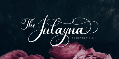 Introduce - The Julayna a luxurious wedding calligraphy font. It will add a luxury spark to any design project that you wish to create! The Julayna script font can be used for your next design, such as wedding invitations and wedding suites, stationery, packaging, feminine branding, logos, quotes, and prints. Includes: Uppercase and Lowercase, numbers, symbols, and punctuation Stylistic Alternate Ligatures Multilingual Characters
 - Uncle Sam Slim NF by Nick's Fonts,
$10.00Based on Morris Fuller Benton's 1905 oeuvre American Extra Condensed, this titling face packs a lot of information into very little horizontal space. Its champfered corners give the font an industrial feel which remains fresh even after more than a century. Both versions include the complete Latin 1252, Central European 1250 and Turkish 1254 character sets, with localization for Lithuanian, Moldovan and Romanian. - Vallely by Fontdation,
$15.00 Vallely is a classic art-deco-ish serif that are inspired by the old typography/letterings used in packaging labels and advertisements. This font is loaded with 350+ glyphs, packed with lots of alternate characters, gives you various letter combinations to play with. If you're a fan of classic and art-decoish typography, make sure you add this font to your design toolbox.
 - Jampact NF by Nick's Fonts,
$10.00A little Compacta, a little Impact, a little photolettering from the 70s, all rolled into one make for a unique headline face that commands attention. Although this font is primarily unicase, the lowercase positions feature stylistic alternates, so can can mix things up and pack them in. Both versions of the font include 1252 Latin, 1250 CE (with localization for Romanian and Moldovan). - Synopsis by Vasava Fonts,
$45.00 Synopsis draws inspiration on the classic proportions and letterforms of old romans. In addition to this a new modern twist has been infused to it, giving it a dimensional double stroke or virtual inline that makes the round parts twist in and out. Specially gorgeous in big sizes it brings the best from the past merging it with new ideas.
 - Matita Connected by Trine Rask,
$12.00 Warning: works with contextual alternate-feature, which is not showing here. Matita Connected is part of a larger type family developed from 2005-2019 with handwriting in mind. A solid script face in two weights and a dotted instructional version. With alternative glyphs based on different writing habits. For teaching, teaching material or just typography. An unchildish handwritten type family for many purposes.
 - Anerome by Azzam Ridhamalik,
$10.00 Introducing Anerome, a vintage display typeface contains a set of 3 style fonts with an authentic vintage look. Anerome comes packed with over 300 glyphs containing stylistic alternates and discretionary ligature characters. This font is perfect for people are looking for vintage aesthetic or logotype. Suitable for any graphic designs such as branding materials, print, business cards, logo, poster, t-shirt, quotes .etc.
 - Pigeon Script by Denis Petrov,
$20.00 The modern incidental, decorative and poster font that imitates the modern household handwriting or handwriting with a capillary or gel pen and rapidograph. There are letters of the Russian and Latin alphabets in upper and lowercase with alternative outlines and ligatures, numbers from 0 to 9, simple fractions, mathematical and punctuation marks, different types of quotes and brackets in the set of characters.
 - Loudine by PintassilgoPrints,
$19.00 Loudine is a striking decorative display typeface, great for posters, book covers and magazine headlines. It comes in two widths, each of them packed with a set of stylistic alternates: just turn on the feature in an OpenType savvy program to instantly get into a new mood, with filled counters and slightly different lettershapes. Be sure to play it loud!
 - Al Mahdis by Mightyfire,
$15.00 We're proudly introduce Al Mahdis, the arabic-style font. Starting from the idea of making an Arabic font that remains clean and easy to read, Al Mahdis was born. This font is very suitable for writing calligraphy, book titles, or even your business logo. We're honored and hope the Al Mahdis font can be part of your special work. Thank You :)
 - Williesh by Almarkha Type,
$25.00 Introducing Williesh - Unique font that uses ligatures to smoothly link letters. inspired by the famous minimalist logo, perfect for the purposes of designing templates, brochures, videos, advertising branding, logos and more. Perfect for adding a unique twist to word-mark logos, monograms or pull quotes. Kavaloora has 18 unique ligatures and Alternate Glyphs as well as numbers and punctuation making it super fantastic.
 - Pebl by Formation Type Foundry,
$25.00 Pebl is inspired by the naturally simplified and smoothed shapes of beach pebbles. The result is a bold, super-rounded display typeface. It's pared back to just the most basic, smooth outlines without counters, for a friendly and organic look. It’s ideal for logos, branding, headlines or just abstract type shapes in print, in displays, on the web, on T-shirts, wherever. Enjoy.
 - Brookside JNL by Jeff Levine,
$29.00 The 1920s were part of an era in songwriting where snappy wordplay and clever (if not long) titles prevailed. The lettering on one such piece of sheet music with the song title "In A Shady Nook by A Babbling Brook" offered up a bold, condensed sans serif design which is now available digitally as Brookside JNL. Available in both regular and oblique versions.
 - MPI Circle Sans by mpressInteractive,
$5.00 Circle Sans is one of the most unique wood type font designs we"™ve found. It was made in Europe and our cut measures just 3 picas. Letters are a basic, rounded gothic with a medium amount of stroke contrast. This font is easy to read and packs a special punch dropped out from the negative space of a circle.
 - Silent Death by Senekaligrafika,
$12.00 "Silent Death" Has hard strokes and a signature styles that speak to instant nightmare sensations,it was inspired by horror and thriller movie posters from the old era. "Silent Death" will help you to create special and touching typographical design for your horror and dark projects, for .branding, labeling, clothing, movie title, album cover, logos and many more. The owner of endless possibilities!
 - Meggie by Youngtype,
$15.00 Meggie Handwritten Font With Fun Extra . Contains a complete set of lowercase, uppercase, alternative, ligatures, punctuation marks, numbers and multilingual support. This font is ideal for use in watercolor designs or hand bold styles, such as blog headers, posters, wedding elements, t-shirts, clothing, book covers, business cards, greeting cards, branding, merchandise, invitations and handmade quotes and more. again. again. Thank you :)
 - Mileadila by Letterara,
$14.00 Mileadila is a sweet and simple display font that is perfect for adding a romantic charm to your next Valentine's day project and that will turn any design project into a true standout. We also made many stunning clip-art which is packed in extras, so you can create many designs for your projects. Get inspired by Mileadila's unique look for your valentine.
 - Monem by Wiescher Design,
$39.50 Monem is the word for the smallest significance-carrying part of a language. I thought that was a good name for a clean, straightforward Sans typeface. Monem is very sturdy and usable for lots of occasions. I am using this font myself for those of my clients that want to convey a clean unobtrusive image. Your very restrained Gert Wiescher
 - Microphone Check by IKIIKOWRK,
$19.00 Proudly present Microphone Check - Marker Type, created by ikiiko Microphone Check is inspired by the bold and expressive signature strokes of the 90s street hip hop movement. In that era, freestyle marking was a method of self-expression that was closely associated with the underground graffiti scene. This typeface perfectly encapsulates the vitality, attitude and resilience of life on the streets. Sharp lines with bold, bold bodies characterize this type of marker, allowing for substantial fills and bright colors to stand out on any surface. It gave them the opportunity to express their originality and creativity while leaving their mark on the urban environment. This type is very suitable for making a street wear brand, book cover, movie title, magazine layout, poster, quotes, or simply as a stylish text overlay to any background image. What's Included? Uppercase & Lowercase Numbers & Punctuation Alternates & Ligature Multilingual Support Works on PC & Mac
 - FranklinGothicHandLight by Wiescher Design,
$39.50 FranklinGothicHandLight is part of a series of hand-drawn fonts from way back in time – before computers changed the way we worked. When I was in advertising – before computers – a very time consuming part of my daily work was sketching headlines. I used to be able to sketch headlines in Franklin Gothic, Times, Futura, Helvetica and several scripts. We had a kind of huge inverted camera – which we called Lucy. We projected the alphabet onto a sheet of transparent paper, outlined the letters with a fineliner and then filled them in. It was very tedious work, but the resulting headline had its own charm and we had a permanent race going on who was best and fastest. I won most of the time! They used to call me the fastest "Magic Marker" this side of the Atlantic. Great days, just like today! Your sentimental type designer from the past Gert Wiescher
 - FranklinGothicHandDemi by Wiescher Design,
$39.50 FranklinGothicHandDemi is part of a series of hand-drawn fonts from way back in time – before computers changed the way we worked. When I was in advertising – before computers – a very time consuming part of my daily work was sketching headlines. I used to be able to sketch headlines in Franklin Gothic, Times, Futura, Helvetica and several scripts. We had a kind of huge inverted camera – which we called Lucy. We projected the alphabet onto a sheet of transparent paper, outlined the letters with a fineliner and then filled them in. It was very tedious work, but the resulting headline had its own charm and we had a permanent race going on who was best and fastest. I won most of the time! They used to call me the fastest "Magic Marker" this side of the Atlantic. Great days, just like today! Your sentimental type designer from the past Gert Wiescher
 - Museum Ornaments by T4 Foundry,
$7.00Museum Borders and Ornaments is part of a typographical treasure, the Norstedts type collection in Sweden. Type designer Torbjörn Olsson has painstakingly translated the original 34 Ornament matrices in the collection to Open Type. Among them are several of Granjon's arabesques, as well as symbols from both Swedish and Danish typefoundries. The signs were cut in the 16th, 17th and 18th centuries. The old Swedish name for these "type trademarks" were "rössjor". Museum Borders and Ornaments is an OpenType creation, for both PC and Mac. Swedish type foundry T4 premiere new fonts every month. Museum Borders and Ornaments is our tenth introduction. Museum Borders and Ornaments is part of the growing Museum type family. Museum also includes Museum Tertia Cursive, an exquisite 1700's typeface with modern additions, and Museum Fournier, a set of Rococo capitals designed by Pierre Simon Fournier le Jeune circa 1760. - HS Alhuda by Hiba Studio,
$50.00 HS Alhuda is a display typeface. It can be used for titles and graphic projects, which support Arabic, Persian Urdu and Kurdish. It has been created based on modern kufi style. It enjoys flexibility between sharp and curved lines in the structure of characters. This supports with a beautiful appearance and wonderful geometric structure. The sharp endings in the bottom of character also give an aesthetic addition to the character. (8) Weights has been created for this typeface between the heariline weight and heavy weight. Besides, those six additional weights which can be used in headline, has baseline parts are more thicker than the vertical parts. One has a regular form and the others has a stencil form in the middle using various styles. This typeface with its diversity of (14) weights is intended to be an attempt for a good addition to Arabic typography.
 - Antoinette Monogrammes by Dharma Type,
$19.99 Antoinette Monogrammes is a monogram font based on old embroideries in the early 20th century by Janon Co. This font includes Upright script capitals and Normal slanted script capitals and 24 fancy frames. By combining each letters and frames, you can make your own monogram. And Every letters and frames were added handwritten effect to make warm and handcrafted impression. How about making monogram for wedding card, scrap book, stamp, logo? Upright script capitals can be accessed by typing Uppercase keys(A, B, C ....) and Slanted script capitals by lowercase key(a, b, c ...). Frames are 0-9 and exclamation mark(!), at mark(@), number sign(#), dollar($), percent(%), ascii circumflex(^), ampersand(&), asterisk(*), left and right brackets(()), period(.), comma(,), less and greater(). You need to arrange and set the position manually to finish making monograms. Please use graphic applications such as adobe illustrator or photoshop but not microsoft word.
 - Steam by Type Forward,
$- Steam combines the spirit of the old-fashioned wood type with modern flavours. Its distinctive reversed high contrast and extremely bold serifs make it impossible to stay unnoticed. It’s a fun and bold unconventional typeface that we’ve designed with great passion and curiosity! The type family consists of 13 weights that are divided into several packs. Each font in the pack can be layered on top of each other to make a funkier look. Steam is multilingual! It speaks more than 130 languages and supports extended Latin, Cyrillic, punctuation, default and small numbers, symbols and signs. It is also familiar with the OpenType features like standard and discretionary ligatures, stylistic sets, localized forms, small numbers and fractions and more. Steam looks best on logos, posters, headlines, and T-shirts and is perfect anytime you need some bold letters with specific flavour and touch. Have fun creating!
 - Museum Fournier by T4 Foundry,
$16.00Museum Fournier is inspired by a set of Rococo capitals designed by Pierre Simon Fournier le Jeune circa 1760. The matrices are part of a set imported to Sweden by J.P. Lindh in 1818 from Breitkopf & Härtel in Leipzig, Germany. They are now in the Nordiska Museum in Stockholm. Type designer Torbjörn Olsson has expanded the original 31 lead matrices in the collection to 55 characters. Please note that the font contains capitals only, no lower case letters and no figures either. Museum Fournier is an OpenType creation, for both PC and Mac. Swedish type foundry T4 premiere new fonts every month. Museum Fournier is our ninth introduction. Museum Fournier is part of the growing Museum type family. Museum also includes three different border fonts, an ornament font with some of Granjon's arabesques and Museum Tertia Cursive, an exquisite 1700's typeface with modern additions. - Acarau Display by Tipogra Fio,
$30.00 Acarau is a 6 fonts display typeface with high reverse contrast—since from Roman capitals and calligraphy, usually Latin alphabet letters have thiner horizontal steams and thicker verticals, these features being optical or visual—quite adequate for logos, headlines and posters. Moreover, the style of the typeface is inspired by Italics form factor: lowercase letters having less strokes to make their shapes; A has one story; E has one stroke shape, such as K, G, Y and Z; F has a descent. To give it more calligraphic feeling, there is contrast for uppercases as well, this is very perceived by the diagonal letters like A, K, M, N, V, W, X, Y and Z. J also has a descent. Q and R have natural swashes, but they have alternates in case the costumer want to go for more usual forms—including accent marked letters. Acarau is a 12 months project, the contrast for uppercases were increasing as the process was made. In the middle it is found suitable blend the letter shapes with the history of Brazilian music from the 70’s and 80’s, since the font has a tropical, warm, spicy and nostalgic feeling. Songs from bands and singers that emerged on Rio de Janeiro like Paralamas do Sucesso, Cazuza, Lulu Santos and Kid Abelha bring the beach accent and rhythm that this font has. OpenType features complement the set, which has Multi-Lingual support for a comprehensive Latin set, including Vietnamese—meaning more than 640 glyphs: Case-Sensitive forms, so symbols can properly align to uppercase letters; Ligatures, to better reading for z_y and L_I, and style for s_s, w_w_w; also for ease arrows and punctuation typing; Stylistic Set 1: two story a—including accent marked letters; Stylistic Set 2: two story g—including accent marked letters; Stylistic Set 3: diagonal (usual) z—including accent marked letters; Stylistic Set 4: flower i and j dots; Contextual alternates; Terminal forms, for R and Q; Ordinals.
 - Amor Serif by Storm Type Foundry,
$55.00Antique monumental incriptional majuscule, originally carved in stone, and sometimes called “Roman Capital”, is the origin of the upper-case part of our latin alphabet. Its narrowed form, derived from handwritten originals used between the first to third century A. D., served as the inspiration for the Mramor typeface, which I drew with ink on paper in 1988 under Jan Solpera’s leadership. After composing negative letters on a strip of film it was possible to use Mramor with the early phototypesetting devices. In 1994 with the help of Macintosh IIvi I added the lowercase letters and bolds, and issued this typeface as 14-font family. After some years of using Mramor for various purposes, I realized a need of modernization and humanizing its very fragile appearance, as well as removing numerous decorative and useless parts. Besides that, type design made a huge technical progress in past few years, so I was able to finish the remaining approximately 9600 glyphs contained in the present font system named Amor. It is already usual to combine sans and serif fonts within one family in order to distinguish (e. g. in a book) historical part from contemporary, a plain chapter from a special one, or, in quotations, to divide speaking persons. Sans-serif typefaces don't arise by simple removal of serifs; they have to be drawn completely separately, when occasionally many declined forms may be made, considered to the serifed original. Nevertheless, both parts of this type system appear consistent as for proportional, aesthetic and emotional atmosphere. Usage of type is often closely linked to its original inspiration, in this particular case with architecture and figurative sculpture. An inner “order” was also text setting in smaller sizes. A smooth scale of weights enriches the possibilities in designing of magazines, brochures, exposition catalogues and corporate identity. Economizing, but opened shape of characters is well legible and antique hint comes into play after longer reading. - Deco Wide JNL by Jeff Levine,
$29.00 A unique and stylized type design with Art Deco influence was found within the French publication “Modèles de lettres modernes par Georges Léculier” (“Models of Modern Letters by Léculier”). This lettering is now digitally available as Deco Wide JNL in both regular and oblique versions.
 - Camper by Fenotype,
$35.00 Camper is an original font collection of sixteen display fonts and extras. Camper’s core is a low-contrast connected script with three weights. In addition there are Sans, Serif and Slab fonts. All Camper fonts have a coherent style of solid forms with soft edges. They all play well together but work as themselves too. Camper’s Print is the same family with rugged “printed” edges and print texture. Camper Script is packed with several OpenType features: Contextual Alternates and Standard Ligatures help to maintain smooth flow while typing and they’re normally on. If you need more flashy characters try Swash, Stylistic or Titling Alternates or seek for even more Alternates from the Glyph Palette. Camper Script is PUA encoded and you can access extra characters in most graphic design softwares even without OpenType support. From Discretionary Ligatures you will find several flashier ligatures and a set of Catchwords: Access them by typing “The”, “And” or “With” with Discretionary Ligatures turned on. Camper Extras is a pack of strokes and swashes designed to go with the script. Many strokes can also be directly combined with a letter to make a custom “swash letter”. Check out posters for more inspiration. All Camper’s fonts have a wide language support — even Cyrillic. Camper is a recognizable and sturdy display pack with smooth and friendly outfit. It’s great for any display project from posters to identities and from online to print.
 - Sublime by Coniglio Type,
$19.95 Sublime45-Regular Sublime Revised for 2021. One font in Opentype format as Sublime45. Families and all TT Truetype versions eliminated in this wonderful stand alone. The Spring 1997 original release of Sublime —borne an organic creature of black water soluble ink & digitized by Coniglio Type. Sublime is a fun font to use in commercial layouts. It is soft and fluid as ink. Like the wrinkles of time, it is imperfect. That in itself makes it incredibly attractive, warm and “human factor”. Sublime offers legibility so sorely missed in the current recreational font market. Sublime was inspired by World War II US fighter pilot Donald Alling. He flew missions over Nazi Germany. His squadron also dropped food, medicine and relief supplies over the Netherlands. Known as “the Colonel” to his friends. Don as a civic engineer ruled literally miles of ink letter callout’s with a template device called a LeRoy in peacetime on vellum and mylar across his career as a technical illustrator. You didn't want to screw up inking into a template with wet black permanent ink. You really had to have a steady hand and it was all done by hand. You can say Don worked “unplugged”. And that is cool! He was part of the broad stroke of postwar industrial expansion that helped keep America strong, rendering exploded views on top secret projects. Many of us were not even born yet when all this was going on. Today at over 80 years young Don is like a national treasure, savvy and bright—and the ladies love him! The Colonel remains a dedicated master airbrush man, stand–up man, caricature artist and letterman all without use of a computer! He was lucky enough to retire before a desktop cathode tube was put in his face. Today the Colonel enjoys restoring VW’s, flying and freelance consulting when not being called to supper by his lovely wife Rea.
 - Palatino Nova Paneuropean by Linotype,
$67.99Palatino® Nova is Prof. Hermann Zapf's redesign of his own masterpiece, Palatino. The original Palatino was cut in metal by August Rosenberger at D. Stempel AG typefoundry in Frankfurt, and released in 1950. Palatino was later adapted for mechanical composition on the Linotype machine, and became one of the most-used typefaces of the 20th Century. Palatino was designed for legibility, and has open counters and carefully weighted strokes. The type was named after Giambattista Palatino, a master of calligraphy from the time of Leonardo da Vinci. Palatino is a typeface based on classical Italian Renaissance forms. A modern classic in its own right, Palatino is popular among professional graphic designers and amateurs alike, working well for both text and display typography. Hermann Zapf and Akira Kobayashi redeveloped Palatino for the 21st Century, creating Palatino Nova. Released by Linotype in 2005, the Palatino Nova family is part of Linotype's Platinum Collection. Palatino Nova includes several weights (Light, Regular, Medium, and Bold), each with companion italics. Four styles (Regular, Italic, Bold, and Bold Italic) have Greek and Cyrillic glyphs built into their character sets. The Palatino Nova family also includes revised versions of Aldus (now called Aldus Nova), as well as two titling weights. The first titling weight, Palatino Nova Titling, is based on Hermann Zapf's metal typeface Michelangelo, including Greek glyphs from Phidias Greek. The heavier titling weight, Palatino Nova Imperial, is based on Sistina. The fonts in the Palatino Nova family support all 48 Western, Central, and Eastern European languages. Additional features: ligatures and historical ligatures, Small Caps, ornaments, and a range of numerals (proportional & tabular width lining and Old style Figures, fractions, inferiors, and superiors)." - Palatino Nova by Linotype,
$50.99 Palatino® Nova is Prof. Hermann Zapf's redesign of his own masterpiece, Palatino. The original Palatino was cut in metal by August Rosenberger at D. Stempel AG typefoundry in Frankfurt, and released in 1950. Palatino was later adapted for mechanical composition on the Linotype machine, and became one of the most-used typefaces of the 20th Century. Palatino was designed for legibility, and has open counters and carefully weighted strokes. The type was named after Giambattista Palatino, a master of calligraphy from the time of Leonardo da Vinci. Palatino is a typeface based on classical Italian Renaissance forms. A modern classic in its own right, Palatino is popular among professional graphic designers and amateurs alike, working well for both text and display typography. Hermann Zapf and Akira Kobayashi redeveloped Palatino for the 21st Century, creating Palatino Nova. Released by Linotype in 2005, the Palatino Nova family is part of Linotype's Platinum Collection. Palatino Nova includes several weights (Light, Regular, Medium, and Bold), each with companion italics. Four styles (Regular, Italic, Bold, and Bold Italic) have Greek and Cyrillic glyphs built into their character sets. The Palatino Nova family also includes revised versions of Aldus (now called Aldus Nova), as well as two titling weights. The first titling weight, Palatino Nova Titling, is based on Hermann Zapf's metal typeface Michelangelo, including Greek glyphs from Phidias Greek. The heavier titling weight, Palatino Nova Imperial, is based on Sistina. The fonts in the Palatino Nova family support all 48 Western, Central, and Eastern European languages. Additional features: ligatures and historical ligatures, Small Caps, ornaments, and a range of numerals (proportional & tabular width lining and Old style Figures, fractions, inferiors, and superiors)."
 - IMAN RG by LGF Fonts,
$10.00 This type of Richard Gans, has always seemed very striking, despite having the complexity of the sources extrusion, has its own personality, and readability unusual for this type of letters. Use it for composing posters, programs or logos was very common at the time. My father, Antonio Lage Parapar, typographer by profession, who composed the texts, which not only had it for profession, but he liked to do, always he spoke of sources and decorative elements of the type foundry Richard Gans, as well as other foundries, especially those that required the mender of them, exercised creator, many of these types they have already been recovered by professionals and companies with excellent results. I've been surrounded by these movable type, and the occasional catalog unfortunately lost. One of those guys that has always struck me visually speaking was the type IMAN Richard Gans, the typographer and more of German origin arrived in Spain, back in 1874, also a pioneer. This work to revive the type mentioned, as well as create non existing glyphs between documents and parts I've been finding, is and has been a personal pleasure all I want serve as a tribute to my father (of aopodo curiously "Richard"), the only sadness it has not been completed. Richard Gans, arrived in Spain in 1874 as a representative of several European factories. then liaised with journalistic and publishing companies, which led him knowledge required of the first sector art. In 1878 he created a center importer gadgets graphic arts and three years later he created his own type foundry. The first rotary newspaper ABC, very famous and the most advanced of the time, the brand manufactured Richard Gans.
 - Deadfall by Mofr24,
$11.00 Discover Deadfall, the ultimate horror display font that will send shivers down your spine! What sets Deadfall apart is its unique blend of fear-inducing aesthetics and multilingual capabilities. This Monospace typeface exudes a captivating dripped and splash style, adding an extra layer of terror to your designs. Notably, Deadfall supports the Cyrillic alphabet, making it an ideal choice for a global audience. Deadfall offers both regular and italic variations, granting you even more creative possibilities. Whether you're designing posters, crafting marketing materials, conjuring chilling movie titles, creating Death metal logotypes, or working on Halloween-themed crafts, Deadfall will infuse your projects with a bone-chilling atmosphere. To ensure versatility, consider pairing Deadfall with related font families or other typefaces that complement its macabre charm. Its functional aspects include an extensive character set and special features, making it suitable for a wide range of applications. The design concept behind Deadfall revolves around the idea of capturing the essence of horror. The font's distinctive dripped and splash style adds a sense of chaos and unease to any composition, immersing the viewer in a world of terror. The inclusion of the Cyrillic alphabet reflects our commitment to providing a font that caters to diverse audiences, bringing fear to every corner of the globe. We created Deadfall to meet the demand for a truly spine-tingling font that conveys a sense of horror and foreboding. Whether you're a graphic designer looking to evoke fear or a Halloween enthusiast seeking to amplify the spooky atmosphere, Deadfall is here to unleash terror in your designs. Get ready to embrace the darkness with Deadfall - the ultimate font for all things haunting and macabre!
 - The Auratype by Auratype Studio,
$9.00 Hai Folks! The Auratype is retro and classic typeface who inspired by the 60s - 80s designs with more unique explored style like swosh and alternate character. This font made from manual sketch with many many scratch then finished to font. Make your designs project with this font and extras illustration to give more superb. This font also suitable to design like logo, sticker, tees design, banner, poster, sign, display design, packaging and more superb designs! Enyoy with our product and feel free contact us for support! Features : Full set of Upper & Lowercase Character Number & Punctuation Swosh Alternate Extras Illustration Multilingual Language PUA encoded Opentype Features _________ ▼To using the feature OpenType Stylistic alternate (including swosh), you must use program that supports OpenType such as Adobe Illustrator CS, Adobe Indesign, Corel Draw X6-X7 and Microsoft Office 2010 or later versions. Additional way to access alternate/swoshes are using Character Map (Windows), Nexus Font (Windows), Font Book (Mac), or more program which has Pop Character. ▼For more information about accessing alternative, you can see on this link : http://adobe.ly/1m1fn4Y ✌ Get in touch with author https://www.instagram.com/wahyudwi.cc/ https://www.instagram.com/auratype/ https://www.behance.net/fontsfighters ❤ Thank you for purchasing our product and supporting us! We hope this font can be part of your designs project. If you have other queries, questions or issues, just feel free and have fun to contact us directly. We are glad if we can help you more! If you are happy with our product, please put your star into our design reviews, it was so fantastic moment for us. Thanks! :)
 - Strak by Kustomtype,
$25.00 Strak is a font that was born out of admiration for the work of E. Vermeulen, a Belgian artist known for his tight, precise line and an unseen masterpiece that is spread around the world. He has published and exhibited his work in London, Liverpool, Angoulême, New York, Geneva, Amsterdam, Lyon and Turku (in Finland) and he even signed for the New York Times. Based on a few characters, a complete font was composed by Kustomtype. After a few sketches, Strak came to life. The name Strak, in this case, refers to the slender, beautiful woman with the correct waistlines and proportions. The font is designed this way; it is completely hand-drawn, digitized and can be used in all modern and graphic media. Strak is available in 8 different styles, has class and will make many people's mouth water when they see it on your designs. Do you want quality and style? Then Strak is the font-perfect solution!
 - LiebeKlara by LiebeFonts,
$29.90 LiebeKlara is LiebeFonts’ most delicious gourmet creation yet. The mouth-watering look of savory swashes and the fine aroma of masterfully sprinkled contextual alternates will make everyone happy—your spouse, family, and friends. LiebeKlara is festive enough to sit on wedding menus, but still warm enough to give everyday dinner invitations the personal flavor they deserve. LiebeKlara likes company—for example when her girlfriend LiebeErika comes over and they have some LiebeOrnaments with their LiebeMenu. LiebeKlara also likes travelling! She speaks most Western languages fluently and with a cute accent. Try it for yourself—LiebeKlara is calorie-free but (or because) she is very delicate. We hope you like her as much as we do! Bon appétit! LiebeKlara comes with a tasty variety of ligatures and alternative forms available through OpenType features. (Please make sure your software supports OpenType if you wish to use the advanced features.) The font contains over 580 carefully hand-crafted glyphs—so it’s more like two or three fonts in one.
 - Weird Better by Heyfonts,
$15.00 Weird Better fonts are typography designs that imitate or simulate the appearance of liquids. They are often fluid and dynamic in nature, providing an illusion of movement and flow in letters and characters. Weird Better fonts can be created using different design techniques, including hand-drawn illustrations, digital effects, or 3D modeling software. Some common features of liquid fonts include: Fluid and dynamic appearance: Weird Better fonts have a free-flowing and organic appearance, mimicking the look and movement of liquids such as water, ink, or paint. Variations in thickness: The thickness of the lines and curves in Weird Better fonts can vary, creating an uneven and organic appearance. Versatile use: Weird Better fonts are commonly used in creative designs such as logos, album covers, and advertising campaigns to create an eye-catching and memorable visual impact. Overall, Weird Better fonts are a unique and creative way to portray text, giving a sense of energy, motion, and fluidity to design projects.
 - Pedantic by Larin Type Co,
$15.00 Pedantic it's a classic, delightful and charming, sounds like a perfect melody, flows like water,working with her is a pleasure. This font duo includes a monumental serif and a calligraphy script. The Serif font is contracting and elegant, will emphasize your taste and impress with its sophistication and simplicity. The calligraphic Script is elegant, beautiful and carefully assembled, he includes many alternates for uppercase and lowercase as well as swashes. Script and Serif looks great both separately and together and they will be a wonderful addition to your font library.This font is easy to use has OpenType features and all characters in this font have PUA encoding. Includes: Full alphabet with Uppercase and Lowercase A-z for Script Full Capital alphabet A-Z for Serif Numbers, fractions for Script and Serif Punctuation and symbols for Script and Serif Alternates for Serif "Q, K, R, ampersand" Alternates uppercase for Script Alternates lowercase for Script Ligatures for Script "ff, oh, ol, ok, or, os" Swashes for Script